Beautiful Branding & Package Design

A great brand identity and packaging by studio Eskimo. Roasting Caffè Pagani was founded in 1949 from the dream and the passion of the founder Giorgio Pagani. Roasting is based in is managed by the second generation of the family. They call themselves craftsmen of good taste and the branding and packaging certainly reflect that. The new logo is a metaphor of circular movement of coffee during roasting. In general, the entire roasting process is based on circles, coffee beans always move in a circle. Two main characteristics (time and temperature) have round dials too. Everything is circular and everything rotates. Generation by generation Pagani offer you coffee mixtures of excellent quality. The result of the branding is simply elegant.

cafe 1.jpeg cafe 2.jpg cafe-5 cafe 3.jpeg cafe 10.jpeg cafe 12.jpeg cafe 26.jpg Cafe 27.jpgcafe 13.jpegcafe-15cafe 21.jpegcafe 23.jpegcafe 24.jpegcfafe 14.jpegcsfe 4.jpegcsfe 6.jpgcsfe 8.jpegcsfe 6.jpeg

Beautiful Branding+Design

I adore this branding and interior design by Biasol in Austrailia for Kitty Burns based on a historic story. The concept of Kitty Burns is a tale of two sisters in Australia. The playful character and rich history of the Skipping Girl, nicknamed “Little Audrey” and also known as the “Vinegar Girl” create the concept and title of Kitty Burns. The original Skipping Girl was modeled on 5 year old Kitty Minogue in 1915 when her brother sketched her in a winning competition entry for the vinegar company. An updated version of the skipping girl was recreated a short time later where in fact the elder sister of Kitty Minogue, Alma Burns was used to create the current Skipping Girl seen today.

hero-about

Kitty Burns was born out of tying their two names together to create a fictional character – reminiscent of the rich history of the area that reflects the serene, quiet yet playful nook where the spirited sisters liked to skip. Kitty Burns is conveyed as a home away from home for the residents of an apartment complex. A pitched roof design was introduced and incorporated into all elements of the project. The home concept was also carried through into the brand identity inspired by The Skipping Girl story creating a dual personality for the brand. The contrasting elements of the Kitty Burns personality are creatively woven into every design element- Kitty’s fun loving, playful personality, juxtaposed with Burns’ more serious and structured side.

KITTY-BURNS-01-OF-10.jpg KITTY-BURNS-02-OF-10.jpg KITTY-BURNS-04-OF-10.jpg KITTY-BURNS-05-OF-10.jpg KITTY-BURNS-06-OF-10.jpg KITTY-BURNS-07-OF-10.jpg KITTY-BURNS-08-OF-10.jpg KITTY-BURNS-09-OF-10.jpg kitty-burns-10-of-10The legacy of the two little girls that loved to skip can now be remembered through the name Kitty Burns.

Beautiful Iconic Designs

Ah, the pause that refreshes. One of the most famous lines in advertising for Coca-Cola.

1427462564181

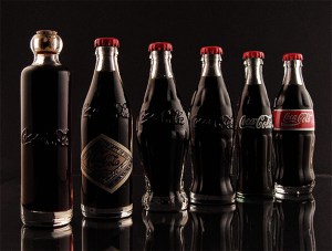
I don’t drink it often but occasionally it really “hits the spot”.  And it always seems to taste better when it comes out of a glass bottle, yes/no? One of the most famous shapes in the world is the iconic contour fluted lines of the Coca-Cola bottle. Renowned as a design classic and described by noted industrial designer, Raymond Loewy as the “perfect liquid wrapper,” the bottle has been celebrated in art, music and advertising. When Andy Warhol wanted a shape to represent mass culture, he drew the bottle:

“What’s great about this country is that America started the tradition where the richest consumers buy essentially the same things as the poorest. You can be watching TV and see Coca Cola, and you know that the President drinks Coca Cola, Liz Taylor drinks Coca Cola, and just think, you can drink Coca Cola, too. A coke is a coke and no amount of money can get you a better coke than the one the bum on the corner is drinking. All the cokes are the same and all the cokes are good. Liz Taylor knows it, the President knows it, the bum knows it, and you know it.”           Andy Warhol

evolution-of-the-contour-bottle-Coca-cola use

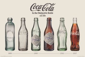
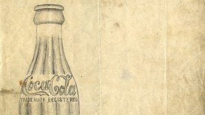
How did the bottle become so iconic?
It began with the desire to protect brand Coca-Cola and was a cooperative project between The Coca-Cola Company and its bottlers. In 1899, two Chattanooga lawyers, Joseph Whitehead and Benjamin Thomas, traveled to Atlanta to negotiate the rights to bottle Coca-Cola. The product had been an increasingly popular soda fountain drink established a mere 13 years previously. In fountain form, Coca-Cola grew from an average of nine drinks per day sold in 1886 to being sold in every state of the US by 1900. Thomas and Whitehead wanted to capitalize on the popularity of the drink by bottling it to be consumed outside the four walls of a soda fountain.

And to indicate the power of brand, as of 2015 the Coca-Cola brand was valued at 83.84 billion U.S. dollars.
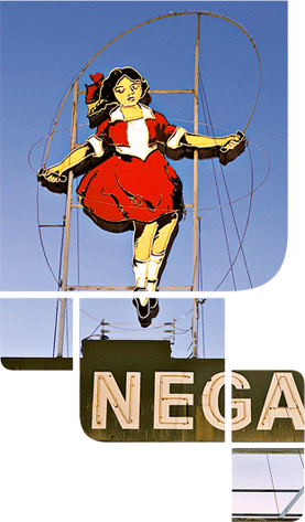
GlassBottle-Patent-2_647 The-History-Of-Coca-Cola-2

Beautiful Movie Posters

For all the cinema lovers out there in movie land,
myself included.
10 Oscar-Nominated Movie Posters Get A Pop Art Makeover
3026924-slide-12-years-slave 3026924-slide-americanhustle Captain Phillip Print 3026924-slide-gravitypopartposter 3026924-slide-her-2 3026924-slide-nebraska2a 3026924-slide-philomena-poster-2-1 popartoscars

And here are my thoughts on each one:
1) 12 Years a Slave: Loved it, great acting, will probably win
2) American Hustle: Overrated, somewhat boring
3) Captain Phillips: Great casting/acting but not a favorite
4) Dallas Buyers Club: Unfortunately missed this one
5) Gravity: Great special effects but lacks a real story line. And I want to know where she landed.
6) Her: Very intriguing script, liked it a lot.
7) Nebraska: Loved the story, superb acting. May win.
8) Philomena: Loved this one as well but some scenes, such as the one with the car that takes away the boy, looked 1930s not 1950s. Makes me want to read the book.
9) The Wolf of Wall Street: Highly overrated, weakest of all.

Beautiful Graphic Design

Systems
An international group of graphic designers respond
to the systematicity of Braun Design. Systems is an
exhibition of commissioned poster designs and ‘60s
Braun products. Braun gets graphic in this new series
of commissioned poster designs and ’60s Braun products
in its Systems exhibition. Thirty-four leading graphic
designers and studios were invited to produce a poster
design on the theme of Braun systems design.

From repetition and development to nostalgia and critique,
the response this project received is quite amazing and
offers just a snapshot of the international graphic design scene.

06 B_braun NBBS_121_P600_DINA0 04 10 11 15 18