Beautiful Color Theory: Revisiting Emily Vanderpoel

Revisiting Emily Vanderpoel’s Color Theory Book 117 Years After Its First Release
In addition to being a watercolorist, Emily Noyes Vanderpoel was also the author of Color Problems, widely overlooked, yet staggering turn-of-the-century book on color theory.
Collection-of-the-Litchfield-Hist-Litchfield-Connecticut-1.jpg

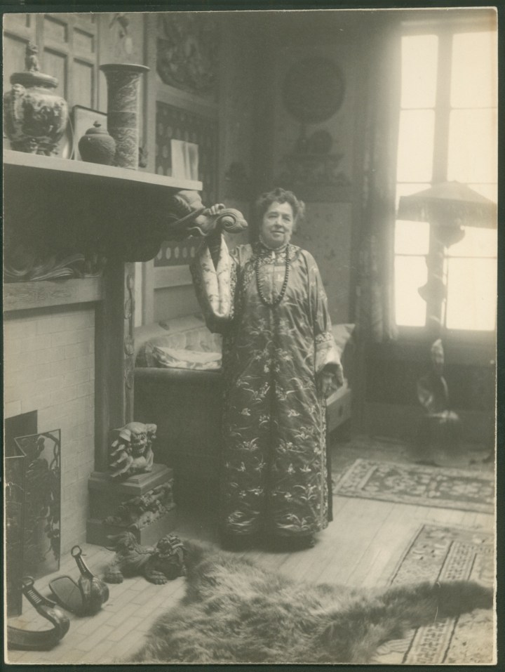
Though her name is virtually unknown today, Emily Noyes Vanderpoel enjoyed a modest reputation as a watercolorist at the turn of the 20th century. She painted seascapes, country landscapes and the occasional industrial scene — perfectly competent works, but ultimately quite conventional. Nothing about them hints at the fact that Vanderpoel was also the author of a widely overlooked, yet staggering book on color theory, its pages bursting with a series of vibrant illustrations that seem to anticipate an abstract aesthetic decades before it emerged in full force.

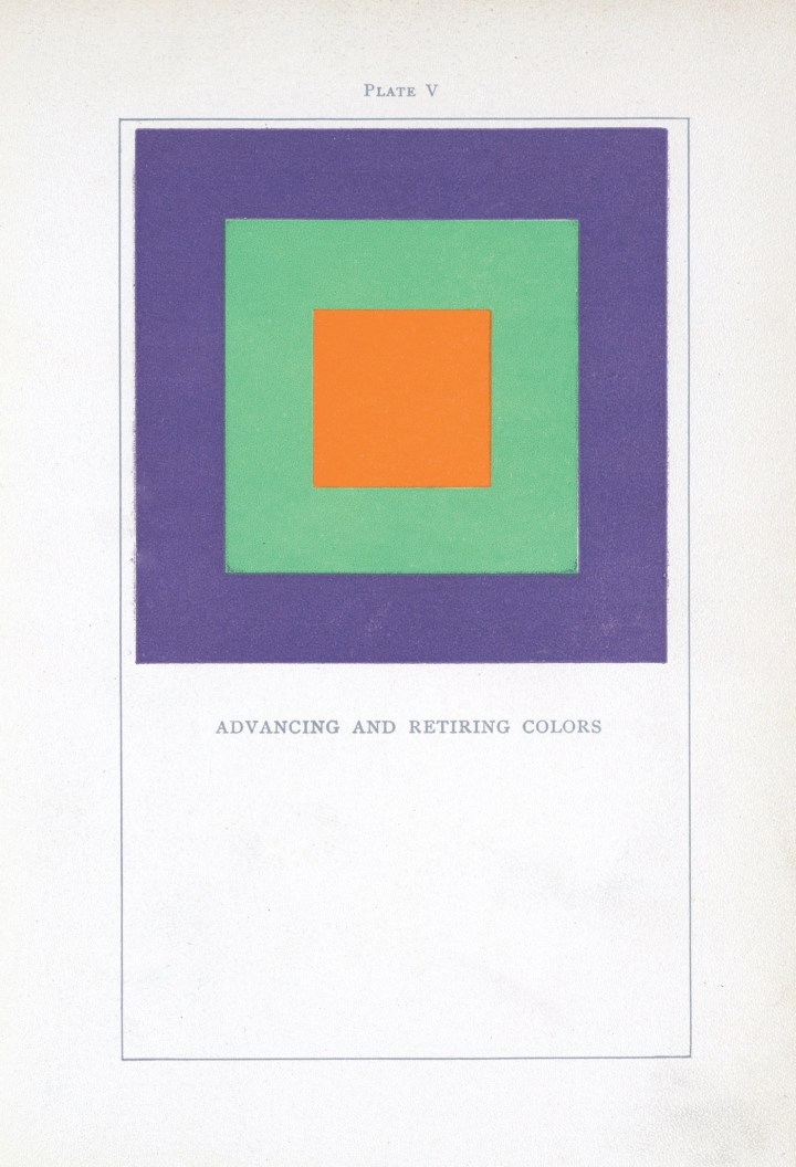
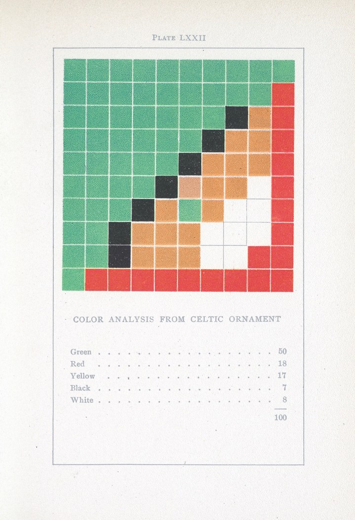
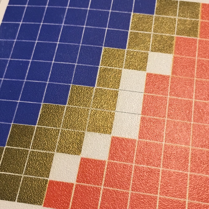
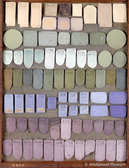
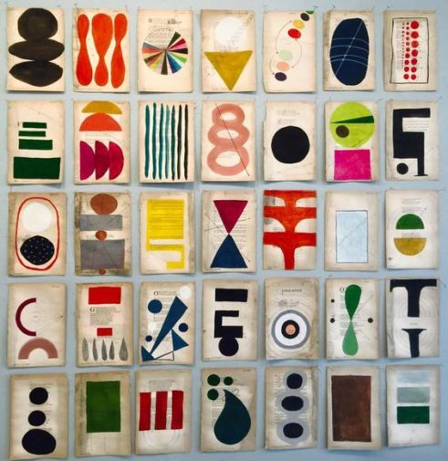
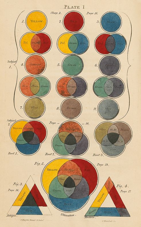
Color Problems: A Practical Manual for the Lay Student of Color, which Vanderpoel first published in 1901, sought to teach an audience of non-artists how to combine colors in ways pleasing to the eye. The 400-page book elegantly summarizes the ideas of eminent color theorists, before unleashing Vanderpoel’s wildly original approach to color analysis: 10 x 10 grids that break down the color proportions of real objects, most of which came from the author’s personal collection of antiques. Vanderpoel lovingly transforms a mummy case, a teacup, a Japanese silk brocade and dozens of other knick-knacks into series of geometric patterns. Her grids emerge as artworks reminiscent of Homage to the Square, the iconic abstract series that Bauhaus pioneer Josef Albers began creating in the 1950s.

Book-Cover

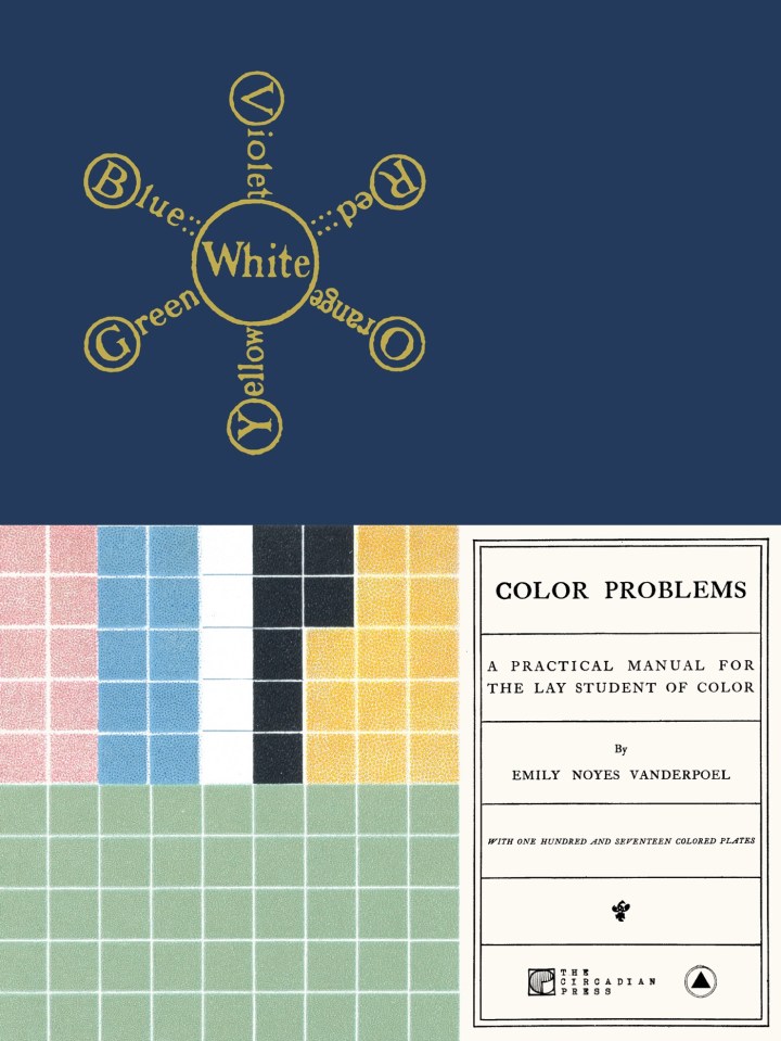
In spite of its stunning prescience, Color Problems has been largely forgotten in the 117 years since it was first released. Two Brooklyn-based publishing companies now hope to salvage the book from obscurity. On November 9, The Circadian Press and Sacred Bones Records will reissue Color Problems in both softcover and a hardcover facsimile, their efforts supported by a successful Kickstarter campaign.

Plate-005

Vanderpoel was immersed in New York’s creative scene. She never received a formal art degree, but studied under the painters William Sartain and Robert Swain Gifford, who taught at Cooper Union and the Arts Students League. Vanderpoel exhibited her artworks through the New York Watercolor Club, which frequently staged group shows, and her paintings occasionally cropped up in grander venues. In 1893, she won a bronze medal at the Chicago World’s Columbian Exposition for a painting of an industrial rail yard. Some years later, her painting “Ypres,” (no date) a memorial to World War I that is now lost, was displayed at the National Art Museum in Washington, DC (which was subsequently incorporated into the Smithsonian). In the late 1920s, the Metropolitan Museum of Art mounted an offsite exhibition of nine of her watercolors at the Connecticut Agricultural College.

At some point amidst this flurry of productivity, Vanderpoel began writing and illustrating Color Problems. No records of her process survive to the present day, but she likely worked on the book for several years, says Alan Bruton, a professor at the University of Houston’s College of Architecture and Design who has researched Vanderpoel’s life and work.

Plate-057-720x1056

Color Problems is a guide for both hobbyists and people who work in the practical arts: florists, decorators, designers, lithographers, salespeople who want to attractively display their wares. The book is not specifically catered to women, but Vanderpoel certainly had female readers on her mind. She writes that understanding the intricacies of color theory can be of value to milliners and dressmakers — occupations often held by women during the Victorian era — along with housewives who dabbled in home decor.

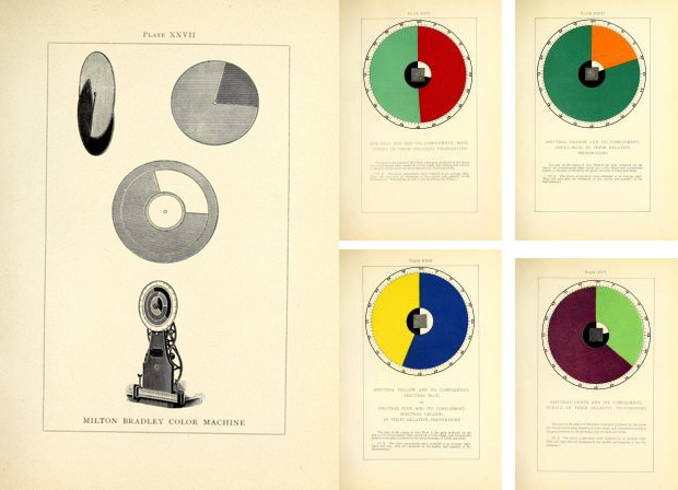
As she doles out advice for achieving aesthetic harmony at home and at work, Vanderpoel reveals herself to be well versed in color theories that proliferated throughout the 19th century, due in part to scientific advances that led to the development of new pigments. She frequently refers to major names in the field, among them Michel-Eugène Chevreul, whose ground-breaking 1839 book explored how adjacent colors influence one another; James Clerk Maxwell, who used spinning color discs to show how people perceive mixtures of color; and Ogden Rood, who, among his other contributions, suggested that colors differ from one another due to variations in purity, hue, and luminosity.

Plate-106-720x1056.jpg

Even more striking are Vanderpoel’s 54 grids, or “Color Analyses, ” in which she reinterprets various objects as geometric designs made up of 100 squares. Vanderpoel’s analysis of a Celtic ornament, for instance, is rendered as 50 green squares, 18 red ones, 17 yellow, seven black, and eight white, all fitted together with Tetris-like precision. She wasn’t the first theorist to organize colors into grids, but rendering pixel-like representations of real objects to capture the optical effect of color — that was something new.

Plate-073.jpg

colorwe11

Read more of the original article here
Learn more about the Kickstarter 
campaign 

Beautiful Amazing Kindergarten

Today, I present one of those projects that takes your breath away. It is designed by Emmanuelle Moreaux and it’s a beautiful kindergarten full of color, a stimulating environment where kids can let their imagination run free. Every child should be so lucky to go to school to attend a learning environment like this.

colorful-nursery1

I love the use of color, a common feature that runs throughout the space. The school, Creche Ropponmatsu, is located in a residential area in Fukuoka, Japan. Emmanuele Moreaux designed this crazy, whimsical project – color is common theme throughout many of her projects. The result is amazing. Emmanuelle designed the architecture, interior space, logos and graphical signage, with a vision to open a new kindergarten where children can grow up freely in mind and body. Running behind the colorful grove, this kindergarten gives opportunity for children to raise rich sensibility by feeling many colors wherever they are.

colorful-nursery2

colorful-nursery3

THREE-DIMENSIONAL COLORS AND ELEMENTS
Color is apparent in every corner of the space. 22 colors were used in the 63m height trees on the façade. The branches appear to wrap the entire building, protecting it, perhaps, from the less colorful world outside. Collections of color jump out at one glance. On the facade, there are 22 colors used in 63 multi-colored trees of 4 m in height extend the branches rhythmically and wrap the building. While giving full-sized glass with a feeling of openness, by wrapping it with colorful trees, gives a sense of distance to the outside. Inside, 200 colorful boxes in 25 colors are lined up on the wall, where each one of them belongs to every child to stock their personal goods. Every time children use their own tools or get changed, they find and pick up the box of their color.

colorful-nursery4.jpg

colorful-nursery5

The stairs which connect the 4 floors is also full of colors, 18 different tones in fact. This creates an environment where kids are surrounded by diversity inside, outside and in common zones. Stimulation with colors and shapes is crucial for kids at this age – experts claim that color helps kids to develop their sensitivity and individuality.

colorful-nursery6

DETAILS IN THE LOGO
Colorful trees on the façade have been also included in the logo, a perfect representation.

colorful-nursery7.jpg

creche_01

creche_0

creche_ropponmatsu_fp

creche_ropponmatsu_fp_2

creche_ropponmatsu_elevation_3

Learn more about her colorful projects here 

Beautiful Pink House

4-Laurinda-Spear-Bernardo-Fort-Brescia-Arquitectonica-The-Pink-House-Miami-Shores-1976-79-Photography-by-Eric-Meola

The Pink House, otherwise known as The Spear House, is one of the best known and most photographed residences in Miami, Florida. It is a quintessential symbol of modernism and sits at the edge of Biscayne Bay in the older Miami suburb of Miami Shores, is intended as an urban house within a suburban context. Rigorously conceived as a study in different planes, the house is painted give shades of pink, ranging from deep near-red to pale pink, which heighten the illusionistic perspective of the house and define the series of planes. Pink was chosen because it seemed to be the most tropical of all colors and at the time was rarely used. Many factors make the house interesting bit its controversy has all the intrigue. designed by Laurinda Spear and Bernardo Fort-Bescia of Arquitectonica for Spears’ parents in 1976, it’s a series of planes and framed views designed to maximize East/West breezes.

The Pink House, Miami Shores, Florida, 7800

Although the house was initially conceived as an object standing on its own, the west façade, facing the city, is scaled down; its dimensions diminish to relate to other houses on the street in an almost mathematical cadence. The east façade, designed for long-distance viewing from Miami Beach and the bay, is scaled so that it looms large. The approach is through a tropical grove — almost a tunnel– which opens to a geometric landscape with palm trees spaced regularly in a carpet of pavers.

pink jhouse ext 3.jpg

The house has a precise sequence: the façade, the courtyard, and then the rooms, each framing a different view of the bay. The house encloses a swimming pool, which, along with the living areas, is the piano, one level above ground. The house in narrow — only 18 feet wide — to capture the bay breezes and daylight as well. The Spear House is more rigorously mathematical than Arquitectonica’s later work, yet in many ways it is seminal, establishing a number of paths of inquiry that the firm has pursued consistently, including color and cadence.

The Pink House, Miami Shores, Florida, 7800

Its color statement received a lot of attention in the late 1970s when it was built.
Neighbors were disturbed by the 5 shades of pink, which were chosen to reflect
the tropical climate and were rarely used at the time. Ultimately a grove of trees
were planted to shield the house from the street.

The Pink House, Miami Shores, Florida, 7800

pink house porthole large

pink house pool

pink house pool2

PinkHouse_MiamiShores5

PinkHouse_MiamiShores1

early-collage-study-pink-house-copy
Original sketch

rendering 1

rendering 2

Beautiful History of Crayons

To celebrate National Crayon Month here is the interesting history of crayola crayons. From its earliest days, Crayola has been a color company.  During the last 100-plus years, Crayola has grown beyond our founders’ wildest dreams.  By applying technical innovation, unparalleled quality, consumer satisfaction and product value, Crayola has become the preeminent producer of hands-on products for creative personal development and fun.  Read more about the colorful history here. Oh RIP Dandelion, today it was discontinued.

crayolaboxes.jpg
1 and 2: Original box of crayons
3. Original box of 48 colors
4. Original box of 52 colors
5. Original box of 64 colors
AC0624-0000001.jpg 4-FLESH-V-PEACH-570.jpg3 crayon 2 o-BLUES-AND-REDS-570.jpgcrayon 1

Retired13.jpg
Retired colors

440px-Rubens500_inside
Original colors

Crayola_Ad_1905.jpg
Original Ad – 1905


Beautiful Pink Fashion Trend

Pink has been #rebranded. Once a symbol of dated gender binaries, pink is now the color of powerful optimistic statements — Trump-shading pussy hats, shapely, multiethnic Barbie dolls, a cosmetics company that values realism over illusion. Those of us who cast aside our bubble gum pink paraphernalia the moment we grew old enough to shop for ourselves — and those of who still loved the hue but grew sick of the vaguely offensive “girly girl” associations — now have reason to reach for our rose-colored glasses.

spring-2017-pink-trend.jpg

fall-2017-pink-trend.jpg

pinnk 2.jpg

pink 3.png

pink 4

pink 5.jpg pink 1

pink 6.png

Beautiful Red Interiors

I’m personally not a huge fan of red when it comes to interiors but it can be used to make a powerful statement in subtle and not so subtle ways. Check out how these designers who love red have incorporated this fiery and beautiful color into their homes.

Red-house-exterior-victorian-with-red-paint-red-paint.jpg

There are instances, such as this Victorian farm house, where red is the perfect color.

primary-coloured-houses1.jpg
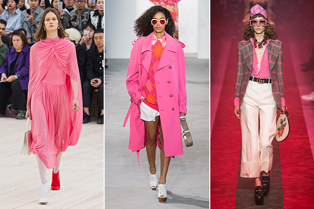
…or sometimes you just want to have fun with it. 

red-dwell

These walls are covered in Graniplast, a tinted acrylic finish. Nathan Pereira Arquitectos y Diseño advised on the facade, floors, and finishes. Designed by Vanessa Clark.

red bath.jpg

Red gives a bathroom and modern appeal. This bathroom features Chromtech tile, a Toto toilet, Kohler vanity, and powder-coated steel countertop.

red-nook

Red is perfect for a comfy kitchen nook. Eazy side chairs by Whiteonwhite line one side of the custom-designed table by LOT-EK. Castore suspension lights by Michele De Lucchi for Artemide hang above, and a custom rug by Liora Manné lies below.

red kitchen.jpg

Red is one of those colors where “less is more” often makes a bolder statement. Largely white monotone, the kitchen introduces a pop of red through the glossy AGC kitchen backsplash. Red Piston stools by Shin and Tomako Azumi complete the space.

red-modern

Red is often used in commercial spaces. In Situ Design and Lilian B Interiors adapted a six-story brownstone in midtown Manhattan into a boutique hotel with 33 guest suites. Each floor received what the designers call a “visceral” color treatment using Benjamin Moore paints, including Outrageous Orange.

red eames.jpg

I love this red Eames chair. Magenta Togo sofas by Ligne Roset, a red Eames molded plywood chair, provide seating around the hearth.

red locker.jpg

Red used as a fun, happy accent especially when it comes to kids. E27 pendant lamps from Muuto a with matching red locker storage. The inside of the front door is painted bright green.

red cabinets.jpg

Designer Harry Bates designed a simple cedar house for a young family in New York in 1967. Forty years later he updated the place for its new owners. The addition of bright red cabinetry in the kitchen introduces a contemporary style without losing the rustic, vintage quality of the space. 

red leather.jpg

Red can be interpreted as masculine or feminine. I love this distressed red couch;
mixed with the industrial surroundings it adds a beautiful layer of texture.

red-bunk-bed

This bedroom features bright red bunk beds for a dormitory-like experience and can be
paired with adjoining rooms for larger groups of guests.

red-plaster

The kitchen’s red Venetian plaster walls makes for a nice textural detail. 

red door.jpg

rotating-door-in-bright-red

Two great examples of how red is the perfect color for modern door.

To learn about these products visit Dwell


Beautiful Historic Homes

I love architecture and when I’m out-and-about I sometimes find myself stalking the neighborhood to check the latest and greatest home designs. With the building frenzy going on in Seattle and so many structures being torn down and replaced at such a rapid pace, I’m developing a new appreciation for the beauty of old homes and buildings. I’m personally a fan of modern design with the less is more approach but my heart holds a special place for authentic craftsman style homes in Seattle, the colorful Victorian homes in SF and Row Houses in DC. It amazes me how much residential architecture can define a city. Put them in a different location and they almost look silly. Hopefully more will be preserved so that a cities don’t lose their historic identity. Enjoy these images, one day they may become just that, an image.

San Francisco Victorians

sf1 sf2sf3 sf4 sf5 sf7

Row Houses of Washington, DC
Many of these are about 200 years older than the SF Victorians and 300 years older than the Seattle Craftsman Bungalows! Built long before western states even existed. Amazing they have survived.

dc-row-house1 dc-row-house2 colorful_townhouses drwilliambishops1878workingclassrentalhousesaugust21st2015 washingtonhouses-row-house-3exterior4x6200dpi

Seattle Craftsman Bungalows
With the Seattle building boom, sadly many of these are disappearing and being torn down only to be replaced with what I consider poorly designed modern homes and condos. I am a huge fan of well designed modern homes however the surrounding neighborhood and homes always need to be taken into consideration.

seattle-1 seattle 3.png   seattle-6 seattle-12 seattle-5

Beautiful Cuba

cuba7

The one place on my bucket list lately is Cuba. The fact that it’s been forbidden for the last 60 years makes it even more alluring. For those looking to visit you can book a tour through Coast to Costa out of LA. Alas you can peek behind the curtain and experience the magic of Cuba. More about the tour company here. For those who have visited feel free to any “not to be missed”  sites.

cuba1 cuba2 cuba3 cuba4 cuba5cuba8cuba6
Photo credits Alessandro Giraldi,
Erich Mcvey, Tom Blachfor for
My Modern Met.