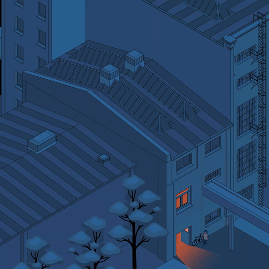
Milano – Coming Soon
Beautiful conversations, people, places, design+photography
A modern office, linear and neutral, is converted into a home and made welcoming through a play of colors, coverings, and décor. Its unique structure, consisting of a narrow corridor, was the driving force behind the design project, turning a limitation into an opportunity. The goal was to enhance the areas and multiply the spaces through optical illusions based on targeted colors, mirrors, and wallpaper.
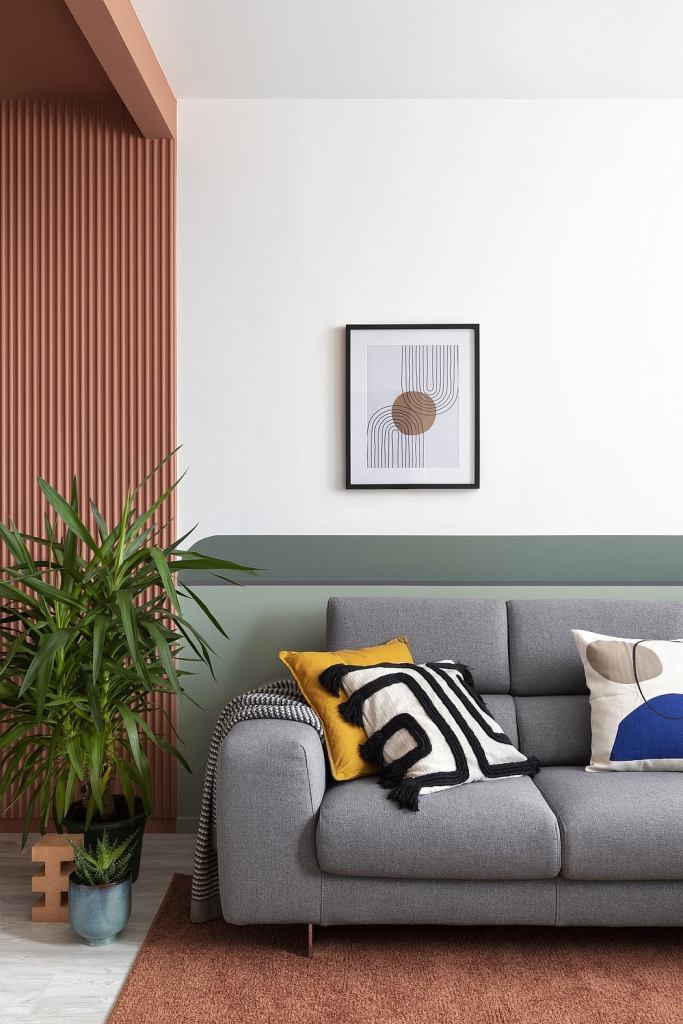
The space is transformed and divided, illuminated by large ribbon windows that fill the place with natural light. The intervention therefore aimed at enhancing the existing monochromatic and linear spaces which lent themselves adequately to achromatic and decorative play thanks to the play of volumes already present.
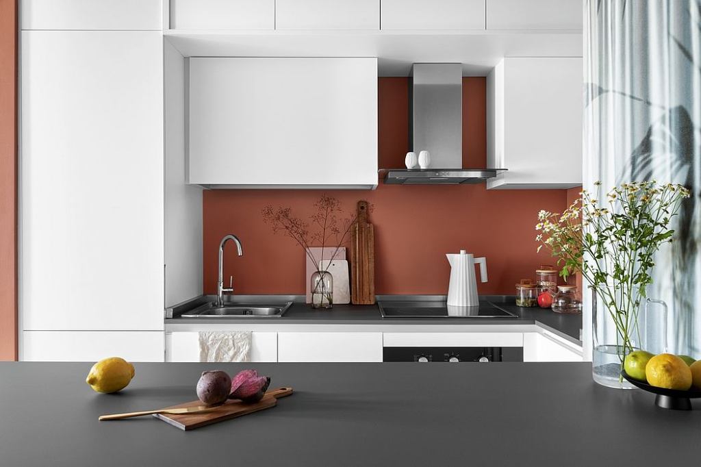
The kitchen is the heart of the house, enclosed in a chromatic “cube” that instills openness and sociability, thus generating a dynamic and multifunctional environment. It becomes the place to welcome and share, accompanied by dark chestnut wood, a color that increases energy and stimulates the appetite.

Color is used as an excellent tool for delimiting a space, dividing it, giving it an identity. By the choice of the correct color, it is possible to create moods and feelings and make sure that the environment we live in can influence our emotions.
The pine green of the living room, used in two shades, expresses regeneration and rebirth, urging us to breathe more deeply and instilling trust and security. It favors blood pressure reduction by stimulating the pituitary gland, which is ideal for the living area! The palette also includes the white color, which acts as a neutral canvas and contributes to lightening the environment by providing balance and serenity. Colors carry with them a universal message, fruit of cultural and historical evolution; their communicative capacity is very powerful.
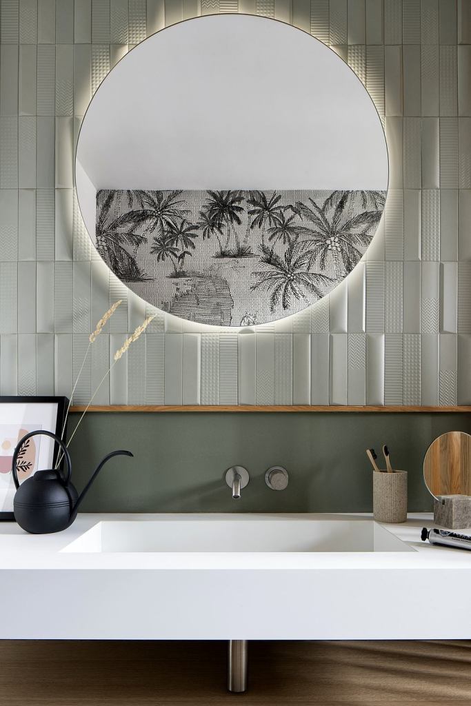
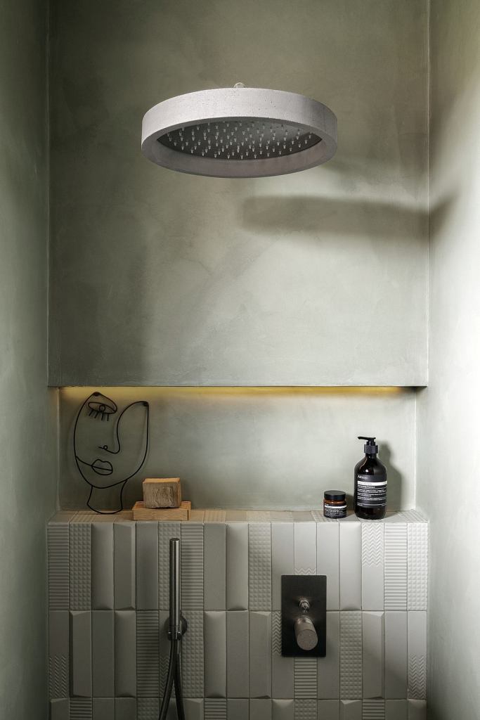
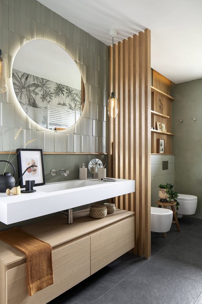
Playing with solids and voids is a very interesting method to embellish an environment. In the bathroom, Chroma Studio has chosen to play with the wooden divider that, with its rectangular axes, gives an added value in terms of functionality, chromatic harmony, and dynamism. The bathroom is, by choice, the most restful space of the entire apartment, a place to abandon the tensions of the day and take our time.
Materials, colors, and textures have been chosen to help the reconnection with nature. The use of sage green infuses a feeling of balance and regeneration, associated with natural oak wood and the wallpaper “Exotic dream” by Londonart that reminds of pristine places. The design choice was to enhance the long walls of this bathroom in which one is reflected in the other. The left side holds the large Fenix and oak washbasin, separated from the sanitary area through the oak divider. This wall was imagined as a sort of chessboard, where the two-dimensional enamel was associated with the three-dimensional tiles “Biscuit” from 41zero42, creating vertical and horizontal sections through the use of wood. The large circular mirror reflects the fiberglass wallpaper that occupies the entire front wall. The walk-in shower, designed as a real relaxation space, occupies the entire bottom of the room for comfortable and pleasant use.
Photography by Riccardo Gasperoni
Design by Chroma Studio
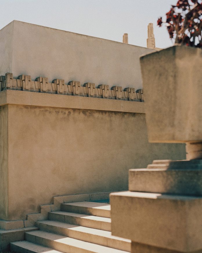
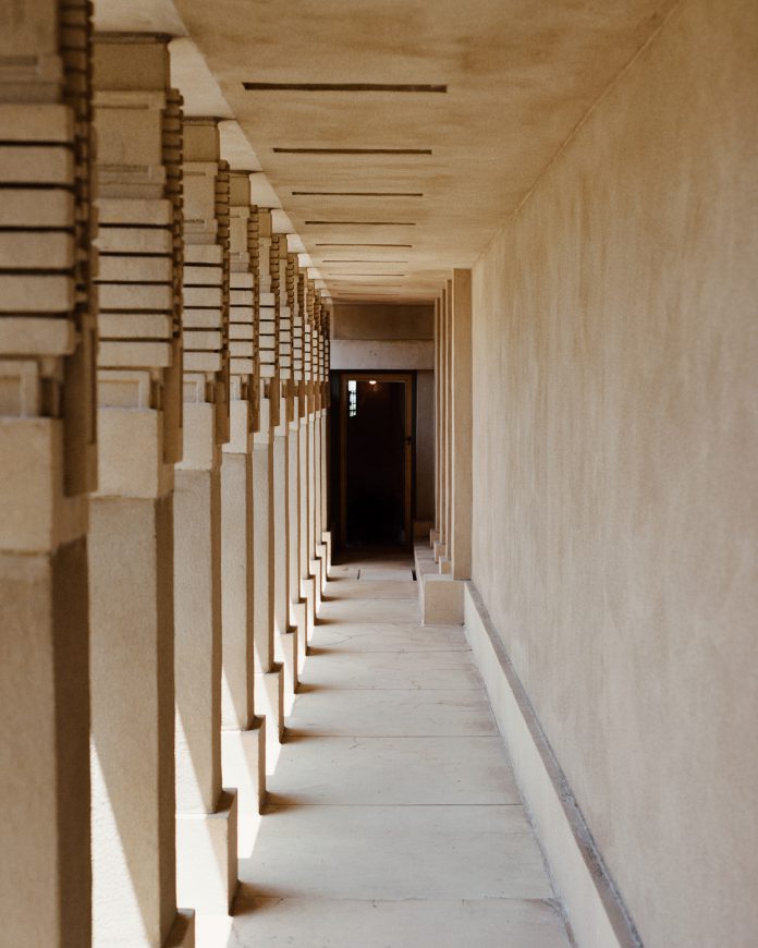
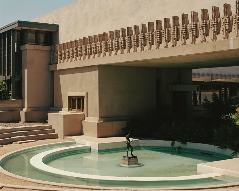
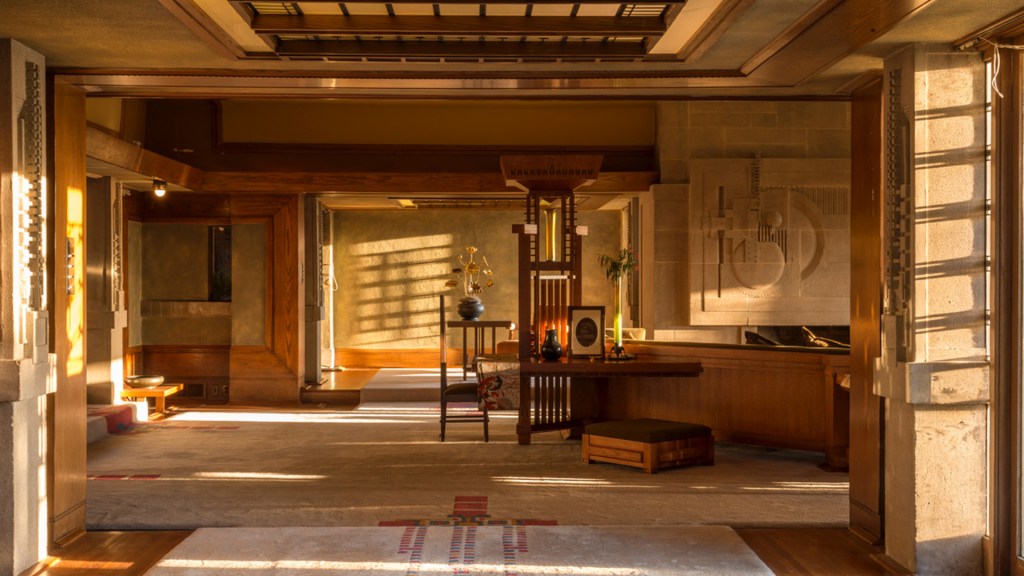
One of Los Angeles’s architectural gems is back! After a six-year extensive restoration, you can once again tour Frank Lloyd Wright’s first commission in this city. Cresting Olive Hill in Barnsdall Art Park like a crown, Frank Lloyd Wright’s Hollyhock House glows in honey-colored stone. Built between 1919 and 1921 for Aline Barnsdall, the building was awarded UNESCO World Heritage status in 2019. It features many of Lloyd Wright’s classic architectural signatures, such as vast windows, an open-plan living space, bold lines and geometric accents. Mayan architectural shapes embellish the walls, from the numerous roof terraces down to the patio.
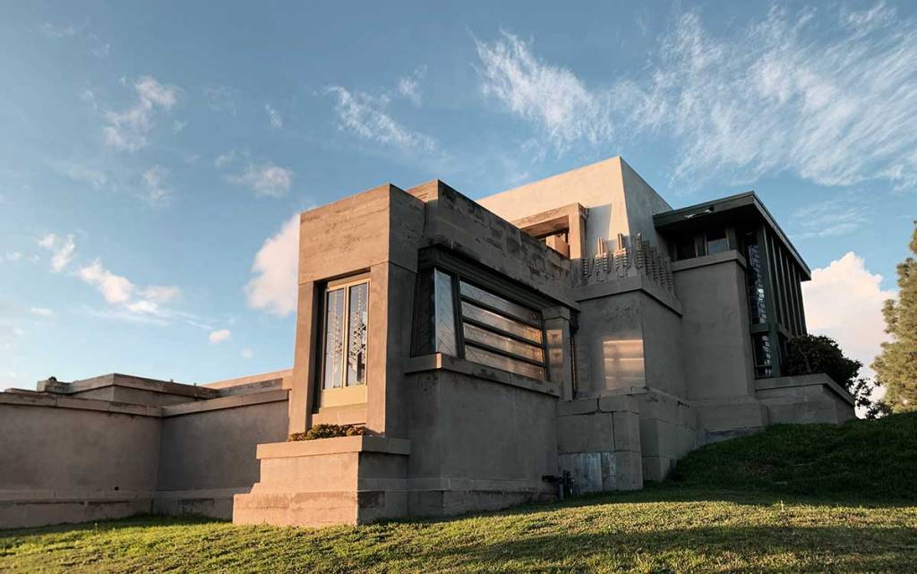
A significant part of LA’s storied architectural history, Hollyhock House (built 1919-21) marked Wright’s first architectural project in Los Angeles. Hollyhock House boasts a lyrical and poetic style of architecture known as “California Romanza” (from the musical term meaning “freedom to make one’s own form”), which complements LA’s significance as a trendsetter in the arts and architecture.
Hollyhock House is a gorgeous Mayan Revival style house with 17 rooms and 7 bathrooms. Oil heiress, theater producer, single mother, and social activist Aline Barnsdall commissioned the house, and it was originally intended to be part of an avant-garde arts and theater complex known as Olive Hill, now known as Barnsdall Art Park. Barnsdall tapped Wright for the job when she bought Olive Hill in 1919. Wright was hired to design multiple buildings, but he only finished the plans for Hollyhock House before being fired. He wasn’t on the job long enough to see the house completed in 1921.
This project marked a transitional moment for Wright, as it heralded the end of his prairie style home period. It also marked a turning point in the history of modern architecture in Los Angeles; the house’s construction brought three seminal architects—Wright, Rudolph Schindler, and Richard Neutra—to the city. All three went on to create iconic buildings throughout Los Angeles, defining California modernism in the process. It’s one of the many L.A. treasures listed on HistoricPlacesLA.org, a historic preservation resource from the City of L.A. and the Getty Conservation Institute.
In addition to the UNESCO recognition, Hollyhock House was designated Los Angeles Historic-Cultural Monument #12 in 1963, added to the National Register of Historic Places in 1971, and designated a National Historic Landmark in 2007.

Little known facts about this newly reopened historic landmark.
Hollyhock is not someone’s last name
Unlike Wright’s other Los Angeles commissions, “Hollyhock” is not someone’s last name. Before it was even designed, Barnsdall decided to name the house after her favorite flower—hollyhock. Wright used the name as inspiration, implementing an abstract hollyhock motif throughout the house’s façade and interiors. Actual hollyhock flowers are located in the central courtyard and the exterior spaces.
Project Restore Came to Its Rescue
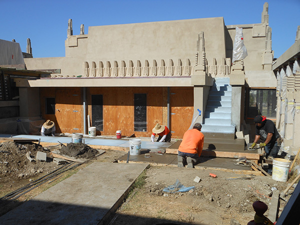
Hollyhock House is almost 100 years old, and with age comes much need conservation work. Due to financial limitations, Wright used hollow clay tile and plaster instead of poured concrete to build the house. These materials made the structure susceptible to water and seismic damage. Over the years, the house has confronted intense leakage problems, sagging concrete beams, distorted paint color, cracks in the pool, soil settling, and the impact of some pesky trees.
In 2005, a restoration team fixed damage caused by the 1994 Northridge earthquake, but many other problems remained. Their work lead to a ton of discoveries about the original 1921 house, as well as previous conservation efforts in the 1940s, 1950s, 1970s, and early 2000s.
Luckily for the preservation of Wright’s work, Project Restore assembled a team of experts to spearhead the conservation and restoration of Hollyhock House. Initial funding was provided by the California Cultural and Historical Endowment and grants from Save Americas Treasures. Additional support was provided by the City of Los Angeles and the National Parks Service.
Project Restore was awarded the 2014 California Restoration Award for their work on Hollyhock House. Full slideshows of the whole conservation process can be seen on Project Restore’s website.
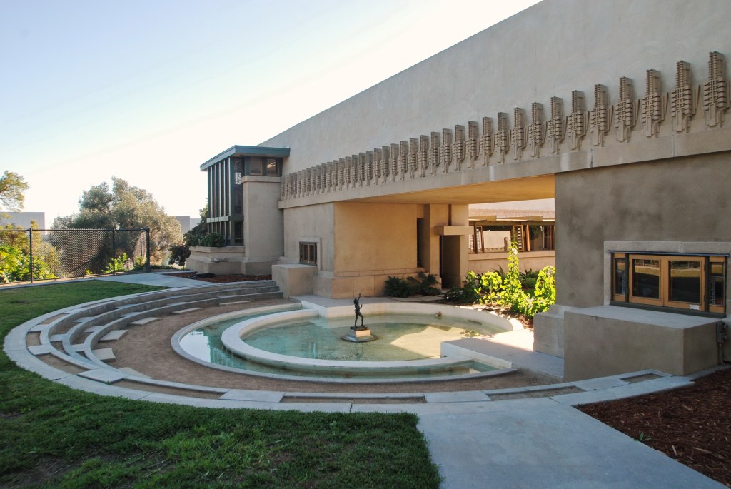
It Includes Symbols for Earth, Water, Fire, and Air
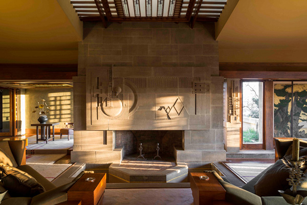
Japanese-inspired idea is the metaphorical inclusion of the four elements—earth, water, fire and air—in the house. The concrete bas-relief of the fireplace represents earth, the fireplace itself and the torchiere lamps allude to fire, the skylight references air, and the entire home is surround by a moat representing water.
The concrete bas-relief, considered one of Wright’s greatest works of art, is said by some to be an abstract representation of Barnsdall as an “Indian Princess” on a hill overlooking the city.
Some Furniture Pieces Are Original—And Some Are Replicas

After a century of use, it is understandable that some of the furniture had to be replaced. The curator of Hollyhock House, Jeffrey Herr, used old photos to find or reconstruct exact replicas of objects and furniture in the house. But many of the pieces are original, including the dining room chairs from 1921. The chairs feature a hollyhock motif along with what looks to be a human spine—perhaps an expression of Wright’s macabre sense of humor. When touring the house, visitors can guess which objects are original and which are exact replicas.
**Spoiler Alert** Speaking of replicas, one item known to be a copy is the grand couch located in the living room. At some point during the house’s life, the original couch mysteriously disappeared.
Rudolf Schindler Left His Mark on the House
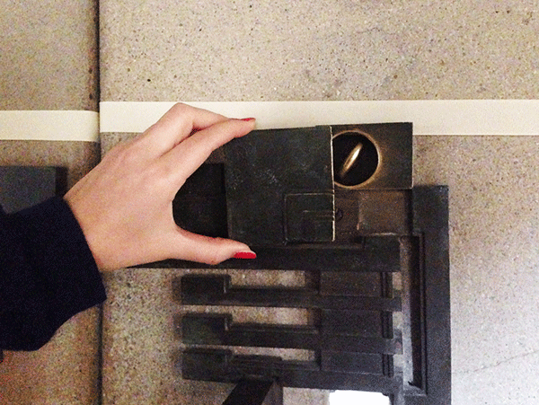
Due to time restraints, budget decisions, the architect’s preoccupation with projects in Japan, and tensions with Barnsdall, Wright did not finish construction of the house. Rudolf Schindler came to Los Angeles to work as project manager for Hollyhock House under Wright, and he was hired to finish the remainder of the home after Wright was fired by Barnsdall.
Schindler contributed several architectural features to Hollyhock House, including the camouflaged locks and Barnsdall’s bedroom. After developing his own successful body of work in the city, Schindler urged Richard Neutra to follow. Through the Hollyhock commission, three important architects wound up in Los Angeles.
…And So Did Wright’s Son, Lloyd Wright
Wright’s eldest son, Lloyd Wright, was an architect in his own right, and he also worked extensively on Hollyhock House. Lloyd was his father’s right hand man during the early stages of construction when Wright was in Japan and Rudolf Schindler had yet to be brought on as project manager. In the 1940s, Lloyd spearheaded a restoration of the house while simultaneously taking some creative liberties and adding several new design elements such as cabinets. These cabinets remain today, even though the rest of Hollyhock House stays true to its original 1921 state.
Aline Barnsdall Was Drought Savvy
The house includes an underground plumbing system to allow water to flow from the central courtyard into an interior moat and then out again to the main pool outside. Due to its impracticality and wastefulness, Barnsdall discontinued the water flow to the fireplace moat shortly after its completion. Was Aline a water conservation pioneer?
It’s Had Killer Views from the Beginning
Hollyhock House offers exceptional views of many of the city’s landmarks, including the Hollywood sign and the Griffith Observatory. However, completion of Hollyhock House predated both famous sites—the sign went up in 1922 and the Observatory opened in 1935.
The House Once Belonged to a Girl Named Sugartop
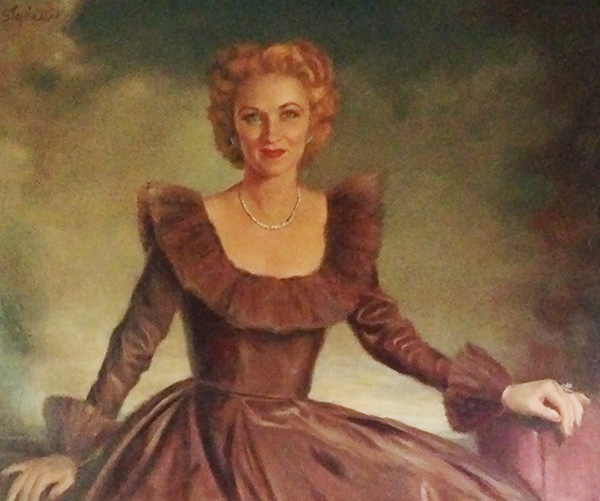
Barnsdall was infamously a single mother by choice, for she wanted a child but not a husband. In 1917 she gave birth to a daughter named Betty, also known as “Sugartop” because of her white blonde hair. Photographs and paintings of Sugartop are displayed throughout Hollyhock House. Wright planned with Sugartop’s needs in mind, particularly in the designs for her bedroom and the outside areas of the home.
Hollyhock House is located at 4800 Hollywood Blvd, Los Angeles, CA, 90027, and the house is open from Thursday to Sunday, 11am–3pm. Admission is $7 for adults and $3 for students and seniors with ID. Additional information can be found on Barnsdall’s website.
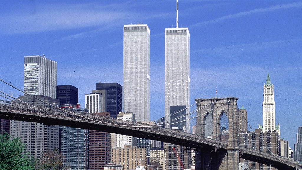
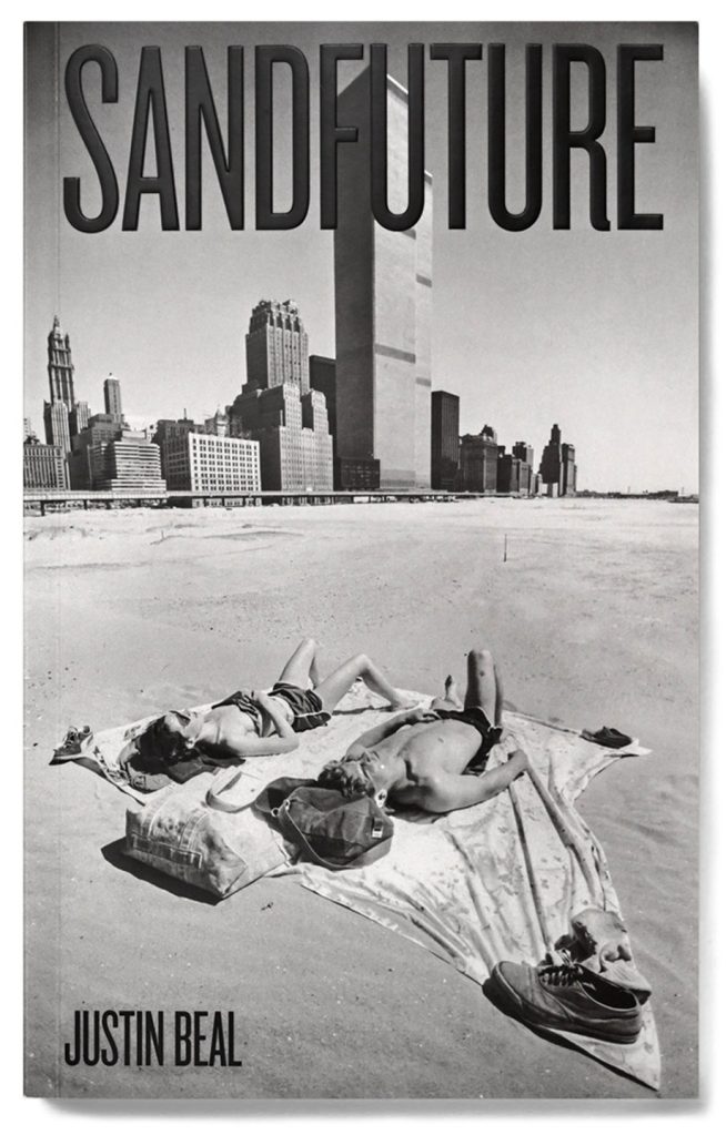
Though the Twin Towers will forever be ingrained in American culture, their architect and many of the themes he intended for the World Trade Centers’ design have been lost in the annals of history.
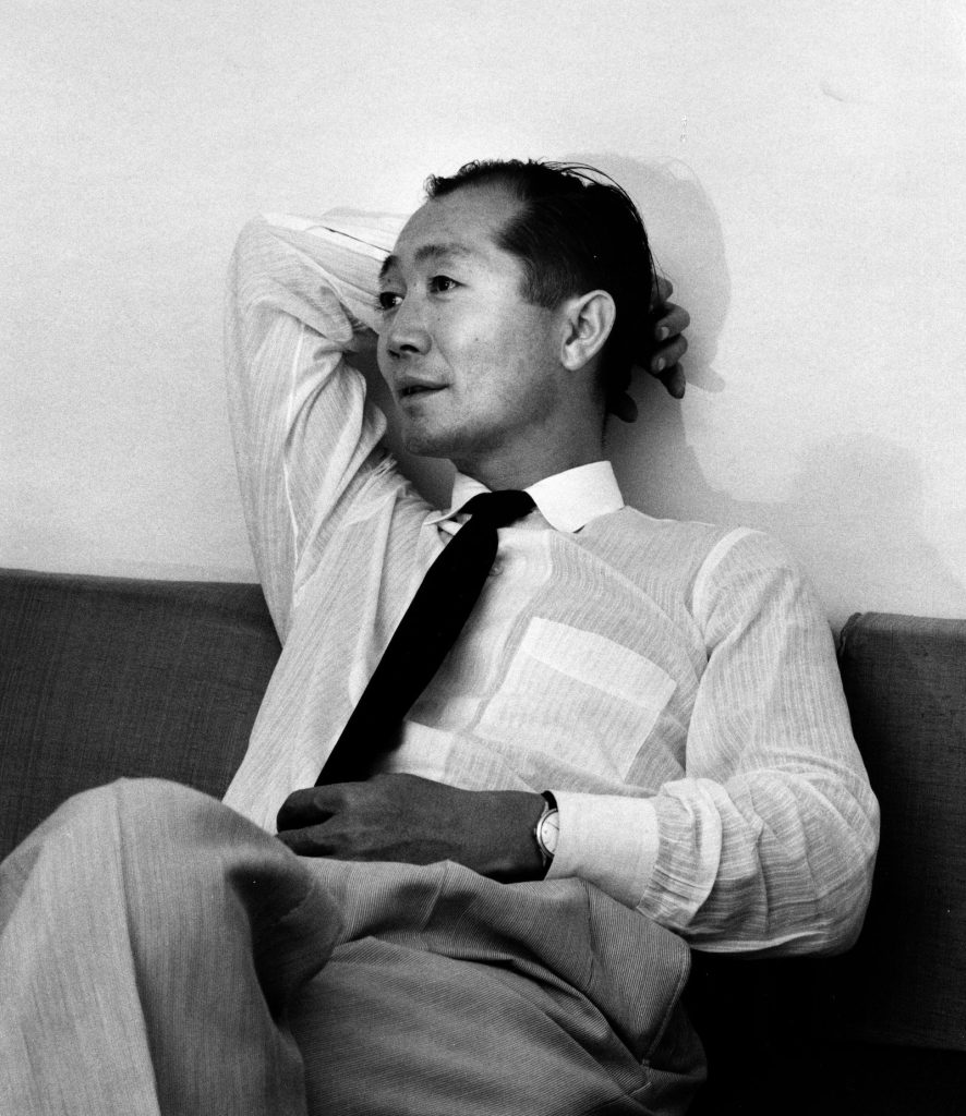
Japanese architect Minoru Yamasaki was a modernist who designed for human interaction. His designs might have been minimal, pared down, and somewhat cold, but life could fill them up. He preferred people to interior design too. As he once said: “If you have white walls, human beings look better in a room than if you have red walls.” Yamasaki, who designed the original World Trade Centers in 1973, is the subject of a new book called Sandfuture, out on September 14. The book traces his unconventional path in architecture, from his early life, born to Japanese immigrants in 1912, to his path in architecture, moving to New York City during the Great Depression.
Yamasaki was part of the New Formalism movement, which saw its rise in the 1950s, aiming for a monumental presence in modernist towers, with delicate details and a rich use of materials like marble and granite.
In 1955, he started his own firm, Yamasaki & Associates, which created 43 residential and commercial towers across the globe, from Brazil to Azerbaijan. Though his design accomplishments are awe-inspiring, he remains in the margins of design history.
Yamasaki is best known for designing the original World Trade Center towers, which were destroyed on 11 September 2001 in a terrorist attack. At 1,368 and 1,362 feet (417 and 415 meters) tall, the towers were the world’s tallest buildings when they opened in 1973.
However, despite their international significance, Yamasaki’s career sits in “the margins of architectural history”.
Yamasaki was born in 1912 and raised in Seattle, Washington to Japanese immigrant parents, and anti-Japanese prejudice defined much of his youth. He enrolled on the University of Washington’s architecture program in 1929 and started his own firm 20 years later.He was commissioned for The World Trade Center in 1962 by American banker David Rockefeller and the Port Authority of New York and New Jersey, after being selected from a shortlist including architects IM Pei, Philip Johnson, Welton Becket and Walter Gropius.
The complex was built with the aim of revitalizing Lower Manhattan, and it drew on the 1939 New York World’s Fair exhibit called the World Trade Center, which was dedicated to the concept of achieving world peace through trade. We are accustomed now to seeing the World Trade Center as a symbol of American capitalism and American unilateralism, but that’s not really what it meant when it was built.
The project was conceived around an idea of global trade as a force for good that seems impossibly naïve now.
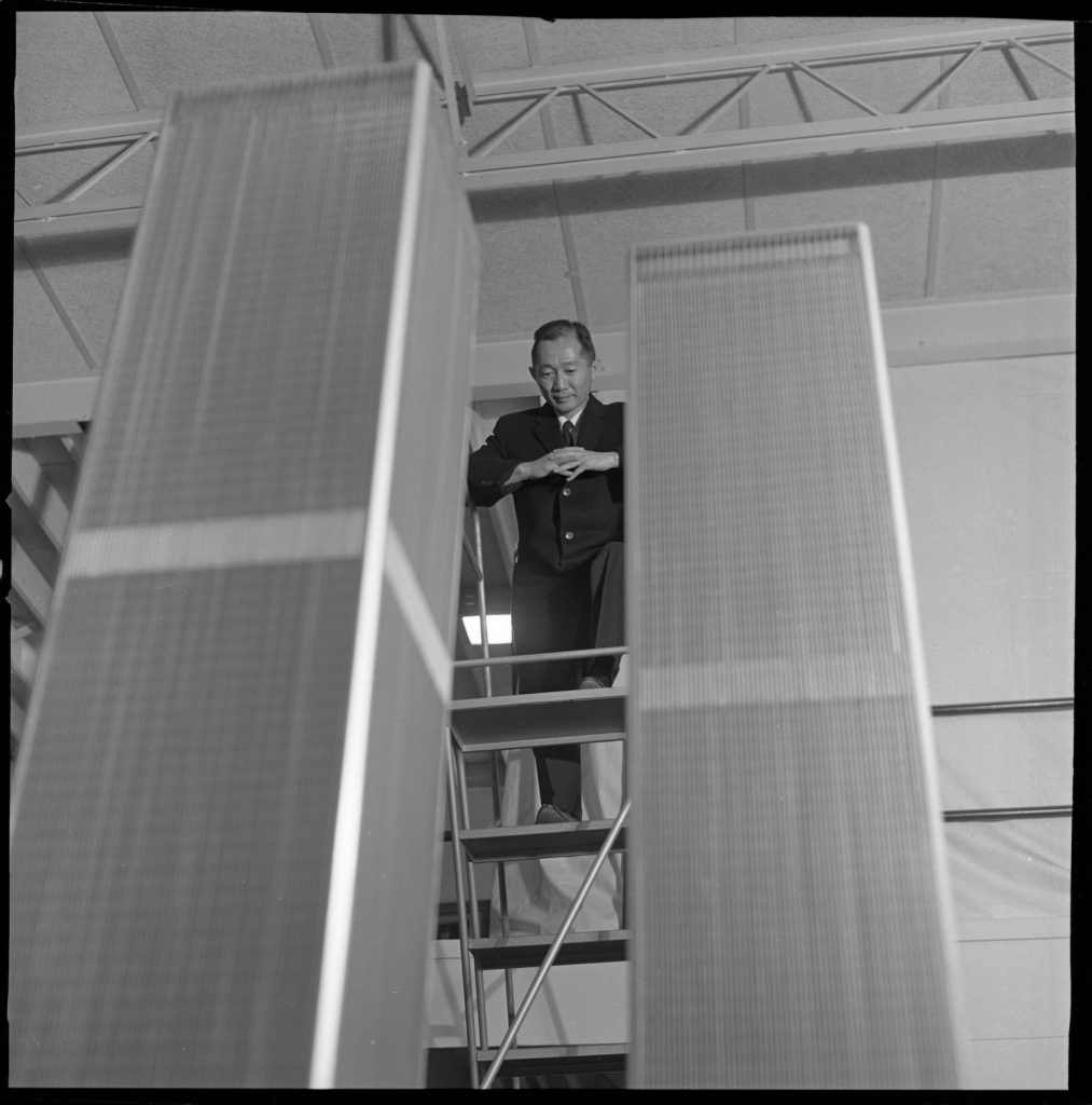
Project designed as “a Mecca” – Yamasaki’s final design for the center – a pair of towers with narrow windows, decorative pointed arches at their base and a large surrounding plaza – was revealed in 1964. His aim was to embody the New York World’s Fair exhibit concept by creating a “beacon of democracy” and, in the architect’s own words, “a Mecca”.
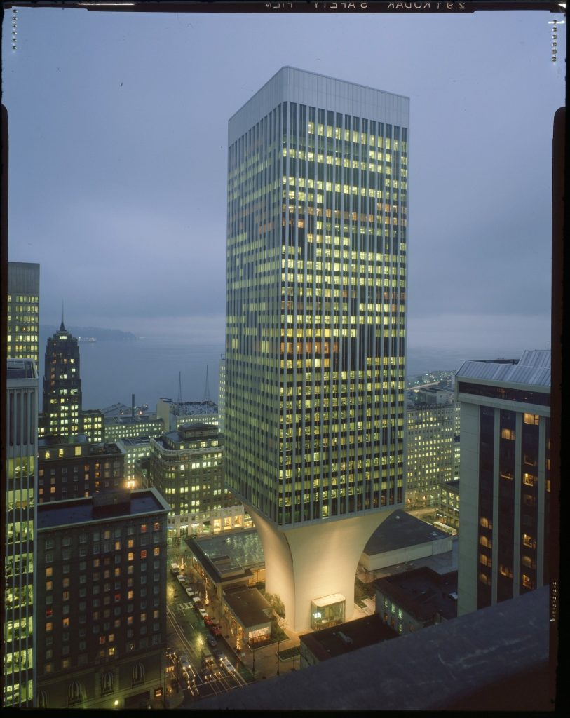
Minoru Yamasaki & Associates, Rainier Bank Tower (Seattle, 1972–1977).
Yamasaki genuinely believed that this project could be both a nexus of international commerce and a beacon of democracy and goodwill between nations. However, despite his ambitions, “accepting the job was not an easy decision” for Yamasaki. It was the commission of a lifetime, and he knew that he could not turn it down, but he also understood that it was too big a job for his office.
Twin Towers branded “Disneyland fairytale blockbuster” – Upon its conception, the World Trade Center was widely lauded but as the project progressed “critical reception shifted dramatically”. Yamasaki worked in “constant conflict” with the port authority as it cut key elements of the design to save costs and pushed the scheme to increase its height and office space. This turn of events is encapsulated by the shift in opinion of the late architecture critic Ada Louise Huxtable over the course of the project.
Ada Louise Huxtable was a longtime advocate of Yamasaki’s work, but she was also a very sharp and conscientious critic, and the evolution of her opinion is a good indication of the arc of the critical reception of the project.
It is hard to imagine another pair of buildings which in their lifespan, from conception to construction to spectacular violent destruction, have exerted a greater influence on the course of American architecture. It is difficult to imagine any story that has shaped the culture and politics of architecture in the last eighty years more than the thousands of images of the towers of the World Trade Center collapsing under their own weight.
Yamasaki “remains largely unknown” – partly blames Yamasaki’s untraditional approach to modernism and use of ornament for his obscurity in the architecture industry. However, his background also had a large part to play due to the “diversity problem” in the architecture sector. Art, cinema, literature have all had major reckonings with their respective lack of diversity in recent years, but less attention has been paid to the fact that most of the buildings we work in, live in, go to school in have been designed by one very homogeneous group of people.
Atelier Barda, an architectural firm renowned for its constructive thinking in approaching every design, introduces Residence Alma, a full renovation project of a residential triplex in Montreal’s Little Italy district. The program focused on redeveloping an existing commercial ground floor space, as well as consolidating two upper floor apartments in order to design a single-family residence. Beautifully designed and executed, the result is quiet yet impactful.
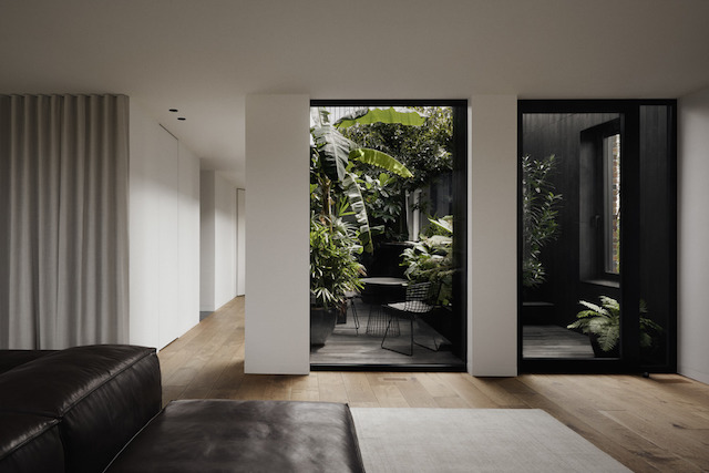
In approaching the mixed-use, early 20th century building, Atelier Barda focused on three archetype design principles: the loggia, the passageway, and the colonnade. The main idea was to preserve the existing façade and to use the envelope to deflect from what is happening inside while respecting the past making slight additions to delineate old from new, including rounded brick columns that subtly contrast with the angular architecture of the original building.

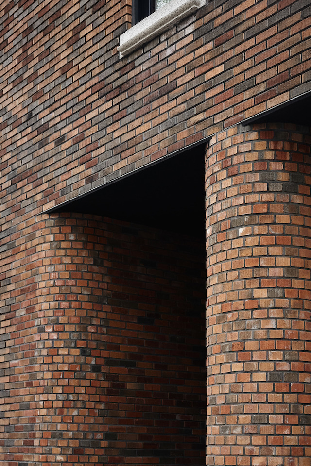
In respecting the external façade of the building, Atelier Barda made only subtle changes to existing elements in order to transition the building from the past to the present. In contrast, the interior of the existing building was completely gutted and redesigned from scratch. A portion of the commercial space was preserved, yet halved in size, and cuts were made to the side of the existing façade in order to create new openings for entry to the residential space, and for a new garage. The original entrance to the upper-level apartments was then relocated from the main commercial boulevard to the residential side street, providing the client with more discreet access to the residence. At the rear of the building, two external balconies were enclosed by making a slight extension of the brick façade, using brick patterns that match the original construction.
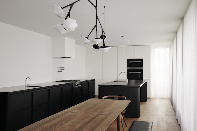
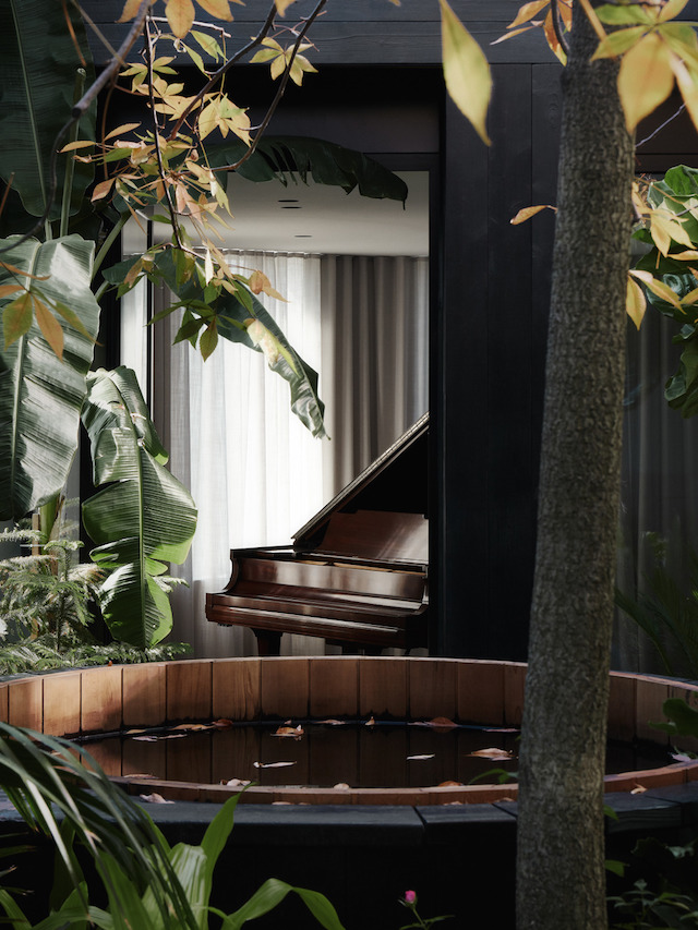
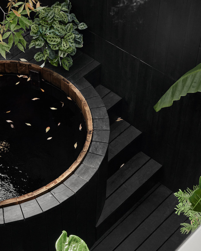
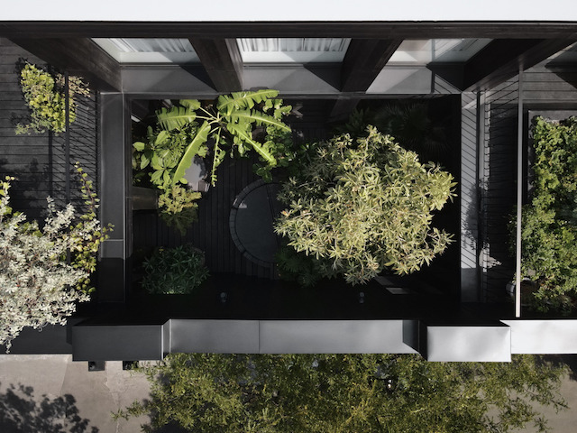
To maximize its vision, while adhering to strict building codes and regulations, Atelier Barda embarked on an interior design plan that compressed previous ceiling heights, established new floor plates, and created a fourth level in the form of a rooftop mezzanine. On the second level of the building, the firm created a visitor’s suite comprised of three bedrooms, a kitchen, a dining room, a living room, and two bathrooms. The third level, which serves as the principal living quarters of the client, was hollowed out to create an open-air courtyard that is enclosed in glass internally and divides the living room area from the master bedroom. Extending vertically, the stunning courtyard is exposed to nature’s elements from above and features lush vegetation, seating areas, and a Japanese soaking tub. The courtyard really articulates the space, while creating a very private outdoor area for the client. It also allowed us to bring abundant light into the core of the building.
In the episode of “Behind the Scenes”, where the work of visionary artists is showcased and asked about their experiences beyond what is seen by the public, is Nicolás Castagnola: an illustrator, animator, and architect born in Buenos Aires and based in Berlin. Through his illustrations and animations, he brings different meanings to architecture by opening an imaginative field about the infinite possibilities that the built environment can provide.
Victor Delaqua (VD): How would you define your style?
Nicolás Castagnola (NC): Clear lines, slow pace, good times.
VD: What is your favorite building?
NC: The buildings and public spaces where I spent time and developed myself among others. You can actually miss them after some time not being there.
VD: What are the key elements for a great architectural illustration?
NC: I personally appreciate when Illustrations create atmospheres that give Architecture a reason to be there and host them.
VD: Who or what influenced you?
NC: Georges Remi, Edgar Jacobs, Gordon Cullen, Kazuhiko Kato. Comics like Blake & Mortimer, TinTin; and animated series like Lupin or the Pink Panther.
VD: Do you think being an architect helps you to illustrate better?
NC: It is great when it comes to technical and methodological skills. But I also believe in deconstructing some of these tools, so as not to narrow our practice to an only architects´ audience.
VD: How would you describe the work process with architects?
NC: I have worked with Architects for several years, so communication is easy and clear. We share a common language, and some traumas too.
VD: How do you manage through your animations to translate sensations? How do you achieve this expression?
NC: I like telling small stories in a language that everyone can relate to.
Someone looks out the window, a dog walks by, there are some noises in the background.
VD: What would architecture be without human presence?
NC: Animation enhances the importance of this presence: when humans are in motion, architecture loses protagonist but gains meaning.


By Victor Delaqua
Check more of Nicolás Castagnola’s work at CUCU Studio and @nicolascastagnola.
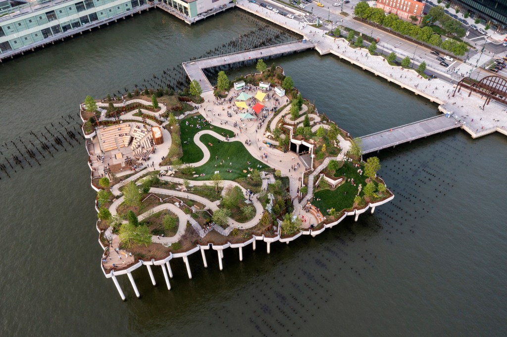
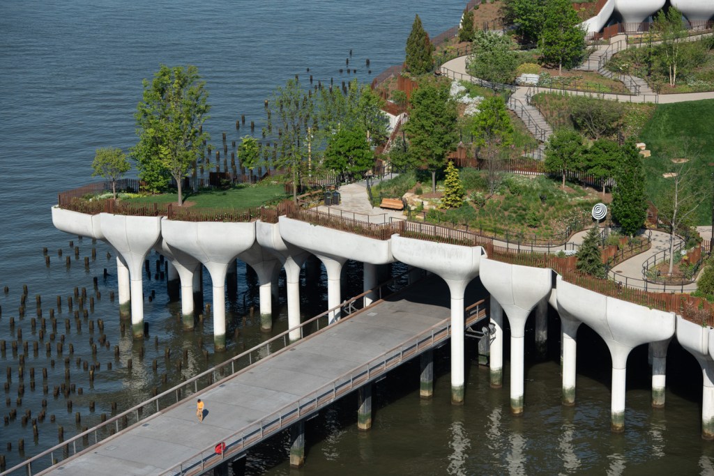
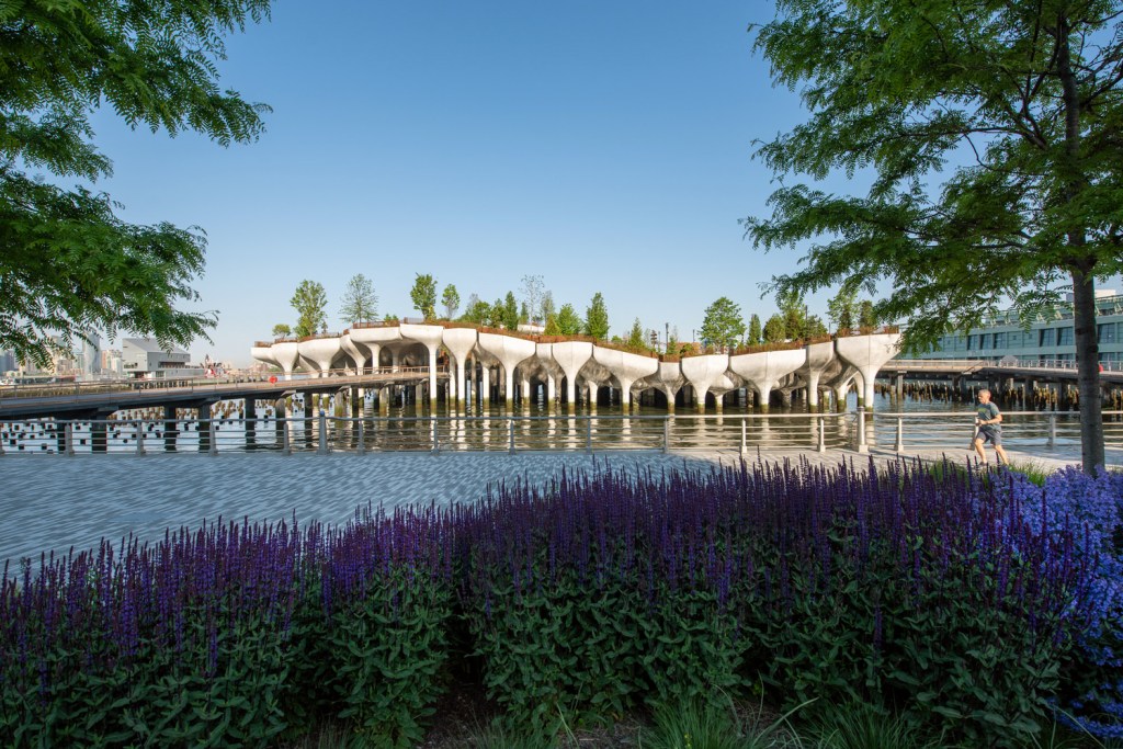
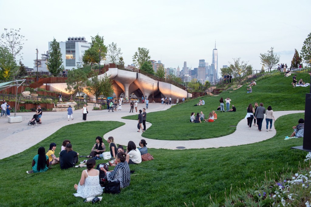
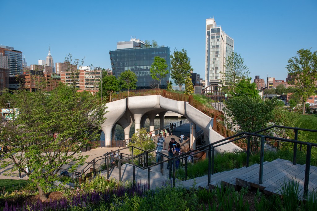
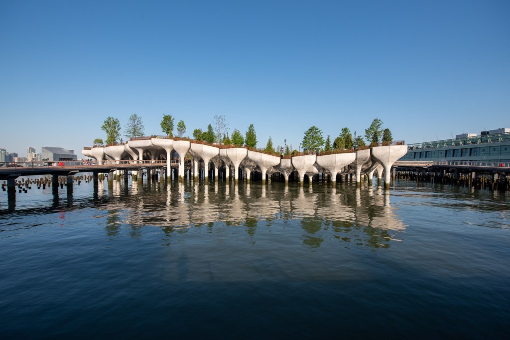
Designed by Heatherwick Studio, together with landscape architecture firm MNLA, the Little Island project is New York’s newest major public space, showcasing a richly-planted piece of topography above the Hudson River. The design featuring a public park and performance venues reinvents the pier typology into an undulating artificial landscape. After surpassing many hurdles, the eight years in the making project is now open to the public, and the bold design is set to become an icon in New York.

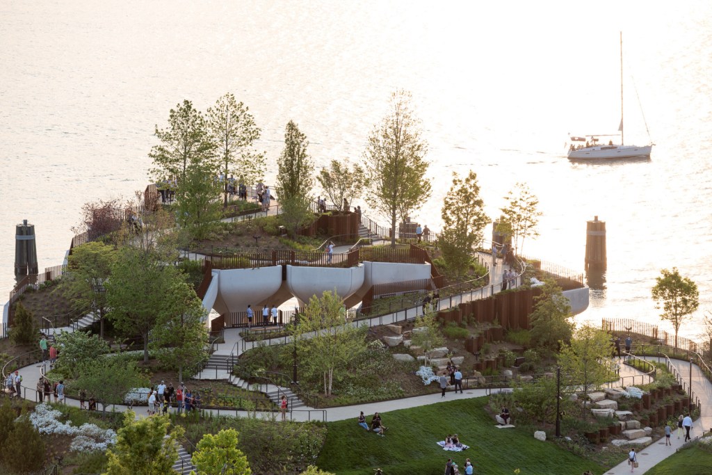
The project reimagines the pier as an experience and designs a structure that would foster a vibrant art, education and community space, creating a distinct performance venue. The offshore structure connected to the shoreline through two doc-like pathways features three outdoor performance spaces: an acoustically-optimized 700-seat amphitheater, a 200-seat spoken word stage, and a flexible venue with a capacity for 3,500 at the center. The project creates a diverse landscape with numerous pathways, viewing platforms and destinations, fostering numerous activities.
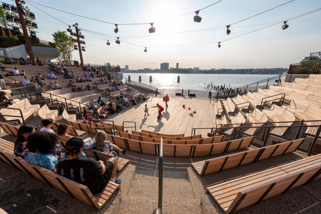
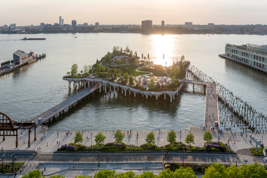
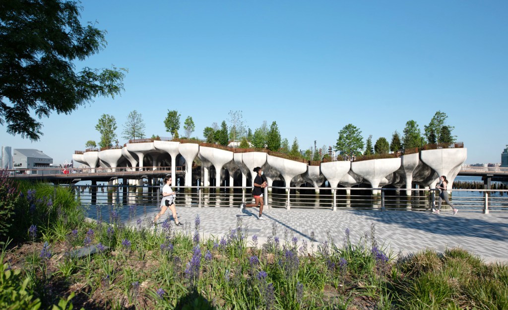
The structural columns are a key identity element of the design, which comprises some 132 tulip-like concrete piles that double as planters. Describing the structure, Thomas Heatherwick says, “we were inspired by these piles and the civil engineering required to build structures that can withstand extreme river conditions. Could we make these the heroes of our project, rather than hiding them? The vision that’s been built is based on taking these piles and turning their tops into dramatic planters that fuse together to make a richly-planted undulating landscape.” The project’s engineering consultant Arup used parametric modelling and advanced prefabrication techniques to deliver the complex precast geometry of the “pots”, which were fabricated locally and delivered on-site.
The architecture studio worked with New York-based landscape architecture studio MNLA to design the park, which is home to nearly 400 species of trees, shrubs, grasses and perennials. The landscape creates opportunities for different views and creates numerous paths within the park while also fostering biodiversity.
Heatherwick’s Little Island is Taking Shape off New York’s Shoreline
Photos by Timothy Schenck

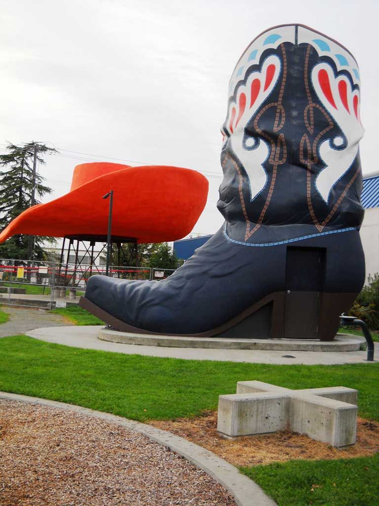
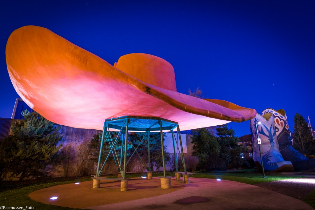
Hat and Boots started out as a gas station in Seattle, WA. The gas station is no longer but the Hat and Boots lives on at Oxbow Park in the Georgetown neighborhood in Seattle. Touted as the largest cowboy hat and boots in America, these pieces of massive rancher apparel made their debut in the 1950s in Seattle’s Georgetown neighborhood as part of a western-themed gas station called Hat ‘n’ Boots. The 44-foot-wide hat was designed to hold the gas station’s office while the 22-foot-tall boots served as the restrooms.
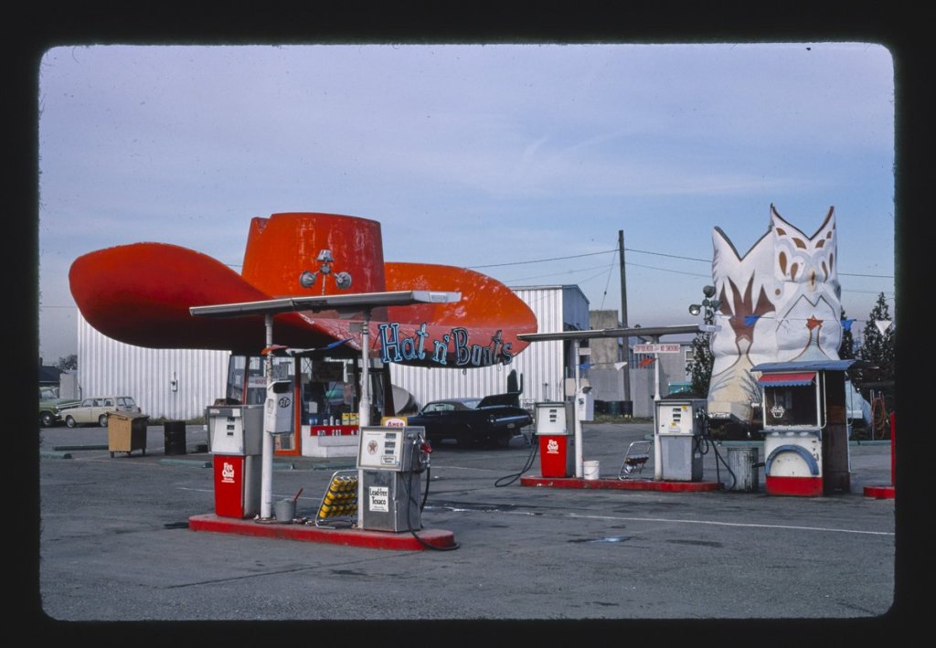
However, in the mid 1960s, Interstate 5 was built through the city and spurred traffic away from the station. By the ‘80s, the trail looked bleak. When the gas station finally closed in 1988, Hat ‘n’ Boots sank into a period of decay and vandalism. After skateboarders cracked the brim of the hat, it appeared that Hat ‘n’ Boots would finally be put out to pasture.
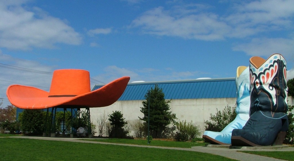
Georgetown residents, however, were unwilling to let the unique duds ride into the sunset without a fight. The iconic attraction was moved to Georgetown’s Oxbow Park in 2003. The boots were restored in 2005; the hat finally completed in 2010. Plans are currently in the works to turn the hat into an interpretive exhibit brimming with the history of Hat ‘n’ Boots and its importance to the local area.
2. The service station in Ukiah, California, is made from the trunks of giant redwoods. The Redwood Tree Service Station was made from a 1,500 year old tree selected from the coastal redwood forests west of Ukiah. The tree was 250 feet high and 81 feet in circumference at the base when it was chopped down in 1936. It was painstakingly quartered, transported, reassembled, and cabled back together. A roof and canopy were added, then covered with redwood shakes. Two smaller log sections behind the main log became restrooms.
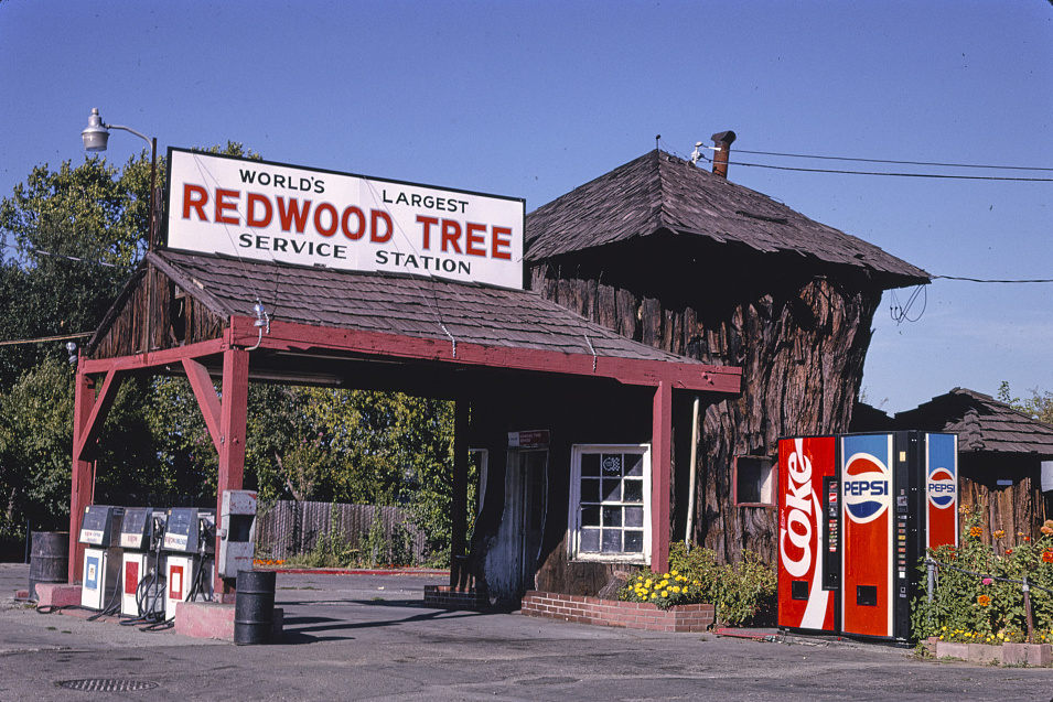
Nicknamed “The Stump” by locals, novel building has always been a popular Redwood Highway tourist stop and shutterbug magnet (that’s the whole point of lugging a massive tree out of the forest to the town). When Richfield merged with another company in 1960 the Redwood Tree became the distributor for Rocket Gasoline: 100-Octane Ethyl! Times and demand changed again, and Jess Rawles bought out Bob Ford in 1962, and in 1972 the Redwood Tree began distributorship of Exxon products.
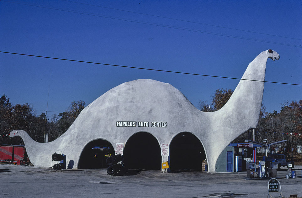
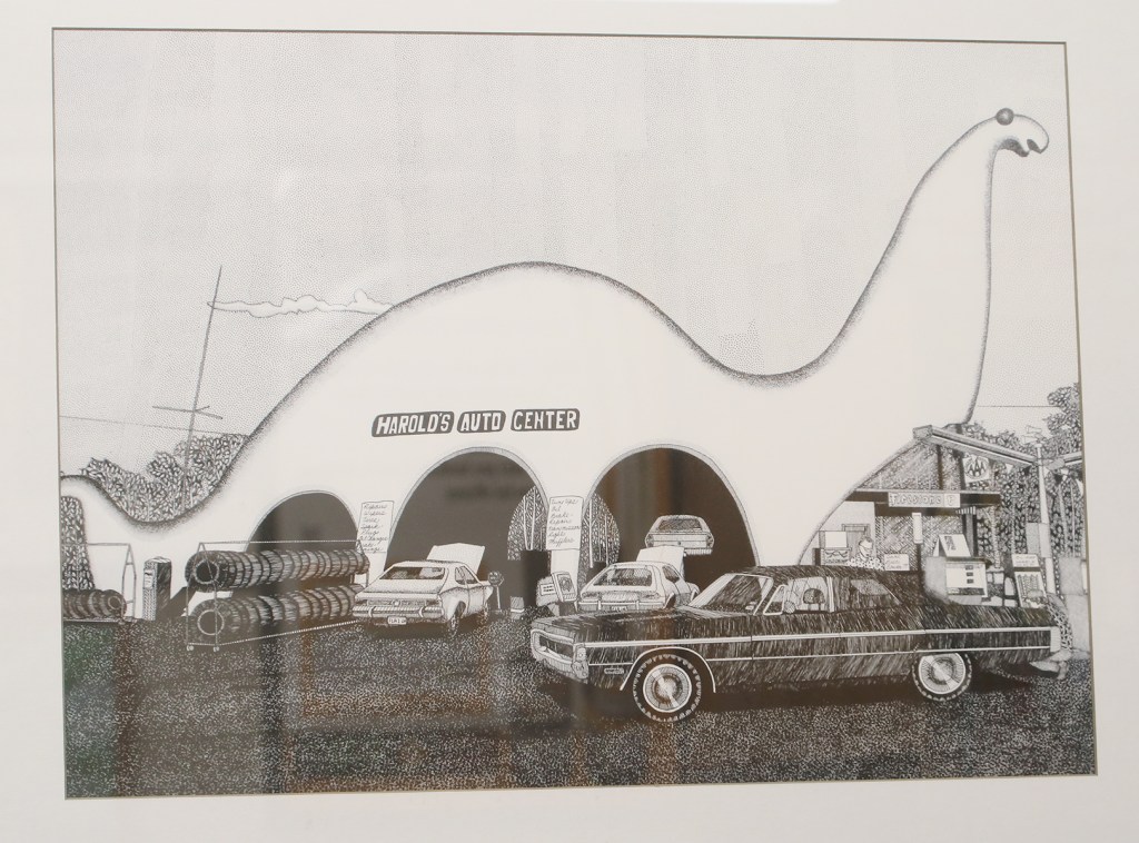
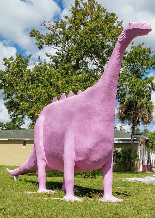
3. This gas station in Spring Hill, Florida, looks mightily prehistoric. This building will certainly get your attention. Harold’s Auto dinosaur was originally a Sinclair gas station in 1964, inspired by the Sinclair Oil mascot prominently featured in ads and on signs since 1930. Located at 5299 Commercial Way in Spring Hill near Weeki Wachee Springs, it shares a short stretch of Rt. 19 in Spring Hill, Florida with the Pink Dinosaur a few miles South. Dino, an “Apatosaurus”, stands 47 feet tall and is 110 feet long.

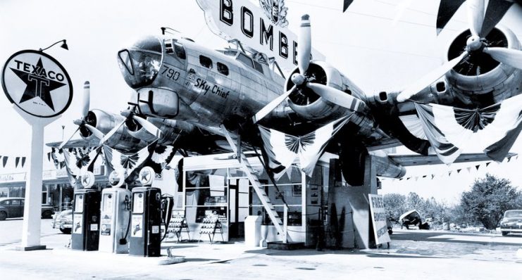
4. This gas station on Route 99 in Milwaukie, Oregon, photographed in 1980, was topped with a B-17G bomber named Lacey Lady, which is now being restored by the B-17 Alliance Foundation in Salem, Oregon. In 1947, Art Lacey purchased a B-17 Flying Fortress bomber plane that had been decommissioned when World War II ended. He flew it from Oklahoma to Oregon and then had it mounted on a building at his gas station. The 102-foot wingspan of the plane served as the canopy over the gas pumps.

5. This gas station in Milwaukee, Wisconsin, photographed in 1977, was inspired by the designs of pagodas. The Wadhams Oil Company gas stations were designed by Alexander Eschweiler. These small, red pagoda roofed stations were built in the Midwest between 1917 and 1930. At one time, there were more than 100 of them but there are only a handful of these buildings left.

One of the last pagoda-style Wadhams Oil and Grease Co. gas stations was moved from its original location at Federal Mfg. Co., 201 W. Walker St., which provided its fourth wall. The 60,000-pound pagoda, built in the 1930s, was jacked up onto a trailer for the move to its new home at 430 S. 2nd St., next to the Reed Street Station tavern.
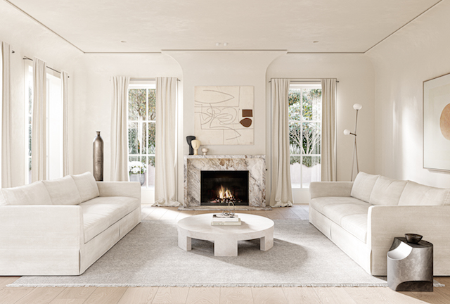
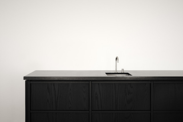
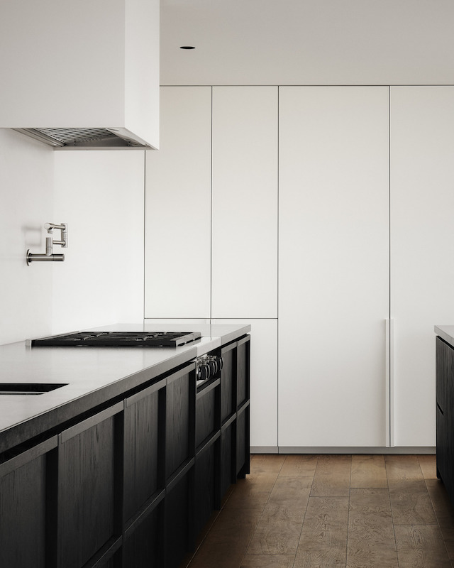
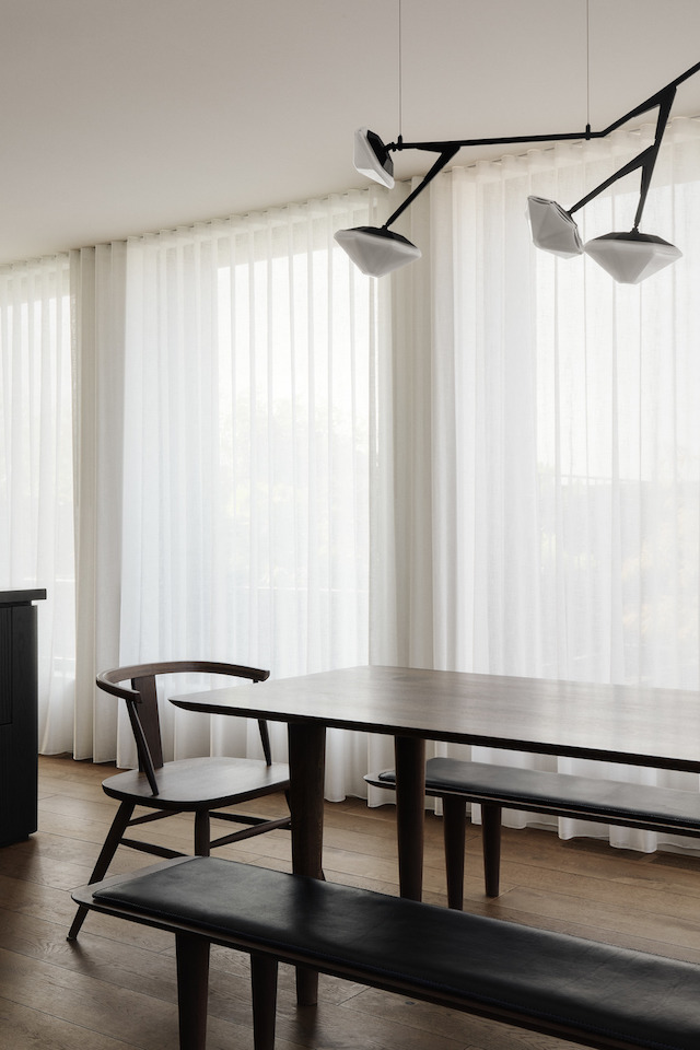
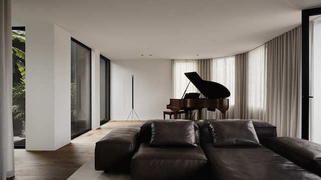
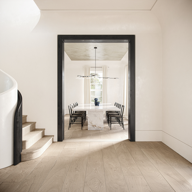
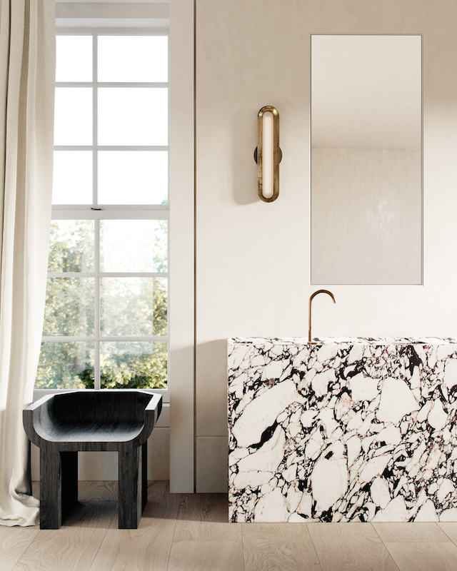
Designed by Melbourne-based Conrad Architects, this new family home in Los Angeles typifies the practice’s approach to balancing a contemporary and minimal aesthetic with traditional influences. Exhibiting a sense of calm and retreat achieved through the timeless aesthetic and controlled design, the careful selection of materials is based upon their environmental and wellness qualities. This includes a preference for natural materials that showcase integrity and resilience, with colours reflective of natural timbers, stones, linens, plasters, renders and sands. The overall result is a rich and warm interior that portrays a restrained luxury.


For French photographer Audrey Bellot, animals have always had a place in her heart. She’s loved dogs ever since she can remember, and she’s even turned her passion for pups into her career. She’s an expert in dog photography, and focuses on showcasing the beauty of the beloved pets by photographing them in stunning landscapes.

Bellot works all over the world, capturing all sorts of dogs in natural settings. Her ever-growing portfolio includes a portrait of Ohana, a Golden Retriever who posed in a field of lavender. There’s also a husky who sits in a moss-covered woodland and a Samoyed who barks into a snowy landscape. For Bellot, it’s important that her photos capture the unique personality of each dog and convey the authentic expressions of dogs in extraordinary natural settings.

As well as capturing the character of her fluffy subjects, Bellot hopes her images will evoke a sense of magic, and remind people how amazing dogs can be choosing combinations of places and dogs that perfectly match both the colors and the atmosphere.


Audrey Bellot: Website | Instagram
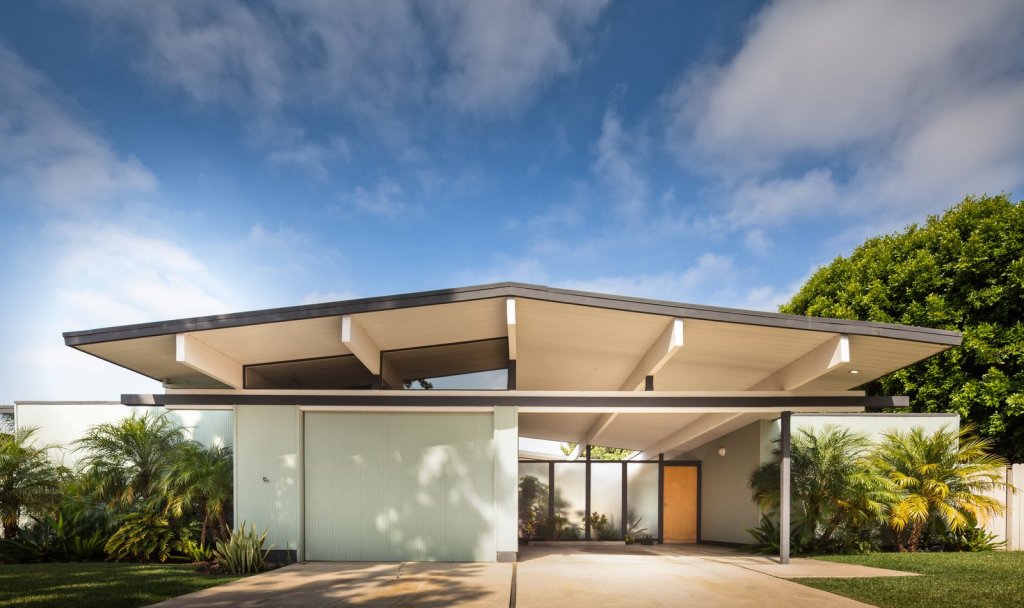
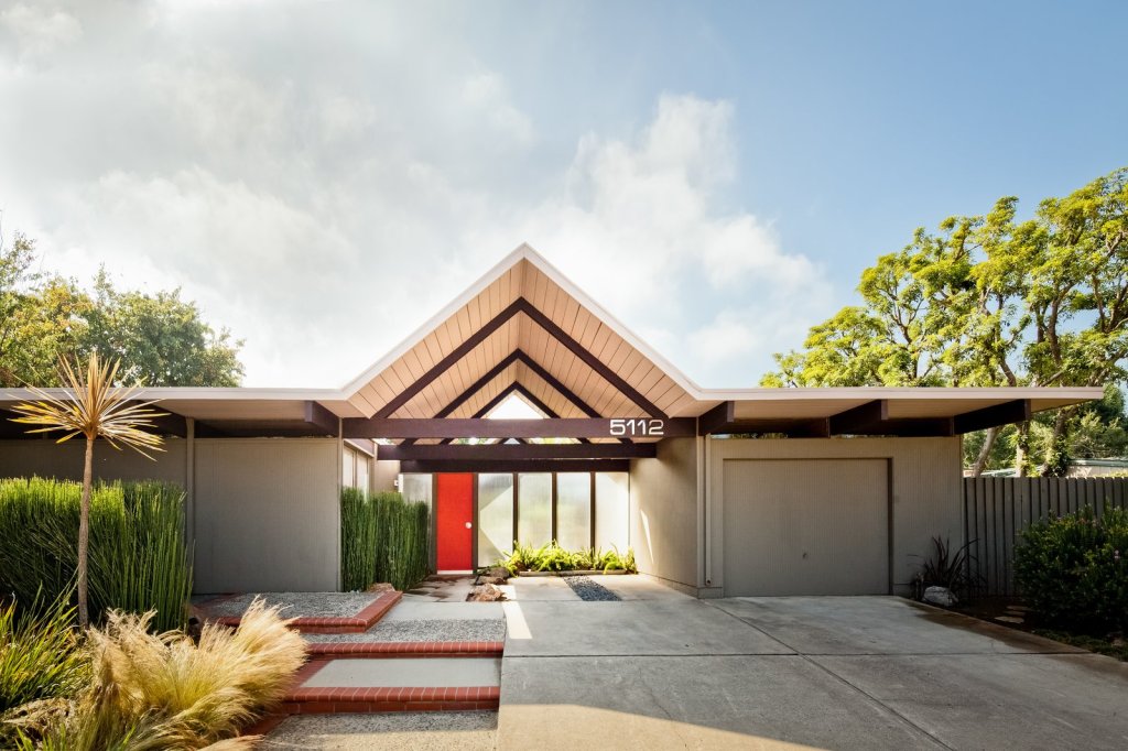
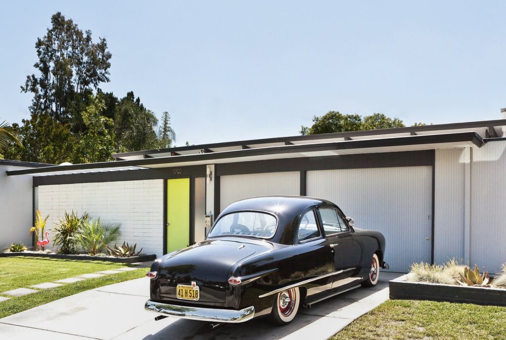
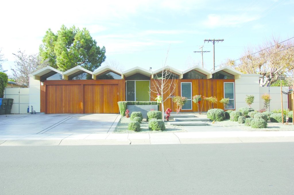
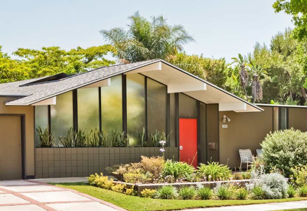
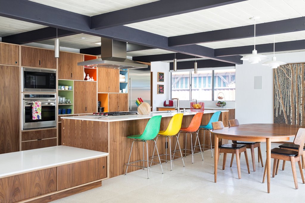
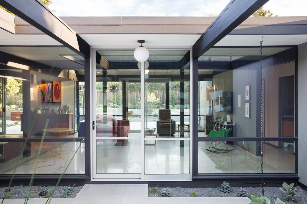
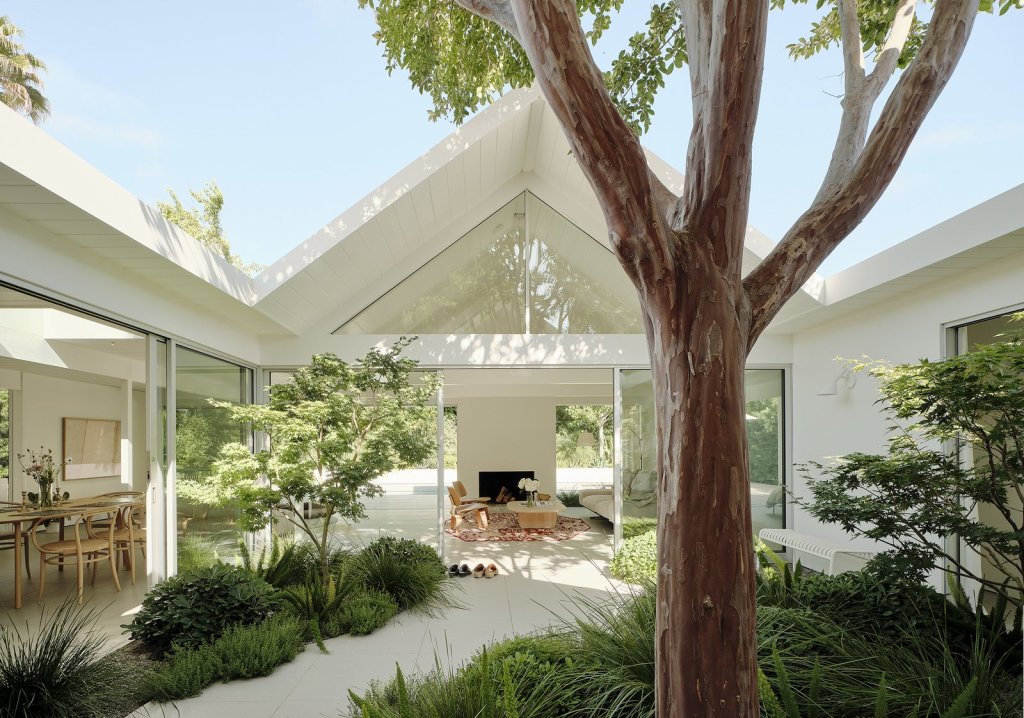
And now for some super awesome Eichler homes in Orange, California. Just that.