Beautiful Mondrian Inspired Buildings+Interiors

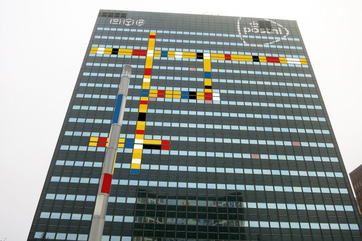
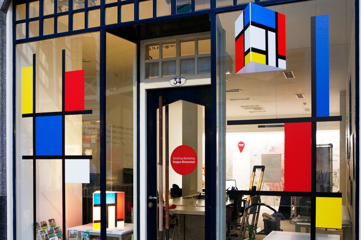
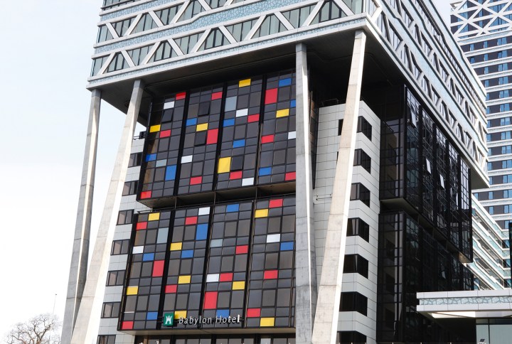
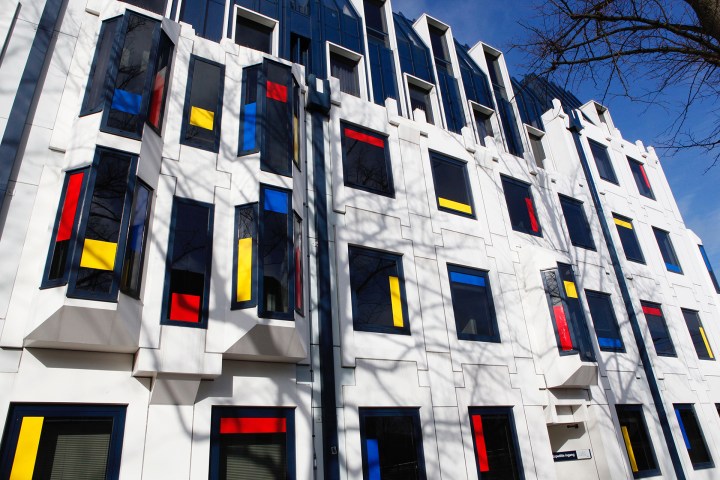
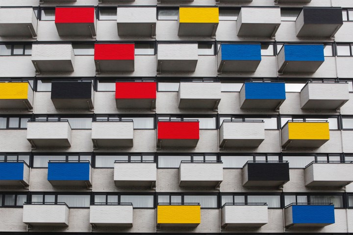
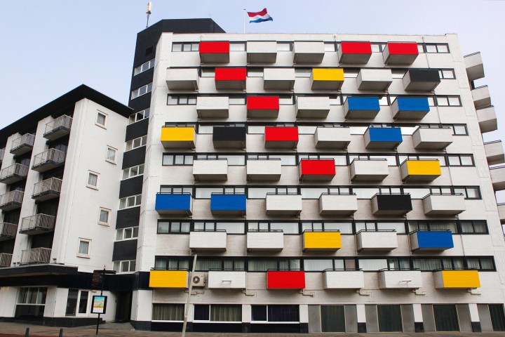
To honor of Dutch painter Piet Mondrian’s 147th birthday, here are six buildings inspired by his abstract, geometric style.

Artist Piet Mondrian (1872–1944) was introduced to art at an early age by his father, a drawing teacher at a local primary school. At the age of 20, formally began his career as an artist and teacher. His artistic career began with more traditional, representational paintings, however upon moving to Paris in 1911 his style was greatly influenced by Cubism and his work began to turn more abstract. Later, alongside painter Theo van Doesburg, Mondrian created the De Stijl movement, which embraced an abstract, simplified aesthetic. The De Stijl artists sought to devalue tradition, and they greatly impacted the rise of modern art during the 20th century.
mondrian-100-year-legacy-1

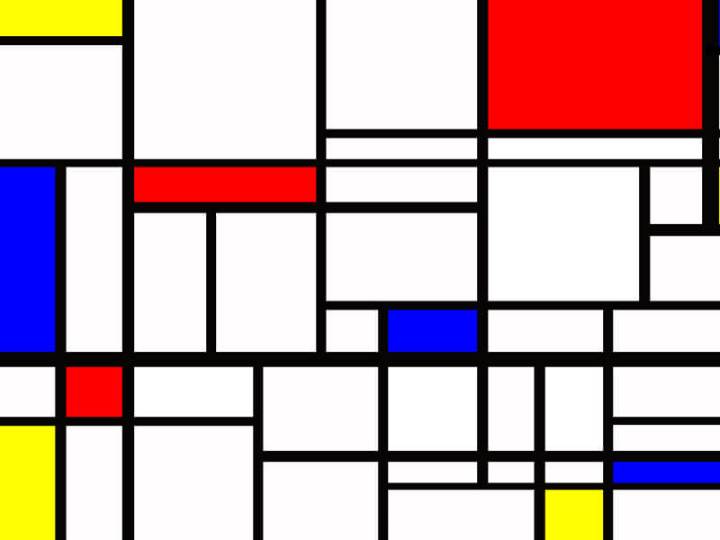
Considered a pioneer of 20th century abstract art, Mondrian is best known for his paintings featuring basic forms and colors. The artist limited his paintings to the three primary colors (red, blue, and yellow) and the two primary directions (horizontal and vertical), thus creating colorful and geometric compositions. He hoped that these simplified subjects could transcend cultures and become a new common language. Mondrian’s impact on modern art is visible in the work of other artists and subsequent artistic movements, as well as in contemporary art and design. Here are six projects that embody the spirit of Mondrian’s work.

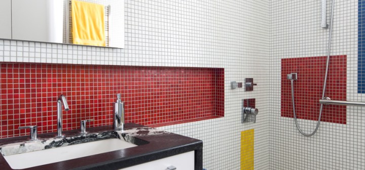
A Mondrian inspired bathroom in VirginiaVirgina small-bathroom-project-inspired-by-artist-piet-mondrian-floor-to-ceiling-glass-tiles-re-interpret-mondrians-compositions.jpg
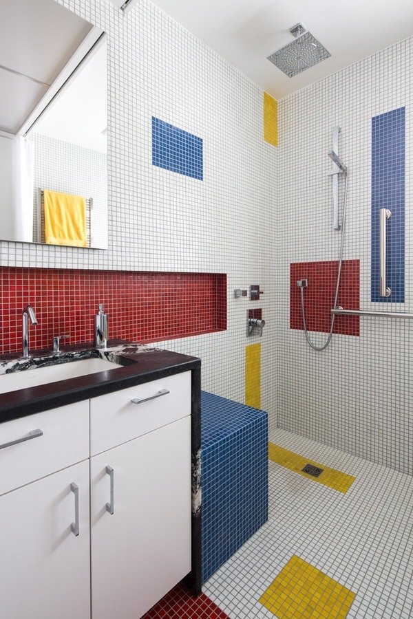
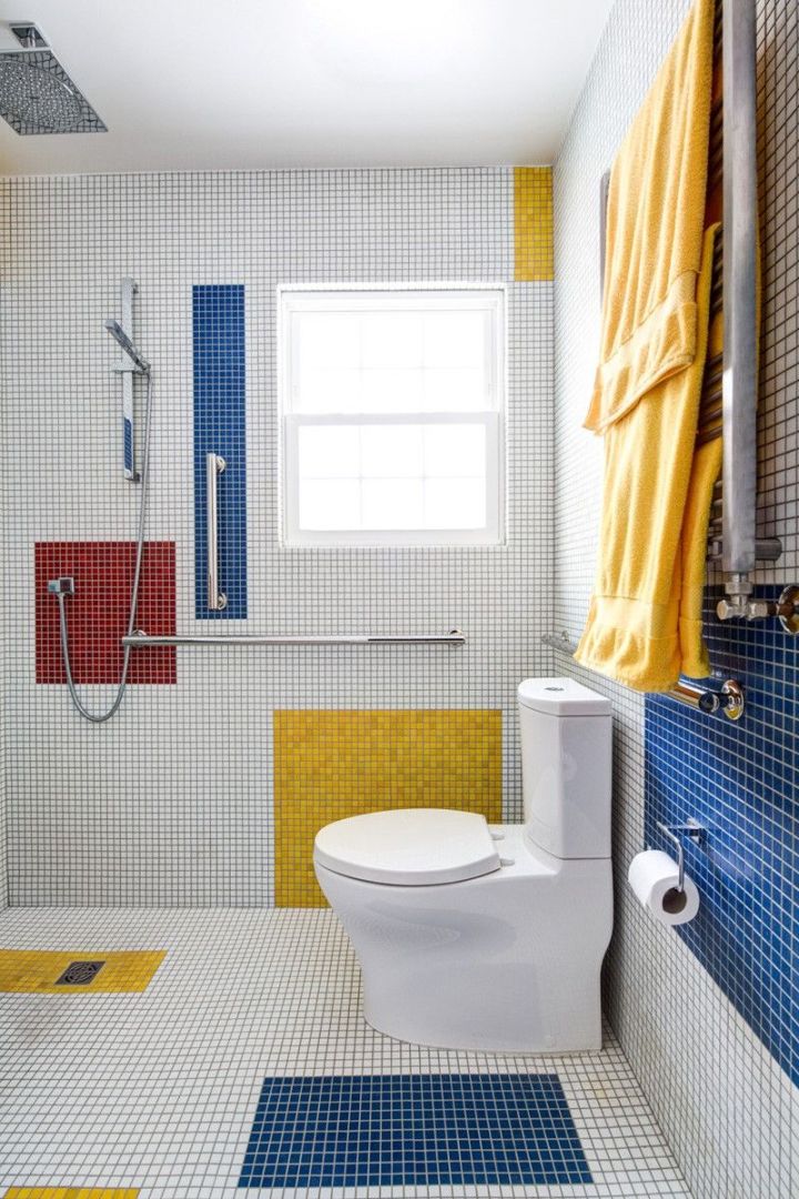
The clients for this small bathroom project are passionate art enthusiasts and asked the architects to create a space based on the work of one of their favorite abstract painters, Piet Mondrian. Mondrian, a Dutch artist associated with the De Stijl movement, reduced designs down to basic rectilinear forms and primary colors within a grid. Alloy used floor to ceiling recycled glass tiles to re-interpret Mondrian’s compositions, using blocks of color in a white grid of tile to delineate space and the functions within the small room. A red block of color is recessed and becomes a niche, a blue block is a shower seat, a yellow rectangle connects shower fixtures with the drain.

The bathroom also has many aging-in-place design components. There is a zero clearance entrance to the shower. The doorway is wider for greater accessibility and pocket door installed to save space. ADA compliant grab bars were located to compliment the tile composition.

A small bathroom project inspired by artist Piet Mondrian. Floor-to-ceiling glass tiles re-interpret Mondrian’s compositions.
mondrian bathAlloy-Innes-
Design by Alloy Workshop
The design team used floor-to-ceiling tiles to create the geometric interior. Yellow tiles connect the shower fixtures to the drain, blue tiles are used for the shower seat, and a red block is recessed to create a niche in the wall.

Colorful Painted Home in San Francisco
the-exterior-facade-of-this-san-francisco-home-displays-the-colors-and-lines-typical-of-piet-mondrians-paintings
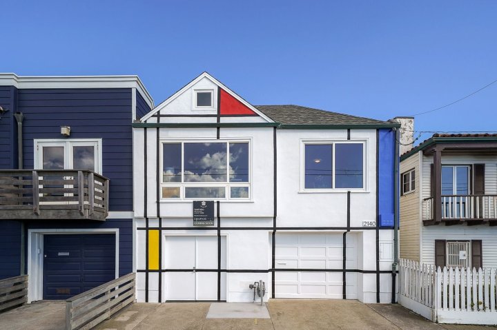
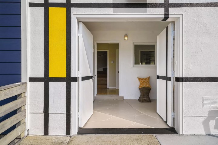
The exterior of this home in the Outer Sunset neighborhood of San Francisco was inspired by the colorful grid-based paintings for which Mondrian is best known. Painted in Mondrian’s style over 20 years ago, this whimsical house has become iconic also due to its location across the street from the beach. The two-story house features two beds and one bath, as well as a recently landscaped backyard—and it recently hit the market.
Update: The Outer Sunset home bearing a paint job a la Piet Mondrian’s most famous work sold over asking, netting $2,050,000. That’s $555,000 over the original ask of $1.495 million. No word if the new owner will keep the exterior paint job.
entrance

The ‘Breakfast With Mondrian’ Apartment
breakfast 1.jpg
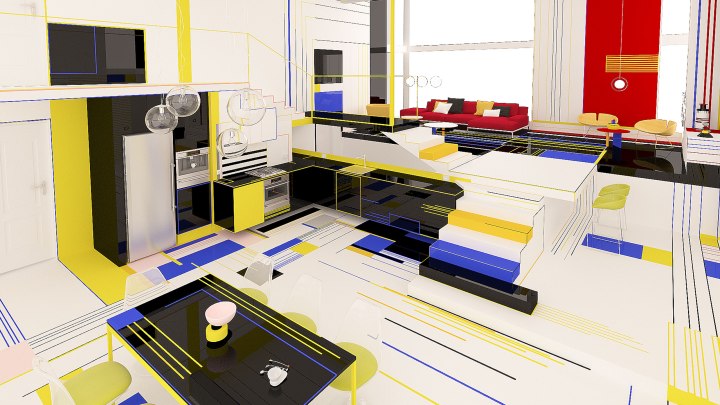
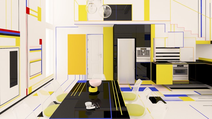
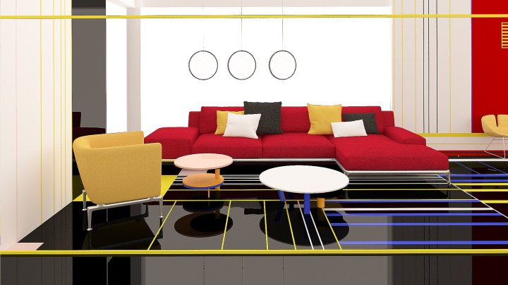
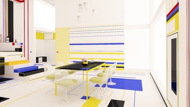
Breakfast with Mondrian is an experimental project where the use of forms, lines and colors is focusing of the positive impact which has to provoke the space on the people living there. The design concept is inspired by the Dutch painter Piet Mondrian for his vision of nature, manifested in his simple and pure abstract paintings. He is one of the founders of the Neo-Plasticism Movement, style which is recognized with the use only of horizontal and vertical lines and the fundamental colors – red, blue, yellow. With these elements the artist developed a new plastic language where he shows how he sees the world, the nature and the human – as one unity. In his paintings he represents the perfect harmony between the elements of this unity.
breakfast 2.jpg
Mondrian’s aim is to provoke emotions to the viewers. The viewers should feel themselves dancing while watching his paintings. Through lines and colors the inhabitants and their guests should feel themselves as they are part of a dance. In the dance between forms and colors we use the white and black colors as intervals between them. The white is active, the black is passive. As Mondrian says that through oppositions of color and line one can see the plastic expression of relationships.
The space of this experimental modern house is open and every zone has its own function and in the same time is connected to everything else. The meaning is that the kitchen cannot be without the dining room, or living room. As in nature everything is connected and cannot without its parts, because one unity cannot be unity without its parts.
screen-6
Breakfast with Mondrian is a concept by design duo Brani & Desi inspired by the artist’s work and vision. Mondrian saw the world, nature, and the human as one unit, and he expressed these relationships through his geometric and colorful paintings. Brani & Desi aim to provoke the emotions of their viewers and to create unity within every aspect of the apartment.berakfast 3
The ‘Mondrianized’ City Hall in The Hague
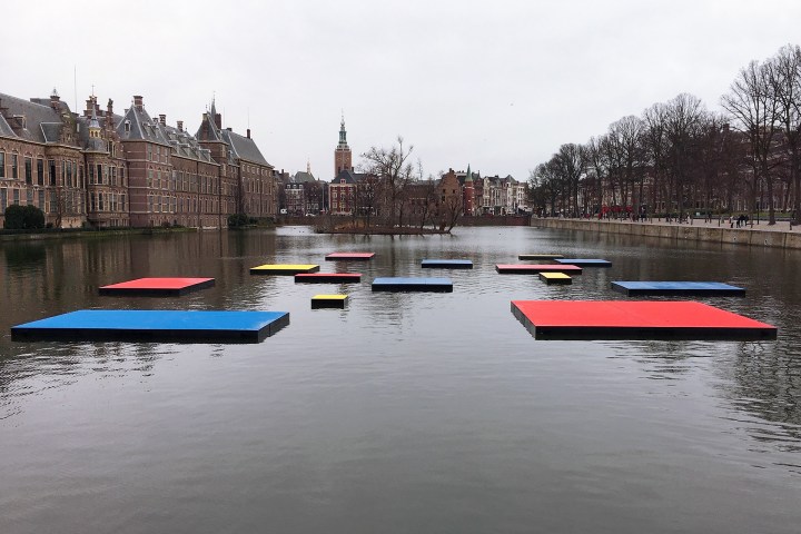
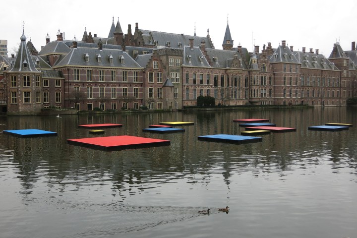
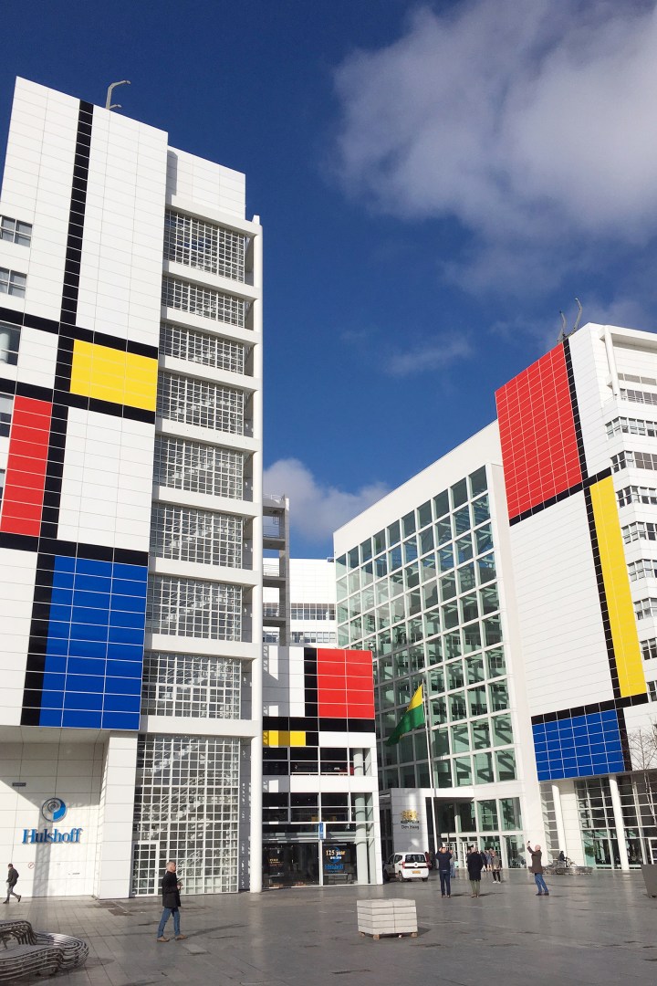
In honor of the 100th anniversary of the Dutch De Stijl art movement, The Hague unveiled the largest Mondrian in the world. The city hall building is painted with the familiar colors and lines of a Piet Mondrian work.
city hall 1
buildingstore frontcity hall 5city hall 4water 2waterpattencity hall 2

Beautiful Snarkitecture

10 Years of Snarkitecture
SNARKITECTURE PROJECT IS ABOUT OPENING UP THE POSSIBILITY, LEAVING THINGS AS OPEN QUESTIONS FOR PEOPLE THAT ARE COMING TO VISIT IT. THERE’S NOT NECESSARILY ANY PRESCRIBED MEANING — TO SAY IT’S ABOUT THIS OR ABOUT THAT — BUT HOPEFULLY, IT ALLOWS YOU TO WONDER.

journal_snarkitechture1.jpg

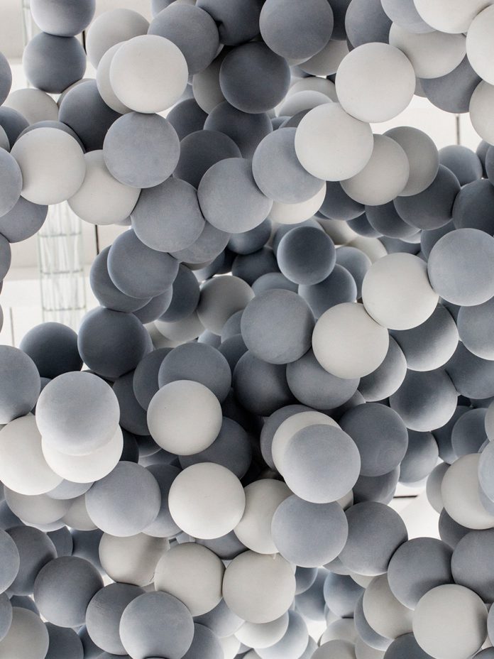
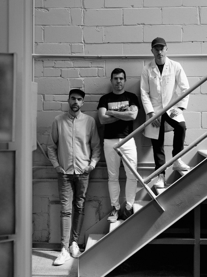
Perched on a quartz topped column, beneath the crumbling, paint peeled dome of an 18th Century palazzo in Milan, Alex Mustonen is thinking about his legacy. Or rather, the legacy of his design firm, Snarkitecture, whose 2018 has been a banner year. They’ve celebrated their 10 year anniversary, published their first monograph with Phaidon, and have plans to mount a career spanning retrospective at Washington DC’s National Building Museum, opening this Fourth of July.

journal_snarkitechture3

journal_snarkitechture4-

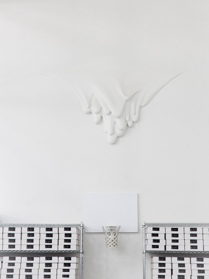
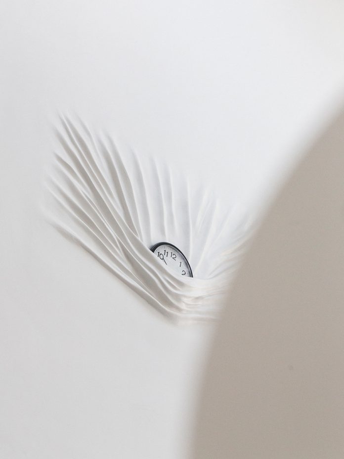
The moody Italian palace doesn’t just serve as a dramatic backdrop for ponderous self reflection. The trio, Mustonen, Daniel Arsham, and Benjamin Porto, have just installed their latest Salone del Mobile project there, a collaboration with quartz manufacturer Caesarstone, that explores water in its various states. It takes the shape of an ethereal amphitheater circling a terraced fountain of quartz. On top, planetary spheres of ice drift and creak, melting into the running water only to rise again as steam. It’s the latest in a sprawling roster of projects — 75 of which are detailed in the book — that Snarkitecture have dreamed into life during their decade-long tenure. They’ve morphed museums into massive, giggling ball pits (The Beach, ongoing), choreographed a ballet of over sized balloons during a gala at the New Museum, and filled the Storefront for Art and Architecture in New York entirely with pure white styrofoam, which they then invited viewers to watch as they excavated it with chisels and icepicks


journal_snarkitechture8.jpg.journal_snarkitechture7.jpg

It’s often said the core genius of Snarkitecture’s projects are their simplicity. For a union that formed in the cerebral confines of New York’s Cooper Union (Mustonen, in architecture and Arsham, art, attended at the same time, while Porto joined the firm later on), their installations and interiors strike straight to the heart of what brings us the purest kinds of joy. There’s an unabashedly innocent jubilation involved in doing a cannonball into a ball pit, marvelling at pirouetting balloons, or digging an endless hole to nowhere. In conceiving their much celebrated work, Snarkitecture are like children, having been gifted with the most expensive and high-tech of toys, instead choosing to make a fort from the box. Or, in their case, the packing foam.

Cereal sat down with partner Alex Mustonen to talk about the past ten years, plans for the future, and what’s inspiring them now.

journal_snarkitechture6

journal_snarkitechture11

From Cereal

Beautiful Gallery Walls For Kids

gallery-wall-kids-room-1

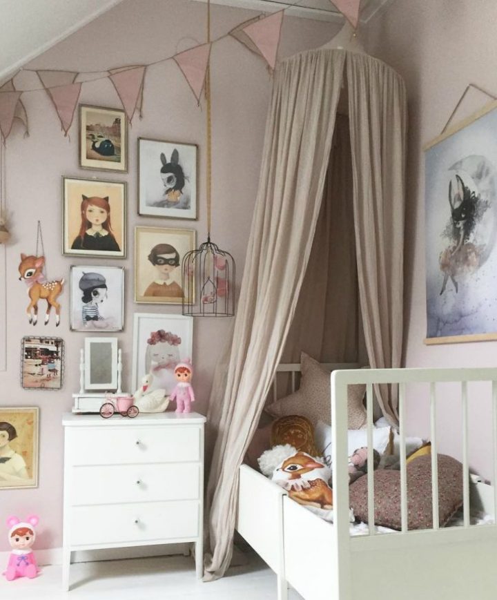
Gallery walls look great and they’re a quick way to update a room that needs a bit of life or to change the look for a new season. Gallery walls can be made up of art in frames or frame-less art taped to the wall. The art can be hung up in an organized manner or in an eclectic, random manner. But it doesn’t stop at art. In a kid’s room, you can use toys, decorations, clothes and lots more to make your wall unique to your kid. There are so many ways to create an interesting gallery wall, it just depends on your personality and style.

Here are some more fun ways to create a gallery wall in your kid’s room:

gallery-wall-kids-room-2

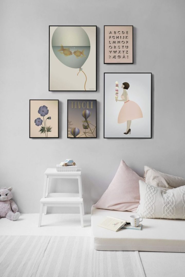
If you prefer a more streamlined look, a gallery wall like the one above is the one for you. The key is to pick prints that are similar in style and in color tones. All the prints above are very similar to the type of art and the colors are in similar tones too.  This creates a stylish and interesting look.

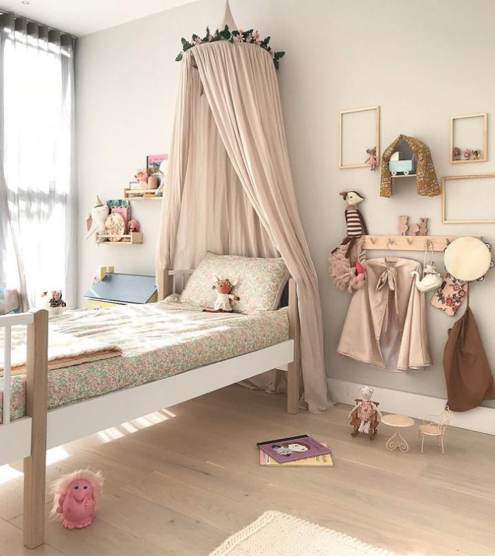
For a playful and very creative take on a gallery wall, you don’t need any art at all. Instead, we love how they’ve used just the frame and placed some little toys that act as 3D art.  And the addition of other toys, clothes, and decorations adds to the charm of this very fun wall.

gallery-wall-kids-room-3

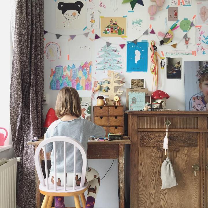
Kids create a ton of art so why not turn their art into their very own art gallery? We’re loving the informality of simply taping all the art to the wall and also we love how the whole wall is covered. So fun and colorful. The mix of the child’s art and shop bought art, works really well too.  This kind of gallery wall is so personal and can be changed up in minutes, as often as you like.

gallery-wall-kids-room-4
Article and photo Credits

Beautiful Hotel Interiors

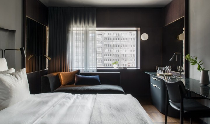
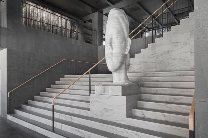
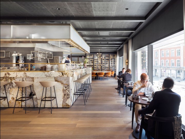
Located in a brutalist former bank headquarters in Stockholm, Universal Design Studio’s latest project, the At Six hotel, is home to one of Europe’s most significant hotel art collections. The London-based studio carried out a complete interior renovation to create the 343-room luxury hotel in the Swedish capital’s Brunkebergstorg Square, and also designed a new entrance. The scheme includes 10 floors of guest rooms, a penthouse suite, a 100-cover restaurant, a wine bar, cocktail bar, a 2,000-square-metre events and flexible work space, and Scandinavia’s first slow listening lounge.

hotel-at-six-standard-room

The art collection is curated by Sune Nordgren, formerly of the BALTIC Centre for Contemporary Art.

art

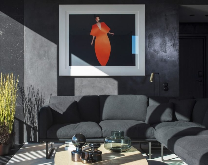
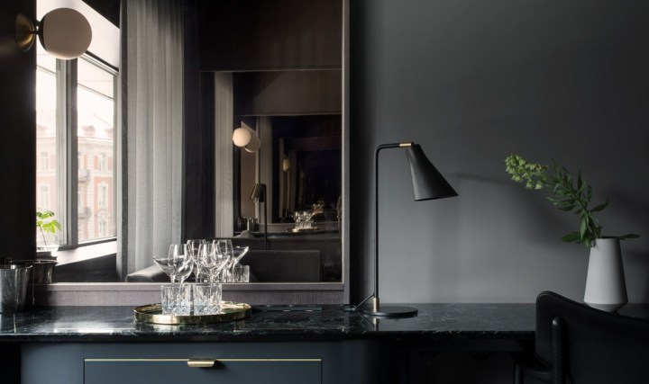
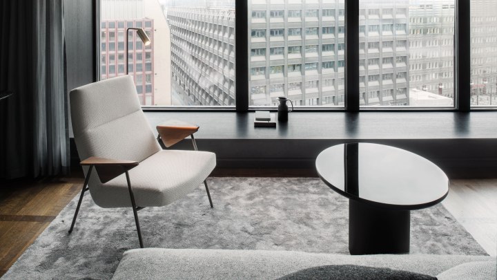
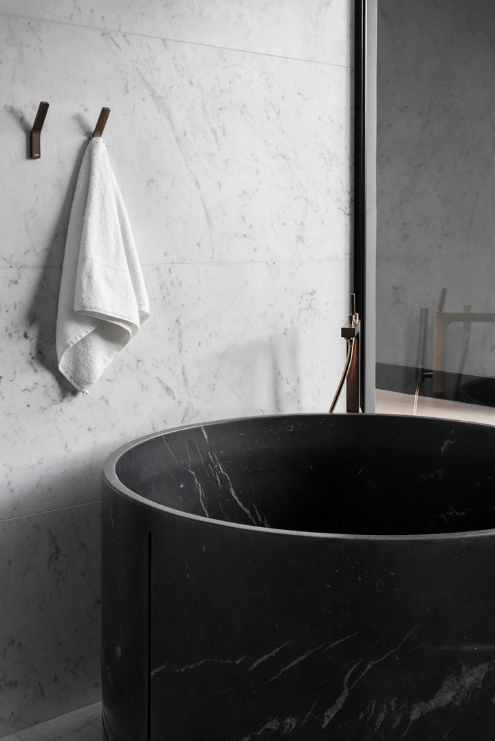
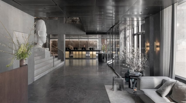
The gorgeous monochrome interior contrasts shades of warm grey and highly textured natural materials with soft furnishings and classic furniture. The aim was to reinterpret the brutalist aesthetic of the building and the immediate architectural landscape of Brunkebergstorg Square. “A palette of sawn stone, blackened steel, fine timber and polished granite lends a sense of permanence and authenticity to the new interior,” explained Universal Design Studio.

hotel-a2

“Moving away from the uncompromising and unforgiving aesthetic characteristics often associated with the brutalism – the brief was to create a desirable, fashionable destination,” said the team. “Design is focused on humanising the architecture, bringing a sense of desirability and luxury to a brutalist building not often associated with these traits, turning the hotel into a contemporary version of a metropolitan grand hotel.”

hotel-3.jpg

Pieces of contemporary and classic furniture are complemented by specially commissioned pieces created by local makers and established Scandinavian designers. Custom lighting by Rubn is installed in each guest room, and local glassmaker Carina Seth Anderson has created a series of sculptural, hand-blown glass vessels for the lobby as well as tabletop pieces for each dining table in the restaurant.

six 5

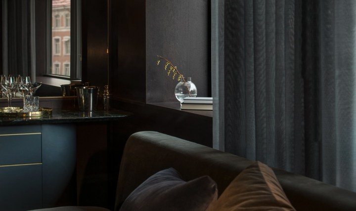
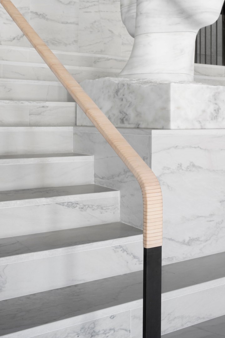
The handrail of the grand white granite staircase in the hotel’s lobby was wrapped in leather by a local saddle maker, while a communal table in the wine bar was carved by local artist Lies-Marie Hoffman from a single Swedish elm trunk. Bedrooms feature timber wall panelling and marble credenzas that run the full length of the room. The hotel is one of four 1970s buildings that occupy Stockholm’s Brunkebergstorg Square. The buildings were built during a government initiative that aimed to replace much of the city centre’s belle époque grandeur with brutal modernity.

six 6

Although the high-rise building was originally designed by Swedish architects Boijsen & Efervgren as a hotel, it ended up functioning as the headquarters of Swedbank, never fulfilling its intended purpose. Now owned and operated by Petter Stordalen of Nordic Hotels & Resorts, the hotel is at the centre of a wider regeneration programme that aims to transform Brunkebergstorg Square into a social hub within the city.

six 8

six 7.jpg

hotel 4

Six-hotel-by-Universal-Design-Studio-Stockholm-Sweden-07

Beautiful Castle

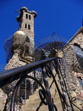
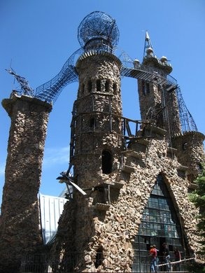
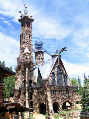
When in Colorado you won’t want to miss visiting Bishops Castle, an extraordinary work of one man. For 40 years, Jim Bishop has been building a castle on a mountainside in central Colorado. Every year since 1969, Bishop has single-handedly gathered and set over 1000 tons of rock to create this stone and iron fortress
in the middle of nowhere.

2 3 4 56 7

With the help of his parents Jim saved up and bought himself a two and
a half acre plot of land in rural Colorado, planning to hunt and live on it.
A frontier spirit, when Jim decided it was time for him and his wife to get
a house, he figured he would build it himself. What started as a one room
stone cottage would soon grow to astounding proportions: it may be the
largest one-man architecture project in the world. Today the frontier
fortress reaches over 16 stories high, has three large cathedral windows,
wrought iron walkways and a steel fire-breathing dragon. Today Jim Bishop
is 63 and is still building. It is unlikely he will stop anytime soon.

READ MORE ABOUT THIS AMAZING STORY AND HOW TO VISIT HERE

Beautiful Photography

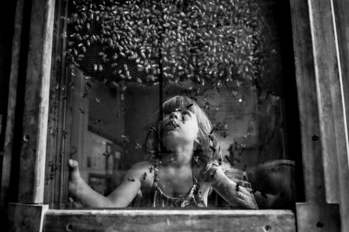
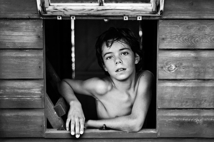
We all go through childhood, but no two experiences are alike. Whether it’s culture, class, and/or geography, it all shapes these formative years in a powerful way. But despite these differences, as young people, we each explore the world around us with the same sense of wonder and imagination. These varied snapshots highlight a universal truth about life—this juxtaposition of emotion starts when we’re young and never ends. We just grow older and wiser. Can you see yourself in any of these?

01.pic olga ageeva.jpgPlaying with light, by Olga Ageeva, Russia
02.pic oriano.jpgLooking Out, by Oriano Nicolau, Spain

03.pic anna.jpgThe Horse Whisperer, by Anna Ajtner, The Netherlands

04.pic olga.jpgSleeping, by Olga Ageeva, Russia

05.pic hutchins.jpgLooking For the Queen, By Hutchins, Poland/USA

06.pic zhou.jpgChildren of the Indian Ocean Seaboard, Guomiao Zhou, China

07. batman annaBatman, Anna Kuncewicz, Poland

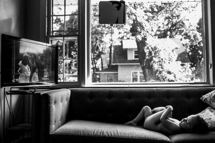
08.chelseaClassic Couch Potato, Chelsea Sibereis, USA

09.boyhood.jpgBoyhood, Alicja Pietras, Poland

10.karen
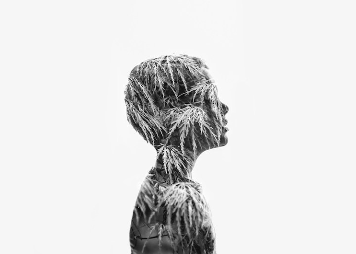
Double, Karen Osdieck, USA

11.plums.jpg
Plums, Mariola Glajcar, Poland

Beautiful St. Paddy’s Day

St. Paddy’s Day is definitely an homage to Ireland, but there’s no denying that it also pays tribute to something a little more universal – booze. And while you may be thinking “What the heck does alcohol have to do with green design?” there are actually a keg’s worth of hooch-related eco innovations out there that you might not know about yet.

TINY IRISH PUB ON WHEELS

2Shebeen-Tiny-Irish-Pub.jpg
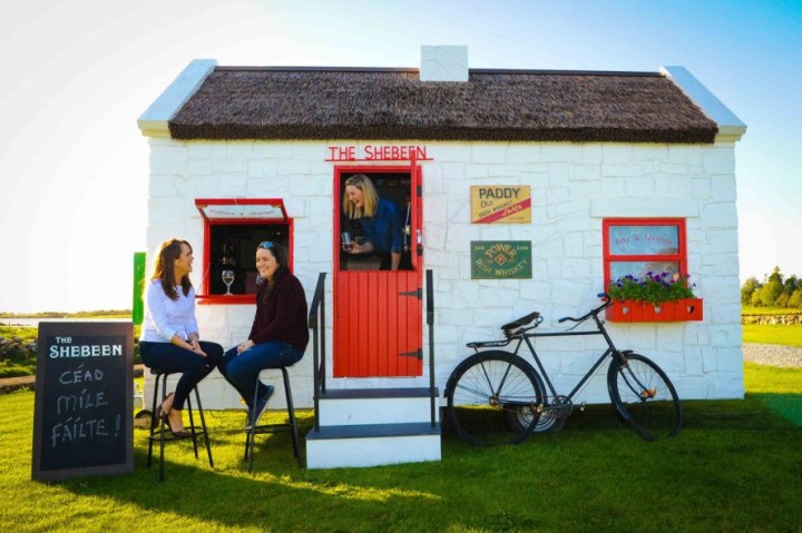
When Irish cabinetmaker John Walsh decided to convert his rusty old caravan into a tiny pub, the world’s most charming St. Patrick’s Day hotspot was born. The Shebeen is literally translated into “an illicit bar where alcohol is sold illegally.” The mobile booze cruiser was so popular in Ireland, the people of Boston commissioned another one to be brought to the states.


ARCHITECT BUIILDS HIS OUSE OUT OF 8,500 BEER BOTTLES

3Man-builds-his-house-out-of-beer-bottles

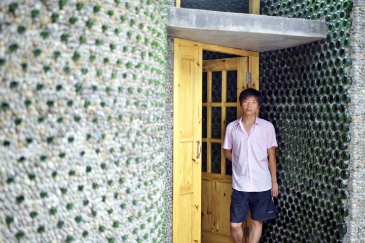
This brings new meaning to the song 99 Bottles of Beer on the Wall. Aspiring architect in Chongqing city, China designed and constructed his very own office with 8,500 recycled beer bottles. The impressive upcycled structure gets its sturdy foundation from 40 layers of beer bottles. The entire construction took four months and $11,000 to complete.

A BEER BOTTLE THAT DOUBLES AS BRICK

4top-green-booze-stories-heinecke.jpg

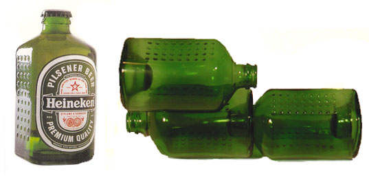
Have your brick and drink it too? Famed beer brewer Alfred Heineken and Dutch architect John Habraken came out with their Heineken WOBO (world bottle) brick all the way back in 1963, but the principle behind it still rings true today. As you probably already guessed, the idea behind the boozy brick was that thirsty people could drink their fix of beer from the WOBO and reuse it to build structures. Cheers to that.

A PAVILION MADE OF 33,000 BEER CRATES

5top-green-booze-stories-beer-crate-.jpg

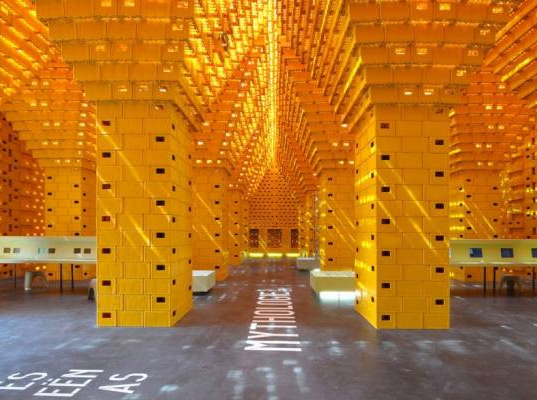
It must have taken a lot of frat parties to empty out the 33,000 yellow beer crates that architects SHSH stacked atop one another to create this intoxicating pavilion. Using the crates like giant legos, the design features interesting architectural touches like columns, arches and even domes inside.


Source
http://inhabitat.com

Beautiful Color Red

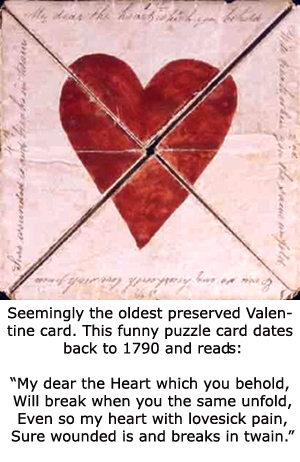
Being Valentine’s Day I have the color red on my mind. On Valentine’s Day, red is everywhere.

red-caveCave art paintings of Lascaux in France

If any color can stake a claim to be the oldest, it is red. We’ve been seeing red since our neolithic days. It is the most primary of primary colors – the very blood in our veins is red.

valentine-oldest
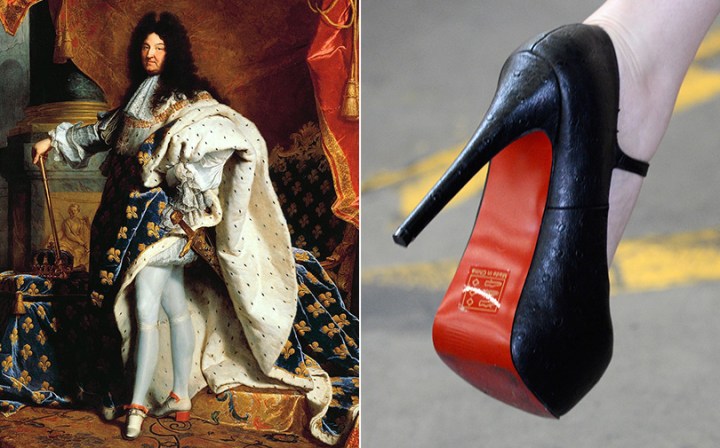
So how did red become the color of love? 400 years ago in 17th-century France, red was a color of power. Red was always a color associated with palaces, with Versailles, in fact Louis XIV put a little red into every step he took. He was a man who was very proud of his legs. Known as having gorgeous legs and he wore all kinds of fashion that would show them off. Louis wore knee-length tight pants and beautiful silk stockings. His heels — which were quite high for a man — were not just red, but scarlet.

rose-garden

King louis XIV inf red.jpg

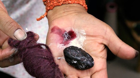
Red was an expensive color in 17th-century France because at the time, the dye was made from a little bug found in Mexican cactus, the cochineal. Soon nobles all over Europe were painting their heels red. Red was chic, flashy… and expensive.

gty_cochineal_bug_tk_120326_wblog

Dyers_soaking_red_cloth_in_a_heated_barrel_-_Des_Proprietez_des_Choses_(Volume_II)_(1482),_f.269_-_BL_Royal_MS_15_E_III.jpg

Nilda-and-Acopia-Women.jpg
Nilda and Acopia women dying yarn red

These white bugs produced a potent red dye so sought-after by artists and patrons that it quickly became the third greatest import out of the “New World” (after gold and silver), as explains Victoria Finlay in A Brilliant History of Color in ArtRaphaelRembrandt, and Rubens all used cochineal as a glaze, layering the pigment atop other reds to increase their intensity. A non-toxic source for red pigment, the cochineal bug is still used to color lipsticks and blush today.

The bottom fell out of the bug market in the middle of the 1800s, when synthetic dyes were invented. Previously, red was only for the rich who could afford the expensive insect dye. In some cultures, the privilege of wearing red was reserved exclusively for the powerful. When you saw someone wearing red in Japan or Italy, the person was of high status.

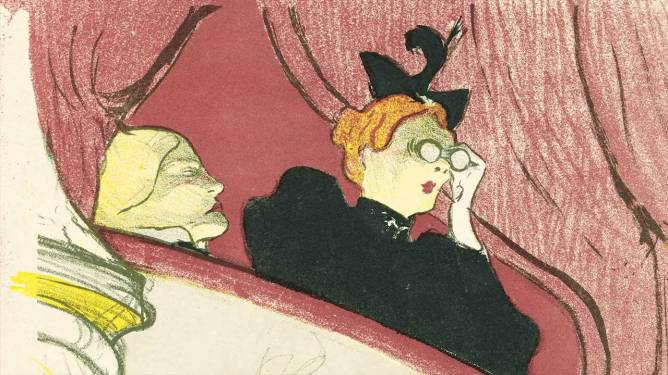
toulouse-lautrec-the-box-with-the-golden-mask
Toulouse-Lautrec – The Box with the Golden Mask

Today Red has many faces and is the color of extremes. It’s the color of passionate love, seduction, violence, danger, anger, and adventure. Our prehistoric ancestors saw red as the color of fire and blood – energy and primal life forces – and most of red’s symbolism today arises from its powerful associations in the past.

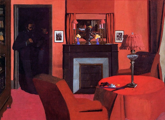
vallotton-felix-la-chambre-rouge
Felix Vallotton – La Chambre Rouge

Red can be a naughty color — red-light districts and bordellos. It is both the color of Satan and the color of the Roman Catholic Church. Red is often associated with divinity; medieval and renaissance paintings show Jesus and the Virgin Mary in red robes. Red is for happiness — Indian brides get married in red saris. Red for good luck — the one-month birthday of a Chinese baby is celebrated with red eggs.

red2

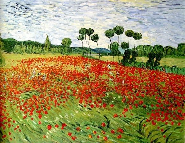
I’ll leave it with this though. In 1888, Vincent Van Gogh wrote that he “sought to express with red and green the terrible human passions”. Ancient, complex and representing extremes – red is nothing if not passionate. Perhaps Van Gogh would have seen red, should he have lived long enough to see the reds in his paintings starting to fade away.

field-of-poppies
Vincent Van Gogh – Field of Poppies


Beautiful Photography

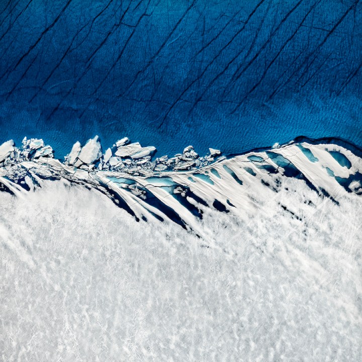
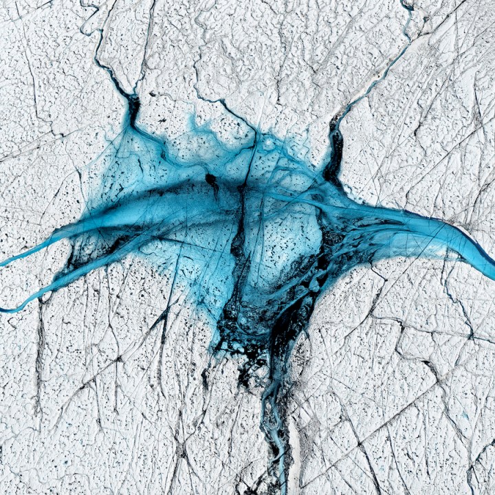
Photographer Timo Lieber uses his fine art photography to tell a story about the fragility of our planet. His latest project, THAW, conveys Greenland’s ice caps shooting the growing lakes from an aerial view. THAW will make its public debut from February 20 – 23, 2017 at Bonham‘s in London.

timo-lieber-melting-polar-ice-caps-1

The resulting images are simultaneously stunning and scary. From a fine art perspective, the balance of colors, as well as the visually stimulating composition, draws the spectator in. From an environmental view point, Lieber’s work is an eerie reminder about the effects of global warming.

polar-ice-caps-2.jpg

Year after year, Greenland’s lakes continue to increase in size, as the ice caps slowly melt. Since 2009, the Greenland ice sheet has been losing an estimated 419,000,000,000 tons of ice annually. This is three times more than the contribution from Antarctica. Thus, Lieber felt the urgency to shoot this transitional phase in order to raise awareness about climate change.

melting-polar-ice-caps-3.jpg

THAW showcases the rapidly growing number of blue lakes and rivers that form on the Greenland ice cap —one of the most inaccessible areas on earth. Here, in the pristine landscape, stripped to the bare minimum of colors and shapes, the dramatic impact of climate change is more obvious than anywhere else in the world.”

melting-polar-ice-caps-4

melting-polar-ice-caps-5.jpg

Images by Timo Lieber via My Modern Met

Beautiful Art Exhibits

Cool Events taking place around the world.

Tatsuo Mayajima’s “Connect with Everything” installation at the Museum of Contemporary Art, Australia

2 mca_tatsuo-miyajima_mega-death_1999-2016-alex-davies-2-highres1.jpg

Few contemporary artists grapple with what it means to be human as profoundly as Japanese-born Tatsuo Miyajima, whose signature works are high-tech, immersive light installations that border on the mystical. “Tatsuo Miyajima―Connect with Everything,” the artist’s first solo show in the Southern Hemisphere, is on view at Sydney’s Museum of Contemporary Art, and is as comprehensive a retrospective as the works deserve.

Museum of Contemporary Art, 140 George St, The Rocks NSW 2000, Sydney, Australia; mca.com.au/miyajima. Through March 5.  

A Robert Rauschenberg Retrospective at the Tate Modern Switch House, London

Your excuse for a visit across the pond to inaugurate the Switch House – the Tate Modern’s new brick pyramid-tower extension designed by the same Swiss firm, Herzog & de Meuron, that transformed the massive Bankside Power Station into the enormously popular hub of modern and contemporary art – has arrived in the form of the first major retrospective of Robert Rauschenberg since the American artist’s death in 2008.

Organized chronologically and in collaboration with New York’s MoMA, where it heads next spring, the show unfolds as a riveting narrative, journeying through the maverick’s many seminal creative moments, from his striking blue monoprints and his extraordinary Combines.

1.jpg

Tate Modern, Bankside, London; tate.org.uk/whats-on/tate-modern/exhibition/robert-rauschenberg. Through April 2.

Cy Twombly’s Retrospective at the Centre Pompidou, Paris

Cy Twombly, an artist who was born in Lexington, Virginia in 1928 and moved to Italy in the 1950s, is in many ways very French. In the Salle des Bronzes Antiques at the Louvre museum in Paris, where ancient Greek armour waits silently for wars that will never come again, the room’s vast ceilingis painted by Twombly with a bright expanse of blue, its intensity illuminated by silver and gold suns and moons as if the light of the Mediterranean were infusing the museum with desire and danger. So it is fitting that France is staging the first Cy Twomblyretrospective since his death. On the top floor of the Centre Pompidou, the helmeted Greek heroes have returned. Gore, love and revenge stain the walls.

twombly.jpg

Centre Pompidou, Place Georges-Pompidou, Paris; centrepompidou.fr/en. Through April 24.

R.H. Quaytman’s “Morning: Chapter 30″ exhibit at the Museum of Contemporary Art, Los Angeles

thumb_1923_1120x0_0_0_auto.jpg

MOCA presents R. H. Quaytman, Morning: Chapter 30, the first major museum survey of work by New York–based artist R. H. Quaytman. The poetic, hypnotic, and singular work of R.H. Quaytman is on display in full splendor at “R.H. Quaytman, Morning: Chapter 30” at the Museum of Contemporary Art in Los Angeles, the first major museum survey of the NYC-based artist. Made up of 22 gesso-and-silkscreen paintings, the series “30 Chapters” is, like the 29 “chapters” that preceded it, a site-specific project that in this case takes inspiration from another site-specific work, Michael Heizer’s earthwork Double Negative, an excavation on the eastern side of Mormon Mesa in southern Nevada that resulted in two massive trenches. Museum of Contemporary Art, 250 South Grand Ave, Los Angeles; moca.org/exhibition/r-h-quaytman-morning. Through February 6. 

The Opening of the Sumida Hokusai Museum, Tokyo

exterior.jpg

Despite the rich history of art in Japan, it is ukiyo-e (“pictures of the floating world”) — woodblock prints from the 18th and 19th centuries depicting everything from kimono-clad courtesans and kabuki actors to animals, plants, and dramatic, often romantic landscapes — that first comes to mind when one thinks of Japanese art, and that has had the most lasting influence on artists of every nationality (including 19th-century masters James Whistler, Edgar Degas and Mary Cassatt, among others).

Now there’s a museum devoted entirely to the country’s best-known practitioner, Katsushika Hokusai (1760-1849), whose formal, masterfully composed works have, alongside those of rival Hiroshige (1797-1858), come to define the genre. Designed by Pritzker Prize–winning architect Kazuyo Sejima, the angular Sumida Hokusai Museum just opened in Tokyo’s Sumida Ward, where the legendary master lived and produced the bulk of his work in the mid 19th century. Don’t miss Great Wave off Kanazawa from his seminal “36 Views of Mt. Fuji” series.

Sumida Hokusai Museum, 2-7-2 Kamezawa, Sumida-ku, Tokyo; hokusai-museum.jp

Louise Bourgeois’s “Structures of Existence: The Cells” at the Louisiana Museum of Modern Art, Copenhagen

Louisiana’s big autumn exhibition Louise Bourgeois. Structures of Existence: The Cells, presents one of the most striking and influential visual artists of the twentieth century. Over a period of some 70 years Louise Bourgeois (1911, Paris – 2010, New York) created a comprehensive oeuvre spanning a wide range of materials and forms, emotions and moods.

cell_xxvi_13.jpg