Beautiful Mondrian Inspired Buildings+Interiors

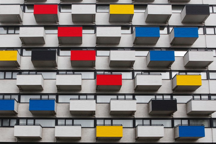
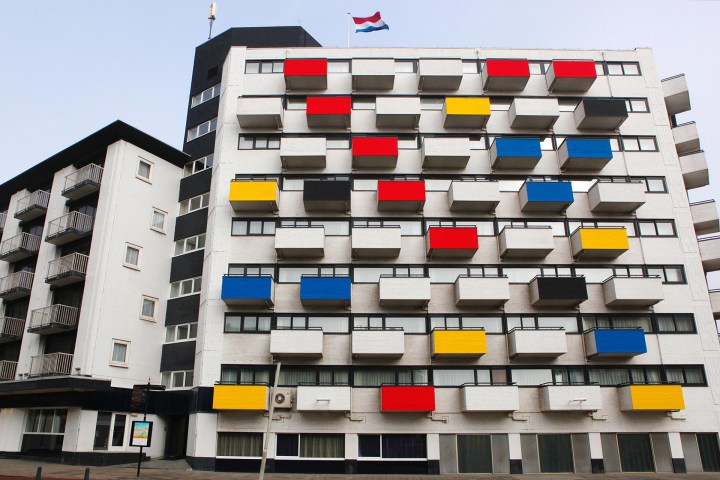
To honor of Dutch painter Piet Mondrian’s 147th birthday, here are six buildings inspired by his abstract, geometric style.

Artist Piet Mondrian (1872–1944) was introduced to art at an early age by his father, a drawing teacher at a local primary school. At the age of 20, formally began his career as an artist and teacher. His artistic career began with more traditional, representational paintings, however upon moving to Paris in 1911 his style was greatly influenced by Cubism and his work began to turn more abstract. Later, alongside painter Theo van Doesburg, Mondrian created the De Stijl movement, which embraced an abstract, simplified aesthetic. The De Stijl artists sought to devalue tradition, and they greatly impacted the rise of modern art during the 20th century.

mondrian-100-year-legacy-1

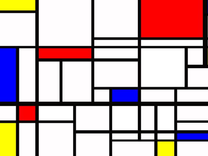
Considered a pioneer of 20th century abstract art, Mondrian is best known for his paintings featuring basic forms and colors. The artist limited his paintings to the three primary colors (red, blue, and yellow) and the two primary directions (horizontal and vertical), thus creating colorful and geometric compositions. He hoped that these simplified subjects could transcend cultures and become a new common language. Mondrian’s impact on modern art is visible in the work of other artists and subsequent artistic movements, as well as in contemporary art and design. Here are six projects that embody the spirit of Mondrian’s work.

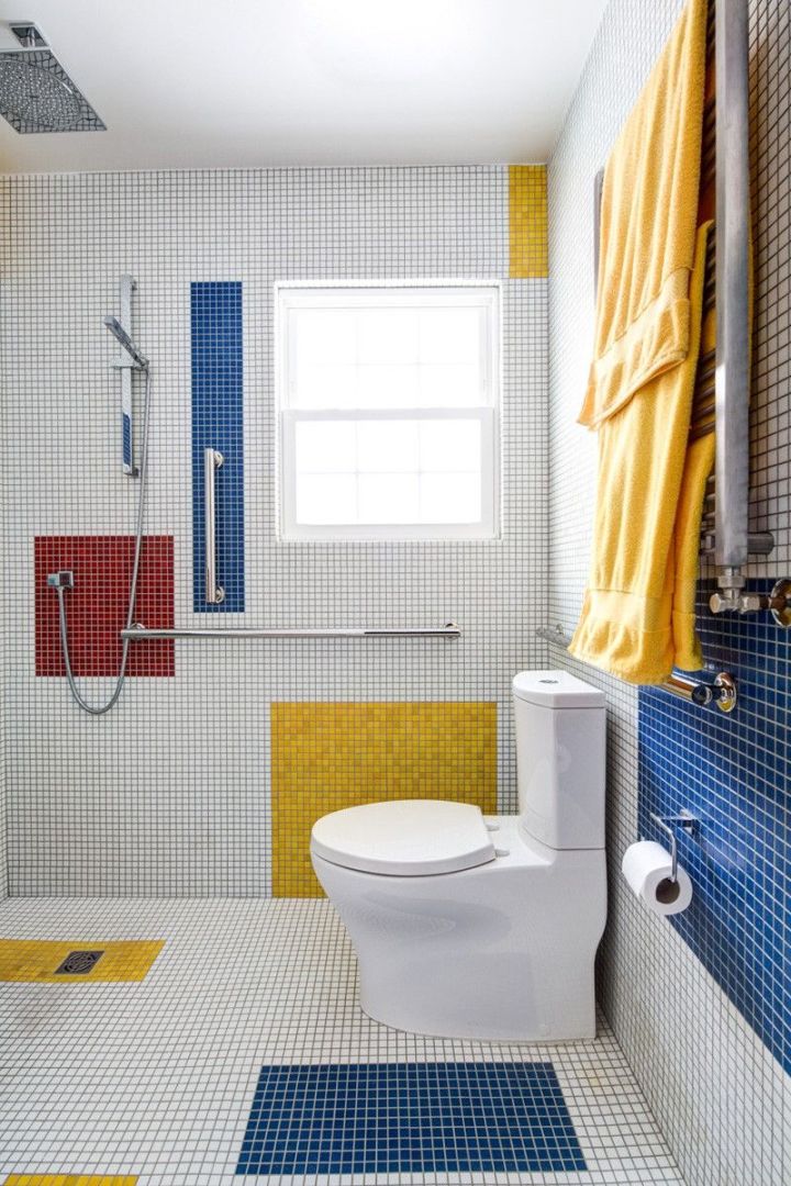
A Mondrian inspired bathroom in VirginiaVirgina small-bathroom-project-inspired-by-artist-piet-mondrian-floor-to-ceiling-glass-tiles-re-interpret-mondrians-compositions.jpg
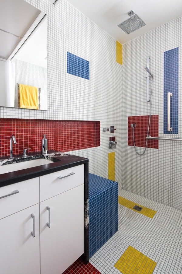
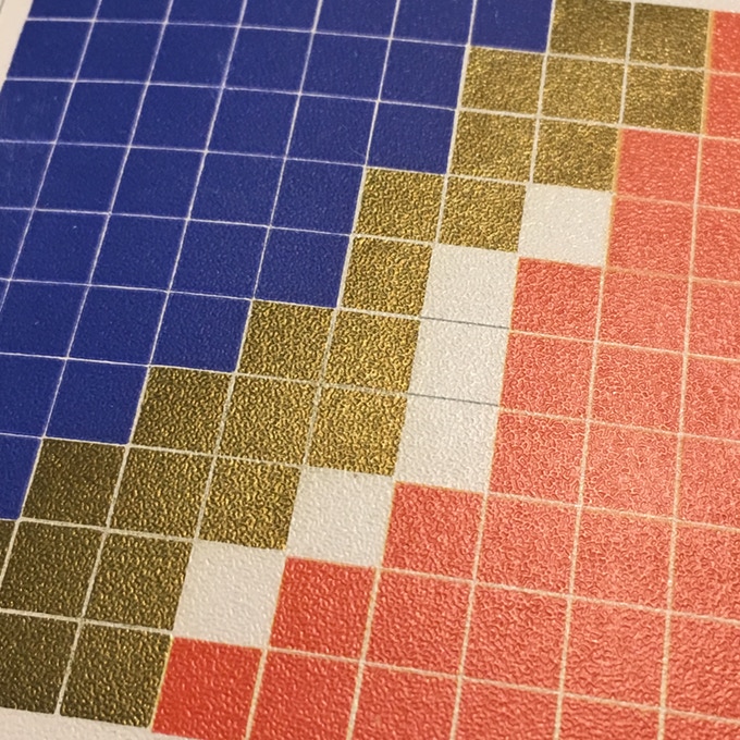
The clients for this small bathroom project are passionate art enthusiasts and asked the architects to create a space based on the work of one of their favorite abstract painters, Piet Mondrian. Mondrian, a Dutch artist associated with the De Stijl movement, reduced designs down to basic rectilinear forms and primary colors within a grid. Alloy used floor to ceiling recycled glass tiles to re-interpret Mondrian’s compositions, using blocks of color in a white grid of tile to delineate space and the functions within the small room. A red block of color is recessed and becomes a niche, a blue block is a shower seat, a yellow rectangle connects shower fixtures with the drain.

The bathroom also has many aging-in-place design components. There is a zero clearance entrance to the shower. The doorway is wider for greater accessibility and pocket door installed to save space. ADA compliant grab bars were located to compliment the tile composition.

A small bathroom project inspired by artist Piet Mondrian. Floor-to-ceiling glass tiles re-interpret Mondrian’s compositions.
mondrian bathAlloy-Innes-
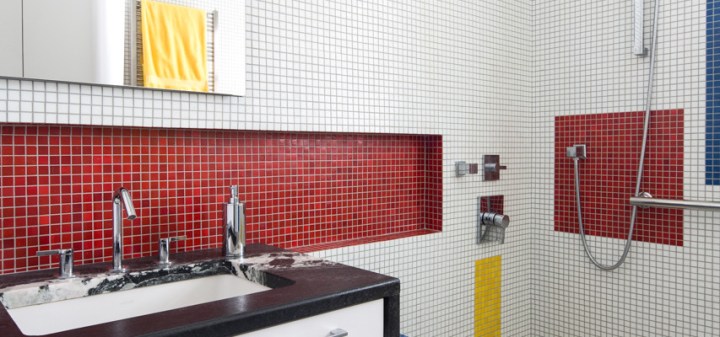
Design by Alloy Workshop
The design team used floor-to-ceiling tiles to create the geometric interior. Yellow tiles connect the shower fixtures to the drain, blue tiles are used for the shower seat, and a red block is recessed to create a niche in the wall.

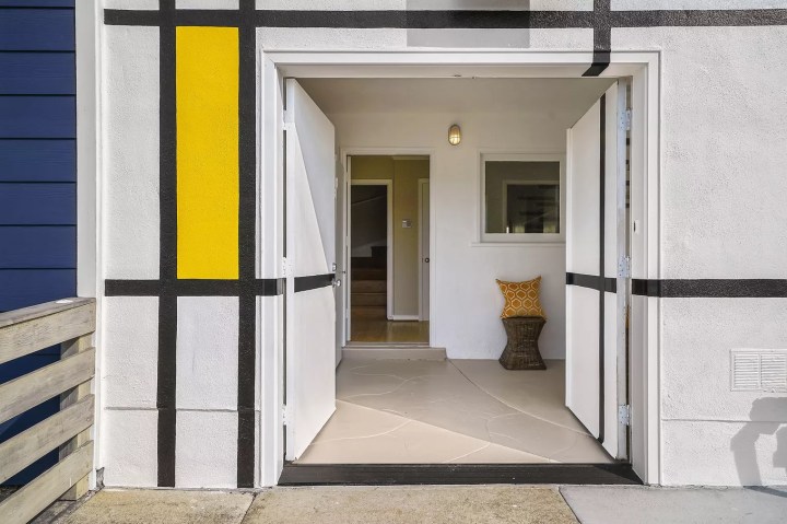
Colorful Painted Home in San Francisco
the-exterior-facade-of-this-san-francisco-home-displays-the-colors-and-lines-typical-of-piet-mondrians-paintings
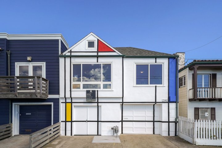
The exterior of this home in the Outer Sunset neighborhood of San Francisco was inspired by the colorful grid-based paintings for which Mondrian is best known. Painted in Mondrian’s style over 20 years ago, this whimsical house has become iconic also due to its location across the street from the beach. The two-story house features two beds and one bath, as well as a recently landscaped backyard—and it recently hit the market.
Update: The Outer Sunset home bearing a paint job a la Piet Mondrian’s most famous work sold over asking, netting $2,050,000. That’s $555,000 over the original ask of $1.495 million. No word if the new owner will keep the exterior paint job.
entrance

The ‘Breakfast With Mondrian’ Apartment
breakfast 1.jpg
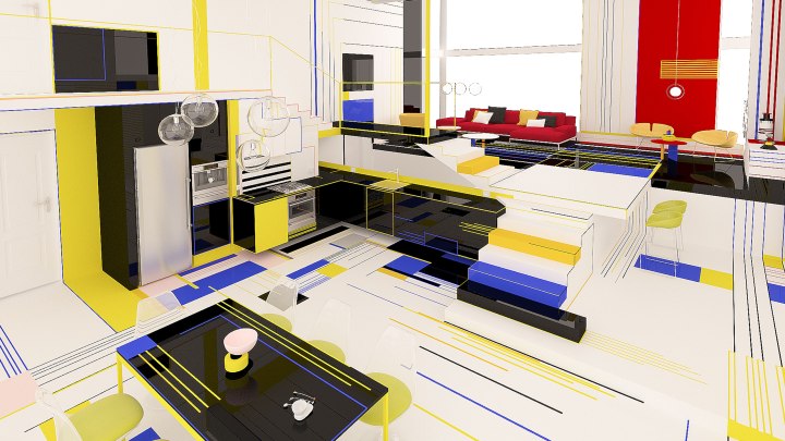
Breakfast with Mondrian is an experimental project where the use of forms, lines and colors is focusing of the positive impact which has to provoke the space on the people living there. The design concept is inspired by the Dutch painter Piet Mondrian for his vision of nature, manifested in his simple and pure abstract paintings. He is one of the founders of the Neo-Plasticism Movement, style which is recognized with the use only of horizontal and vertical lines and the fundamental colors – red, blue, yellow. With these elements the artist developed a new plastic language where he shows how he sees the world, the nature and the human – as one unity. In his paintings he represents the perfect harmony between the elements of this unity.
breakfast 2.jpg
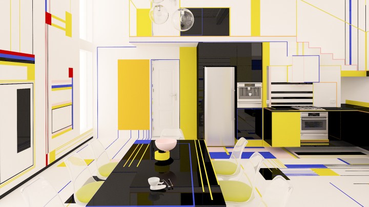
Mondrian’s aim is to provoke emotions to the viewers. The viewers should feel themselves dancing while watching his paintings. Through lines and colors the inhabitants and their guests should feel themselves as they are part of a dance. In the dance between forms and colors we use the white and black colors as intervals between them. The white is active, the black is passive. As Mondrian says that through oppositions of color and line one can see the plastic expression of relationships.
The space of this experimental modern house is open and every zone has its own function and in the same time is connected to everything else. The meaning is that the kitchen cannot be without the dining room, or living room. As in nature everything is connected and cannot without its parts, because one unity cannot be unity without its parts.
screen-6
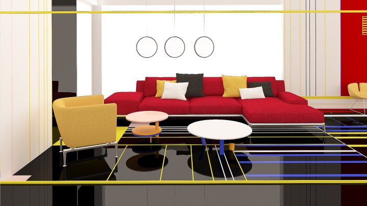
Breakfast with Mondrian is a concept by design duo Brani & Desi inspired by the artist’s work and vision. Mondrian saw the world, nature, and the human as one unit, and he expressed these relationships through his geometric and colorful paintings. Brani & Desi aim to provoke the emotions of their viewers and to create unity within every aspect of the apartment.berakfast 3

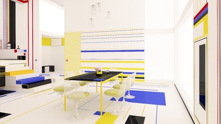
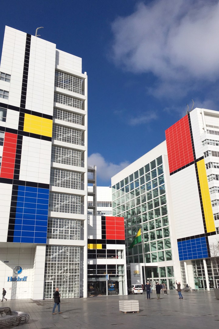
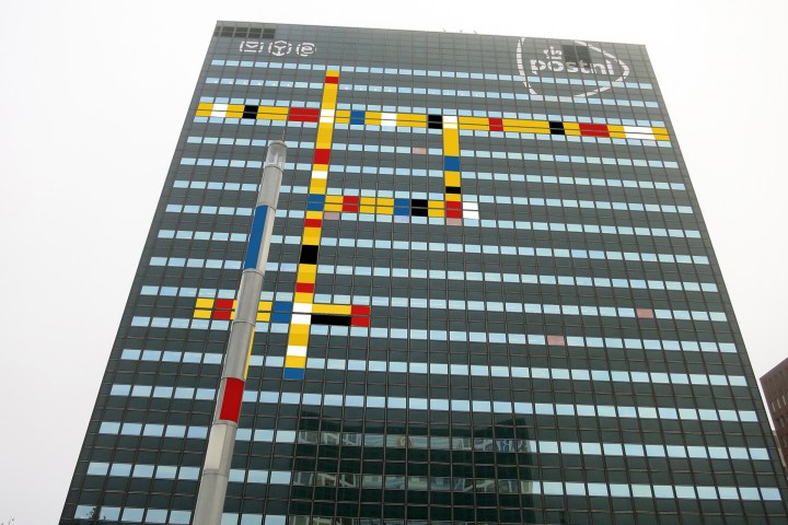
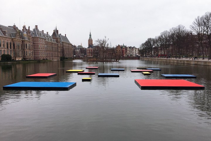
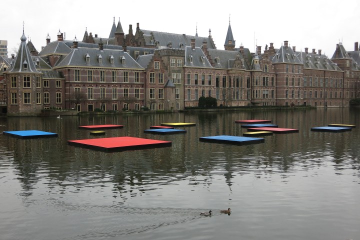
The ‘Mondrianized’ City Hall in The Hague
In honor of the 100th anniversary of the Dutch De Stijl art movement, The Hague unveiled the largest Mondrian in the world. The city hall building is painted with the familiar colors and lines of a Piet Mondrian work.
city hall 1
buildingstore frontcity hall 5city hall 4water 2waterpattencity hall 2

Beautiful Color Theory: Revisiting Emily Vanderpoel

Revisiting Emily Vanderpoel’s Color Theory Book 117 Years After Its First Release
In addition to being a watercolorist, Emily Noyes Vanderpoel was also the author of Color Problems, widely overlooked, yet staggering turn-of-the-century book on color theory.
Collection-of-the-Litchfield-Hist-Litchfield-Connecticut-1.jpg

Though her name is virtually unknown today, Emily Noyes Vanderpoel enjoyed a modest reputation as a watercolorist at the turn of the 20th century. She painted seascapes, country landscapes and the occasional industrial scene — perfectly competent works, but ultimately quite conventional. Nothing about them hints at the fact that Vanderpoel was also the author of a widely overlooked, yet staggering book on color theory, its pages bursting with a series of vibrant illustrations that seem to anticipate an abstract aesthetic decades before it emerged in full force.

Color Problems: A Practical Manual for the Lay Student of Color, which Vanderpoel first published in 1901, sought to teach an audience of non-artists how to combine colors in ways pleasing to the eye. The 400-page book elegantly summarizes the ideas of eminent color theorists, before unleashing Vanderpoel’s wildly original approach to color analysis: 10 x 10 grids that break down the color proportions of real objects, most of which came from the author’s personal collection of antiques. Vanderpoel lovingly transforms a mummy case, a teacup, a Japanese silk brocade and dozens of other knick-knacks into series of geometric patterns. Her grids emerge as artworks reminiscent of Homage to the Square, the iconic abstract series that Bauhaus pioneer Josef Albers began creating in the 1950s.

Book-Cover

In spite of its stunning prescience, Color Problems has been largely forgotten in the 117 years since it was first released. Two Brooklyn-based publishing companies now hope to salvage the book from obscurity. On November 9, The Circadian Press and Sacred Bones Records will reissue Color Problems in both softcover and a hardcover facsimile, their efforts supported by a successful Kickstarter campaign.

Plate-005

Vanderpoel was immersed in New York’s creative scene. She never received a formal art degree, but studied under the painters William Sartain and Robert Swain Gifford, who taught at Cooper Union and the Arts Students League. Vanderpoel exhibited her artworks through the New York Watercolor Club, which frequently staged group shows, and her paintings occasionally cropped up in grander venues. In 1893, she won a bronze medal at the Chicago World’s Columbian Exposition for a painting of an industrial rail yard. Some years later, her painting “Ypres,” (no date) a memorial to World War I that is now lost, was displayed at the National Art Museum in Washington, DC (which was subsequently incorporated into the Smithsonian). In the late 1920s, the Metropolitan Museum of Art mounted an offsite exhibition of nine of her watercolors at the Connecticut Agricultural College.

At some point amidst this flurry of productivity, Vanderpoel began writing and illustrating Color Problems. No records of her process survive to the present day, but she likely worked on the book for several years, says Alan Bruton, a professor at the University of Houston’s College of Architecture and Design who has researched Vanderpoel’s life and work.

Plate-057-720x1056

Color Problems is a guide for both hobbyists and people who work in the practical arts: florists, decorators, designers, lithographers, salespeople who want to attractively display their wares. The book is not specifically catered to women, but Vanderpoel certainly had female readers on her mind. She writes that understanding the intricacies of color theory can be of value to milliners and dressmakers — occupations often held by women during the Victorian era — along with housewives who dabbled in home decor.

As she doles out advice for achieving aesthetic harmony at home and at work, Vanderpoel reveals herself to be well versed in color theories that proliferated throughout the 19th century, due in part to scientific advances that led to the development of new pigments. She frequently refers to major names in the field, among them Michel-Eugène Chevreul, whose ground-breaking 1839 book explored how adjacent colors influence one another; James Clerk Maxwell, who used spinning color discs to show how people perceive mixtures of color; and Ogden Rood, who, among his other contributions, suggested that colors differ from one another due to variations in purity, hue, and luminosity.

Plate-106-720x1056.jpg

Even more striking are Vanderpoel’s 54 grids, or “Color Analyses, ” in which she reinterprets various objects as geometric designs made up of 100 squares. Vanderpoel’s analysis of a Celtic ornament, for instance, is rendered as 50 green squares, 18 red ones, 17 yellow, seven black, and eight white, all fitted together with Tetris-like precision. She wasn’t the first theorist to organize colors into grids, but rendering pixel-like representations of real objects to capture the optical effect of color — that was something new.

Plate-073.jpg

colorwe11

Read more of the original article here
Learn more about the Kickstarter 
campaign 

Beautiful Villa Savoye

As a monument to modernism, the building possesses a poetry and sensitivity full of idealism. The careful composition of living space and intention to harness natural light, not to mention the building’s iconic aesthetic, still define modern architecture.

villasavoye_landscapeThe Villa Savoye, built in 1929 in Poissy, a rural area outside Paris, was Le Corbusier’s answer to a French country house. Given relatively few constraints by the Savoye family, Le Corbusier designed a building to embody the architectural theory he had evolved in practice and in his book, Towards an Architecture 1923. He was inspired by both the classical forms of ancient Greek architecture and the modern technologies that were shaping the world such as automobiles, airplanes and ocean liners.

villasavoye_landscape2.jpgThis project was the last in a series of private homes known as the ‘white villas’ built by Le Corbusier and his cousin and partner Pierre Jeanneret, which introduced a new form of luxury in which space itself, and its capacity for leisure, were the valuable commodities.

Of these, The Villa Savoye perhaps best embodies Le Corbusier’s architectural manifesto, the five points of architecture. The first, pilotis – slender pillars which raise the building off the ground, opening up more space for gardens and cars, made possible the second, a façade free of its usual load bearing function. Walls were no longer supporting structures but ‘membranes.’ This allowed the unimpaired design of the third, an open plan interior, and the fourth, ribbon windows to flood the interior with maximum light and to illuminate it evenly. A sliding window system patented by Le Corbusier and Pierre Jeanneret was intended to offer superior ventilation, as well as give access to the fifth, a flat roof which could serve as a terrace. A curved solarium crowns the structure, the brightest increment in the layered design. This symbiotic relationship of these five features gives some insight into what could otherwise be a somewhat alienating notion of Le Corbusier’s, the famous concept of a house as ‘a machine for living.’

villasavoye_landscape3-outdoor.jpgUnfortunately the Villa Savoye presented its residents with its own host of problems, despite its pioneering design. Each autumn, as the windows ushered in a warm vista of seasonal colour, the family would write repeatedly to Le Courbusier, begging him to make ‘habitable,’ what proved to be a damp and chilly building. They complained of ‘raining’ in the hall, on the ramp and in the bathroom. The loud drumming of rain on the bathroom skylight kept them awake at night, heat escaped through the long stretches of glazing and the heating system was both insufficient and a further cause of flooding.

villasavoye_stair.jpg villasavoye_portraitchair villasavoye_landscape4.jpgvillasavoye_portrait6-bath.jpgvillasavoye_portrait5-stair 2.jpg villasavoye_landscape4

Much of this was perhaps due to the fact that the technology involved was not fully developed at the time. As a monument to Modernism, the building possesses a poetry and sensitivity full of idealism. The careful composition of living space and intention to harness natural light, not to mention the building’s iconic aesthetic, still define modern architecture. Nonetheless, the discomforts they had suffered ultimately led the Savoye family to decide against restoring the property after the 2nd World War, when it was seized by German forces. About to be demolished by the local authorities to make way for a school, the building was rescued by architects and academics including Le Corbusier himself. Now a museum, restored closely to its original state, Villa Savoye is one of 17 of Le Corbusier’s buildings declared a UNESCO World Heritage Site.
Credit: readcereal.com/

Beautiful Lithography Stones

n 2011, while the REI store in the Puck Building in Manhattan’s SoHo district was undergoing renovation, workers made an unexpected discovery. Hidden behind one of the walls of the cellar were more than 100 lithography stones from the building’s days as a printer. They are now on display on the store’s lower floor.

1 REI  3 rei 4 rei

The historic building got its name from the magazine Puck, the first wide-reaching humor publication in the United States, which was
founded in 1871 and moved to lower Manhattan in 1887. It shared the space, in a mutually beneficial relationship, with its printer, J. Ottman Lithographic Company. Their shared headquarters was the largest building in the printing district at the time.

J. Ottman Lithographic Company printed many things beyond the Puck magazines, including theatrical posters and board games. Among the works now hanging on the REI wall are a high school diploma, a certificate of election, and a mortgage bond. Some of the litho stones are in rougher shape than others.

7 rei.jpg 5 rei 6 rei

Most of the writing and images on the stones is “backwards,” standard practice so that the final print is the reverse of what is seen on the plate or stone. Some, though, were prepared for offset printing, which involves an additional
step between the plate and the final product. The inked image, prepared “forwards,” or as it would be seen in the final product, is first transferred to a rubber blanket, reversing
the image once, and then to the final surface, setting it right.

Puck continued to operate out of the Puck Building until 1918, when it ceased publication. It was known for beautiful, full-color lithographs and sharp political satire. Statues of the magazine’s mascot, Puck, decorate the outside of the building. J. Ottman Lithographic Company shuttered around the same time.
Other printing companies, and even another satirical magazine, have called the building home since the original tenants left.

9 rei.jpg 10 rei.jpg 8 rei

During REI’s renovation, a deliberate effort was made to repurpose materials from the original building. Fixtures from the steam engine that powered the presses are on permanent display, including two flywheels and the governor. Nineteenth century I. P. Frink chandeliers, newly fitted with LED lights, help light the main floor.

 Source: Atlas Obscura