Beautiful Interiors

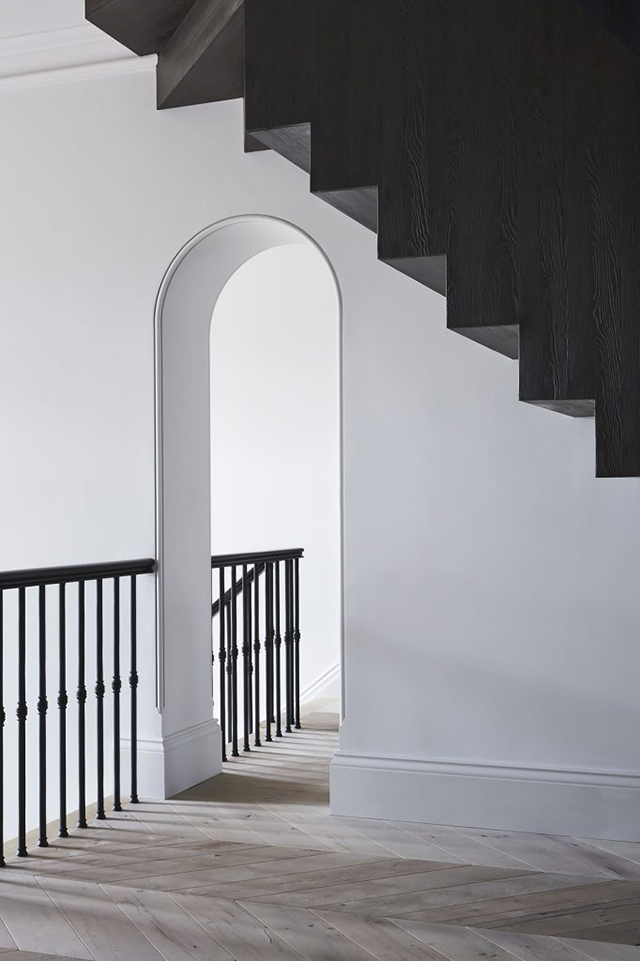
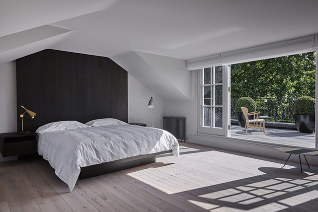
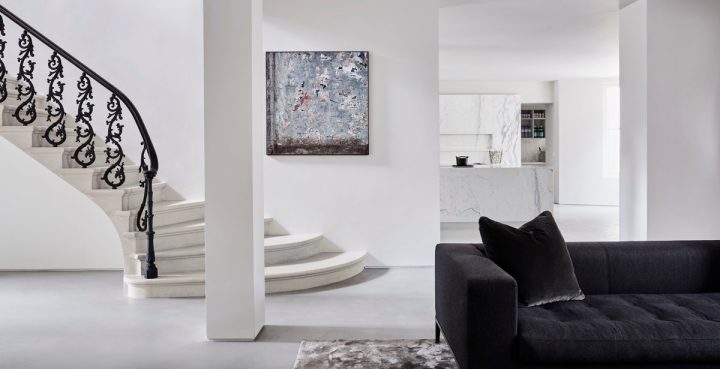
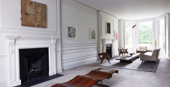
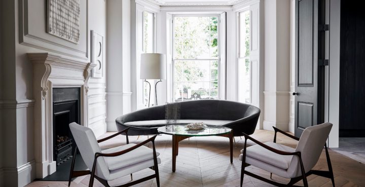
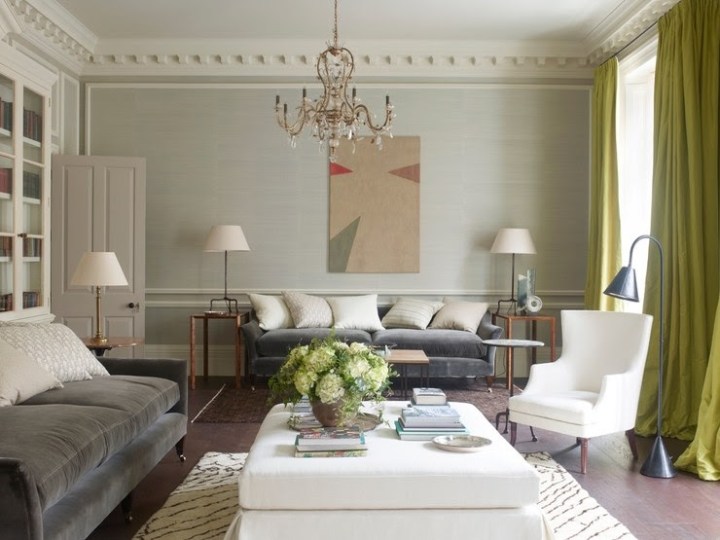
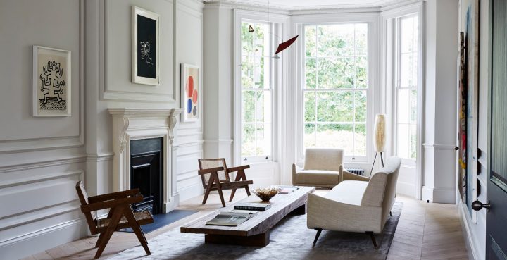
Little Venice Residence by Originate + GL Studio is exquisite. Formerly two adjoining townhouses, this stunning mid-19th century property in West London was completely restored by Originate Architects and GL Studio. Now a Victorian stucco-fronted villa, the original features were reinstated and married with contemporary elements to fulfill the needs of modern family. The details are gorgeous!

LR-Garden-View-
littlevenice_03
littlevenice_02
littlevenice_6(1)littlevenice_7
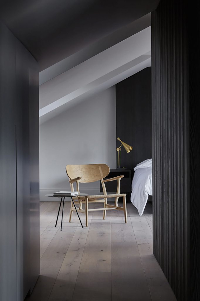
The restoration process included the installation of new fireplaces and arched openings in keeping with the historical period. New joinery units were designed by Originate using a unique finish to enhance the natural grain of the timber, while a fairly neutral colour palette was chosen to complement the client’s extensive collection art and furniture collection. In particular, a love of mid-century design that can bee seen with the iconic Pierre Jeanneret chairs, a beautiful Jorge Zalszupin table, and the Carl Hansen & Søn’s reissue of the Hans J Wegner CH22 lounge chair from 1950.

littlevenice_5littlevenice_4
Dining-Stairs-Dining-Garden-
RR-Kitchen-Stairs-RR-Kitchen-Island-View
RR-Living-Room-RR-Living-Room-Seating-RR-Living-Room-Arch-
Images via Orginate and GL Studio

Beautiful Toys by Charles & Ray Eames

Serious Fun

Taking inspiration from the humble cardboard box, Ray and Charles Eames created toys and furniture to spark the imagination of kids and adults alike. A central tenant of the design philosophy of Ray and Charles Eames was an embrace of play as an end in itself, the idea that creativity should be unconstrained and unburdened. While the couple will always be remembered for their contributions to furniture, design and cinema, it was their approach to experimentation, and their interest in seemingly tangential topics such as clowns, that inspired their seemingly endless sense of wonder and a constant drive towards exploration and improvement. As champions of those beliefs, it only goes to follow that they’d also be some of the world’s foremost toy designers.
Ray and Charles Eames took child’s play seriously. They invented playthings, furniture, and films to spark, but never limit, the young imagination. Given their own ideas of fun, these toys tended to emphasize composition, structure, and building, giving children the tools of their own adult trades in miniature (and giving some adults the chance to make like children again). Many of their designs embrace what kids and parents have long known: that the box an item comes in, especially if it’s a very large item, can be more exciting than the contents.
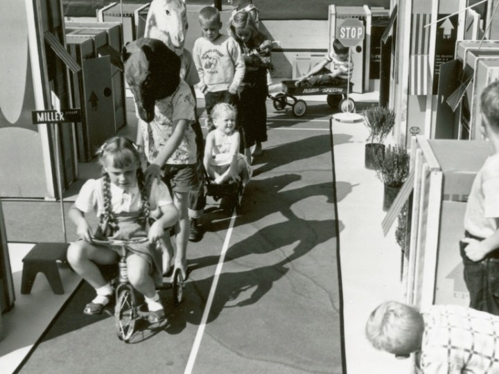
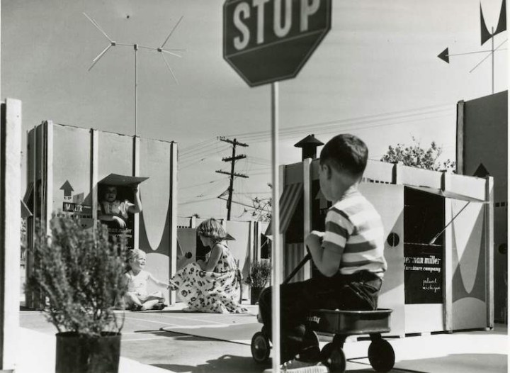
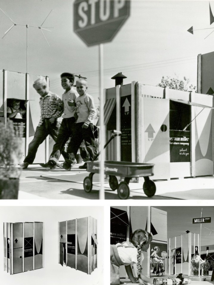
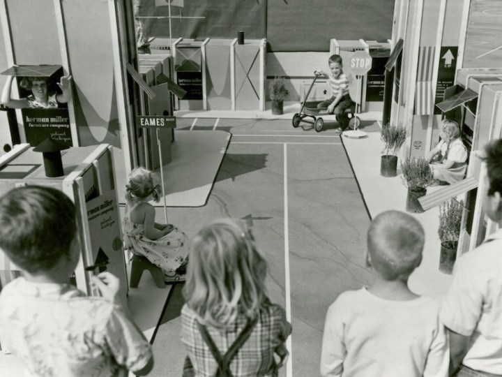
So it comes as no surprise that the Eameses improved the box itself, as a portfolio of photographs unearthed from the Herman Miller Archives reminds us. The humble cardboard box offers children their first chance to make space for themselves, whether that’s a race car, a robot, or a house, sprouting from the shipping container the Eames Office designed in 1951 for the Eames Storage Units (ESUs).
Printed in a colorful red and black design, and featuring the distinctive Herman Miller ‘M,’ the heavy cardboard carton, reinforced with wood splines, had only to be re-nailed to the bottom wood skid, after the furniture had been removed, to be made into a playhouse youngsters would love, reads text from a draft press release. A separate leaflet offers instructions on “How to Make a Playhouse,” but it should have been self-explanatory: dotted lines suggest locations for an entrance and a view out, as well as jaunty awnings.
In one fell swoop, the Eameses managed to combine adult and child fun, eliminate waste, and add excitement to the mundane process of delivery. The up arrows, as well as the deep V of the logo “M,” designed by Irving Harper for the company, suggest the possibility of upward expansion into a miniature townhouse or skyscraper, should a child or parent need more furniture.

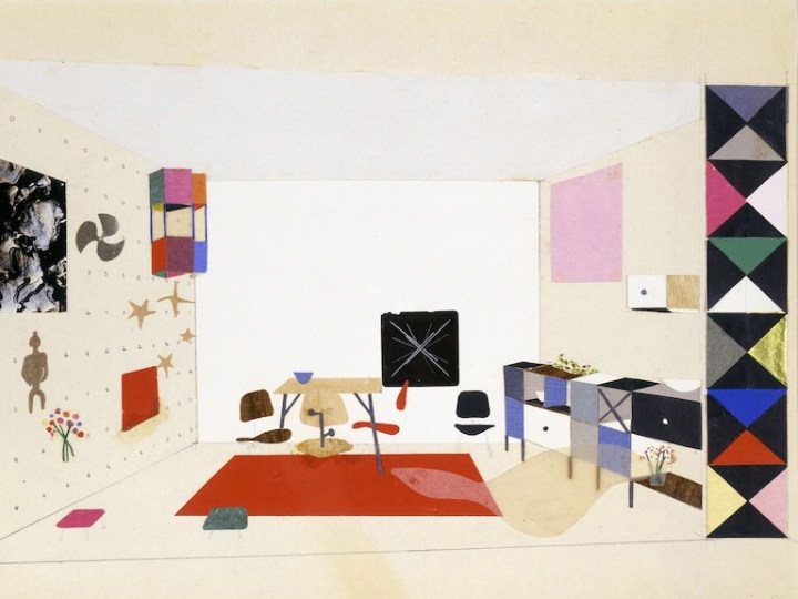
The ESUs themselves were also a kind of demountable toy for grownups. Made of perforated steel extrusions with diagonal bracing, they could be configured as low credenzas or high bookshelves. Buyers could customize the interior arrangement, selecting plywood drawers or doors, and perforated metal or enameled Masonite filler panels. Owners could also take them apart and rearrange or add on, treating the furniture as a series of modular boxes‑ furniture as toy.

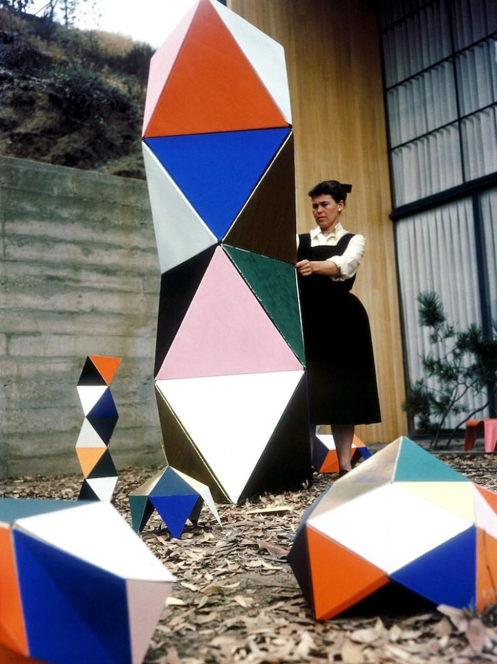
As adults designing playthings intended for children, the Eameses found more inspiration in boxes. The Toy, manufactured by Tigrett Enterprises in 1951, offered children the chance to make their own prefabricated structure, one more colorful and flexible than Carton City. The Eameses had first been in touch with Tigrett about manufacturing large, bright, paper-and-cardboard animal masks based on those they used for skits and photo shoots in the late 1940s. The Memphis-based company was run by the highly entrepreneurial John Burton Tigrett, who made his fortune selling the Glub-Glub duck and may have been looking for more patentable products. The masks never made it out of the prototype stage, but the simpler and more geometric Toy did.

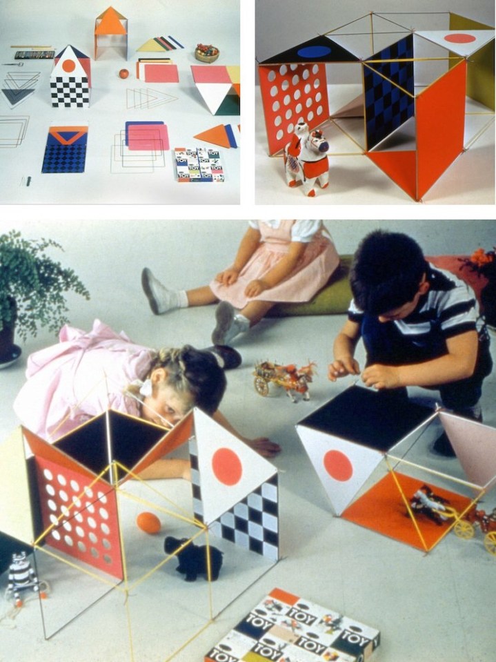
The Toy combined thin wooden dowels, pipe cleaners, and a set of square and triangular stiffened-paper panels in green, yellow, blue, red, magenta, and black. Children could run the dowels through sleeves on the edges of the panels to strengthen them, and then attach these struts at the corners. Initially sold in a big, flat box via the Sears catalog, the Eameses soon redesigned this packaging as well, creating a far more elegant 30-inch hexagonal tube, into which all parts could be rolled and stored.

The first version of the Toy made spaces big enough for children to inhabit, like the cartons. The Little Toy, released in 1952, was scaled more like an architectural model, allowing children to radically reinterpret the dollhouse. (The office later prototyped a modern model house for Revell, but it never went into production.) The Little Toy boxes, which feature a grid of colorful rectangles and words, resemble the panelized arrangement of the Eames House façade and the ESUs, and all of these products, at their various scales, were being developed at the Eames Office within the same few years.

Charles Eames once said of the work done out of the Eames Office, “We work because it’s a chain reaction, each subject leads to the next.” The connection to the ESU cartons and The Toy is immediately apparent in the longest-lived of the modular, paper-based playthings to come out of the Eames Office, the House of Cards.

In the voiceover for “Toccata for Toy Trains,” Charles Eames says, “In a good old toy there is apt to be nothing self-conscious about the use of materials. What is wood is wood; what is tin is tin; and what is cast is beautifully cast.” He could have added, in reference to the couple’s own toys, what is cardboard is cardboard, and then talked about the qualities that make it an ideal building material: its strength, its low cost, its ability to withstand a judicious number of cuts and slots.
Why Magazine by Alexandra Lange
Beautiful Interiors on a Budget

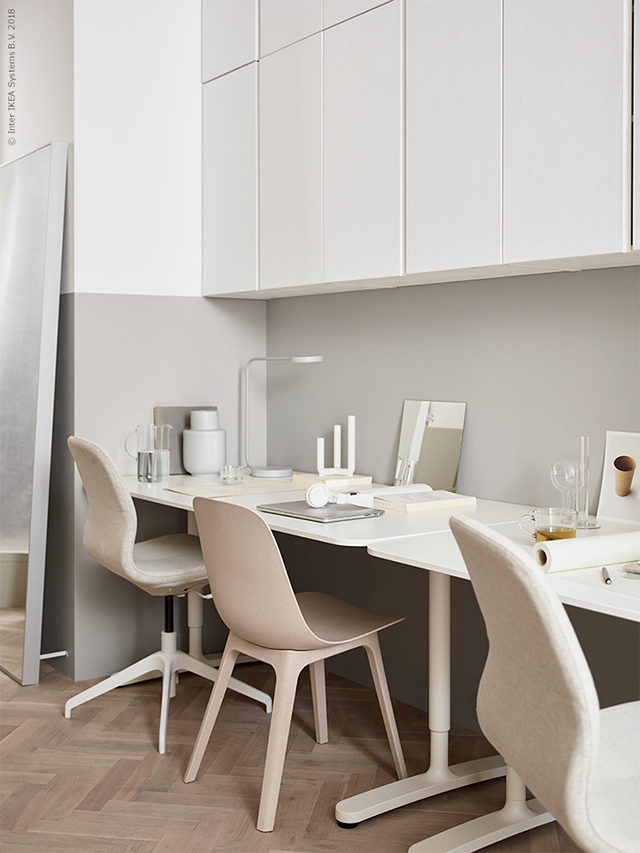
Ikea isn’t for everyone but if you are looking for a soft minimal look without spending a lot, Ikea gets the job done. Some inspiration from Ikea’s blog Livet Hemma (Live at Home) today, with two very different living room looks. The first is a soft minimalism style living room created by Susanne Swegen. Inspired by her love of mixing Japanese and Finnish aesthetics, the space features a soft color scheme and lots of warm wood. The two-toned walls provide a lovely framework for the room, while mirrors are used to play with light and reflections. I absolutely love the recessed desk area with vertical shelving. Such a great use of space!

ikea_inspiration_1

Ikeainspiration_2

ikea__inspiration_3

ikea__inspiration_4

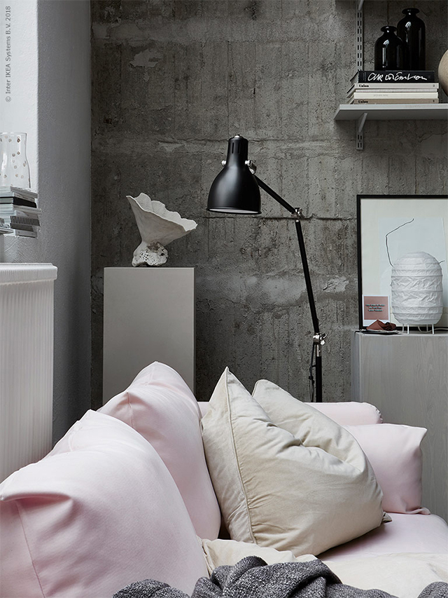
The soft pink Söderhamn sofa styled against the raw concrete creates a beautiful contrast of textures in this living room setting.

ikea inspiration_55

ikea nspiration_6

ikea_inspiration_7

Styling by Susanne Swegen  / Photography by Andrea Papini and Emily Layefor Ikea Livet Hemma

Beautiful Kid Spaces

How to crate a beautiful, cool, functional space for kids.

VINTAGE-DESK-WITH-HOUSE-SHELF-AND-DOTTY-WALL-FROM-PINTERESTSeptember is almost here and that can only mean one thing: back-to-school time! But homework doesn’t have to be boring – and neither does your child’s desk. Whether it’s for homework, drawing, coloring or simply chilling with a favorite book, study spaces can be both functional AND fun.
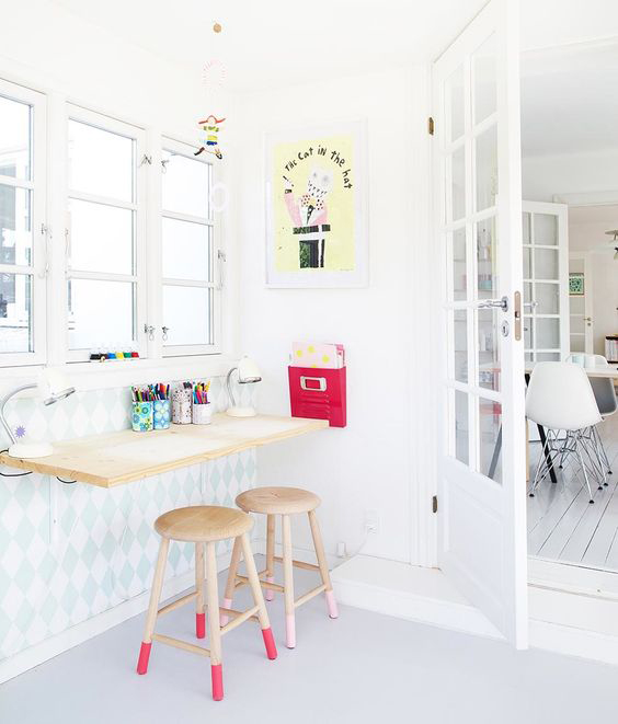
Here’s how:

1. Choose an area that works within the room

ATTIC-ROOM-BY-VAN-STAEYEN
Image sourced from Van Staeyen

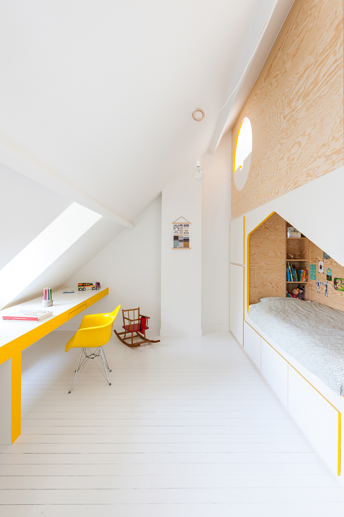
Placing a table along the length of the room (as pictured above) makes an area that may otherwise not be used for anything, useful – especially in a loft or attic room like this one. It’s light and bright, thanks to the window and the cheerful sunshine yellow and white, with plenty of desktop space for every activity you can think of! Don’t forget alcoves, unused corners, underneath loft beds, and even cupboards – they can make perfect study zones too!

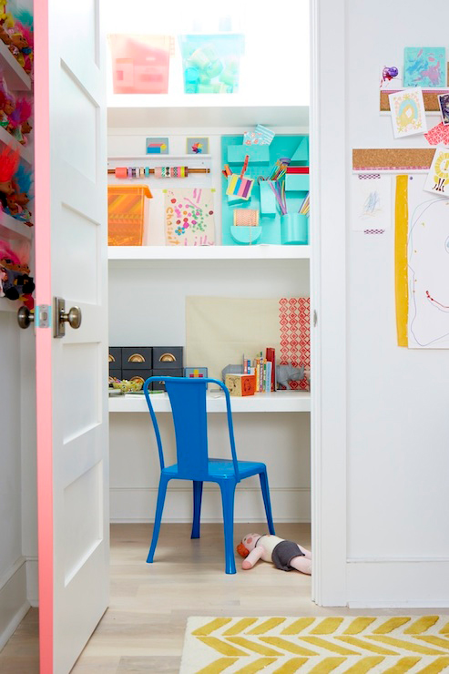
DESK-IN-CLOSET-BY-THE-LAND-OF-NOD
Image sourced from The Land of Nod

2. Hang a shelf

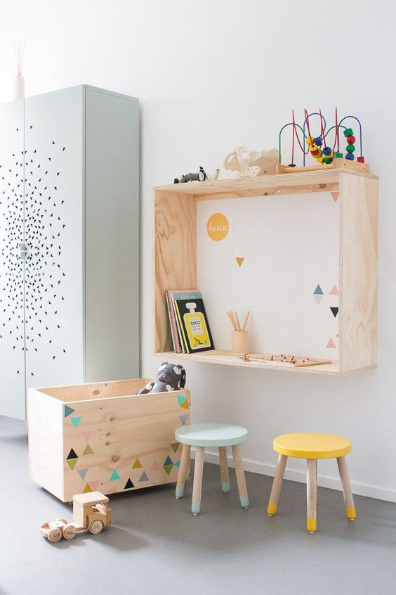
WALL-MOUNTED-DESK-AS-SEEN-ON-ESTILOESCANDINAVO
Image sourced from Estiloescandinavo

If you don’t have a lot of space, consider hanging a wall-mounted shelf instead. Simple and smart, yet effective as well. If it’s next to a wall, even better – hang some extra storage for all those arty bits and pieces and to help keep everything tidy and organized. And don’t forget all that extra space underneath the desk. Stack some storage boxes, bins or baskets to stash away all the mess when work and play is over.

KIDS-WALL-DESK-STYLED-BY-SUUS
Image sourced from En Suus

3. Choose a colored chair or stool

COLOURFUL-STOOLS-IN-PLAYROOM-BY-SAARKELOVES.jpeg
Image sourced from Saarkeloves on Instagram

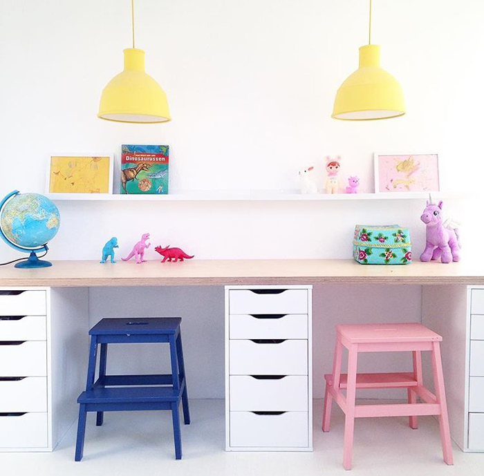
These Ikea steps look amazing painted in bright colors and used as stools. Love how the drawers divide up the two areas whilst serving as functional desktop legs, not to mention brilliant storage for paper, pens, crayons and books.

Likewise, these sweet vintage chairs in this kids’ room (below) add a pop of bright color whilst being perfectly in keeping with the style of the room:

COOSJE-BLOG
Image sourced from Coosje 

4. Decorate!

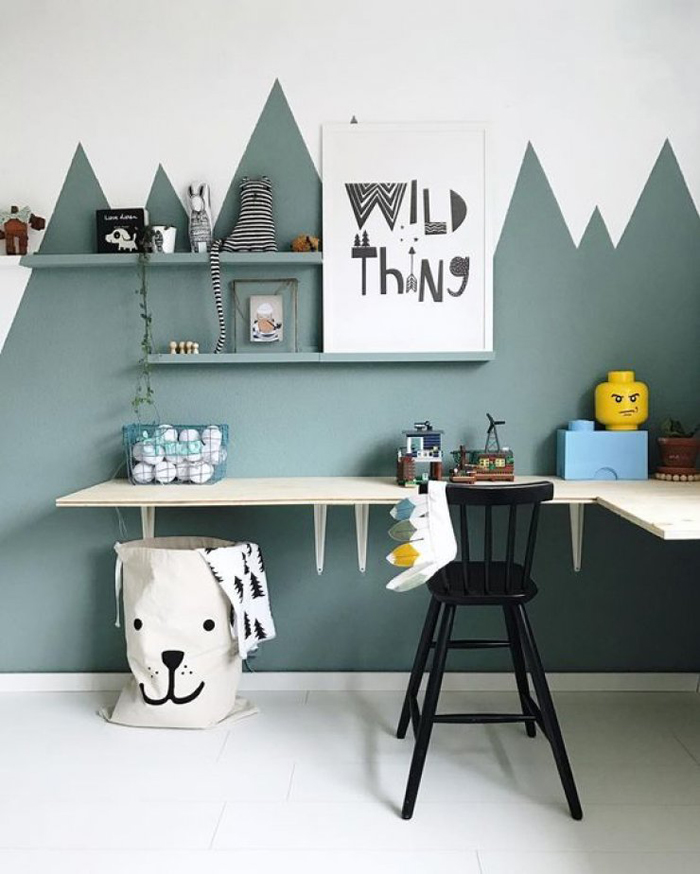
Colored paint, wallpaper, wall stickers and wall art all help to add color and character to the walls, giving the study area its own identity. This simple yet creative two-tone ‘mountain’ design on the wall, which defines the corner and separates it out from the rest of the room:

CORNER-DESK-WITH-PAINTED-WALL-FROM-MOMMO-DESIGN-BLOG-IMAGE-FROM-WILD-ONES
Image sourced from Wildones
How cool is this grey and white cloud wallpaper for the alcove surrounding the desk?

KIDS-DESK-STYLED-BY-BOBBY-RABBITImage sourced from Bobby Rabbit
5. Add a peg board

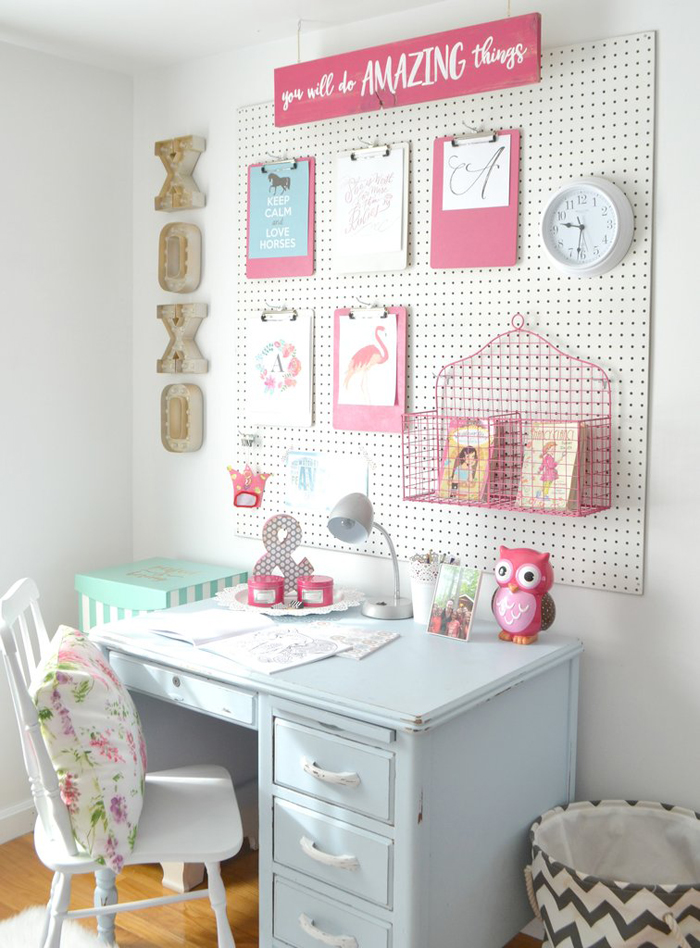
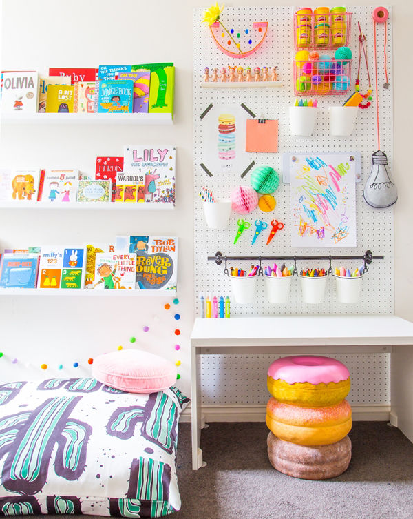
A simple pegboard above the desk is decorative, functional as storage and the perfect solution for displaying their creative masterpieces:

KIDS-PEG-BOARD-BY-AIMEE-WEAVER
Image sourced from Aimee Weaver
PAINTED-PEGBOARD-AS-SEEN-ON-PRETTY-LIFE-GIRLS-BLOG
Image sourced from Pretty Life Girls 
PEG-BOARD-DISPLAYING-WALL-ART
Image sourced from Petit and Small
So, whether it’s for a 2, 12 or 22-year-old, you can keep the study space both fun and functional by adding elements such as a bright chair or stool, a colorful shelf or pegboard or a decorative wall feature through paint, wallpaper or wall art. And let’s face it – when you have kids, there is plenty of wall art to display.

For more ideas visit petitandsmall.com

Beautiful Dining Room Designs

As a self-proclaimed lover of food, I believe the dining room is the most important room in a home (next to the kitchen, of course), so picking out a table, choosing the right chairs, and adding that perfect rug to tie it all together are very important. With so many ways to style the dining room, from rustic wooden tables to sleek touches of gold, here are some favorite looks to give you some much-needed inspiration.

dining_room_feature

Clean & Neutral
Go simple with natural tufted chairs, a sleek wooden table, and tons of white
flowers. The neutral palette is really versatile, great for changing up your
tabletop for different occasions.

dining

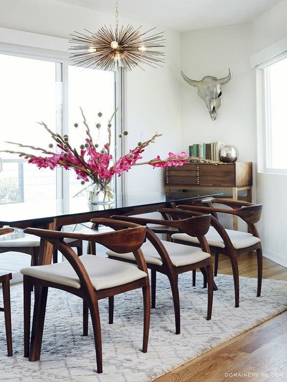
Modern & Bold
You can still keep your dining room relatively neutral with bold, modern
pieces like these exaggerated wooden chairs and metal taxidermy.
The combination is effortless.

dining 2

Inspired by Scandinavian Style
We’re always a fan of Scandinavian style, especially this simple
combination of light wood and modern white chairs. The faded palette
and modern silhouettes are staples of Scandinavian design.

dinnig 3

Mix & Match
Love the idea of mixing and matching your dining room chairs.
Choose one color palette to keep the look cohesive.

dinindg

Beautiful Mood Board Musings

Inspired by the beautifully sculptural effect of curved architectural walls, the work of French interior designer Francois Champsaur, has a beautiful smooth timber finish.

Trocadero_1.jpg
Trocadero Apartment by Francois Champsaur

Bold in black and incredibly textural, this piece was designed by CM Studio.
It features a distinctive curved batten pod that cleverly conceals the apartment’s bathroom.

mood 2.jpg
CM Studio / Photograph by Kelly Geddes

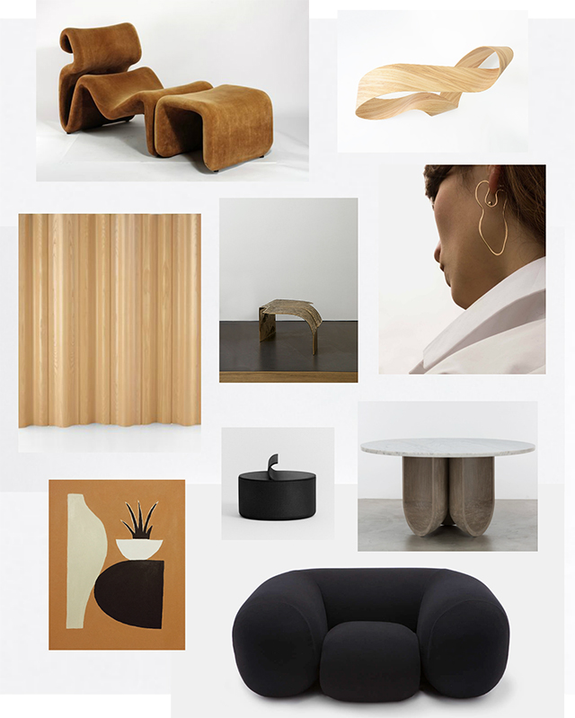
Curved walls are visually interesting and work well to soften sharp lines of an
interior space. The same effect can be created with a room divider, furniture,
or smaller design pieces such as ceramics and art. Here are some examples.
mood 3.jpg

Beautiful Pop-Up Shop Interiors

Reoccurring conceptual pop-up shops have become the latest and most innovative way to access up and coming ideas in design and fashion. By opening up home spaces to photoshoots, conceptual stores and events, a new trend in home design is emerging.

The Loft is a periodically recurring conceptual pop-up store. It beautifully expresses the eclectic nature of their values with our choice of products. I’m particularly fond of the natural materials like wood, steel, leather, glass, wool and ceramics. These materials tell a lot about the love and attention invested in a product. It shows its age and origin, its history, the way it was crafted. Learn more about the Loft studio here and swoon.

Loft 1.jpg

I love the whimsical nature of the space and objects.

loft-3Loft 2.jpgloft-4loft-5Loft 6.jpgLoft 7.jpgLoft 8.jpgLoft 9.jpgloft-10Loft 11.jpg

Beautiful Place To Stay In Barcelona, Spain

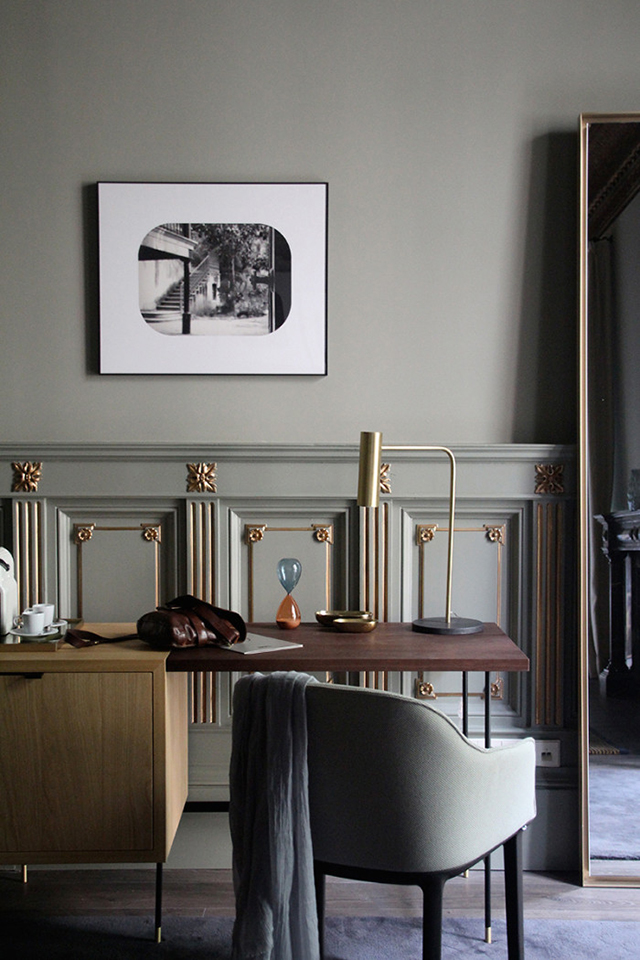
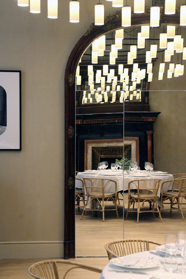
Casa Mimosa is a new hotel by the H10 hotel chain, designed by Tarruella Trenchs Studio. Located in Barcelona, the hotel design integrates original elements of the building by blending them with contemporary features. Muted colors and reclaimed elements such as coffered ceilings, moldings, trim and fireplaces create a comfortable, relaxed atmosphere, while the rooms have a beautiful mix of warm walnut wood, brass and velvet. Custom-made elements such as the headboard, desk and brass lamp sit alongside design pieces such as the Vitra Softshell Chair and Bai Di Di Suspension Lamp by Parachilina. What a dream it would be to stay here!

deja_que_te_mimen_2.jpg3.jpg4.jpg5.jpg

Images via Infurma and Tarruella Trenchs Studio
Via T.D.C.

Beautiful Reading Nooks

Reading is one of my favorite past times however lately I’ve been doing most of it
on plane while traveling. During the year it’s usually reserved for bedtime but when
I do have the time I prefer one of these type of spaces. Though summer calls for
outdoor reading spaces, reading nooks are a must all year round in Seattle.
For tips on how to create a cosy space, check out this article These four
beautifully styled reading nooks feature warm, muted color palettes and serious
arm-chair inspiration.

1.jpg
Via Woonhuis, featuring The Swamp Oil on Canvas by Dutch Painter & graphic artist
Anton Mauve (1838-1888).

2

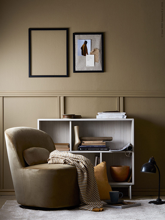
Loving these colors. “Modern Mustard” Styling by Pella Hedeby / Photography by Ragnar Ómarsson for Ikea Livet Hemma

3.jpg
Gubi Beetle Lounge chair in velvet. Via Artilleriet Blog

4.jpg
Love this moody space in festive green. Styling and photography by Daniella Witte
for Ikea Livet Hemma