Museums like the Guggenheim and the Louvre are ingrained in our culture and are best known for their impressive collections and beautiful architecture. These institutions often make it onto top museum lists, and for good reason. People love them, but I’m here to introduce you to some lesser-known, but equally noteworthy museums that are architectural marvels in their own right. From science and technology to art and history, these modern galleries from around the world are works of art that you can admire without even setting foot inside.
THE ROYAL ONTARIO MUSEUM in Toronto, Ontario
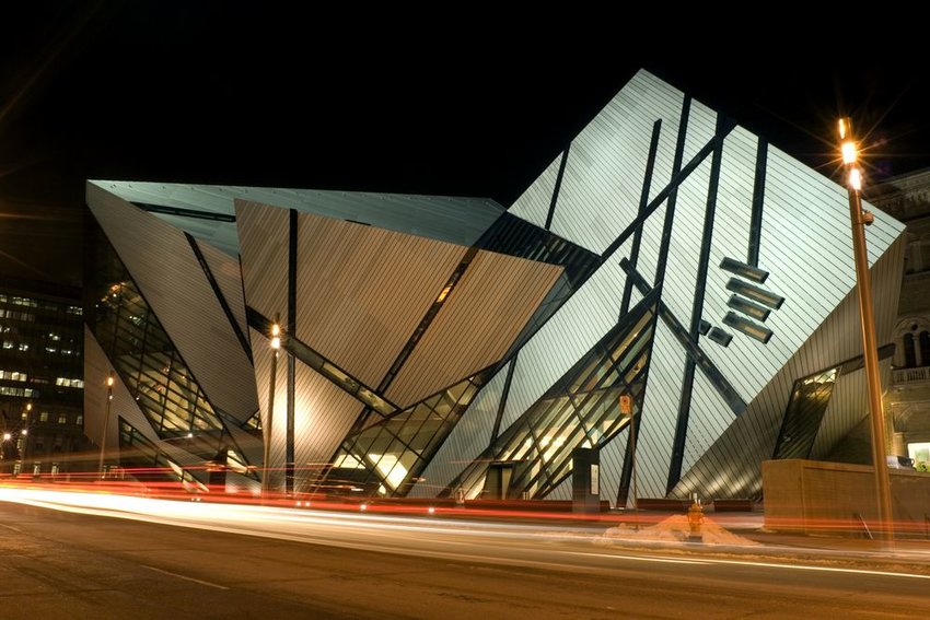
Visit the largest museum in Canada during your next trip to Toronto. The Royal Ontario Museum features exhibits of art, world culture, and natural history and attracts more than one million visitors every year. The historical buildings of the existing structure are complemented by a bold new façade of prismatic glass and metal. According to Studio Libeskind, the architectural firm in charge of the project, the crystal-like atriums presented unique design challenges making it “among the most complicated construction projects in North America.” Besides the impressive multi-million dollar expansion, other reasons to visit include the museum’s vast collection of archaeological specimens as well as its array of design and art pieces.
LOUIS VUITTON FOUNDATION in Paris, France
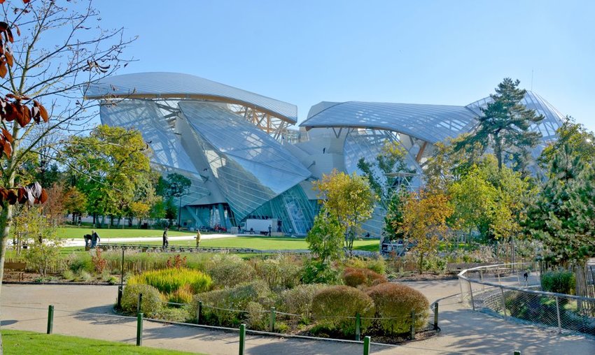
Since 2014, the Louis Vuitton Foundation’s art museum in Paris has introduced visitors to exhibitions promoting modern and contemporary artistic creation. The museum is a production of world-renowned architect Frank Gehry. Its design presented builders with unprecedented technical challenges, namely its clustered white blocks (that the team called icebergs) and twelve glass “sails” supported by wooden beams. The interior design is just as impressive as the exterior — opening up to vast, lofty halls with plenty of natural light. The glass walls and ceilings not only provide epic views of downtown Paris from top floors but also play with the museum’s artwork through light, mirrors, color, and more.
MILWAUKEE ART MUSEUM in Milwaukee, Wisconsin

Located on the coast of Lake Michigan in downtown Milwaukee, Wisconsin is one of the largest art museums in the United States. The Milwaukee Art Museum is home to nearly 25,000 works of art including an extensive Georgia O’Keeffe collection. The museum is comprised of three buildings including the War Memorial Center, Cudahy Gardens, and the Quadracci Pavilion — the iconic glass building that opened in 2001. The 90-foot glass ceiling features a 217-foot moveable, wing-like screen that unfolds twice daily. Called the Burke Brise Soleil, these “wings” open at 10 in the morning, flap at noon, and close when the museum closes. The pedestrian suspension bridge conveniently connects the museum to the city.
MIHO MUSEUM in the Koka Forest, Kyoto, Japan

Located in the dense forest of Koka near Kyoto, Japan, the MIHO Museum offers visitors a unique architectural experience that blends manmade structures and natural surroundings. Designed by famous architect I. M. Pei, the steel and glass structures of the museum were designed to contrast against the panoramic views of the mountains and valleys below. Visitors first walk through an arched tunnel to reach the museum entrance, which is one of the only above-ground structures in the complex. In an effort to preserve the natural environment, about 80% of the museum is underground. The exhibits at MIHO frequently change with a focus on ancient works from the Egyptians, Romans, and Asian cultures.
MUSEO SOUMAYA at PLAZE CARSO in Mexico City, Mexico

The Museo Soumaya has become a highlight of Mexico City’s art scene with its shimmering, anvil-shaped exterior and impressive art collection ranging from MesoAmerican history to modern day. While the museum technically consists of two buildings, the most popular is the new structure at Plaza Carso, where the primary museum collection was moved in 2011. This nine-story building made of 16,000 aluminum hexagons was designed by Fernando Romero, who commonly focuses on fluidity in his designs. As one of the most-visited museums in Mexico, it’s no surprise that its list of A-list displays is lengthy. Don’t miss the vast collection of artwork by Rodin including the famed sculpture “The Thinker” — a permanent exhibit here.
MAXXI NATIONAL MUSEUM IN ROME, ITALY

The MAXXI National Museum of 21st Century Arts focuses on contemporary art and architecture. Upon opening in 2010, this museum designed by architect Zaha Hadid received a Stirling Prize for architecture by the Royal Institute of British Architects. The massive complex consists of two sections — “MAXXI Art” and “MAXXI Architecture” — along with an outdoor courtyard for large-scale works of art. The interior stairways and walking paths overlap to create an exciting and dynamic environment for visitors. The museum’s most prominent architectural features are its curved, concrete walls and suspended, black staircases. Its interior colors and structures are a nod to the overarching theme of the museum — to promote contemporary art and architecture.
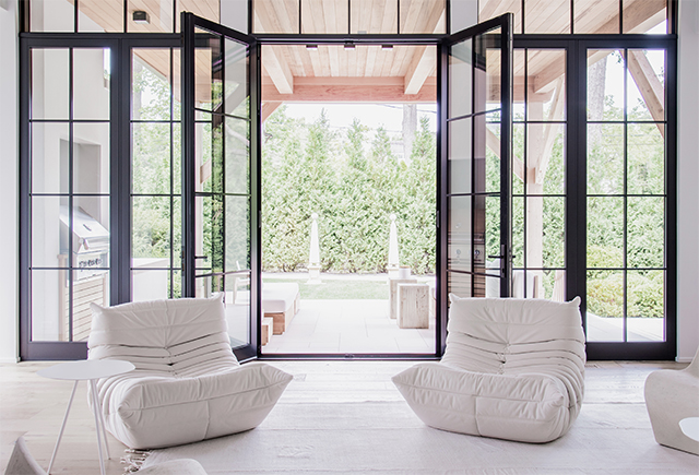
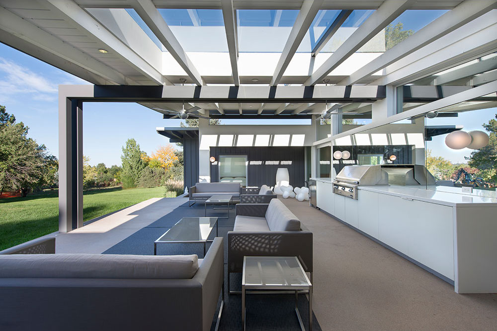
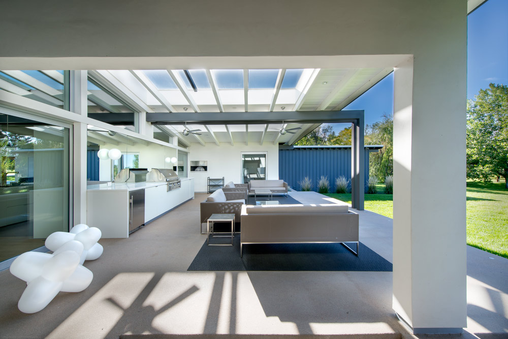
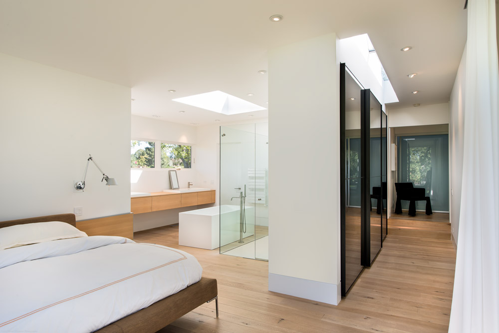


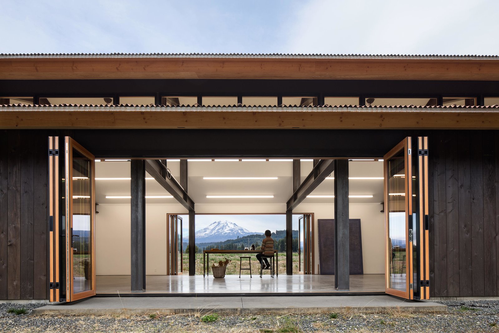
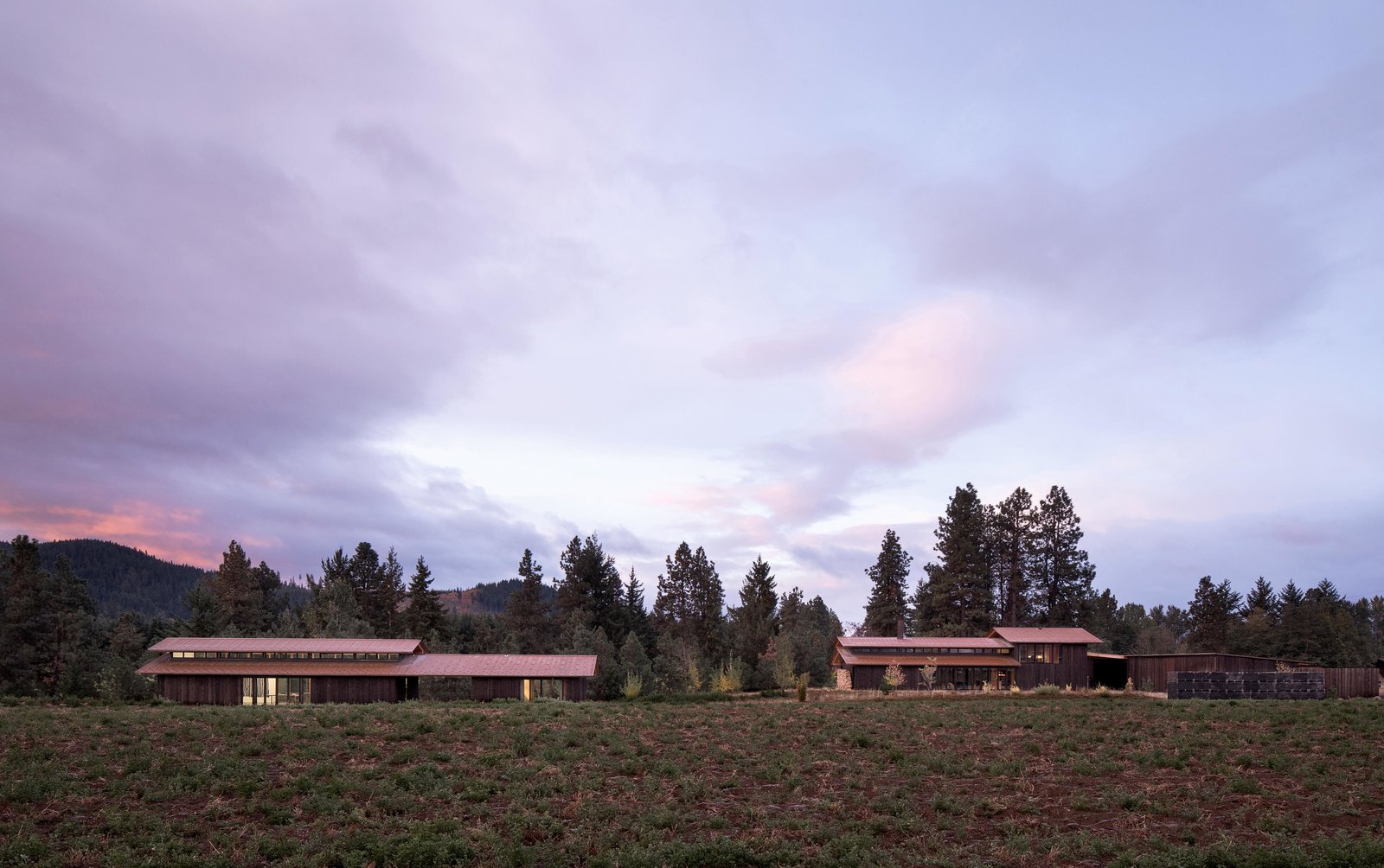
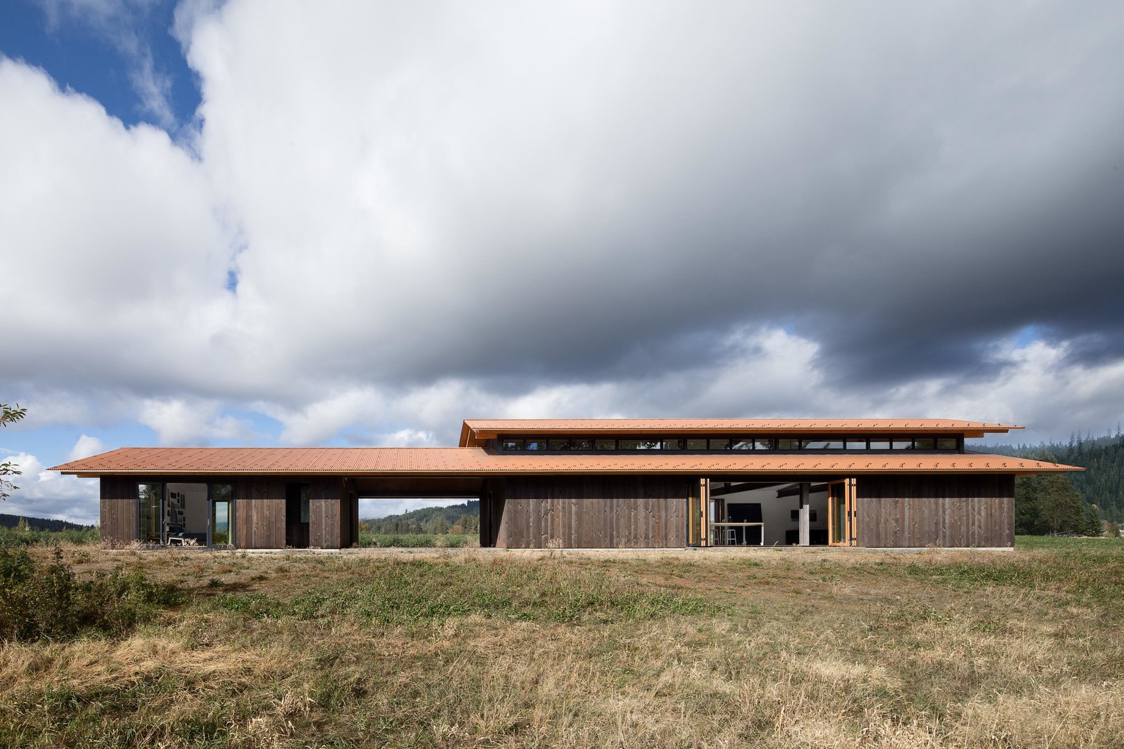
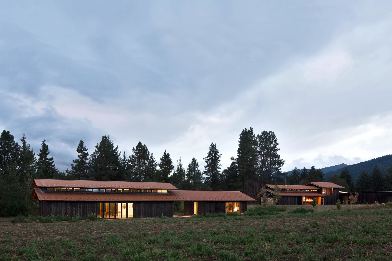
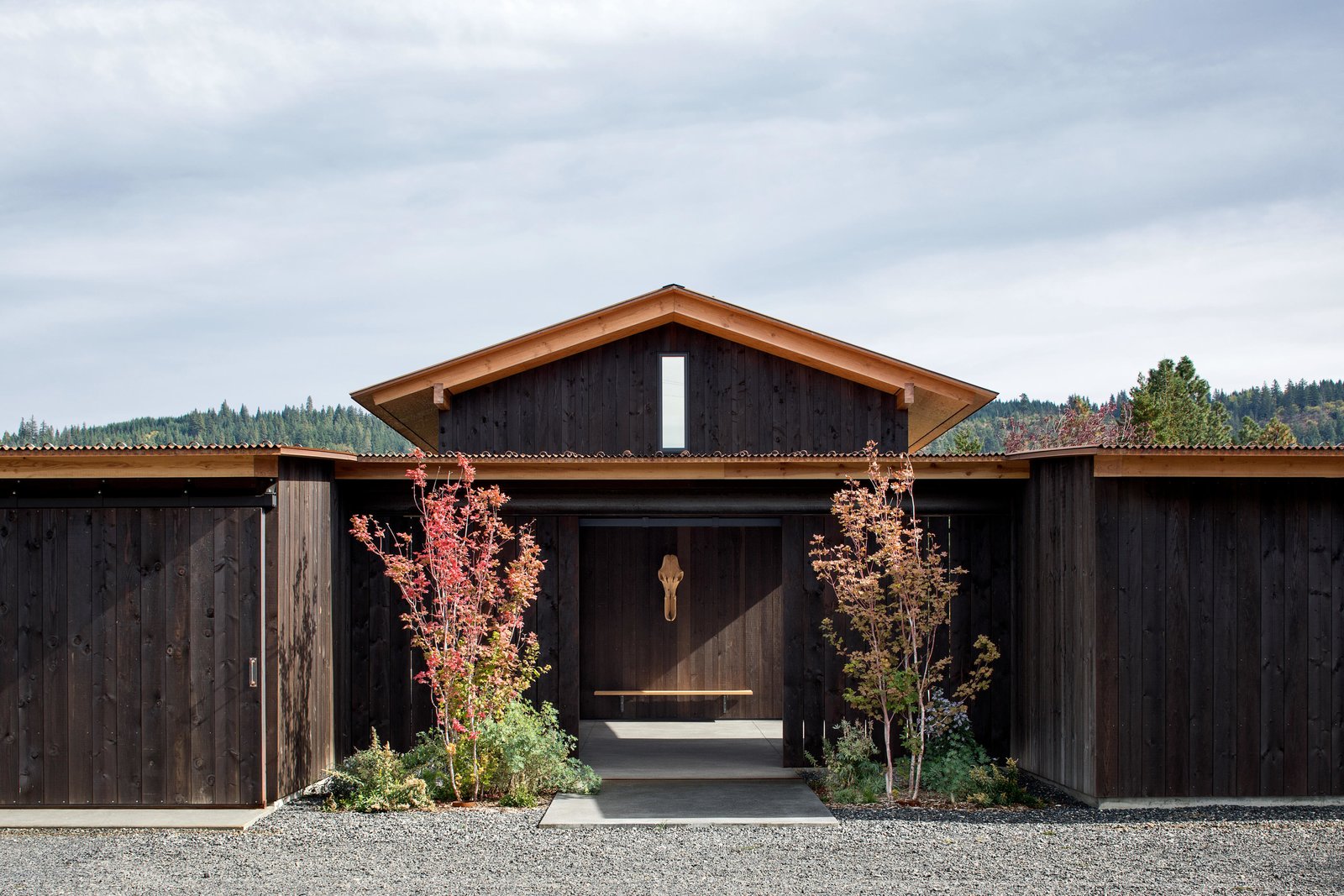
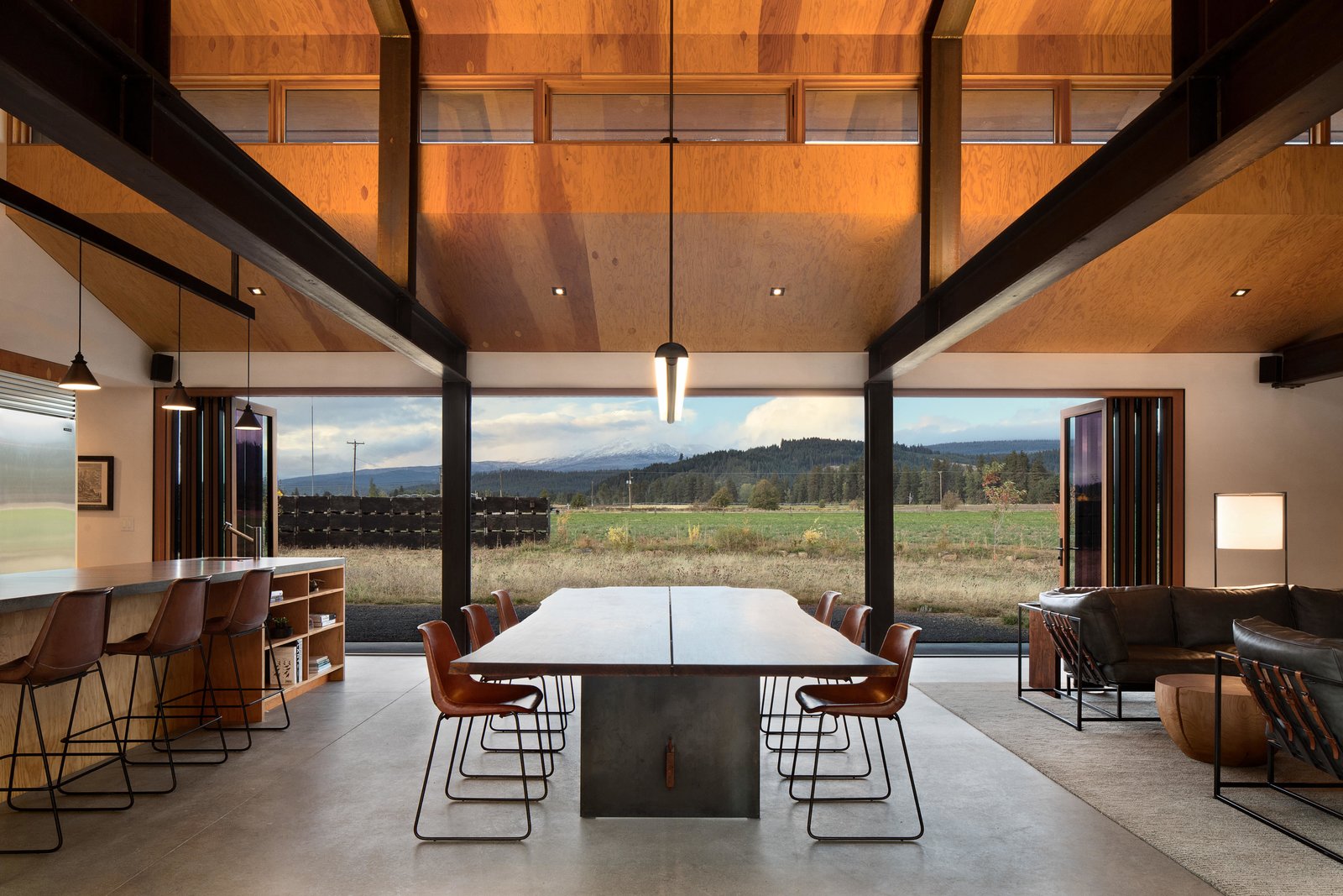
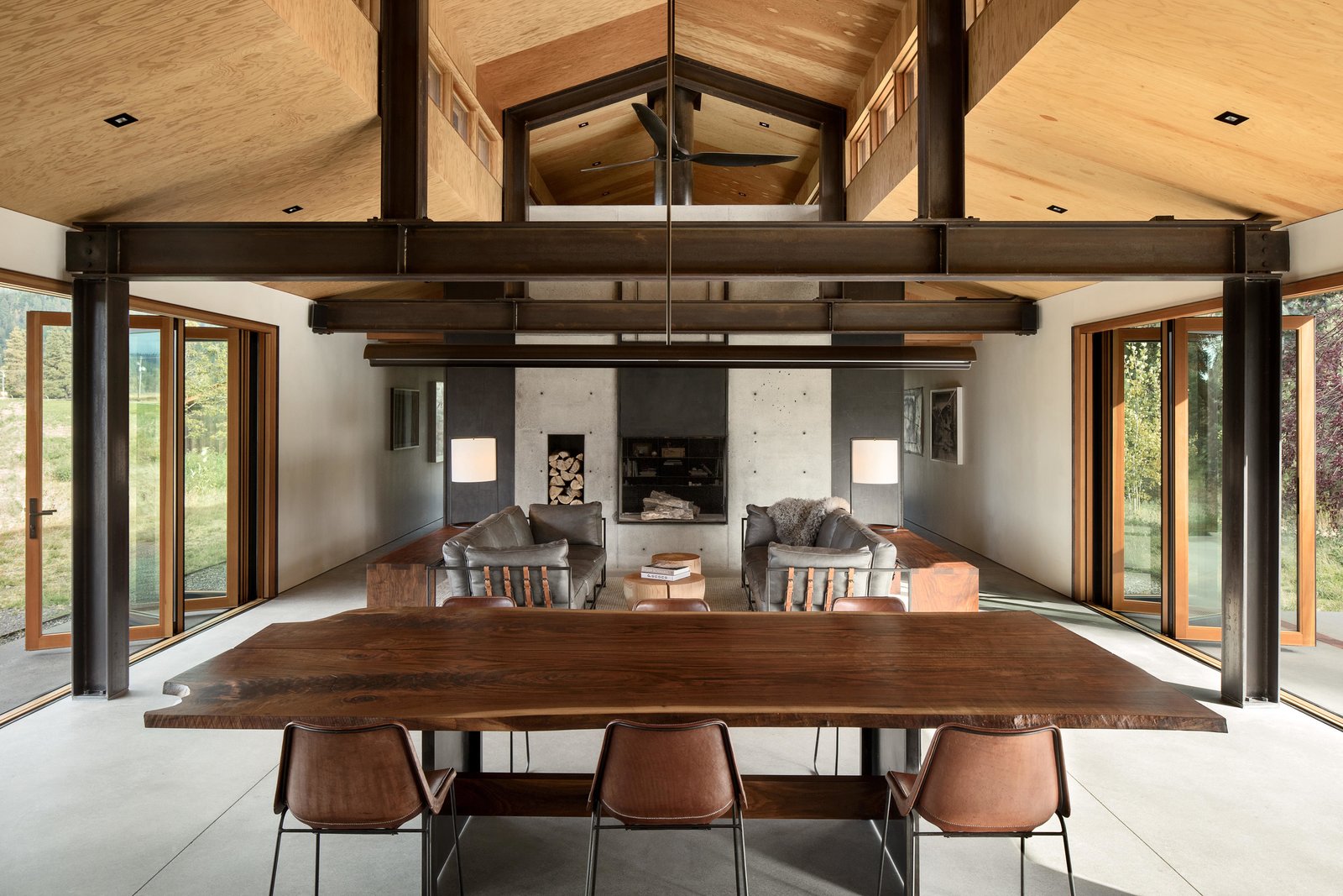
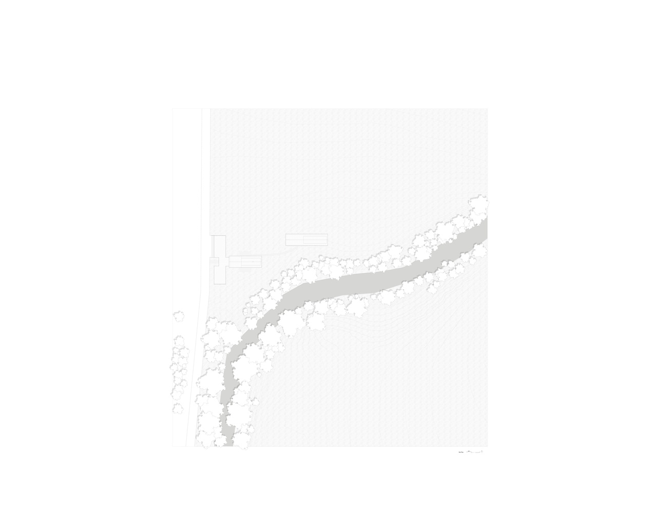
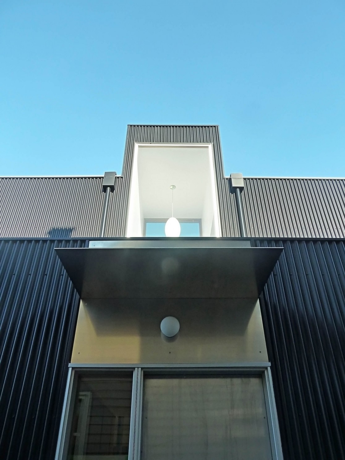
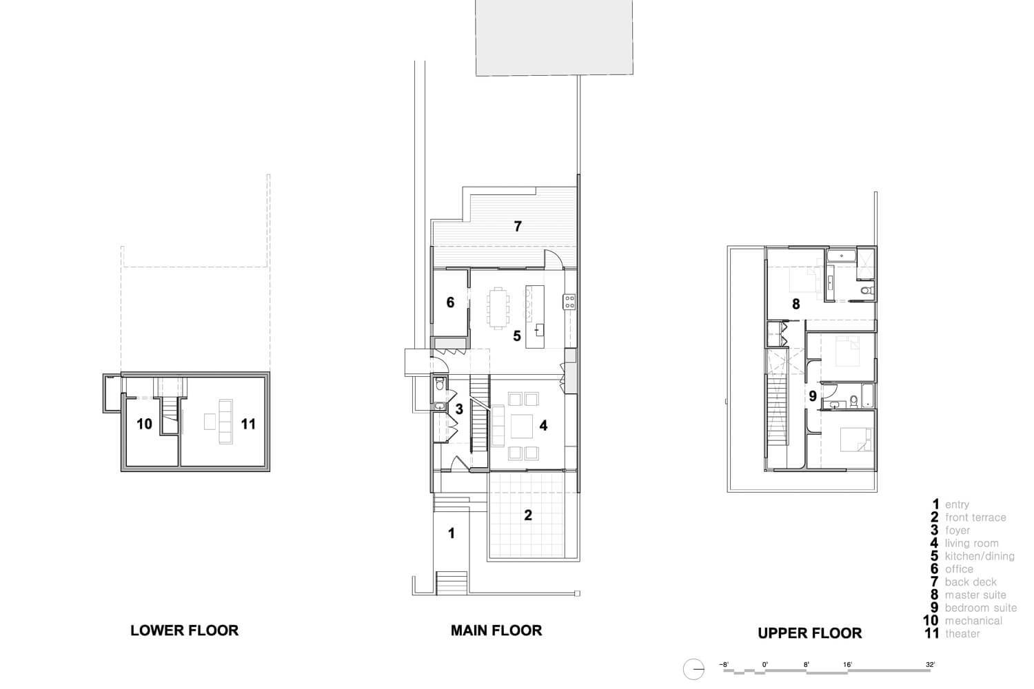
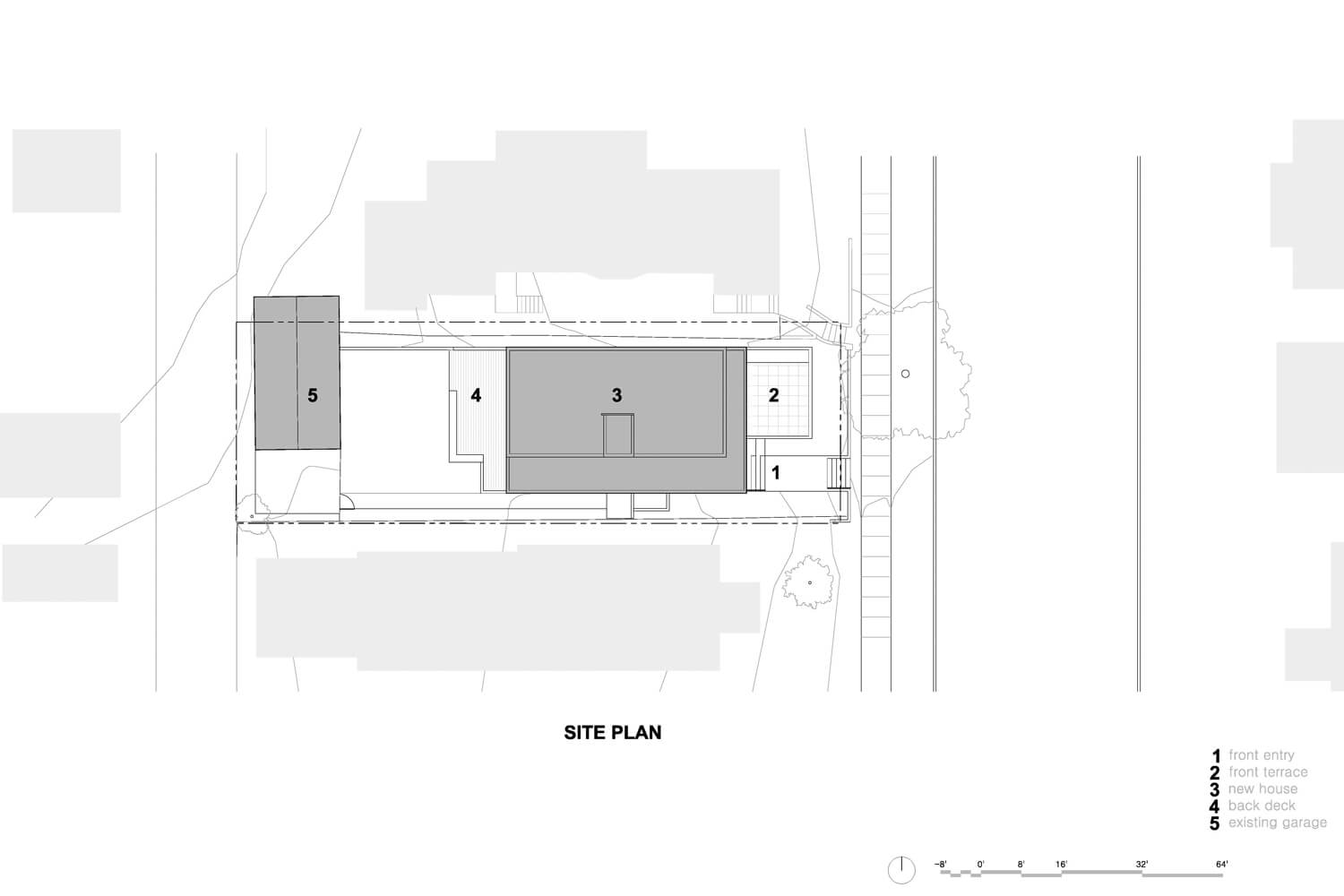
 The retreat contains four distinct buildings arranged in two groupings. The first grouping contains the main house, a woodworking shop, and a carport all contained under a single roof in a T-shape. A covered courtyard connects the three spaces in the middle of the “T”. A separate, free-standing artist studio is located just northeast of the main house, with a covered patio that connects to a guest room. Here, the owners work on their own projects, and occasionally host retreats and community-based arts workshops. In all four buildings, large bi-folding doors and sliding barn doors open up the spaces completely to the outdoors, allowing for the movement of large artworks and equipment, as well as an intimate connection with the environment.
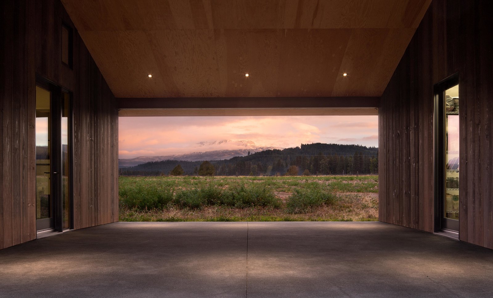
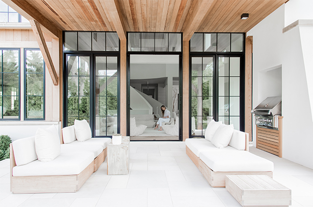
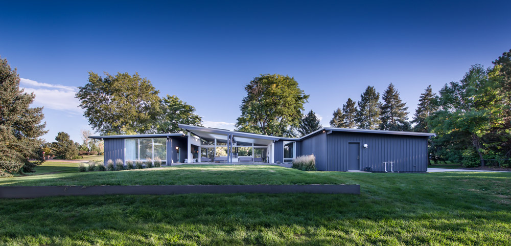
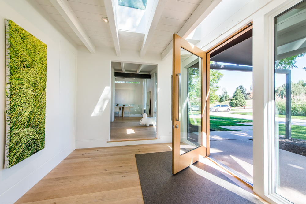
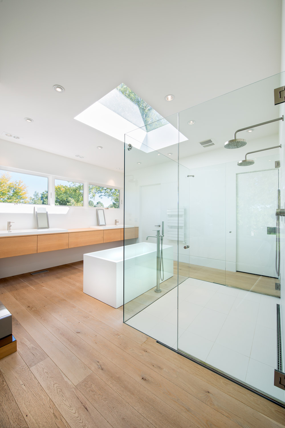
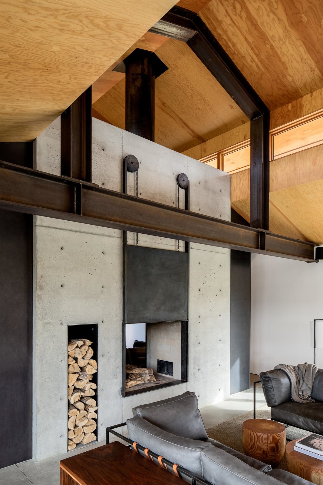
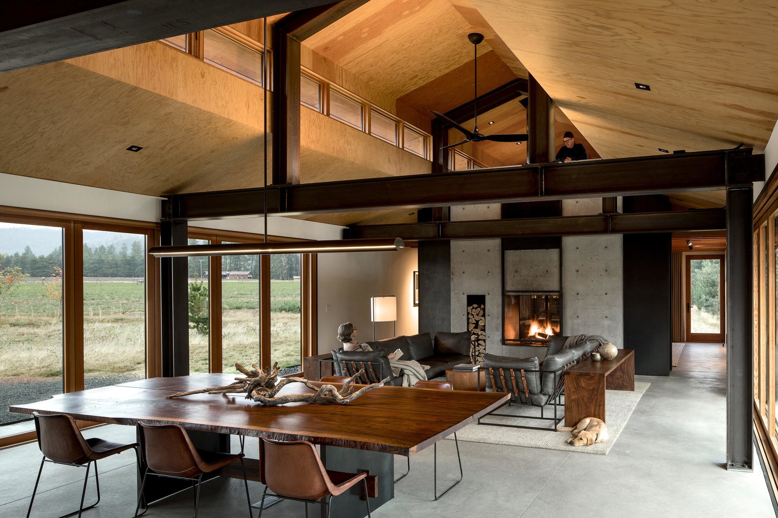
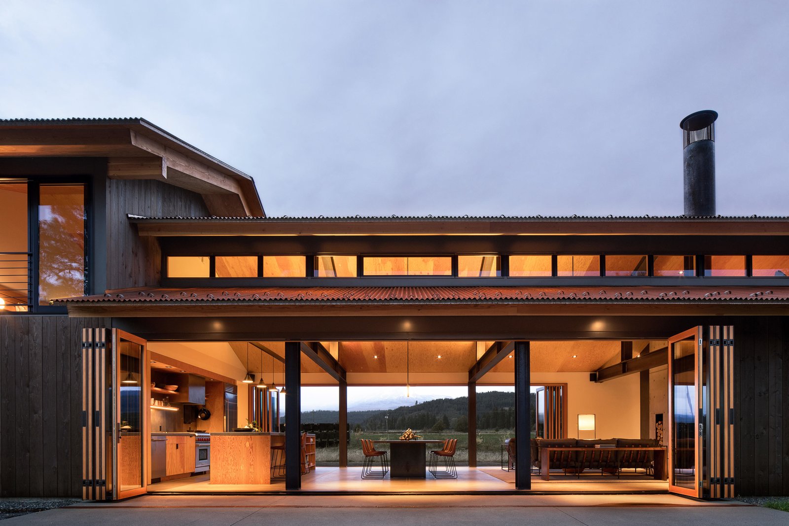 The main house is minimal in form, consisting of a single double height volume with an open plan living, dining and kitchen area separated from a library by a double-sided fireplace. A set of hidden steel stairs nestled into the concrete fireplace lead to a loft above the library. The home’s single bedroom is located above the bathroom and mudroom and is accessed via a set of open stairs in the entry foyer. Two sets of 30-foot-long bi-fold doors in the main living space allow the home to open completely on both sides, maximizing the home’s sweeping views of the nearby river and Mount Adams.
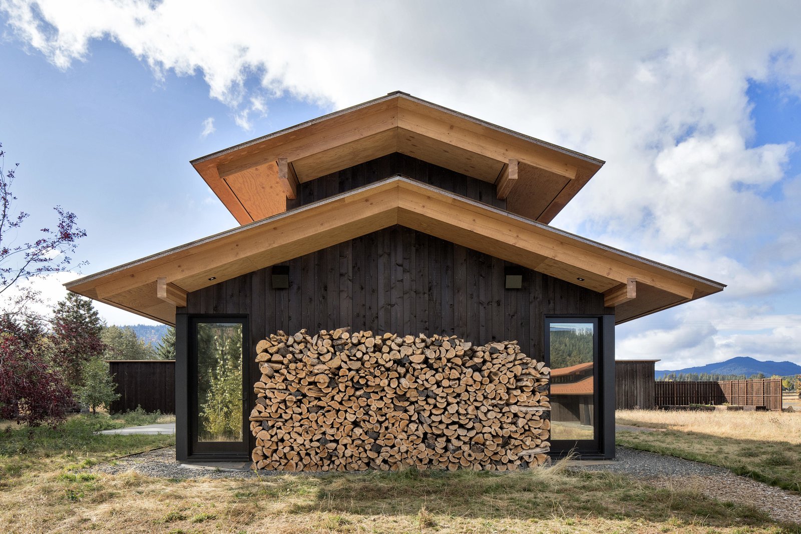
 Main Level
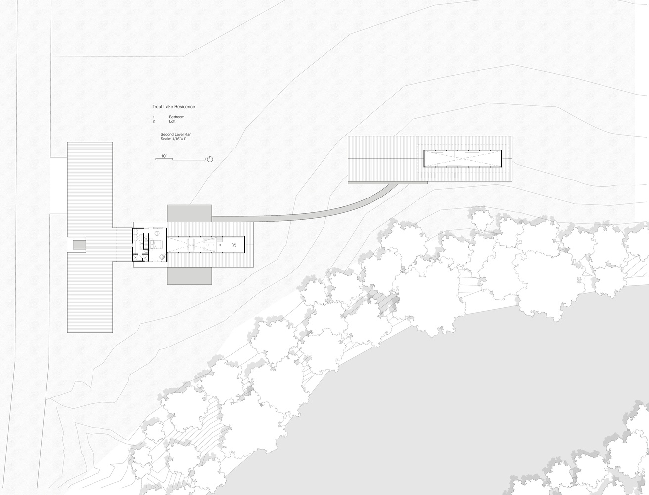 Second Level
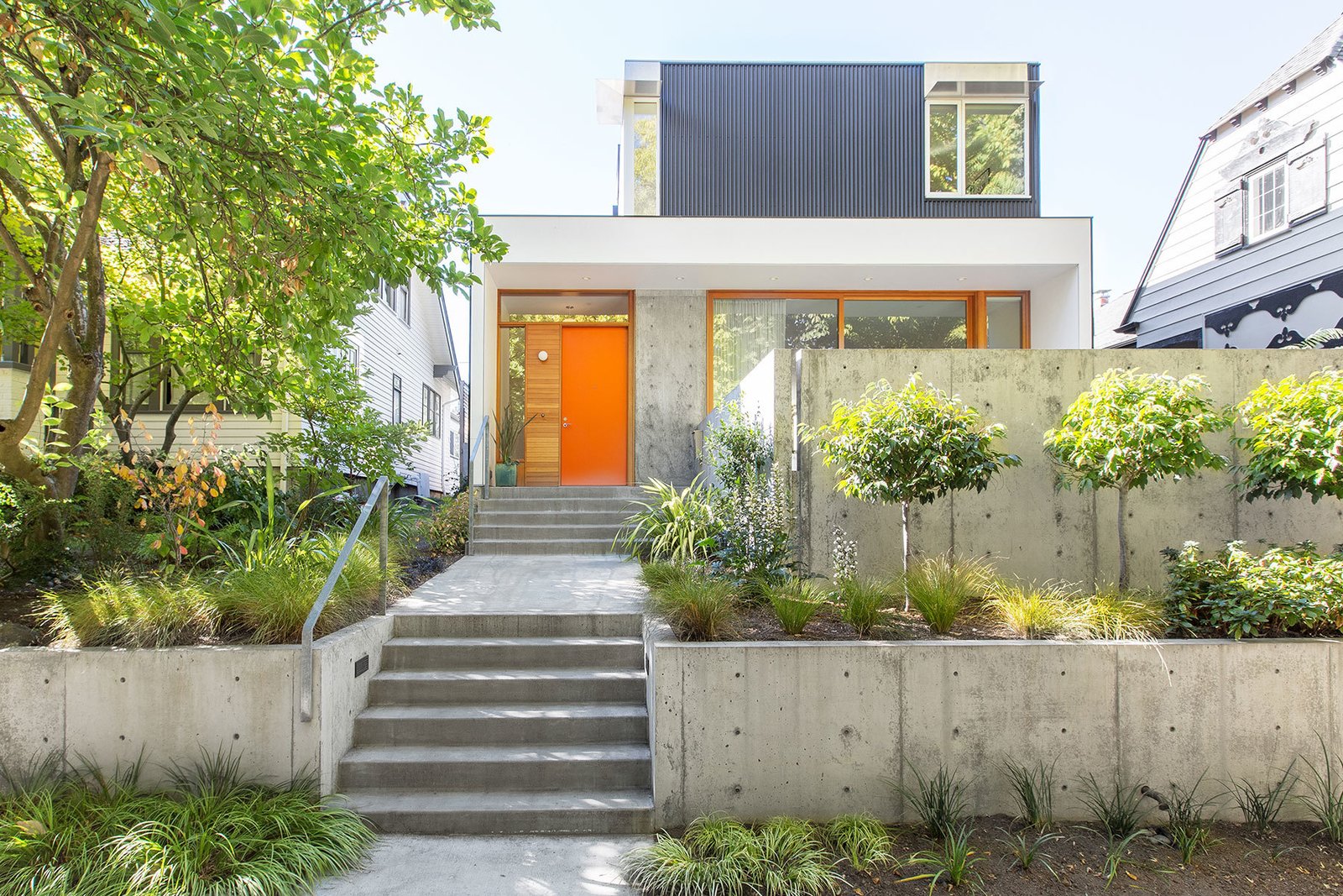


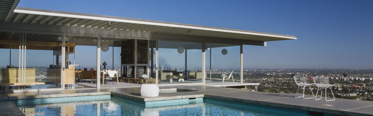
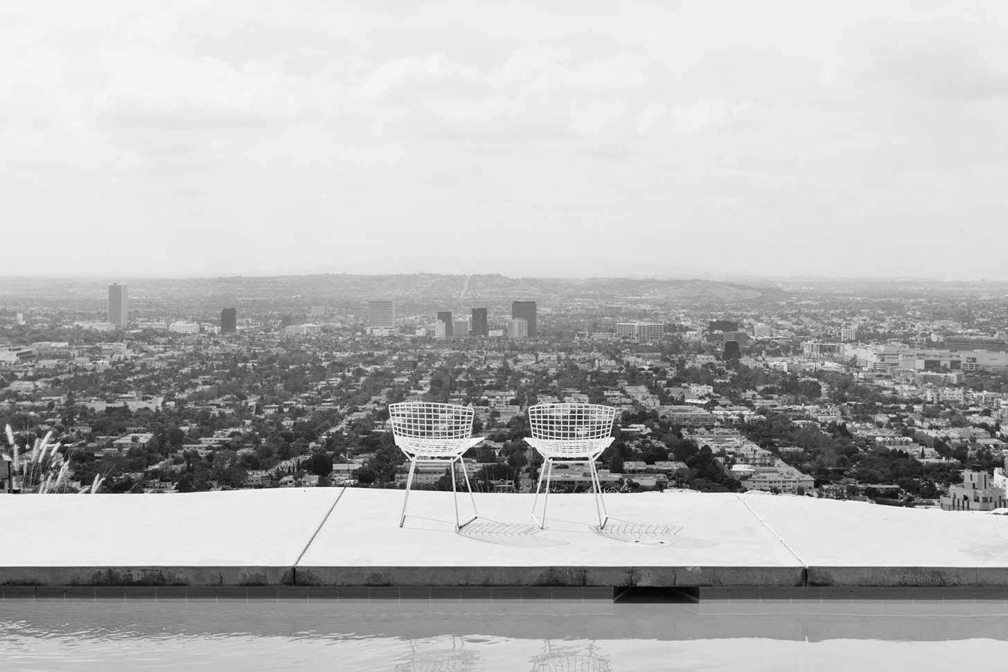
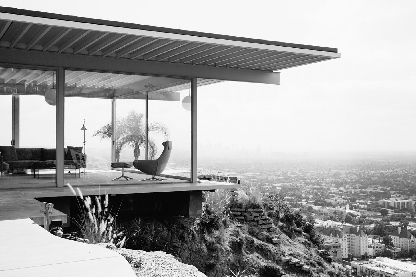 The image is instantly familiar; the house, all dramatic angles, concrete, steel and glass, perched indelibly above Los Angeles, with Hollywood’s lights resembling a circuit board below it. Inside, two women sit, stylish and relaxed, talking casually behind the monumental floor to ceiling glass walls. One of the world’s most iconic photographs,
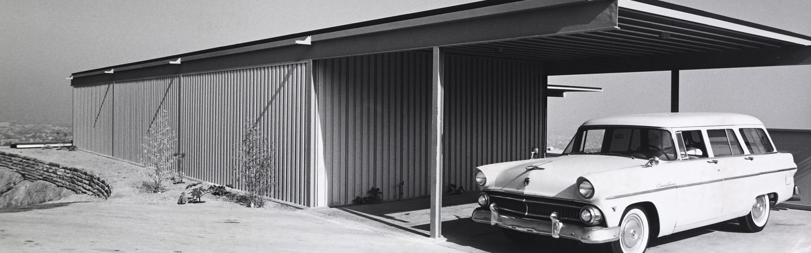
 Buck was a former professional footballer who worked as a graphic designer and sign painter. He spent his first few years as a landowner hauling broken blocks of concrete to the site in attempt to improve its precarious foundation. He and Carlotta ferried their finds, load by load, back to Woods Drive in the back of Buck’s Cadillac, hopeful the reinforcements would prevent the land from sliding. Buck’s dreams for the house began to take shape over the following two years, and eventually, he made a model of the future Stahl House. His grand designs, however, were promptly rejected by several notable architects.
 Carlotta recalled Buck continually telling prospective architects “I don’t care how you do it, there’s not going to be any walls in this wing.” Until they hired Pierre Koenig in 1957, an ambitious young architect determined to build on a site nobody would touch, it seemed unlikely the house would ever exist. Pierre described the process of building Stahl House as “trying to solve a problem – the client had champagne tastes and a beer budget.” He was interested in working with steel, and despite being warned away from it by his architecture instructors, possessed great aptitude for it. He’d experimented with a number of exposed glass and steel homes before he created Case Study 21, or The Bailey House in 1958 and 1959, and his skill for designing functional spaces with simplicity of form, abundant natural light, and elegant lines would eventually make him a master of modernism. Stahl House, completed in 13 months and costing 37,500 USD, further demonstrated Pierre’s flair for working with industrial materials, particularly steel, glass, and concrete. The project put him on the map as an architect with an incredible eye for balance, symmetry, and restraint. The 2,040 m² house was, as Buck insisted, built without walls in the main wing to allow for sweeping 270º views. Three sides of the building were made of plate glass, unheard of in the late 1950s, and deemed dangerous by engineers and architects. This design feature required Pierre to source the largest pieces of glass available for residential use at the time. With two bedrooms, two bathrooms, polished concrete floors, and a very famous swimming pool (a fixture in countless films and fashion editorials) Stahl House was an immediate mid century icon.
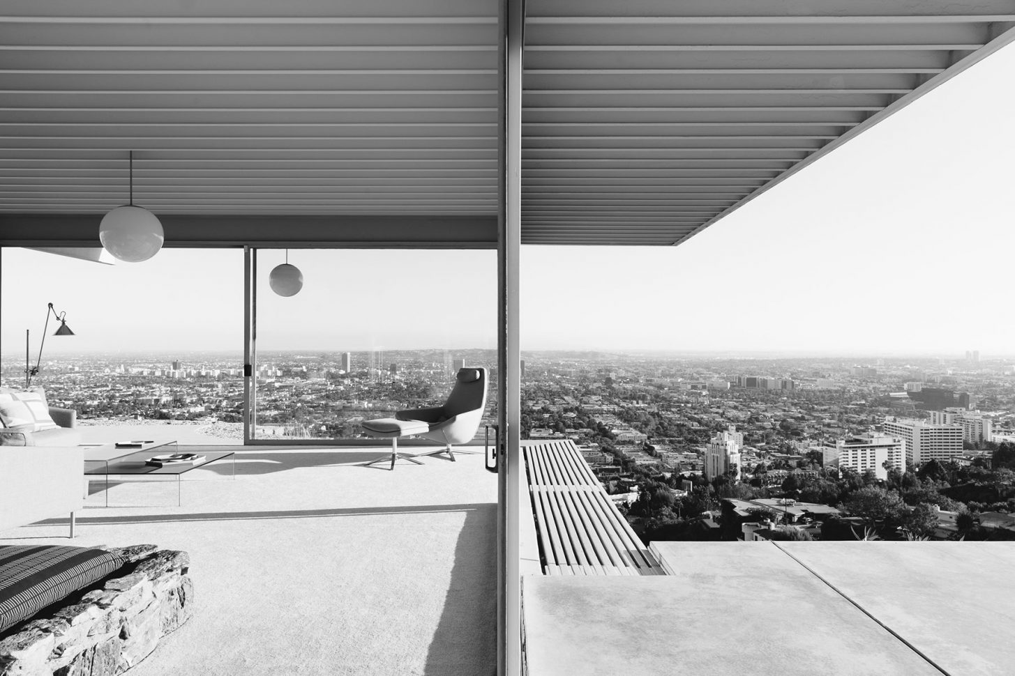


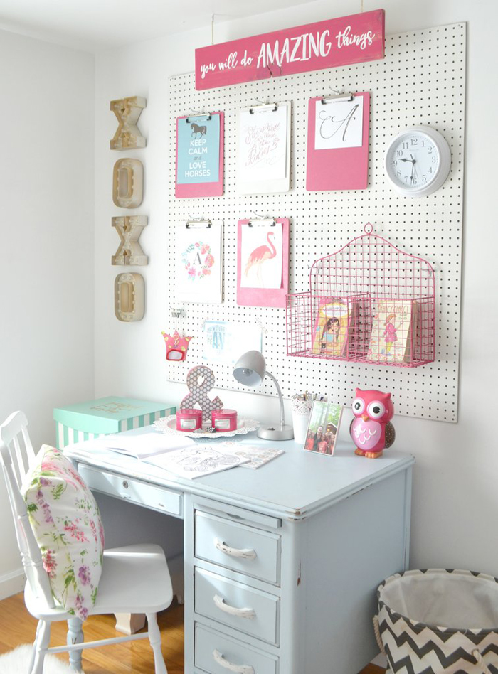
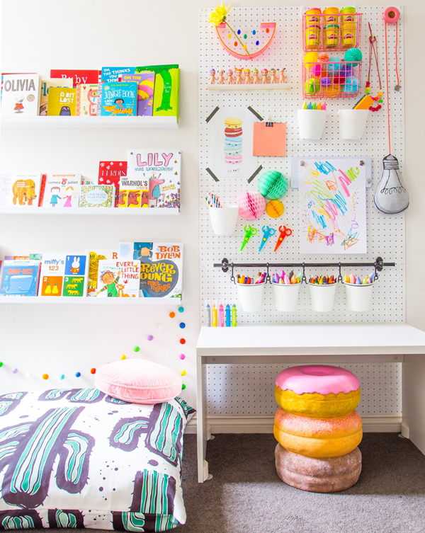
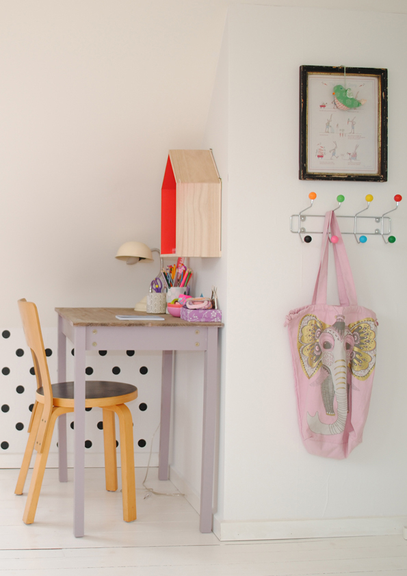 September is almost here and that can only mean one thing: back-to-school time! But homework doesn’t have to be boring – and neither does your child’s desk. Whether it’s for homework, drawing, coloring or simply chilling with a favorite book, study spaces can be both functional AND fun.
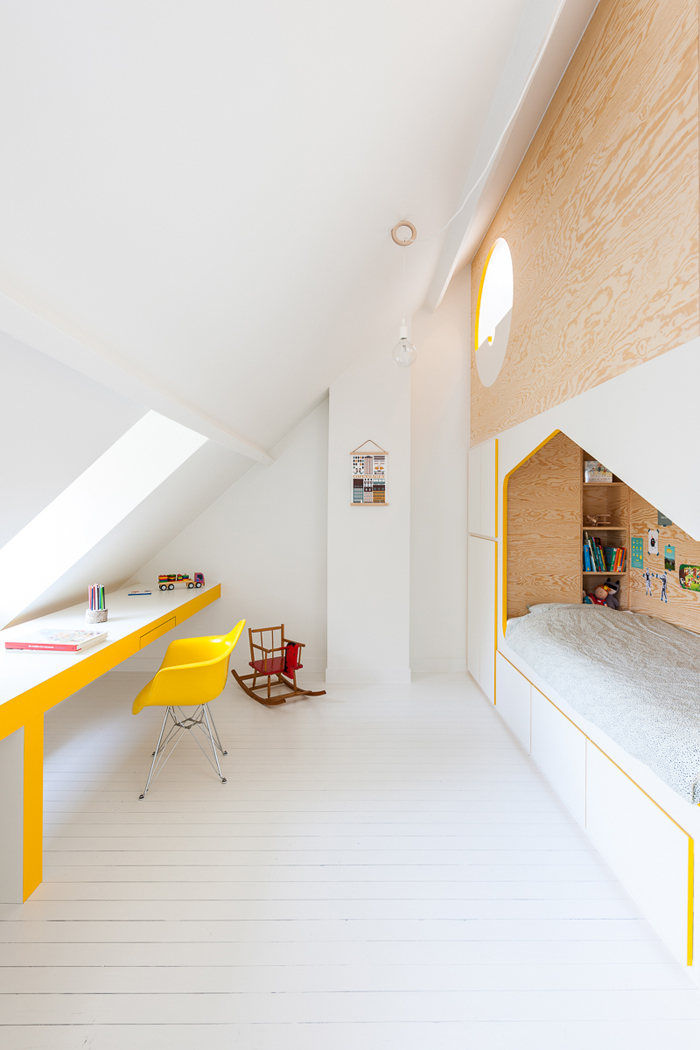
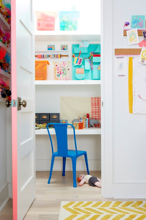
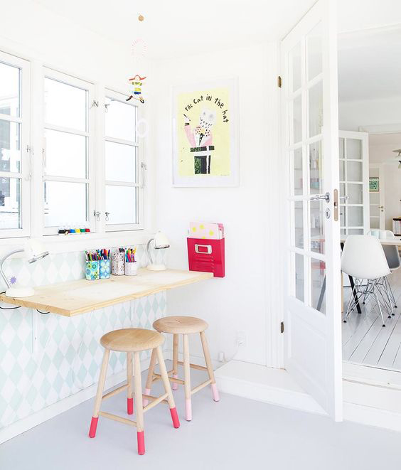
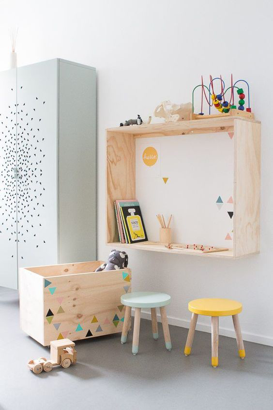
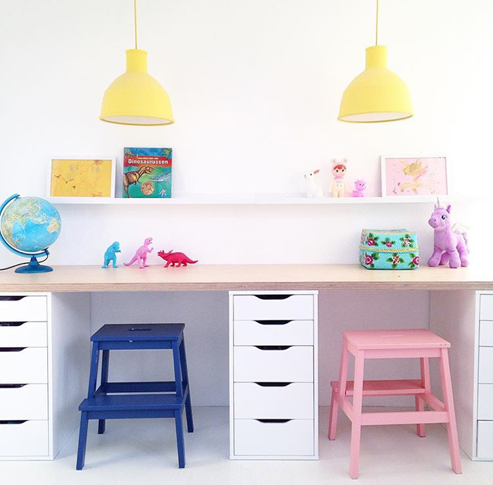
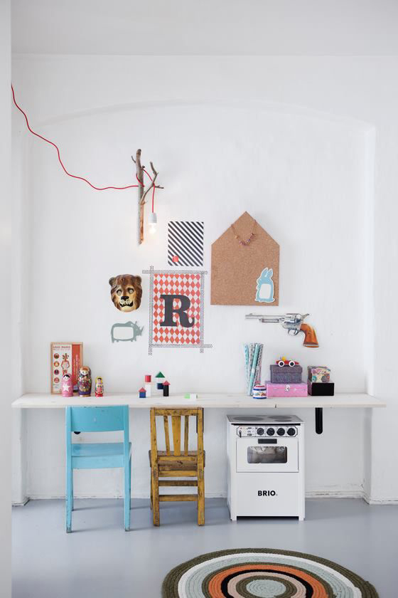
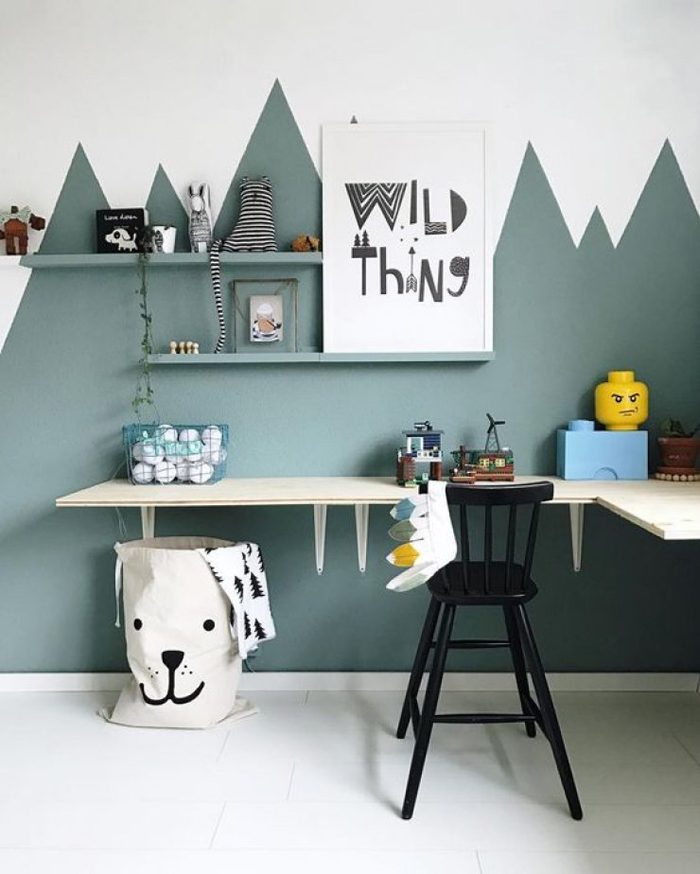
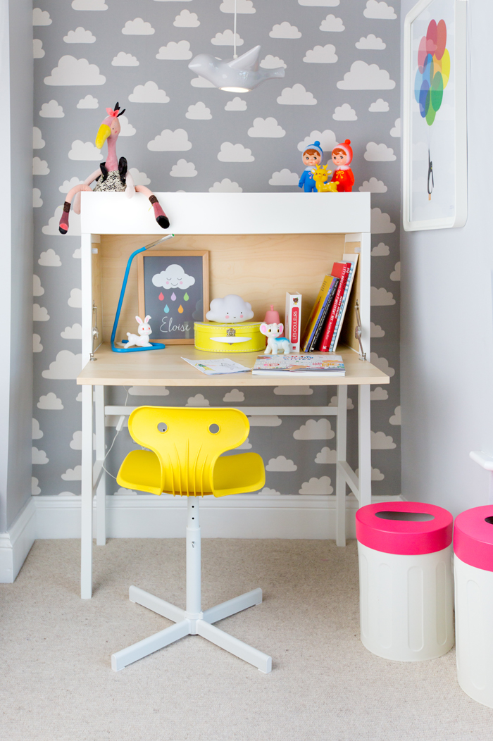 Image sourced from