Beautiful Textiles

Swedish brand HIMLA has launched a unique collaboration with interior
stylist and photographer Daniella Witte, and the imagery she has created
is stunning. Representing Scandinavian Simplicity, most of HIMLA’S products
made from linen, but they also work with other natural materials like wool,
silk and cotton.

living_curtains_Daniella-Witte.jpg

Using textiles from the range, Daniella has created a relaxed interior with
natural colors and a simple aesthetic. Beautiful stone floors are softened
with sheer linen curtains and a warm layering of textiles that carry through
to every room in the home. These include soft rugs underfoot in the living
room, scattered cushions on the sofa and a lovely layering of tablecloth and
napkins on the dining table. Bathed in light, the bedroom is my favorite.
Read more about this inspiring collaboration here. Love the stone floor!

bath 1dining_soulliving areafabricstone floor.jpg
bedroom.jpg
Styling and photography by Daniella Witte for Himla via TDC

Beautiful Renovated Home

This beautiful Copenhagen apartment was featured in
Elle Decoration South Africa earlier this year.
Copenhagen living room
Located in the Frederiksberg, the couple renovated the once run-down
apartment themselves. Restoring the original architectural detailing,
they have introduced new contemporary additions to provide a strong
yet understated contrast. The couple have also incorporated their own
stories and heritage. Justine’s South African roots can be seen in details
such as the fabrics and lithographs created by artists such as her aunt,
South African artist Deborah Bell.

Copenhagen chairCopenhagen bedroom.jpg
Bringing in a number of delicate heirlooms, Jonas’s Danish upbringing
is also evident. Featuring natural materials such as wood and stone, the
home showcases the pair’s attention to detail and the interaction between
origins, functionality and aesthetics. The end result a beautiful!

Copenhagenlights.jpg
Images 1-5 Styling Marie Monrad Graunbøl / Photography by Mikkel Tjellesen via Elle Decoration.  Last image via justinebell.com

Beautiful Pink House

4-Laurinda-Spear-Bernardo-Fort-Brescia-Arquitectonica-The-Pink-House-Miami-Shores-1976-79-Photography-by-Eric-Meola

The Pink House, otherwise known as The Spear House, is one of the best known and most photographed residences in Miami, Florida. It is a quintessential symbol of modernism and sits at the edge of Biscayne Bay in the older Miami suburb of Miami Shores, is intended as an urban house within a suburban context. Rigorously conceived as a study in different planes, the house is painted give shades of pink, ranging from deep near-red to pale pink, which heighten the illusionistic perspective of the house and define the series of planes. Pink was chosen because it seemed to be the most tropical of all colors and at the time was rarely used. Many factors make the house interesting bit its controversy has all the intrigue. designed by Laurinda Spear and Bernardo Fort-Bescia of Arquitectonica for Spears’ parents in 1976, it’s a series of planes and framed views designed to maximize East/West breezes.

The Pink House, Miami Shores, Florida, 7800

Although the house was initially conceived as an object standing on its own, the west façade, facing the city, is scaled down; its dimensions diminish to relate to other houses on the street in an almost mathematical cadence. The east façade, designed for long-distance viewing from Miami Beach and the bay, is scaled so that it looms large. The approach is through a tropical grove — almost a tunnel– which opens to a geometric landscape with palm trees spaced regularly in a carpet of pavers.

pink jhouse ext 3.jpg

The house has a precise sequence: the façade, the courtyard, and then the rooms, each framing a different view of the bay. The house encloses a swimming pool, which, along with the living areas, is the piano, one level above ground. The house in narrow — only 18 feet wide — to capture the bay breezes and daylight as well. The Spear House is more rigorously mathematical than Arquitectonica’s later work, yet in many ways it is seminal, establishing a number of paths of inquiry that the firm has pursued consistently, including color and cadence.

The Pink House, Miami Shores, Florida, 7800

Its color statement received a lot of attention in the late 1970s when it was built.
Neighbors were disturbed by the 5 shades of pink, which were chosen to reflect
the tropical climate and were rarely used at the time. Ultimately a grove of trees
were planted to shield the house from the street.

The Pink House, Miami Shores, Florida, 7800

pink house porthole large

pink house pool

pink house pool2

PinkHouse_MiamiShores5

PinkHouse_MiamiShores1

early-collage-study-pink-house-copy
Original sketch

rendering 1

rendering 2

Beautiful Dining Room Designs

As a self-proclaimed lover of food, I believe the dining room is the most important room in a home (next to the kitchen, of course), so picking out a table, choosing the right chairs, and adding that perfect rug to tie it all together are very important. With so many ways to style the dining room, from rustic wooden tables to sleek touches of gold, here are some favorite looks to give you some much-needed inspiration.

dining_room_feature

Clean & Neutral
Go simple with natural tufted chairs, a sleek wooden table, and tons of white
flowers. The neutral palette is really versatile, great for changing up your
tabletop for different occasions.

dining

Modern & Bold
You can still keep your dining room relatively neutral with bold, modern
pieces like these exaggerated wooden chairs and metal taxidermy.
The combination is effortless.

dining 2

Inspired by Scandinavian Style
We’re always a fan of Scandinavian style, especially this simple
combination of light wood and modern white chairs. The faded palette
and modern silhouettes are staples of Scandinavian design.

dinnig 3

Mix & Match
Love the idea of mixing and matching your dining room chairs.
Choose one color palette to keep the look cohesive.

dinindg

Beautiful Lithography Stones

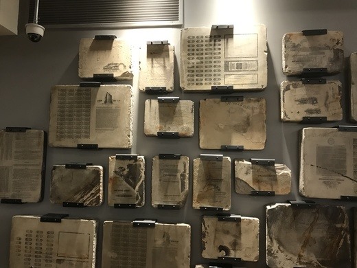
n 2011, while the REI store in the Puck Building in Manhattan’s SoHo district was undergoing renovation, workers made an unexpected discovery. Hidden behind one of the walls of the cellar were more than 100 lithography stones from the building’s days as a printer. They are now on display on the store’s lower floor.

1 REI  3 rei 4 rei

The historic building got its name from the magazine Puck, the first wide-reaching humor publication in the United States, which was
founded in 1871 and moved to lower Manhattan in 1887. It shared the space, in a mutually beneficial relationship, with its printer, J. Ottman Lithographic Company. Their shared headquarters was the largest building in the printing district at the time.

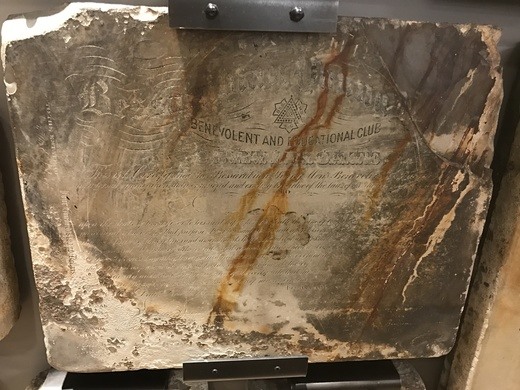
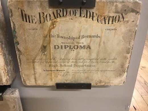
J. Ottman Lithographic Company printed many things beyond the Puck magazines, including theatrical posters and board games. Among the works now hanging on the REI wall are a high school diploma, a certificate of election, and a mortgage bond. Some of the litho stones are in rougher shape than others.

7 rei.jpg 5 rei 6 rei

Most of the writing and images on the stones is “backwards,” standard practice so that the final print is the reverse of what is seen on the plate or stone. Some, though, were prepared for offset printing, which involves an additional
step between the plate and the final product. The inked image, prepared “forwards,” or as it would be seen in the final product, is first transferred to a rubber blanket, reversing
the image once, and then to the final surface, setting it right.

Puck continued to operate out of the Puck Building until 1918, when it ceased publication. It was known for beautiful, full-color lithographs and sharp political satire. Statues of the magazine’s mascot, Puck, decorate the outside of the building. J. Ottman Lithographic Company shuttered around the same time.
Other printing companies, and even another satirical magazine, have called the building home since the original tenants left.

9 rei.jpg 10 rei.jpg 8 rei

During REI’s renovation, a deliberate effort was made to repurpose materials from the original building. Fixtures from the steam engine that powered the presses are on permanent display, including two flywheels and the governor. Nineteenth century I. P. Frink chandeliers, newly fitted with LED lights, help light the main floor.

 Source: Atlas Obscura

Beautiful History of Crayons

To celebrate National Crayon Month here is the interesting history of crayola crayons. From its earliest days, Crayola has been a color company.  During the last 100-plus years, Crayola has grown beyond our founders’ wildest dreams.  By applying technical innovation, unparalleled quality, consumer satisfaction and product value, Crayola has become the preeminent producer of hands-on products for creative personal development and fun.  Read more about the colorful history here. Oh RIP Dandelion, today it was discontinued.

crayolaboxes.jpg
1 and 2: Original box of crayons
3. Original box of 48 colors
4. Original box of 52 colors
5. Original box of 64 colors
AC0624-0000001.jpg 4-FLESH-V-PEACH-570.jpg3 crayon 2 o-BLUES-AND-REDS-570.jpgcrayon 1

Retired13.jpg
Retired colors

440px-Rubens500_inside
Original colors

Crayola_Ad_1905.jpg
Original Ad – 1905


Beautiful Pink Fashion Trend

Pink has been #rebranded. Once a symbol of dated gender binaries, pink is now the color of powerful optimistic statements — Trump-shading pussy hats, shapely, multiethnic Barbie dolls, a cosmetics company that values realism over illusion. Those of us who cast aside our bubble gum pink paraphernalia the moment we grew old enough to shop for ourselves — and those of who still loved the hue but grew sick of the vaguely offensive “girly girl” associations — now have reason to reach for our rose-colored glasses.

spring-2017-pink-trend.jpg

fall-2017-pink-trend.jpg

pinnk 2.jpg

pink 3.png

pink 4

pink 5.jpg pink 1

pink 6.png

Beautiful Mood Board Musings

Inspired by the beautifully sculptural effect of curved architectural walls, the work of French interior designer Francois Champsaur, has a beautiful smooth timber finish.

Trocadero_1.jpg
Trocadero Apartment by Francois Champsaur

Bold in black and incredibly textural, this piece was designed by CM Studio.
It features a distinctive curved batten pod that cleverly conceals the apartment’s bathroom.

mood 2.jpg
CM Studio / Photograph by Kelly Geddes

Curved walls are visually interesting and work well to soften sharp lines of an
interior space. The same effect can be created with a room divider, furniture,
or smaller design pieces such as ceramics and art. Here are some examples.
mood 3.jpg

Beautiful St. Paddy’s Day

St. Paddy’s Day is definitely an homage to Ireland, but there’s no denying that it also pays tribute to something a little more universal – booze. And while you may be thinking “What the heck does alcohol have to do with green design?” there are actually a keg’s worth of hooch-related eco innovations out there that you might not know about yet.

TINY IRISH PUB ON WHEELS

2Shebeen-Tiny-Irish-Pub.jpg
When Irish cabinetmaker John Walsh decided to convert his rusty old caravan into a tiny pub, the world’s most charming St. Patrick’s Day hotspot was born. The Shebeen is literally translated into “an illicit bar where alcohol is sold illegally.” The mobile booze cruiser was so popular in Ireland, the people of Boston commissioned another one to be brought to the states.


ARCHITECT BUIILDS HIS OUSE OUT OF 8,500 BEER BOTTLES

3Man-builds-his-house-out-of-beer-bottles

This brings new meaning to the song 99 Bottles of Beer on the Wall. Aspiring architect in Chongqing city, China designed and constructed his very own office with 8,500 recycled beer bottles. The impressive upcycled structure gets its sturdy foundation from 40 layers of beer bottles. The entire construction took four months and $11,000 to complete.

A BEER BOTTLE THAT DOUBLES AS BRICK

4top-green-booze-stories-heinecke.jpg

Have your brick and drink it too? Famed beer brewer Alfred Heineken and Dutch architect John Habraken came out with their Heineken WOBO (world bottle) brick all the way back in 1963, but the principle behind it still rings true today. As you probably already guessed, the idea behind the boozy brick was that thirsty people could drink their fix of beer from the WOBO and reuse it to build structures. Cheers to that.

A PAVILION MADE OF 33,000 BEER CRATES

5top-green-booze-stories-beer-crate-.jpg

It must have taken a lot of frat parties to empty out the 33,000 yellow beer crates that architects SHSH stacked atop one another to create this intoxicating pavilion. Using the crates like giant legos, the design features interesting architectural touches like columns, arches and even domes inside.


Source
http://inhabitat.com

Beautiful Airbnb in Philadelphia

If you are looking for an Airbnb stay in Philadelphia here’s your answer. I am swooning over the old world charm of this place; I could live here much less stay here temporarily. Not sure what I need to go to Philly for but this would be a good enough reason. BTW there is no television, but who needs a TV when you are surrounded by beauty. This unique Rittenhouse gem was renovated by Tara and Percy of Jersey Ice Cream Co.  Book it here.

1.jpg2.jpg3.jpg4.jpg5.jpg6.jpg7.jpg8.jpg9.jpg

Beautiful Shades of Red in Architecture

Projects to Fall in Love With on Valentine’s Day

10_MONTPELLIER.jpg 02_montpellier_c 08_MONTPELLIER_D.jpg

 ‘André Malraux’ Schools in Montpellier / Dominique Coulon & associés

RIDGING-TEAHOUSE.jpg BRIDGING-TEAHOUSE.jpg bridging-teahouse_

Bridging Teahouse / FR-EE / Fernando Romero Enterprise

LightPathAKL_5.jpg LightPathAKL___2.jpg LightPathAKL.jpg

LightPathAKL / Monk Mackenzie Architects + Landlab

PORTADA_Studio_Libeskind_Vanke_Pavilion_Expo_2015_(c)Hufton_Crow-12.jpg studio_libeskind_vanke_pavilion_expo_2015_chufton_crow-01 Studio_Libeskind_Vanke_Pavilion_Expo_2015_(c)Hufton_Crow-26.jpg

Vanke Pavilion – Milan Expo 2015 / Daniel Libeskind

17424591259_846488dd30_k_(1).jpg luis.jpg

luis 2.jpg
Cuadra San Cristobal / Luis Barragán

pink stair.jpg

BBVA Bancomer Tower / LEGORRETA + LEGORRETA + Rogers Stirk Harbour + Partners

facade_windows.jpg facade_detail1.jpg

Red Wall / 3Gatti Architecture Studio

red.jpg red 2.jpg red3

Instant Red / Wutopia Lab

151010_MVRDV_The_Couch.jpg 151001_MVRDV_The_Couch.jpg 150806_II_MVRDV_The_Couch.jpg

Couch / MVRDV

BOF_CALPE_4.jpg bof_calpe BOF_CALP.jpg

La Muralla Roja / Ricardo Bofill

NESTLE_CHOCOLATE_MUSEUM_.jpg paul-rivera-archphotocom.jpg paul-rivera-archphotocom-6

 Nestlé Chocolate Museum / Rojkind Arquitectos

Ragnarock_.jpg

Museum of Rock / MVRDV + COBE
passerelle09-rgb.jpg
Red Ribbon Park / Turenscape
Read more these project here