Beautiful Amazing Kindergarten

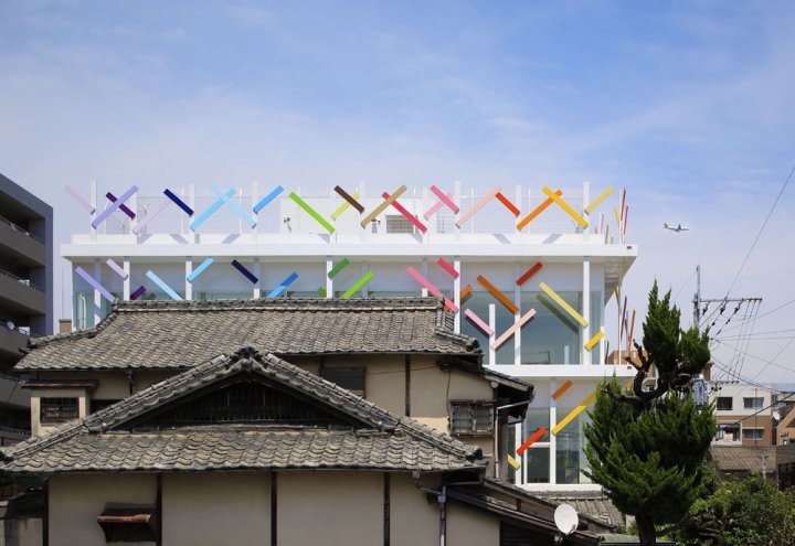
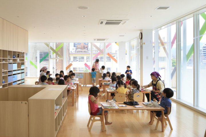
Today, I present one of those projects that takes your breath away. It is designed by Emmanuelle Moreaux and it’s a beautiful kindergarten full of color, a stimulating environment where kids can let their imagination run free. Every child should be so lucky to go to school to attend a learning environment like this.

colorful-nursery1

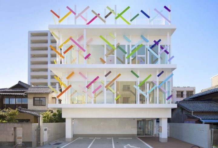
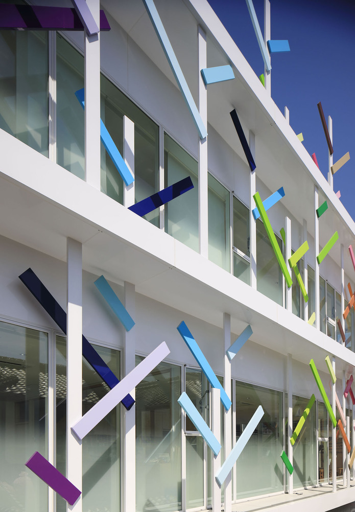
I love the use of color, a common feature that runs throughout the space. The school, Creche Ropponmatsu, is located in a residential area in Fukuoka, Japan. Emmanuele Moreaux designed this crazy, whimsical project – color is common theme throughout many of her projects. The result is amazing. Emmanuelle designed the architecture, interior space, logos and graphical signage, with a vision to open a new kindergarten where children can grow up freely in mind and body. Running behind the colorful grove, this kindergarten gives opportunity for children to raise rich sensibility by feeling many colors wherever they are.

colorful-nursery2

colorful-nursery3

THREE-DIMENSIONAL COLORS AND ELEMENTS
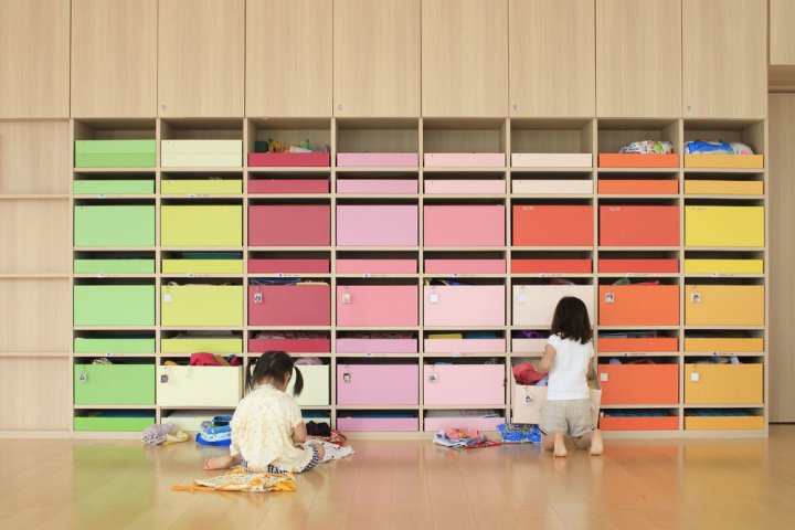
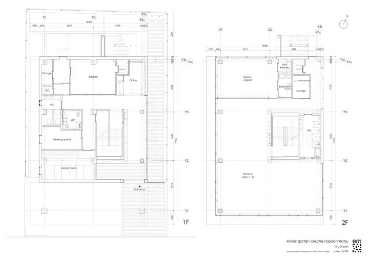
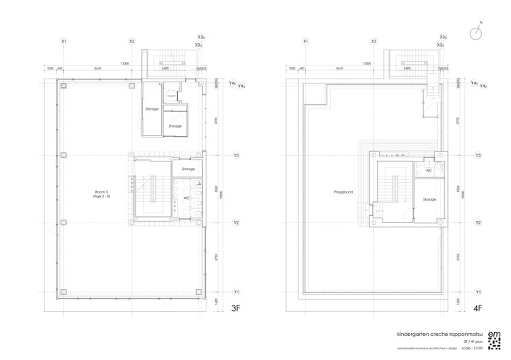
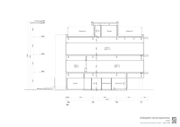
Color is apparent in every corner of the space. 22 colors were used in the 63m height trees on the façade. The branches appear to wrap the entire building, protecting it, perhaps, from the less colorful world outside. Collections of color jump out at one glance. On the facade, there are 22 colors used in 63 multi-colored trees of 4 m in height extend the branches rhythmically and wrap the building. While giving full-sized glass with a feeling of openness, by wrapping it with colorful trees, gives a sense of distance to the outside. Inside, 200 colorful boxes in 25 colors are lined up on the wall, where each one of them belongs to every child to stock their personal goods. Every time children use their own tools or get changed, they find and pick up the box of their color.

colorful-nursery4.jpg

colorful-nursery5

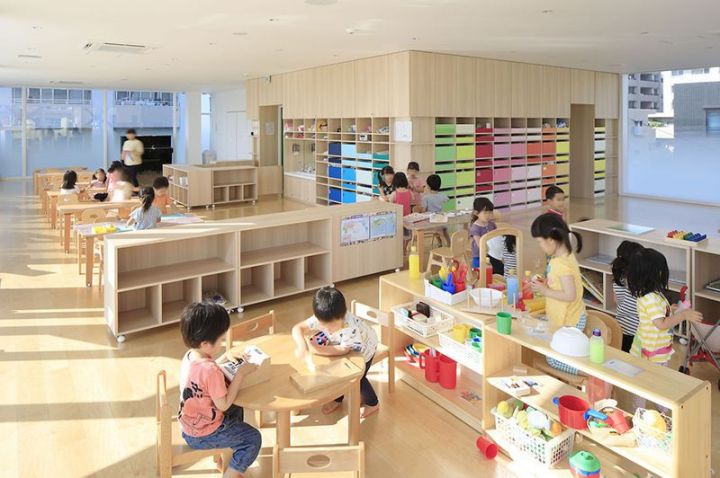
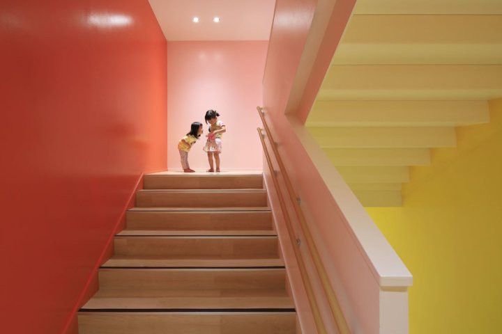
The stairs which connect the 4 floors is also full of colors, 18 different tones in fact. This creates an environment where kids are surrounded by diversity inside, outside and in common zones. Stimulation with colors and shapes is crucial for kids at this age – experts claim that color helps kids to develop their sensitivity and individuality.
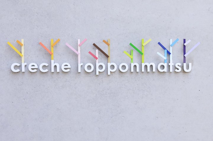
colorful-nursery6

DETAILS IN THE LOGO
Colorful trees on the façade have been also included in the logo, a perfect representation.

colorful-nursery7.jpg

creche_01

creche_0

creche_ropponmatsu_fp

creche_ropponmatsu_fp_2

creche_ropponmatsu_elevation_3

Learn more about her colorful projects here 

Beautiful Colorful Interiors

Check out this crazy wonderful colorful home, full of painted walls, bold rugs, and inspirational details. It features a stairwell with with a color clash of blue and lilac pink walls, and loads of art. But it’s that gold panel detail that really sets it apart. It’s all a wonderful way of mixing old with new while maintaining the original architecture and charm.

colorful-eclectic-staircaise.jpg

One major detail to note in this home is the use of black instead of white to ground all the colorful choices and also bring a sense of drama to the space. The gorgeous herringbone wood floors, and quite a few furnishings are in the black or dark grey realm. It’s so rare to see black used with loads of color in a home – it’s refreshing.

blue-walls-and-black-herringbone-floors

blue-living-room-colorful-house.jpg

The blue continues into this sitting room where modern lighting gets swapped for antique venetian chandeliers. There really are no design rules in this home – it’s very much a case of the ‘buy what you love, and it will work theory.

mad-mix-of-colors-and-texture

While the stairwell reigns supreme, this happy pink kitchen with geometric aqua tile is definitely a close second. The clean design keeps the pink from feeling to precious. The cubbies are a nice alternative to open shelving, and the sleek lighting on either side of the window is perfect.

a-super-fun-pink-kitchen


Beautiful Kid Spaces

How to crate a beautiful, cool, functional space for kids.

VINTAGE-DESK-WITH-HOUSE-SHELF-AND-DOTTY-WALL-FROM-PINTEREST
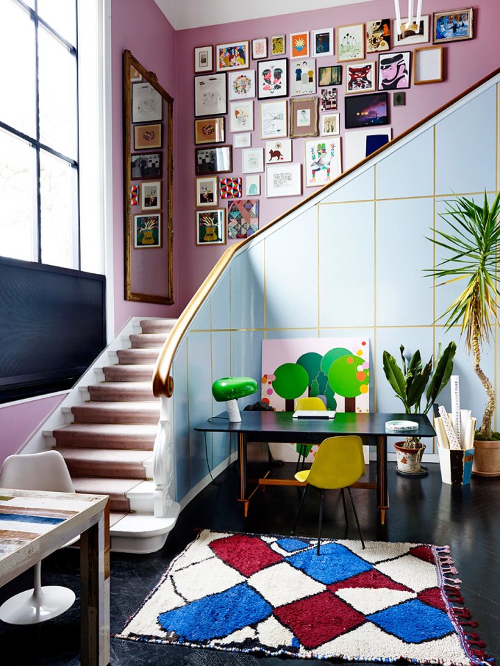
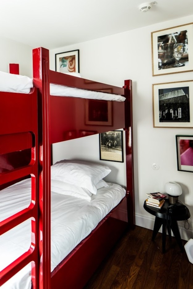
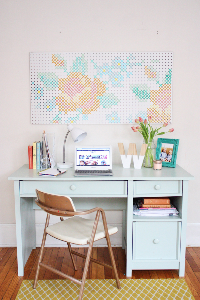
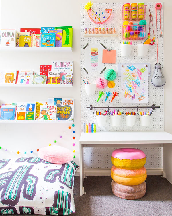
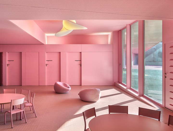
September is almost here and that can only mean one thing: back-to-school time! But homework doesn’t have to be boring – and neither does your child’s desk. Whether it’s for homework, drawing, coloring or simply chilling with a favorite book, study spaces can be both functional AND fun.
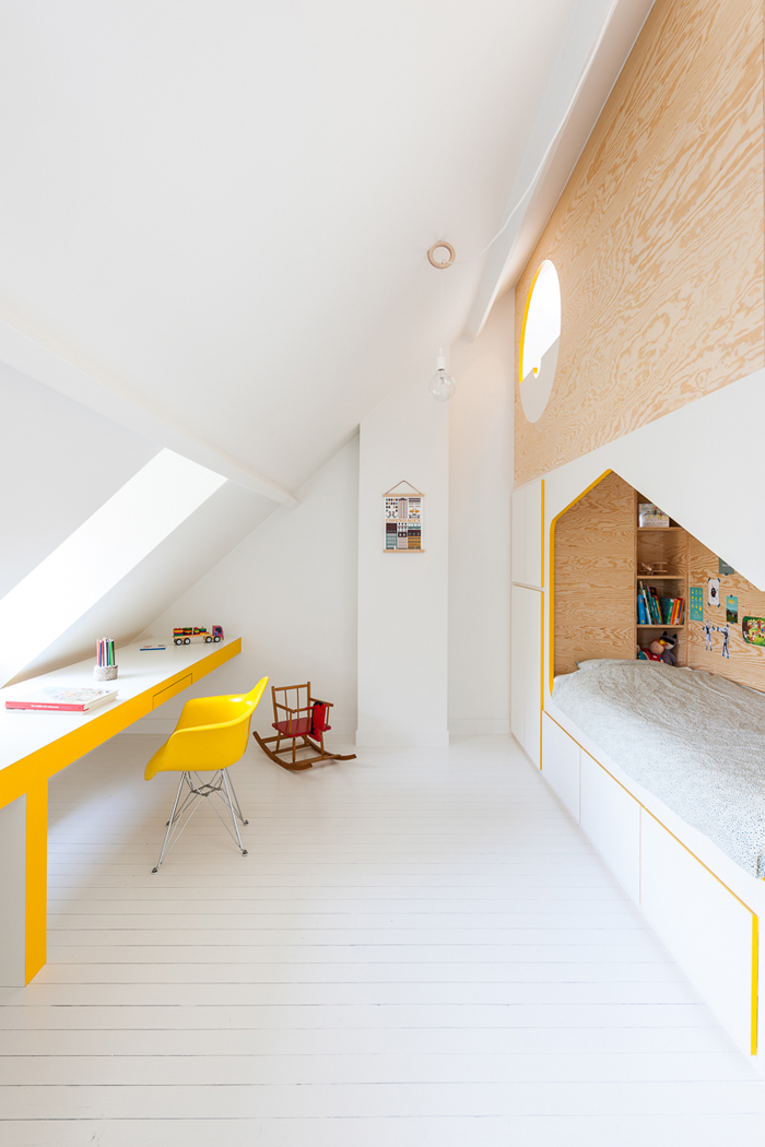
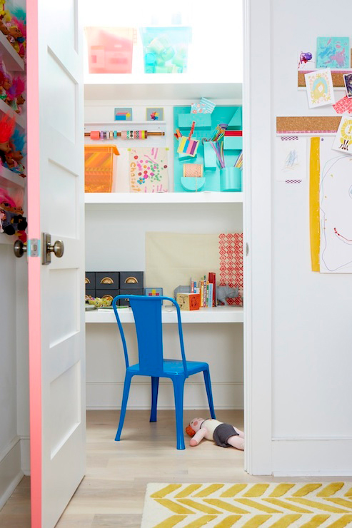
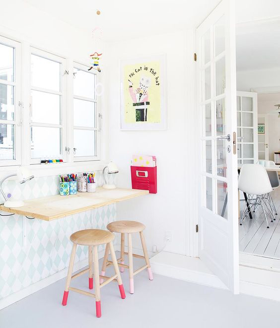
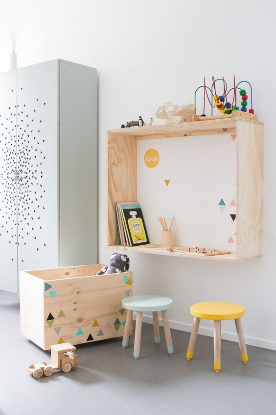
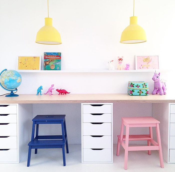
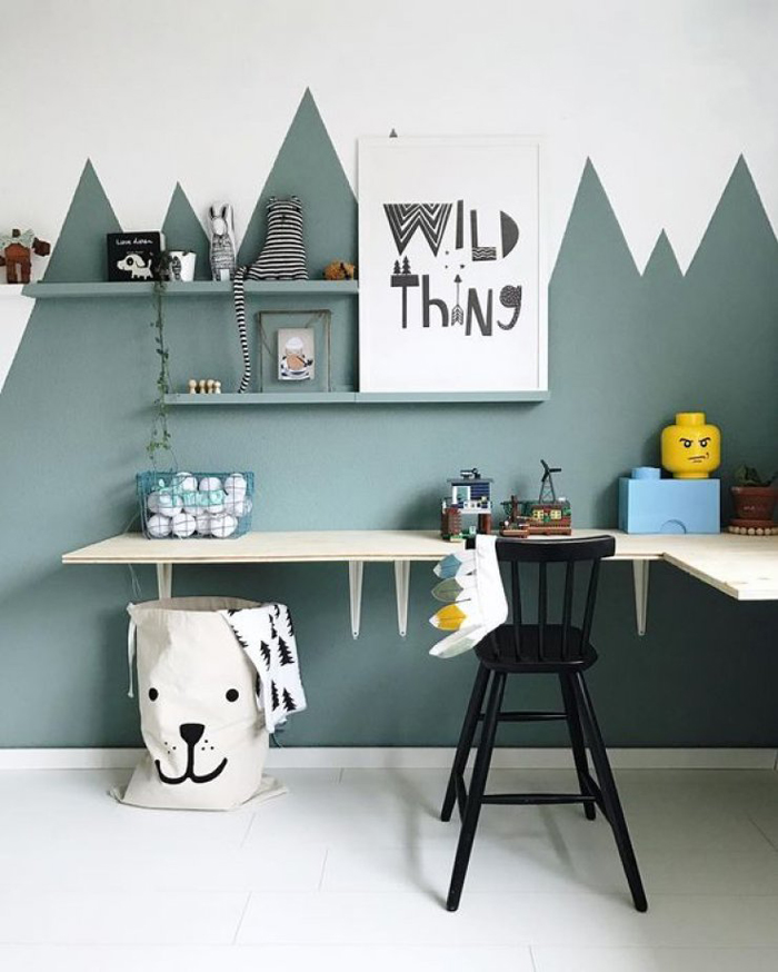
Here’s how:

1. Choose an area that works within the room

ATTIC-ROOM-BY-VAN-STAEYEN
Image sourced from Van Staeyen

Placing a table along the length of the room (as pictured above) makes an area that may otherwise not be used for anything, useful – especially in a loft or attic room like this one. It’s light and bright, thanks to the window and the cheerful sunshine yellow and white, with plenty of desktop space for every activity you can think of! Don’t forget alcoves, unused corners, underneath loft beds, and even cupboards – they can make perfect study zones too!

DESK-IN-CLOSET-BY-THE-LAND-OF-NOD
Image sourced from The Land of Nod

2. Hang a shelf

WALL-MOUNTED-DESK-AS-SEEN-ON-ESTILOESCANDINAVO
Image sourced from Estiloescandinavo

If you don’t have a lot of space, consider hanging a wall-mounted shelf instead. Simple and smart, yet effective as well. If it’s next to a wall, even better – hang some extra storage for all those arty bits and pieces and to help keep everything tidy and organized. And don’t forget all that extra space underneath the desk. Stack some storage boxes, bins or baskets to stash away all the mess when work and play is over.

KIDS-WALL-DESK-STYLED-BY-SUUS
Image sourced from En Suus

3. Choose a colored chair or stool

COLOURFUL-STOOLS-IN-PLAYROOM-BY-SAARKELOVES.jpeg
Image sourced from Saarkeloves on Instagram

These Ikea steps look amazing painted in bright colors and used as stools. Love how the drawers divide up the two areas whilst serving as functional desktop legs, not to mention brilliant storage for paper, pens, crayons and books.

Likewise, these sweet vintage chairs in this kids’ room (below) add a pop of bright color whilst being perfectly in keeping with the style of the room:

COOSJE-BLOG
Image sourced from Coosje 

4. Decorate!

Colored paint, wallpaper, wall stickers and wall art all help to add color and character to the walls, giving the study area its own identity. This simple yet creative two-tone ‘mountain’ design on the wall, which defines the corner and separates it out from the rest of the room:

CORNER-DESK-WITH-PAINTED-WALL-FROM-MOMMO-DESIGN-BLOG-IMAGE-FROM-WILD-ONES
Image sourced from Wildones

How cool is this grey and white cloud wallpaper for the alcove surrounding the desk?

KIDS-DESK-STYLED-BY-BOBBY-RABBITImage sourced from Bobby Rabbit

5. Add a peg board

A simple pegboard above the desk is decorative, functional as storage and the perfect solution for displaying their creative masterpieces:

KIDS-PEG-BOARD-BY-AIMEE-WEAVER
Image sourced from Aimee Weaver
PAINTED-PEGBOARD-AS-SEEN-ON-PRETTY-LIFE-GIRLS-BLOG
Image sourced from Pretty Life Girls 
PEG-BOARD-DISPLAYING-WALL-ART
Image sourced from Petit and Small

So, whether it’s for a 2, 12 or 22-year-old, you can keep the study space both fun and functional by adding elements such as a bright chair or stool, a colorful shelf or pegboard or a decorative wall feature through paint, wallpaper or wall art. And let’s face it – when you have kids, there is plenty of wall art to display.

For more ideas visit petitandsmall.com

Beautiful Pink House

4-Laurinda-Spear-Bernardo-Fort-Brescia-Arquitectonica-The-Pink-House-Miami-Shores-1976-79-Photography-by-Eric-Meola

The Pink House, otherwise known as The Spear House, is one of the best known and most photographed residences in Miami, Florida. It is a quintessential symbol of modernism and sits at the edge of Biscayne Bay in the older Miami suburb of Miami Shores, is intended as an urban house within a suburban context. Rigorously conceived as a study in different planes, the house is painted give shades of pink, ranging from deep near-red to pale pink, which heighten the illusionistic perspective of the house and define the series of planes. Pink was chosen because it seemed to be the most tropical of all colors and at the time was rarely used. Many factors make the house interesting bit its controversy has all the intrigue. designed by Laurinda Spear and Bernardo Fort-Bescia of Arquitectonica for Spears’ parents in 1976, it’s a series of planes and framed views designed to maximize East/West breezes.

The Pink House, Miami Shores, Florida, 7800

Although the house was initially conceived as an object standing on its own, the west façade, facing the city, is scaled down; its dimensions diminish to relate to other houses on the street in an almost mathematical cadence. The east façade, designed for long-distance viewing from Miami Beach and the bay, is scaled so that it looms large. The approach is through a tropical grove — almost a tunnel– which opens to a geometric landscape with palm trees spaced regularly in a carpet of pavers.

pink jhouse ext 3.jpg

The house has a precise sequence: the façade, the courtyard, and then the rooms, each framing a different view of the bay. The house encloses a swimming pool, which, along with the living areas, is the piano, one level above ground. The house in narrow — only 18 feet wide — to capture the bay breezes and daylight as well. The Spear House is more rigorously mathematical than Arquitectonica’s later work, yet in many ways it is seminal, establishing a number of paths of inquiry that the firm has pursued consistently, including color and cadence.

The Pink House, Miami Shores, Florida, 7800

Its color statement received a lot of attention in the late 1970s when it was built.
Neighbors were disturbed by the 5 shades of pink, which were chosen to reflect
the tropical climate and were rarely used at the time. Ultimately a grove of trees
were planted to shield the house from the street.

The Pink House, Miami Shores, Florida, 7800

pink house porthole large

pink house pool

pink house pool2

PinkHouse_MiamiShores5

PinkHouse_MiamiShores1

early-collage-study-pink-house-copy
Original sketch

rendering 1

rendering 2

Beautiful History of Crayons

To celebrate National Crayon Month here is the interesting history of crayola crayons. From its earliest days, Crayola has been a color company.  During the last 100-plus years, Crayola has grown beyond our founders’ wildest dreams.  By applying technical innovation, unparalleled quality, consumer satisfaction and product value, Crayola has become the preeminent producer of hands-on products for creative personal development and fun.  Read more about the colorful history here. Oh RIP Dandelion, today it was discontinued.

crayolaboxes.jpg
1 and 2: Original box of crayons
3. Original box of 48 colors
4. Original box of 52 colors
5. Original box of 64 colors
AC0624-0000001.jpg 4-FLESH-V-PEACH-570.jpg3 crayon 2 o-BLUES-AND-REDS-570.jpgcrayon 1

Retired13.jpg
Retired colors

440px-Rubens500_inside
Original colors

Crayola_Ad_1905.jpg
Original Ad – 1905


Beautiful Shades of Red in Architecture

Projects to Fall in Love With on Valentine’s Day

10_MONTPELLIER.jpg 02_montpellier_c 08_MONTPELLIER_D.jpg

 ‘André Malraux’ Schools in Montpellier / Dominique Coulon & associés

RIDGING-TEAHOUSE.jpg BRIDGING-TEAHOUSE.jpg bridging-teahouse_

Bridging Teahouse / FR-EE / Fernando Romero Enterprise

LightPathAKL_5.jpg LightPathAKL___2.jpg LightPathAKL.jpg

LightPathAKL / Monk Mackenzie Architects + Landlab

PORTADA_Studio_Libeskind_Vanke_Pavilion_Expo_2015_(c)Hufton_Crow-12.jpg studio_libeskind_vanke_pavilion_expo_2015_chufton_crow-01 Studio_Libeskind_Vanke_Pavilion_Expo_2015_(c)Hufton_Crow-26.jpg

Vanke Pavilion – Milan Expo 2015 / Daniel Libeskind

17424591259_846488dd30_k_(1).jpg luis.jpg

luis 2.jpg
Cuadra San Cristobal / Luis Barragán

pink stair.jpg

BBVA Bancomer Tower / LEGORRETA + LEGORRETA + Rogers Stirk Harbour + Partners

facade_windows.jpg facade_detail1.jpg

Red Wall / 3Gatti Architecture Studio

red.jpg red 2.jpg red3

Instant Red / Wutopia Lab

151010_MVRDV_The_Couch.jpg 151001_MVRDV_The_Couch.jpg 150806_II_MVRDV_The_Couch.jpg

Couch / MVRDV

BOF_CALPE_4.jpg bof_calpe BOF_CALP.jpg

La Muralla Roja / Ricardo Bofill

NESTLE_CHOCOLATE_MUSEUM_.jpg paul-rivera-archphotocom.jpg paul-rivera-archphotocom-6

 Nestlé Chocolate Museum / Rojkind Arquitectos

Ragnarock_.jpg

Museum of Rock / MVRDV + COBE
passerelle09-rgb.jpg
Red Ribbon Park / Turenscape
Read more these project here


Beautiful Red Interiors

I’m personally not a huge fan of red when it comes to interiors but it can be used to make a powerful statement in subtle and not so subtle ways. Check out how these designers who love red have incorporated this fiery and beautiful color into their homes.

Red-house-exterior-victorian-with-red-paint-red-paint.jpg

There are instances, such as this Victorian farm house, where red is the perfect color.

primary-coloured-houses1.jpg
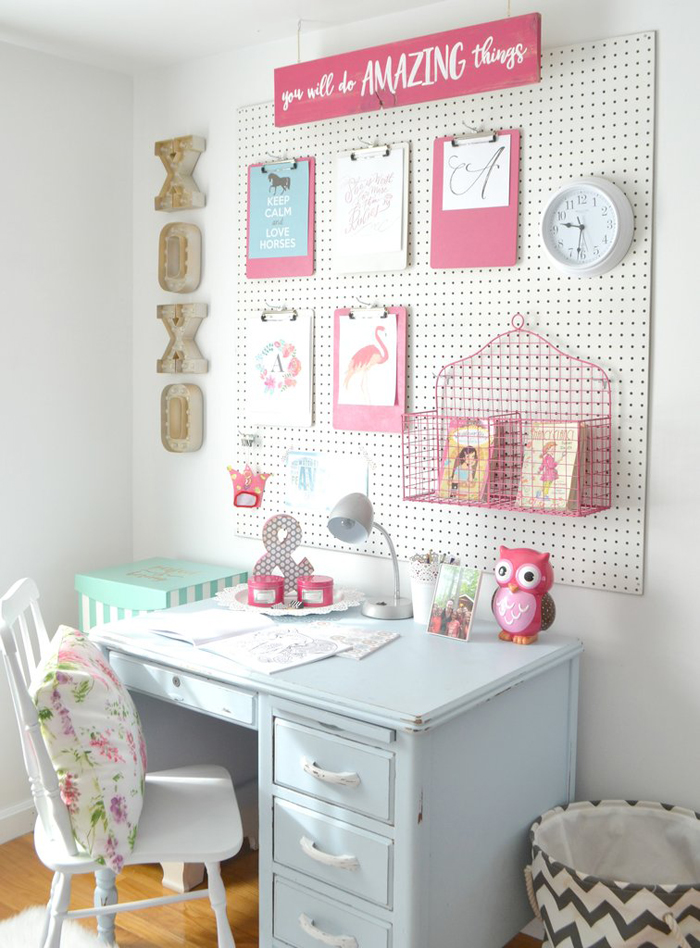
…or sometimes you just want to have fun with it. 

red-dwell

These walls are covered in Graniplast, a tinted acrylic finish. Nathan Pereira Arquitectos y Diseño advised on the facade, floors, and finishes. Designed by Vanessa Clark.

red bath.jpg

Red gives a bathroom and modern appeal. This bathroom features Chromtech tile, a Toto toilet, Kohler vanity, and powder-coated steel countertop.

red-nook

Red is perfect for a comfy kitchen nook. Eazy side chairs by Whiteonwhite line one side of the custom-designed table by LOT-EK. Castore suspension lights by Michele De Lucchi for Artemide hang above, and a custom rug by Liora Manné lies below.

red kitchen.jpg

Red is one of those colors where “less is more” often makes a bolder statement. Largely white monotone, the kitchen introduces a pop of red through the glossy AGC kitchen backsplash. Red Piston stools by Shin and Tomako Azumi complete the space.

red-modern

Red is often used in commercial spaces. In Situ Design and Lilian B Interiors adapted a six-story brownstone in midtown Manhattan into a boutique hotel with 33 guest suites. Each floor received what the designers call a “visceral” color treatment using Benjamin Moore paints, including Outrageous Orange.

red eames.jpg

I love this red Eames chair. Magenta Togo sofas by Ligne Roset, a red Eames molded plywood chair, provide seating around the hearth.

red locker.jpg

Red used as a fun, happy accent especially when it comes to kids. E27 pendant lamps from Muuto a with matching red locker storage. The inside of the front door is painted bright green.

red cabinets.jpg

Designer Harry Bates designed a simple cedar house for a young family in New York in 1967. Forty years later he updated the place for its new owners. The addition of bright red cabinetry in the kitchen introduces a contemporary style without losing the rustic, vintage quality of the space. 

red leather.jpg

Red can be interpreted as masculine or feminine. I love this distressed red couch;
mixed with the industrial surroundings it adds a beautiful layer of texture.

red-bunk-bed

This bedroom features bright red bunk beds for a dormitory-like experience and can be
paired with adjoining rooms for larger groups of guests.

red-plaster

The kitchen’s red Venetian plaster walls makes for a nice textural detail. 

red door.jpg

rotating-door-in-bright-red

Two great examples of how red is the perfect color for modern door.

To learn about these products visit Dwell


Beautiful Bauhaus Art

3,900 Pages of Paul Klee’s personal notebooks (1921-1931) are online. I love his art and thoughts on color and really enjoy his works. Klee taught at the Bauhaus in Weimar from 1921 to 1926 and in Dessau from 1926 to 1931. During his tenure, he was in close contact with other Bauhaus masters such as Kandinsky and Lyonel Feininger.

Klee-Notebooks-1 Klee-Notebooks-2 Klee-Notebooks-3 Klee-Notebooks-4