Revisiting Emily Vanderpoel’s Color Theory Book 117 Years After Its First Release
In addition to being a watercolorist, Emily Noyes Vanderpoel was also the author of Color Problems, widely overlooked, yet staggering turn-of-the-century book on color theory.
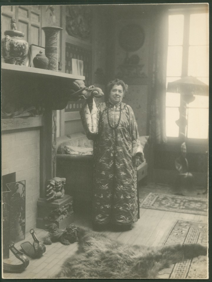
Though her name is virtually unknown today, Emily Noyes Vanderpoel enjoyed a modest reputation as a watercolorist at the turn of the 20th century. She painted seascapes, country landscapes and the occasional industrial scene — perfectly competent works, but ultimately quite conventional. Nothing about them hints at the fact that Vanderpoel was also the author of a widely overlooked, yet staggering book on color theory, its pages bursting with a series of vibrant illustrations that seem to anticipate an abstract aesthetic decades before it emerged in full force.
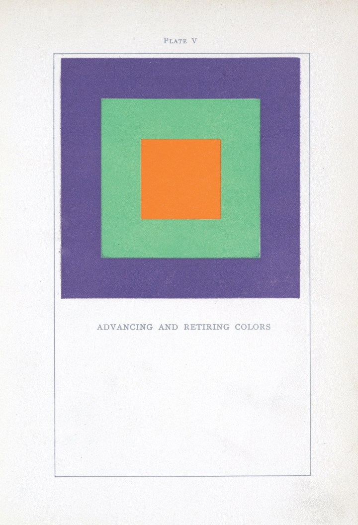
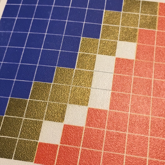
Color Problems: A Practical Manual for the Lay Student of Color, which Vanderpoel first published in 1901, sought to teach an audience of non-artists how to combine colors in ways pleasing to the eye. The 400-page book elegantly summarizes the ideas of eminent color theorists, before unleashing Vanderpoel’s wildly original approach to color analysis: 10 x 10 grids that break down the color proportions of real objects, most of which came from the author’s personal collection of antiques. Vanderpoel lovingly transforms a mummy case, a teacup, a Japanese silk brocade and dozens of other knick-knacks into series of geometric patterns. Her grids emerge as artworks reminiscent of Homage to the Square, the iconic abstract series that Bauhaus pioneer Josef Albers began creating in the 1950s.
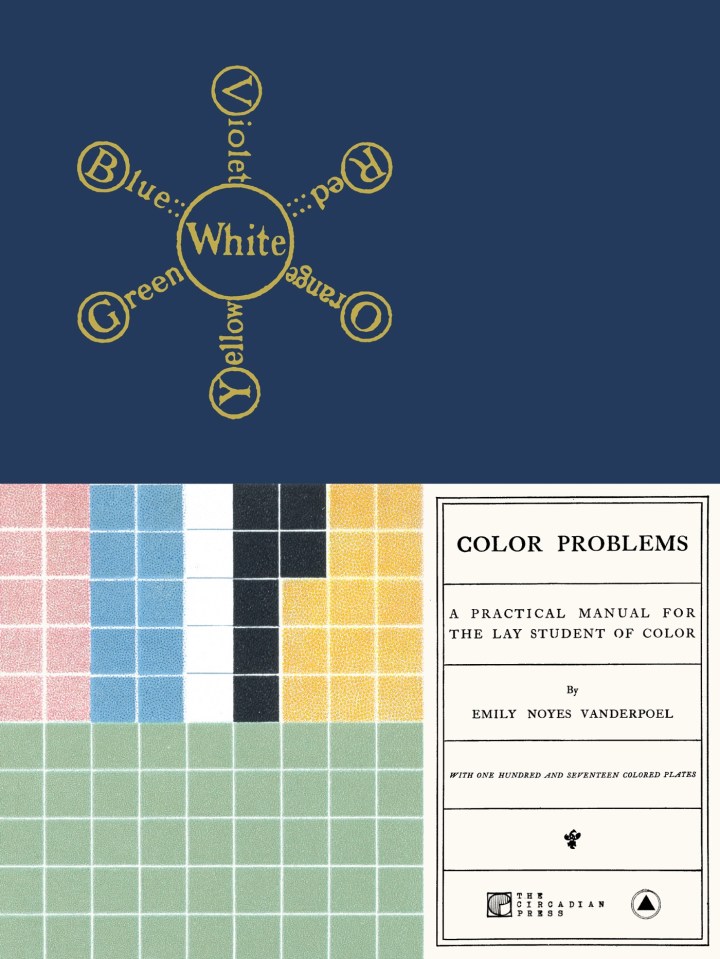
In spite of its stunning prescience, Color Problems has been largely forgotten in the 117 years since it was first released. Two Brooklyn-based publishing companies now hope to salvage the book from obscurity. On November 9, The Circadian Press and Sacred Bones Records will reissue Color Problems in both softcover and a hardcover facsimile, their efforts supported by a successful Kickstarter campaign.
Vanderpoel was immersed in New York’s creative scene. She never received a formal art degree, but studied under the painters William Sartain and Robert Swain Gifford, who taught at Cooper Union and the Arts Students League. Vanderpoel exhibited her artworks through the New York Watercolor Club, which frequently staged group shows, and her paintings occasionally cropped up in grander venues. In 1893, she won a bronze medal at the Chicago World’s Columbian Exposition for a painting of an industrial rail yard. Some years later, her painting “Ypres,” (no date) a memorial to World War I that is now lost, was displayed at the National Art Museum in Washington, DC (which was subsequently incorporated into the Smithsonian). In the late 1920s, the Metropolitan Museum of Art mounted an offsite exhibition of nine of her watercolors at the Connecticut Agricultural College.
At some point amidst this flurry of productivity, Vanderpoel began writing and illustrating Color Problems. No records of her process survive to the present day, but she likely worked on the book for several years, says Alan Bruton, a professor at the University of Houston’s College of Architecture and Design who has researched Vanderpoel’s life and work.

Color Problems is a guide for both hobbyists and people who work in the practical arts: florists, decorators, designers, lithographers, salespeople who want to attractively display their wares. The book is not specifically catered to women, but Vanderpoel certainly had female readers on her mind. She writes that understanding the intricacies of color theory can be of value to milliners and dressmakers — occupations often held by women during the Victorian era — along with housewives who dabbled in home decor.
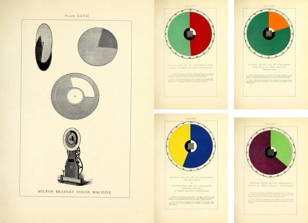
As she doles out advice for achieving aesthetic harmony at home and at work, Vanderpoel reveals herself to be well versed in color theories that proliferated throughout the 19th century, due in part to scientific advances that led to the development of new pigments. She frequently refers to major names in the field, among them Michel-Eugène Chevreul, whose ground-breaking 1839 book explored how adjacent colors influence one another; James Clerk Maxwell, who used spinning color discs to show how people perceive mixtures of color; and Ogden Rood, who, among his other contributions, suggested that colors differ from one another due to variations in purity, hue, and luminosity.

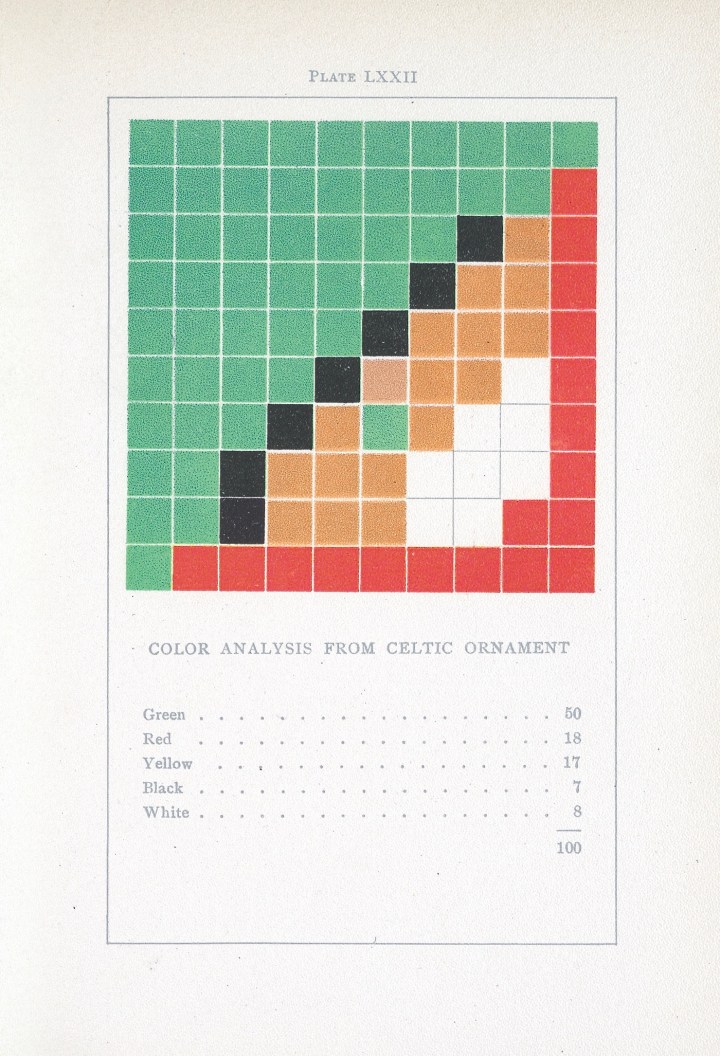
Even more striking are Vanderpoel’s 54 grids, or “Color Analyses, ” in which she reinterprets various objects as geometric designs made up of 100 squares. Vanderpoel’s analysis of a Celtic ornament, for instance, is rendered as 50 green squares, 18 red ones, 17 yellow, seven black, and eight white, all fitted together with Tetris-like precision. She wasn’t the first theorist to organize colors into grids, but rendering pixel-like representations of real objects to capture the optical effect of color — that was something new.
Read more of the original article here
Learn more about the Kickstarter campaign
One thought on “Beautiful Color Theory: Revisiting Emily Vanderpoel”