Beautiful Residential Home Design #2

ch house 1.jpg

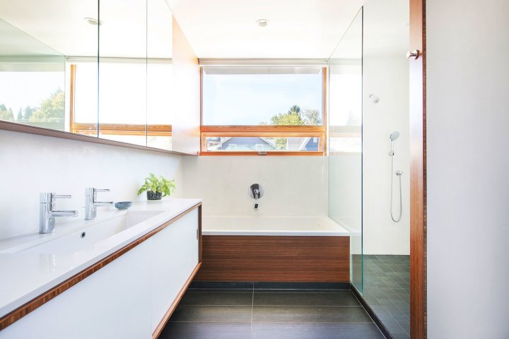
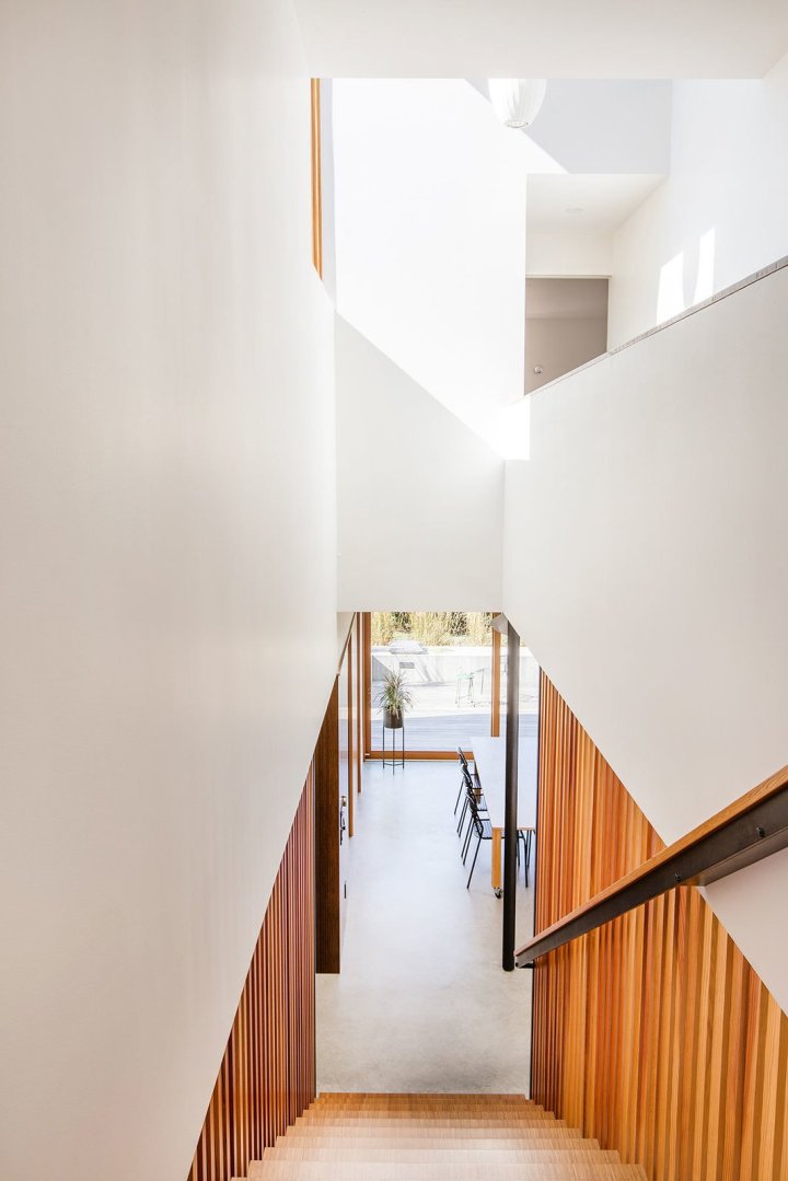
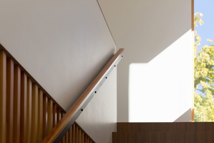
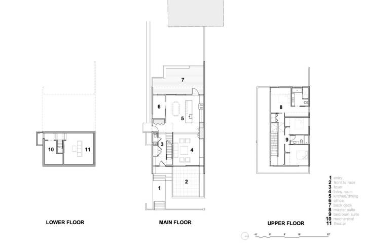
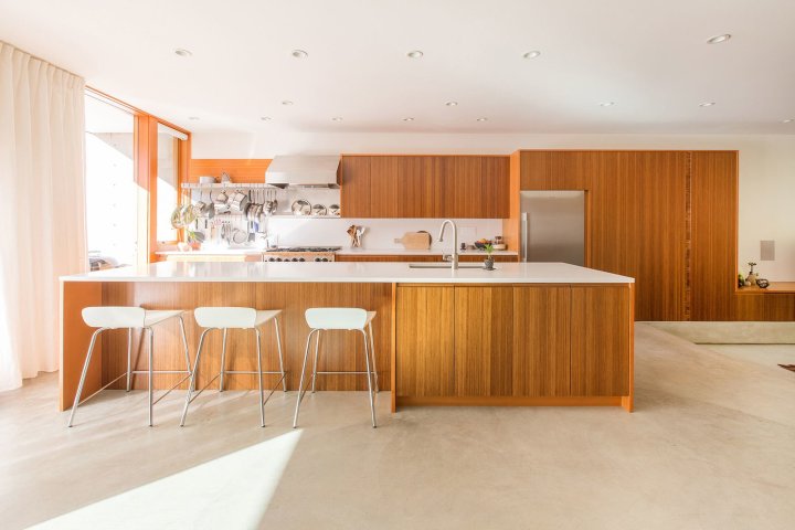
Originally occupied by a small cottage in disrepair, this new modern home in Seattle’s Capitol Hill neighborhood, designed by SHED Architecture, is an economical, efficient, low-maintenance, and modern version of a traditional home – one with primary living spaces on the main floor and three bedrooms above.

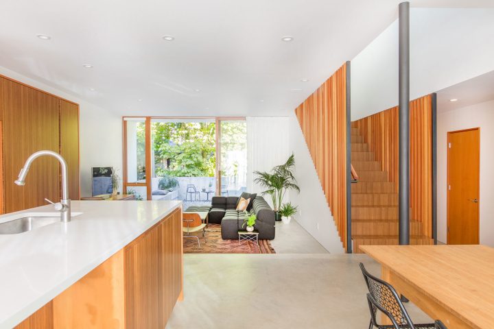
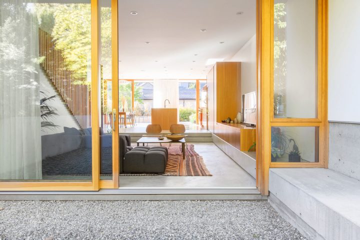
The kitchen to occupies a central and commanding position in the house with easy access to the backyard patio. Large floor-to-ceiling sliding doors flank the east and west ends of the house, exposing an open-plan kitchen, dining and living space ideal for entertaining. The kitchen’s minimal palette of bamboo, fir, cork, and concrete allow the natural materials to take center stage without overpowering the functional details including a custom stainless steel pot rack. In order to achieve the desired aesthetic and budget-level, the designers selected cabinets from Ikea and created custom bamboo cabinet fronts and fir wraps with recessed pulls. The bamboo material was selected for and sets the tone for the rest of the house.

ch house 4

Capitol_Hill_Home_24Capitol_Hill_Home_23-1612x1075

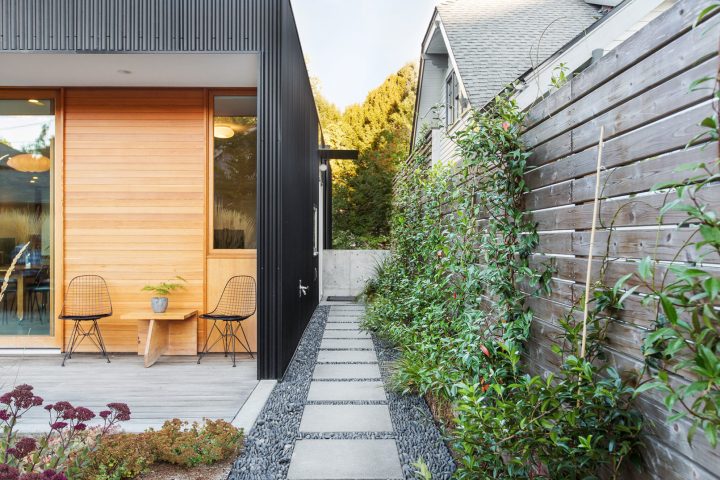
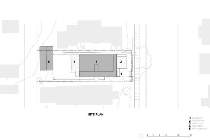
The house sits on a well-traveled arterial along a bus line and is flanked by two multi-unit buildings: to the south a rental house that extends the length of the property line with several windows along that façade; to the north, a triplex with a south-facing entry court encroaches upon the original plot by means of an easement. By limiting windows along the sides of the house and focusing the glazing towards the east and west, the home establishes a strong connection to its front and rear yards while protecting its occupants privacy from the heavily used side-yards of the neighbors. A walled and elevated terrace extending from the sunken living room claims the front yard as usable space and shields the fully glazed living spaces from passersby. Corrugated metal siding and concrete site walls were used where privacy was desired, while wood windows, doors, and siding were used at the sheltered open ends where people interact directly with the building’s exterior.

ch house 3

chhouse 6

ch house 5

ch hose 7

The home was also designed with the environment in mind. A low-maintenance high performance enclosure was achieved by using an effective combination of advanced framing (required 30% less lumber), triple-pane windows protected by aluminum plate ‘visors,’ and metal siding. Natural light, open spaces and simple materials come together to create a private sanctuary for the homeowners to cook, entertain and recharge.

Capitol_Hill_Home_04-1612x1075Capitol_Hill_Home_22-1612x1075

Capitol_Hill_Home_30-1612x1075

Capitol_Hill_Home_26-1612x1075

Capitol_Hill_Home_10-1612x1075Capitol-Hill-House_20121019_0015-1116x1488Capitol_Hill_Home_31-1612x1075

Capitol-Hill-House-Floor-PlansCapitol-Hill-House-Site-Plan

Designed by SHED Architecture + Design 

Beautiful Residential Home Design #1

Sensational, stylish, and startlingly unique—these homes are a cut above. There’s no doubt that one of my favorite places to uncover architectural treasures is on Dwell.com. It’s one of my go to places to admire the riveting spaces and simply admire innovative design. The stunning home below represents 1 of 10 projects that are the best in 2018. From a minimalist modern abode in the South of France to a jaw-dropping artist retreat that embodies indoor/outdoor connection, scroll down to see the first in a series of the best of the best.

Haiku Maui – Haiku, Haiku-Pauwela, Hawaii
Guggenheim Architecture + Design Studio 
Maui cottage

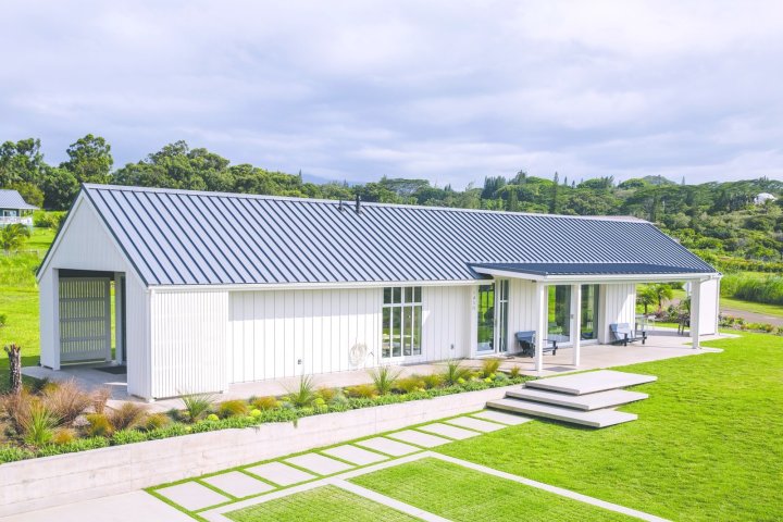
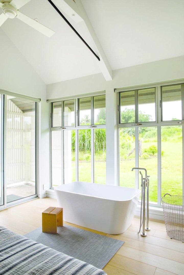
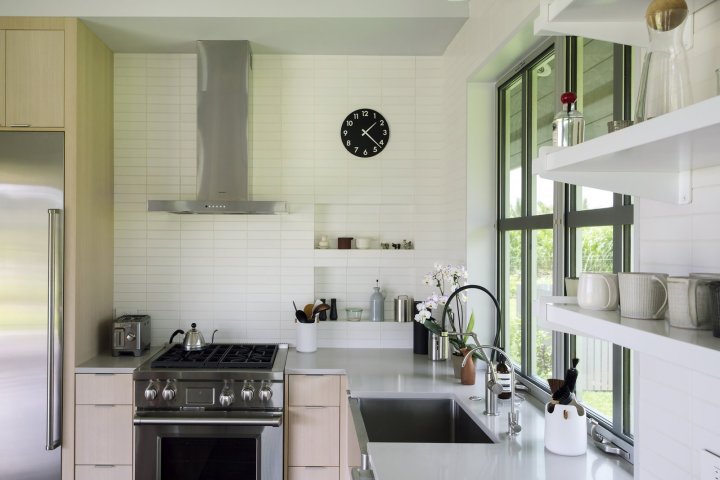
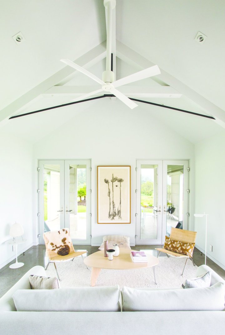
Inspired by the Scandinavian barn vernacular, this Upcountry Maui cottage and barn for Cloth and Goods’ Melissa Newirth and Crossing the Threshold’s David Johnson provides a peaceful minimalist retreat and respite for family gatherings. The 1,000 sf. long and low main cottage is sited to capture both mountain and sea vistas while the adjacent barn is designed to hold large family gatherings and act as a seasonal residence. Impeccably minimalist yet richly textured, highly efficient and livable environment with access to a variety of outdoor living zones.

upcountry-maui-cottage-and-barn.jpg
upcountry-maui-cottage-and-barn-lanaiupcountry-maui-cottage-and-barn-living-room (1)upcountry-maui-cottage-and-barn-master-bedroomupcountry-maui-cottage-and-barn-soaking-tub-in-master-bedroomupcountry-maui-cottage-and-barn-master-bathroomupcountry-maui-cottage-and-barn-workspaceupcountry-maui-cottage-and-barn-kitchenupcountry-maui-cottage-and-barn-living-roomupcountry-maui-cottage-and-barn-kitchen-and-living-room
upcountry-maui-cottage-and-barn-cottage-lanai-screen-detail.jpgupcountry-maui-cottage-and-barn-barn-living-space-and-loft-stair.jpgPhotos by Ryan Siphers

Guggenheim Architecture + Design Studio is a multidisciplinary creative atelier that integrates architecture, interior environments and brand direction. Studio is licensed to practice Architecture in the States of Oregon, Washington, and Hawaii

Beautiful Koenig Mid-Century Restoration

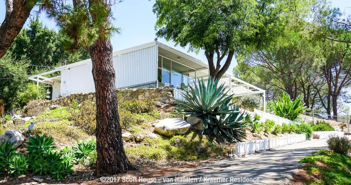
Designed by Pierre Koenig in 1954, this iconic L.A. house was carefully restored to pay homage to the Koenig’s distinctive style.
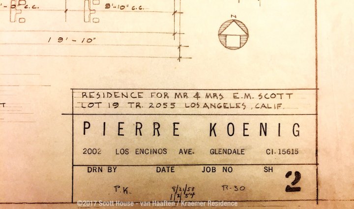
The Scott House in Los Angeles’ Tujunga neighborhood – the fourth house designed by American mid-century modern architect Pierre Koenig – was lovingly restored to stay true to its mid-century roots. The house was commissioned in 1953 by Edwin and Aurora Scott, a chemist and his wife who were looking for a home that would allow them to enjoy the indoor/outdoor lifestyle of Southern California. After purchasing a plot of land in Tujunga with 270-degree views of the city below, the Scotts set out to find an architect to design their home.

large

koenigs-case-study-house-1-in-glendale-which-koenig-was-using-as-his-own-residence-at-the-time-the-scotts-were-so-impressed-by-the-house-that-they-rang-the-doorbell-met-koenig-and-asked-passionate-about-midcentury-modern-architecture-and-furniture-purchased-the-scott-house-from-aurora-who-was-94-years-old-at-the-time-and-sensitively-restored-it-in-a-way-that-w

By chance, they drove past Koenig’s Case Study House #1 in Glendale, which Koenig was using as his own residence at the time. The Scotts were so impressed by the house, that they rang the doorbell, met Koenig, and asked him to design their new home.

In 2014, Nikolaus Kraemer and Heather van Haaften, a couple who are passionate about midcentury-modern architecture and furniture, purchased the Scott House from Aurora (who was 94 years old at the time) and sensitively restored it in a way that would reflect the property’s roots.

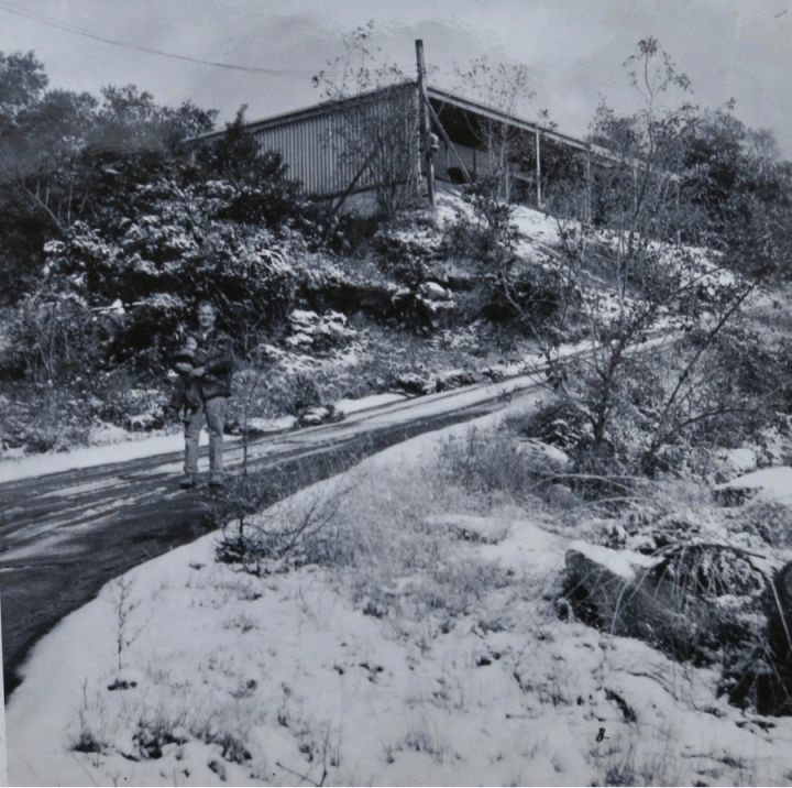
-couple-nonetheless-haEdwin Scott and his son Mike in front of the Scott House in 1956. 

“We knew of Koenig’s work when we first saw his iconic Stahl House. Heather and I were intrigued by his accurate rationale of steel being not just something you can ‘put up and take down,’ but a way of life,” says Nikolaus, who compares their serendipitous acquisition to “owning an original Warhol, Lichtenstein, or Ruscha.”

Though they were grateful to be able to purchase an iconic residence directly from its original owners—rather than one that had been altered by numerous people—the couple nonetheless had to invest a lot of time and effort in renovating and reviving the architectural gem.

“Midcentury-modern homes can suffer from too many ambitious owners trying to improve their homes. Mostly, these attempts do more harm than good, and can even distort the original design,” says Nikolaus.

The house’s flat-roof structure had substantial damage that needed to be addressed. A few years after the house was built, a leak developed in the roof, so Edwin Scott had poured a four-inch layer of light concrete on the metal roof panels.

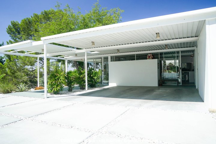
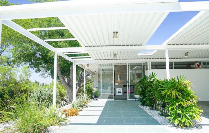
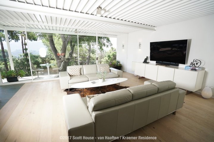
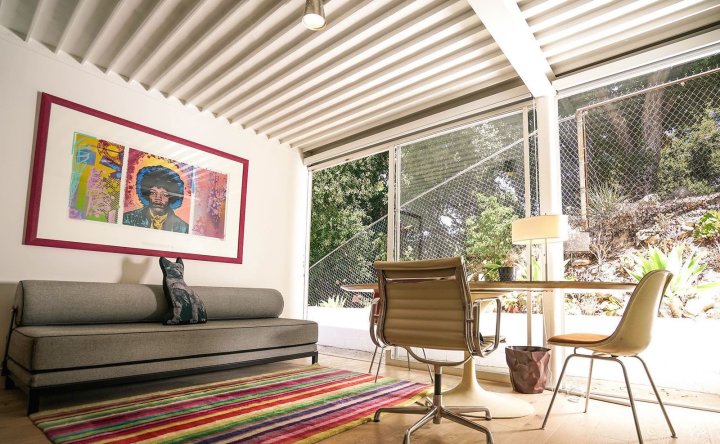
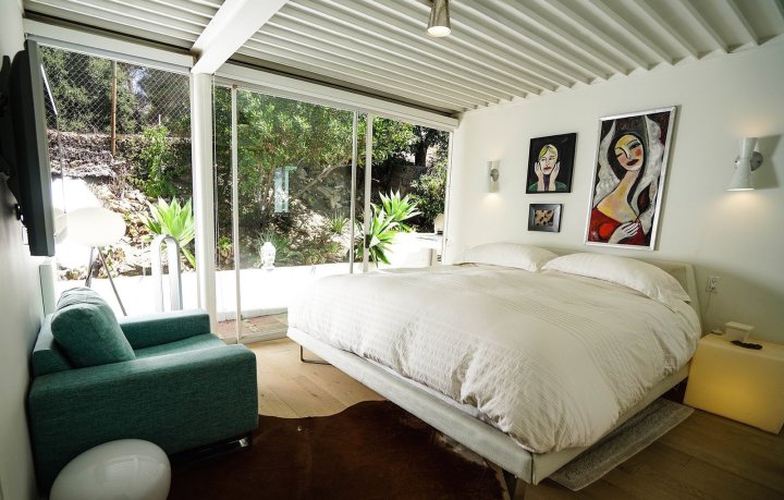
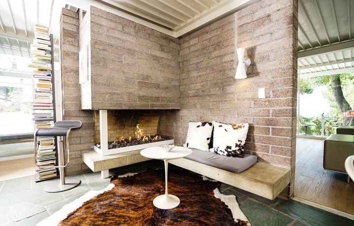
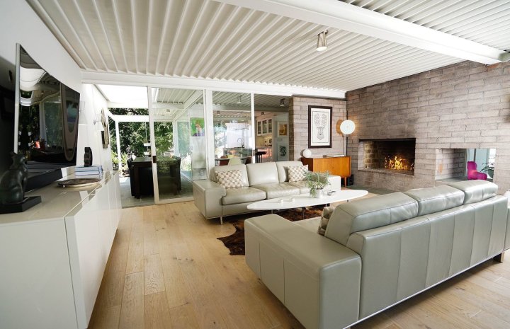
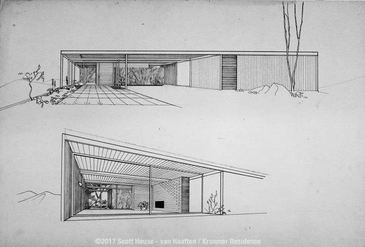
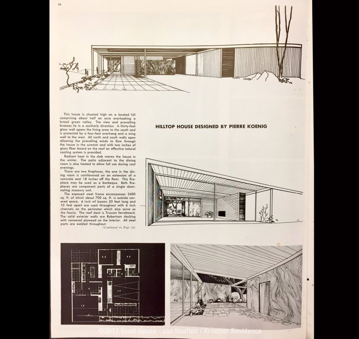
midcentury-modern-homesmodern 7modern 6modern 5Like many of Koenig’s Case Study Houses, the Scott House is an architecturally simple, L-shaped structure made up of straight, clean lines. Plenty of floor-to-ceiling glass walls link the interior spaces and visually connect the house with its surrounding environment. A bright and expansive central living area is anchored by a dividing wall and a two-sided fireplace. Sliding glass doors connect this central living space to other parts of the house. The kitchen connects to two dining zones: an indoor dining area with a small round table, and a larger “winter garden” dining space with a rectangular table. Full glazing on their exterior walls of the two bedrooms bring in tons of light and allow guests to feel a sense of being immersed in the outdoors.

modern 4modern 3

Nikolaus and Heather hired Urban Innovations, Inc. and MIM Construction Inc. to work on the renovation. When the project began, they discovered that the electrical and plumbing systems were also in bad condition.

“The roof was in such bad shape that our contractor Meir Manor from MIM Construction suggested it might be cheaper to replace Koenig’s signature metal ceiling rather than try to fix it. That, of course, was out of the question.  Eventually, Manor and his team found an effective and affordable way to save the original roof by gluing zinc patches on top of the hundreds of holes, filling them up with Bondo, a putty that’s normally used as an anti-rust treatment for cars. He then sanded the entire bottom part of the ceiling to smooth it,” says Heather.

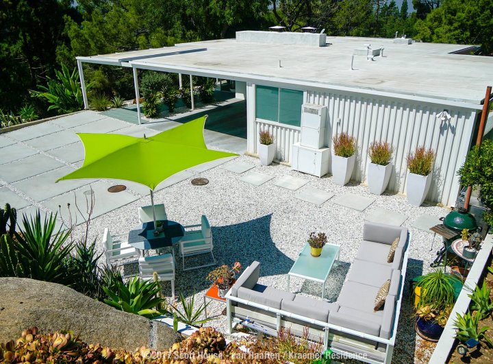
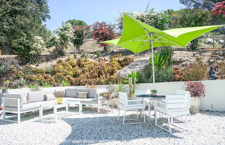
The construction team then rust-proofed the roof by painting it with two layers of heavy-duty primer and a coat of white paint. They replaced all the electric and plumbing systems, as well as the glass panels. They also upgraded the kitchen, bathrooms, floors, driveway, and lighting.

modern back2large

With many of its structural details still intact, the Scott House is an authentic example of Koenig’s architectural legacy.

“With the help of Urban Innovations, Inc. and MIM Construction, the home was brought back to its original state. It now represents the best of Pierre Koenig’s original plans and design, enriched with the amenities of a contemporary 2017 living standard.

elevation largefloor olan 2largefloor planlarge


Beautiful Toys by Charles & Ray Eames

Serious Fun

Taking inspiration from the humble cardboard box, Ray and Charles Eames created toys and furniture to spark the imagination of kids and adults alike. A central tenant of the design philosophy of Ray and Charles Eames was an embrace of play as an end in itself, the idea that creativity should be unconstrained and unburdened. While the couple will always be remembered for their contributions to furniture, design and cinema, it was their approach to experimentation, and their interest in seemingly tangential topics such as clowns, that inspired their seemingly endless sense of wonder and a constant drive towards exploration and improvement. As champions of those beliefs, it only goes to follow that they’d also be some of the world’s foremost toy designers.
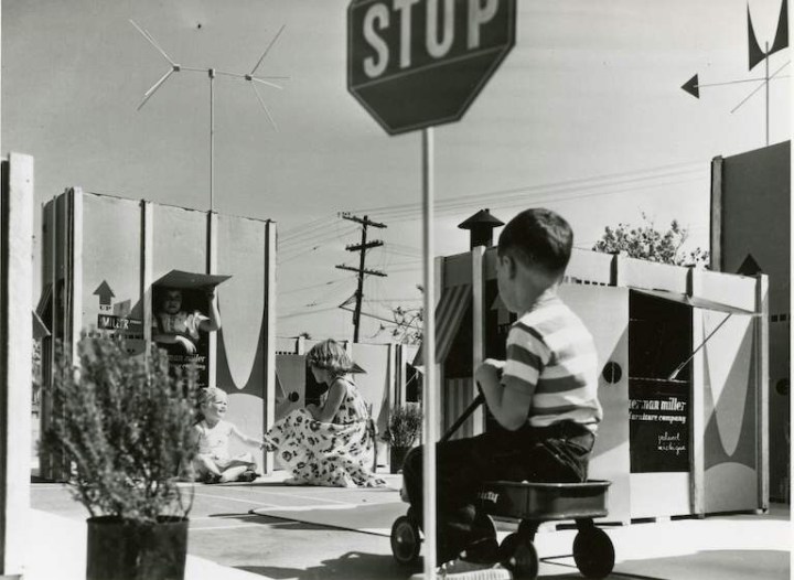
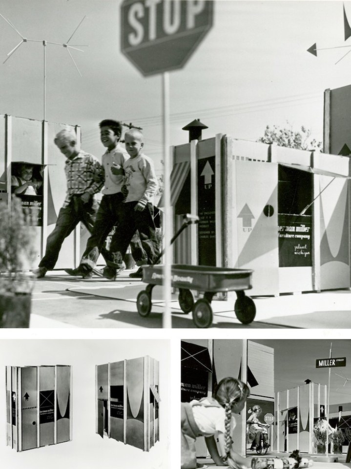
Ray and Charles Eames took child’s play seriously. They invented playthings, furniture, and films to spark, but never limit, the young imagination. Given their own ideas of fun, these toys tended to emphasize composition, structure, and building, giving children the tools of their own adult trades in miniature (and giving some adults the chance to make like children again). Many of their designs embrace what kids and parents have long known: that the box an item comes in, especially if it’s a very large item, can be more exciting than the contents.
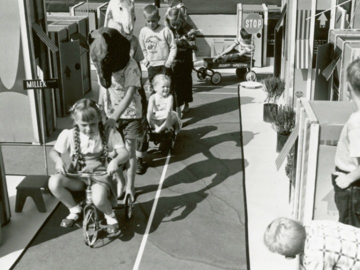
So it comes as no surprise that the Eameses improved the box itself, as a portfolio of photographs unearthed from the Herman Miller Archives reminds us. The humble cardboard box offers children their first chance to make space for themselves, whether that’s a race car, a robot, or a house, sprouting from the shipping container the Eames Office designed in 1951 for the Eames Storage Units (ESUs).
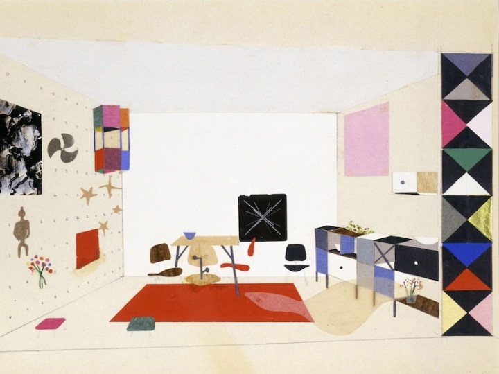
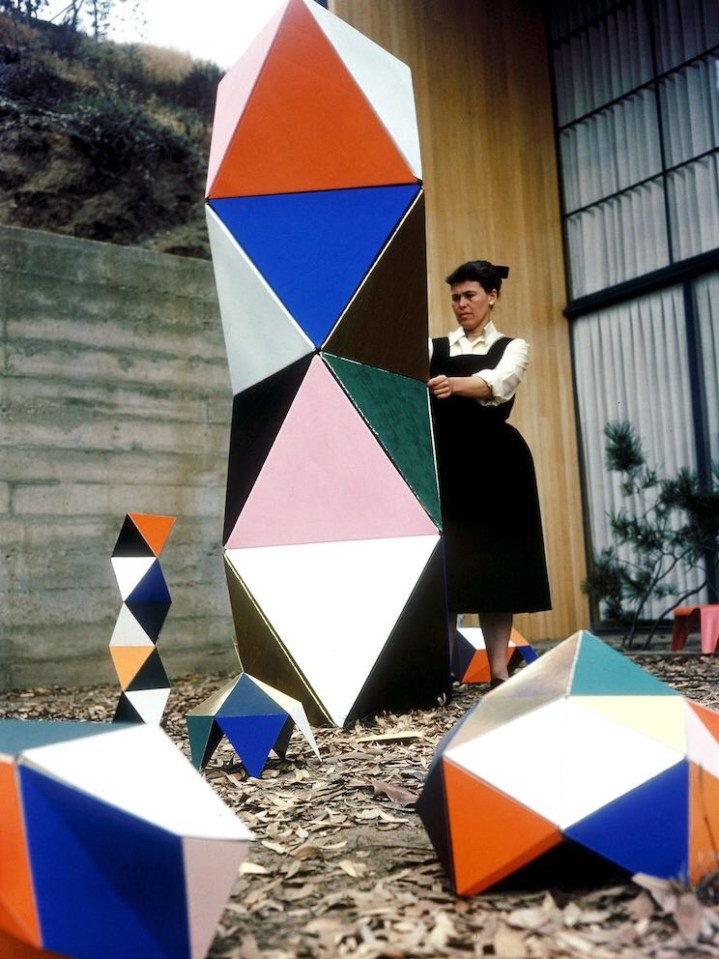
Printed in a colorful red and black design, and featuring the distinctive Herman Miller ‘M,’ the heavy cardboard carton, reinforced with wood splines, had only to be re-nailed to the bottom wood skid, after the furniture had been removed, to be made into a playhouse youngsters would love, reads text from a draft press release. A separate leaflet offers instructions on “How to Make a Playhouse,” but it should have been self-explanatory: dotted lines suggest locations for an entrance and a view out, as well as jaunty awnings.
In one fell swoop, the Eameses managed to combine adult and child fun, eliminate waste, and add excitement to the mundane process of delivery. The up arrows, as well as the deep V of the logo “M,” designed by Irving Harper for the company, suggest the possibility of upward expansion into a miniature townhouse or skyscraper, should a child or parent need more furniture.

The ESUs themselves were also a kind of demountable toy for grownups. Made of perforated steel extrusions with diagonal bracing, they could be configured as low credenzas or high bookshelves. Buyers could customize the interior arrangement, selecting plywood drawers or doors, and perforated metal or enameled Masonite filler panels. Owners could also take them apart and rearrange or add on, treating the furniture as a series of modular boxes‑ furniture as toy.

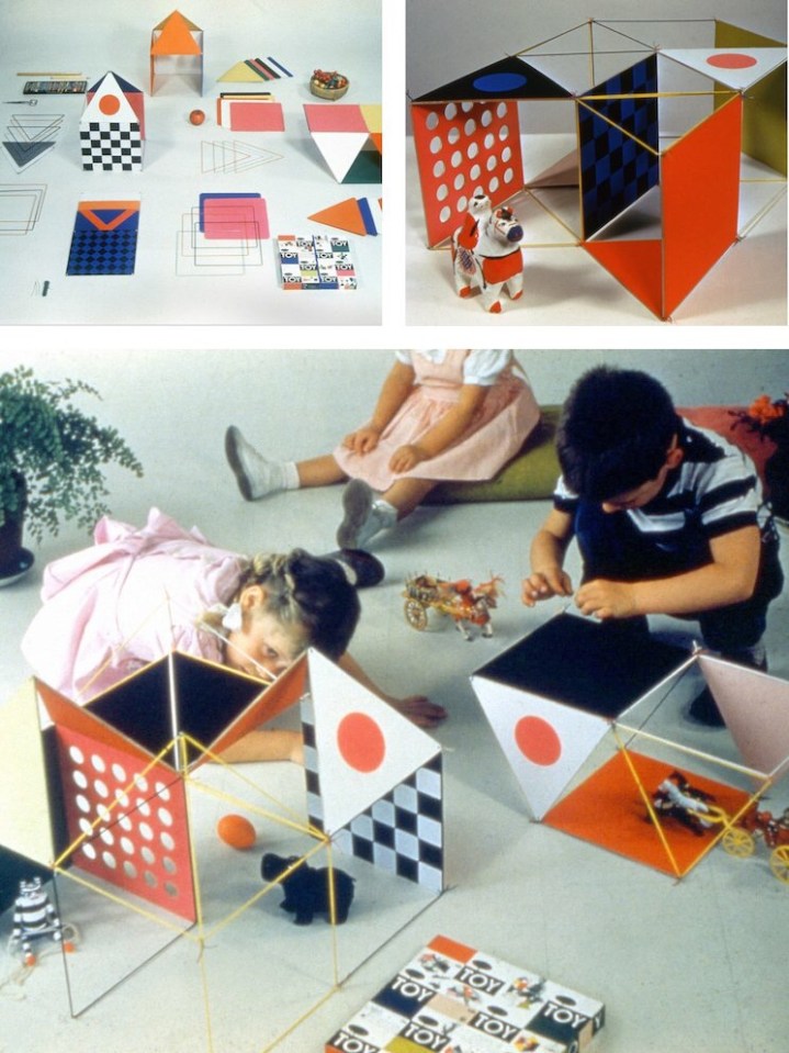
As adults designing playthings intended for children, the Eameses found more inspiration in boxes. The Toy, manufactured by Tigrett Enterprises in 1951, offered children the chance to make their own prefabricated structure, one more colorful and flexible than Carton City. The Eameses had first been in touch with Tigrett about manufacturing large, bright, paper-and-cardboard animal masks based on those they used for skits and photo shoots in the late 1940s. The Memphis-based company was run by the highly entrepreneurial John Burton Tigrett, who made his fortune selling the Glub-Glub duck and may have been looking for more patentable products. The masks never made it out of the prototype stage, but the simpler and more geometric Toy did.

The Toy combined thin wooden dowels, pipe cleaners, and a set of square and triangular stiffened-paper panels in green, yellow, blue, red, magenta, and black. Children could run the dowels through sleeves on the edges of the panels to strengthen them, and then attach these struts at the corners. Initially sold in a big, flat box via the Sears catalog, the Eameses soon redesigned this packaging as well, creating a far more elegant 30-inch hexagonal tube, into which all parts could be rolled and stored.

The first version of the Toy made spaces big enough for children to inhabit, like the cartons. The Little Toy, released in 1952, was scaled more like an architectural model, allowing children to radically reinterpret the dollhouse. (The office later prototyped a modern model house for Revell, but it never went into production.) The Little Toy boxes, which feature a grid of colorful rectangles and words, resemble the panelized arrangement of the Eames House façade and the ESUs, and all of these products, at their various scales, were being developed at the Eames Office within the same few years.

Charles Eames once said of the work done out of the Eames Office, “We work because it’s a chain reaction, each subject leads to the next.” The connection to the ESU cartons and The Toy is immediately apparent in the longest-lived of the modular, paper-based playthings to come out of the Eames Office, the House of Cards.

In the voiceover for “Toccata for Toy Trains,” Charles Eames says, “In a good old toy there is apt to be nothing self-conscious about the use of materials. What is wood is wood; what is tin is tin; and what is cast is beautifully cast.” He could have added, in reference to the couple’s own toys, what is cardboard is cardboard, and then talked about the qualities that make it an ideal building material: its strength, its low cost, its ability to withstand a judicious number of cuts and slots.
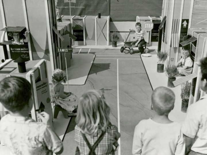
Why Magazine by Alexandra Lange

Beautiful London Architecture

Open House London has officially released the list of over 800 buildings open to the public this fall. This year, a range of exciting architecture is featured, including the new US Embassy by KieranTimberlake, Maggie’s Barts by Steven Holl Architects, and Bloomberg European Headquarters by Foster + Partners, the world’s most sustainable office building. Here is a must-see list of buildings to discover.

MaggiesMAGGIE BARTS
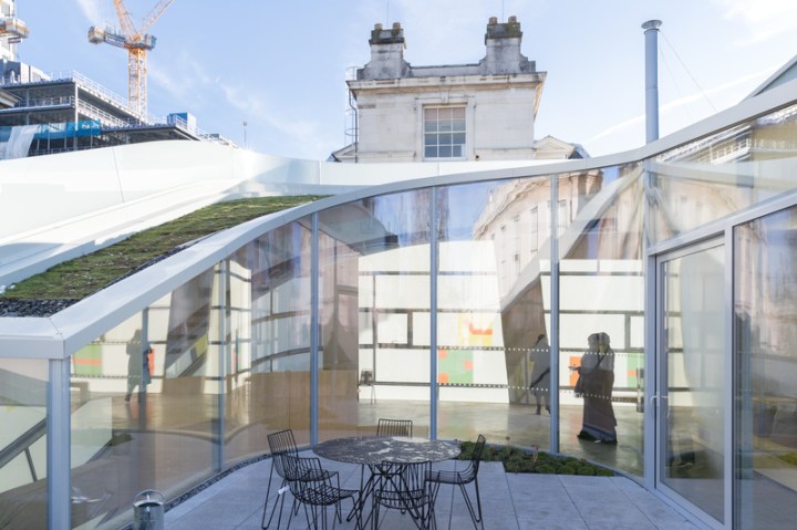
Maggie’s Centers are unique, welcoming and uplifting places with qualified staff on hand to provide free practical, emotional and social support for people with cancer, their families and friends. Maggie’s Centers are designed to feel more like a home than a hospital, with no reception desk, no signs on the wall, no name badges and a big kitchen table at their heart. This approach supports the informal relationships between staff and visitors, and is an important part of the unique support they offer.

Architect's photosArchitect's photosOpening

U.S. EMBASSY
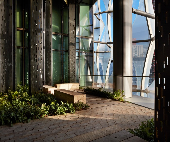
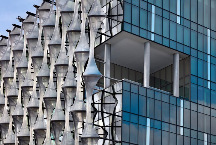
The new U.S. Embassy, by KieranTimberlake, in Nine Elms reflects the best of modern design, incorporates the latest in energy-efficient building techniques, and celebrates the values of freedom and democracy. The Nine Elms district, a South Bank industrial zone under intense redevelopment, is a unique setting for the new Embassy. The Embassy stands at the center of this burgeoning area of London, with a public park containing a pond, walkways, seating, and landscape along its edges. Curving walkways continue into the interior of the building with gardens on each floor that extend the spiraling movement upward.

Kieran TimberlakeKieran TimberlakeKieran Timberlake has completed work on the US Embassy in London, a glass cube swathed in shimmering sails of plastic that is set on a plinth and surrounded by a moat-like pond on the edge of the River Thames.
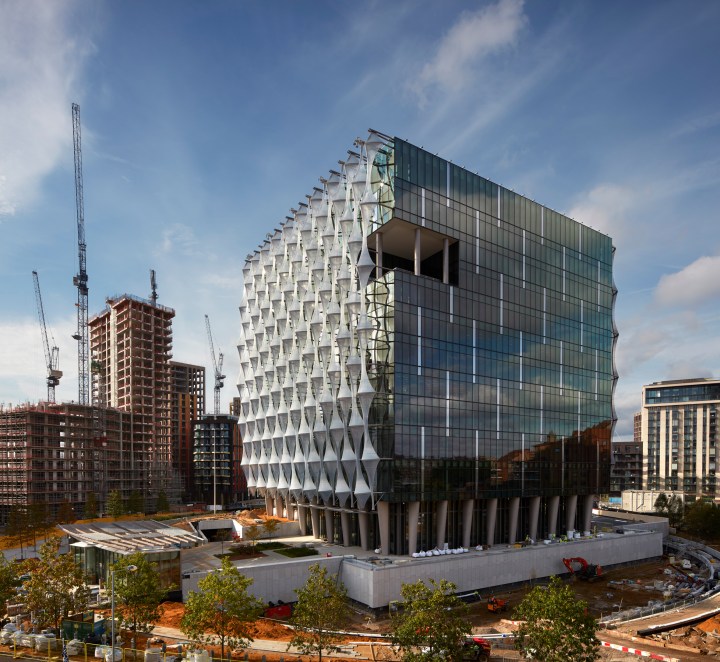
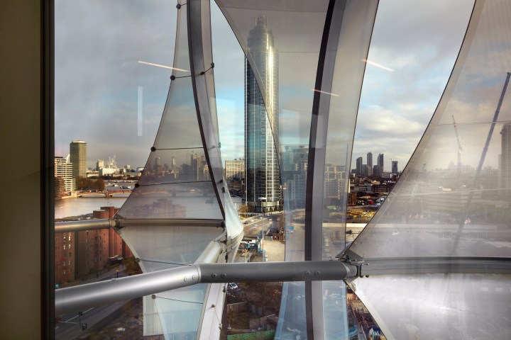
The building, which replaces the previous Eero Saarinen-designed address in Mayfair, has been engineered to balance impenetrable security standards with a visual language of openness. The 12-story cube has a facade of laminated glazing enveloped on two sides with a transparent film of ethylene tetrafluoroethylene (ETFE), the same type of plastic use for the bio-domes in the UK’s Eden Project.

american-embassy--timberlake-col_16american-embassy-imberlake-hero_b-1704x959The “transparent crystalline cube” is intended to symbolize “transparency, openness, and equality”. The unusual form of the building’s facade is designed to minimize solar gain and glare while still allowing natural light in. The reflective facade shifts in color according to the weather and the position of the sun.
american-embassy-kieran-timberlake-col_8american-embassy-kieran-timberlake-col_6american-embassy-timberlake-col_13

ROYAL ACADEMY OF MUSIC – THEATER AND RECITAL HALL
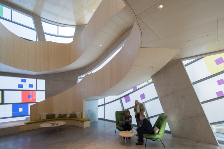
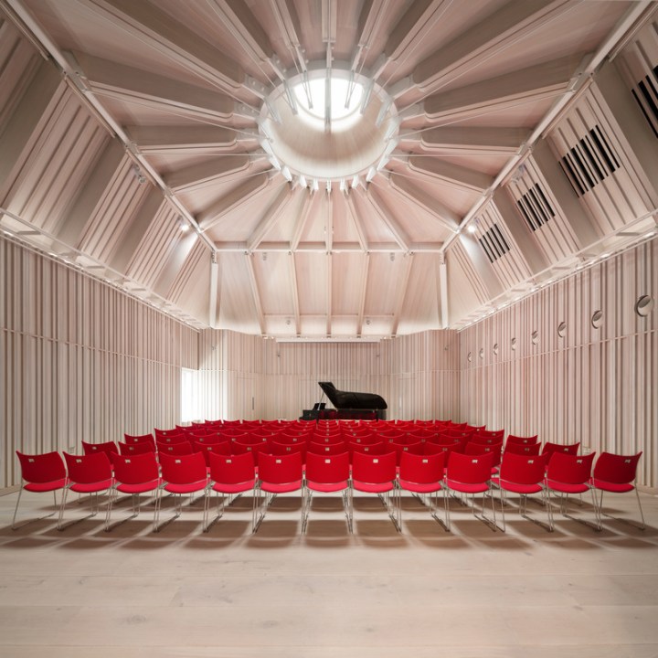
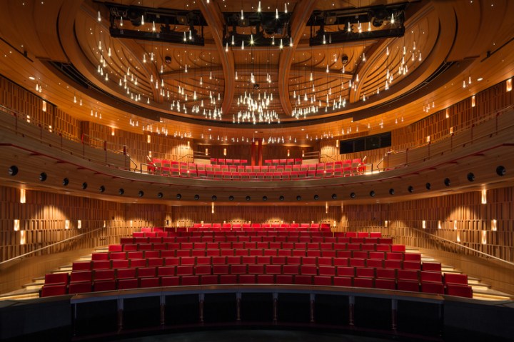
The Royal Academy of Music’s Theatre and new Recital Hall project has created two distinct, outstanding performance spaces for Britain’s oldest conservatory. Designed for both opera and musical theatre productions, The Susie Sainsbury Theater sits at the heart of the Academy. Inspired by the curved shapes of string instruments, the 309-seat cherry-lined Theater has been acoustically refined to deliver excellent sound qualities. Within the old concrete walls, the Theater incorporates 40% more seating than previously through the addition of a balcony, as well as a larger orchestra pit, a stage wing and a fly tower. All seats have unimpeded views of the stage, while the larger orchestra pit allows for an expanded repertoire choice, from early to modern opera and musical theatre.

IanRitchie_RoyalAcademyMusic_RecitalRoom_01

IanRitchie_RoyalAcademyMusic_Theatre_10

BLOOMBERG EUROPEAN HEADQUARTERS
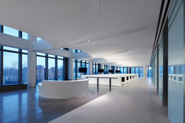
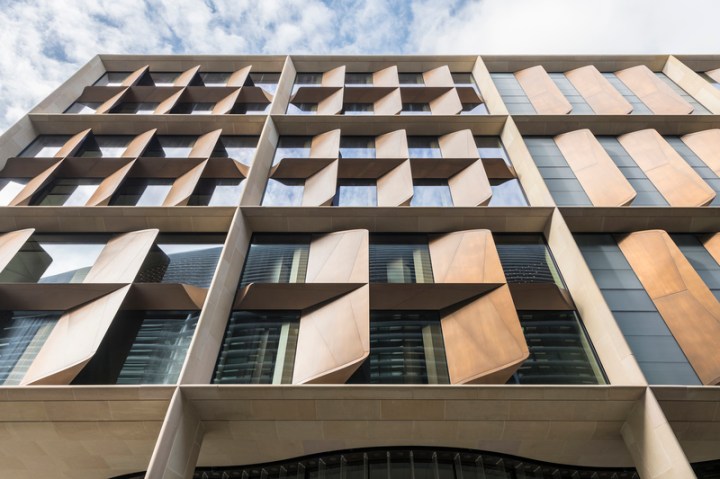
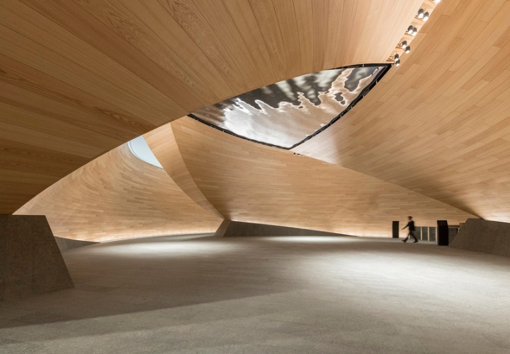
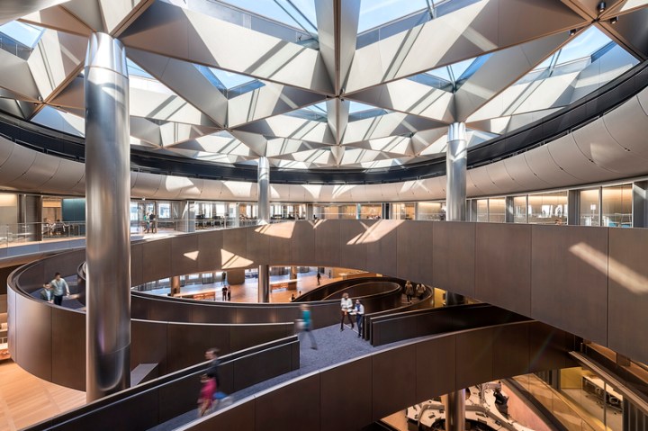
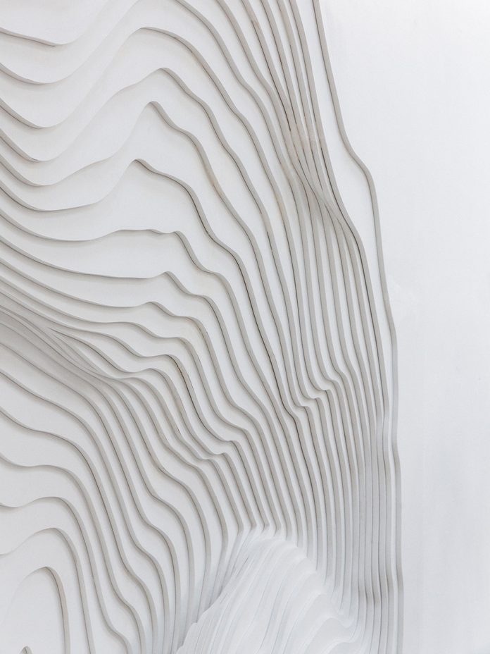
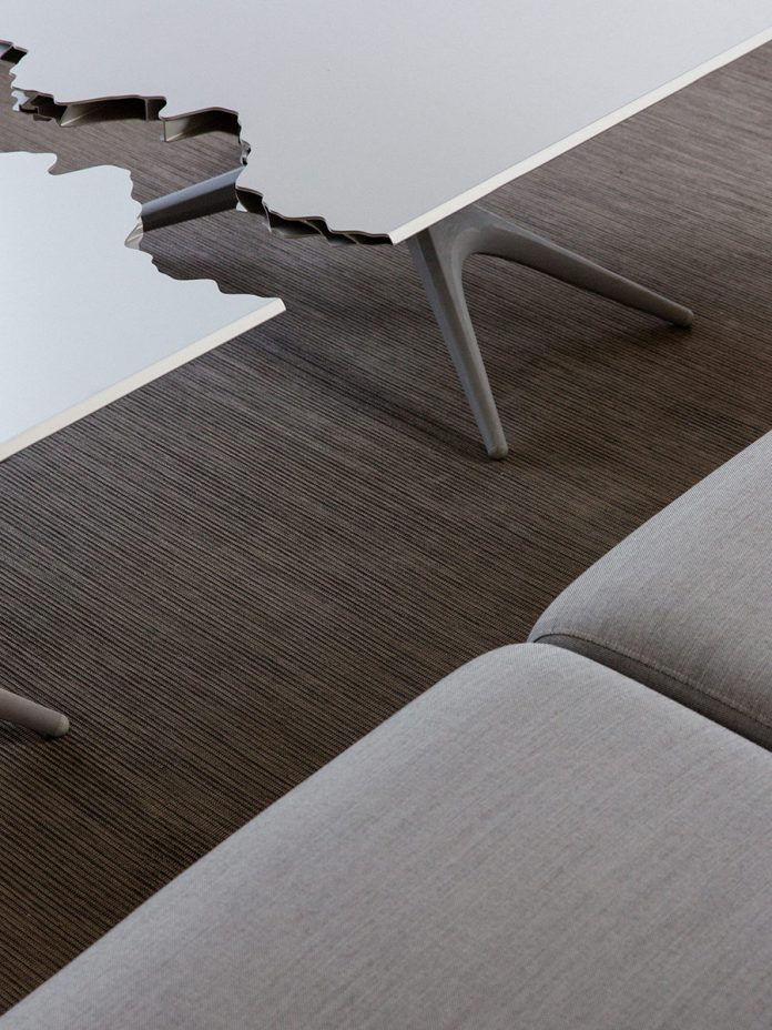
Bloomberg’s European Headquarters is the world’s most sustainable office building. Home to the financial technology and information company’s 4,000 London-based employees, its unique design promotes collaboration and innovation. In its form, massing and materials, the building’s exterior is respectful of its historic setting – a natural extension of the City that will endure and improve the surrounding public realm. Inside, its dynamic, contemporary interior is a highly specific response to the global financial information and technology company’s needs and embodies the organizations core values of transparency, openness and collaboration. Above all, the building sets a new standard in sustainable office design, with a BREEAM Outstanding rating of 98.5% – the highest design-stage score ever achieved by any major office development. The development uses 70% less water and 35% less energy than a typical office building.
Bloomberg European Headquarters12

Bloomberg European Headquarters2Bloomberg European Headquarters.

Beautiful Space Needle

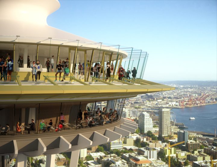
See Seattle from 500 feet through the Space Needle’s rotating glass floor. The 605-foot Space Needle is the most iconic structure in Seattle.

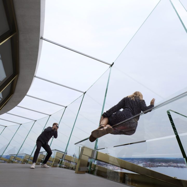
Built in 1962, and reportedly purchased by investors for $75,000, the landmark has an observation deck and revolving restaurant at 500 feet, where hundreds of daily visitors hunker down for 360-degree views of Seattle. Now, 56 years later, the Space Needle is unveiling a massive renovation, with many of the new spaces now open to visitors. Guests can also now “float” over Seattle 520 feet up via new Skyrisers by leaning into the tilting glass walls on the open-air deck for an angled vantage point.

worker sn

Loupe_KasinLoupe_Kasinger_3Loupe_Kasinger_2Loupe_Kasinger_800_7434.0

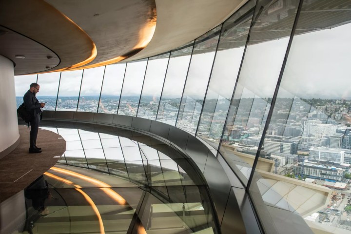
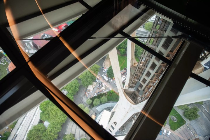
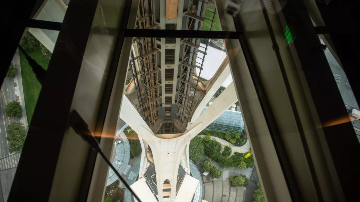
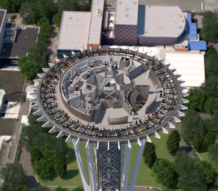
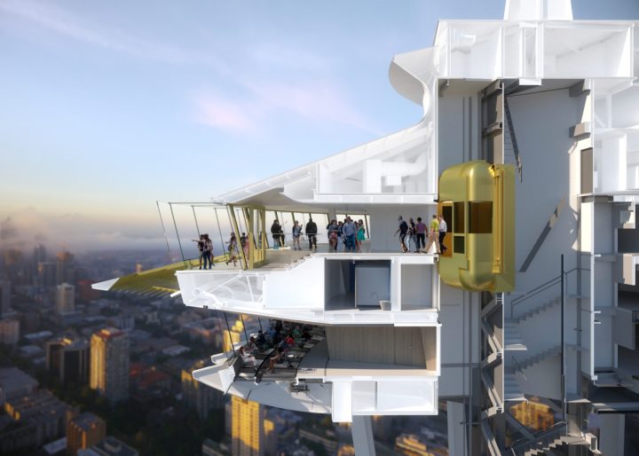
Those who have a fear of heights might not want to look down next time you go up to the Space Needle. One of the centerpieces of the landmark’s massive remodel, designed by Olson Kundig, is now complete: a rotating glass floor, allowing visitors to look down at the 500 feet between them and the ground.

1-Observation-Deck-Rendering-The-Century-Project-Image-by-MIR-Architectural-Design-by-Olson-Kundig-1260x1260

Called the Loupe, the Space Needle’s new floor gives a view not just of the people milling about below, but the inner workings of the building, giving the viewer a sense of what makes the Needle tick. Counter-weights and the insides of the elevator are both revealed.

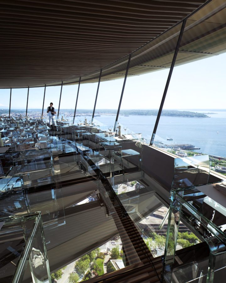
The glass floor goes along with newly-open glass walls, doing away with a more closed-off design and adding glass benches that help give the illusion of floating above the city. All together, more than 176 tons of glass were used in the renovation.

As before, the rotating floor will be part of a restaurant—the exact concept is slated to be announced later this year—but for now, visitors can have a drink or a snack on that level at Atmos Wine Bar. Atmos Café is located on the second floor. Want a glass of water or wine with your meal? It’ll pair well with the glass tables, chairs, windows and rotating floor in the reimagined space. Dropping a fork in this place is going to be a newsworthy event!

2-The-Century-Project-Restaurant-Rendering-Image-by-MIR-Architectural-Design-by-Olson-Kundig-1008x12603-The-Century-Project-Observation-and-Restaurant-Level-Rendering-Image-Courtesy-of-Olson-Kundig-1260x969

8-The-Century-Project-Rendering-Image-Courtesy-of-Olson-Kundig-1260x11055-The-Century-Project-Rendering-Image-Courtesy-of-Olson-Kundig-1260x900

Beautiful Brownstone Interior Renovation

ST. JOHN’S PLACE TOWNHOUSE RENOVATION

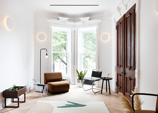
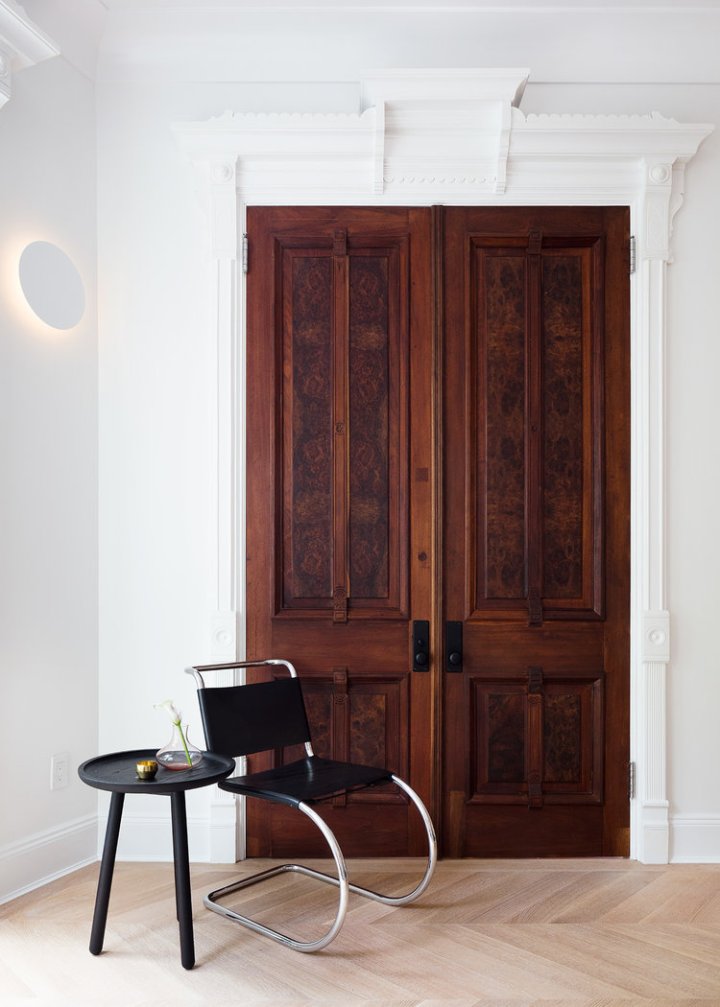
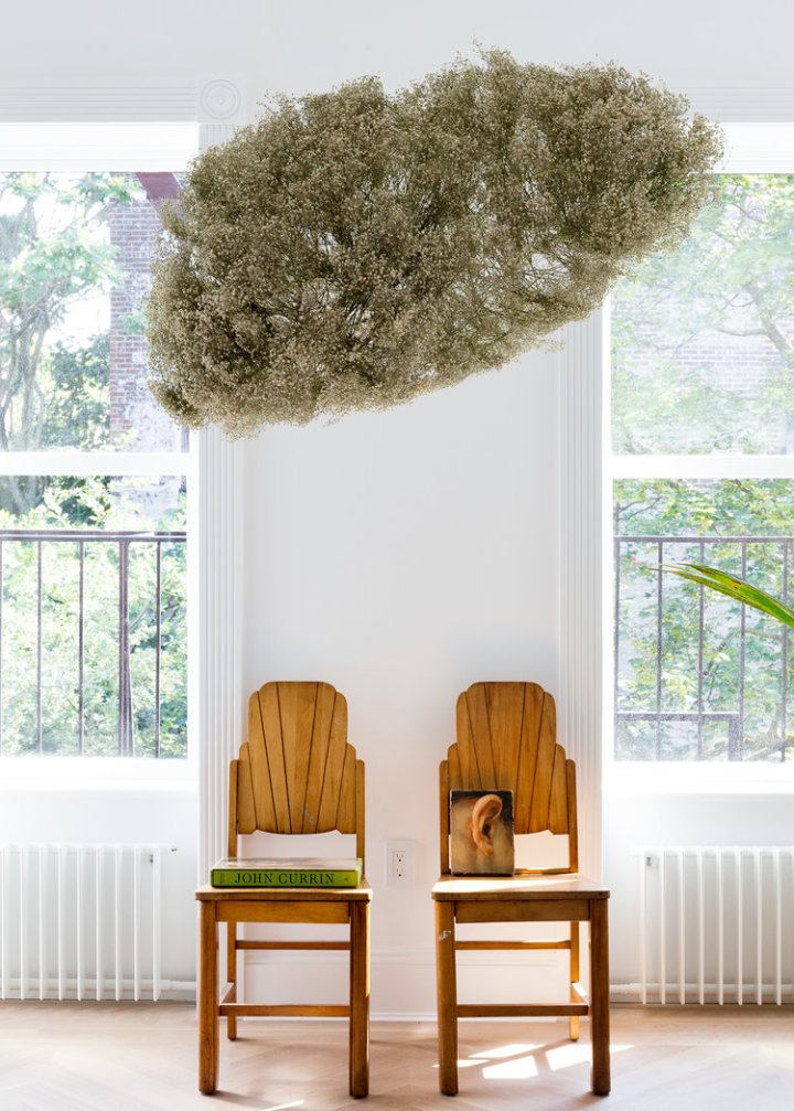
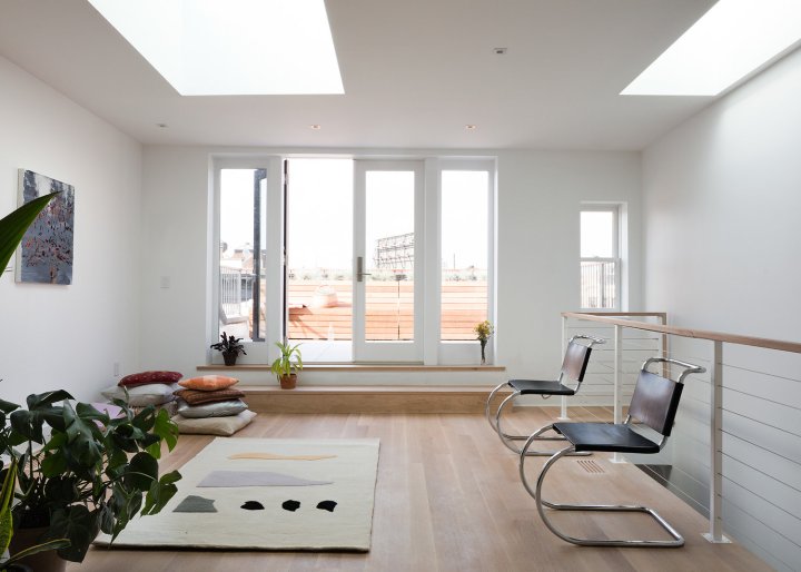
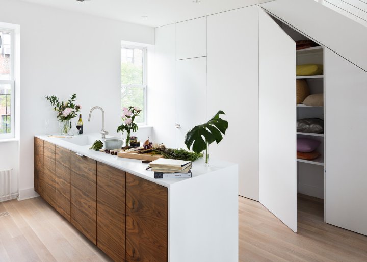
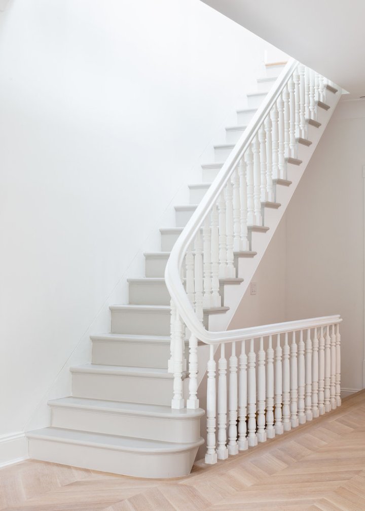
I am drooling over this newly renovated Brooklyn townhouse. I can’t get over the beautiful millwork – The details are stunning!

town house 1

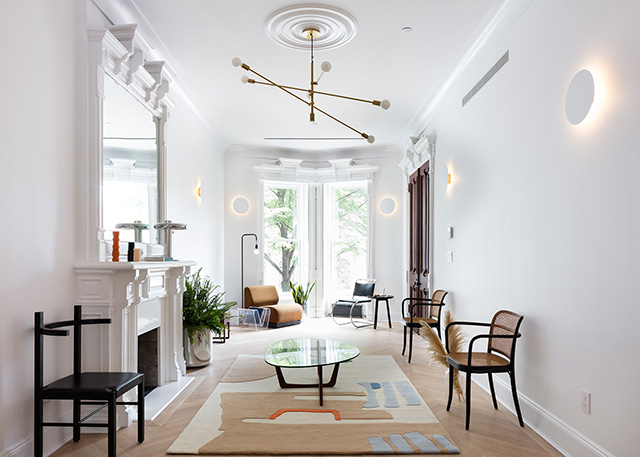
This Spring Hatchet Design Build completed an intricate your-long renovation of a stunning townhouse Brooklyn’s Prospect Heights neighborhood.  Seeking to capture the classic-meets-modern essence of the home, they teamed up with Coil + Drift to style the space.

town h 2.jpg

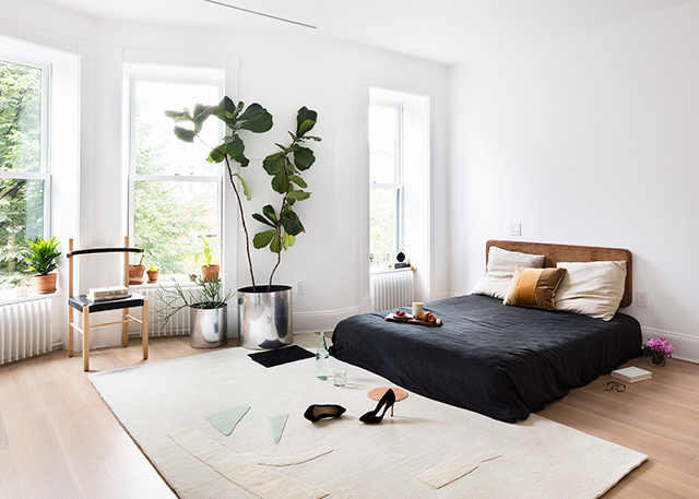
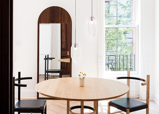
Working along side Brooklyn studio Cold Picnic, Sorensen-Jolink styled the bright home using furniture and lighting from Coil + Drift’s latest collection as well as vintage pieces from Williamsurg’s Home Union and rugs by Cold Picnic.  The result is an elegantly-edited space that feels inviting and fresh while showcasing the homes restored beauty.

town h 5town h 4town h3town h 8town h 7town h 6town h 10Processed with VSCO with a6 presettown h 9town h 13town h 12town h 11town h 15town h 14town h 18town h 17town 16town h 15

All photography by Nicholas Calcott.

Beautiful Snarkitecture

10 Years of Snarkitecture
SNARKITECTURE PROJECT IS ABOUT OPENING UP THE POSSIBILITY, LEAVING THINGS AS OPEN QUESTIONS FOR PEOPLE THAT ARE COMING TO VISIT IT. THERE’S NOT NECESSARILY ANY PRESCRIBED MEANING — TO SAY IT’S ABOUT THIS OR ABOUT THAT — BUT HOPEFULLY, IT ALLOWS YOU TO WONDER.

journal_snarkitechture1.jpg

Perched on a quartz topped column, beneath the crumbling, paint peeled dome of an 18th Century palazzo in Milan, Alex Mustonen is thinking about his legacy. Or rather, the legacy of his design firm, Snarkitecture, whose 2018 has been a banner year. They’ve celebrated their 10 year anniversary, published their first monograph with Phaidon, and have plans to mount a career spanning retrospective at Washington DC’s National Building Museum, opening this Fourth of July.

journal_snarkitechture3

journal_snarkitechture4-

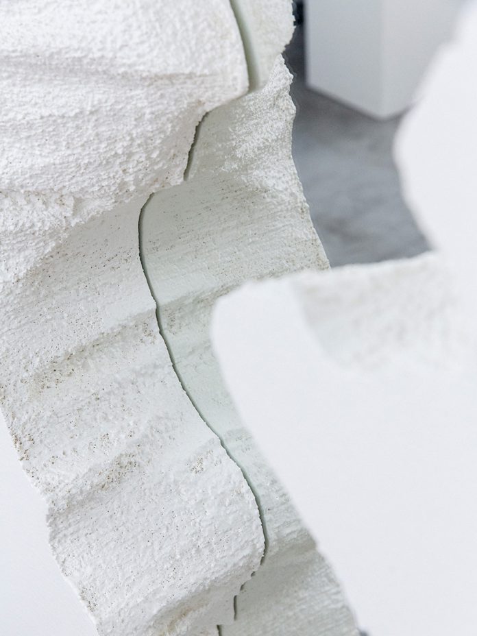
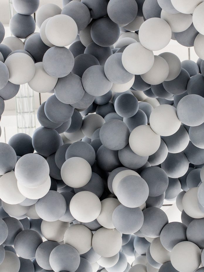
The moody Italian palace doesn’t just serve as a dramatic backdrop for ponderous self reflection. The trio, Mustonen, Daniel Arsham, and Benjamin Porto, have just installed their latest Salone del Mobile project there, a collaboration with quartz manufacturer Caesarstone, that explores water in its various states. It takes the shape of an ethereal amphitheater circling a terraced fountain of quartz. On top, planetary spheres of ice drift and creak, melting into the running water only to rise again as steam. It’s the latest in a sprawling roster of projects — 75 of which are detailed in the book — that Snarkitecture have dreamed into life during their decade-long tenure. They’ve morphed museums into massive, giggling ball pits (The Beach, ongoing), choreographed a ballet of over sized balloons during a gala at the New Museum, and filled the Storefront for Art and Architecture in New York entirely with pure white styrofoam, which they then invited viewers to watch as they excavated it with chisels and icepicks


journal_snarkitechture8.jpg.journal_snarkitechture7.jpg

It’s often said the core genius of Snarkitecture’s projects are their simplicity. For a union that formed in the cerebral confines of New York’s Cooper Union (Mustonen, in architecture and Arsham, art, attended at the same time, while Porto joined the firm later on), their installations and interiors strike straight to the heart of what brings us the purest kinds of joy. There’s an unabashedly innocent jubilation involved in doing a cannonball into a ball pit, marvelling at pirouetting balloons, or digging an endless hole to nowhere. In conceiving their much celebrated work, Snarkitecture are like children, having been gifted with the most expensive and high-tech of toys, instead choosing to make a fort from the box. Or, in their case, the packing foam.

Cereal sat down with partner Alex Mustonen to talk about the past ten years, plans for the future, and what’s inspiring them now.

journal_snarkitechture6

journal_snarkitechture11

From Cereal

Beautiful Stahl House

Stahl House, completed in 13 months and costing $37,500, further demonstrated Pierre Koenig’s flair for working with industrial materials, particularly steel, glass and concrete.

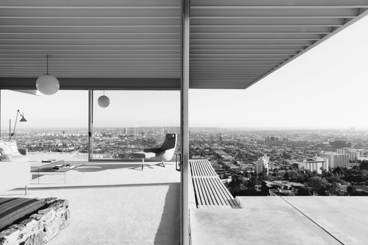
Stahl-Landscape1-The image is instantly familiar; the house, all dramatic angles, concrete, steel and glass, perched indelibly above Los Angeles, with Hollywood’s lights resembling a circuit board below it. Inside, two women sit, stylish and relaxed, talking casually behind the monumental floor to ceiling glass walls. One of the world’s most iconic photographs, Julius Schulman’s Case Study 22 beautifully captures the optimism of 1950s Los Angeles, and the striking beauty of architect Pierre Koenig’s masterpiece, Stahl House. The classic L shaped pavilion, cantilevered above Hollywood on Woods Drive, was built in 1959 after being adopted into the Case Study Program, an experimental residential design initiative that commissioned architects to create model homes in the wake of the 1950s housing boom. Stahl House, also known as No. 22, was the wild one, conjured up by the man who purchased the plot of land at 1635 Woods Drive in 1954 for $13,500 and sealed the deal with a handshake. C H ‘Buck’ Stahl was a dreamer, who, along with his wife Carlotta, set about finding the right person to bring his vision for an innovative and thoroughly modern home to life.
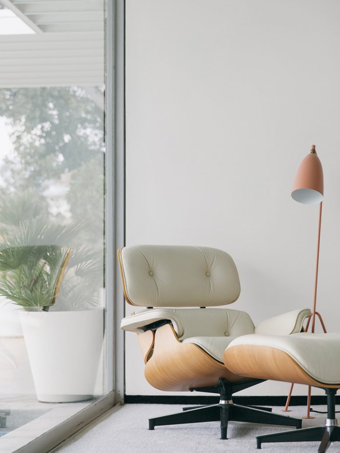
Stahl-portrait1-chairstahl_portrait2-pool.jpgBuck was a former professional footballer who worked as a graphic designer and sign painter. He spent his first few years as a landowner hauling broken blocks of concrete to the site in attempt to improve its precarious foundation. He and Carlotta ferried their finds, load by load, back to Woods Drive in the back of Buck’s Cadillac, hopeful the reinforcements would prevent the land from sliding. Buck’s dreams for the house began to take shape over the following two years, and eventually, he made a model of the future Stahl House. His grand designs, however, were promptly rejected by several notable architects.

Stahl-Landscape2-view.jpgCarlotta recalled Buck continually telling prospective architects “I don’t care how you do it, there’s not going to be any walls in this wing.” Until they hired Pierre Koenig in 1957, an ambitious young architect determined to build on a site nobody would touch, it seemed unlikely the house would ever exist. Pierre described the process of building Stahl House as “trying to solve a problem – the client had champagne tastes and a beer budget.” He was interested in working with steel, and despite being warned away from it by his architecture instructors, possessed great aptitude for it. He’d experimented with a number of exposed glass and steel homes before he created Case Study 21, or The Bailey House in 1958 and 1959, and his skill for designing functional spaces with simplicity of form, abundant natural light, and elegant lines would eventually make him a master of modernism. Stahl House, completed in 13 months and costing 37,500 USD, further demonstrated Pierre’s flair for working with industrial materials, particularly steel, glass, and concrete. The project put him on the map as an architect with an incredible eye for balance, symmetry, and restraint. The 2,040 m² house was, as Buck insisted, built without walls in the main wing to allow for sweeping 270º views. Three sides of the building were made of plate glass, unheard of in the late 1950s, and deemed dangerous by engineers and architects. This design feature required Pierre to source the largest pieces of glass available for residential use at the time. With two bedrooms, two bathrooms, polished concrete floors, and a very famous swimming pool (a fixture in countless films and fashion editorials) Stahl House was an immediate mid century icon.
vol8_stahl_landscape1-viewpoint0.jpg

Although there has been some dispute over Buck’s influence on the design in the years since he died in 2005 and Pierre Koenig’s death in 2004, some experts who have seen Buck’s original model agree that his concept informed the direction the Stahl House would finally take.

“I dismissed it as typical owner hubris at the time,” architect and writer Joseph Giovannini told the Los Angeles Times in 2009. “The gesture of the house cantilevering over the side of the hill into the distant view is clearly here in this model. But it is Pierre’s skill that elevated the idea into a masterpiece. This is one of the rare cases it seems that there is a shared authorship.”

Today, Stahl House is still owned by the Stahl family. Though it remains a magnet for film crews and photographers the world over, for Bruce Stahl, Buck and Carlotta’s son, who grew up there with his siblings, it was simply part of a typical, happy childhood. “We were a blue collar family living in a white collar house,” he said. “Nobody famous ever lived here.”

stahlHouse_2013_0223-1200x375Landscape-.jpg 04-1600x500.jpg
Credits: Lucy Brook
Photos: Rick Poon

Beautiful Villa Savoye

As a monument to modernism, the building possesses a poetry and sensitivity full of idealism. The careful composition of living space and intention to harness natural light, not to mention the building’s iconic aesthetic, still define modern architecture.

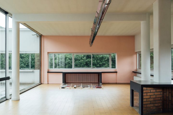
villasavoye_landscapeThe Villa Savoye, built in 1929 in Poissy, a rural area outside Paris, was Le Corbusier’s answer to a French country house. Given relatively few constraints by the Savoye family, Le Corbusier designed a building to embody the architectural theory he had evolved in practice and in his book, Towards an Architecture 1923. He was inspired by both the classical forms of ancient Greek architecture and the modern technologies that were shaping the world such as automobiles, airplanes and ocean liners.

villasavoye_landscape2.jpgThis project was the last in a series of private homes known as the ‘white villas’ built by Le Corbusier and his cousin and partner Pierre Jeanneret, which introduced a new form of luxury in which space itself, and its capacity for leisure, were the valuable commodities.

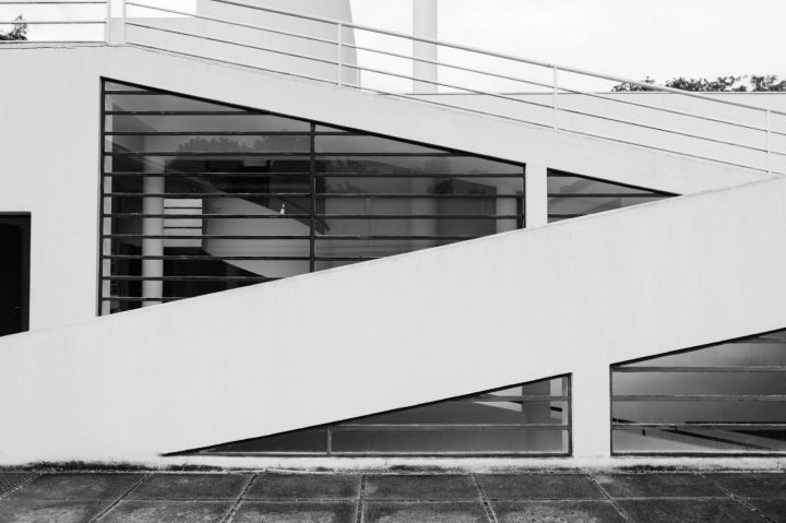
Of these, The Villa Savoye perhaps best embodies Le Corbusier’s architectural manifesto, the five points of architecture. The first, pilotis – slender pillars which raise the building off the ground, opening up more space for gardens and cars, made possible the second, a façade free of its usual load bearing function. Walls were no longer supporting structures but ‘membranes.’ This allowed the unimpaired design of the third, an open plan interior, and the fourth, ribbon windows to flood the interior with maximum light and to illuminate it evenly. A sliding window system patented by Le Corbusier and Pierre Jeanneret was intended to offer superior ventilation, as well as give access to the fifth, a flat roof which could serve as a terrace. A curved solarium crowns the structure, the brightest increment in the layered design. This symbiotic relationship of these five features gives some insight into what could otherwise be a somewhat alienating notion of Le Corbusier’s, the famous concept of a house as ‘a machine for living.’

villasavoye_landscape3-outdoor.jpgUnfortunately the Villa Savoye presented its residents with its own host of problems, despite its pioneering design. Each autumn, as the windows ushered in a warm vista of seasonal colour, the family would write repeatedly to Le Courbusier, begging him to make ‘habitable,’ what proved to be a damp and chilly building. They complained of ‘raining’ in the hall, on the ramp and in the bathroom. The loud drumming of rain on the bathroom skylight kept them awake at night, heat escaped through the long stretches of glazing and the heating system was both insufficient and a further cause of flooding.

villasavoye_stair.jpg villasavoye_portraitchair villasavoye_landscape4.jpgvillasavoye_portrait6-bath.jpgvillasavoye_portrait5-stair 2.jpg villasavoye_landscape4

Much of this was perhaps due to the fact that the technology involved was not fully developed at the time. As a monument to Modernism, the building possesses a poetry and sensitivity full of idealism. The careful composition of living space and intention to harness natural light, not to mention the building’s iconic aesthetic, still define modern architecture. Nonetheless, the discomforts they had suffered ultimately led the Savoye family to decide against restoring the property after the 2nd World War, when it was seized by German forces. About to be demolished by the local authorities to make way for a school, the building was rescued by architects and academics including Le Corbusier himself. Now a museum, restored closely to its original state, Villa Savoye is one of 17 of Le Corbusier’s buildings declared a UNESCO World Heritage Site.
Credit: readcereal.com/

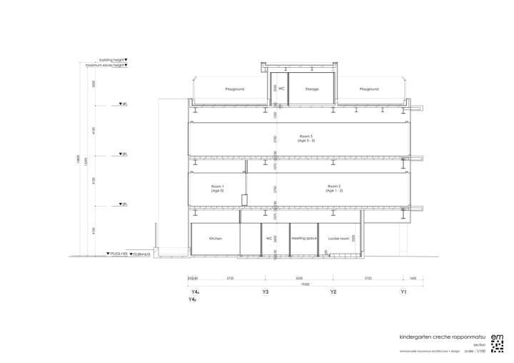
Beautiful Amazing Kindergarten

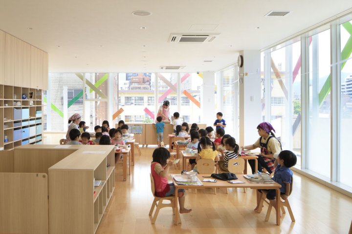
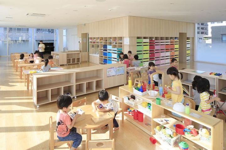
Today, I present one of those projects that takes your breath away. It is designed by Emmanuelle Moreaux and it’s a beautiful kindergarten full of color, a stimulating environment where kids can let their imagination run free. Every child should be so lucky to go to school to attend a learning environment like this.

colorful-nursery1

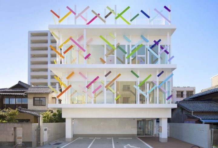
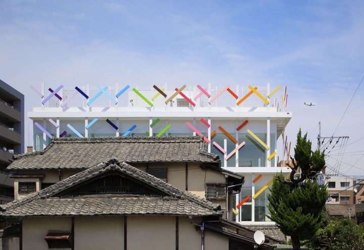
I love the use of color, a common feature that runs throughout the space. The school, Creche Ropponmatsu, is located in a residential area in Fukuoka, Japan. Emmanuele Moreaux designed this crazy, whimsical project – color is common theme throughout many of her projects. The result is amazing. Emmanuelle designed the architecture, interior space, logos and graphical signage, with a vision to open a new kindergarten where children can grow up freely in mind and body. Running behind the colorful grove, this kindergarten gives opportunity for children to raise rich sensibility by feeling many colors wherever they are.

colorful-nursery2

colorful-nursery3

THREE-DIMENSIONAL COLORS AND ELEMENTS
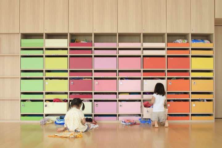
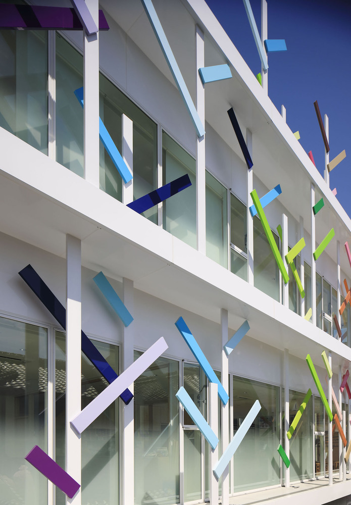
Color is apparent in every corner of the space. 22 colors were used in the 63m height trees on the façade. The branches appear to wrap the entire building, protecting it, perhaps, from the less colorful world outside. Collections of color jump out at one glance. On the facade, there are 22 colors used in 63 multi-colored trees of 4 m in height extend the branches rhythmically and wrap the building. While giving full-sized glass with a feeling of openness, by wrapping it with colorful trees, gives a sense of distance to the outside. Inside, 200 colorful boxes in 25 colors are lined up on the wall, where each one of them belongs to every child to stock their personal goods. Every time children use their own tools or get changed, they find and pick up the box of their color.

colorful-nursery4.jpg

colorful-nursery5

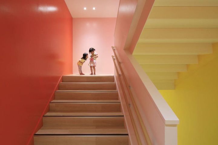
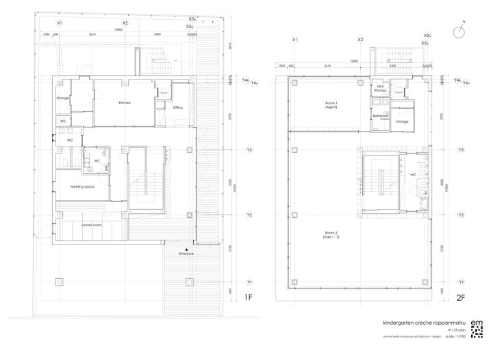
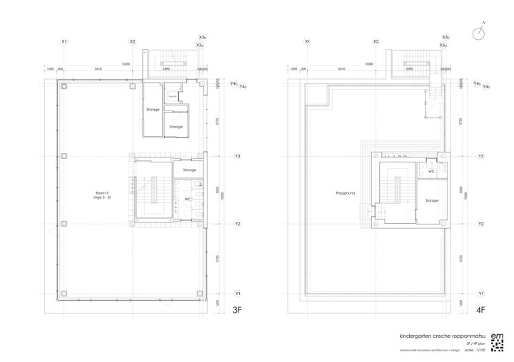
The stairs which connect the 4 floors is also full of colors, 18 different tones in fact. This creates an environment where kids are surrounded by diversity inside, outside and in common zones. Stimulation with colors and shapes is crucial for kids at this age – experts claim that color helps kids to develop their sensitivity and individuality.

colorful-nursery6

DETAILS IN THE LOGO
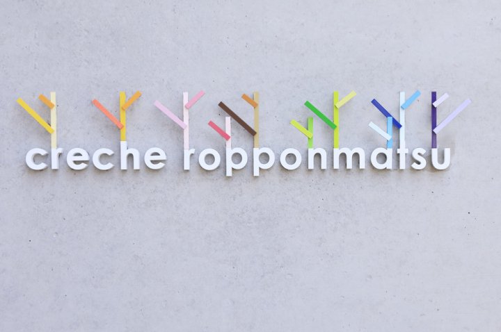
Colorful trees on the façade have been also included in the logo, a perfect representation.

colorful-nursery7.jpg

creche_01

creche_0

creche_ropponmatsu_fp

creche_ropponmatsu_fp_2

creche_ropponmatsu_elevation_3

Learn more about her colorful projects here