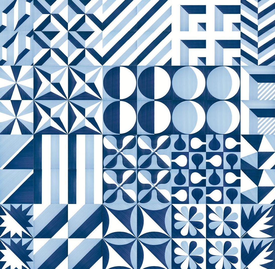
Serious Fun
Taking inspiration from the humble cardboard box, Ray and Charles Eames created toys and furniture to spark the imagination of kids and adults alike. A central tenant of the design philosophy of Ray and Charles Eames was an embrace of play as an end in itself, the idea that creativity should be unconstrained and unburdened. While the couple will always be remembered for their contributions to furniture, design and cinema, it was their approach to experimentation, and their interest in seemingly tangential topics such as clowns, that inspired their seemingly endless sense of wonder and a constant drive towards exploration and improvement. As champions of those beliefs, it only goes to follow that they’d also be some of the world’s foremost toy designers.
Ray and Charles Eames took child’s play seriously. They invented playthings, furniture, and films to spark, but never limit, the young imagination. Given their own ideas of fun, these toys tended to emphasize composition, structure, and building, giving children the tools of their own adult trades in miniature (and giving some adults the chance to make like children again). Many of their designs embrace what kids and parents have long known: that the box an item comes in, especially if it’s a very large item, can be more exciting than the contents.

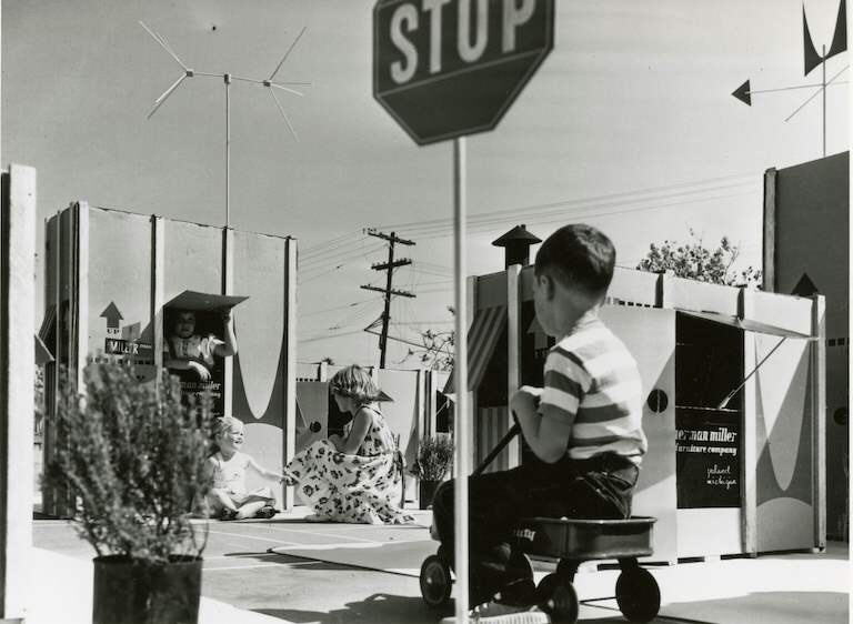
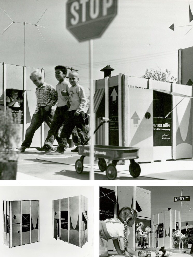
So it comes as no surprise that the Eameses improved the box itself, as a portfolio of photographs unearthed from the Herman Miller Archives reminds us. The humble cardboard box offers children their first chance to make space for themselves, whether that’s a race car, a robot, or a house, sprouting from the shipping container the Eames Office designed in 1951 for the Eames Storage Units (ESUs).
Printed in a colorful red and black design, and featuring the distinctive Herman Miller ‘M,’ the heavy cardboard carton, reinforced with wood splines, had only to be re-nailed to the bottom wood skid, after the furniture had been removed, to be made into a playhouse youngsters would love, reads text from a draft press release. A separate leaflet offers instructions on “How to Make a Playhouse,” but it should have been self-explanatory: dotted lines suggest locations for an entrance and a view out, as well as jaunty awnings.

In one fell swoop, the Eameses managed to combine adult and child fun, eliminate waste, and add excitement to the mundane process of delivery. The up arrows, as well as the deep V of the logo “M,” designed by Irving Harper for the company, suggest the possibility of upward expansion into a miniature townhouse or skyscraper, should a child or parent need more furniture.
The ESUs themselves were also a kind of demountable toy for grownups. Made of perforated steel extrusions with diagonal bracing, they could be configured as low credenzas or high bookshelves. Buyers could customize the interior arrangement, selecting plywood drawers or doors, and perforated metal or enameled Masonite filler panels. Owners could also take them apart and rearrange or add on, treating the furniture as a series of modular boxes‑ furniture as toy.

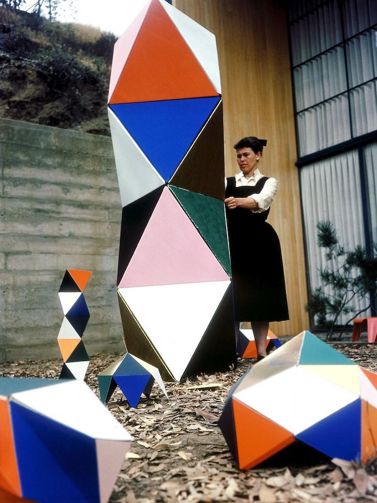
As adults designing playthings intended for children, the Eameses found more inspiration in boxes. The Toy, manufactured by Tigrett Enterprises in 1951, offered children the chance to make their own prefabricated structure, one more colorful and flexible than Carton City. The Eameses had first been in touch with Tigrett about manufacturing large, bright, paper-and-cardboard animal masks based on those they used for skits and photo shoots in the late 1940s. The Memphis-based company was run by the highly entrepreneurial John Burton Tigrett, who made his fortune selling the Glub-Glub duck and may have been looking for more patentable products. The masks never made it out of the prototype stage, but the simpler and more geometric Toy did.
The Toy combined thin wooden dowels, pipe cleaners, and a set of square and triangular stiffened-paper panels in green, yellow, blue, red, magenta, and black. Children could run the dowels through sleeves on the edges of the panels to strengthen them, and then attach these struts at the corners. Initially sold in a big, flat box via the Sears catalog, the Eameses soon redesigned this packaging as well, creating a far more elegant 30-inch hexagonal tube, into which all parts could be rolled and stored.
The first version of the Toy made spaces big enough for children to inhabit, like the cartons. The Little Toy, released in 1952, was scaled more like an architectural model, allowing children to radically reinterpret the dollhouse. (The office later prototyped a modern model house for Revell, but it never went into production.) The Little Toy boxes, which feature a grid of colorful rectangles and words, resemble the panelized arrangement of the Eames House façade and the ESUs, and all of these products, at their various scales, were being developed at the Eames Office within the same few years.
Charles Eames once said of the work done out of the Eames Office, “We work because it’s a chain reaction, each subject leads to the next.” The connection to the ESU cartons and The Toy is immediately apparent in the longest-lived of the modular, paper-based playthings to come out of the Eames Office, the House of Cards.
In the voiceover for “Toccata for Toy Trains,” Charles Eames says, “In a good old toy there is apt to be nothing self-conscious about the use of materials. What is wood is wood; what is tin is tin; and what is cast is beautifully cast.” He could have added, in reference to the couple’s own toys, what is cardboard is cardboard, and then talked about the qualities that make it an ideal building material: its strength, its low cost, its ability to withstand a judicious number of cuts and slots.

Why Magazine by Alexandra Lange


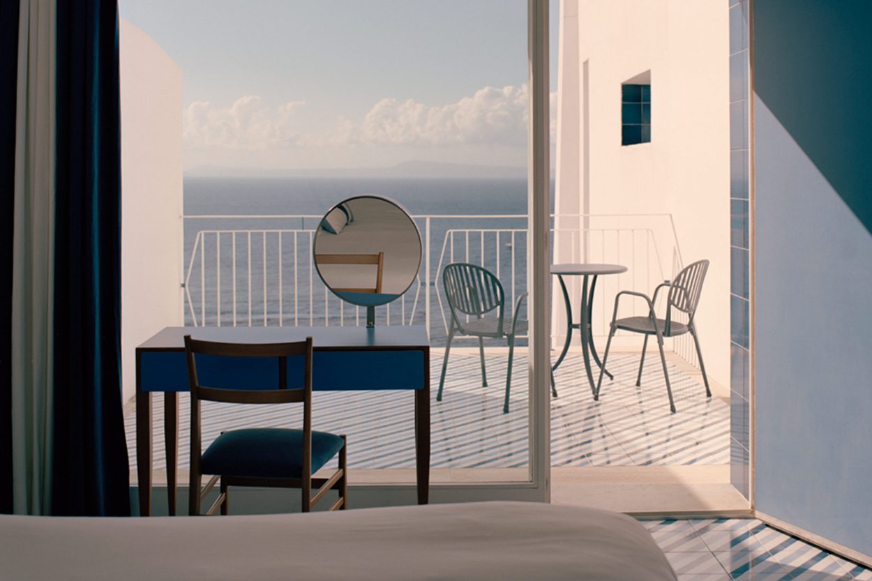
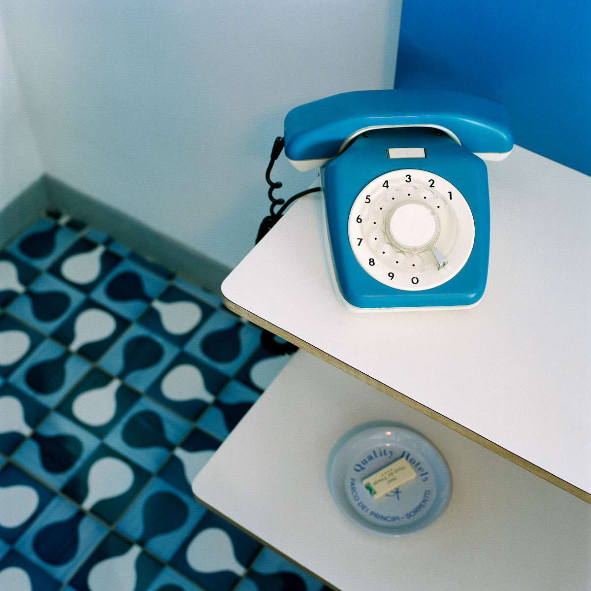
 White concrete frames a square of uninterrupted blue. The cloudless sky, the iridescent Tyrrhenian sea, even the land stretching out either side — pastel-painted Sorrento to the left, Vesuvius to the right — is cast in a haze of blue. An impressionist’s dream.
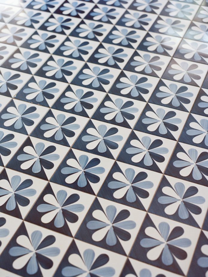
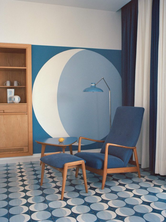
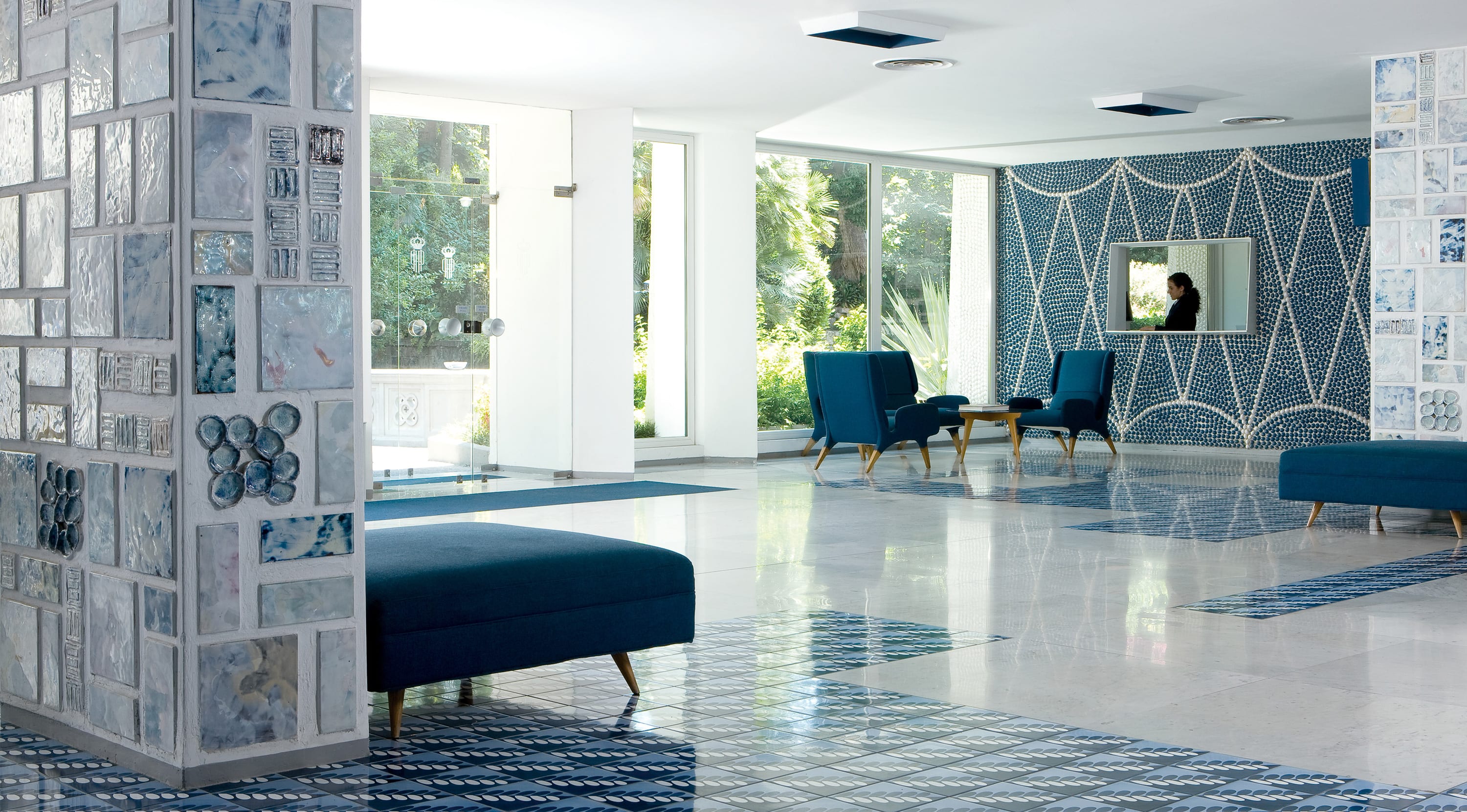 Of all Gio Ponti’s 100-odd buildings, Sorrento is the only hotel where you can still stay, fully immersed in his art — for as well as the building itself he designed every last detail. He was not just an architect, but a designer — of interiors, furniture, industry, cars — an artist and a ceramicist, a writer and a teacher; and at
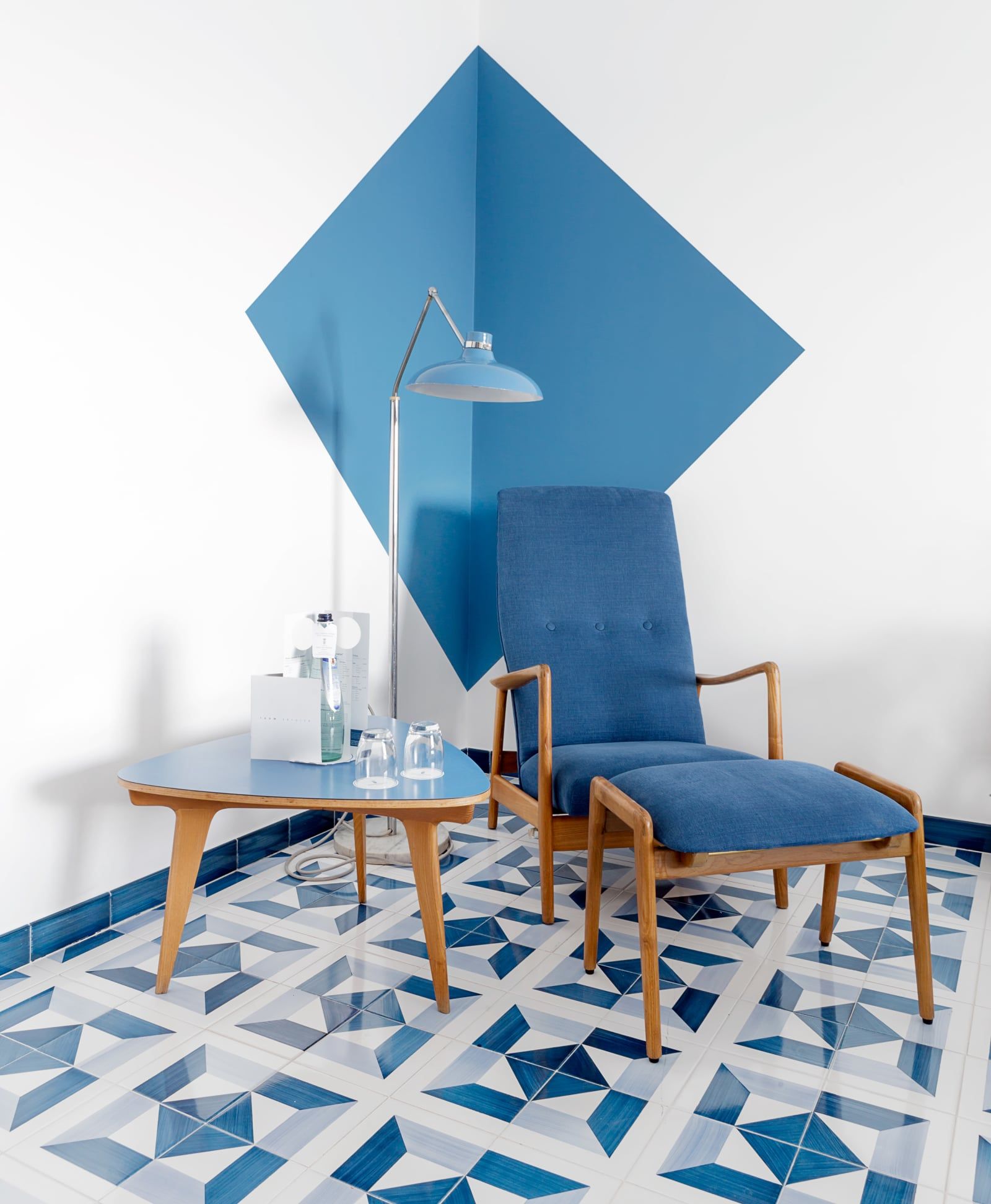
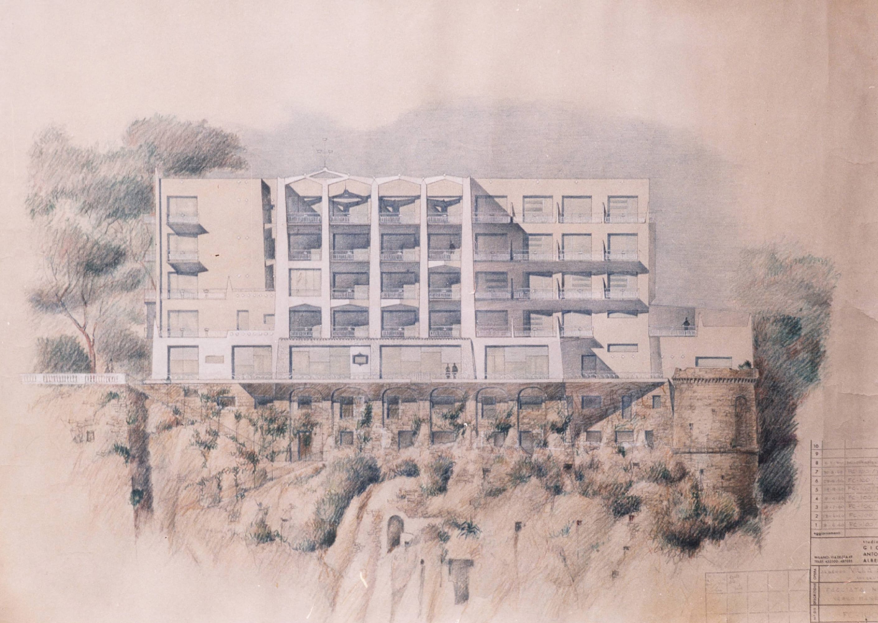

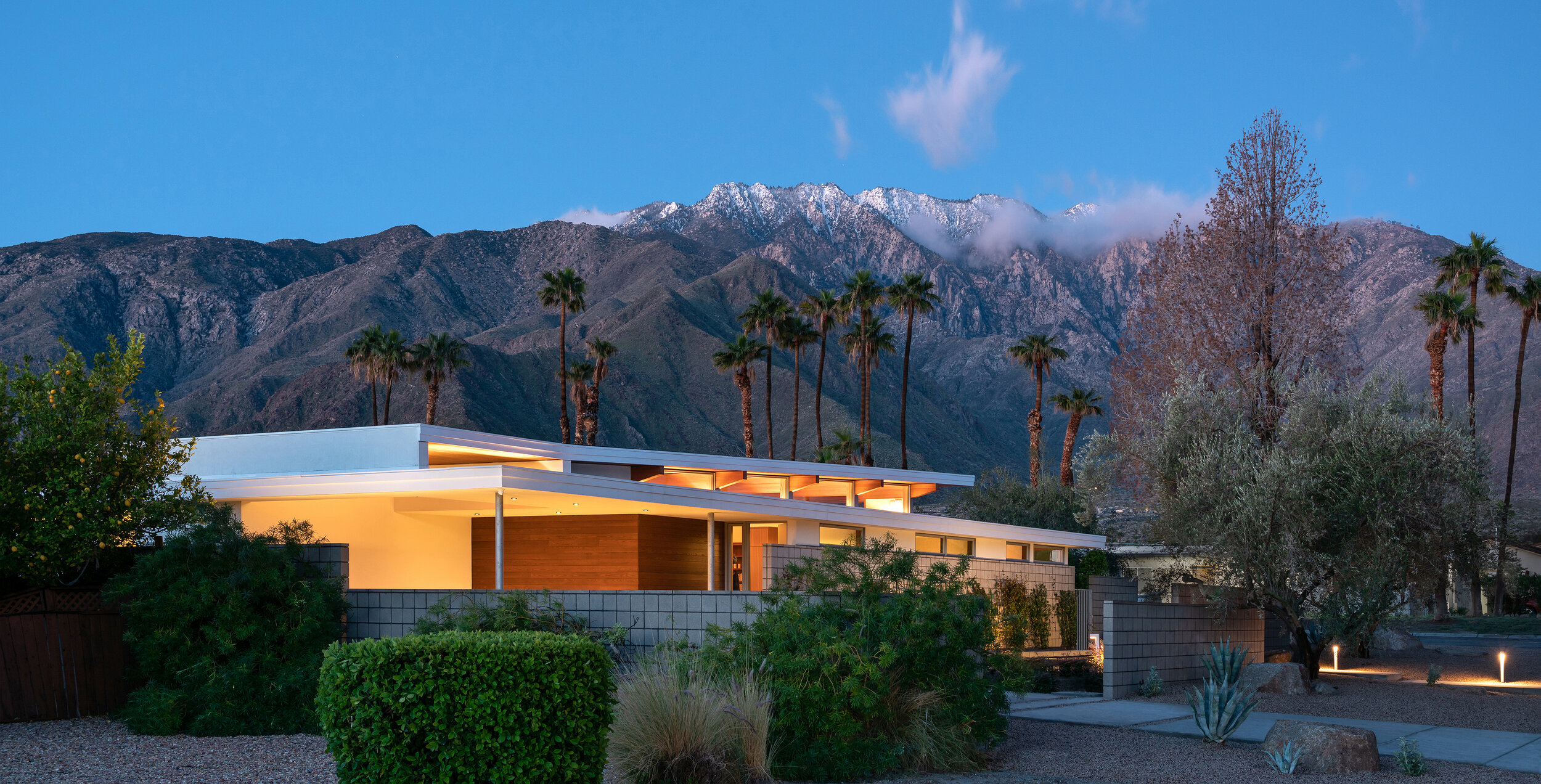 Recently completed in February 2019,
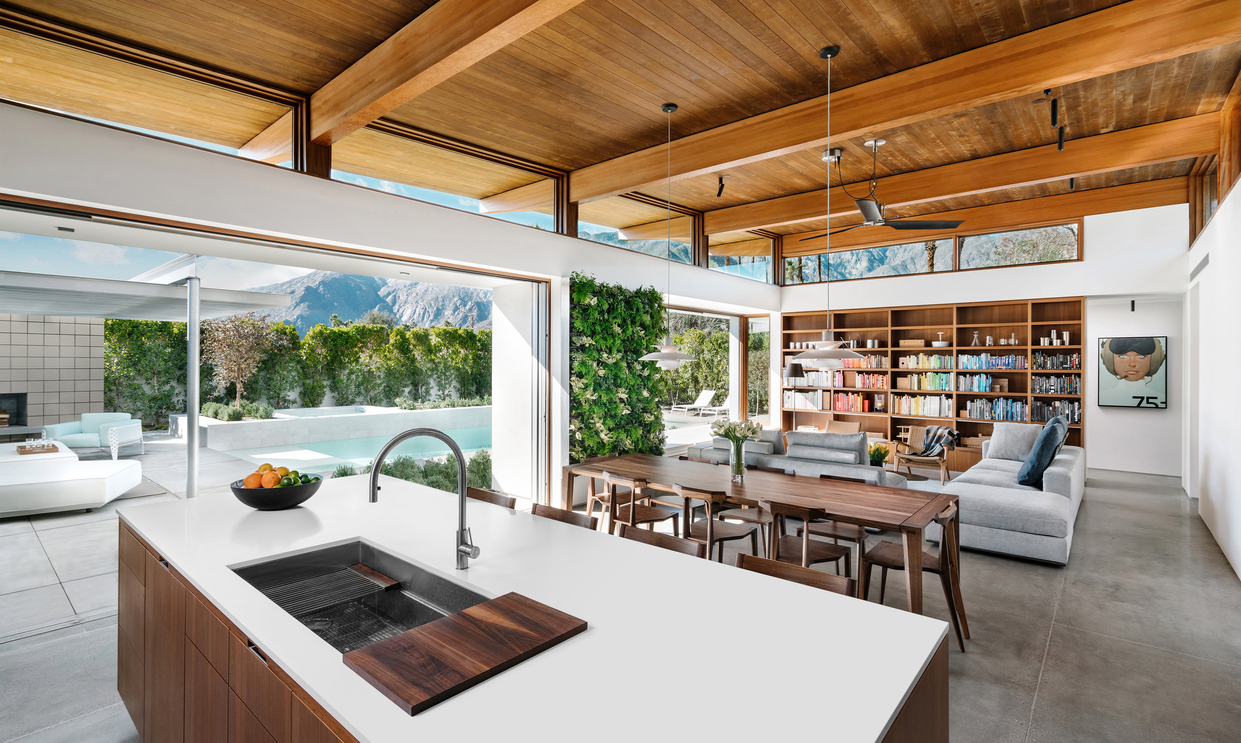
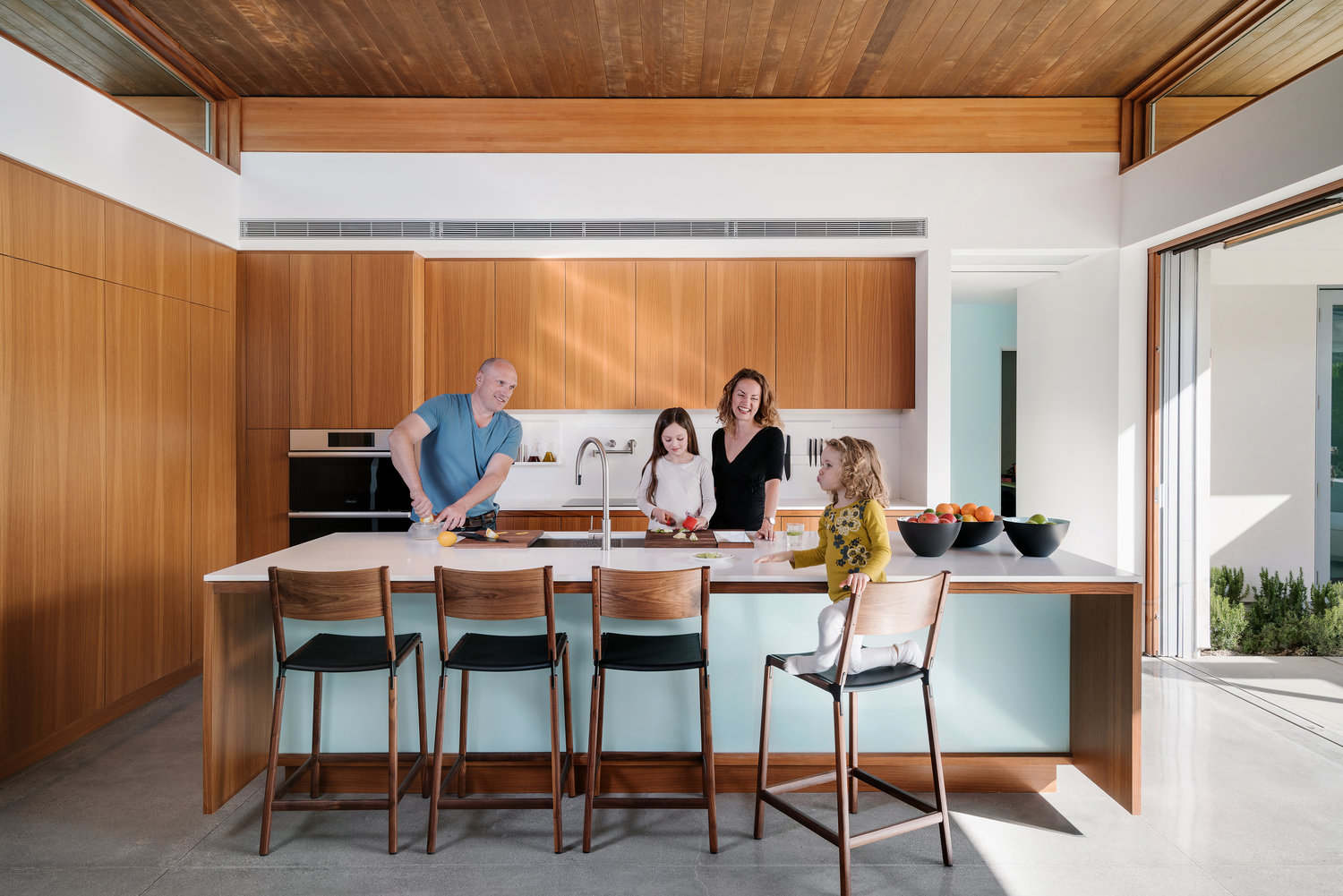
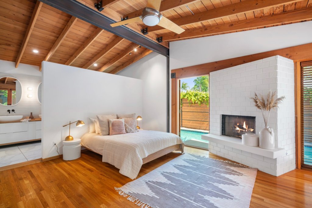
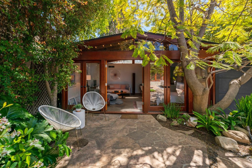
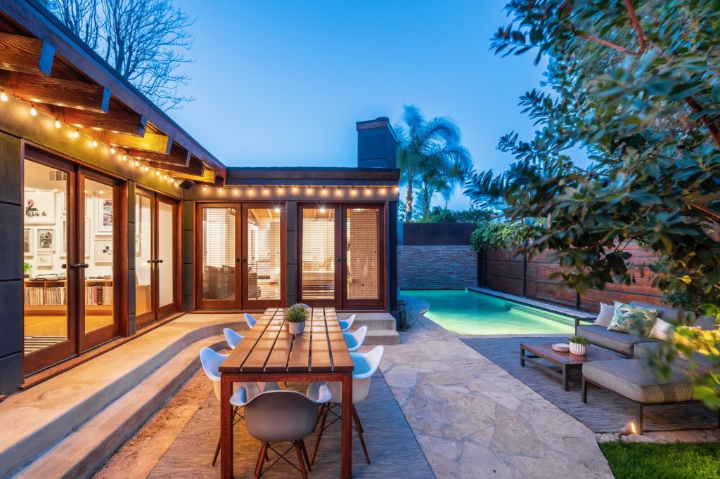
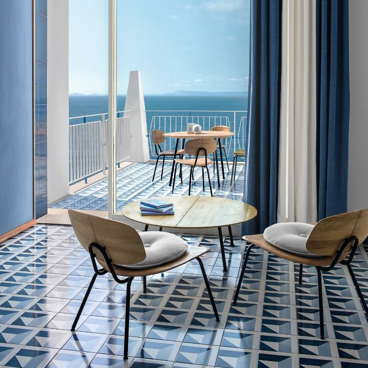
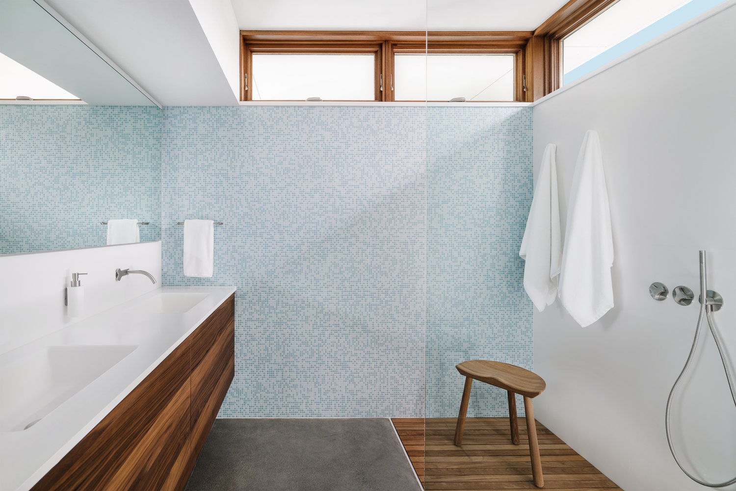
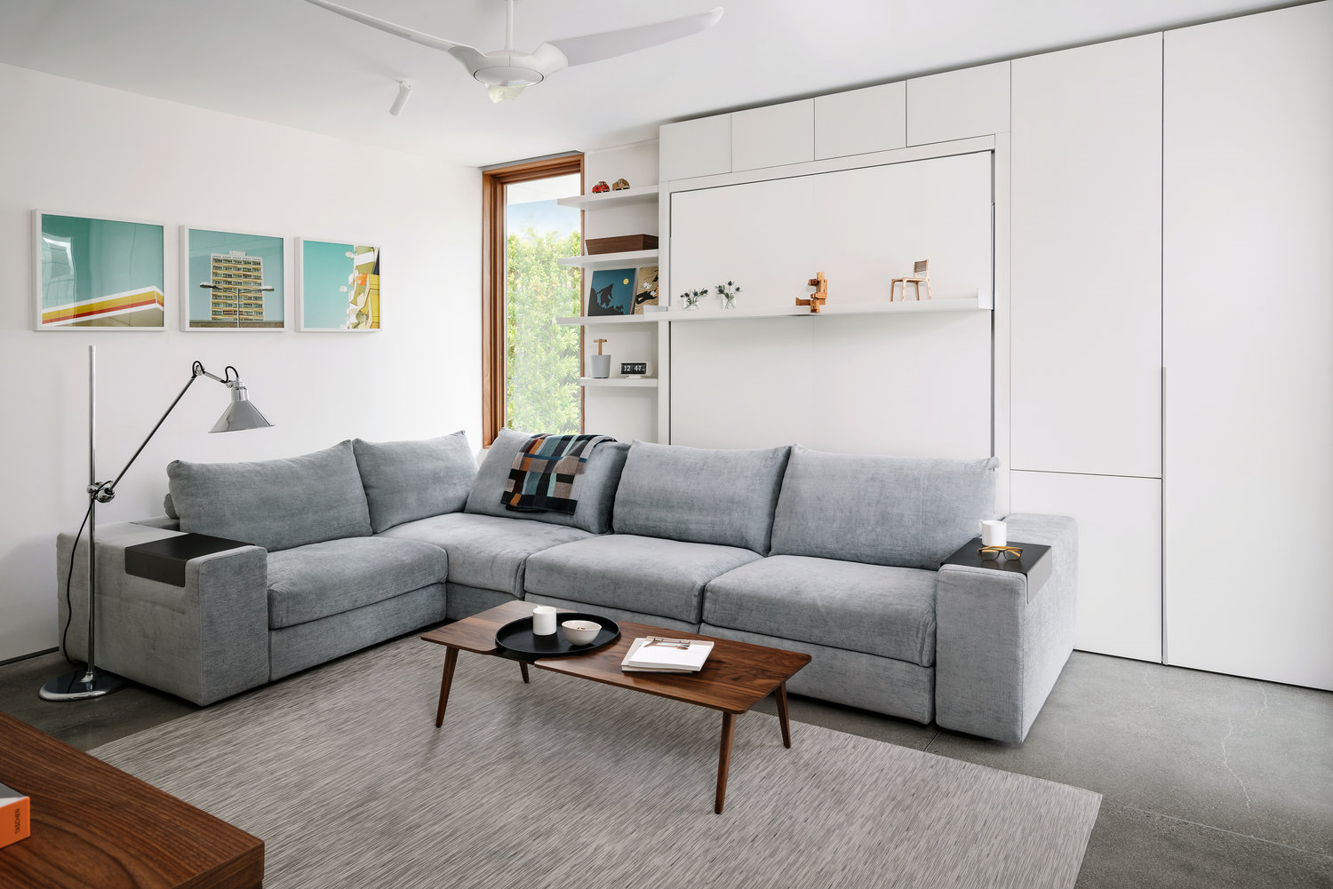
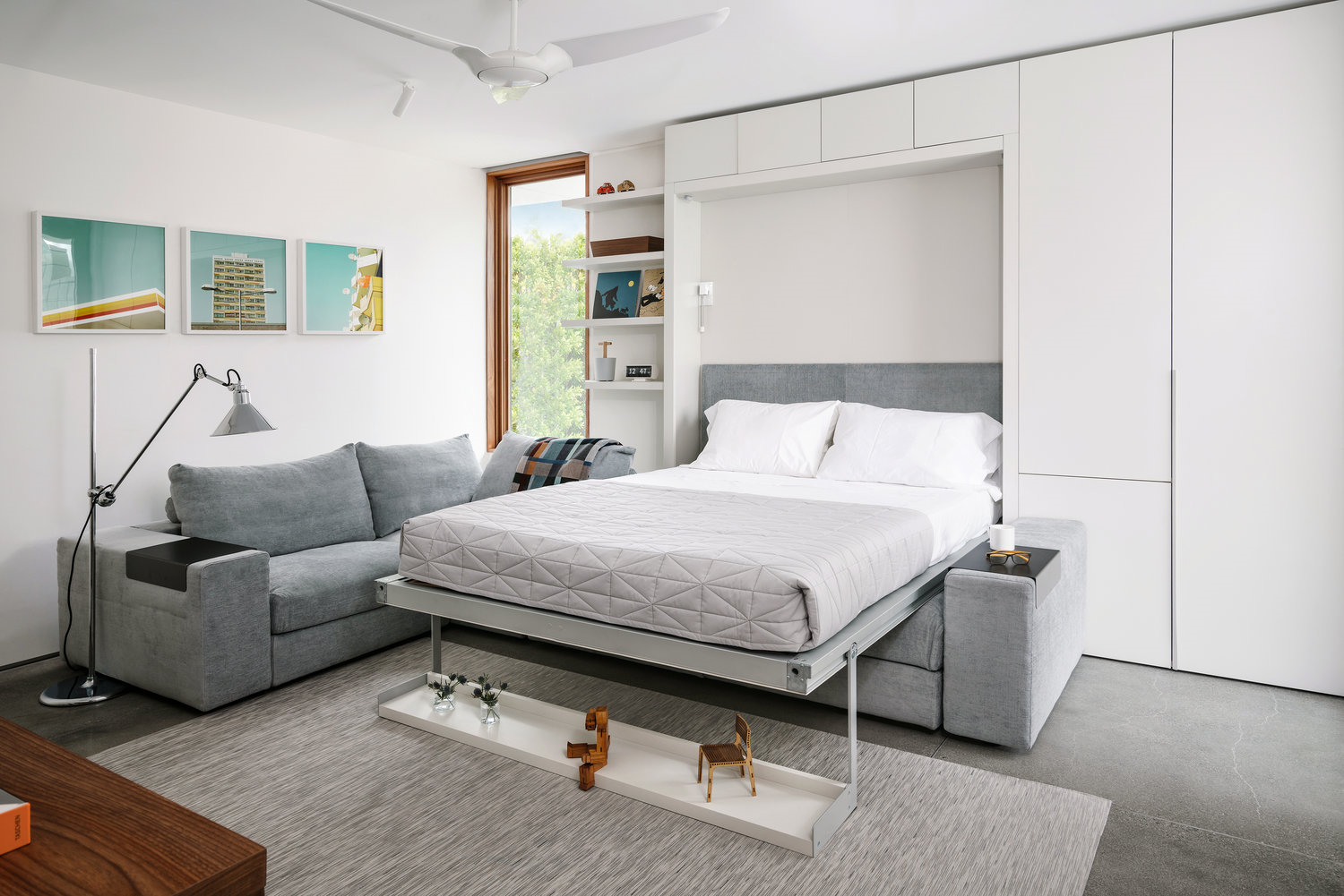
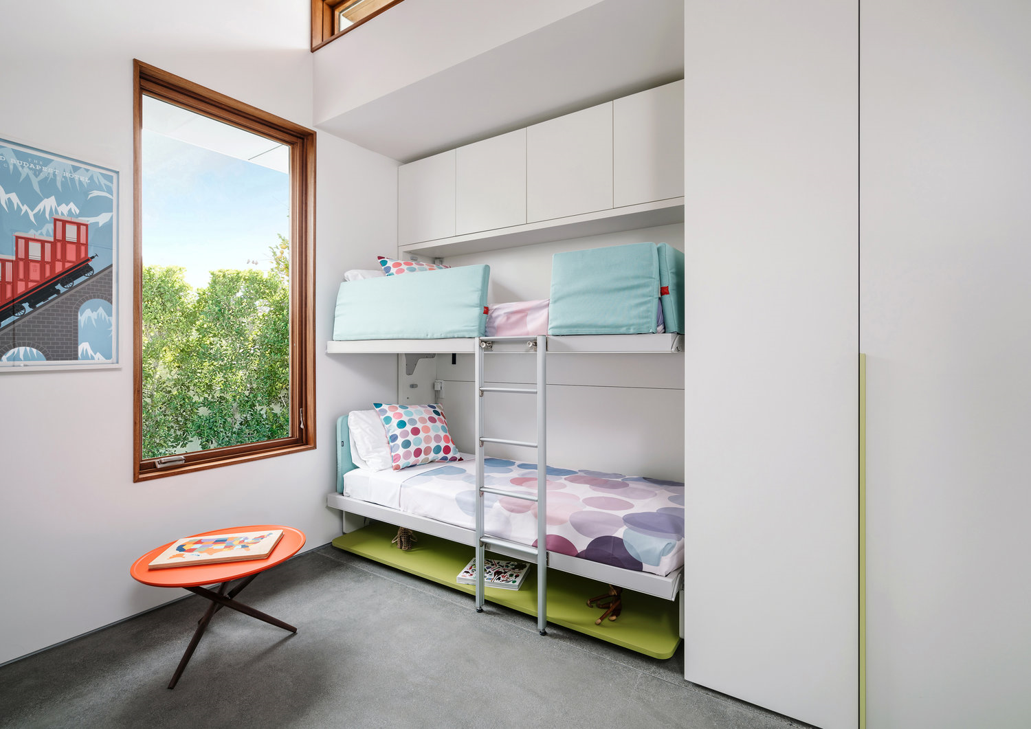
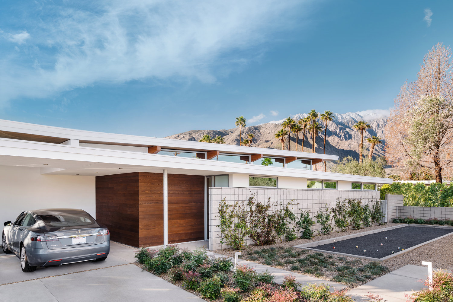
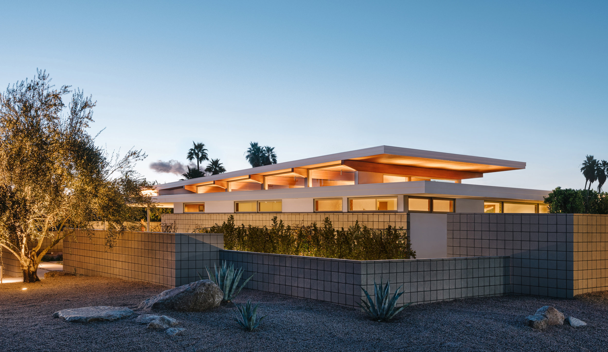
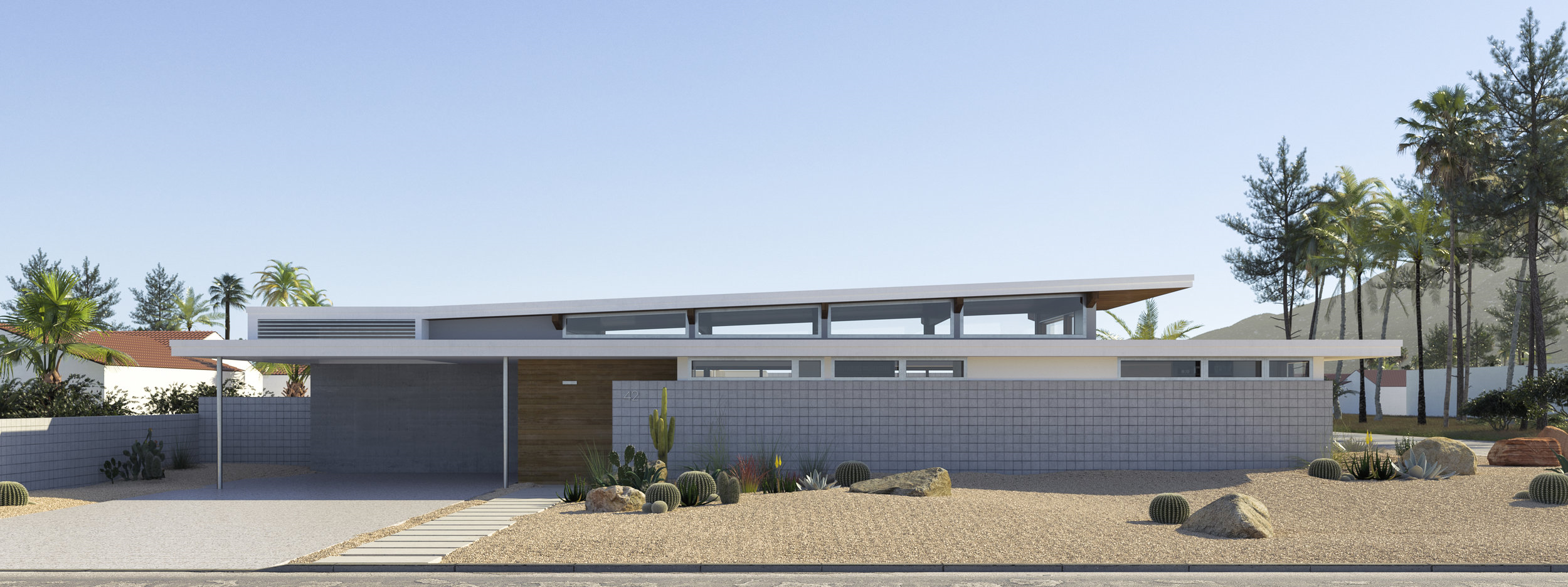
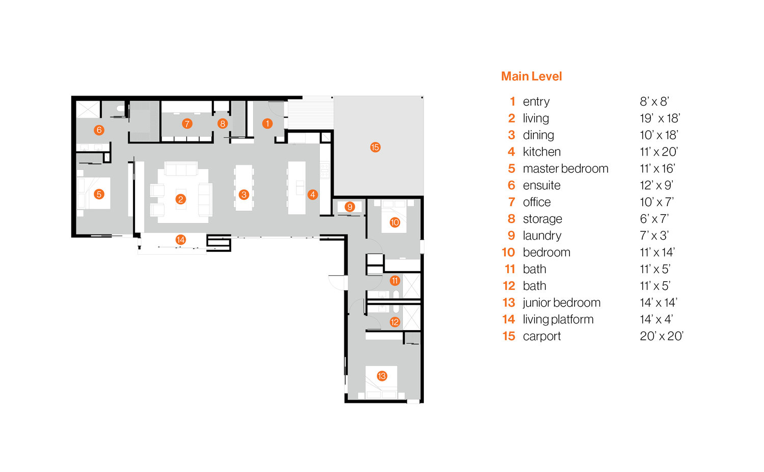
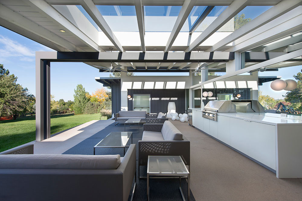
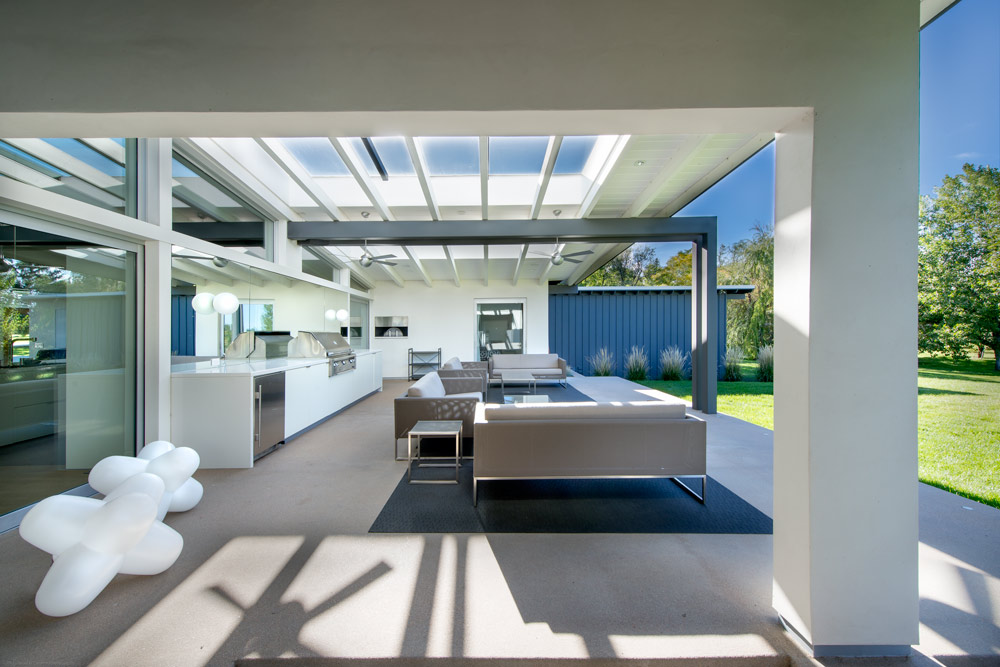
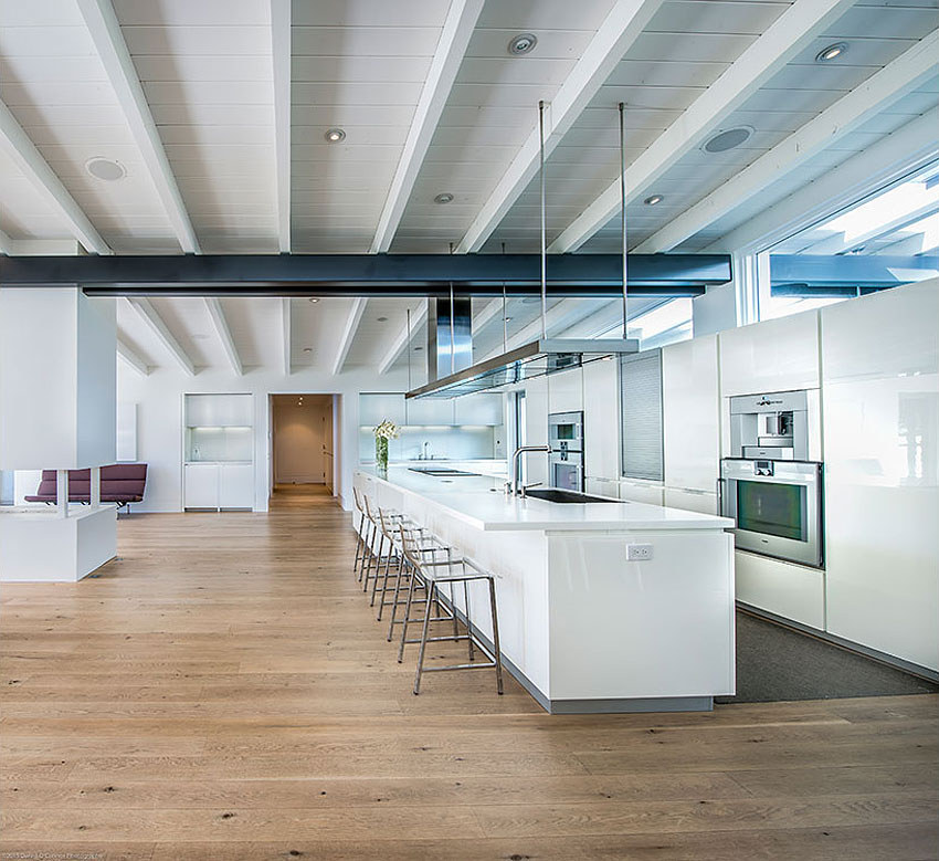
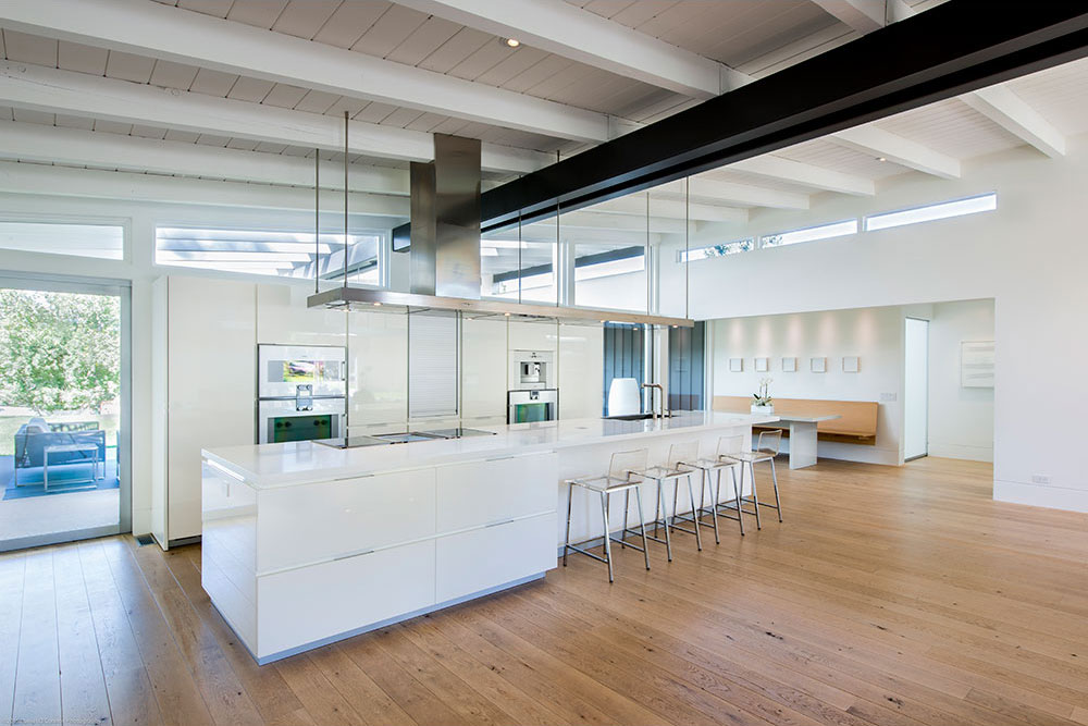
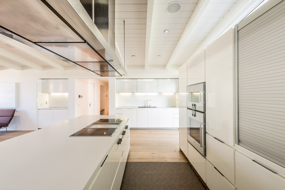
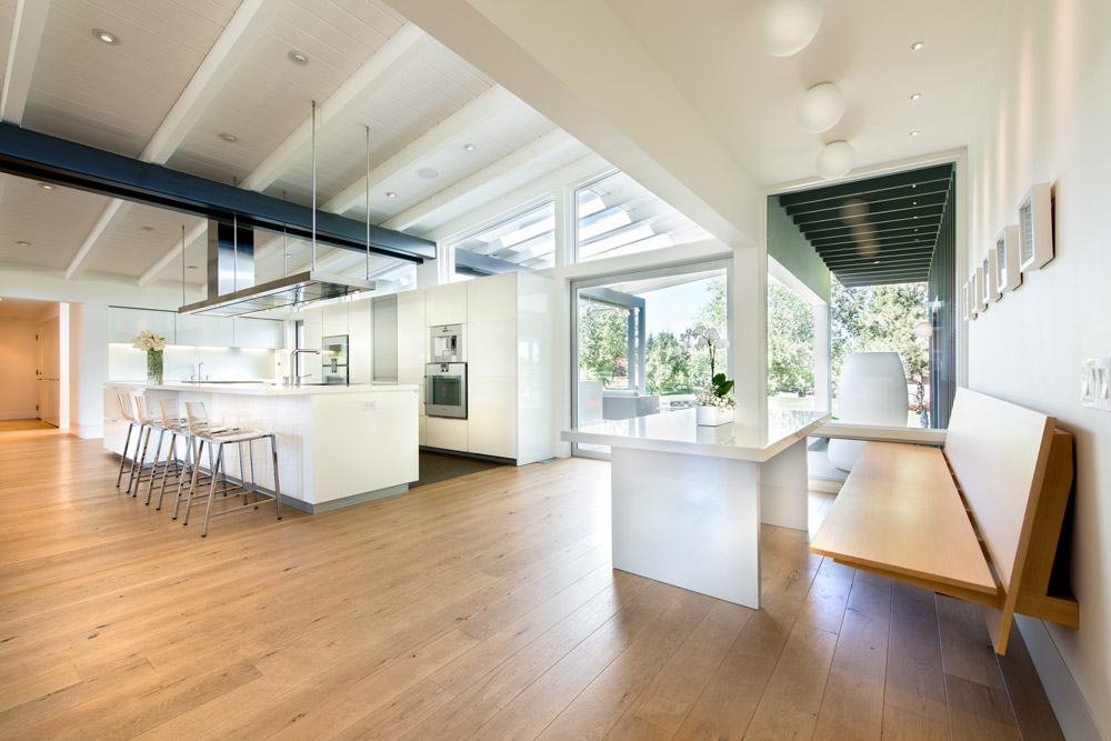
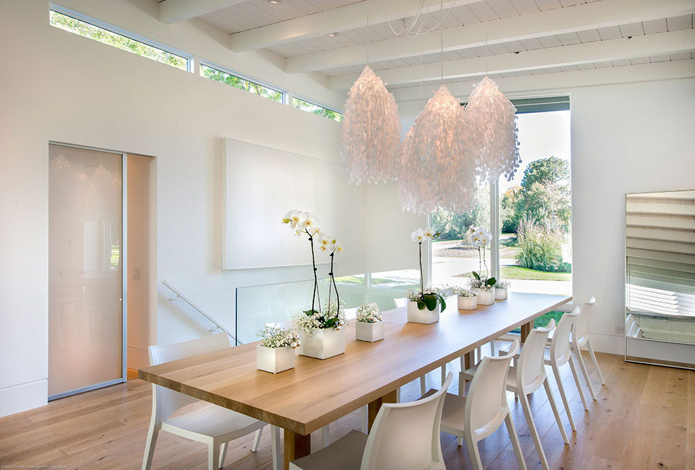
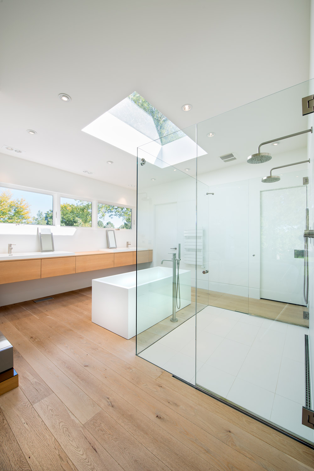
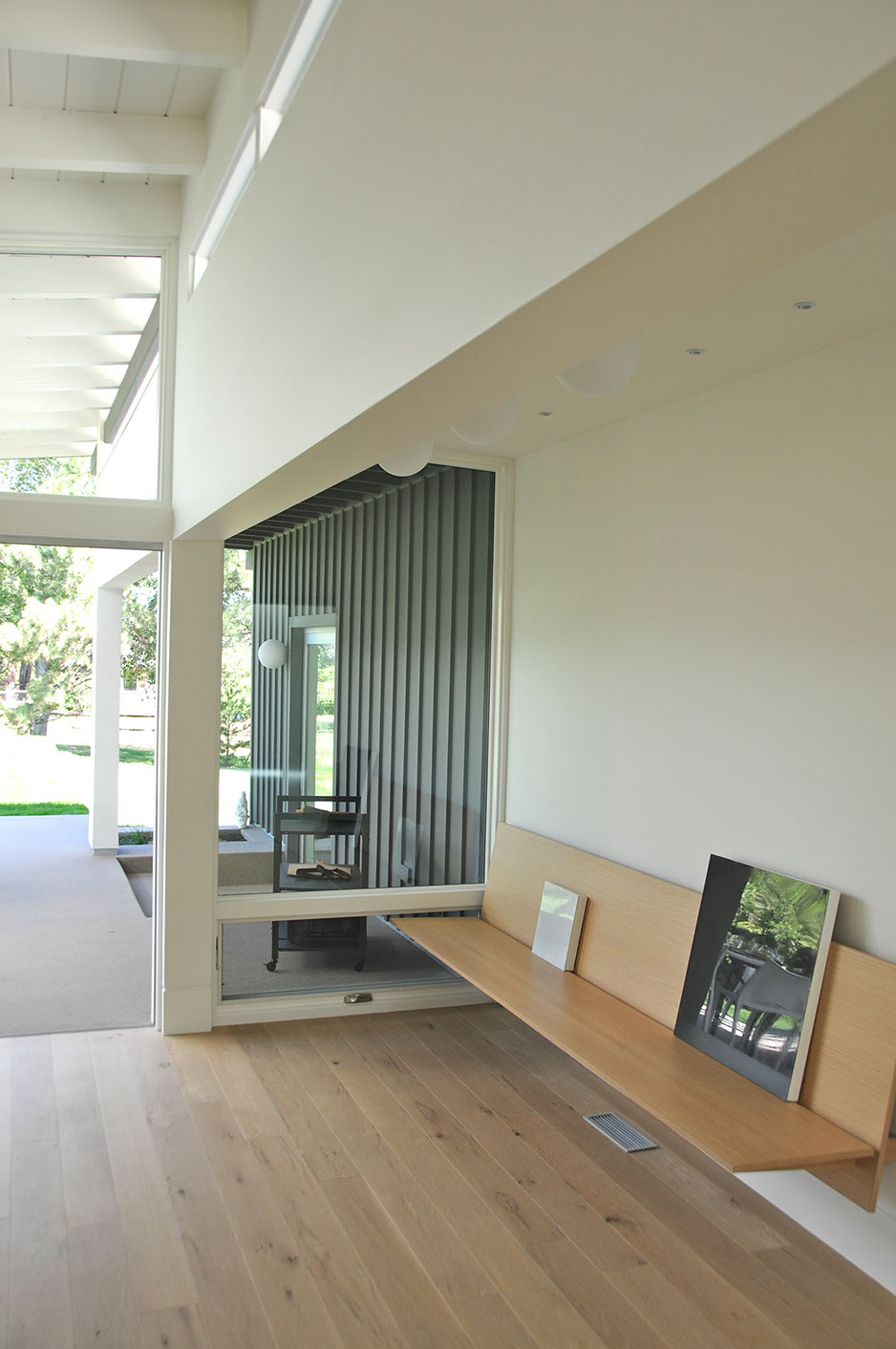
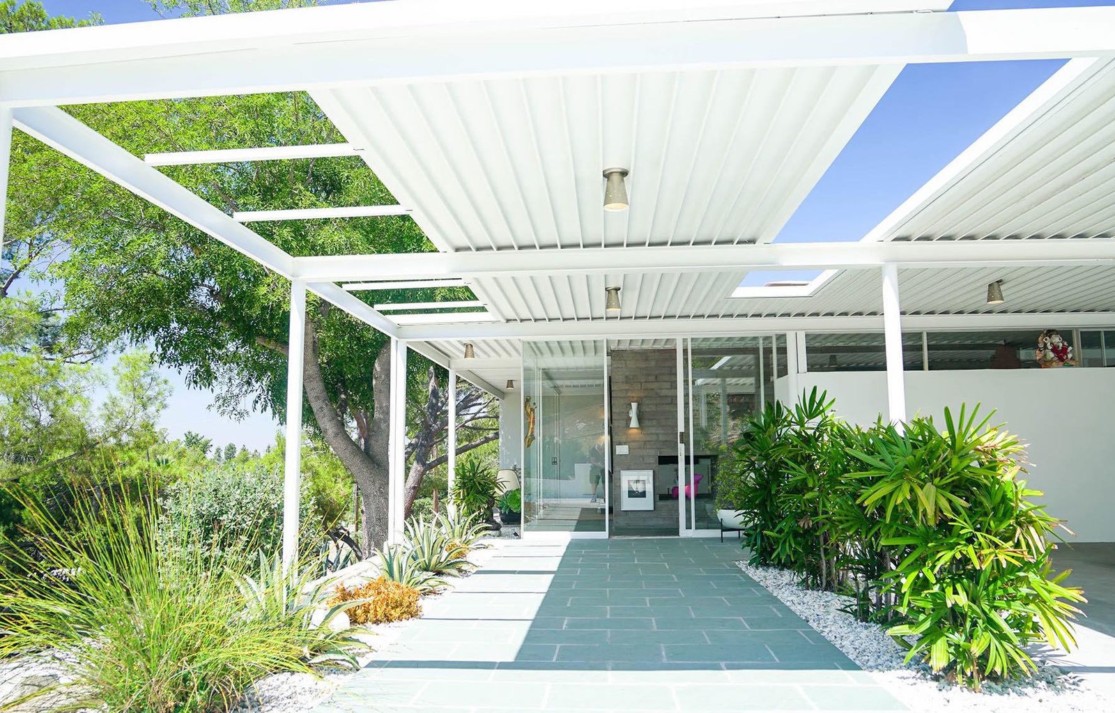
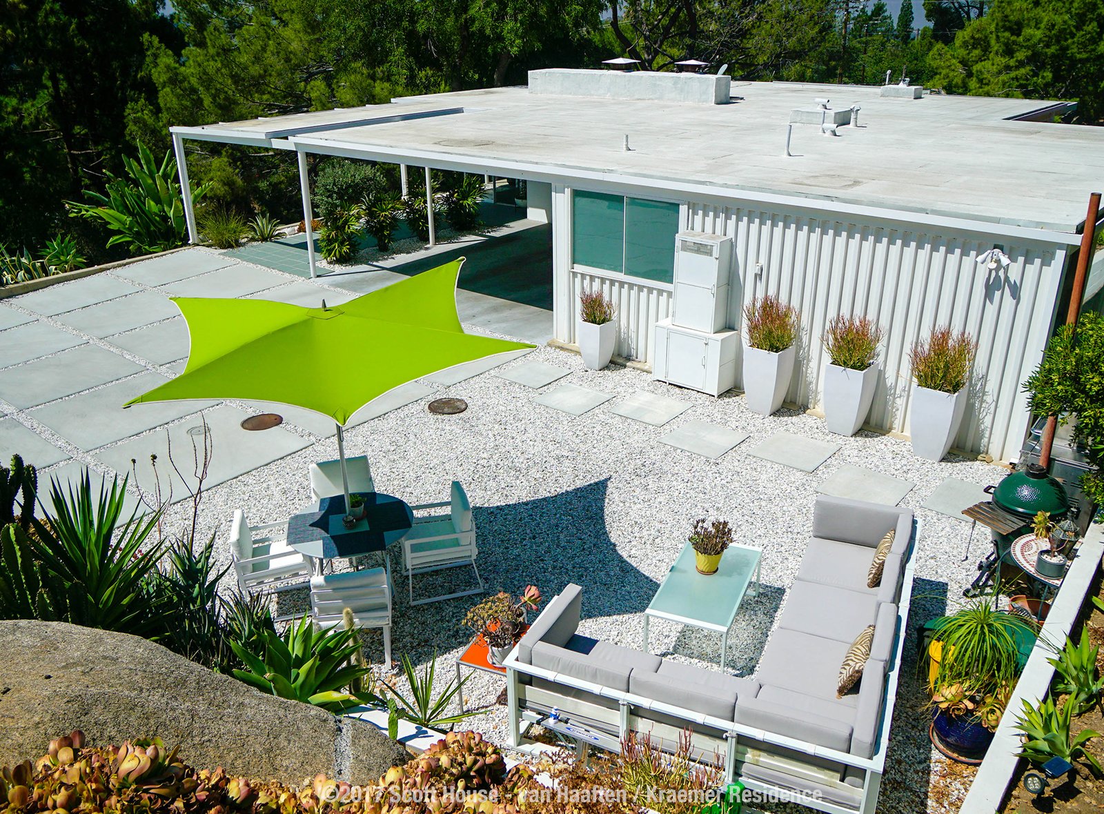
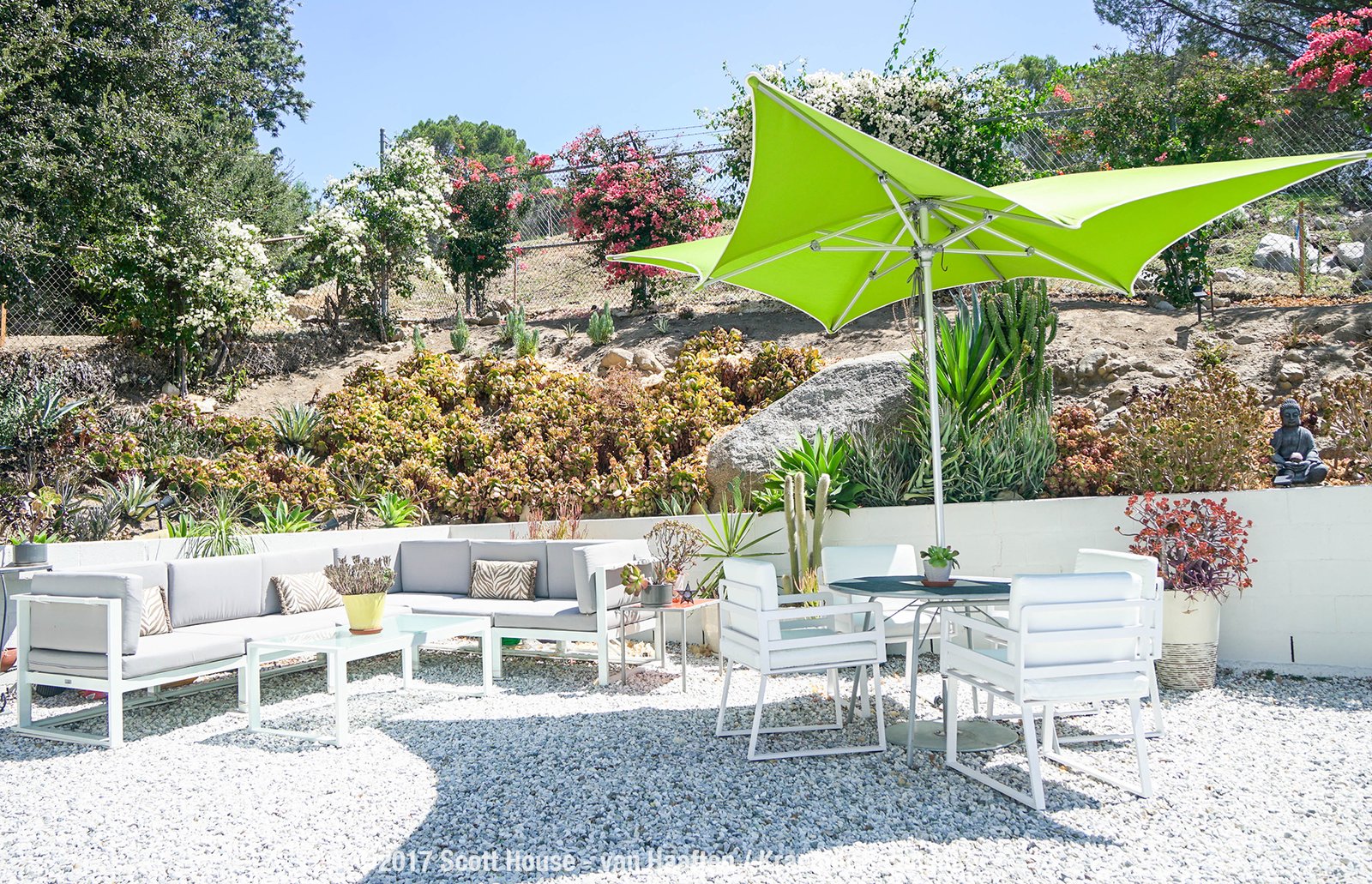
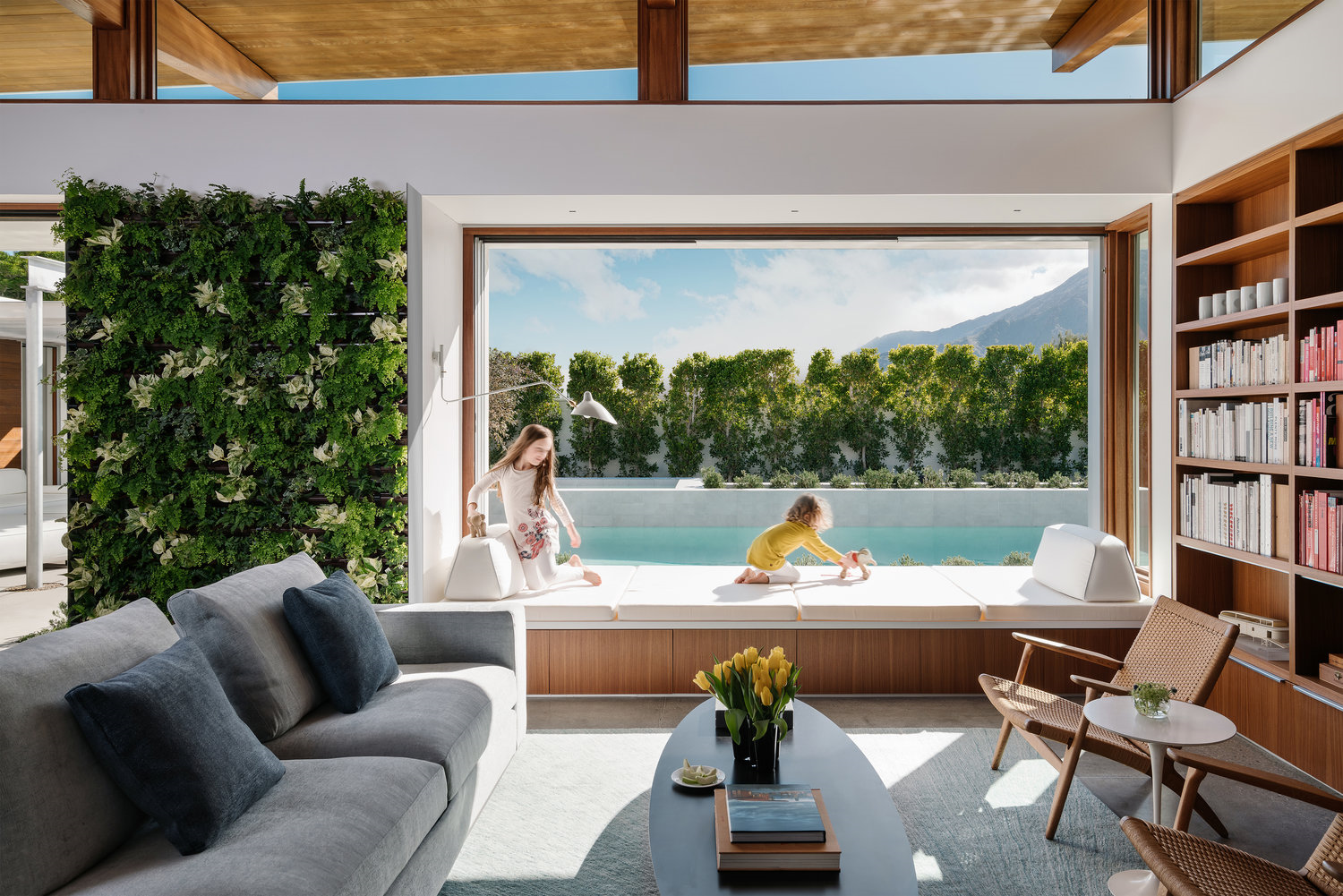 Many cultures feature houses with rooms grouped around a private courtyard: this is a take on that venerable tradition. Passing through a flat-roofed entry, the space expands as you encounter a high, beamed ceiling, sloping upward to 12 feet. This is the great room – 40 feet in length, it opens directly onto the walled courtyard through glass panels that slide away into hidden pockets. An especially admired feature of the room is a 4-by-12-foot window-seat extending into and overlooking the courtyard. This too has operable glass panels that tuck away into pockets: a charming place to lie down—even sleep—“half-in, half-out.”
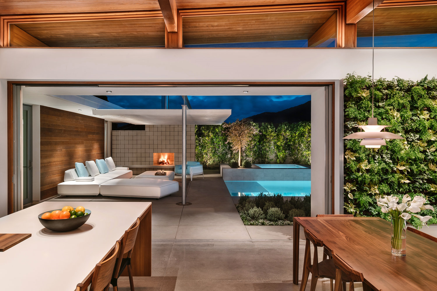
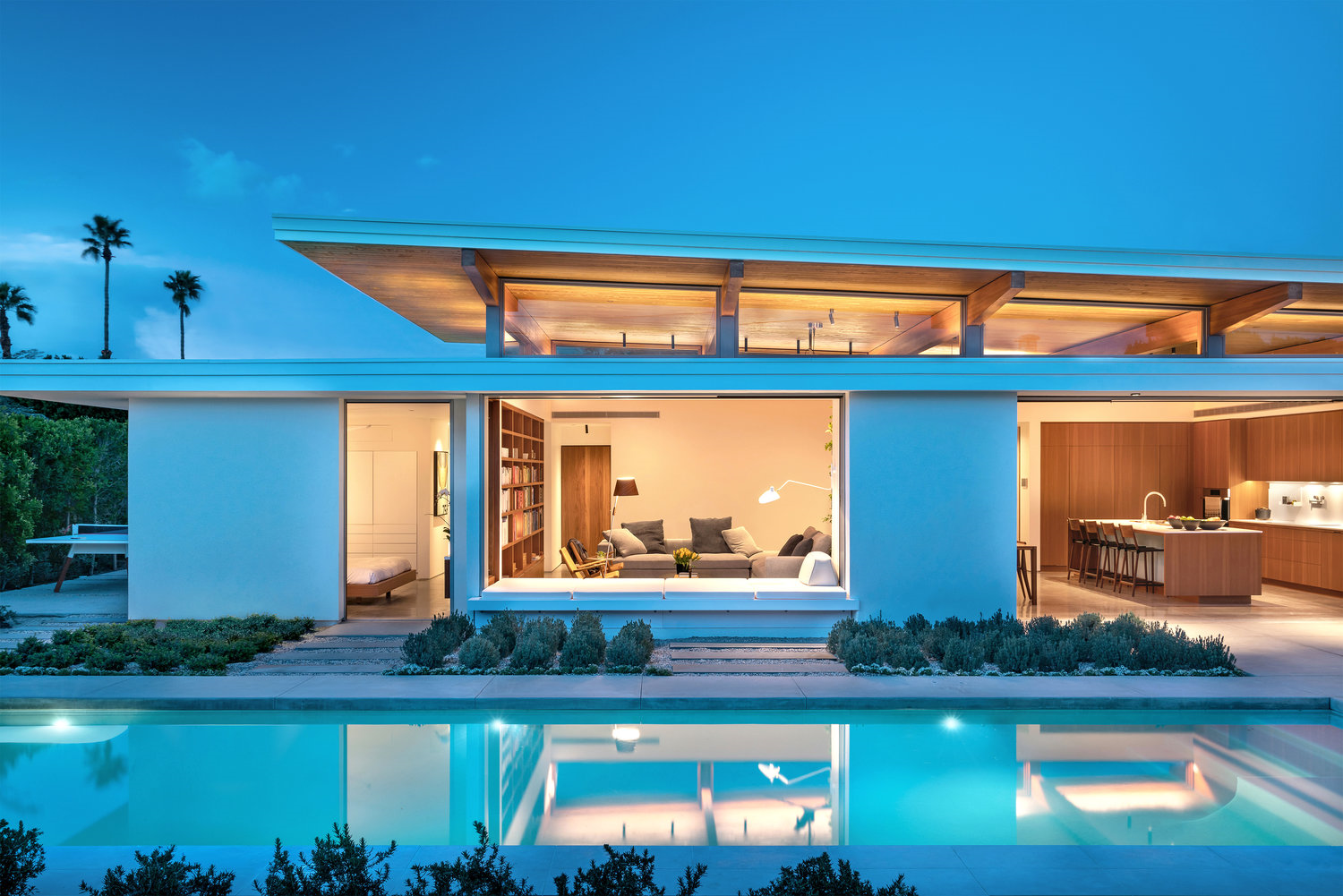
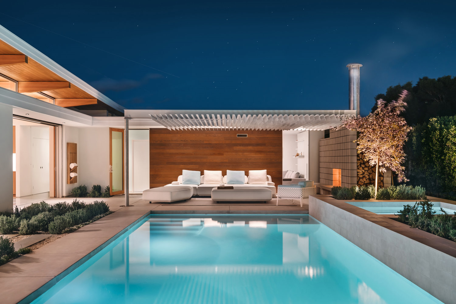
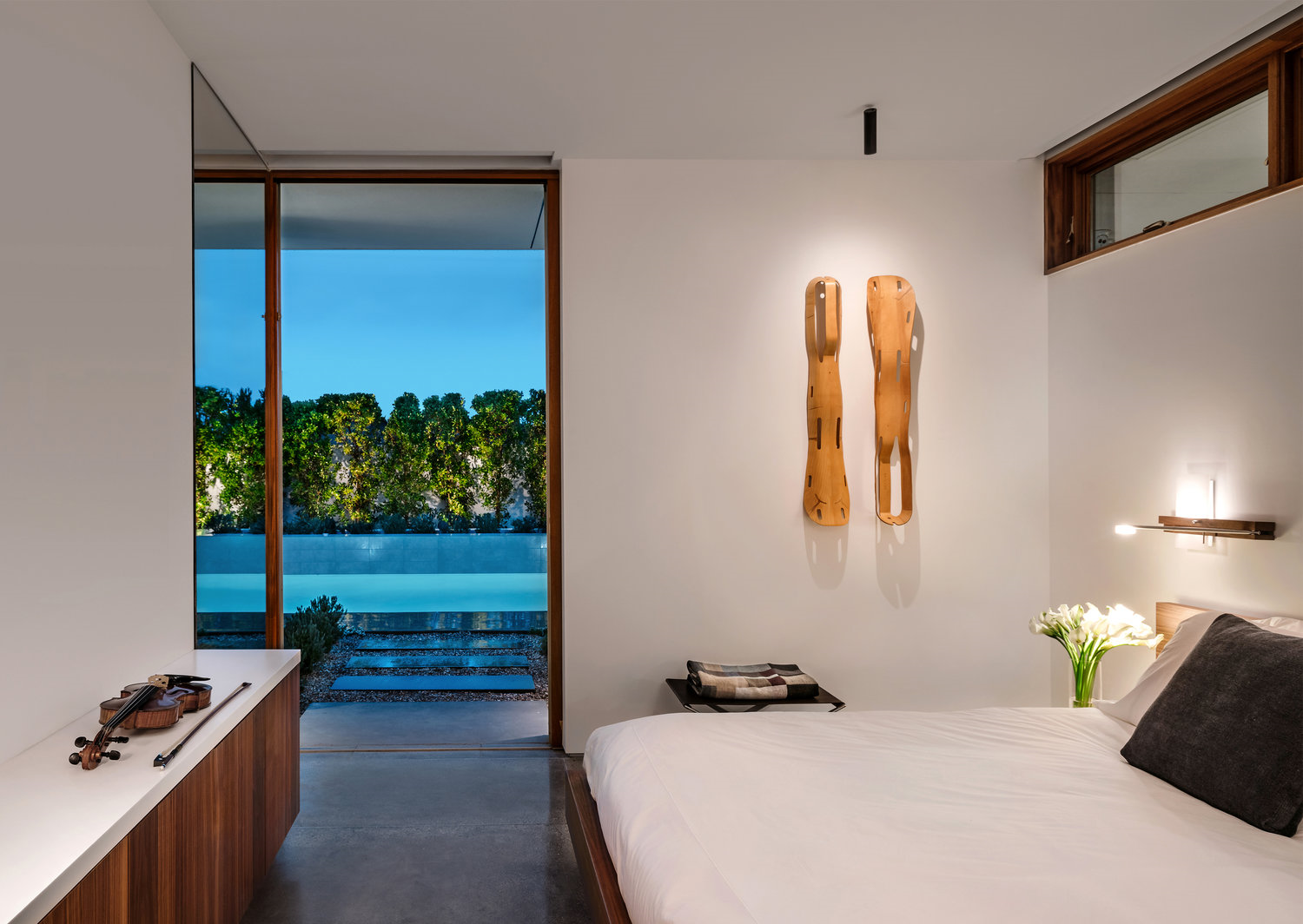
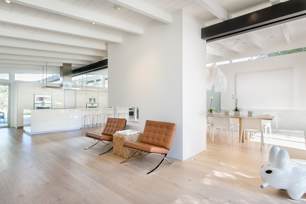
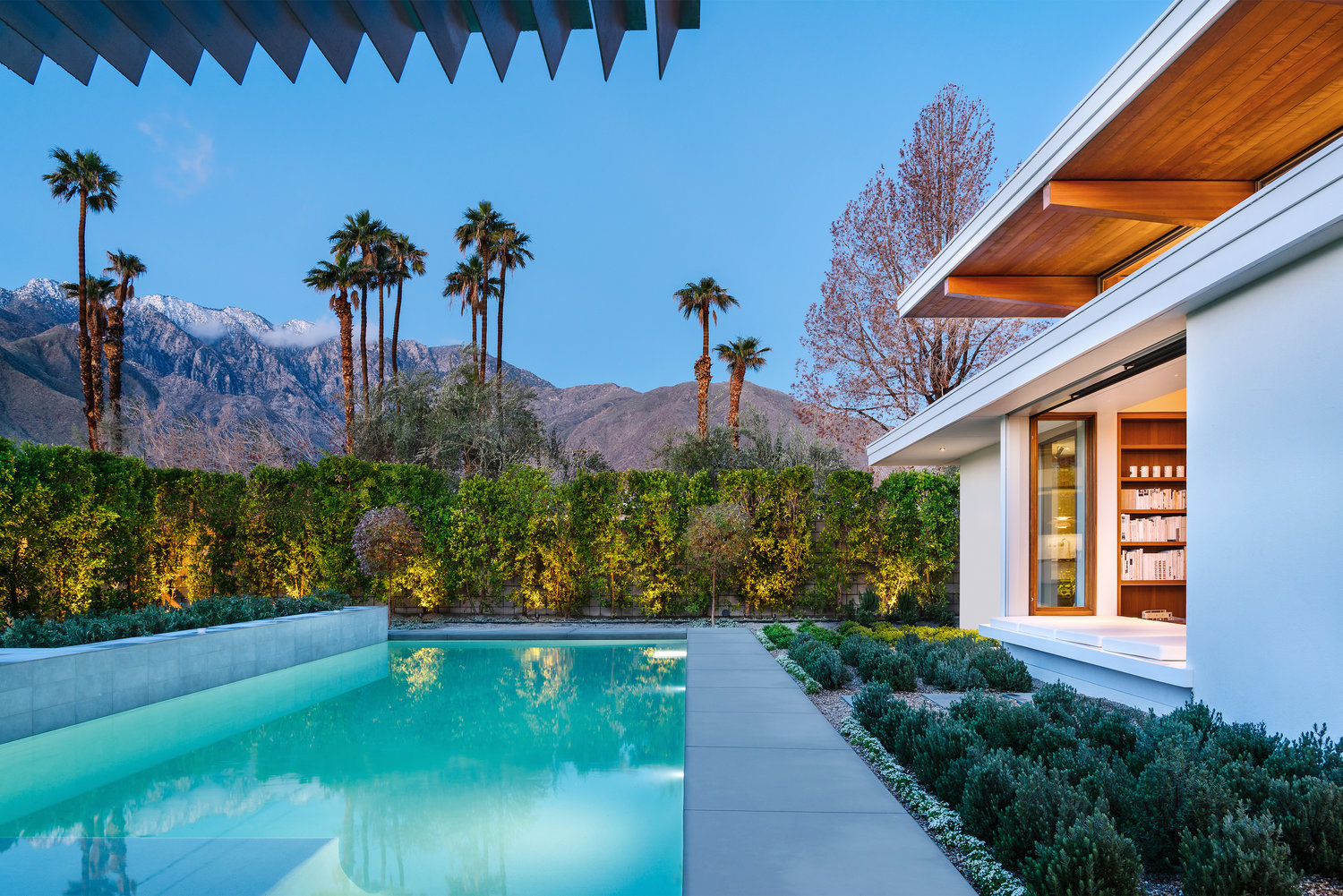 Master suites occupy both ends of this “L” shaped home, each with private access to the courtyard; an ideal arrangement for a shared vacation home, in town or out. While being careful to ensure privacy, the outward facing walls stop short of the overhanging roof, bringing in balancing light and capturing expansive outward views.
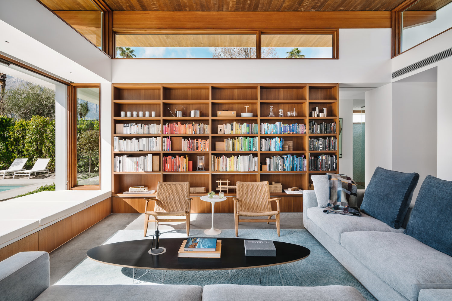


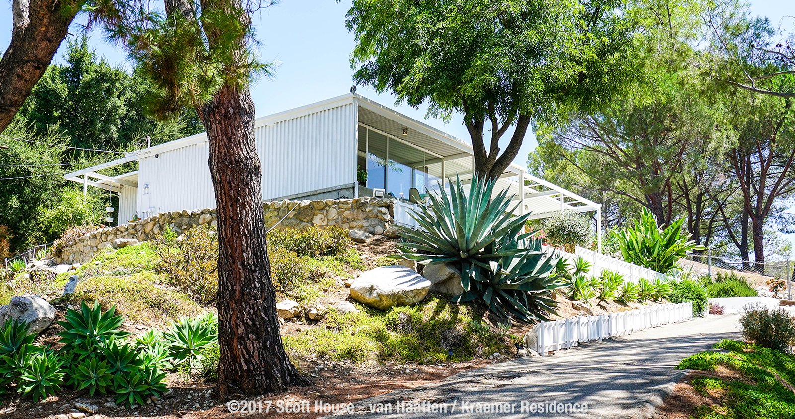

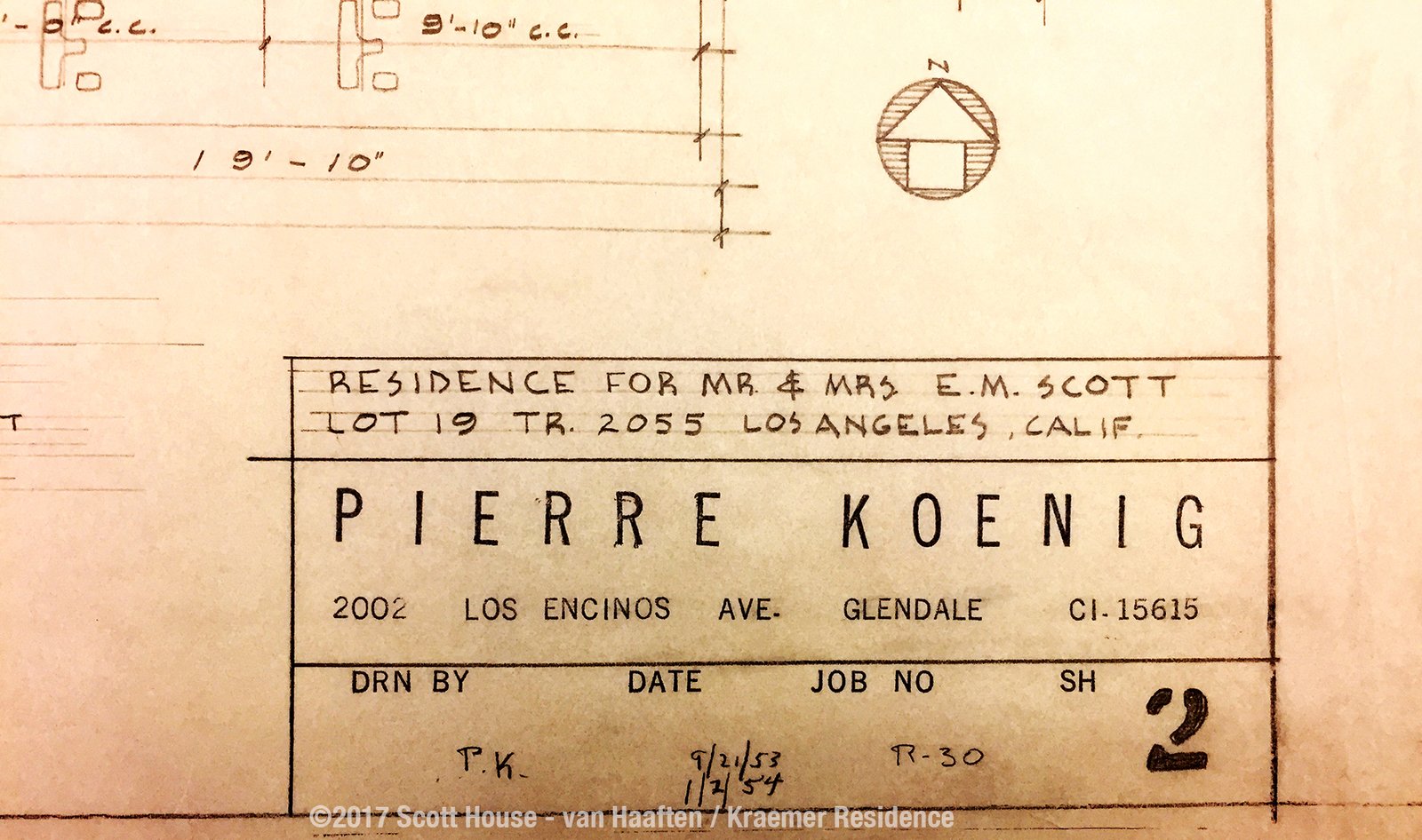
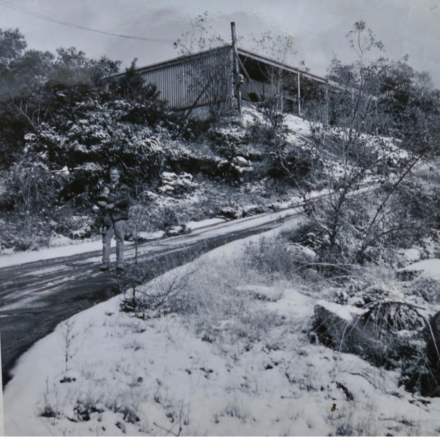 Edwin Scott and his son Mike in front of the Scott House in 1956.
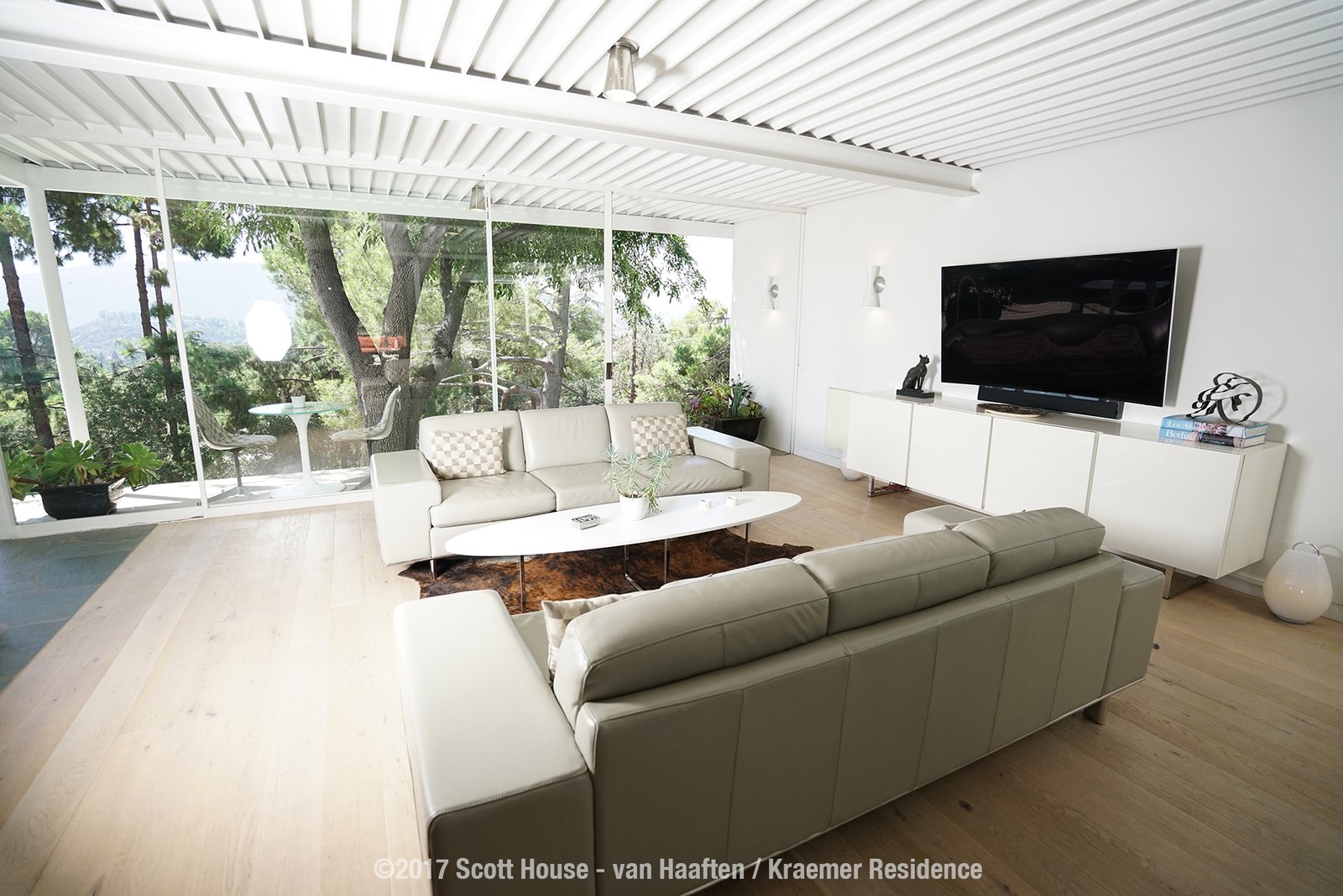
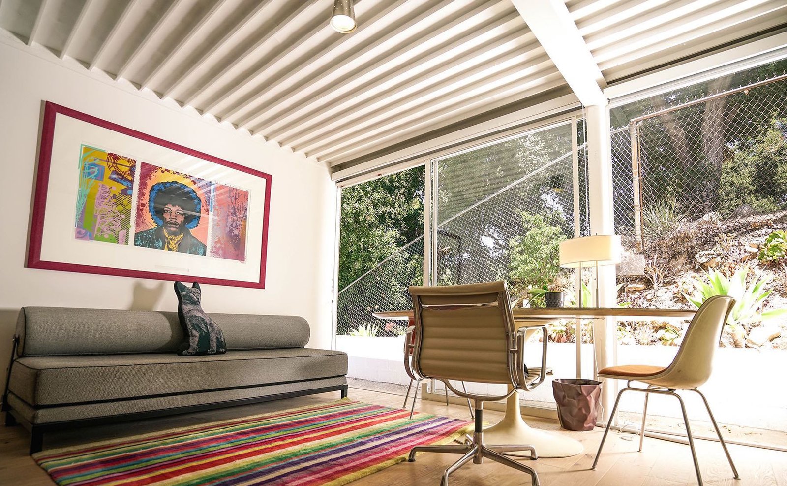
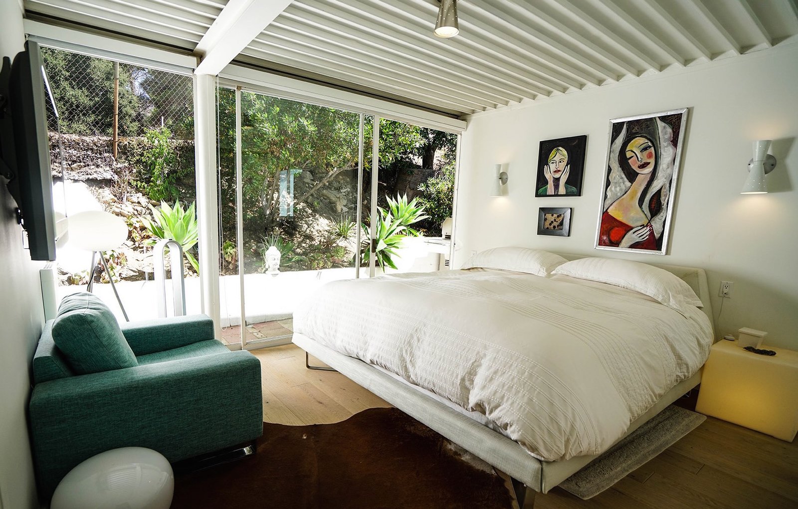
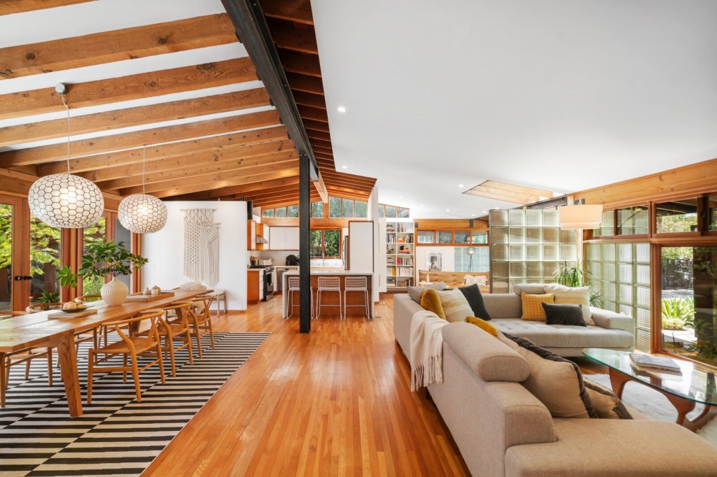
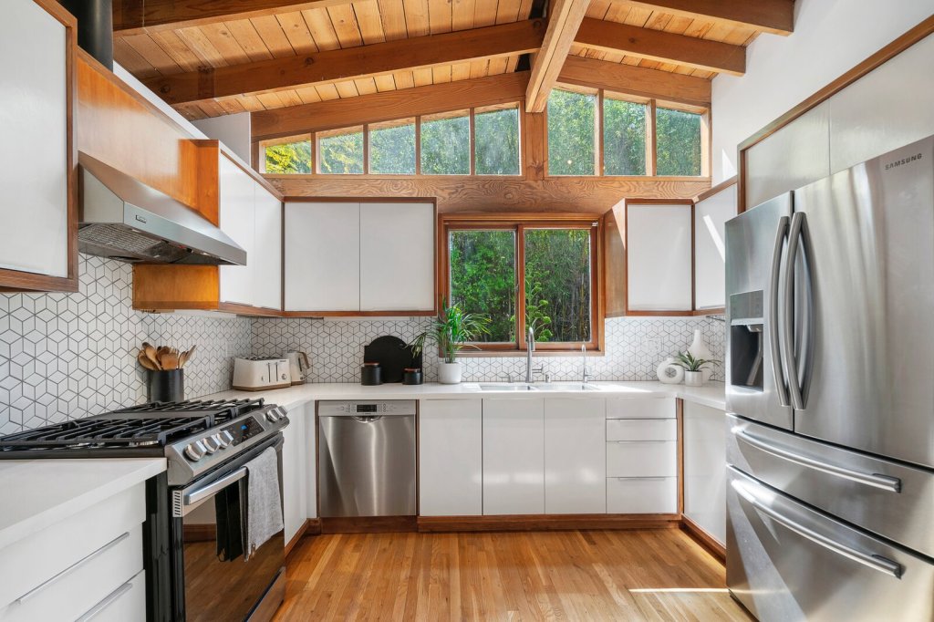
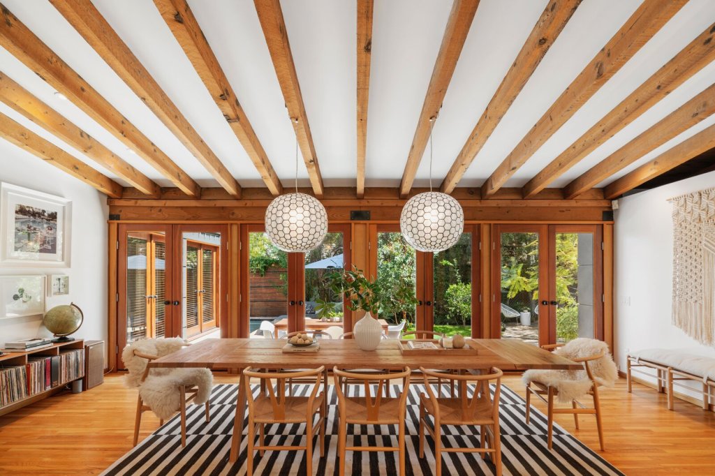
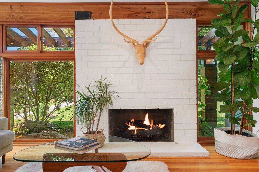
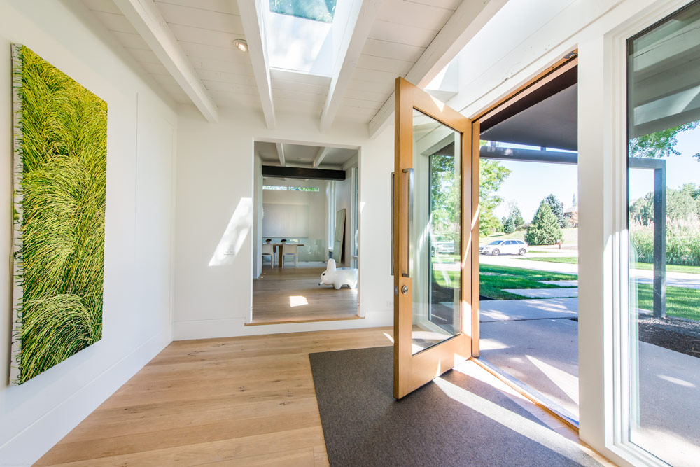
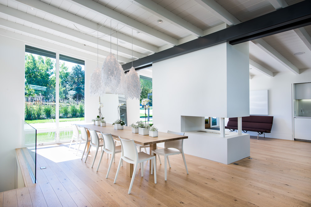
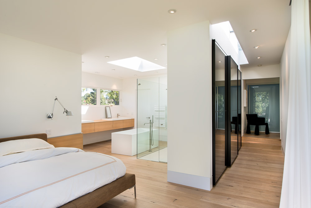
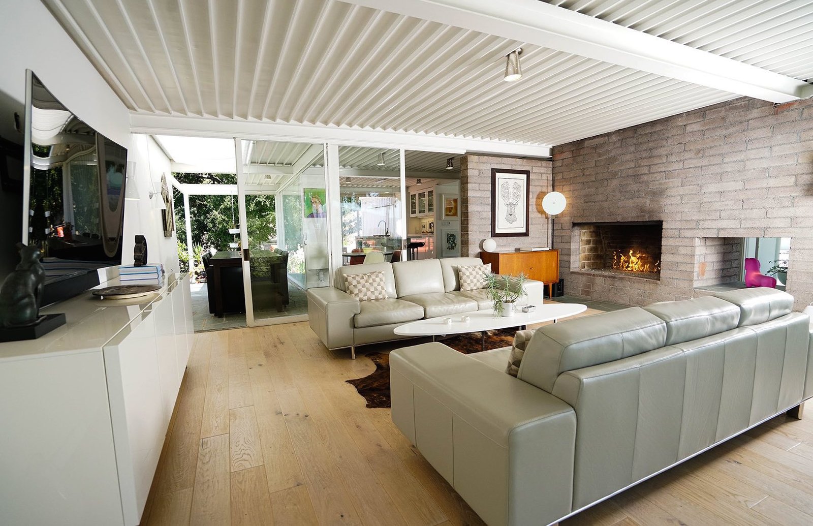
 Like many of Koenig’s Case Study Houses, the Scott House is an architecturally simple, L-shaped structure made up of straight, clean lines. Plenty of floor-to-ceiling glass walls link the interior spaces and visually connect the house with its surrounding environment. A bright and expansive central living area is anchored by a dividing wall and a two-sided fireplace. Sliding glass doors connect this central living space to other parts of the house. The kitchen connects to two dining zones: an indoor dining area with a small round table, and a larger “winter garden” dining space with a rectangular table. Full glazing on their exterior walls of the two bedrooms bring in tons of light and allow guests to feel a sense of being immersed in the outdoors.
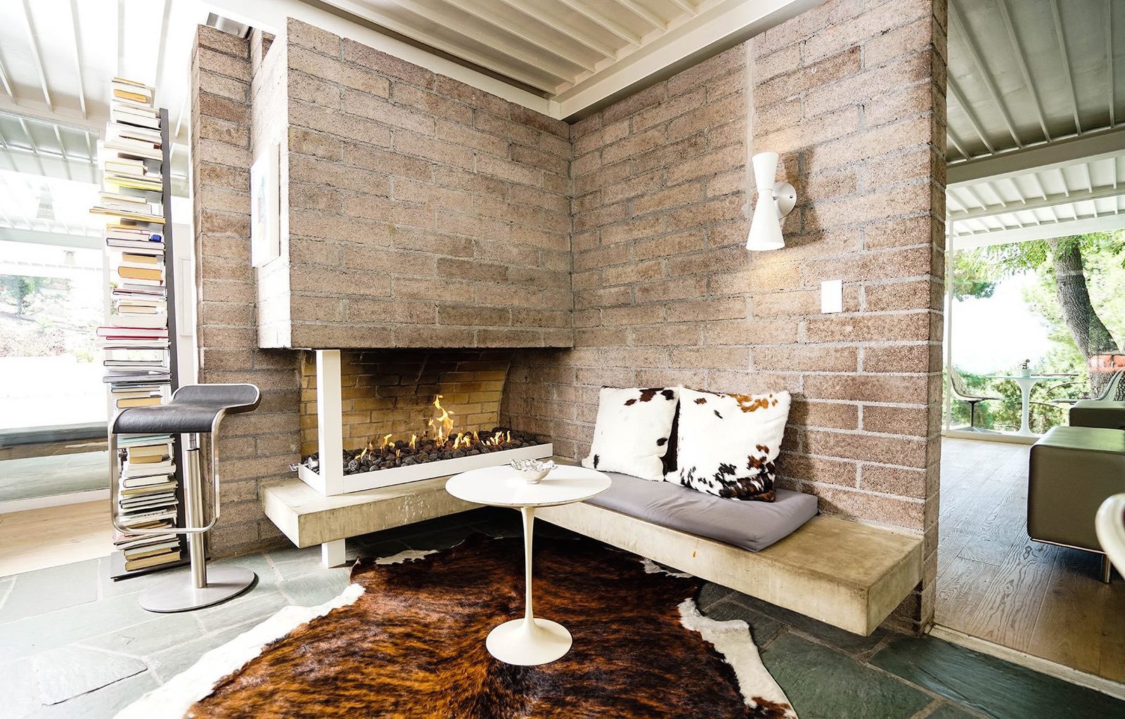


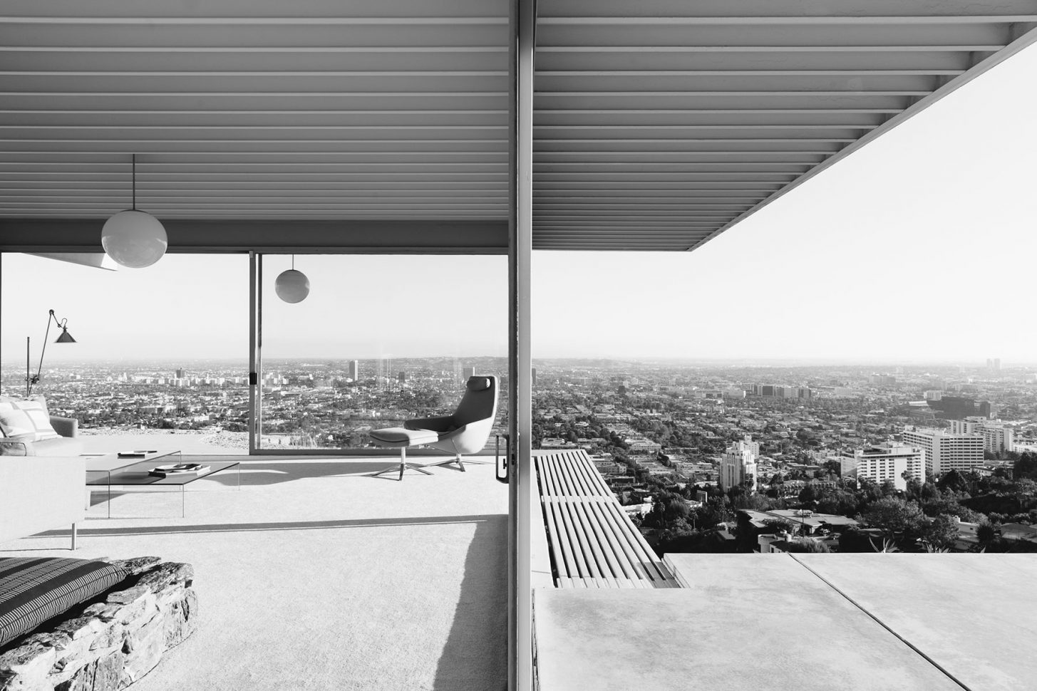
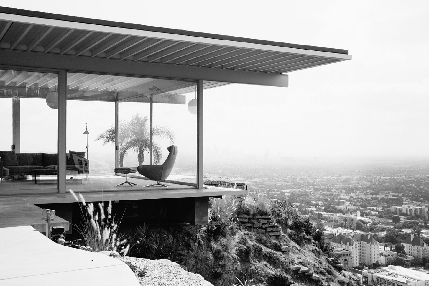 The image is instantly familiar; the house, all dramatic angles, concrete, steel and glass, perched indelibly above Los Angeles, with Hollywood’s lights resembling a circuit board below it. Inside, two women sit, stylish and relaxed, talking casually behind the monumental floor to ceiling glass walls. One of the world’s most iconic photographs,
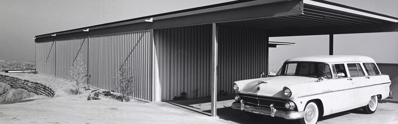
 Buck was a former professional footballer who worked as a graphic designer and sign painter. He spent his first few years as a landowner hauling broken blocks of concrete to the site in attempt to improve its precarious foundation. He and Carlotta ferried their finds, load by load, back to Woods Drive in the back of Buck’s Cadillac, hopeful the reinforcements would prevent the land from sliding. Buck’s dreams for the house began to take shape over the following two years, and eventually, he made a model of the future Stahl House. His grand designs, however, were promptly rejected by several notable architects.
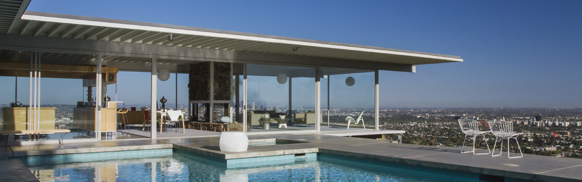
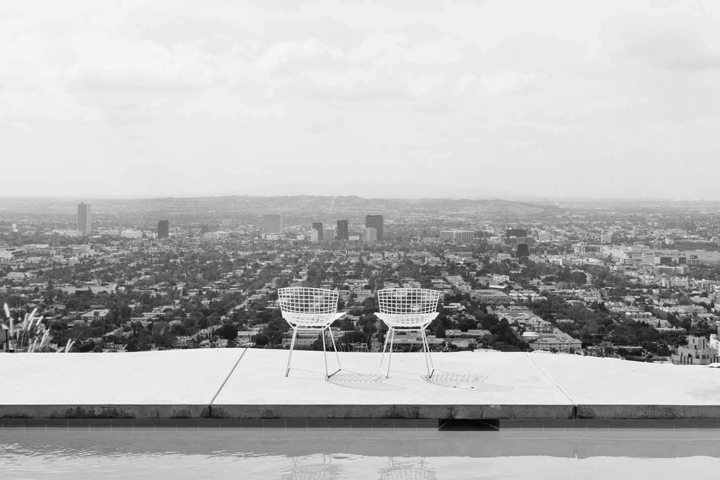
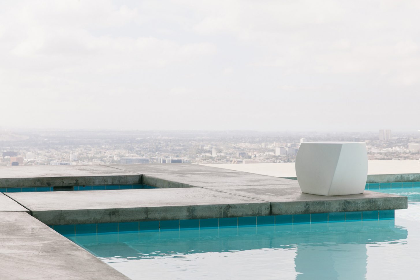 Carlotta recalled Buck continually telling prospective architects “I don’t care how you do it, there’s not going to be any walls in this wing.” Until they hired Pierre Koenig in 1957, an ambitious young architect determined to build on a site nobody would touch, it seemed unlikely the house would ever exist. Pierre described the process of building Stahl House as “trying to solve a problem – the client had champagne tastes and a beer budget.” He was interested in working with steel, and despite being warned away from it by his architecture instructors, possessed great aptitude for it. He’d experimented with a number of exposed glass and steel homes before he created Case Study 21, or The Bailey House in 1958 and 1959, and his skill for designing functional spaces with simplicity of form, abundant natural light, and elegant lines would eventually make him a master of modernism. Stahl House, completed in 13 months and costing 37,500 USD, further demonstrated Pierre’s flair for working with industrial materials, particularly steel, glass, and concrete. The project put him on the map as an architect with an incredible eye for balance, symmetry, and restraint. The 2,040 m² house was, as Buck insisted, built without walls in the main wing to allow for sweeping 270º views. Three sides of the building were made of plate glass, unheard of in the late 1950s, and deemed dangerous by engineers and architects. This design feature required Pierre to source the largest pieces of glass available for residential use at the time. With two bedrooms, two bathrooms, polished concrete floors, and a very famous swimming pool (a fixture in countless films and fashion editorials) Stahl House was an immediate mid century icon.