Beautiful Hotel Interiors

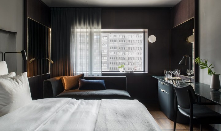
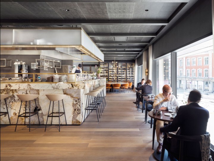
Located in a brutalist former bank headquarters in Stockholm, Universal Design Studio’s latest project, the At Six hotel, is home to one of Europe’s most significant hotel art collections. The London-based studio carried out a complete interior renovation to create the 343-room luxury hotel in the Swedish capital’s Brunkebergstorg Square, and also designed a new entrance. The scheme includes 10 floors of guest rooms, a penthouse suite, a 100-cover restaurant, a wine bar, cocktail bar, a 2,000-square-metre events and flexible work space, and Scandinavia’s first slow listening lounge.

hotel-at-six-standard-room

The art collection is curated by Sune Nordgren, formerly of the BALTIC Centre for Contemporary Art.

art

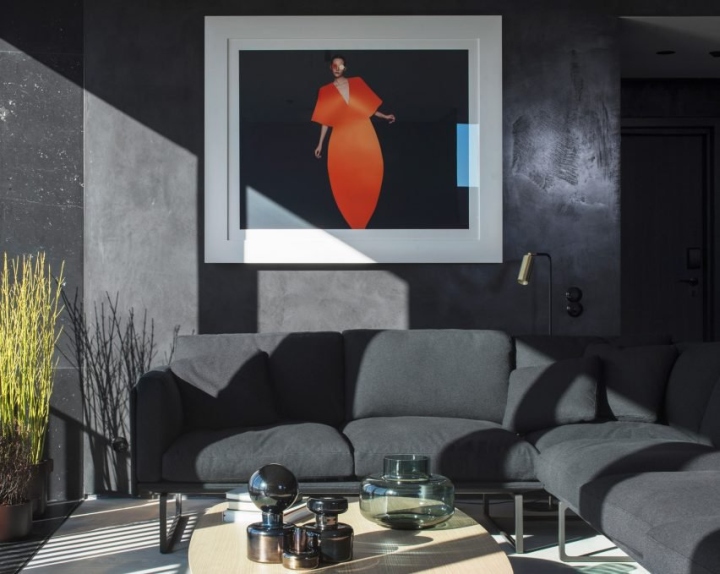
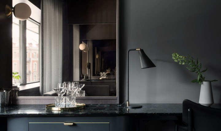
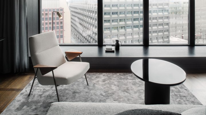
The gorgeous monochrome interior contrasts shades of warm grey and highly textured natural materials with soft furnishings and classic furniture. The aim was to reinterpret the brutalist aesthetic of the building and the immediate architectural landscape of Brunkebergstorg Square. “A palette of sawn stone, blackened steel, fine timber and polished granite lends a sense of permanence and authenticity to the new interior,” explained Universal Design Studio.

hotel-a2

“Moving away from the uncompromising and unforgiving aesthetic characteristics often associated with the brutalism – the brief was to create a desirable, fashionable destination,” said the team. “Design is focused on humanising the architecture, bringing a sense of desirability and luxury to a brutalist building not often associated with these traits, turning the hotel into a contemporary version of a metropolitan grand hotel.”

hotel-3.jpg

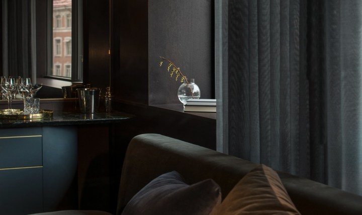
Pieces of contemporary and classic furniture are complemented by specially commissioned pieces created by local makers and established Scandinavian designers. Custom lighting by Rubn is installed in each guest room, and local glassmaker Carina Seth Anderson has created a series of sculptural, hand-blown glass vessels for the lobby as well as tabletop pieces for each dining table in the restaurant.

six 5

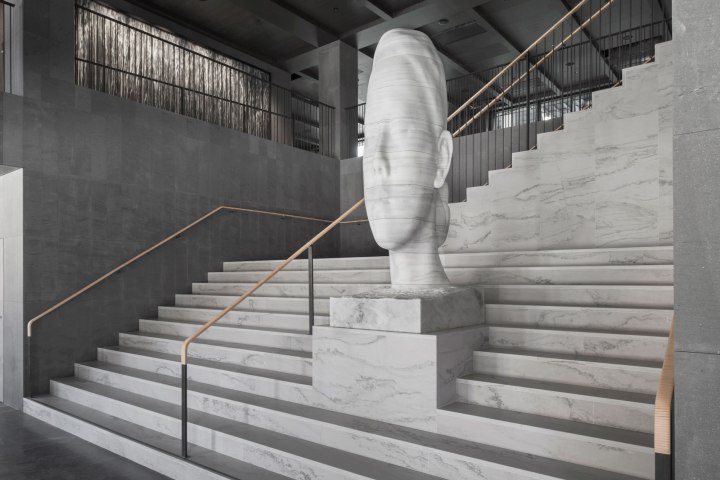
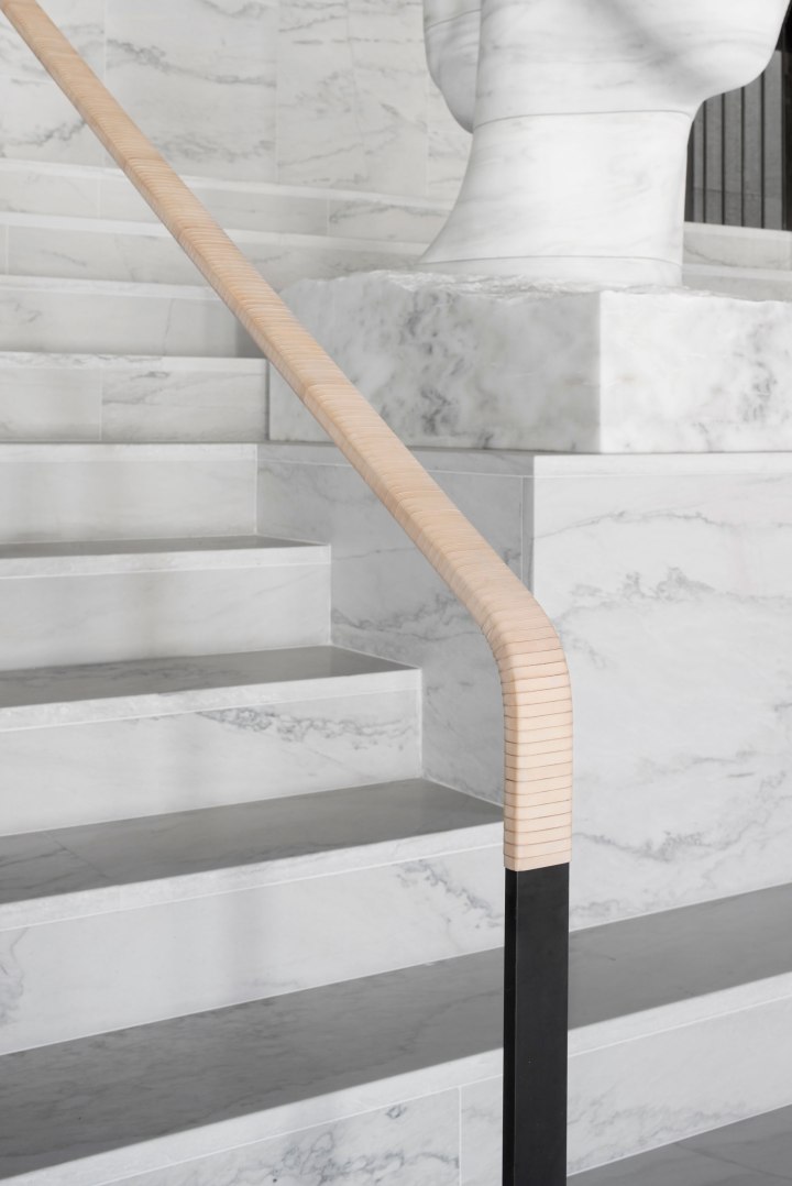
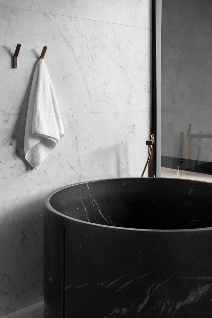
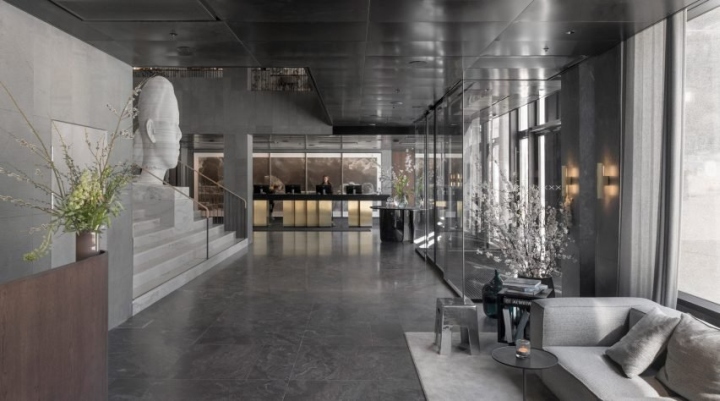
The handrail of the grand white granite staircase in the hotel’s lobby was wrapped in leather by a local saddle maker, while a communal table in the wine bar was carved by local artist Lies-Marie Hoffman from a single Swedish elm trunk. Bedrooms feature timber wall panelling and marble credenzas that run the full length of the room. The hotel is one of four 1970s buildings that occupy Stockholm’s Brunkebergstorg Square. The buildings were built during a government initiative that aimed to replace much of the city centre’s belle époque grandeur with brutal modernity.

six 6

Although the high-rise building was originally designed by Swedish architects Boijsen & Efervgren as a hotel, it ended up functioning as the headquarters of Swedbank, never fulfilling its intended purpose. Now owned and operated by Petter Stordalen of Nordic Hotels & Resorts, the hotel is at the centre of a wider regeneration programme that aims to transform Brunkebergstorg Square into a social hub within the city.

six 8

six 7.jpg

hotel 4

Six-hotel-by-Universal-Design-Studio-Stockholm-Sweden-07

Beautiful Dining Room Designs

As a self-proclaimed lover of food, I believe the dining room is the most important room in a home (next to the kitchen, of course), so picking out a table, choosing the right chairs, and adding that perfect rug to tie it all together are very important. With so many ways to style the dining room, from rustic wooden tables to sleek touches of gold, here are some favorite looks to give you some much-needed inspiration.

dining_room_feature

Clean & Neutral
Go simple with natural tufted chairs, a sleek wooden table, and tons of white
flowers. The neutral palette is really versatile, great for changing up your
tabletop for different occasions.

dining

Modern & Bold
You can still keep your dining room relatively neutral with bold, modern
pieces like these exaggerated wooden chairs and metal taxidermy.
The combination is effortless.

dining 2

Inspired by Scandinavian Style
We’re always a fan of Scandinavian style, especially this simple
combination of light wood and modern white chairs. The faded palette
and modern silhouettes are staples of Scandinavian design.

dinnig 3

Mix & Match
Love the idea of mixing and matching your dining room chairs.
Choose one color palette to keep the look cohesive.

dinindg

Beautiful Mood Board Musings

Inspired by the beautifully sculptural effect of curved architectural walls, the work of French interior designer Francois Champsaur, has a beautiful smooth timber finish.

Trocadero_1.jpg
Trocadero Apartment by Francois Champsaur

Bold in black and incredibly textural, this piece was designed by CM Studio.
It features a distinctive curved batten pod that cleverly conceals the apartment’s bathroom.

mood 2.jpg
CM Studio / Photograph by Kelly Geddes

Curved walls are visually interesting and work well to soften sharp lines of an
interior space. The same effect can be created with a room divider, furniture,
or smaller design pieces such as ceramics and art. Here are some examples.
mood 3.jpg

Beautiful Red Interiors

I’m personally not a huge fan of red when it comes to interiors but it can be used to make a powerful statement in subtle and not so subtle ways. Check out how these designers who love red have incorporated this fiery and beautiful color into their homes.

Red-house-exterior-victorian-with-red-paint-red-paint.jpg

There are instances, such as this Victorian farm house, where red is the perfect color.

primary-coloured-houses1.jpg
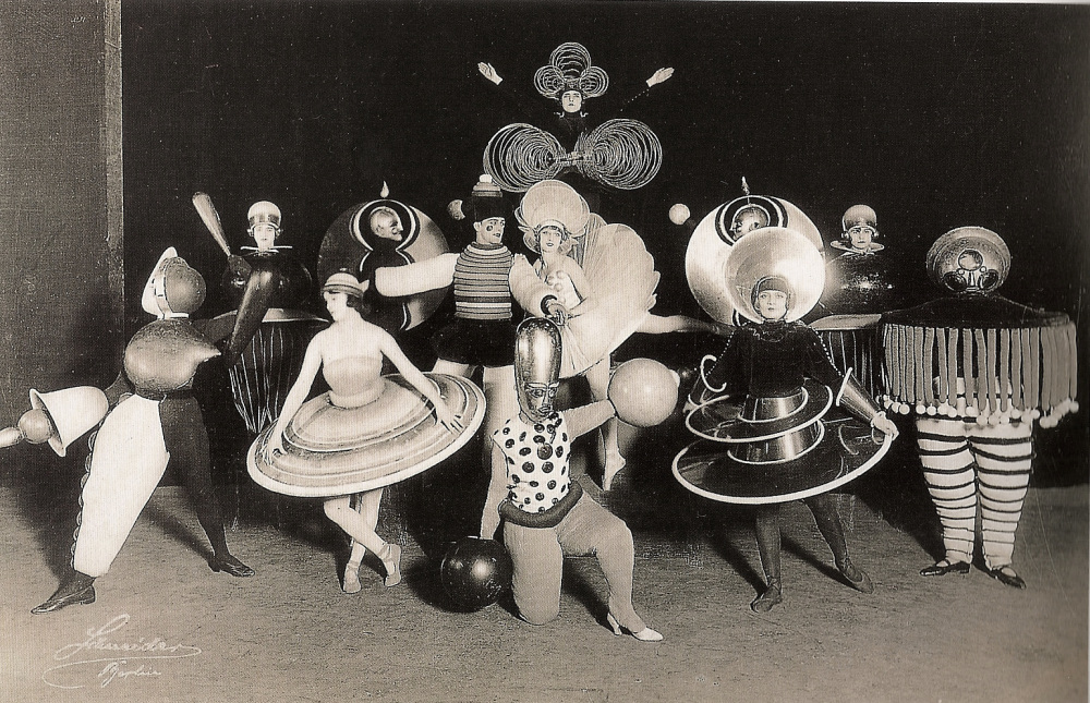
…or sometimes you just want to have fun with it. 

red-dwell

These walls are covered in Graniplast, a tinted acrylic finish. Nathan Pereira Arquitectos y Diseño advised on the facade, floors, and finishes. Designed by Vanessa Clark.

red bath.jpg

Red gives a bathroom and modern appeal. This bathroom features Chromtech tile, a Toto toilet, Kohler vanity, and powder-coated steel countertop.

red-nook

Red is perfect for a comfy kitchen nook. Eazy side chairs by Whiteonwhite line one side of the custom-designed table by LOT-EK. Castore suspension lights by Michele De Lucchi for Artemide hang above, and a custom rug by Liora Manné lies below.

red kitchen.jpg

Red is one of those colors where “less is more” often makes a bolder statement. Largely white monotone, the kitchen introduces a pop of red through the glossy AGC kitchen backsplash. Red Piston stools by Shin and Tomako Azumi complete the space.

red-modern

Red is often used in commercial spaces. In Situ Design and Lilian B Interiors adapted a six-story brownstone in midtown Manhattan into a boutique hotel with 33 guest suites. Each floor received what the designers call a “visceral” color treatment using Benjamin Moore paints, including Outrageous Orange.

red eames.jpg

I love this red Eames chair. Magenta Togo sofas by Ligne Roset, a red Eames molded plywood chair, provide seating around the hearth.

red locker.jpg

Red used as a fun, happy accent especially when it comes to kids. E27 pendant lamps from Muuto a with matching red locker storage. The inside of the front door is painted bright green.

red cabinets.jpg

Designer Harry Bates designed a simple cedar house for a young family in New York in 1967. Forty years later he updated the place for its new owners. The addition of bright red cabinetry in the kitchen introduces a contemporary style without losing the rustic, vintage quality of the space. 

red leather.jpg

Red can be interpreted as masculine or feminine. I love this distressed red couch;
mixed with the industrial surroundings it adds a beautiful layer of texture.

red-bunk-bed

This bedroom features bright red bunk beds for a dormitory-like experience and can be
paired with adjoining rooms for larger groups of guests.

red-plaster

The kitchen’s red Venetian plaster walls makes for a nice textural detail. 

red door.jpg

rotating-door-in-bright-red

Two great examples of how red is the perfect color for modern door.

To learn about these products visit Dwell


Beautiful Branding & Package Design

A great brand identity and packaging by studio Eskimo. Roasting Caffè Pagani was founded in 1949 from the dream and the passion of the founder Giorgio Pagani. Roasting is based in is managed by the second generation of the family. They call themselves craftsmen of good taste and the branding and packaging certainly reflect that. The new logo is a metaphor of circular movement of coffee during roasting. In general, the entire roasting process is based on circles, coffee beans always move in a circle. Two main characteristics (time and temperature) have round dials too. Everything is circular and everything rotates. Generation by generation Pagani offer you coffee mixtures of excellent quality. The result of the branding is simply elegant.

cafe 1.jpeg cafe 2.jpg cafe-5 cafe 3.jpeg cafe 10.jpeg cafe 12.jpeg cafe 26.jpg Cafe 27.jpgcafe 13.jpegcafe-15cafe 21.jpegcafe 23.jpegcafe 24.jpegcfafe 14.jpegcsfe 4.jpegcsfe 6.jpgcsfe 8.jpegcsfe 6.jpeg

Beautiful Scandinavian Design

I am so enamored by this this classic Scandinavian apartment belonging to designer Hanne Bloch featured on Bo Bedre. The mix of mid century furniture, rustic materials and design simplicity blends so beautifully together. The Serge Moille lighting fixtures, the classic white tufted mid-century modern lounger, the Eames dining chairs — all of it works perfectly together. And the dark stained hardwood floors work sets everything off perfectly!

hanne-bloch-stue-pjuwxhlbdphedifgjho6ta

hanne-bloch-spisestue-FLgAjgRq8Dt8fiCTgiHgmQ.jpg

hanne-bloch-soverom-QxA6IRME2yzpf4kODSaD7w.jpg

hanne-bloch-kjokken-6Becty_nPkMWaZMb_u7W4g.jpg

hanne-bloch-bad-82gpKi10ZcvwNPPVcwRwDQ.jpg

Beautiful Mid-Century Modern Home

House stalking…and dreaming

House stalking is like a past time for me lately. Honestly, when I drive by a house I like I think about whether I could live in it and what it’s like inside, but it just seems so far out of reach these days, especially in the heart of Seattle. Property here is ridiculous if you’re wanting to live anywhere within the city limits. Sometimes I feel like I can barely afford life, let alone buying a home in the kind of up and coming area I’d want to be in.

One style I’m currently obsessed with is all things mid-century, I love the clean lines, modern style furniture, large widows and vaulted beamed ceilings. The problem being there are not too many good mid-century style homes in Seattle where bungalows rule. Palm Springs has the best examples, now if only I could find a way to plunk an Eichler home somewhere in Seattle, hmm.

This beauty is the Dr. Scholl’s estate in Palm Springs, CA, the epicenter for mid-century modern, is designed by Anshen+Allen. The entrance has an amazing colonnade and oversize atrium that leads straight into a round pool from the moment you step in the door. I love the front facade with minimal window lines, the privacy, the custom walnut Kerf cabinetry in the kitchen, vintage tiles and hand crafted walnut accent walls….mid-century doesn’t get any better than this. Now if only I had a spare $1.2 million and could tolerate the heat of Palm Springs.

29-full 3-full5-full 7-full 8-full10-full 11-full 13-full 15-full 16-full17-full 21-full 24-full 26-fullMain_Exterior


Beautiful Bauhaus

Most people attribute Germany’s Bauhaus
school, founded by Walter Gropius,with being
all about minimalist design, paring down
architecture to its most non-essential elements
whilst being beautiful at the same time.
What is overlooked is the fantastical costume
parties of the 1920s. Not only were they good
at designing furniture and everything else in
between, their costumes were just as sculptural
and flamboyant. The Bauhaus shindigs were
outright competitive. Imagine dancing around
in one of these with Wassily Kandinsky,
Paul Klee, Piet Mondrian, Laszlo Moholy-Nagy,
Mies van der Rohe and Marcel Breuer.

escola_bauhaus
Bauhaus costumes by Oskar Schlemmer (1925)
Photos by Karl Grill via The Charnel-House

The parties began as improvisational events,
but later grew into large-scale productions
with costumes and sets made by the school’s
stage workshop. There was often a theme to
the evenings. One party was called Beard, Nose,
and Heart, and attendees were instructed t
show up in clothing that was two-thirds white,
and one-third spotted, checked or striped.
However, it’s generally agreed that the
apotheosis of the Bauhaus’ costumed revelry
was the Metal Party of 1929, where guests
donned costumes made from tin foil, frying
pans, and spoons. Attendees entered that
party by sliding down a chute into one of
several rooms filled with silver balls.

bauhaus1
bauhaus2
bauhaus-costumes-1
bauhaus-costumes-4
bauhaus3 bauhause-schlemmer
Bauhaus costumes by Oskar Schlemmer (1925)
Photos by Karl Grill via The Charnel-House


Beautiful Furniture Design From Krakow

Kraków designer Alicja Prussakowska has designed a coat stand
that’s not only useful but beautiful. Its dual purpose design provides
storage and seating in addition to providing spot to hang your hat.
Made of handcrafted pine with a MDF base, I’d like one of these.
IMG_5557-0 IMG_5597-0 IMG_5435-0 IMG_5491-0 IMG_5450-0 IMG_5465-0