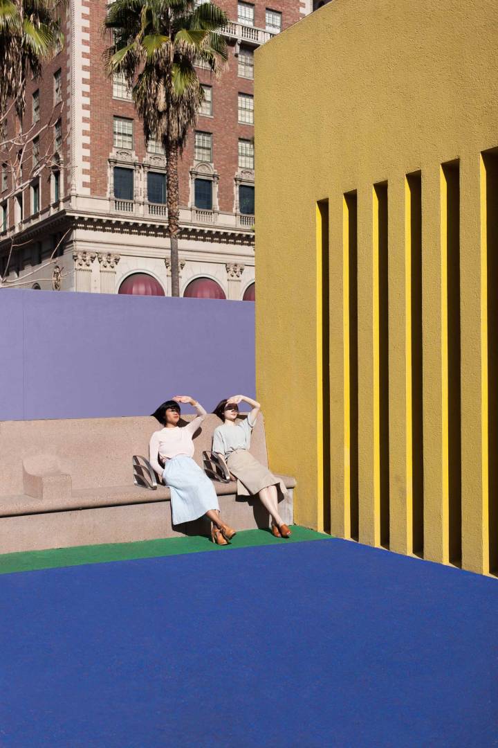
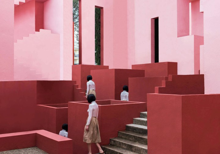
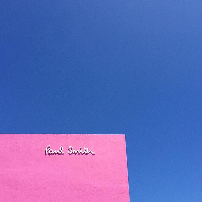
What do you get when you mix Architecture, Symmetry, Minimalism, Fashion, Friendship and the most Perfect Color Palettes? An ongoing image series titled Other On, produced by two talented photographers – June Kim and Michelle Cho.
There is a strong sense of duality at play in all of these images – although perfectly composed and deliciously captivating, a heightened sense of intrigue and drama is achieved thanks to the subjects who almost always have their faces turned away from the camera. Add to the mix some pretty epic architecture and you’ve got yourself a killer photography series that will stay in my mind long after the ongoing internet vortex sucks it away from my screen.
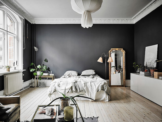
Now for a little drama this Monday…Love the dramatic feel of this beautful apartment.
Perfect conrast between light and dark and modern and classical details. Swooning.
House stalking is like a past time for me lately. Honestly, when I drive by a house I like I think about whether I could live in it and what it’s like inside, but it just seems so far out of reach these days, especially in the heart of Seattle. Property here is ridiculous if you’re wanting to live anywhere within the city limits. Sometimes I feel like I can barely afford life, let alone buying a home in the kind of up and coming area I’d want to be in.
One style I’m currently obsessed with is all things mid-century, I love the clean lines, modern style furniture, large widows and vaulted beamed ceilings. The problem being there are not too many good mid-century style homes in Seattle where bungalows rule. Palm Springs has the best examples, now if only I could find a way to plunk an Eichler home somewhere in Seattle, hmm.
This beauty is the Dr. Scholl’s estate in Palm Springs, CA, the epicenter for mid-century modern, is designed by Anshen+Allen. The entrance has an amazing colonnade and oversize atrium that leads straight into a round pool from the moment you step in the door. I love the front facade with minimal window lines, the privacy, the custom walnut Kerf cabinetry in the kitchen, vintage tiles and hand crafted walnut accent walls….mid-century doesn’t get any better than this. Now if only I had a spare $1.2 million and could tolerate the heat of Palm Springs.
Ah, the pause that refreshes. One of the most famous lines in advertising for Coca-Cola.
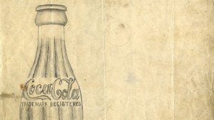
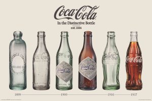
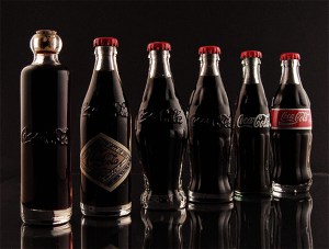
I don’t drink it often but occasionally it really “hits the spot”. And it always seems to taste better when it comes out of a glass bottle, yes/no? One of the most famous shapes in the world is the iconic contour fluted lines of the Coca-Cola bottle. Renowned as a design classic and described by noted industrial designer, Raymond Loewy as the “perfect liquid wrapper,” the bottle has been celebrated in art, music and advertising. When Andy Warhol wanted a shape to represent mass culture, he drew the bottle:
“What’s great about this country is that America started the tradition where the richest consumers buy essentially the same things as the poorest. You can be watching TV and see Coca Cola, and you know that the President drinks Coca Cola, Liz Taylor drinks Coca Cola, and just think, you can drink Coca Cola, too. A coke is a coke and no amount of money can get you a better coke than the one the bum on the corner is drinking. All the cokes are the same and all the cokes are good. Liz Taylor knows it, the President knows it, the bum knows it, and you know it.” Andy Warhol
How did the bottle become so iconic?
It began with the desire to protect brand Coca-Cola and was a cooperative project between The Coca-Cola Company and its bottlers. In 1899, two Chattanooga lawyers, Joseph Whitehead and Benjamin Thomas, traveled to Atlanta to negotiate the rights to bottle Coca-Cola. The product had been an increasingly popular soda fountain drink established a mere 13 years previously. In fountain form, Coca-Cola grew from an average of nine drinks per day sold in 1886 to being sold in every state of the US by 1900. Thomas and Whitehead wanted to capitalize on the popularity of the drink by bottling it to be consumed outside the four walls of a soda fountain.
And to indicate the power of brand, as of 2015 the Coca-Cola brand was valued at 83.84 billion U.S. dollars.
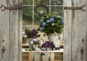
I am currently obsessed with blue velvet, particularity furniture. There is something so luxurious and glamorous about velvet, especially in rich colors like blue. The beauty of the fabric is classic, timeless and it never gets old, even vintage velvet has elegance. Here is an interesting bit of velvet fabric history and some stunning examples. I would love to own any of these.
As today is St. Patrick’s Day it has me thinking about the color green. It’s not my favorite color but I do love nature where it’s everywhere, some people wear it very well and when it comes to interiors it has a quiet, moody feel about it. So I guess it all depends on the context in which it’s used. As I researched the color I came upon some beautiful renditions. Happy St. Patrick’s day to all who celebrate. For those who don’t, enjoy some fun trivia about Green.
The Meanings of Green Since the beginning of time, green has signified growth, rebirth, and fertility. In pagan times, there was the “Green Man” – a symbol of fertility. In Muslim countries, it is a holy color and in Ireland, a lucky color. It was the color of the heavens in the Ming Dynasty.
Today’s greens can be found in a wide range of objects: pea soup, delicate celadon glazes, emeralds, wasabi, and sage. The English language reflects some strange attributes: Would you rather be green with envy, green behind the ears, or green around the gills?
Global Meaning of Green
Green is universally associated with nature.
Green symbolizes ecology and the environment.
Traffic lights are green all over the world.
In China, Green may symbolize infidelity. A green hat symbolizes that a man’s wife is cheating on him.
In Israel, green may symbolize bad news.
In Japan, the words for blue and green (ao) are the same.
In Spain, racy jokes are “green.”
Giovanni Arnolfini and His Bride by Jan Van Eyck , 1434
The bride in this Renaissance masterpiece wears green as a symbol of her fertility. She is slouching in imitation of pregnancy, thus indicating her willingness to bear children.
In Celtic myths the Green man was the God of fertility.
Later in the millennium, Early Christians banned green because it had been used in pagan ceremonies.
Nevertheless, as evidenced by Van Eyck’s 15th Century wedding portrait, the color green was the best choice for the bride’s gown because of its earliest symbolism.
Of note is the continued symbolism attached to the color in the latter part of this century. Anyone who chooses a green m & m (an American candy which contains an assortment of different colored chocolate sweets) is sending a somewhat similar message. Green has been reinterpreted by late 20th century American culture to signify a state of heightened sexuality in this specific situation.
Jan Van Eyck: The Arnolfini Wedding, circa 1435
Beautiful green velvet furniture
adds a quiet moodiness and softness
to a room.
Design bloggers Brooke and Steve Gianetti, (Velvet & Linen) have written a beautiful book about the process of building their marvelous home in Ojai, California called Patina Farm. And now it’s in a book with beautiful photos of a place I would call utopia living. It’s the stuff that dreams are made of, of a beautiful alternate life adorned with vintage French wood doors, charming chicken coops, dreamy landscapes, glass walled showers and baby goats. I would love to visit this place.
Backyard garden view with gravel path through boxwood shrubs leading towards backdoor of tan house with red tile roof.
3,900 Pages of Paul Klee’s personal notebooks (1921-1931) are online. I love his art and thoughts on color and really enjoy his works. Klee taught at the Bauhaus in Weimar from 1921 to 1926 and in Dessau from 1926 to 1931. During his tenure, he was in close contact with other Bauhaus masters such as Kandinsky and Lyonel Feininger.
I stumbled across this gorgeous two bedroom condo for sale n Boston if anyone is looking. It’s absolutely beautifully appointed. Find out more about here.