Being in a state of quarantine, my planned excursion to Italy had to be put on hold. Actually, as everything has a way of turning out alright, I’m ok with that because it gives me more time peruse wonderful stories about Italy that I previously never seemed to find time for. I’m discovering some of the hidden treasures that I’ll take with me…some this September. And if September shall come and go and still I cannot fly to Europe? Well then, I shall peruse even deeper until the time comes when I can. Below is a story from Cereal magazine for all to peruse and enjoy.
“I STAND ON A BALCONY WITH TILES LAID IN DIAGONAL STRIPES, LOOKING OUT INTO THAT INFINITE BLUE UNTIL I AM SUSPENDED IN IT.”
 White concrete frames a square of uninterrupted blue. The cloudless sky, the iridescent Tyrrhenian sea, even the land stretching out either side — pastel-painted Sorrento to the left, Vesuvius to the right — is cast in a haze of blue. An impressionist’s dream.
swooning over this blue tile
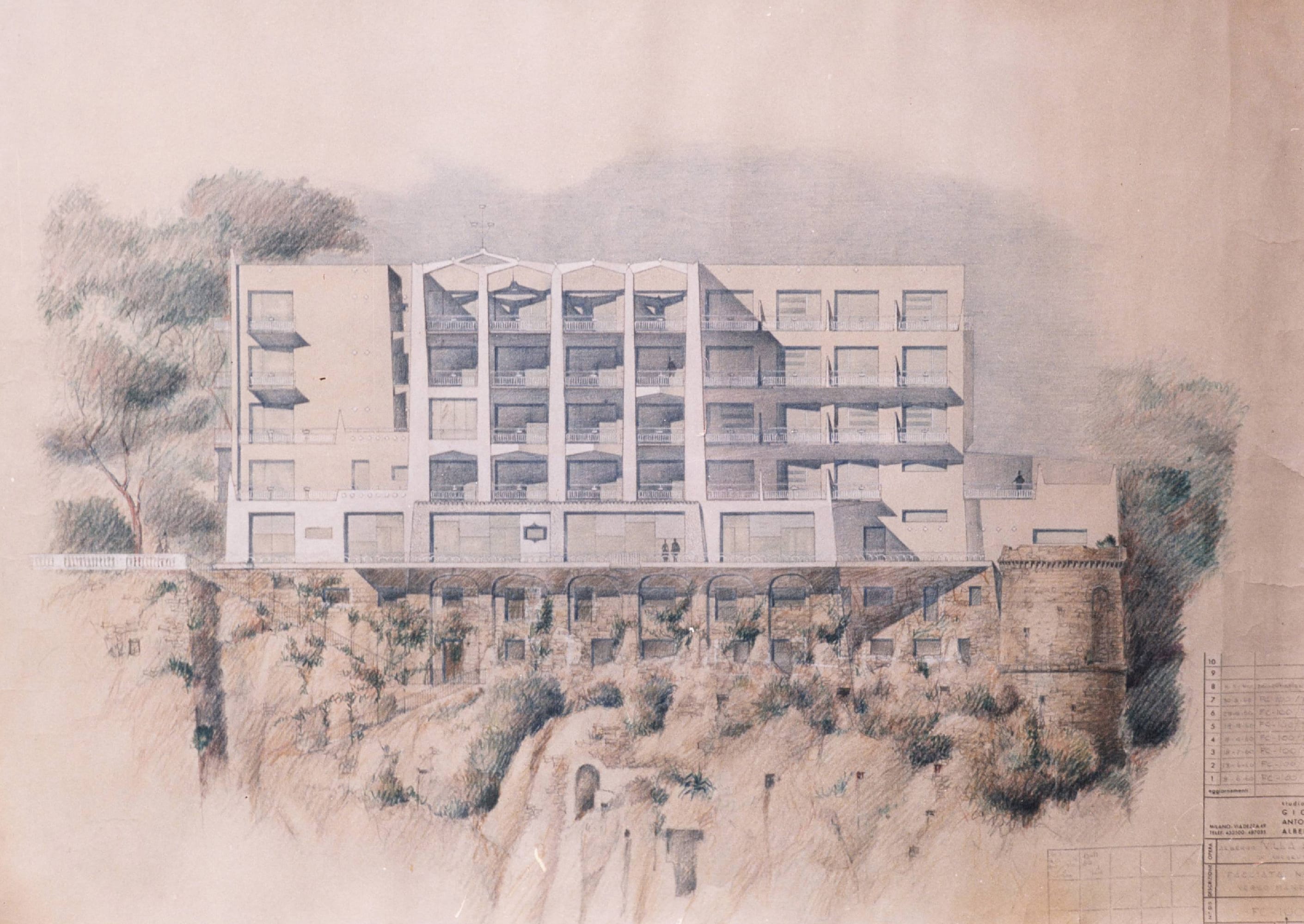
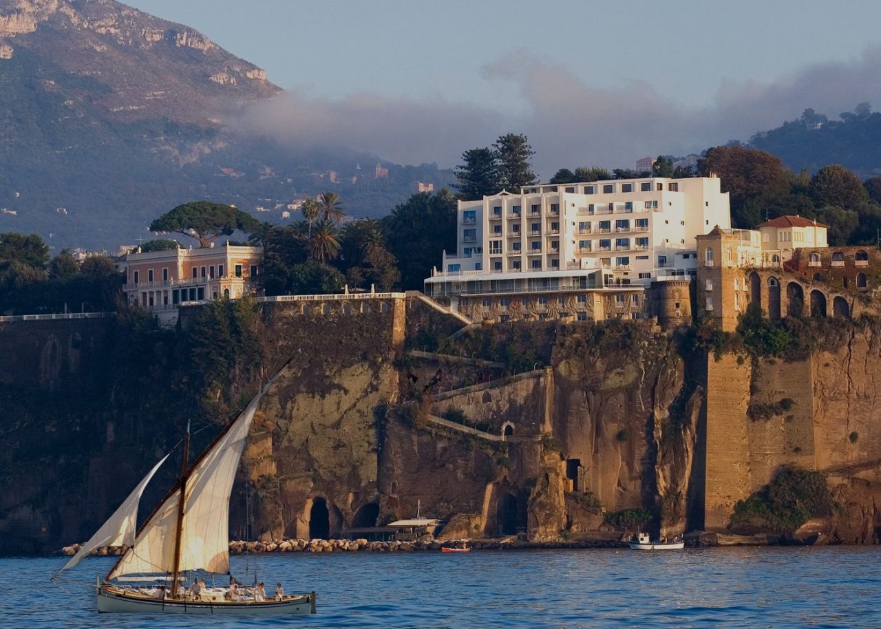
The concept of infinite blue was architect Gio Ponti’s driving inspiration when he built Parco dei Principi, his slice of 1960s modernism on a coast of faded antiquity. When it opened in 1962, the hotel was something new for ancient Sorrento: a clean-lined, contemporary edifice on the tufa-stone cliff. Inside, the bright, wide-open spaces were pared down and decorated entirely in white and blue.
Ponti was commissioned to build Parco dei Principi when his friend and colleague, the Neapolitan engineer and hotelier Roberto Fernandes, bought the neighboring property, the ballet-shoe-pink 18th century Villa Cortchacow. The villa was originally owned by the Count of Syracuse and then by a Russian prince, who had a mock Gothic castle half-built in the grounds lest his cousin, the last tsar of Russia, should come to stay. Ponti’s challenge was to transform this — perhaps thankfully — unfinished castle.
Gio Ponti was one of the most pioneering architects of the mid-century, with an extraordinary portfolio of buildings that championed forward-looking principles. He was driven by the ideas of transparency and lightness. His diamond-shaped Pirelli tower in Milan soars; his ethereal Taranto Cathedral in Puglia, delicate as a paper cut-out, is known as ‘the Sail’. “He loved to create little spaces of lightness, through elements in the design,” says Caterina Licitra Ponti, his great-granddaughter, a passion for her great-grandfather’s work alive in her eyes.
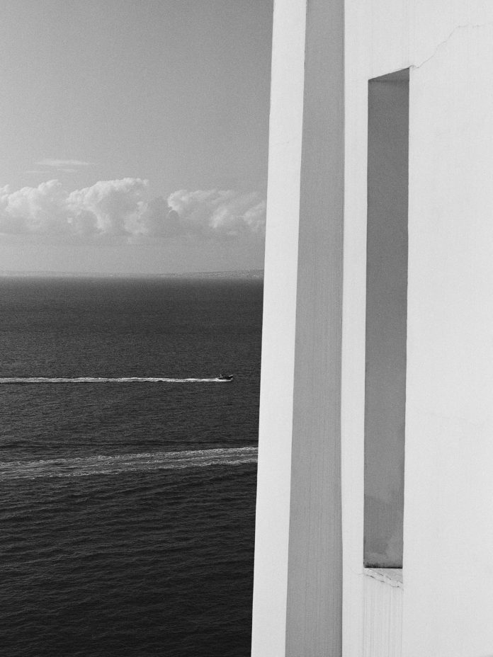
And so in Sorrento, as in Taranto, he uplifted the castle’s solid stone walls so that the new building seemed to hover above the clifftop, wrapping the interior in a white concrete skin, perforated with spaces that allow the light and the sky to penetrate the framework. On approach, through verdant subtropical gardens, the blue of the sea is visible all the way through the glass-walled ground floor.
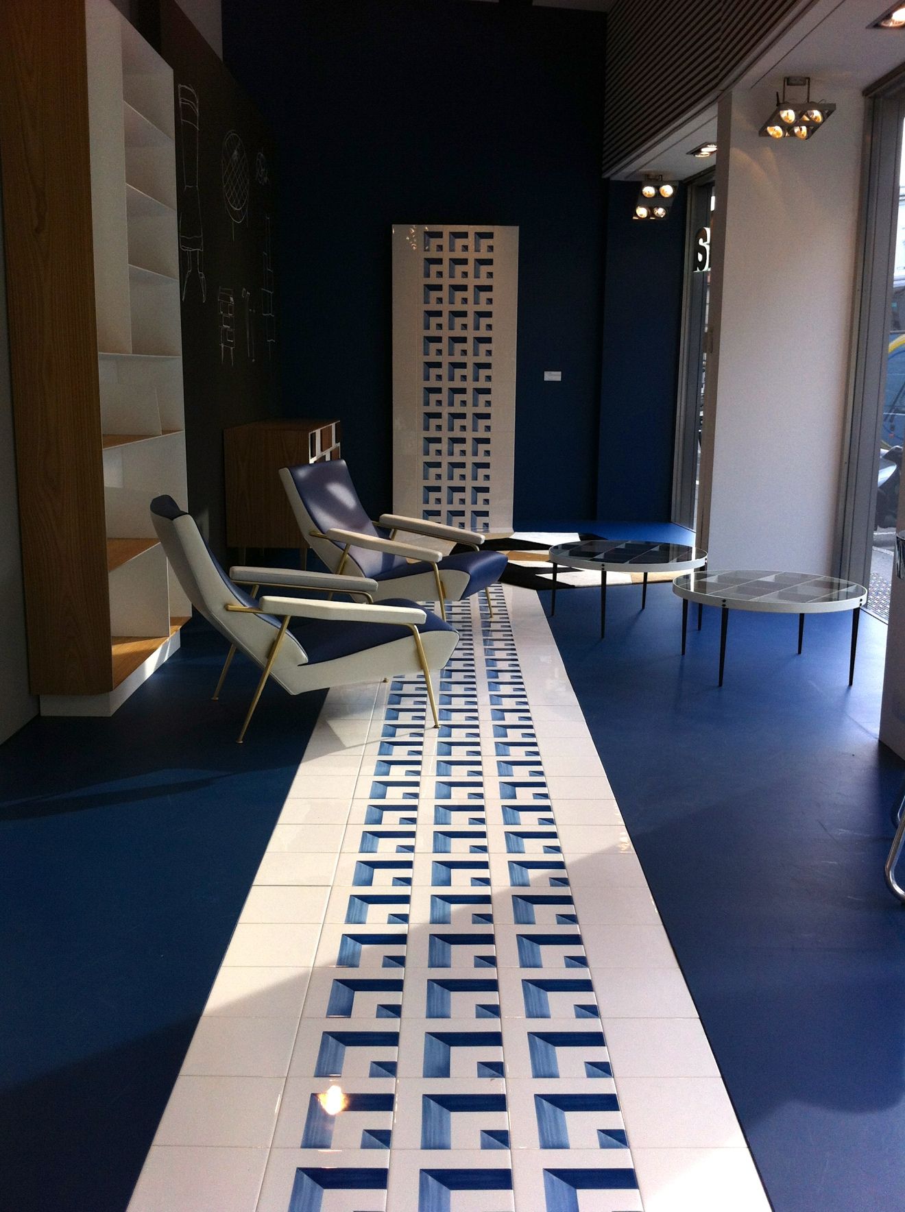
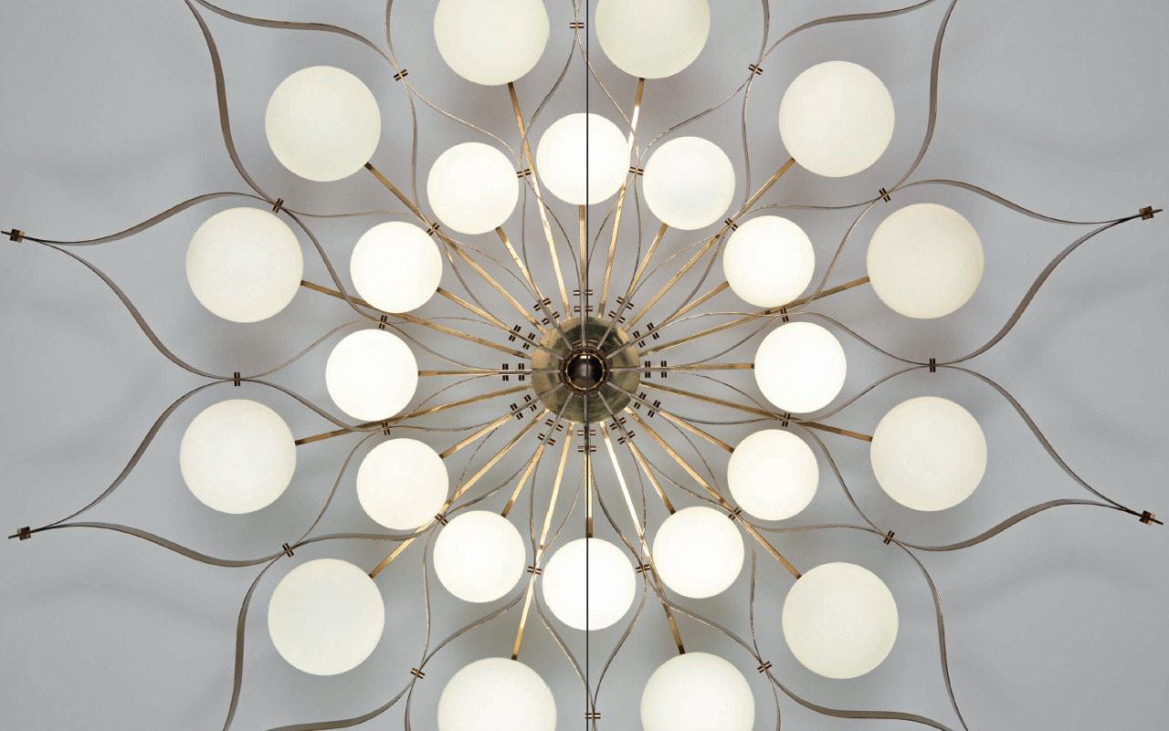
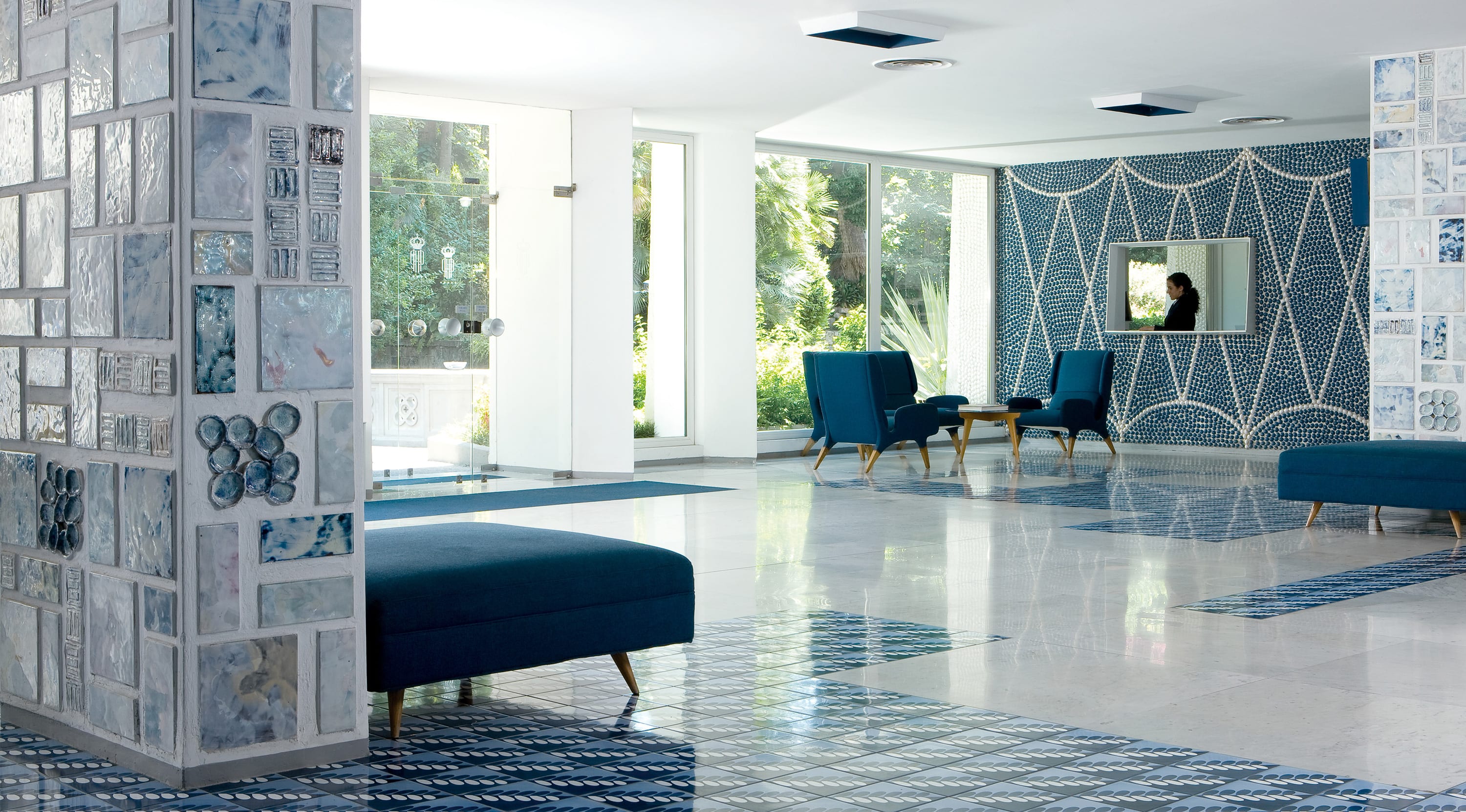 Of all Gio Ponti’s 100-odd buildings, Sorrento is the only hotel where you can still stay, fully immersed in his art — for as well as the building itself he designed every last detail. He was not just an architect, but a designer — of interiors, furniture, industry, cars — an artist and a ceramicist, a writer and a teacher; and at Parco dei Principi his passion for so many disciplines converged in one triumphant paean to modernity.
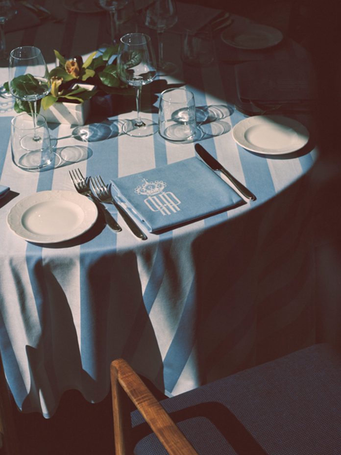
Work was his passion. Every moment was one in which to create. Her grandmother, Lisa — Ponti’s daughter — recalls him waking each morning at 6.00 am. He used to have coffee in bed while he sketched and wrote letters on a tray of his own design — daily correspondence to friends and colleagues about every devilishly intricate detail of his projects, right down to the tablecloths and tiles.
In the lobby, blue and white glazed pebbles are set into the walls, their cool, shiny-smooth surfaces reflecting infinite depths of radiance, chosen, Ponti wrote, for their ‘lightness and grace’, their ‘reflexes of light and sky’. Down in the hotel’s subterranean levels, where there is nobody else about, I put my cheek to the cool of them. It is clear Ponti created this place not just to look at but to touch, too, so that his work would engage and bring delight.
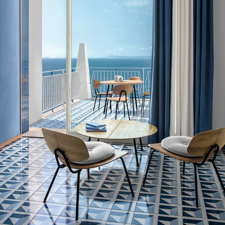
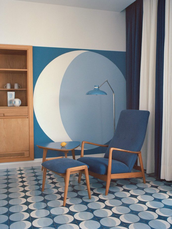
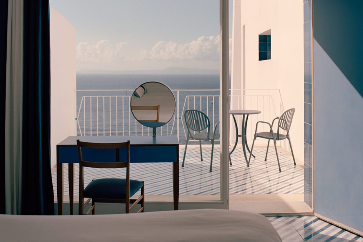
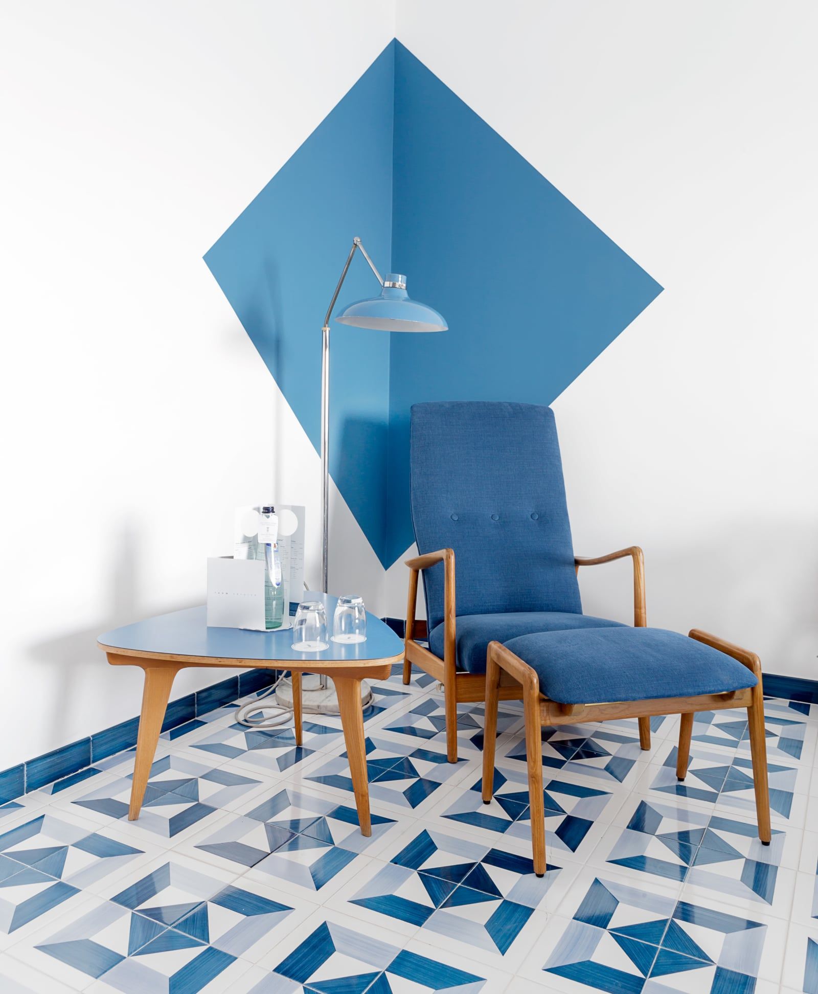
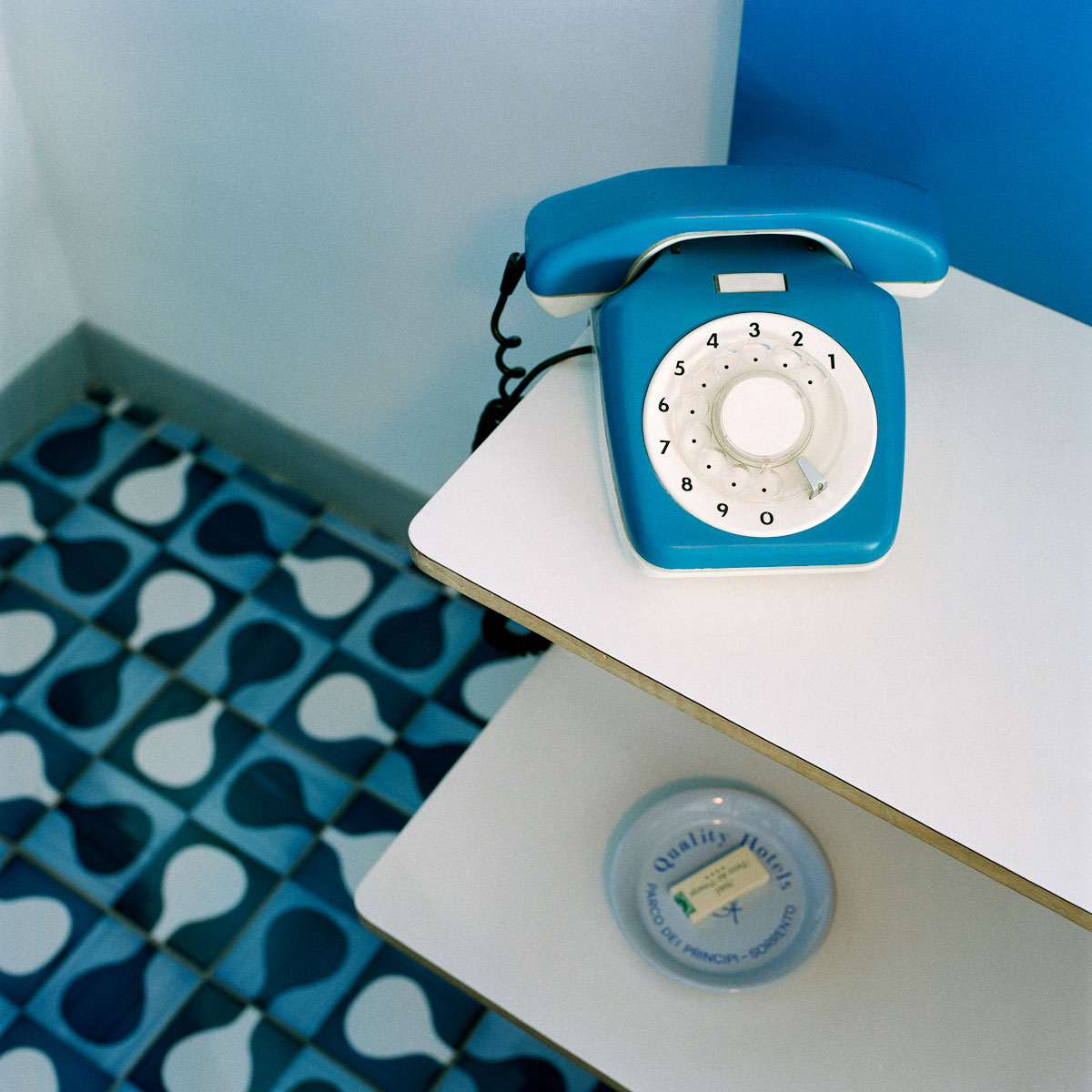
On the bright upper floors, the hotel’s bedrooms are stripped back to the bare essentials, each element designed by Ponti in mid-century modern style and made in Italy: a bed, a chair, a footstool which doubles as a suitcase stand, and a dressing table facing the sea, where I sit and write this story on its smooth Formica top the color of the sky.
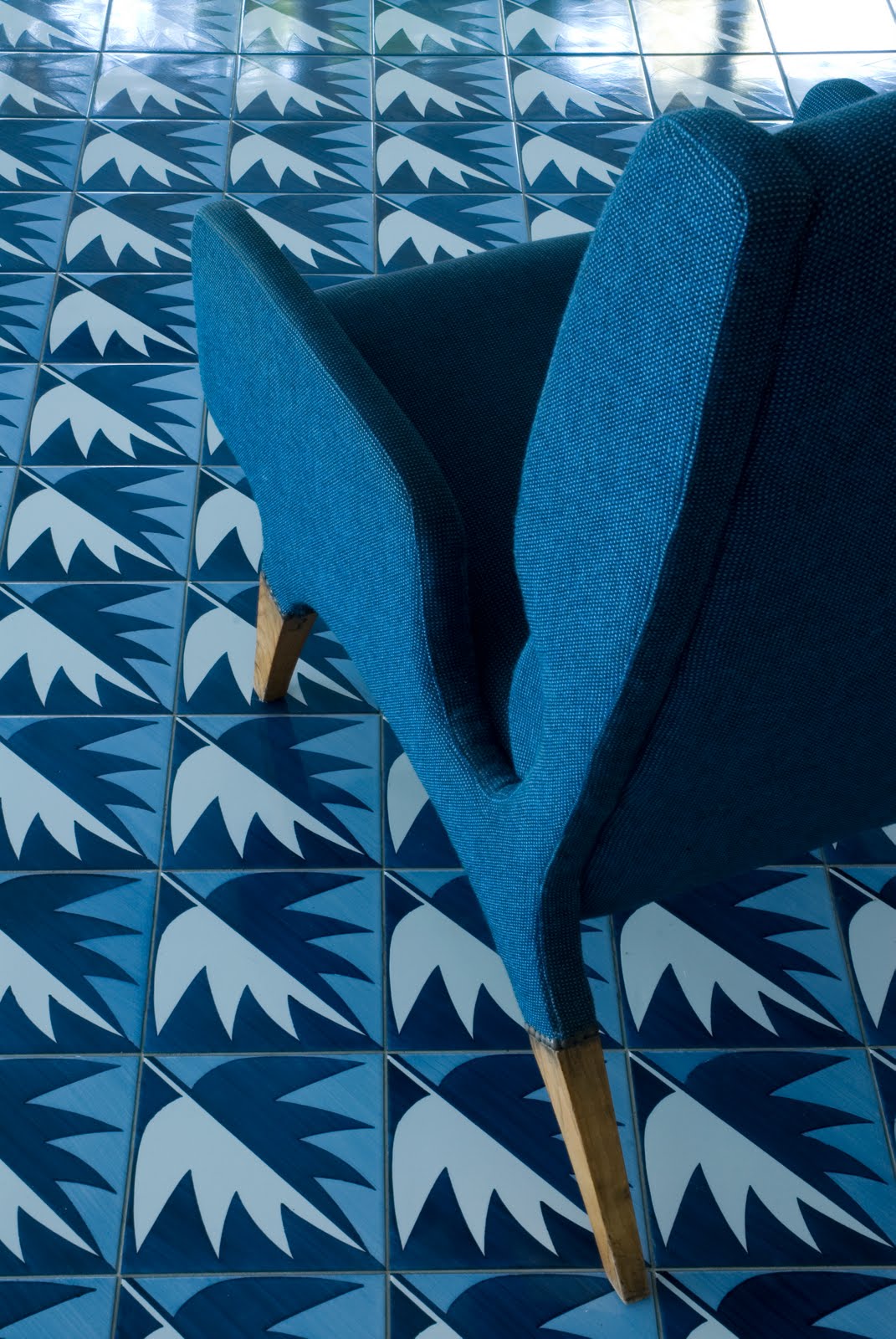
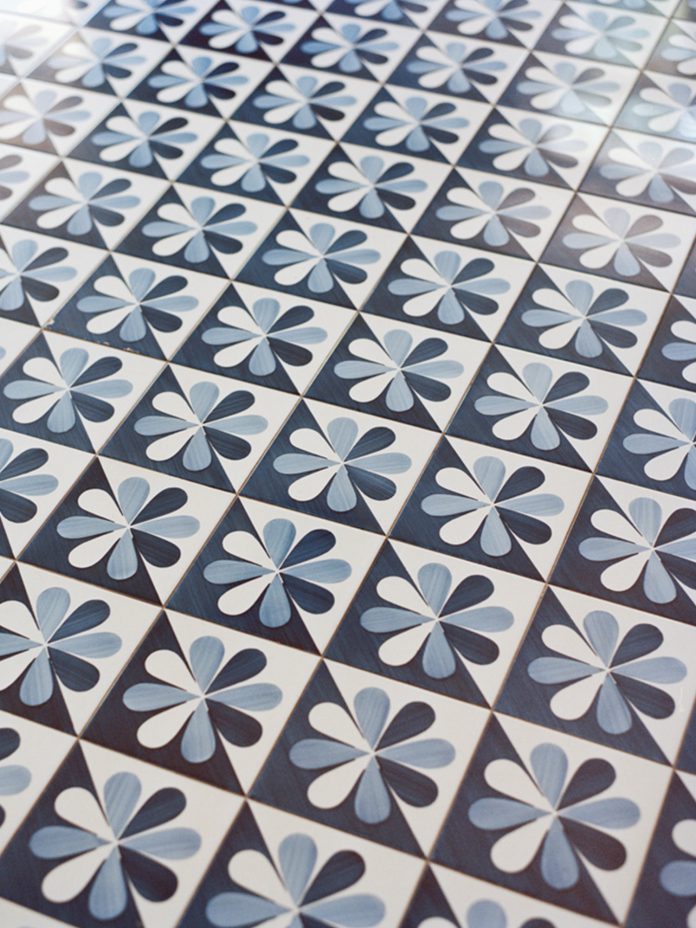
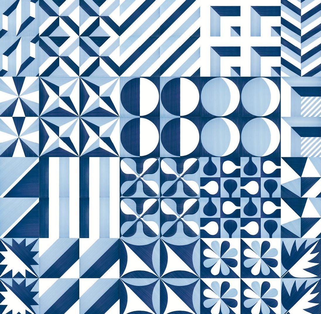
Shaded from direct sunshine by the building’s perforated sheath, the room is cooled naturally by the shades of blue and white, and by the ceramic tiles underfoot. Of all Parco dei Principi’s carefully curated details, these ceramic tiles are perhaps the most enduring. Ponti made 30 different designs, all in the dark blue, pale blue, and white of the local seascape — some geometric, some figurative, featuring moons, stars and leaves. They are configured differently in each of the hotel’s 96 rooms.
“I always think of the endless possibilities of the art,” Ponti observed, of creating these tiles. “Give someone a square measuring 20 by 20 and although people have been turning them out for centuries, there’s always room for a new pattern… There will never be a last design.” Here again, the concept of infinite blue. His dream was to make a permanent mark — infinite, like the blue of the sea and the sky.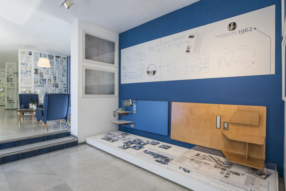
I stand on a balcony with tiles laid in diagonal stripes, looking out into that infinite blue until I am suspended in it. Below me, a sailing boat cuts across the bay, its wake drawing a straight white line through the water. Above me, a gull hangs steadily for a moment, then soars away into the sky. Borne on the wind, light as air. Gio Ponti is everywhere.
Cereal magazine
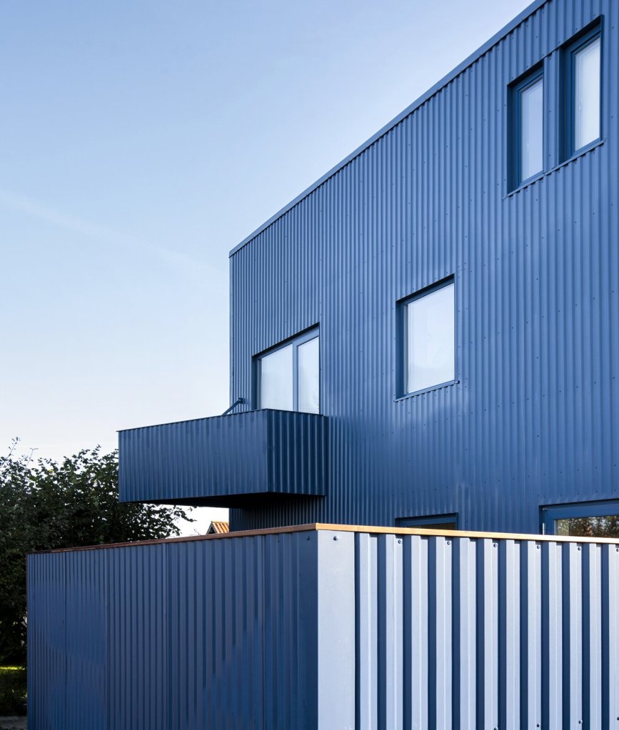
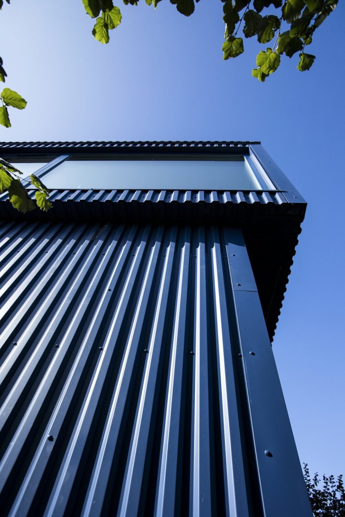


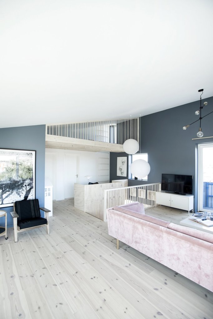
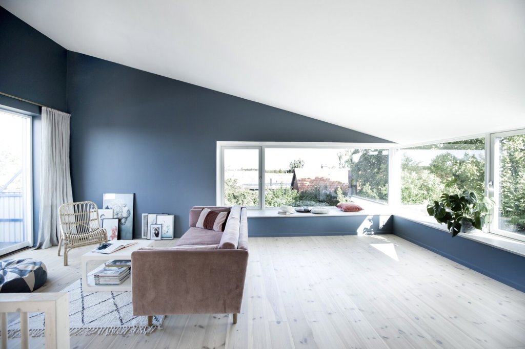
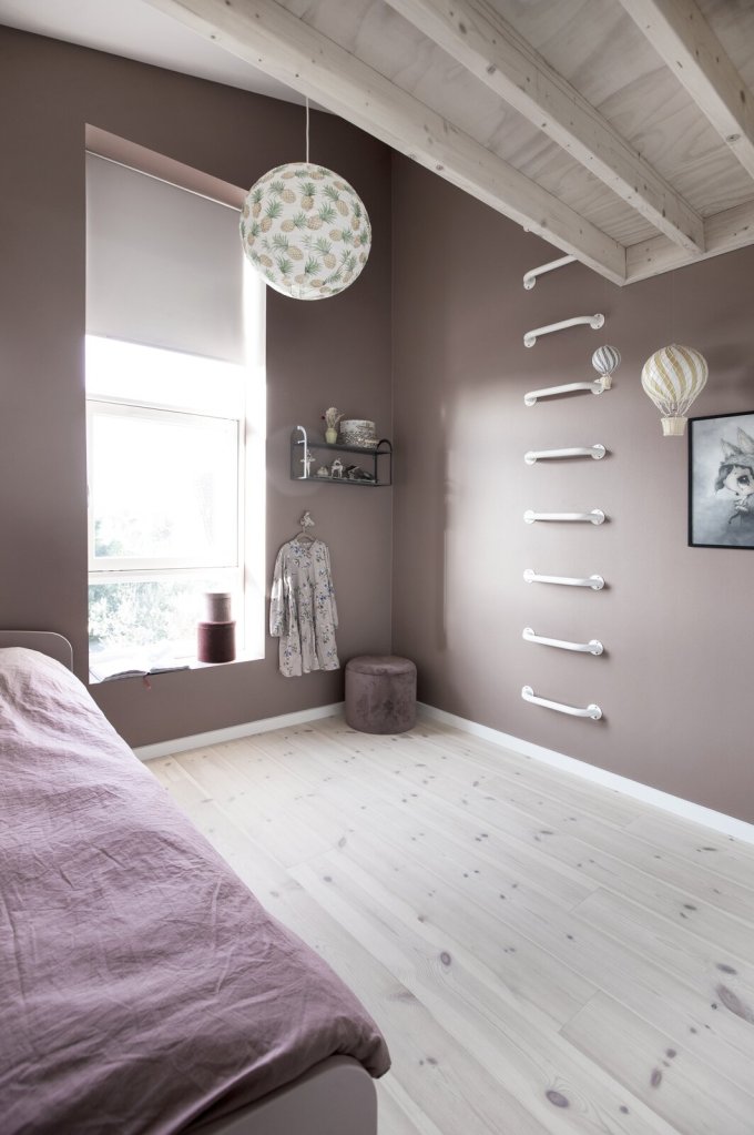

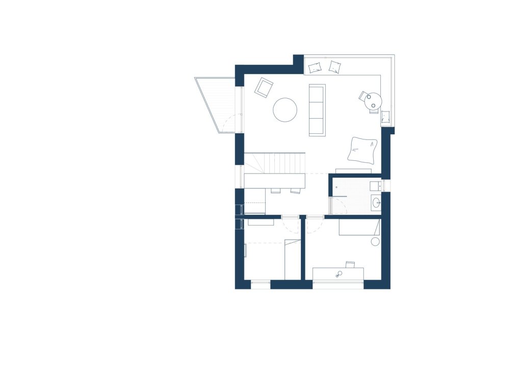
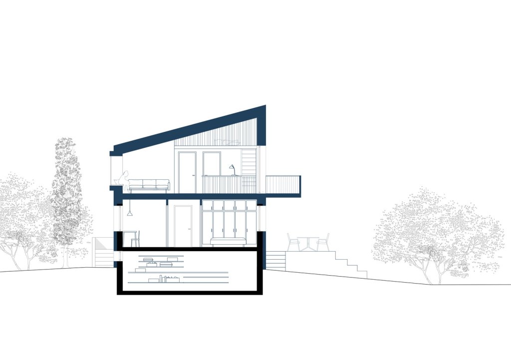
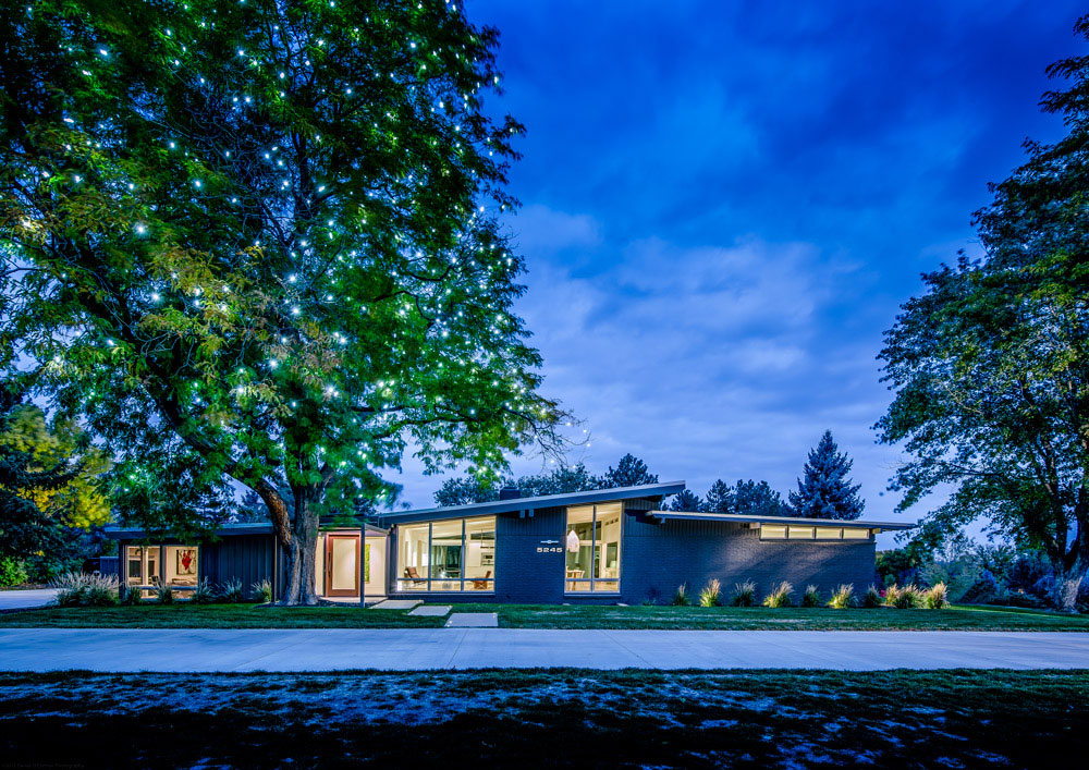
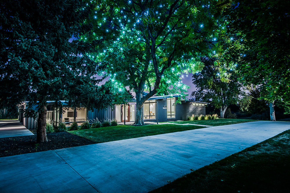
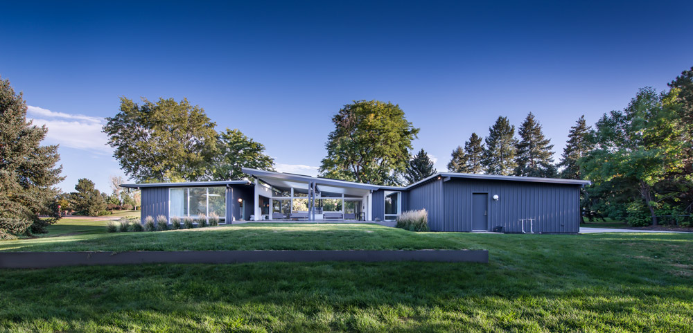
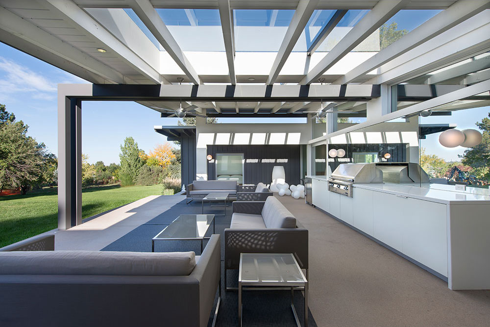
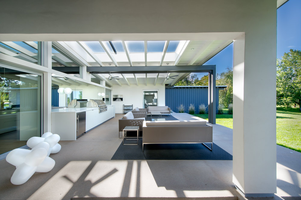
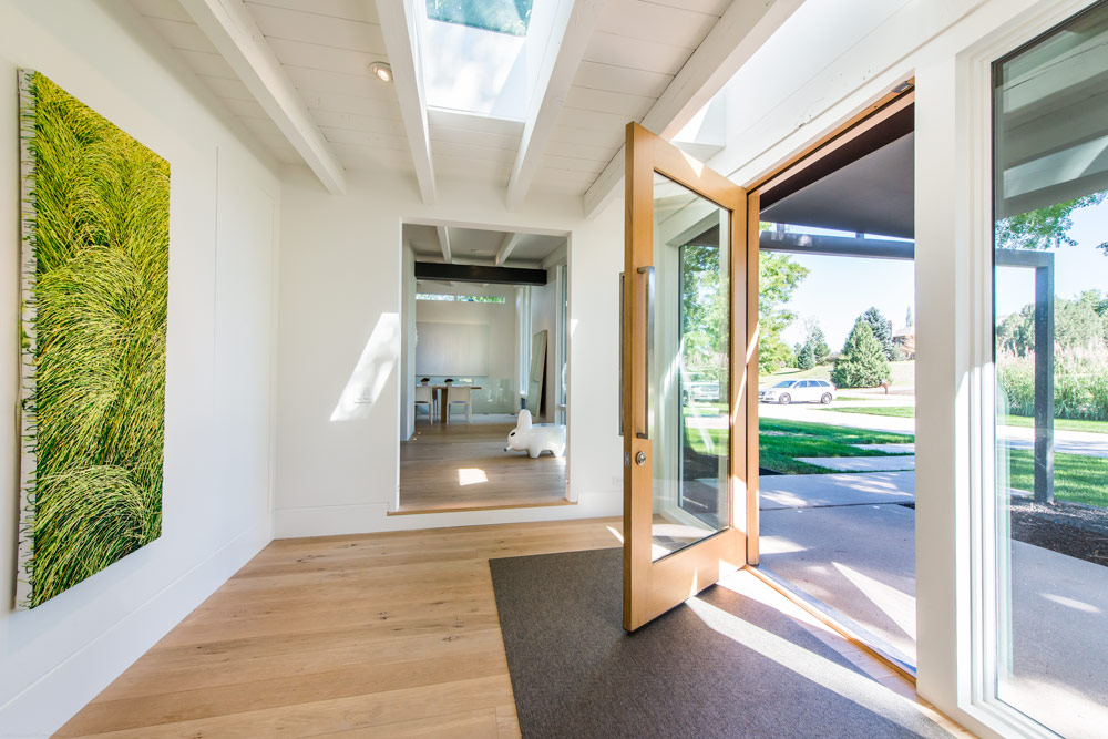
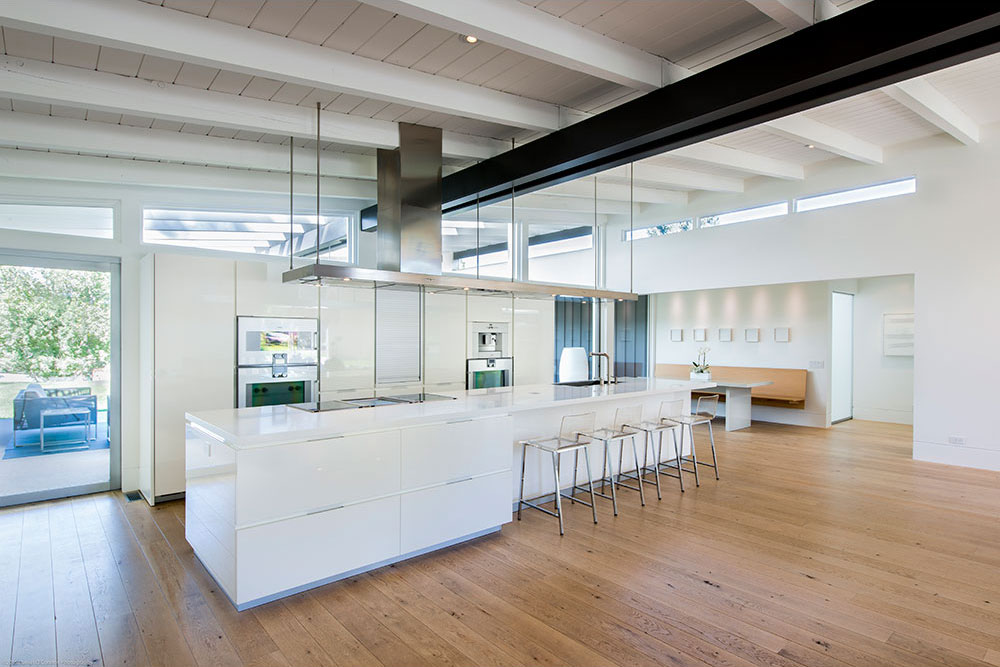
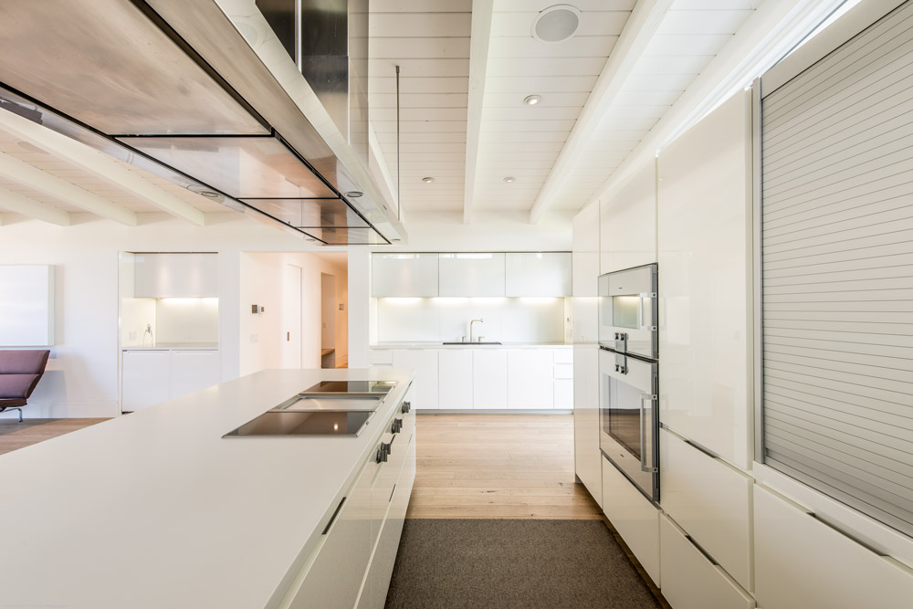
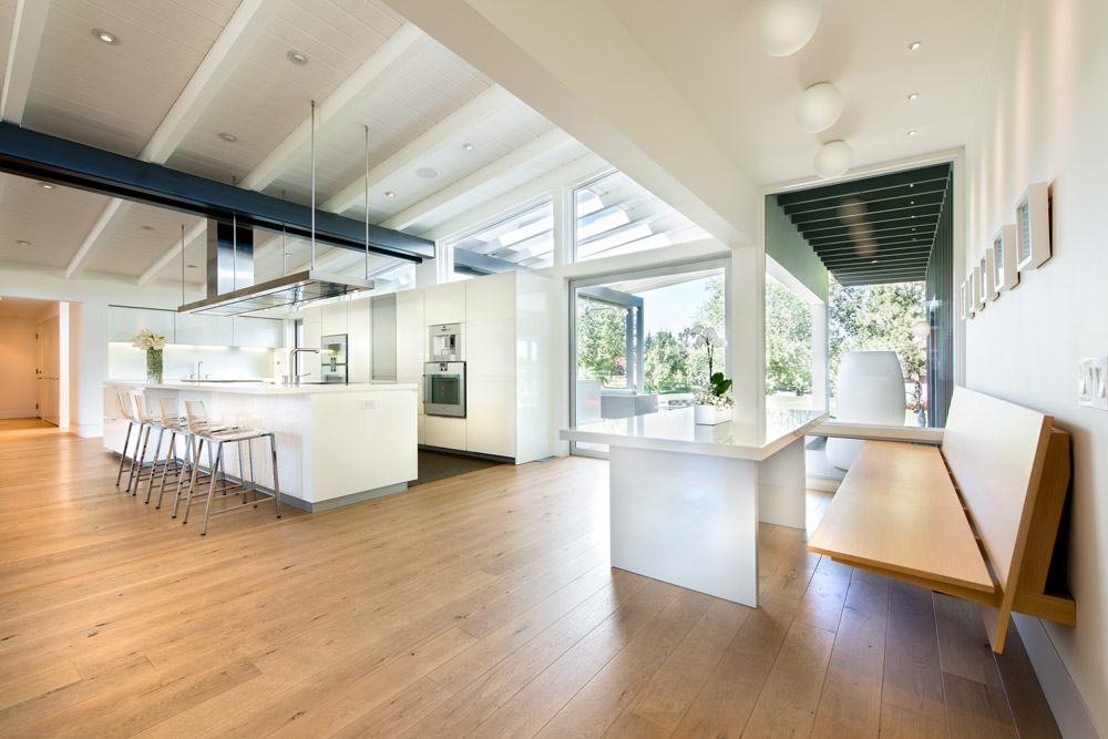
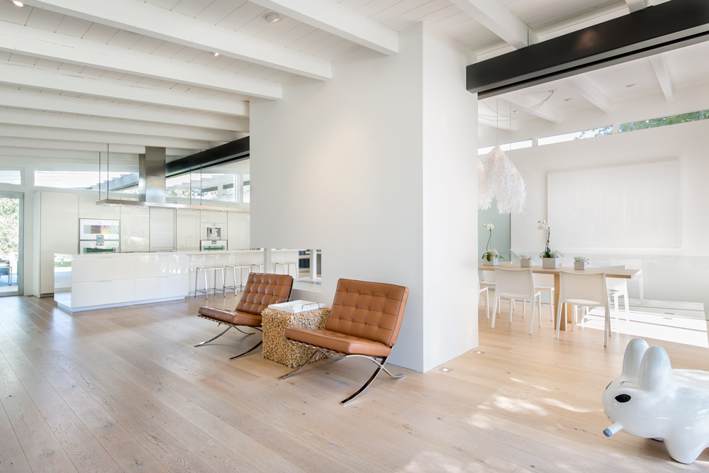


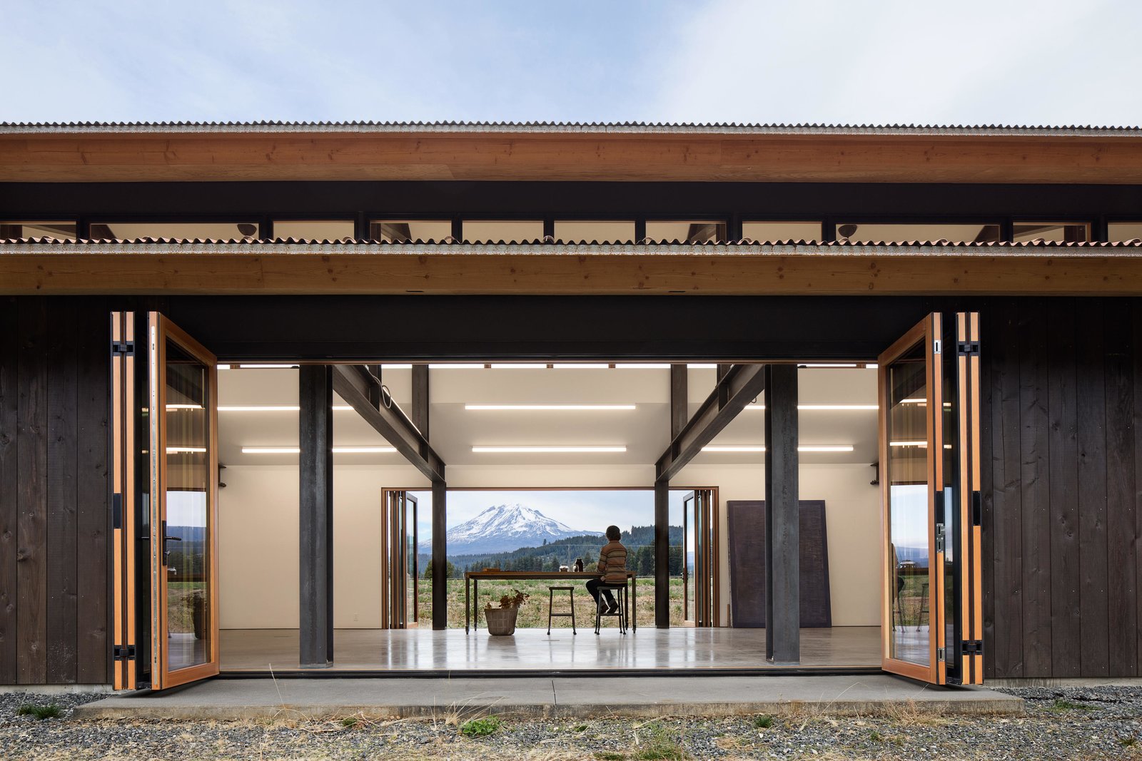
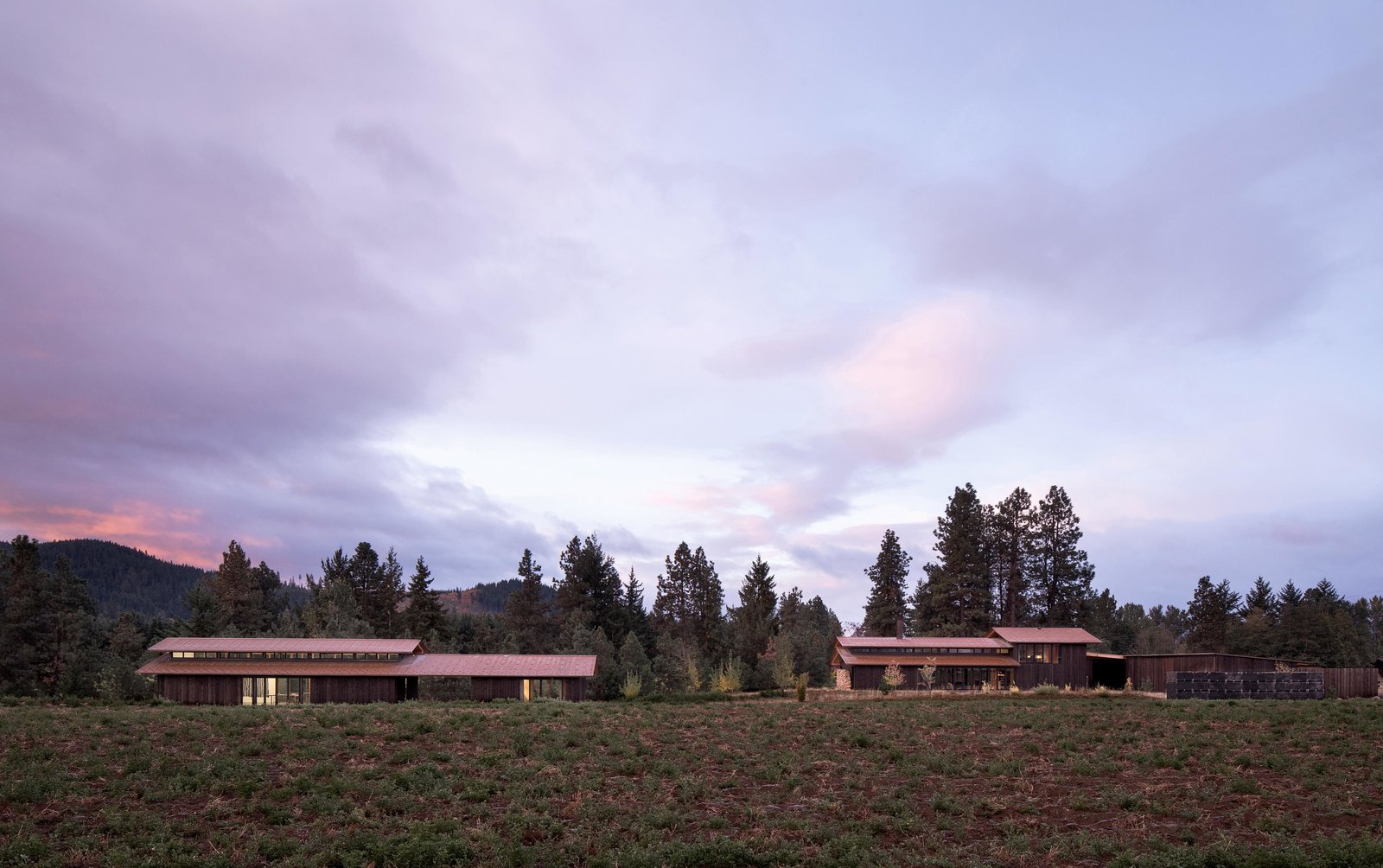
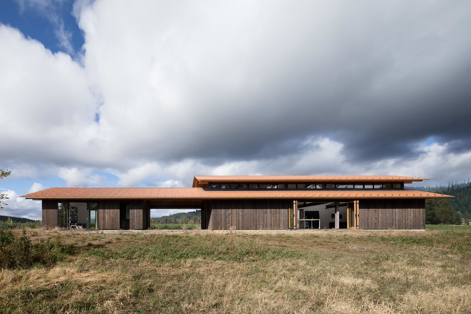
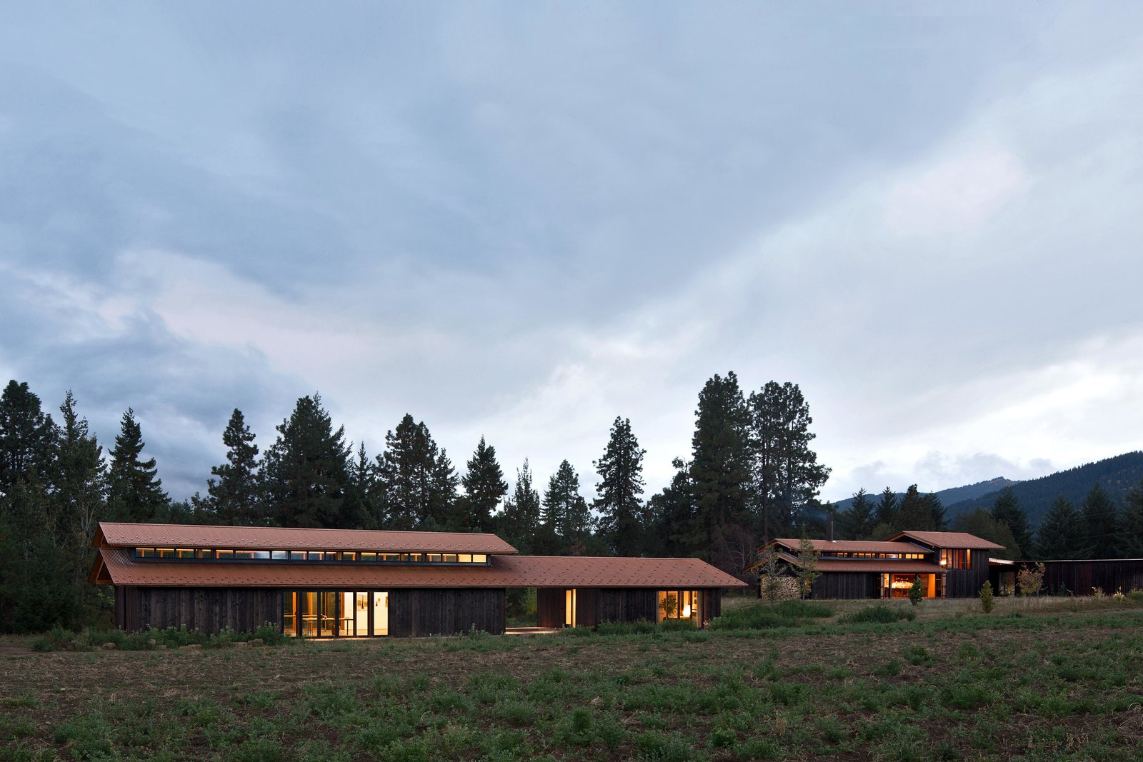
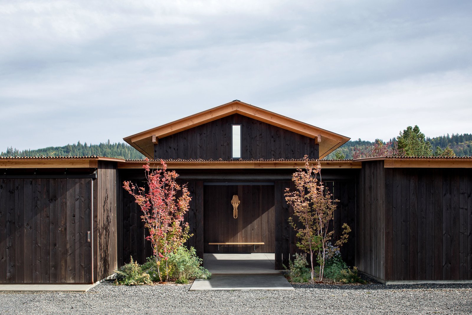
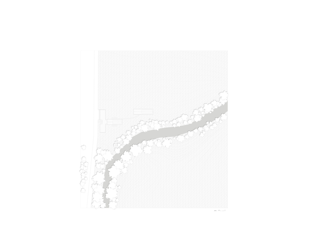
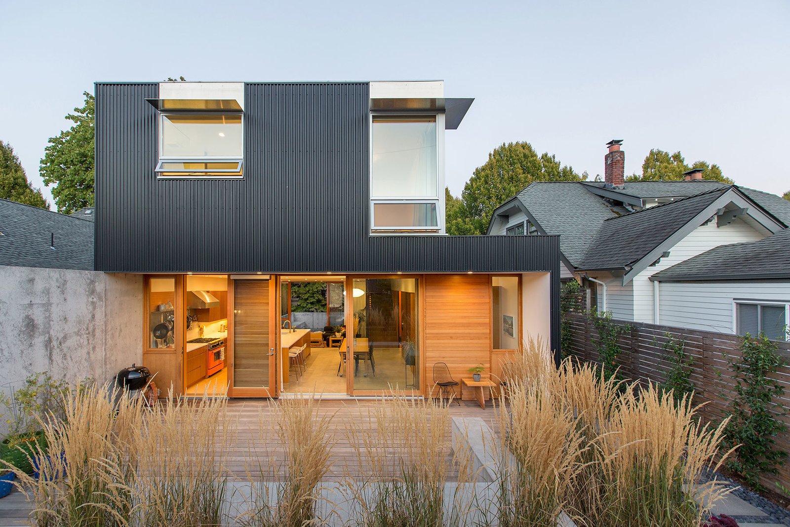
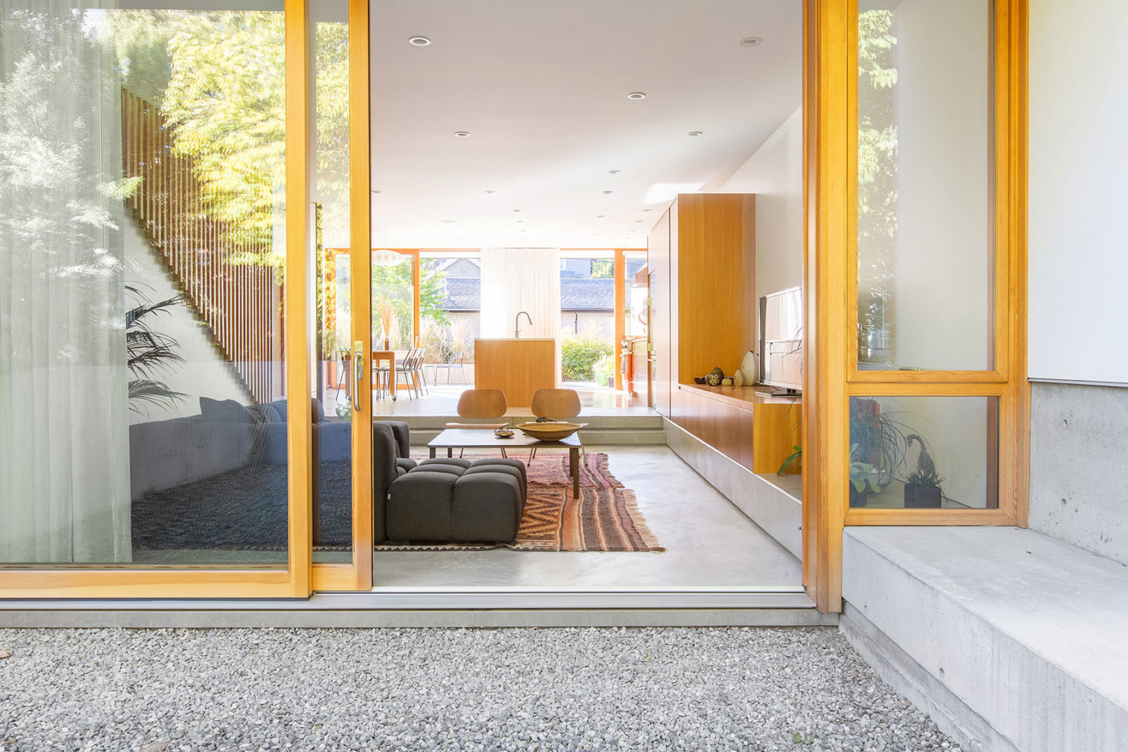
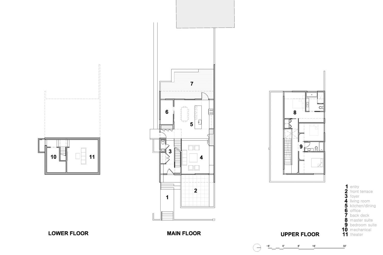
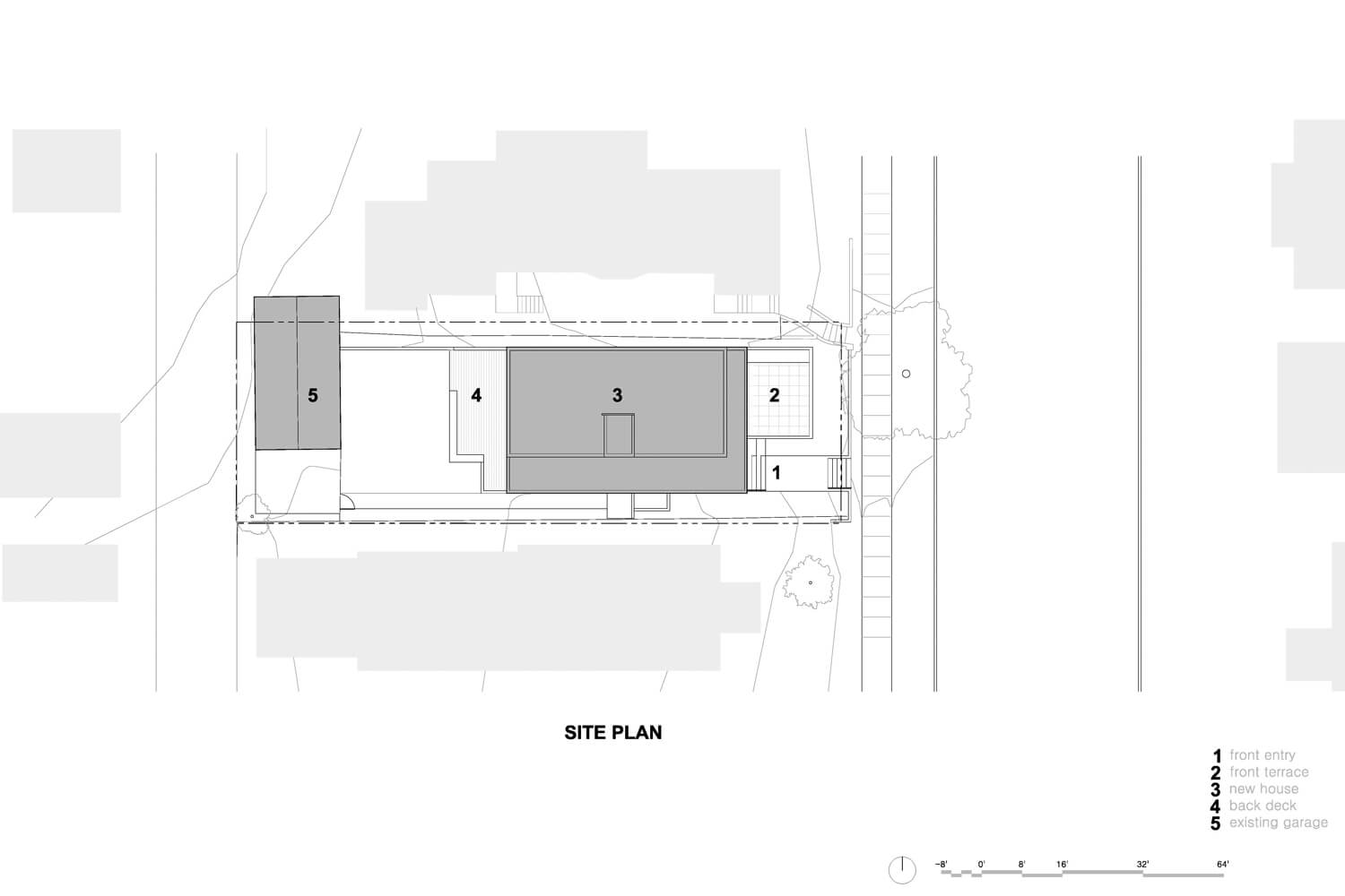
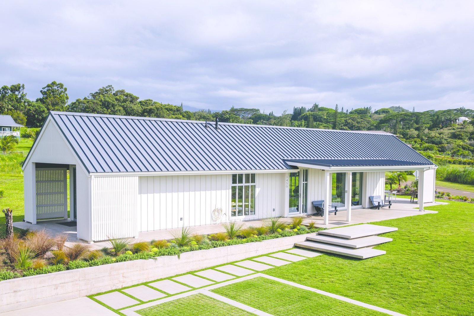
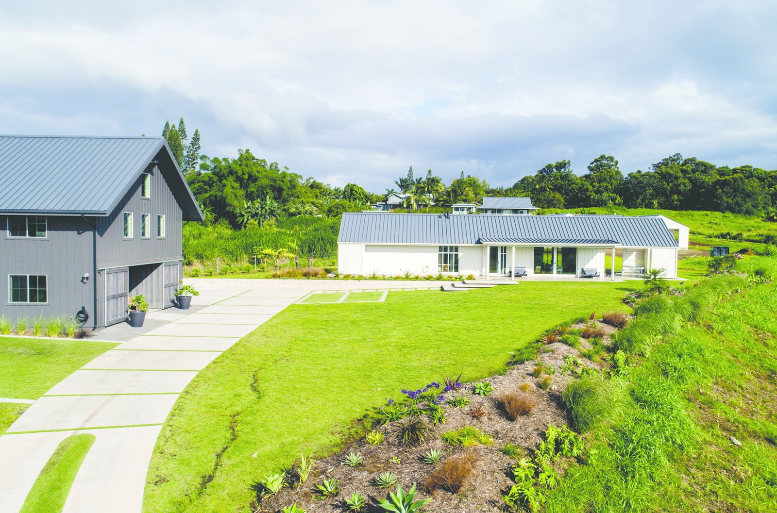
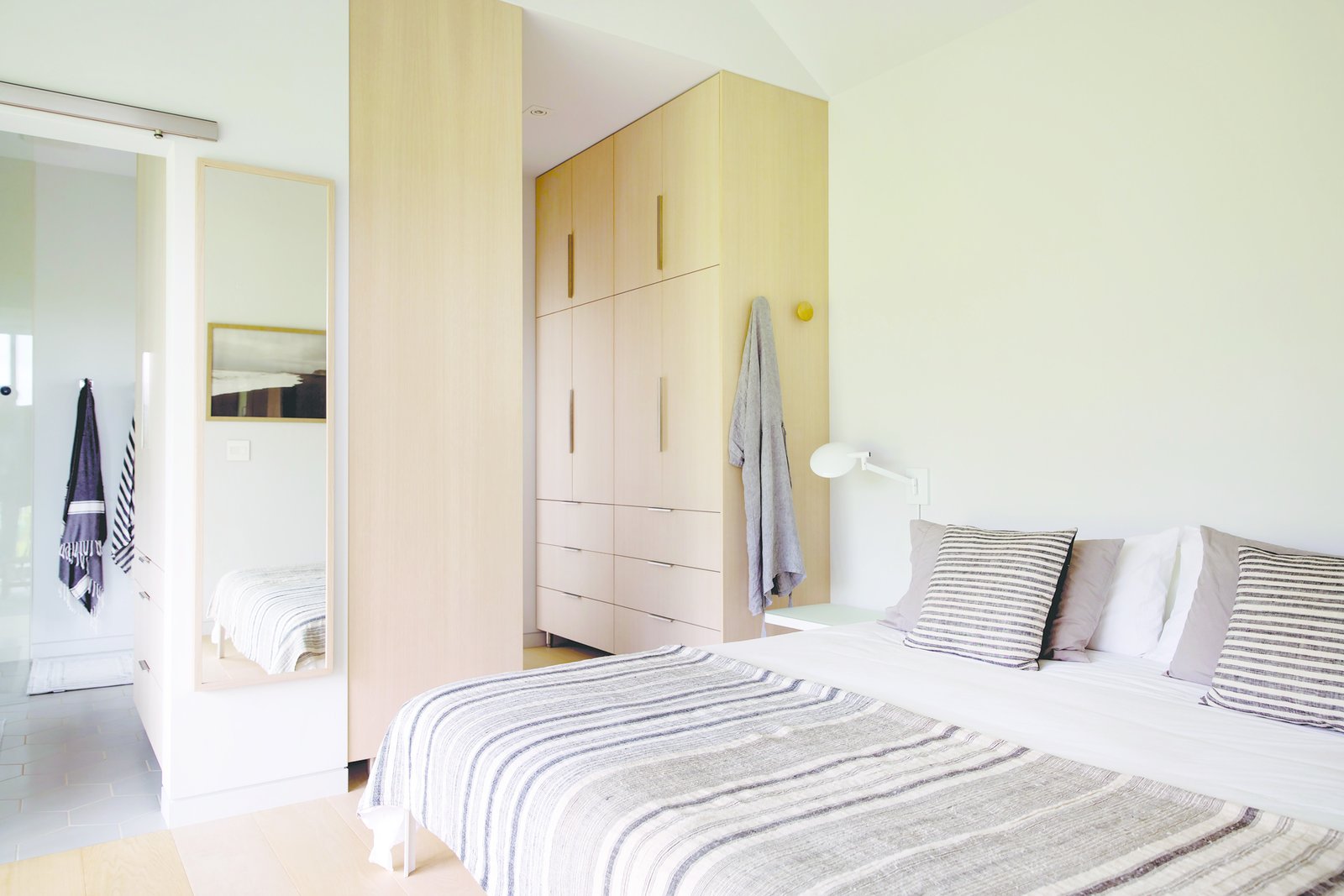
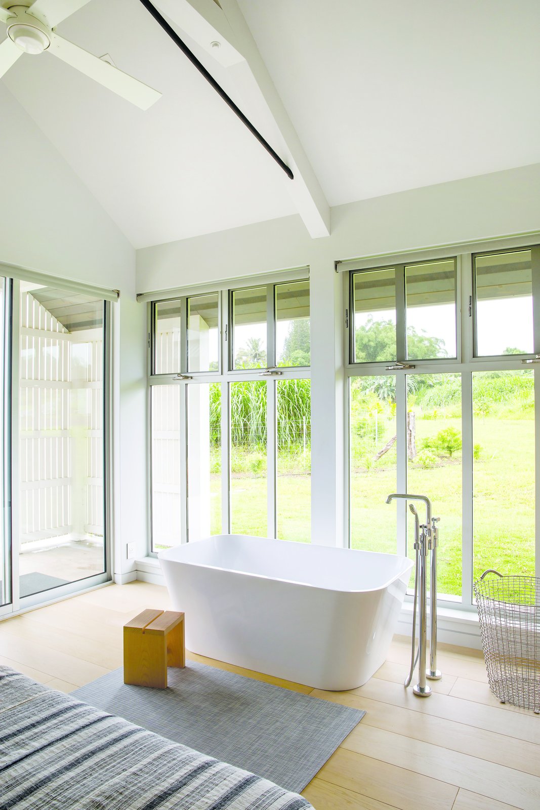
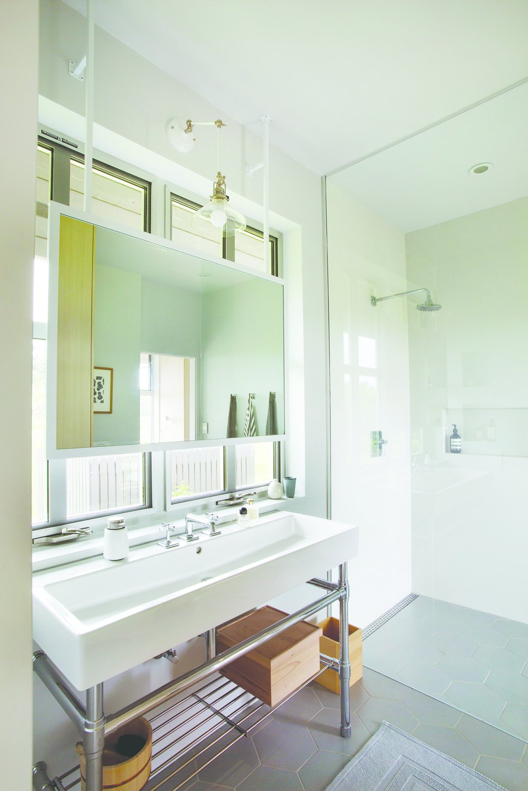
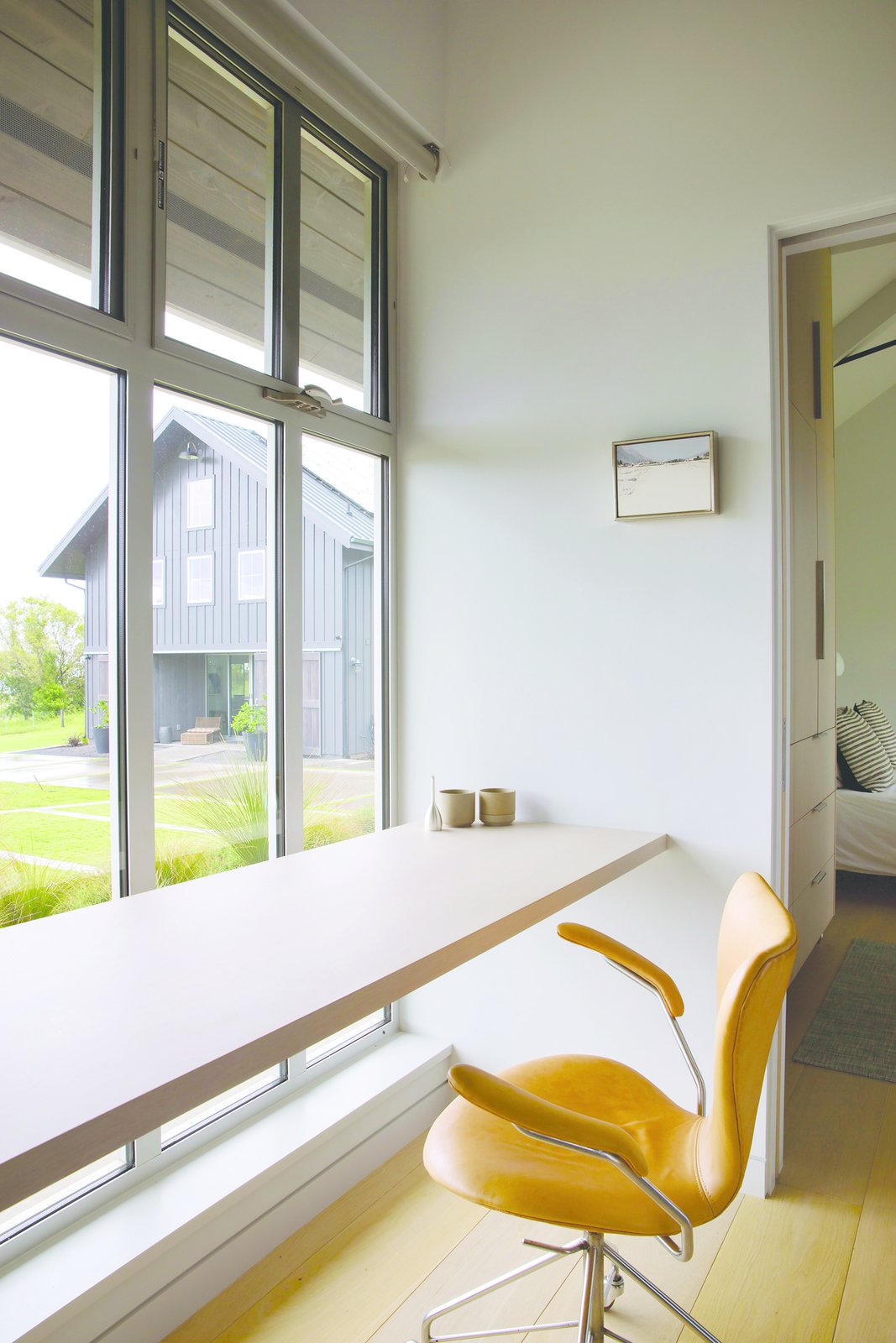
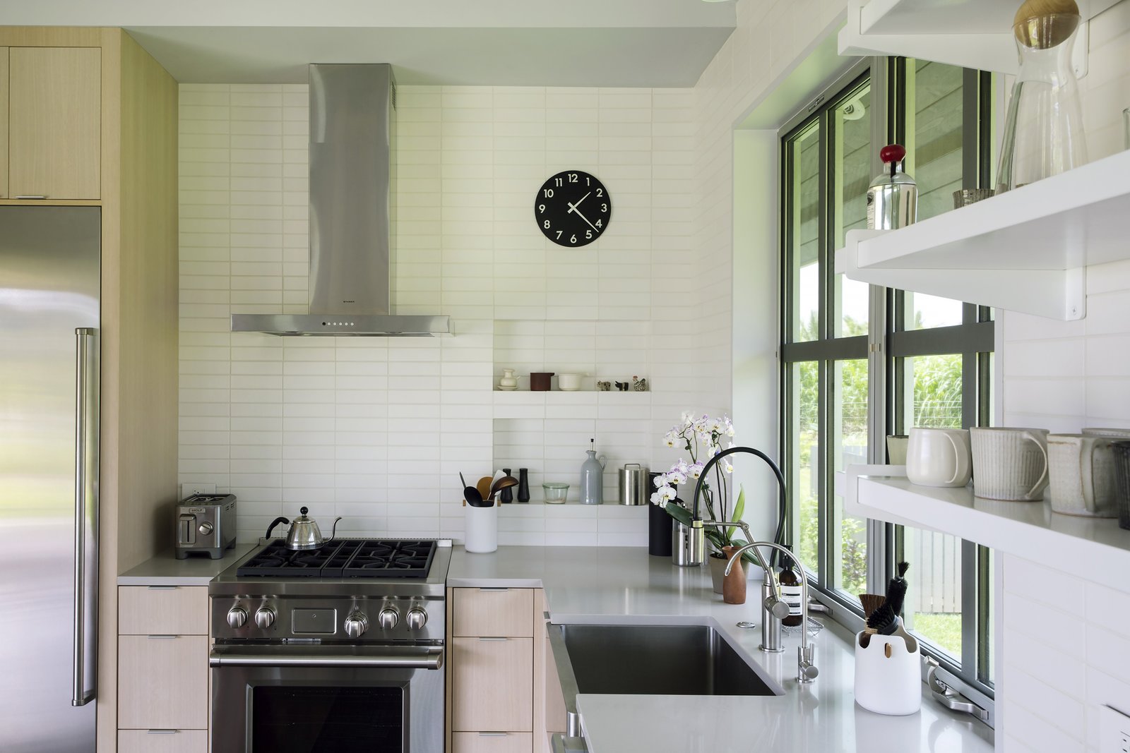
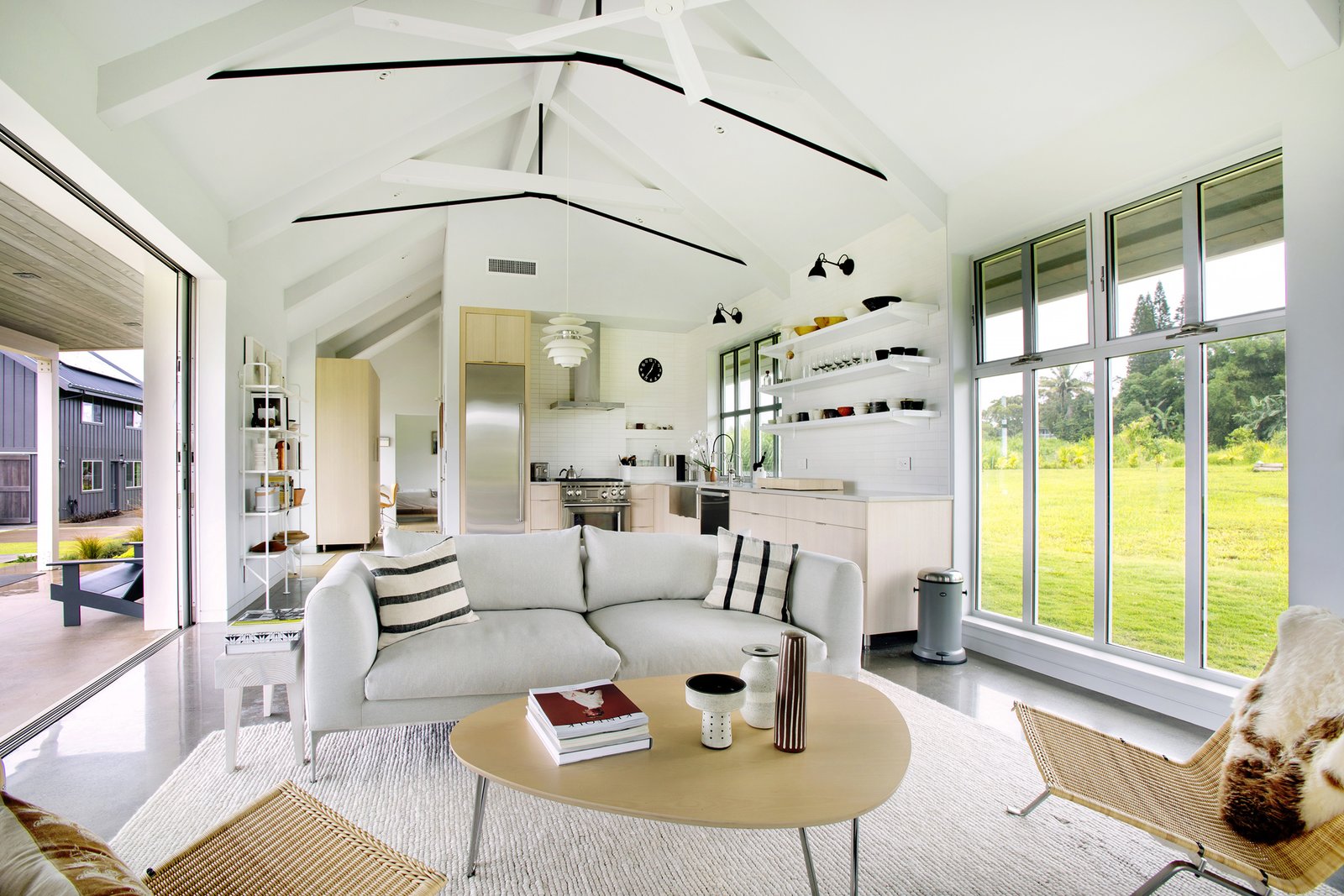
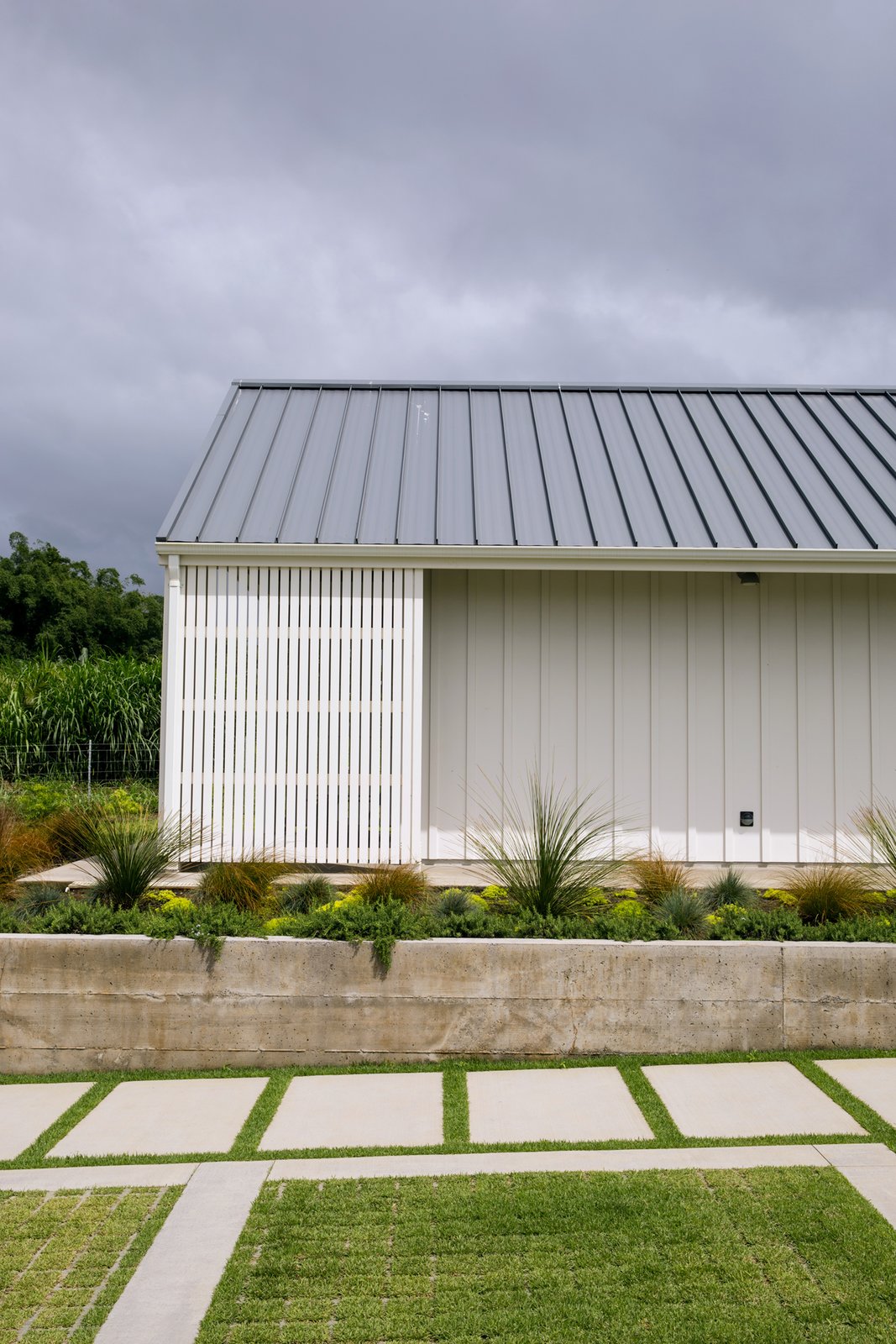
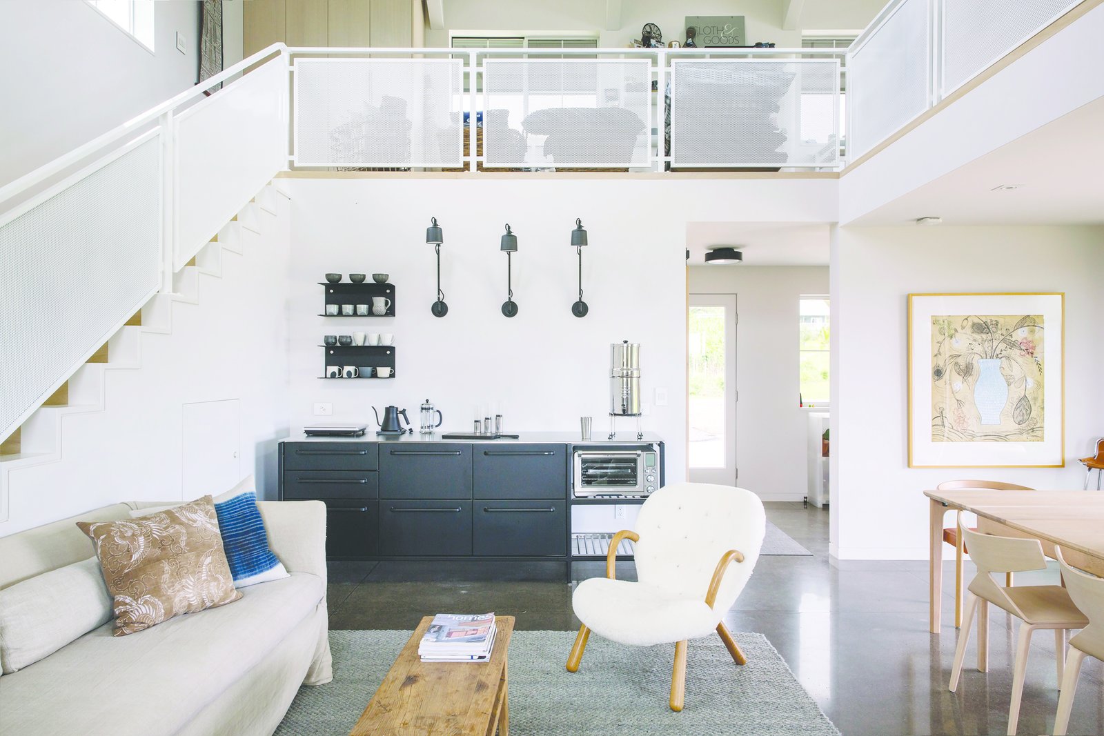
 The retreat contains four distinct buildings arranged in two groupings. The first grouping contains the main house, a woodworking shop, and a carport all contained under a single roof in a T-shape. A covered courtyard connects the three spaces in the middle of the “T”. A separate, free-standing artist studio is located just northeast of the main house, with a covered patio that connects to a guest room. Here, the owners work on their own projects, and occasionally host retreats and community-based arts workshops. In all four buildings, large bi-folding doors and sliding barn doors open up the spaces completely to the outdoors, allowing for the movement of large artworks and equipment, as well as an intimate connection with the environment.
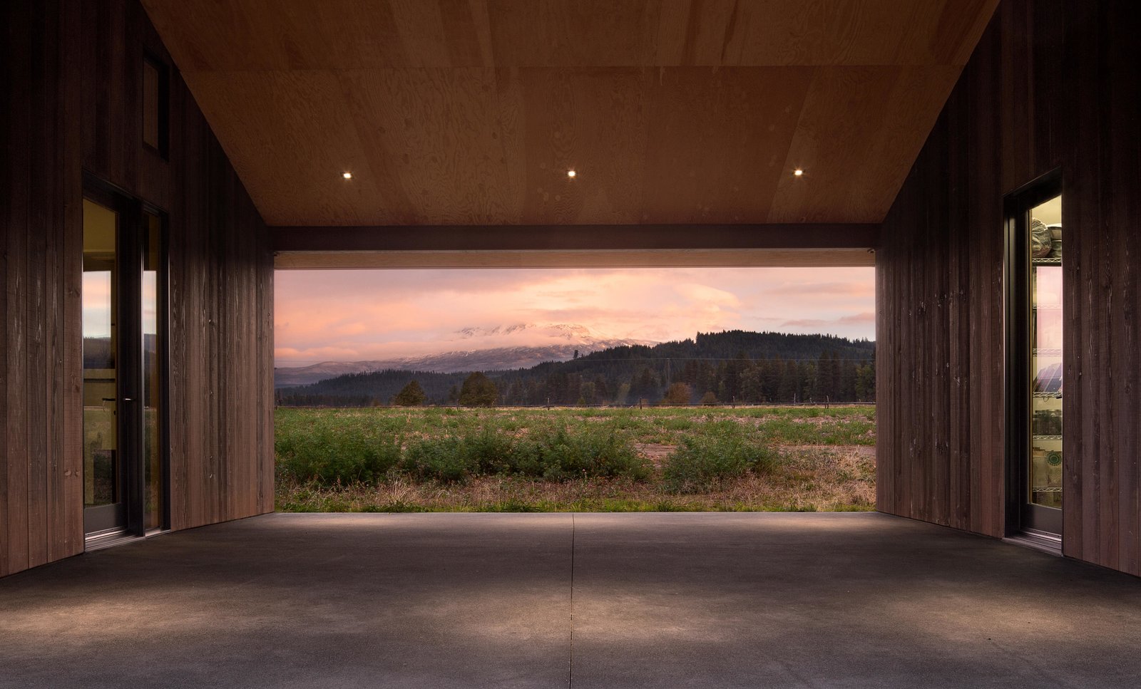
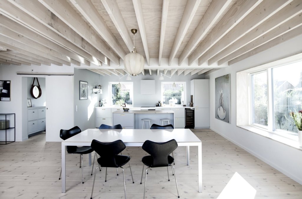
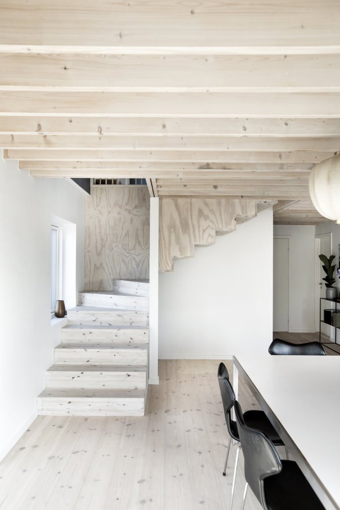
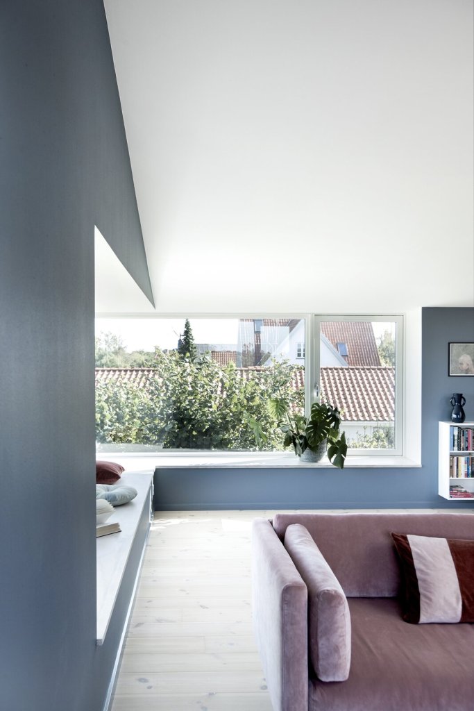
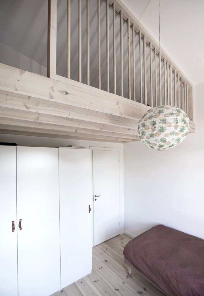
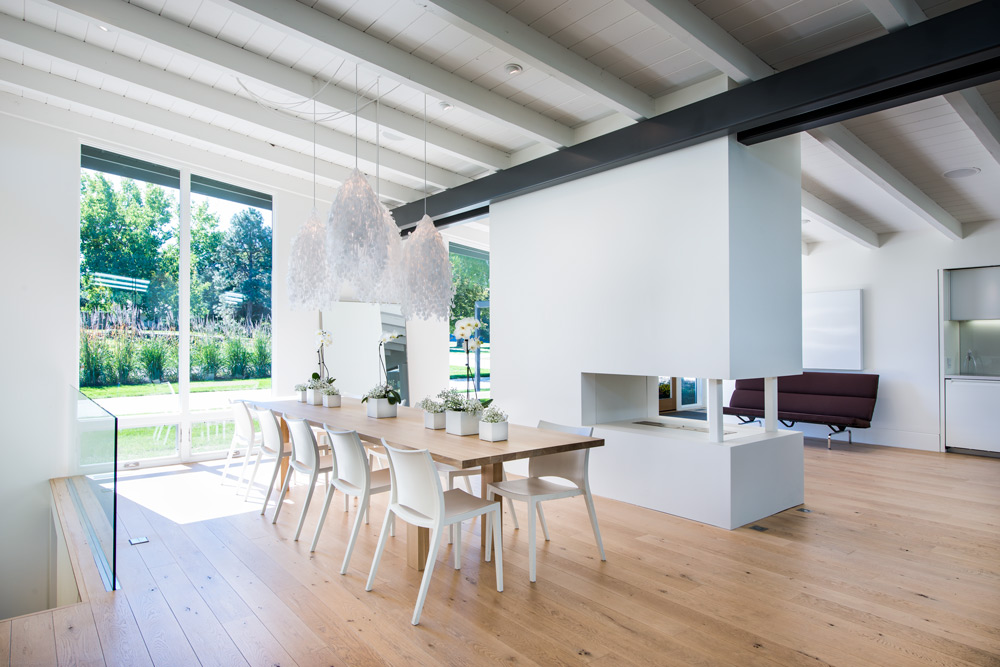
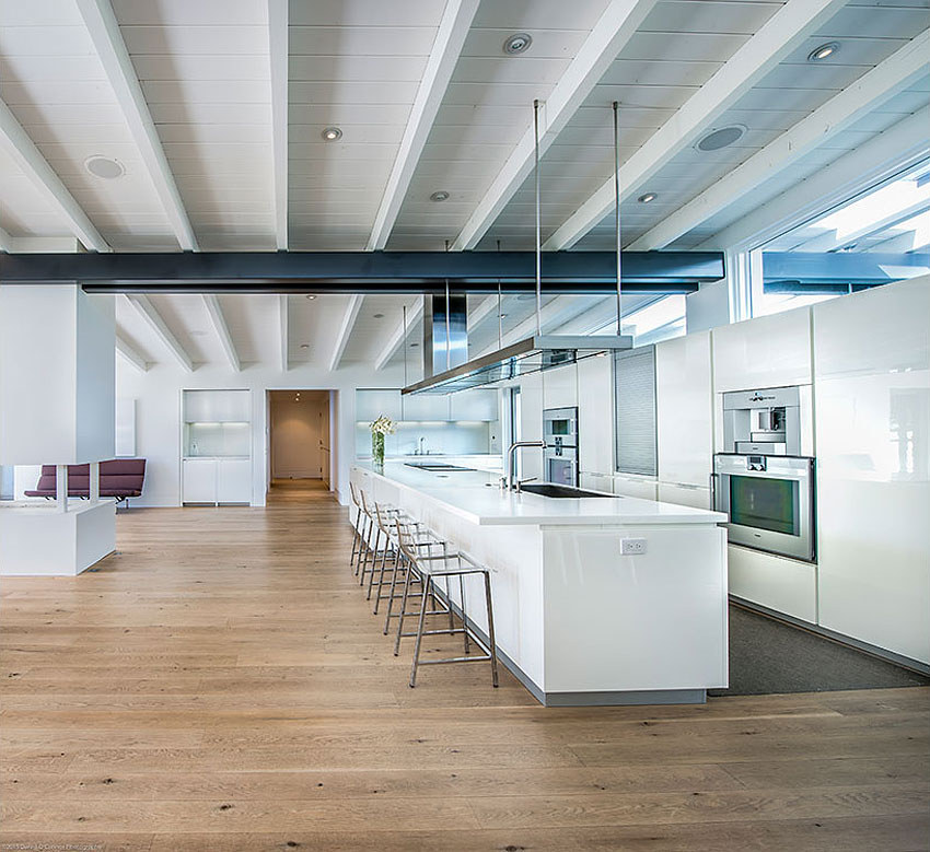
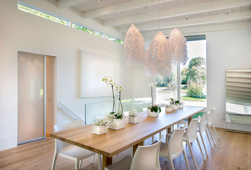
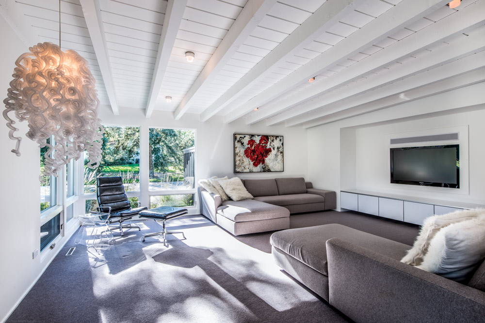
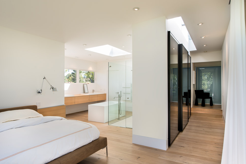
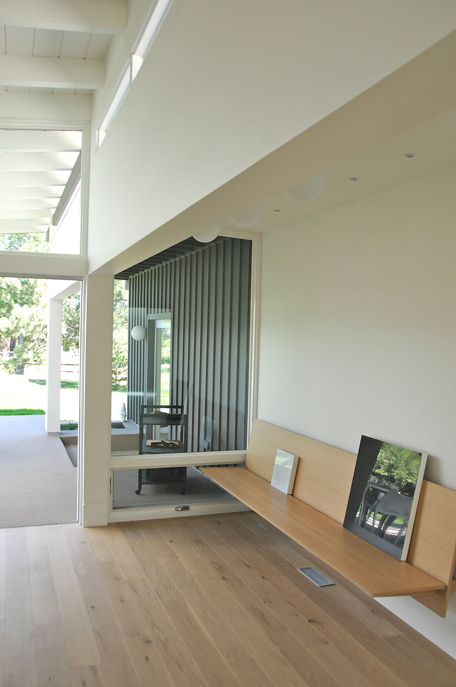
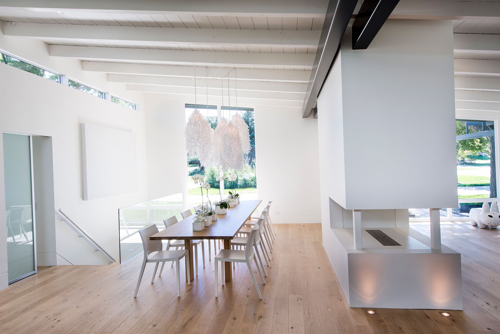
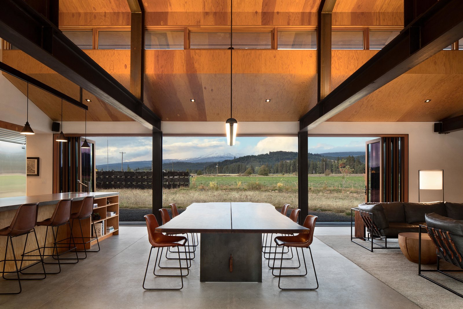
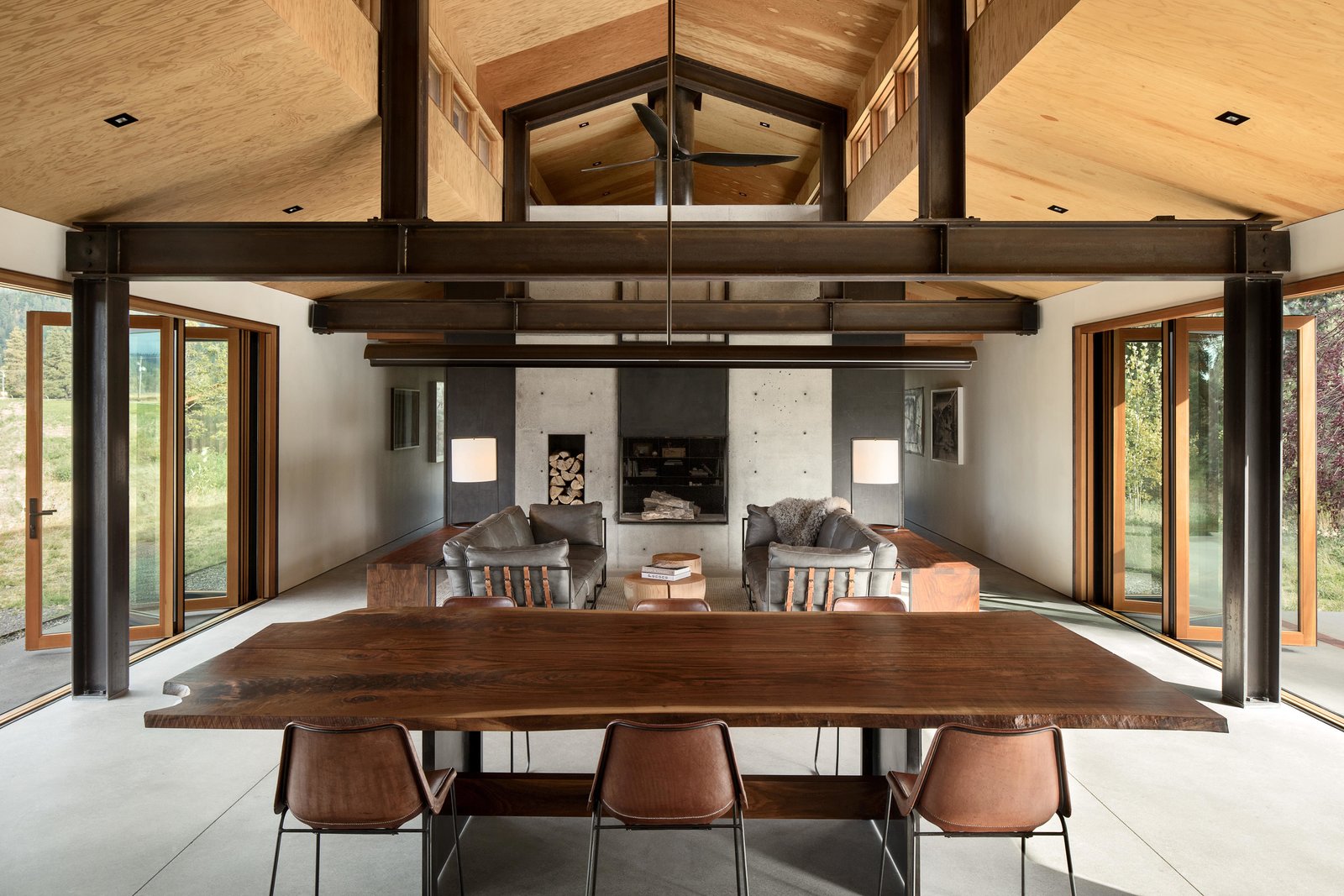
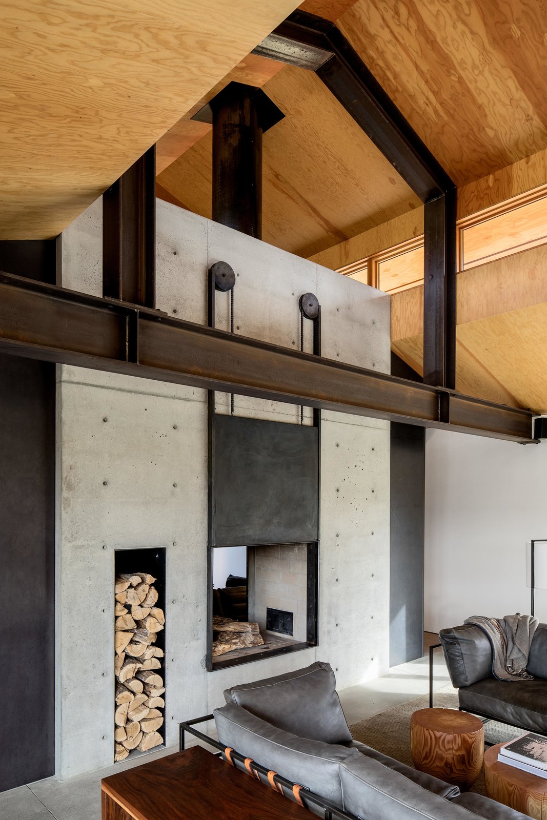
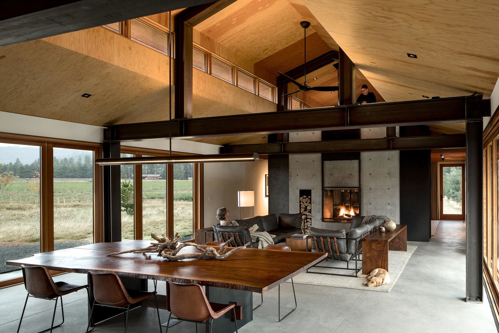
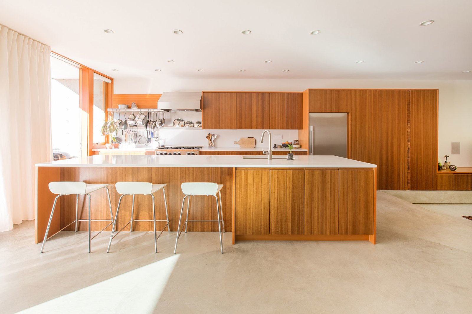
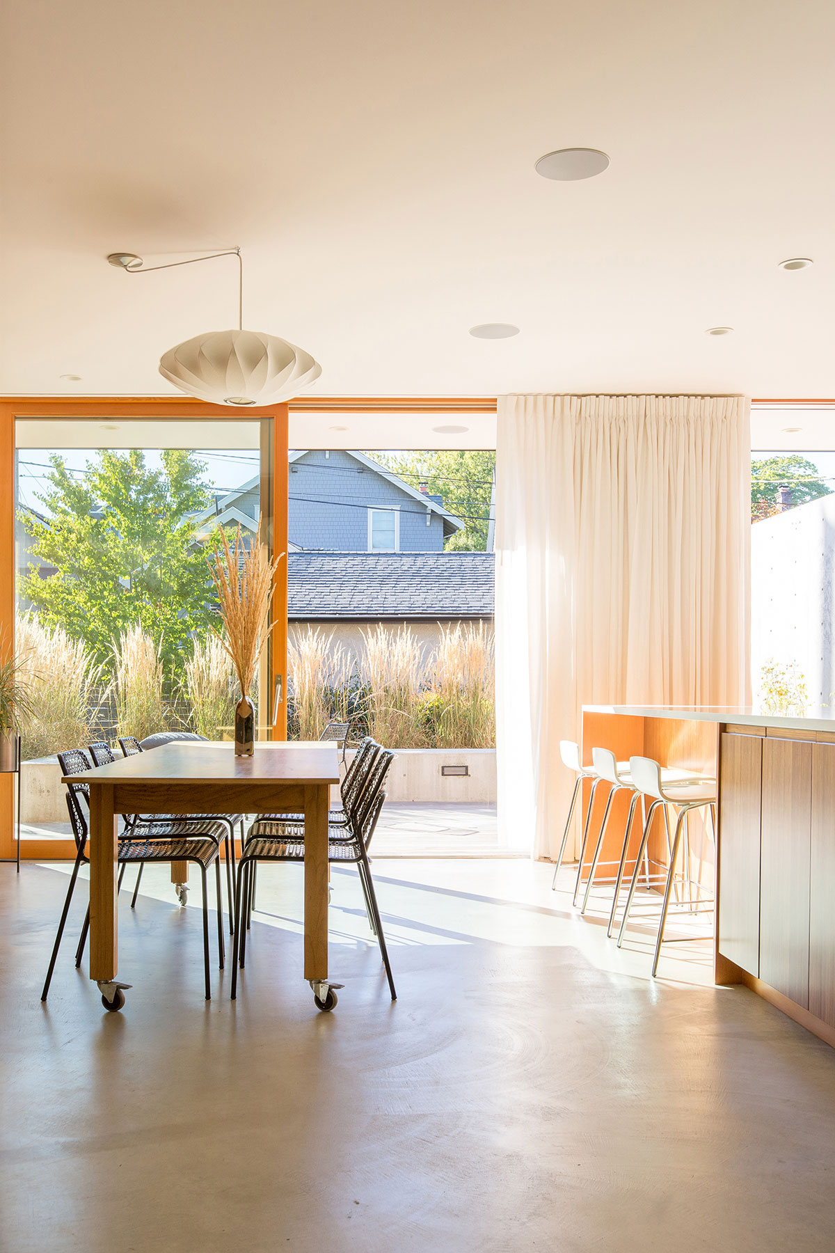
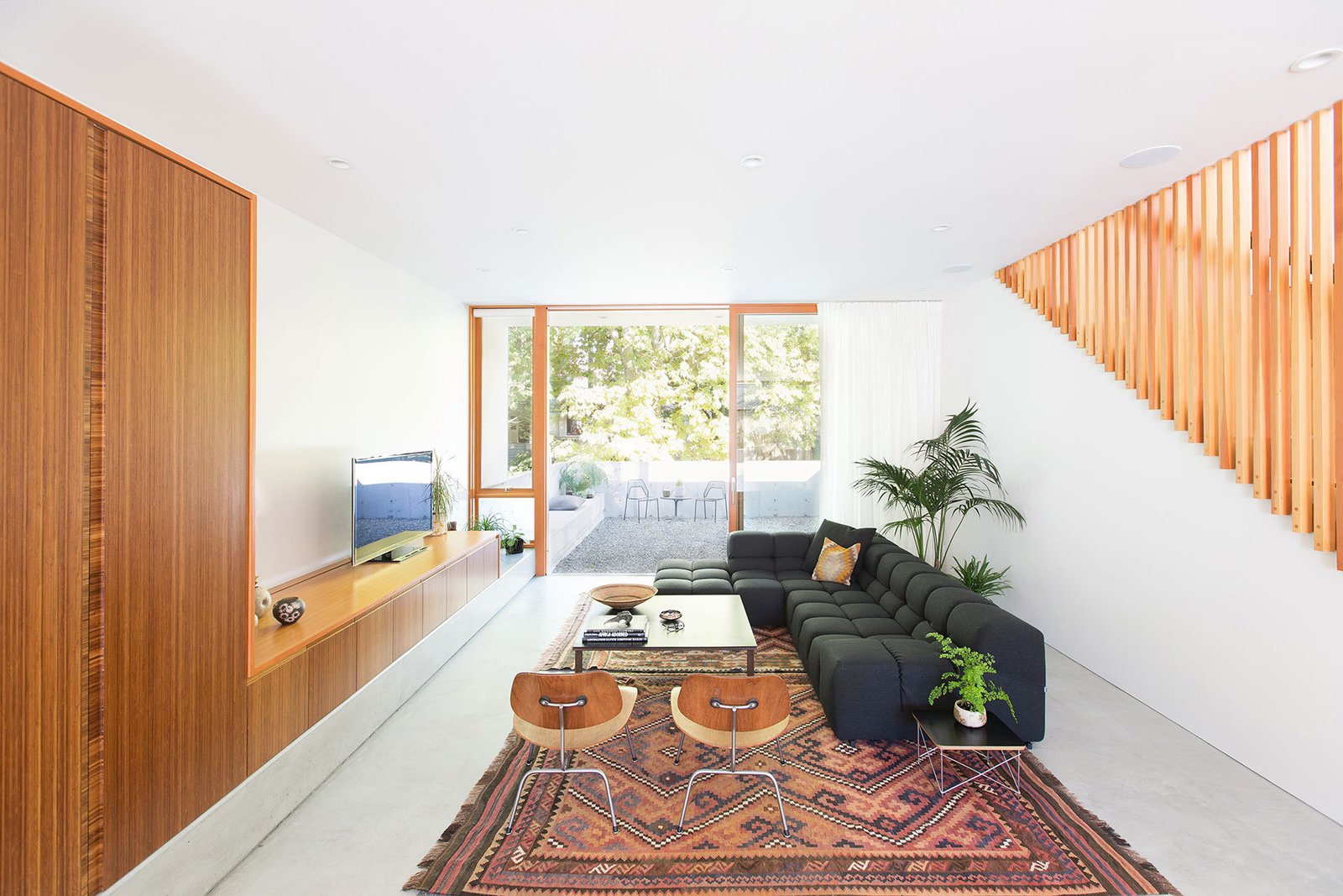
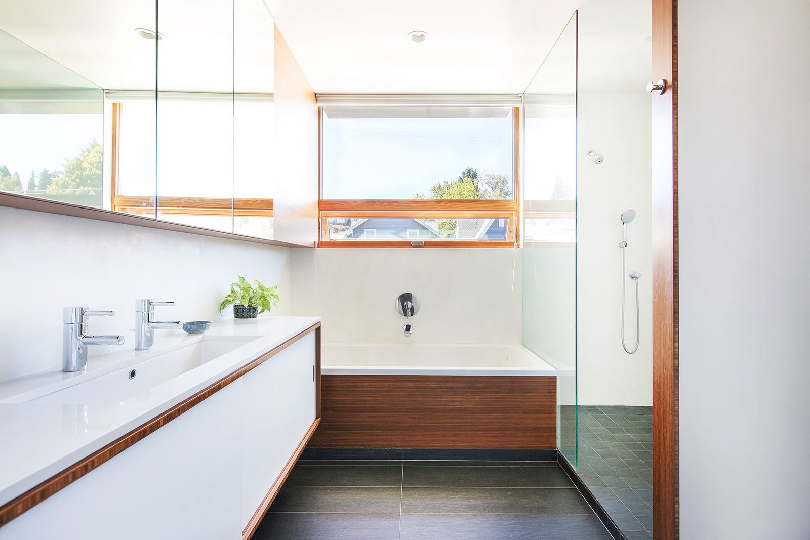
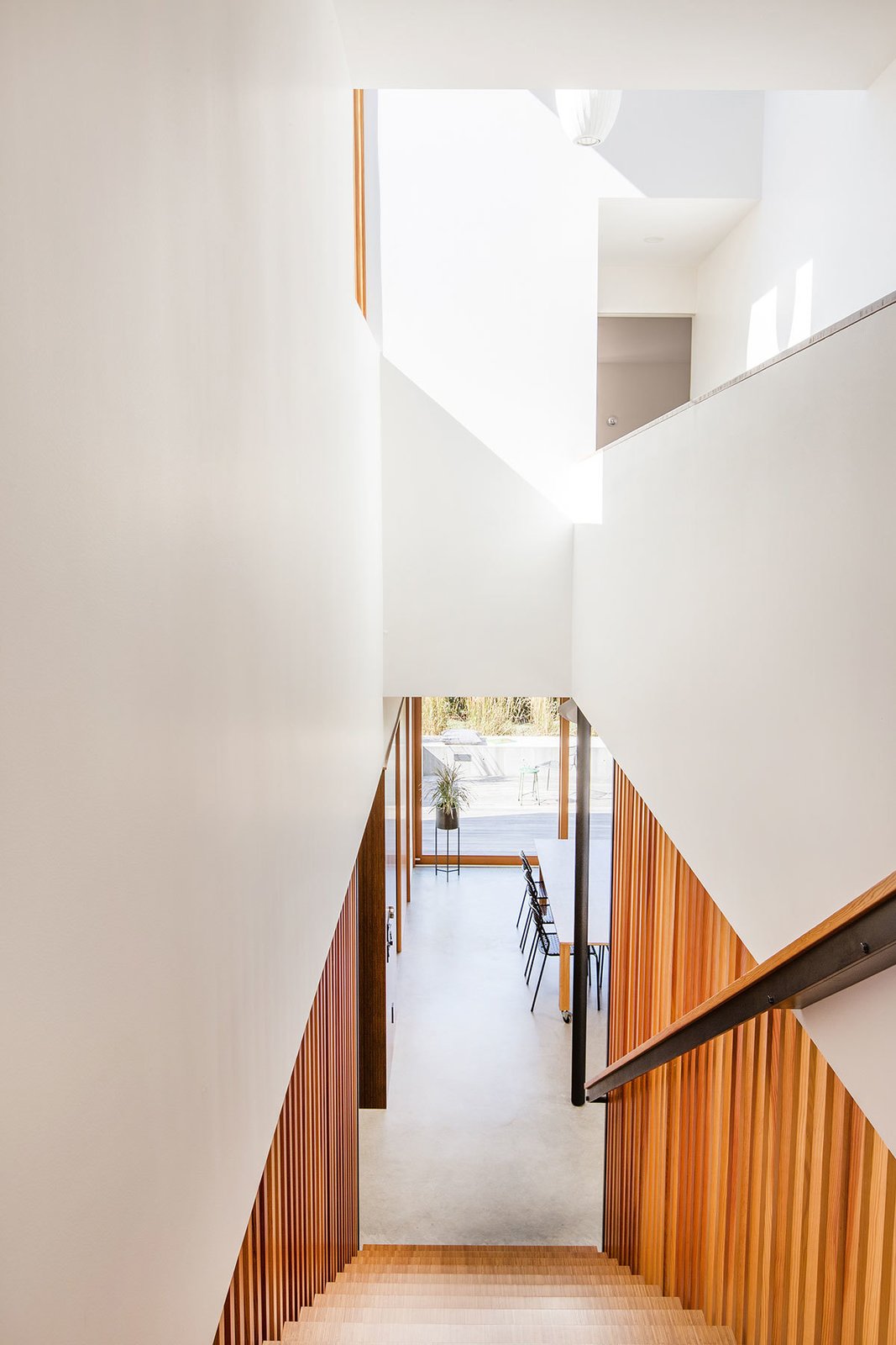
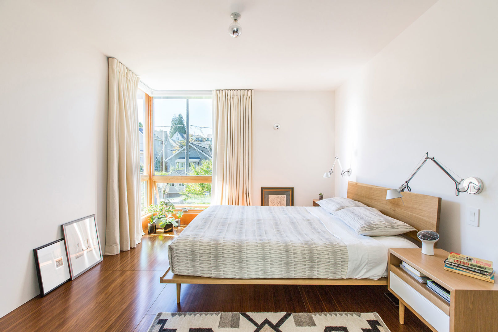
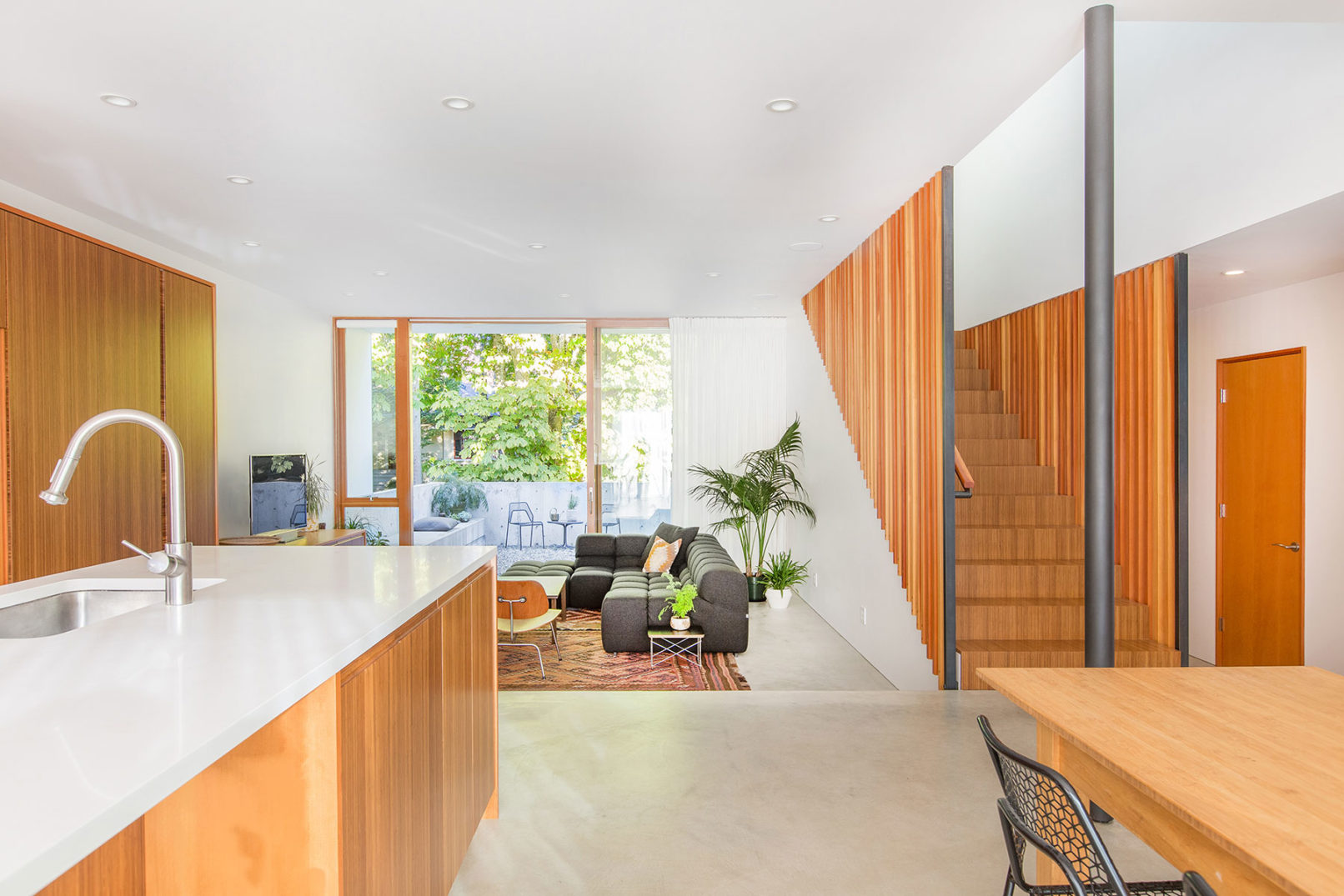
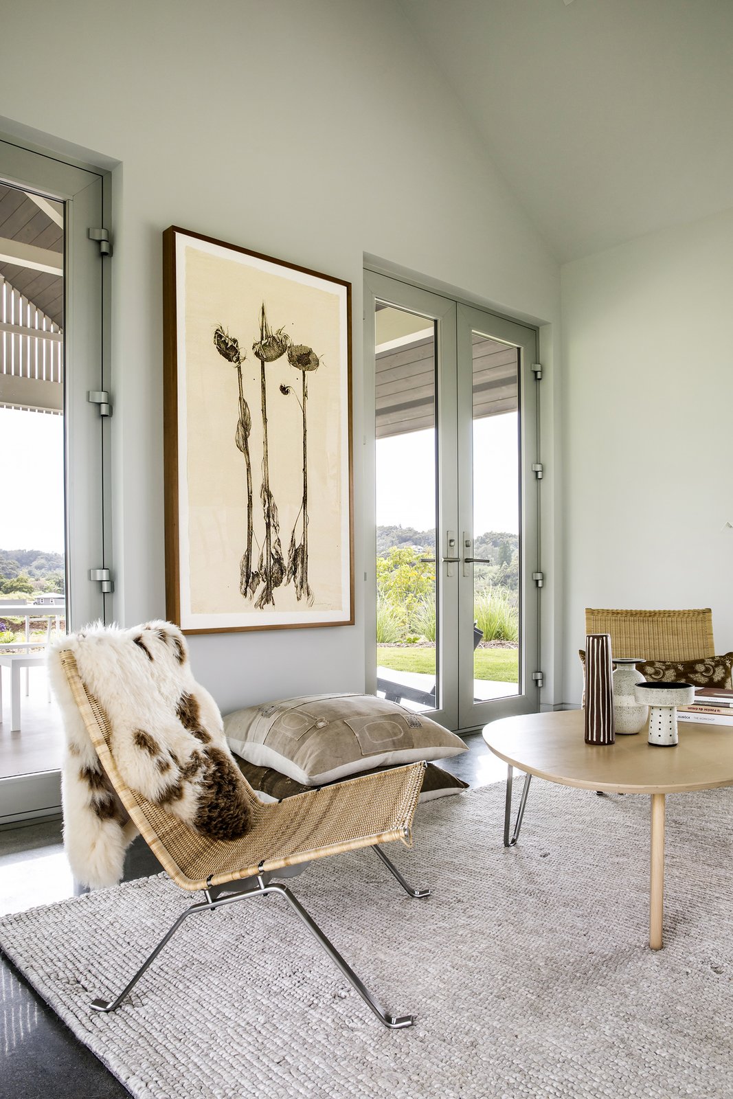
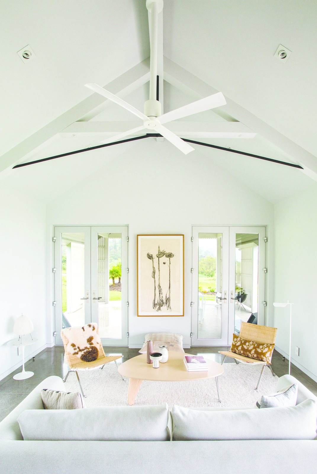
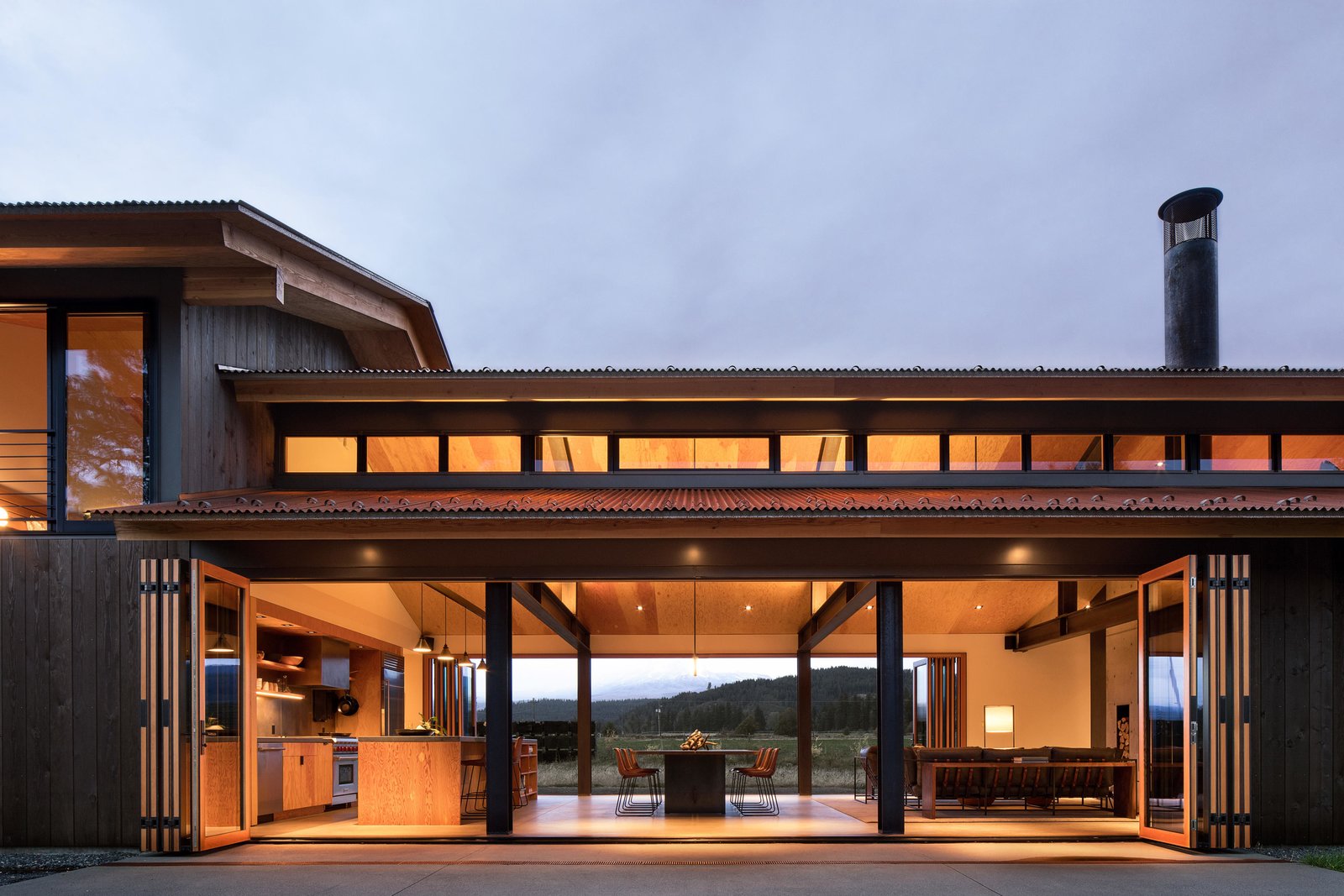 The main house is minimal in form, consisting of a single double height volume with an open plan living, dining and kitchen area separated from a library by a double-sided fireplace. A set of hidden steel stairs nestled into the concrete fireplace lead to a loft above the library. The home’s single bedroom is located above the bathroom and mudroom and is accessed via a set of open stairs in the entry foyer. Two sets of 30-foot-long bi-fold doors in the main living space allow the home to open completely on both sides, maximizing the home’s sweeping views of the nearby river and Mount Adams.
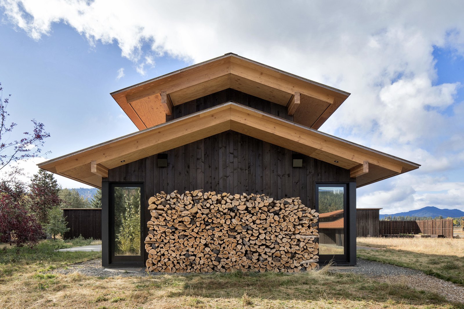
 Main Level
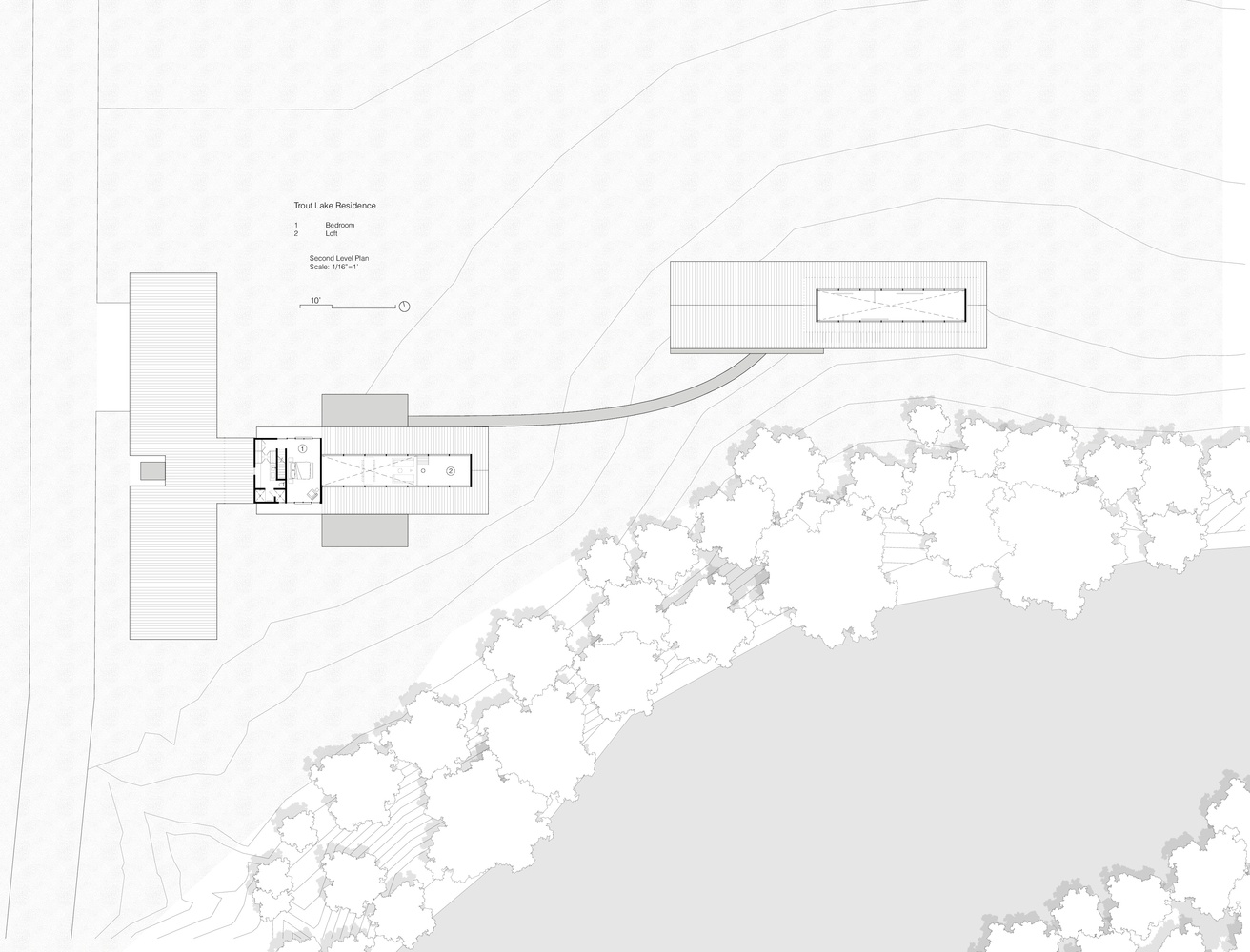 Second Level
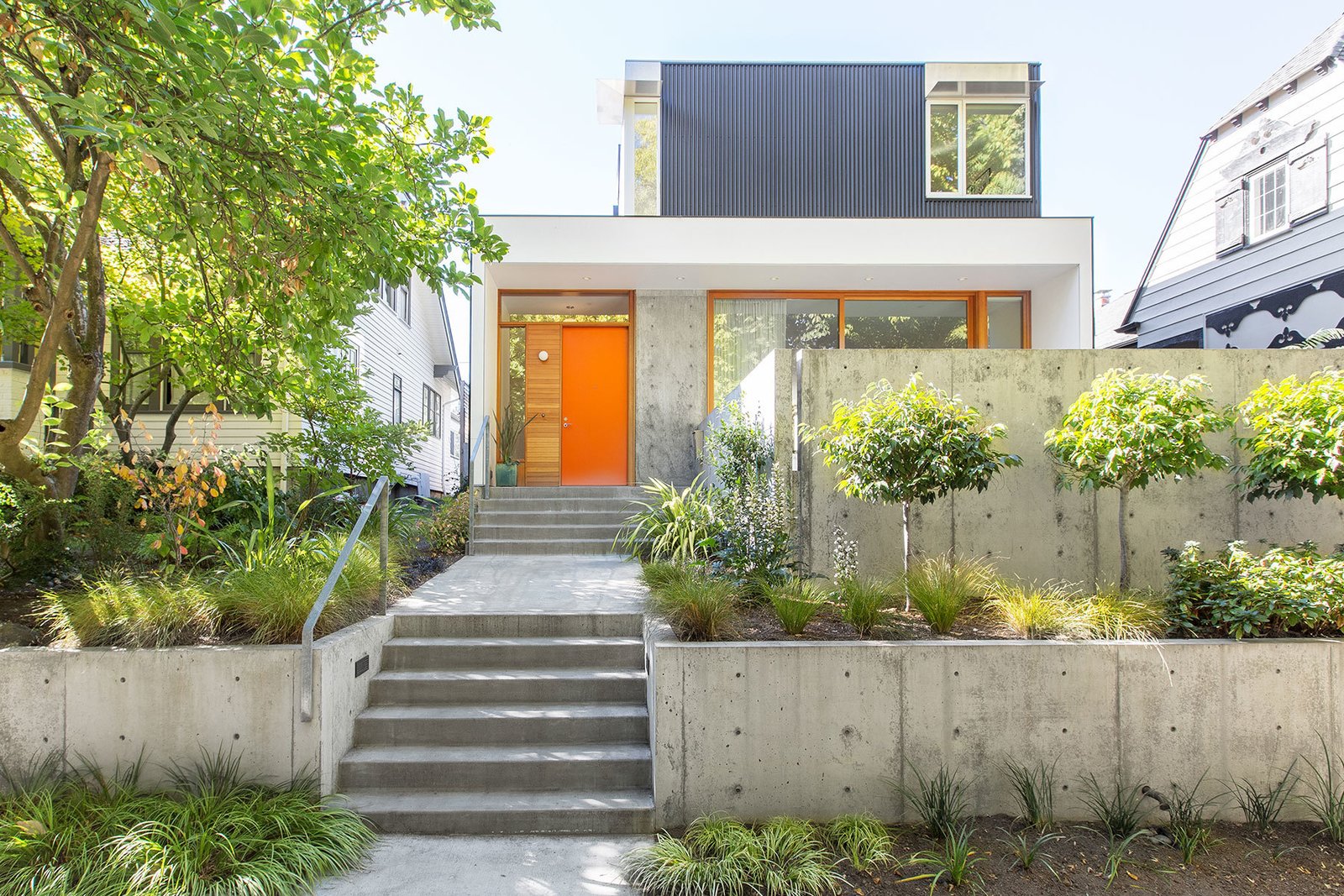


 Photos by Ryan Siphers
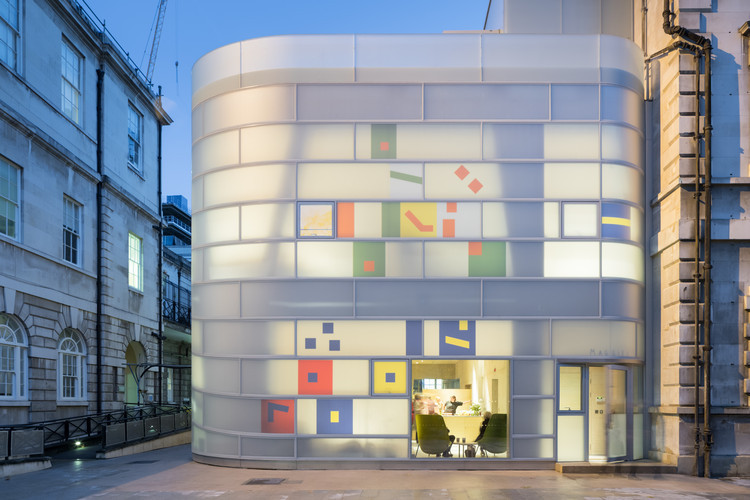 MAGGIE BARTS
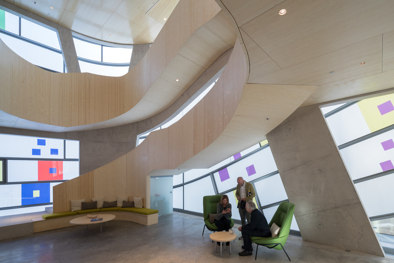
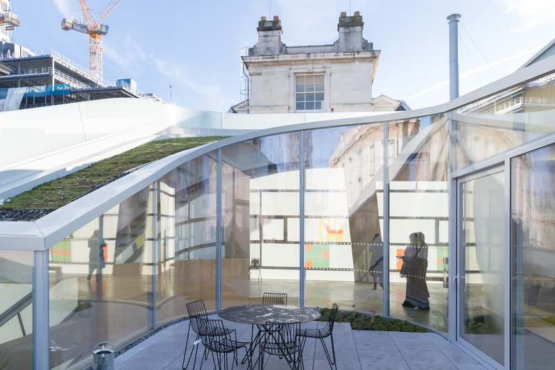
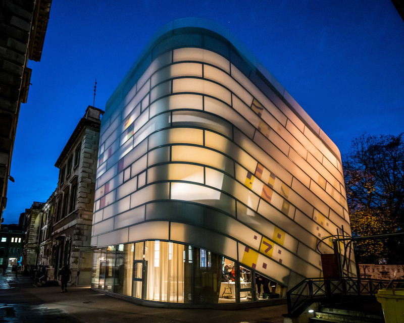
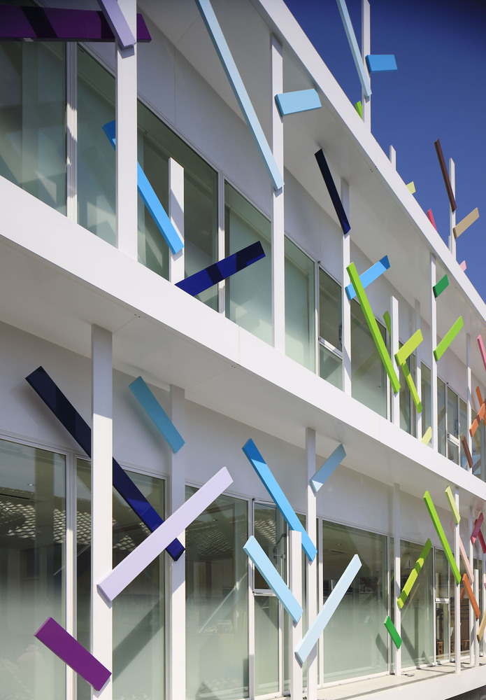
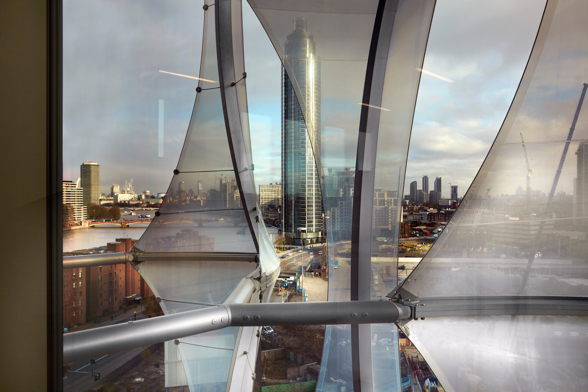
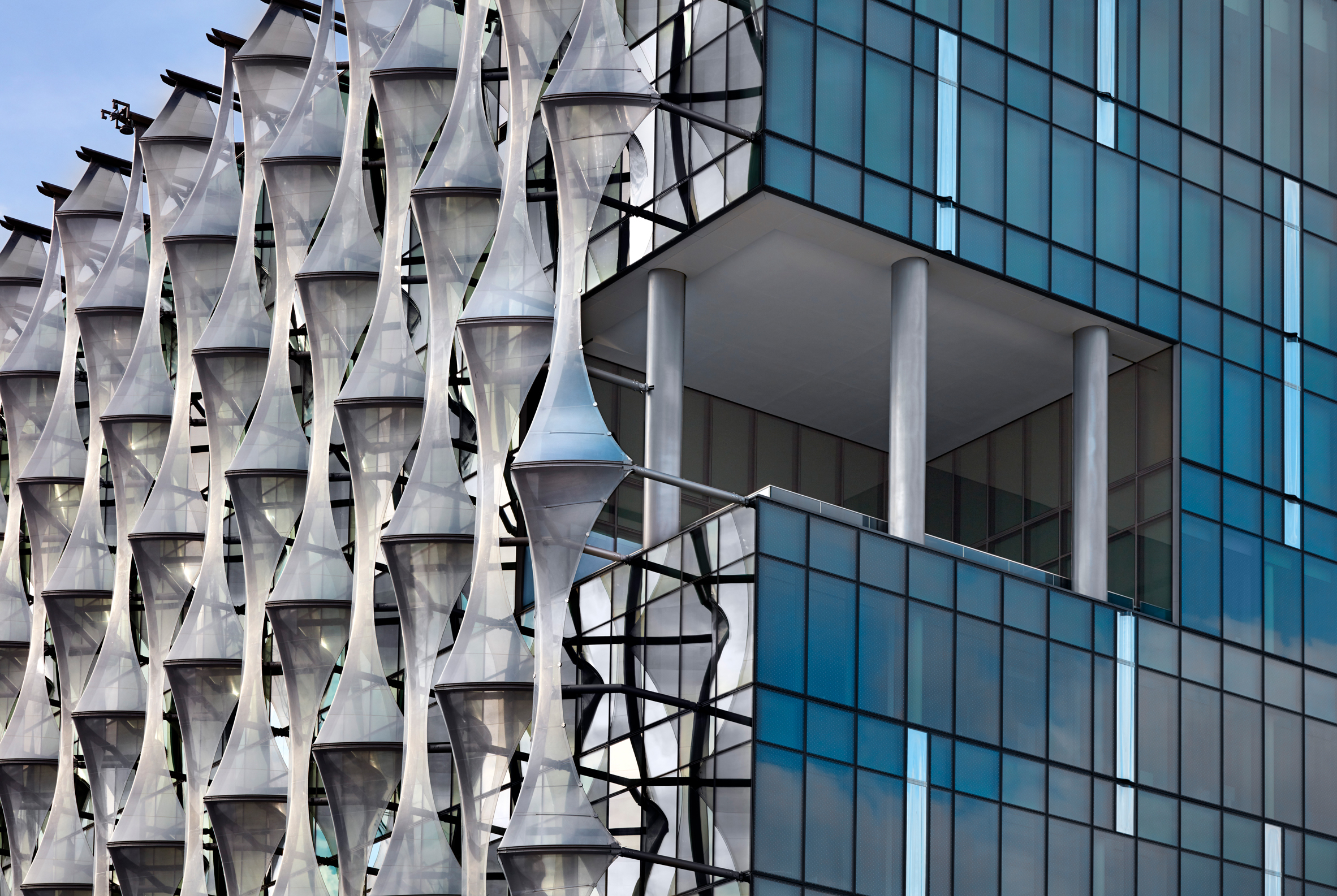
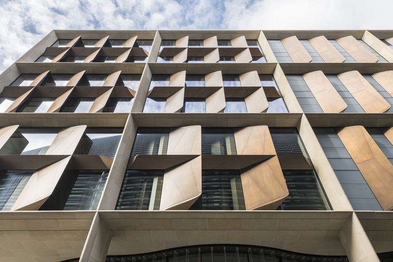
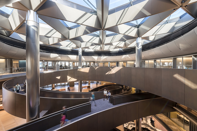
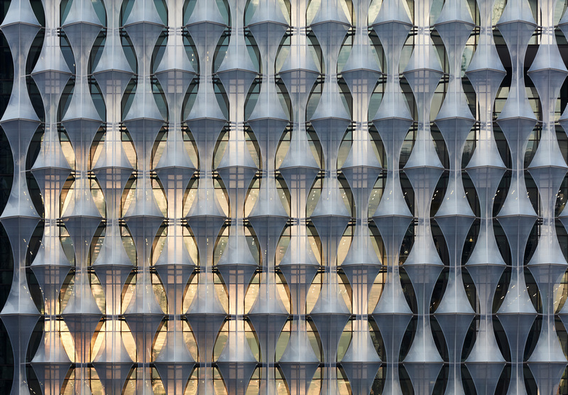 Kieran Timberlake has completed work on the US Embassy in London, a glass cube swathed in shimmering sails of plastic that is set on a plinth and surrounded by a moat-like pond on the edge of the River Thames.
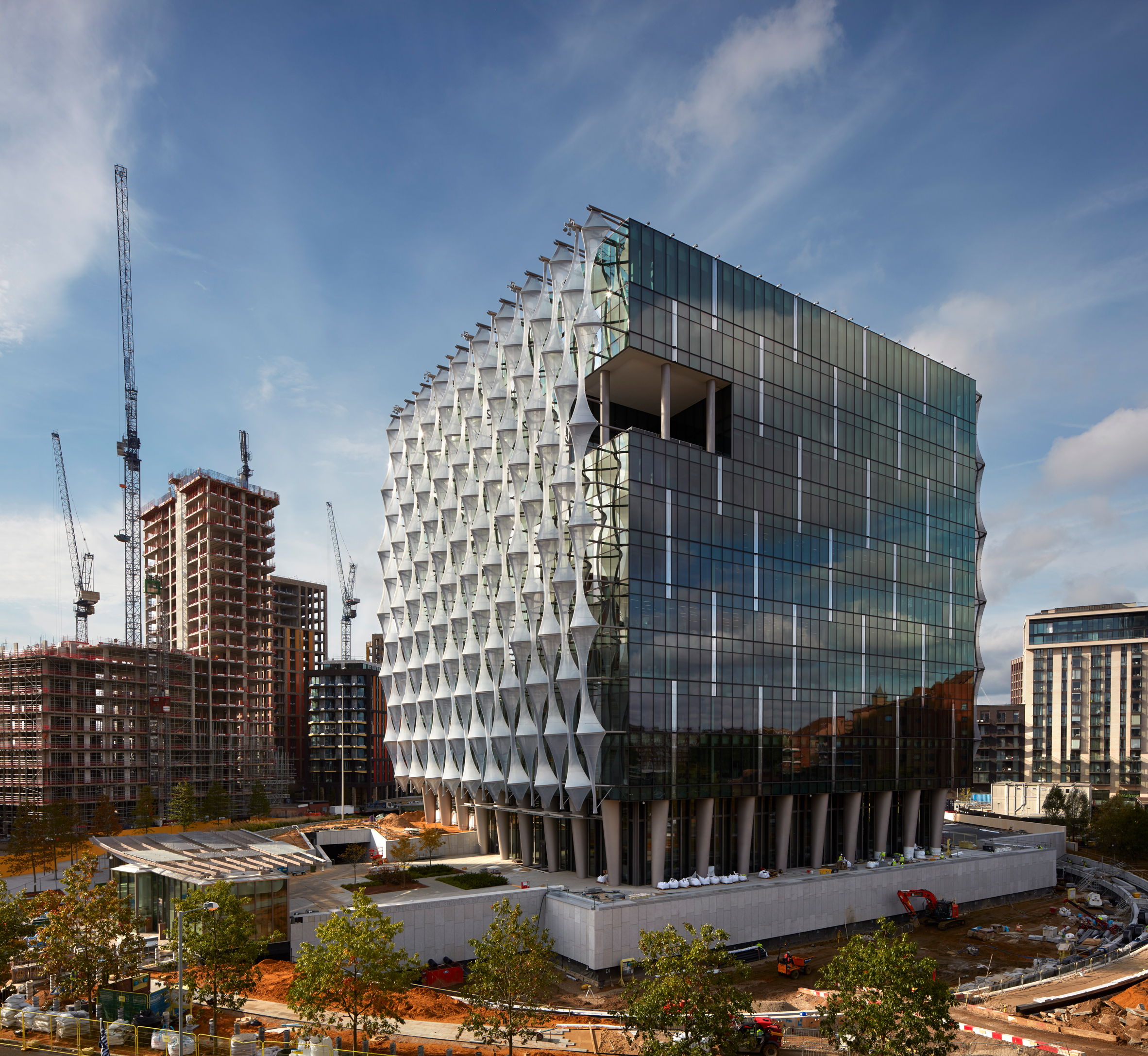
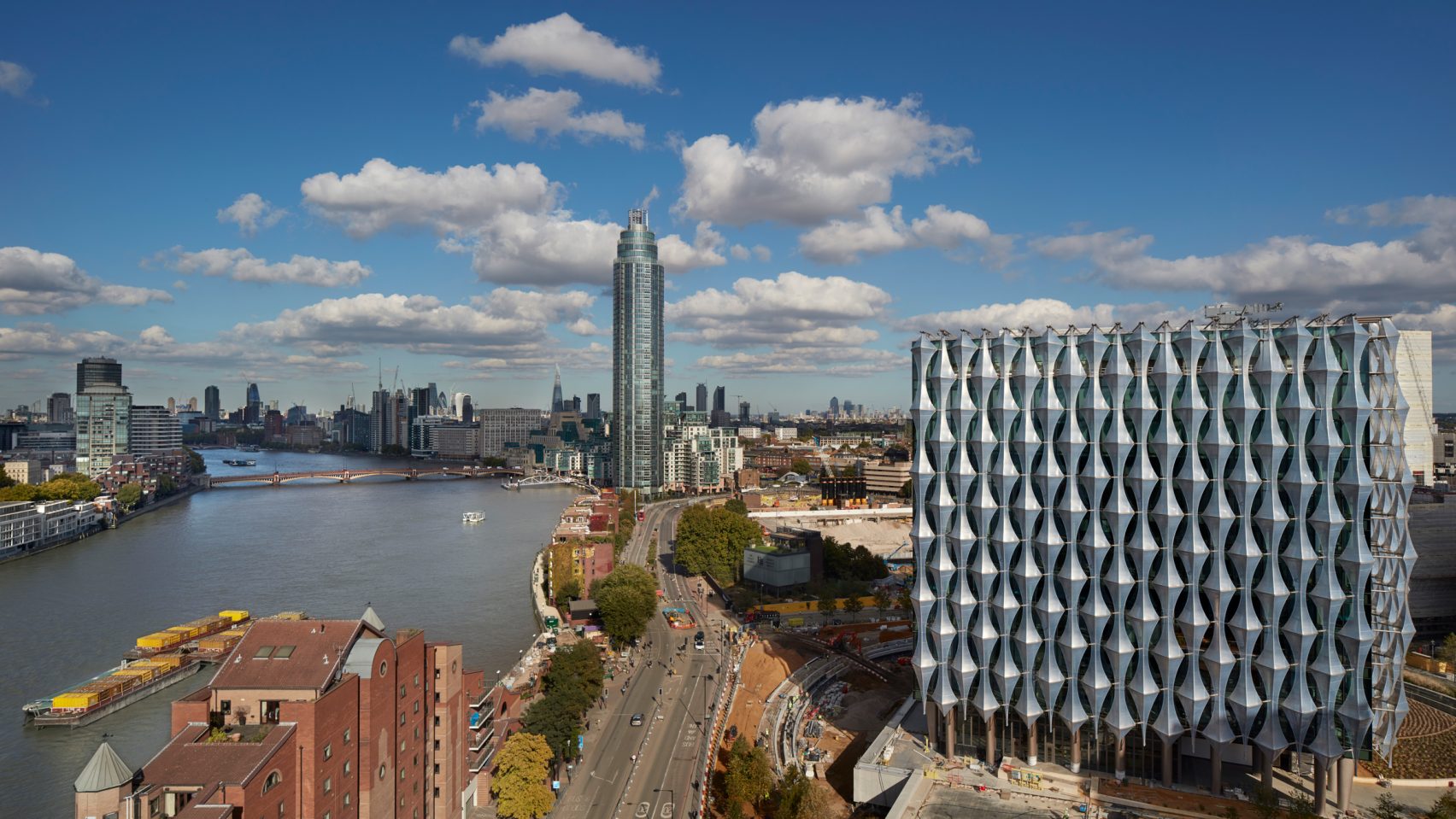 The “transparent crystalline cube” is intended to symbolize “transparency, openness, and equality”. The unusual form of the building’s facade is designed to minimize solar gain and glare while still allowing natural light in. The reflective facade shifts in color according to the weather and the position of the sun.
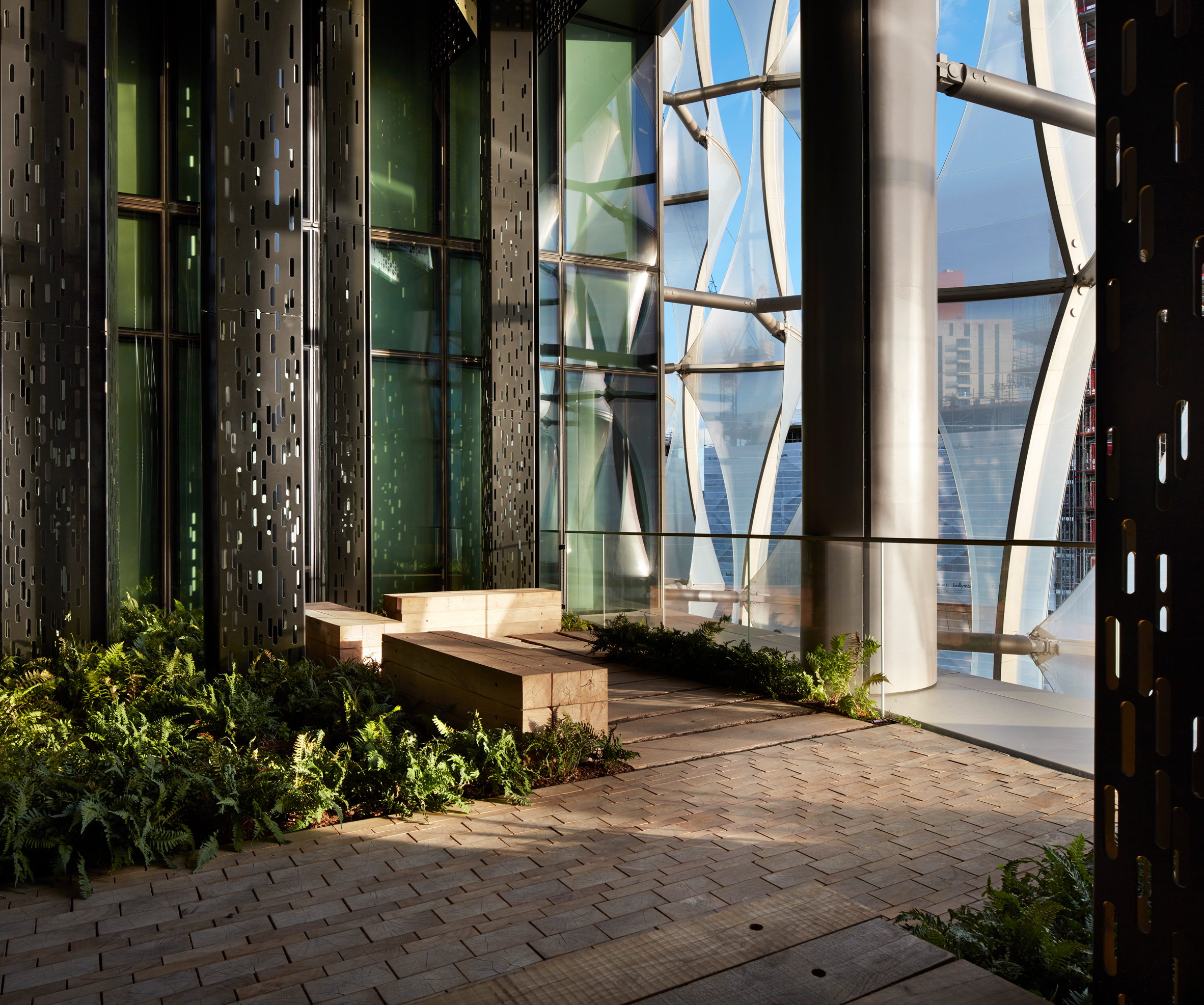


 .
.


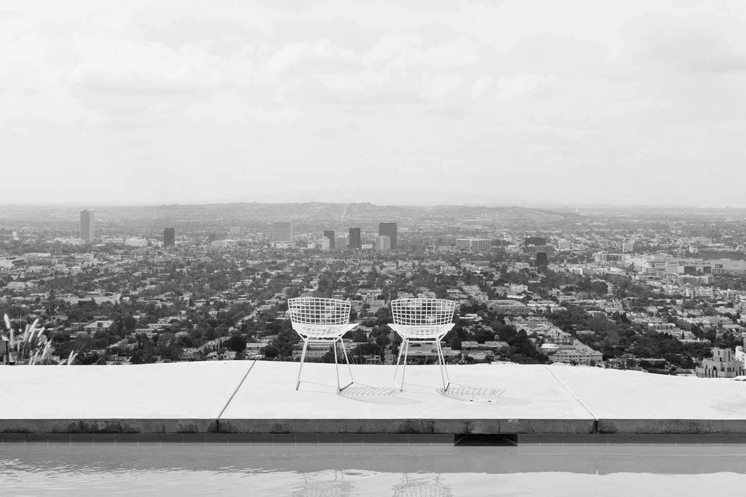
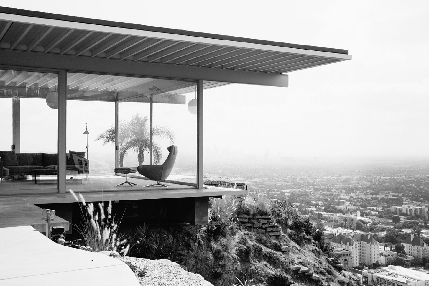 The image is instantly familiar; the house, all dramatic angles, concrete, steel and glass, perched indelibly above Los Angeles, with Hollywood’s lights resembling a circuit board below it. Inside, two women sit, stylish and relaxed, talking casually behind the monumental floor to ceiling glass walls. One of the world’s most iconic photographs,
 Buck was a former professional footballer who worked as a graphic designer and sign painter. He spent his first few years as a landowner hauling broken blocks of concrete to the site in attempt to improve its precarious foundation. He and Carlotta ferried their finds, load by load, back to Woods Drive in the back of Buck’s Cadillac, hopeful the reinforcements would prevent the land from sliding. Buck’s dreams for the house began to take shape over the following two years, and eventually, he made a model of the future Stahl House. His grand designs, however, were promptly rejected by several notable architects.
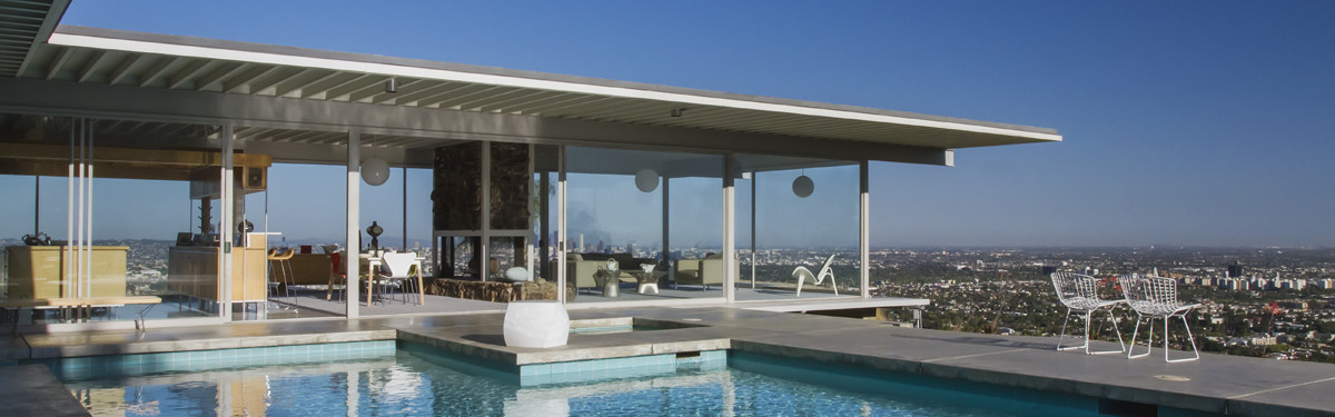
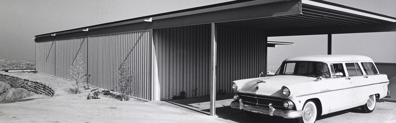
 Carlotta recalled Buck continually telling prospective architects “I don’t care how you do it, there’s not going to be any walls in this wing.” Until they hired Pierre Koenig in 1957, an ambitious young architect determined to build on a site nobody would touch, it seemed unlikely the house would ever exist. Pierre described the process of building Stahl House as “trying to solve a problem – the client had champagne tastes and a beer budget.” He was interested in working with steel, and despite being warned away from it by his architecture instructors, possessed great aptitude for it. He’d experimented with a number of exposed glass and steel homes before he created Case Study 21, or The Bailey House in 1958 and 1959, and his skill for designing functional spaces with simplicity of form, abundant natural light, and elegant lines would eventually make him a master of modernism. Stahl House, completed in 13 months and costing 37,500 USD, further demonstrated Pierre’s flair for working with industrial materials, particularly steel, glass, and concrete. The project put him on the map as an architect with an incredible eye for balance, symmetry, and restraint. The 2,040 m² house was, as Buck insisted, built without walls in the main wing to allow for sweeping 270º views. Three sides of the building were made of plate glass, unheard of in the late 1950s, and deemed dangerous by engineers and architects. This design feature required Pierre to source the largest pieces of glass available for residential use at the time. With two bedrooms, two bathrooms, polished concrete floors, and a very famous swimming pool (a fixture in countless films and fashion editorials) Stahl House was an immediate mid century icon.
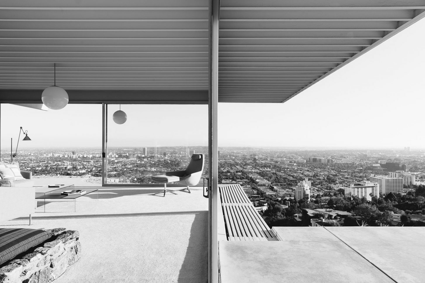
 The
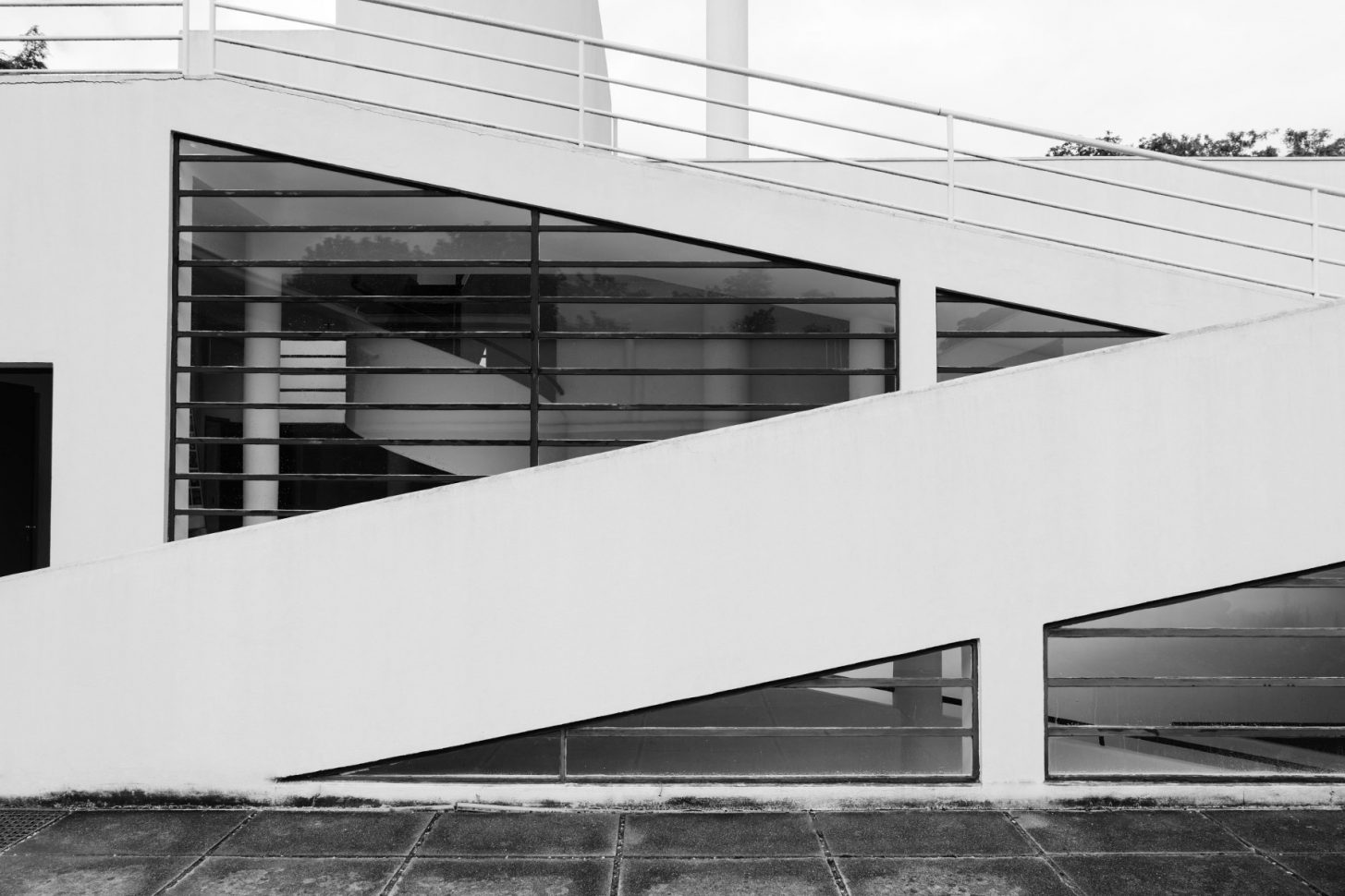
The  This project was the last in a series of private homes known as the ‘white villas’ built by Le Corbusier and his cousin and partner
  Unfortunately the Villa Savoye presented its residents with its own host of problems, despite its pioneering design. Each autumn, as the windows ushered in a warm vista of seasonal colour, the family would write repeatedly to Le Courbusier, begging him to make ‘habitable,’ what proved to be a damp and chilly building. They complained of ‘raining’ in the hall, on the ramp and in the bathroom. The loud drumming of rain on the bathroom skylight kept them awake at night, heat escaped through the long stretches of glazing and the heating system was both insufficient and a further cause of flooding.