Beautiful Villa Savoye

As a monument to modernism, the building possesses a poetry and sensitivity full of idealism. The careful composition of living space and intention to harness natural light, not to mention the building’s iconic aesthetic, still define modern architecture.

villasavoye_landscapeThe Villa Savoye, built in 1929 in Poissy, a rural area outside Paris, was Le Corbusier’s answer to a French country house. Given relatively few constraints by the Savoye family, Le Corbusier designed a building to embody the architectural theory he had evolved in practice and in his book, Towards an Architecture 1923. He was inspired by both the classical forms of ancient Greek architecture and the modern technologies that were shaping the world such as automobiles, airplanes and ocean liners.

villasavoye_landscape2.jpgThis project was the last in a series of private homes known as the ‘white villas’ built by Le Corbusier and his cousin and partner Pierre Jeanneret, which introduced a new form of luxury in which space itself, and its capacity for leisure, were the valuable commodities.

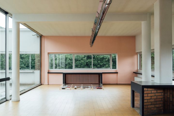
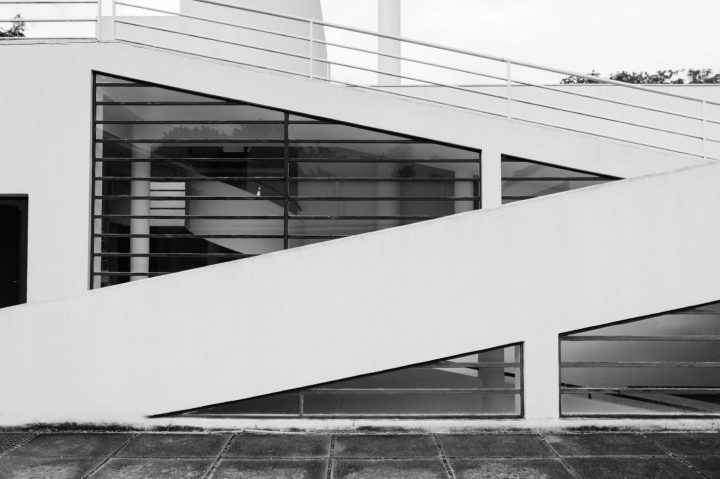
Of these, The Villa Savoye perhaps best embodies Le Corbusier’s architectural manifesto, the five points of architecture. The first, pilotis – slender pillars which raise the building off the ground, opening up more space for gardens and cars, made possible the second, a façade free of its usual load bearing function. Walls were no longer supporting structures but ‘membranes.’ This allowed the unimpaired design of the third, an open plan interior, and the fourth, ribbon windows to flood the interior with maximum light and to illuminate it evenly. A sliding window system patented by Le Corbusier and Pierre Jeanneret was intended to offer superior ventilation, as well as give access to the fifth, a flat roof which could serve as a terrace. A curved solarium crowns the structure, the brightest increment in the layered design. This symbiotic relationship of these five features gives some insight into what could otherwise be a somewhat alienating notion of Le Corbusier’s, the famous concept of a house as ‘a machine for living.’

villasavoye_landscape3-outdoor.jpgUnfortunately the Villa Savoye presented its residents with its own host of problems, despite its pioneering design. Each autumn, as the windows ushered in a warm vista of seasonal colour, the family would write repeatedly to Le Courbusier, begging him to make ‘habitable,’ what proved to be a damp and chilly building. They complained of ‘raining’ in the hall, on the ramp and in the bathroom. The loud drumming of rain on the bathroom skylight kept them awake at night, heat escaped through the long stretches of glazing and the heating system was both insufficient and a further cause of flooding.

villasavoye_stair.jpg villasavoye_portraitchair villasavoye_landscape4.jpgvillasavoye_portrait6-bath.jpgvillasavoye_portrait5-stair 2.jpg villasavoye_landscape4

Much of this was perhaps due to the fact that the technology involved was not fully developed at the time. As a monument to Modernism, the building possesses a poetry and sensitivity full of idealism. The careful composition of living space and intention to harness natural light, not to mention the building’s iconic aesthetic, still define modern architecture. Nonetheless, the discomforts they had suffered ultimately led the Savoye family to decide against restoring the property after the 2nd World War, when it was seized by German forces. About to be demolished by the local authorities to make way for a school, the building was rescued by architects and academics including Le Corbusier himself. Now a museum, restored closely to its original state, Villa Savoye is one of 17 of Le Corbusier’s buildings declared a UNESCO World Heritage Site.
Credit: readcereal.com/

Beautiful Architecture Photography

Berlin-based architecture photographer Paul Eis reimagines buildings from Berlin and Hamburg by digitally replacing their original facades with new vibrant and colored ones.

This is a small selection of Paul’s colorful architecture photographs.

Oval, Hamburg by Ingenhoven Architekten

Cho58, Berlin by Zoomarchitekten

Eurefcampus14, Berlin by Remtec Architekten

Beautiful Rooms For Kids

6F016A03-0525-4791-BCC4-20E52BA8C80C
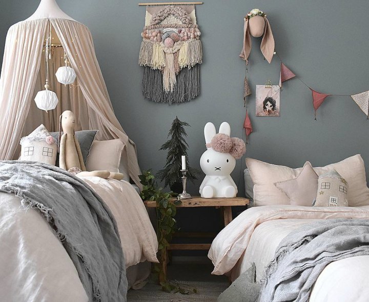
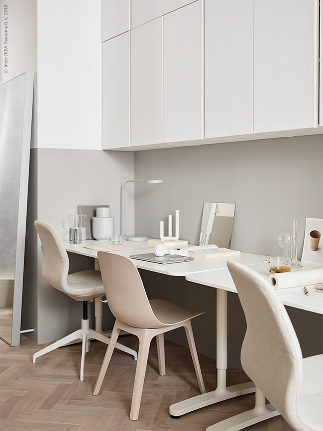
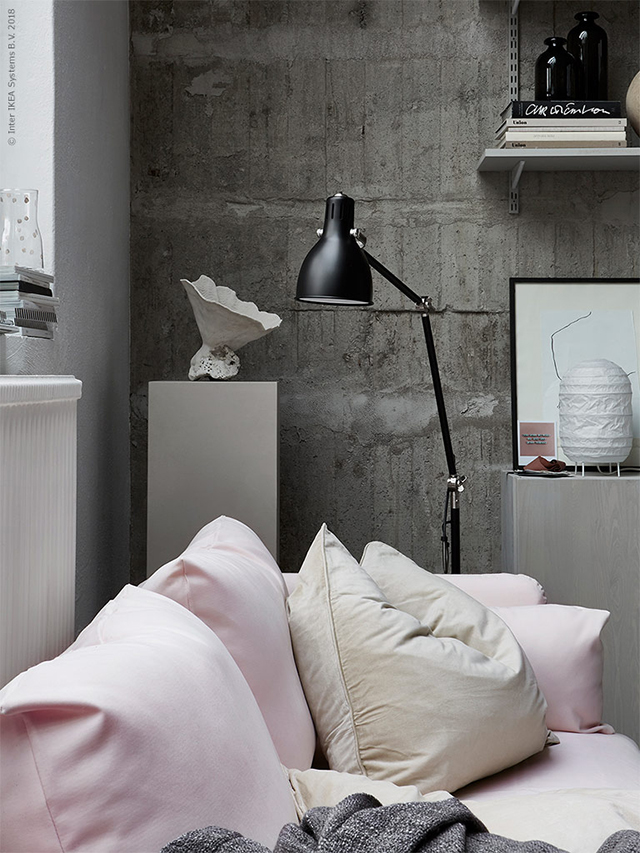
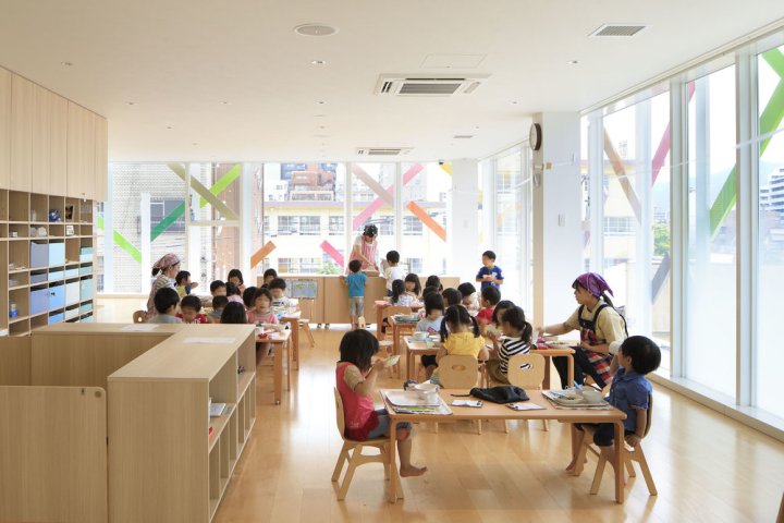
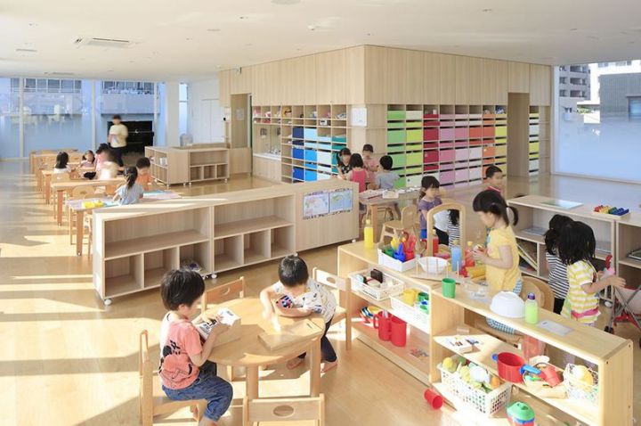
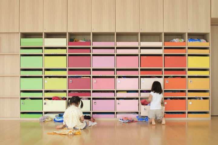
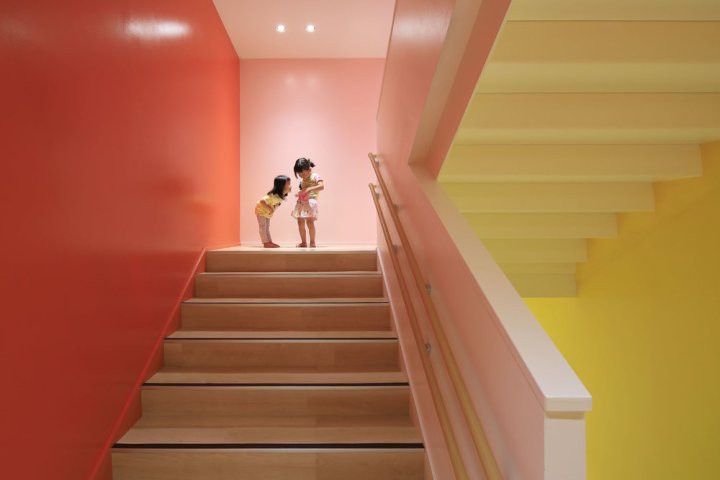
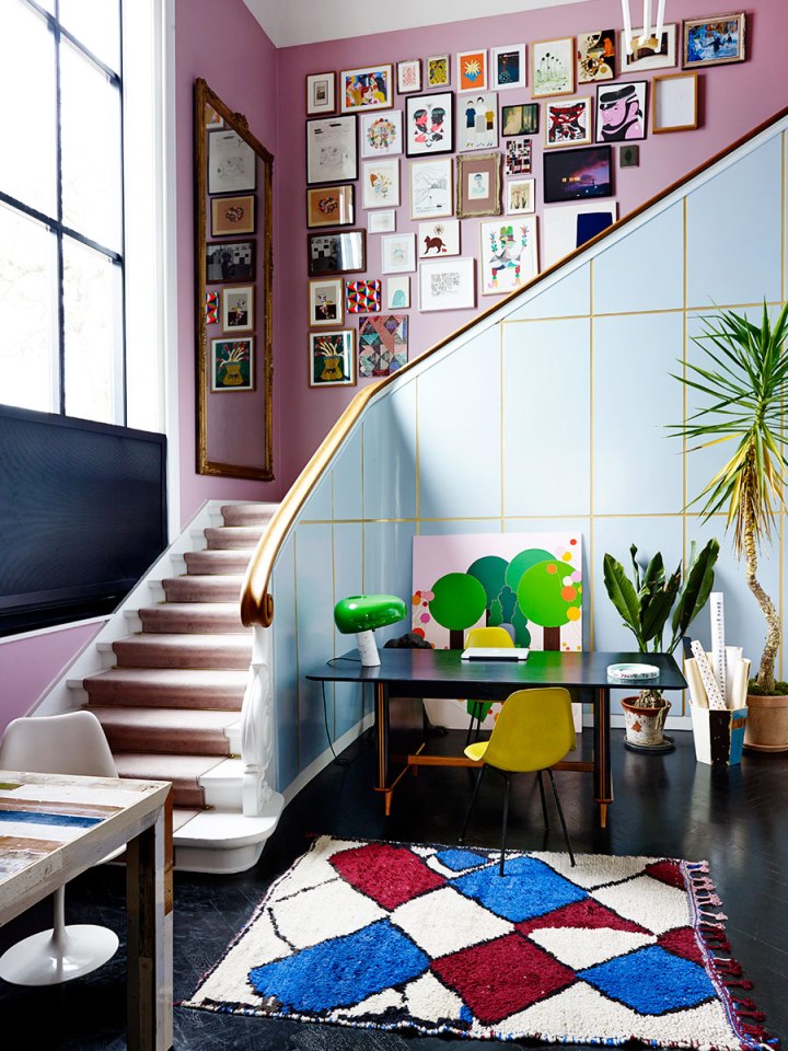
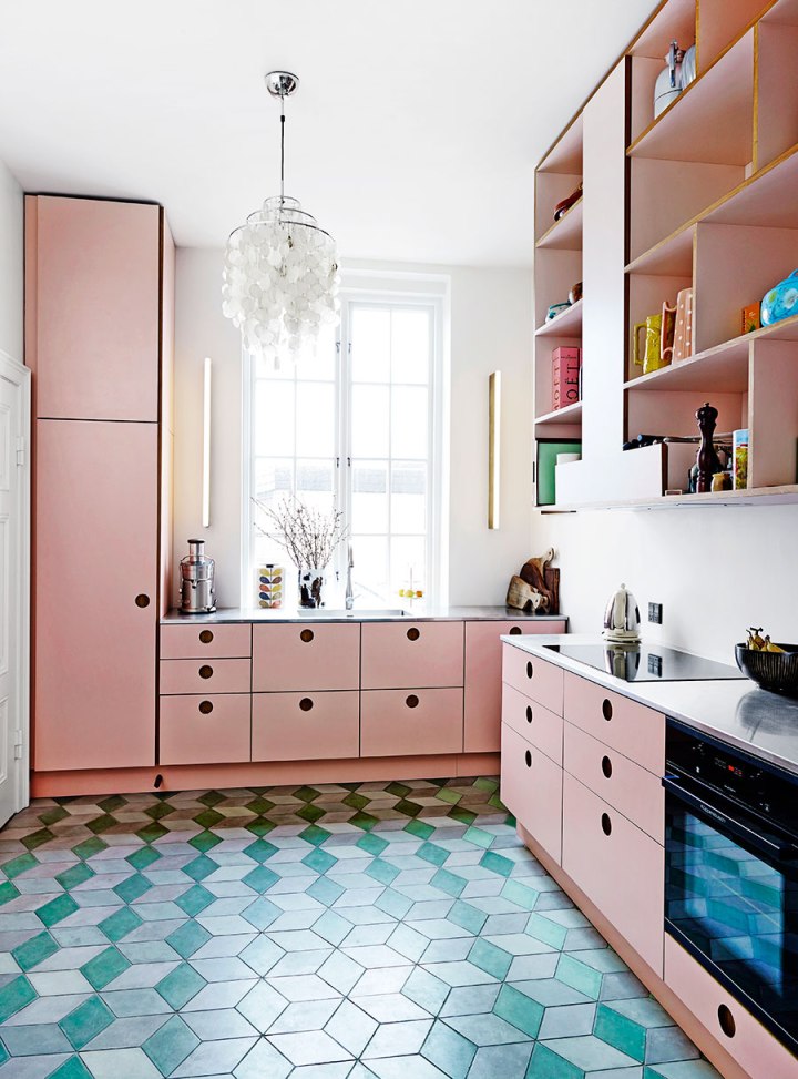
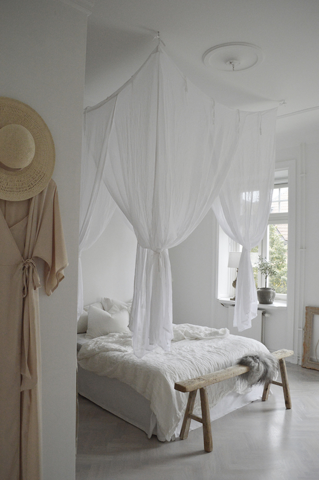
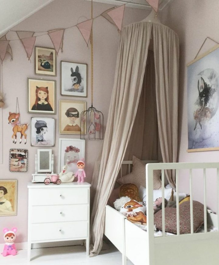
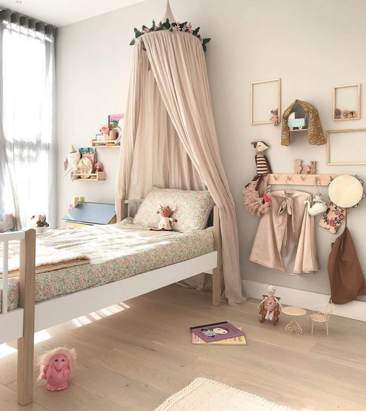
Loving this beautiful blush trend for a kids room. Blush has a softness, a warmth and calmness all in one which is so perfect for a kids room. Blush mixes well with lots of colors, but works best with monochromes, greys and greens. Alternatively, the wall to wall blush color is perfect for a bedroom.

Here are some more blush rooms that showcases beautiful blush:

F0AFA152-C621-4D6D-85C3-4DD0024DC812

If not an all blush room, white and blush make a great combination too. But it doesn’t have to be blush walls with white decorations. Instead, use a white backdrop with lots and lots of blush decor from rugs to baskets to bedding and more. And the white background makes these blush colored decorations pop even more.

9C3A1734-4410-4A7B-99F8-F6701673AA4D

Add some fun and make it a whimsical blush room. The color blush lends itself to so many moods and styles of room. Here blush is complemented with touches of green which is another colour combo that works so well. Loving the moody, magical feel that all the blush decorations help create.

1EA25FAE-261C-4740-8563-D98673764FBC.jpeg

Blush and grey feels like it’s a match made in heaven! It doesn’t matter what shade of grey you use, from lightest to darkest, it just works so well with blush. Both colors are calming and warm so, together they create a wonderful, inviting space for kids.

0429E7F2-459E-4628-A459-F8389E980716.jpeg

An all blush room can look super stunning by mixing different shades of blush from the palest to much darker tones. The combination of the soft blush bedding against the dark wall – just beautiful.


Beautiful Interiors

Architect Andreas Martin-Löf resides in one of the stunning Stockholm residences developed with Oscar Properties. The Lyceum developments are the result of an incredible transformation of the historical university buildings into modern and exclusive homes. Andreas’ work and home is featured in My Residence (the international bookazine by Residence magazine), and interestingly, he has become known not only for transforming culturally and historically valuable buildings in Stockholm for the high end market, but also for renewing the quality of Stockholm’s low-cost housing that is so essential in large cities. Here’s a look inside his beautiful home.

38D6C7A9-AB30-46D0-B15C-D1FFB7A70C16B7C7449D-9F55-430D-9FF1-C9724F64D2B376AAAFC3-1F04-4AEE-B6BA-AD951C859B87

Specially designed in laboratory green, the kitchen is by Swedish cabinet-makers Kvänum. Stools in teak and iron are by Pierre Jeanneret and the pedestal is by Matti Carlson, custom-designed for Martin-Löf’s home. The 1950s style sofa in the living room has been upholstered in specially made fabric by Astrid Textiles, while the armchairs and Kangaroo chairs in teak and rattan are also by Pierre Jeanneret. The table is Travertine and the lamps in this room and the dining area are designed by Andreas Martin-Löf Arkitekter, as part of their Objects Collection.


Beautiful Interiors on a Budget

Ikea isn’t for everyone but if you are looking for a soft minimal look without spending a lot, Ikea gets the job done. Some inspiration from Ikea’s blog Livet Hemma (Live at Home) today, with two very different living room looks. The first is a soft minimalism style living room created by Susanne Swegen. Inspired by her love of mixing Japanese and Finnish aesthetics, the space features a soft color scheme and lots of warm wood. The two-toned walls provide a lovely framework for the room, while mirrors are used to play with light and reflections. I absolutely love the recessed desk area with vertical shelving. Such a great use of space!

ikea_inspiration_1

Ikeainspiration_2

ikea__inspiration_3

ikea__inspiration_4

The soft pink Söderhamn sofa styled against the raw concrete creates a beautiful contrast of textures in this living room setting.

ikea inspiration_55

ikea nspiration_6

ikea_inspiration_7

Styling by Susanne Swegen  / Photography by Andrea Papini and Emily Layefor Ikea Livet Hemma

Beautiful Thoughts

Some days are easy going and good and somehow we arrive at the end of it a little wiser, happier, or maybe the same but unscathed.  Then there are days we question our very worth and sometimes we don’t even know or understand why we derailed off the happy train. It’s those days that we need the extra kindness of friends and strangers, a smile, an acknowledgement that you are seen and even valued. We need a beautiful sight, a flower, a tree, a child, a beautiful human, something funny, the water or the forest, or at least the memory of such.

puget sound 1

We need to give our smile to someone else because they may be feeling the same and need a little confirmation, a little love, too.  You can never know the complete affect your little act of kindness can have on the world. So today, as easy or as confusing as it may be, I choose to let the universe flow through me as a confirmation that life is beautiful. And,  I vow to let the people I love and the strangers I make eye contact with, feel valued and seen, and acknowledged. So I ask you to just smile at someone, make eye contact and say hi, you just never know!  Let’s be better humans!

Photo taken somewhere on Puget Sound between Kitsap and Seattle

Beautiful Amazing Kindergarten

Today, I present one of those projects that takes your breath away. It is designed by Emmanuelle Moreaux and it’s a beautiful kindergarten full of color, a stimulating environment where kids can let their imagination run free. Every child should be so lucky to go to school to attend a learning environment like this.

colorful-nursery1

I love the use of color, a common feature that runs throughout the space. The school, Creche Ropponmatsu, is located in a residential area in Fukuoka, Japan. Emmanuele Moreaux designed this crazy, whimsical project – color is common theme throughout many of her projects. The result is amazing. Emmanuelle designed the architecture, interior space, logos and graphical signage, with a vision to open a new kindergarten where children can grow up freely in mind and body. Running behind the colorful grove, this kindergarten gives opportunity for children to raise rich sensibility by feeling many colors wherever they are.

colorful-nursery2

colorful-nursery3

THREE-DIMENSIONAL COLORS AND ELEMENTS
Color is apparent in every corner of the space. 22 colors were used in the 63m height trees on the façade. The branches appear to wrap the entire building, protecting it, perhaps, from the less colorful world outside. Collections of color jump out at one glance. On the facade, there are 22 colors used in 63 multi-colored trees of 4 m in height extend the branches rhythmically and wrap the building. While giving full-sized glass with a feeling of openness, by wrapping it with colorful trees, gives a sense of distance to the outside. Inside, 200 colorful boxes in 25 colors are lined up on the wall, where each one of them belongs to every child to stock their personal goods. Every time children use their own tools or get changed, they find and pick up the box of their color.

colorful-nursery4.jpg

colorful-nursery5

The stairs which connect the 4 floors is also full of colors, 18 different tones in fact. This creates an environment where kids are surrounded by diversity inside, outside and in common zones. Stimulation with colors and shapes is crucial for kids at this age – experts claim that color helps kids to develop their sensitivity and individuality.

colorful-nursery6

DETAILS IN THE LOGO
Colorful trees on the façade have been also included in the logo, a perfect representation.

colorful-nursery7.jpg

creche_01

creche_0

creche_ropponmatsu_fp

creche_ropponmatsu_fp_2

creche_ropponmatsu_elevation_3

Learn more about her colorful projects here 

Beautiful Colorful Interiors

Check out this crazy wonderful colorful home, full of painted walls, bold rugs, and inspirational details. It features a stairwell with with a color clash of blue and lilac pink walls, and loads of art. But it’s that gold panel detail that really sets it apart. It’s all a wonderful way of mixing old with new while maintaining the original architecture and charm.

colorful-eclectic-staircaise.jpg

One major detail to note in this home is the use of black instead of white to ground all the colorful choices and also bring a sense of drama to the space. The gorgeous herringbone wood floors, and quite a few furnishings are in the black or dark grey realm. It’s so rare to see black used with loads of color in a home – it’s refreshing.

blue-walls-and-black-herringbone-floors

blue-living-room-colorful-house.jpg

The blue continues into this sitting room where modern lighting gets swapped for antique venetian chandeliers. There really are no design rules in this home – it’s very much a case of the ‘buy what you love, and it will work theory.

mad-mix-of-colors-and-texture

While the stairwell reigns supreme, this happy pink kitchen with geometric aqua tile is definitely a close second. The clean design keeps the pink from feeling to precious. The cubbies are a nice alternative to open shelving, and the sleek lighting on either side of the window is perfect.

a-super-fun-pink-kitchen


Beautiful Kitchen Design

I am loving this little kitchen with dark grey and black cabinets. Love the sleek new black stainless steel, fingerprint-resistant appliances with a rich, matter look.

dark-grey-kitchen.jpg

The great thing about black and dark grey is how dramatic it is, and how it helps make everything else around it pop. And adding black appliances to the mix gives things a seriously seamless look!

gorgeous-black-cabinetry

black-and-white-kitchen.jpg

Check out Whirlpool’s newest line of black appliances here


Beautiful Bedroom Retreat

CREATING A BEDROOM HAVEN WITH WHITE WALLS + WARM NEUTRALS

Planning a white bedroom but don’t want it to feel sterile? The white walls can feel a little boring and stale –  inject a bit more warmth. Fabrics, such a linen headboard can make a big difference to the space, injecting texture and contrast. Team white with neutral elements such as warm wood and linen bedding, especially lovely when the sun is streaming in through windows. These beautiful bedrooms and retreats provide some great ideas for creating a neutral bedroom haven all year round.

HARMONY-AND-DESIGN-TIPS 1
A dreamy sun-filled bedroom via Uniqwa Furniture

bed 2

bed 3.jpg
Layers of linen and a touch of velvet make for a cozy combo
Styling by Balthaz Interior | Photography by Elisabeth Daly for Wrede

bed 4.jpg
bed 5
The beautiful home of Danish designer Caroline Feiffer
Photographed by Katrine Rohrberg via Remodelista

bed 6

bed 7.jpg
A lovely Spanish home by Gordana Golubovic
Photographed by Lauren Moore via Est

bed 8
A tranquil bedroom in the home of Swedish interior stylist Denice Lindell, via My Scandinavian Home 

To finish, here are some some favorite design pieces to further inspire a neutral bedroom with warm, textural elements.
bed 9

Sally waffle weave blanket from TRNK
Olive art print by Ekatarina Koroliva from The Poster Club
Cultiver Pinstripe linen duvet set
Armadillo & Co Braid Weave rug from The Ivy House
Fenton Bed by Tim Webber Design
Jo Malone English Oak & Redcurrant Cologne
Sans [ceuticals] Palm Comb
Sans [ceuticals] Boabab Regenerative Body Cream
Vitra Akari 1 ad light by Isumu Noguchi
Citta Silky Cushion from Paper Plane
Vitra Wiggle stool by Frank O. Gehry 

Beautiful Gallery Walls For Kids

gallery-wall-kids-room-1

Gallery walls look great and they’re a quick way to update a room that needs a bit of life or to change the look for a new season. Gallery walls can be made up of art in frames or frame-less art taped to the wall. The art can be hung up in an organized manner or in an eclectic, random manner. But it doesn’t stop at art. In a kid’s room, you can use toys, decorations, clothes and lots more to make your wall unique to your kid. There are so many ways to create an interesting gallery wall, it just depends on your personality and style.

Here are some more fun ways to create a gallery wall in your kid’s room:

gallery-wall-kids-room-2

If you prefer a more streamlined look, a gallery wall like the one above is the one for you. The key is to pick prints that are similar in style and in color tones. All the prints above are very similar to the type of art and the colors are in similar tones too.  This creates a stylish and interesting look.

For a playful and very creative take on a gallery wall, you don’t need any art at all. Instead, we love how they’ve used just the frame and placed some little toys that act as 3D art.  And the addition of other toys, clothes, and decorations adds to the charm of this very fun wall.

gallery-wall-kids-room-3

Kids create a ton of art so why not turn their art into their very own art gallery? We’re loving the informality of simply taping all the art to the wall and also we love how the whole wall is covered. So fun and colorful. The mix of the child’s art and shop bought art, works really well too.  This kind of gallery wall is so personal and can be changed up in minutes, as often as you like.

gallery-wall-kids-room-4
Article and photo Credits