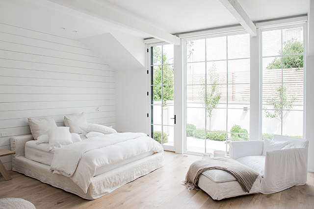
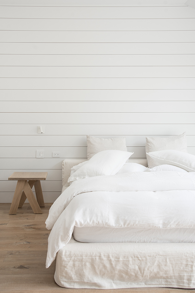
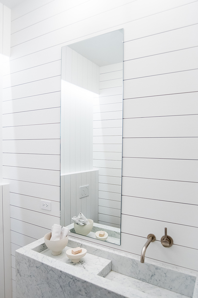
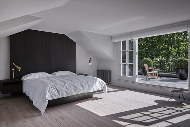
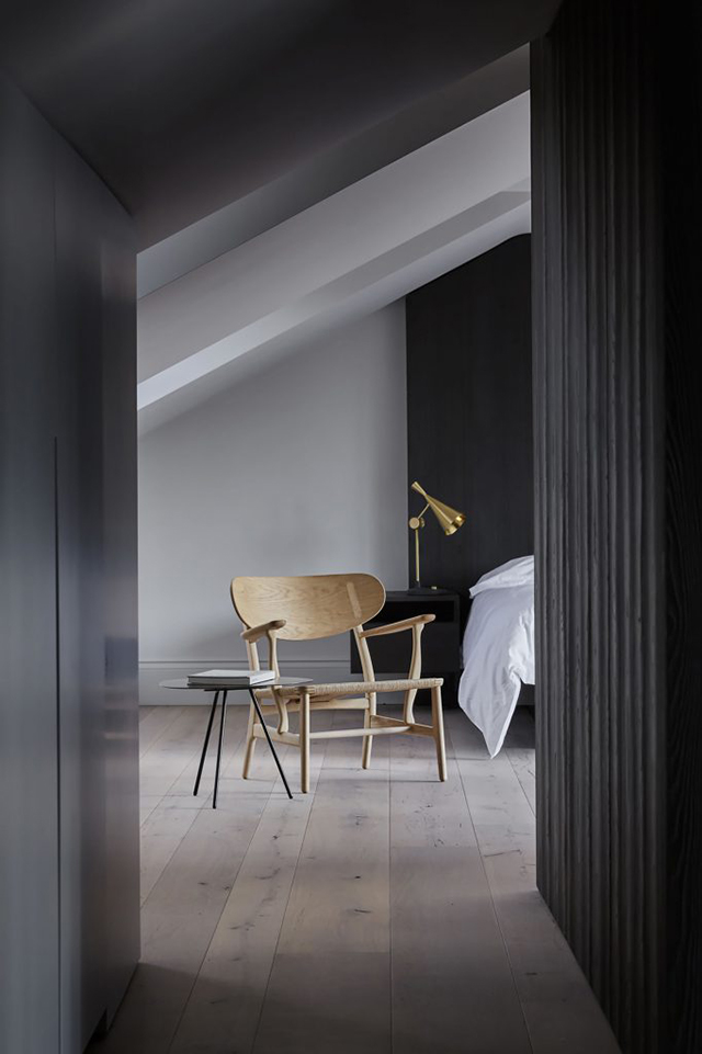
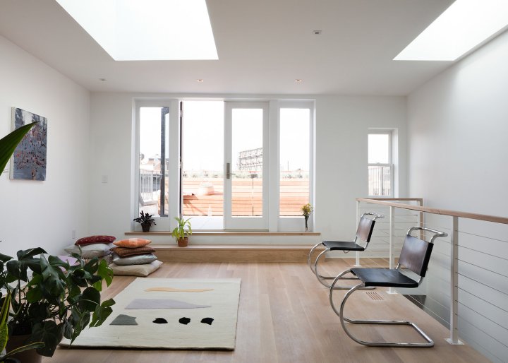
I really need to revamp my bedroom in the coming weeks and need to start curating current inspirations. The overall goal is to create a relaxing haven, a place to escape from the business of life, and to feel calm and restful. In order to achieve this, I hope to de-clutter and keep the room as pared back as possible, with a focus on natural materials. Linen in soft neutral colors are a favorite. Love these materials at Menu Space. Simple with beautiful textures.
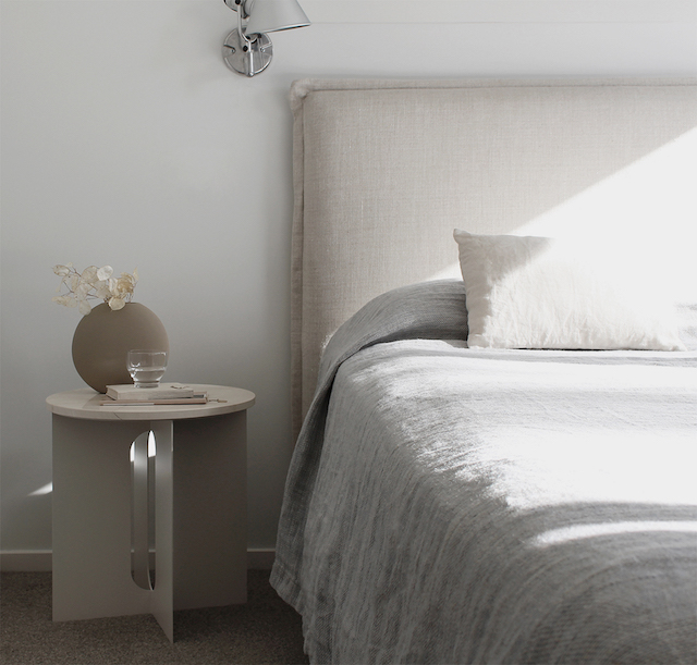 A new paint color is a great starting point. Maybe a neutral tone? I love these soft colors by dulux.

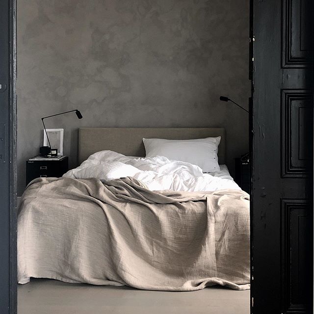

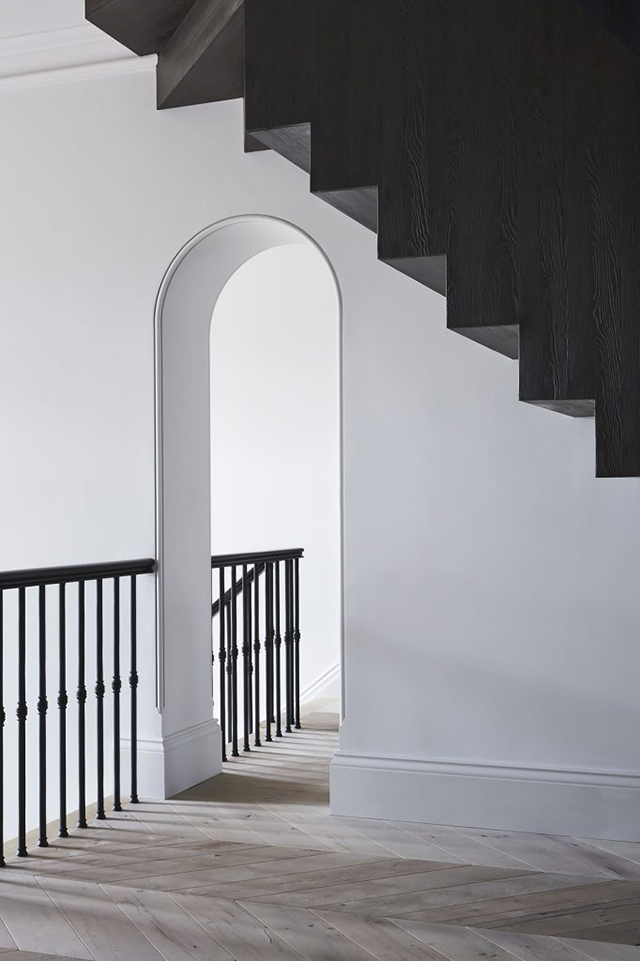
A style that I am becoming more and more drawn to is minimalist task lighting. All of the examples here demonstrate a beautiful architectural purity, and are a signature feature of Belgian architecture. They go hand in hand with textural walls, and a quiet, serene aesthetic.


Photo sources designchaser
Tag: interior design
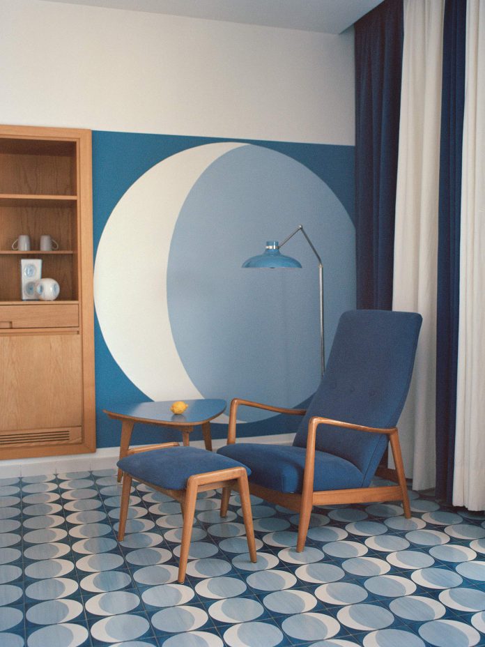
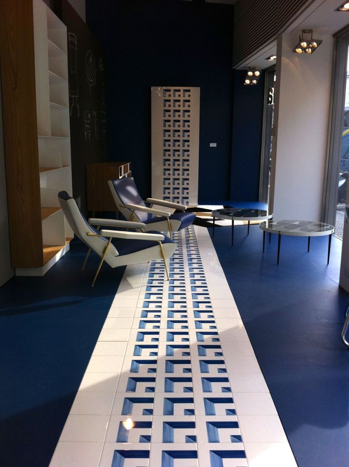
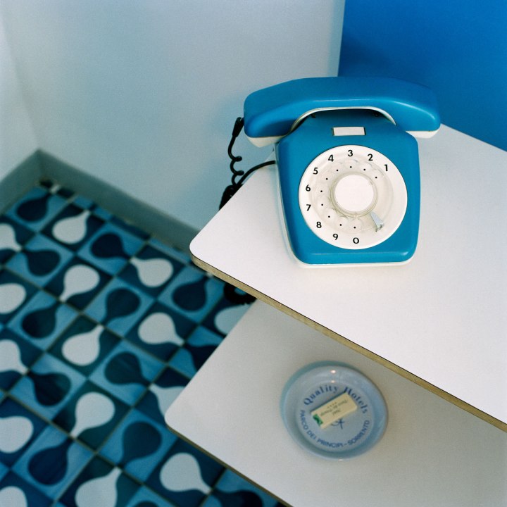
Beautiful Infinite Blue Hotel – Sorrento, Italy
Being in a state of quarantine, my planned excursion to Italy had to be put on hold. Actually, as everything has a way of turning out alright, I’m ok with that because it gives me more time peruse wonderful stories about Italy that I previously never seemed to find time for. I’m discovering some of the hidden treasures that I’ll take with me…some this September. And if September shall come and go and still I cannot fly to Europe? Well then, I shall peruse even deeper until the time comes when I can. Below is a story from Cereal magazine for all to peruse and enjoy.
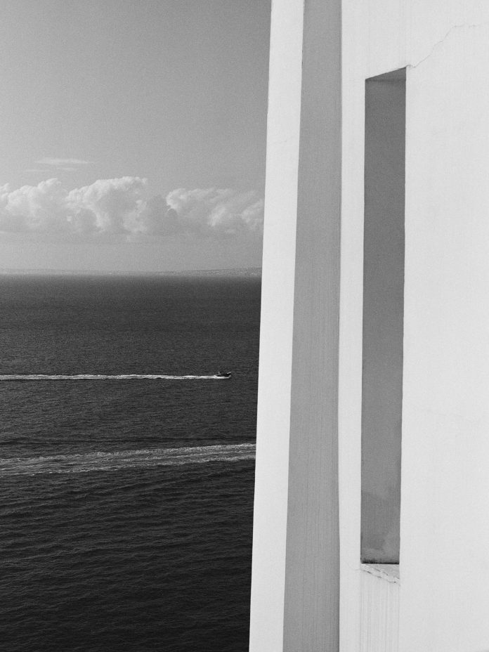
“I STAND ON A BALCONY WITH TILES LAID IN DIAGONAL STRIPES, LOOKING OUT INTO THAT INFINITE BLUE UNTIL I AM SUSPENDED IN IT.”
 White concrete frames a square of uninterrupted blue. The cloudless sky, the iridescent Tyrrhenian sea, even the land stretching out either side — pastel-painted Sorrento to the left, Vesuvius to the right — is cast in a haze of blue. An impressionist’s dream.
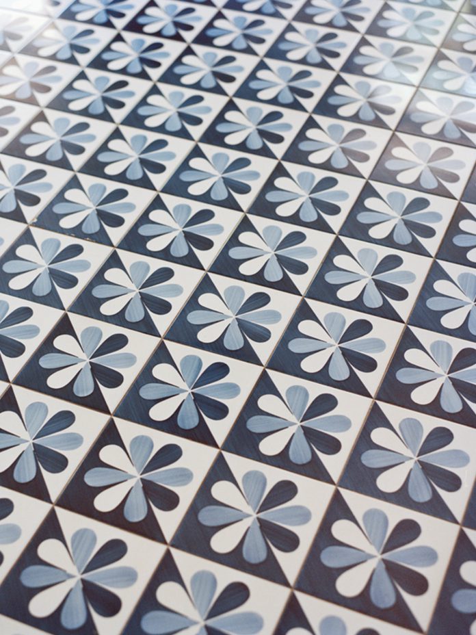
swooning over this blue tile
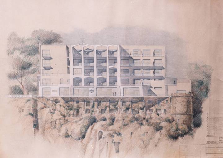
The concept of infinite blue was architect Gio Ponti’s driving inspiration when he built Parco dei Principi, his slice of 1960s modernism on a coast of faded antiquity. When it opened in 1962, the hotel was something new for ancient Sorrento: a clean-lined, contemporary edifice on the tufa-stone cliff. Inside, the bright, wide-open spaces were pared down and decorated entirely in white and blue.
Ponti was commissioned to build Parco dei Principi when his friend and colleague, the Neapolitan engineer and hotelier Roberto Fernandes, bought the neighboring property, the ballet-shoe-pink 18th century Villa Cortchacow. The villa was originally owned by the Count of Syracuse and then by a Russian prince, who had a mock Gothic castle half-built in the grounds lest his cousin, the last tsar of Russia, should come to stay. Ponti’s challenge was to transform this — perhaps thankfully — unfinished castle.
Gio Ponti was one of the most pioneering architects of the mid-century, with an extraordinary portfolio of buildings that championed forward-looking principles. He was driven by the ideas of transparency and lightness. His diamond-shaped Pirelli tower in Milan soars; his ethereal Taranto Cathedral in Puglia, delicate as a paper cut-out, is known as ‘the Sail’. “He loved to create little spaces of lightness, through elements in the design,” says Caterina Licitra Ponti, his great-granddaughter, a passion for her great-grandfather’s work alive in her eyes.
And so in Sorrento, as in Taranto, he uplifted the castle’s solid stone walls so that the new building seemed to hover above the clifftop, wrapping the interior in a white concrete skin, perforated with spaces that allow the light and the sky to penetrate the framework. On approach, through verdant subtropical gardens, the blue of the sea is visible all the way through the glass-walled ground floor.
 Of all Gio Ponti’s 100-odd buildings, Sorrento is the only hotel where you can still stay, fully immersed in his art — for as well as the building itself he designed every last detail. He was not just an architect, but a designer — of interiors, furniture, industry, cars — an artist and a ceramicist, a writer and a teacher; and at Parco dei Principi his passion for so many disciplines converged in one triumphant paean to modernity.
Work was his passion. Every moment was one in which to create. Her grandmother, Lisa — Ponti’s daughter — recalls him waking each morning at 6.00 am. He used to have coffee in bed while he sketched and wrote letters on a tray of his own design — daily correspondence to friends and colleagues about every devilishly intricate detail of his projects, right down to the tablecloths and tiles.
In the lobby, blue and white glazed pebbles are set into the walls, their cool, shiny-smooth surfaces reflecting infinite depths of radiance, chosen, Ponti wrote, for their ‘lightness and grace’, their ‘reflexes of light and sky’. Down in the hotel’s subterranean levels, where there is nobody else about, I put my cheek to the cool of them. It is clear Ponti created this place not just to look at but to touch, too, so that his work would engage and bring delight.
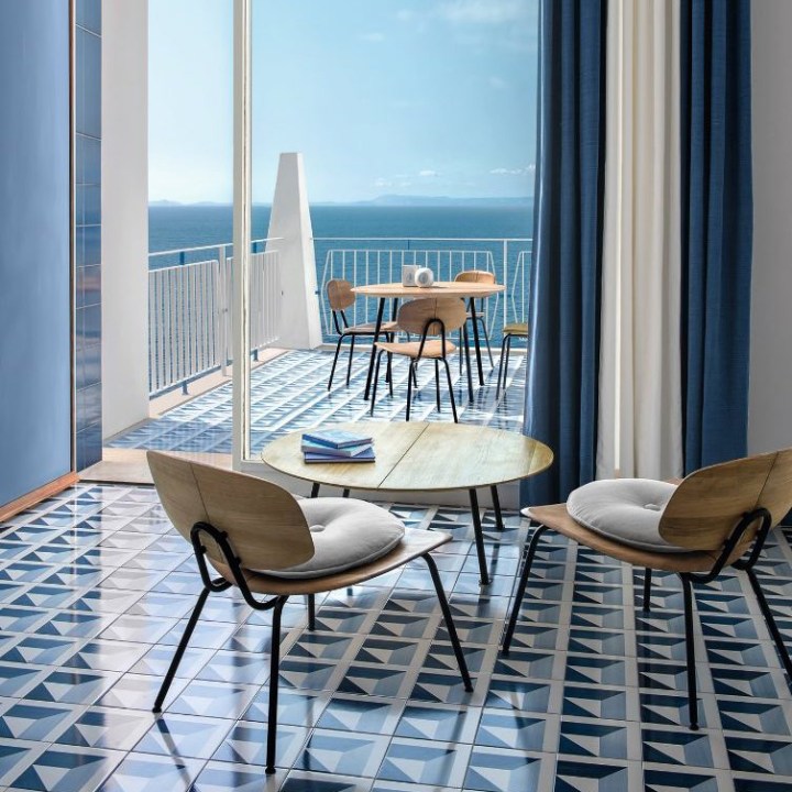
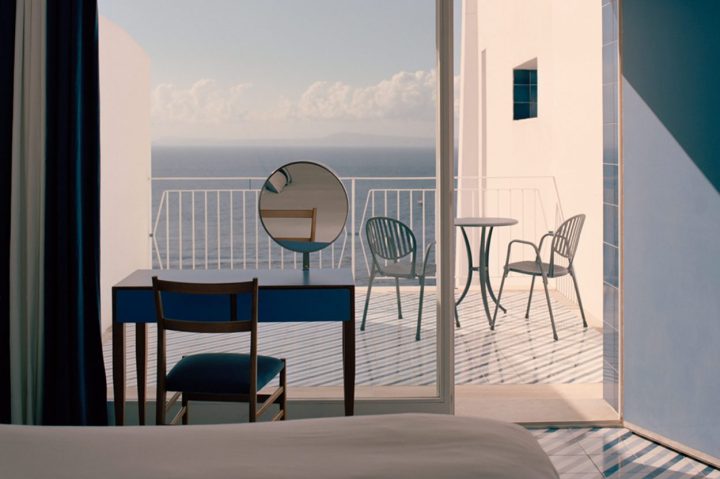
On the bright upper floors, the hotel’s bedrooms are stripped back to the bare essentials, each element designed by Ponti in mid-century modern style and made in Italy: a bed, a chair, a footstool which doubles as a suitcase stand, and a dressing table facing the sea, where I sit and write this story on its smooth Formica top the color of the sky.
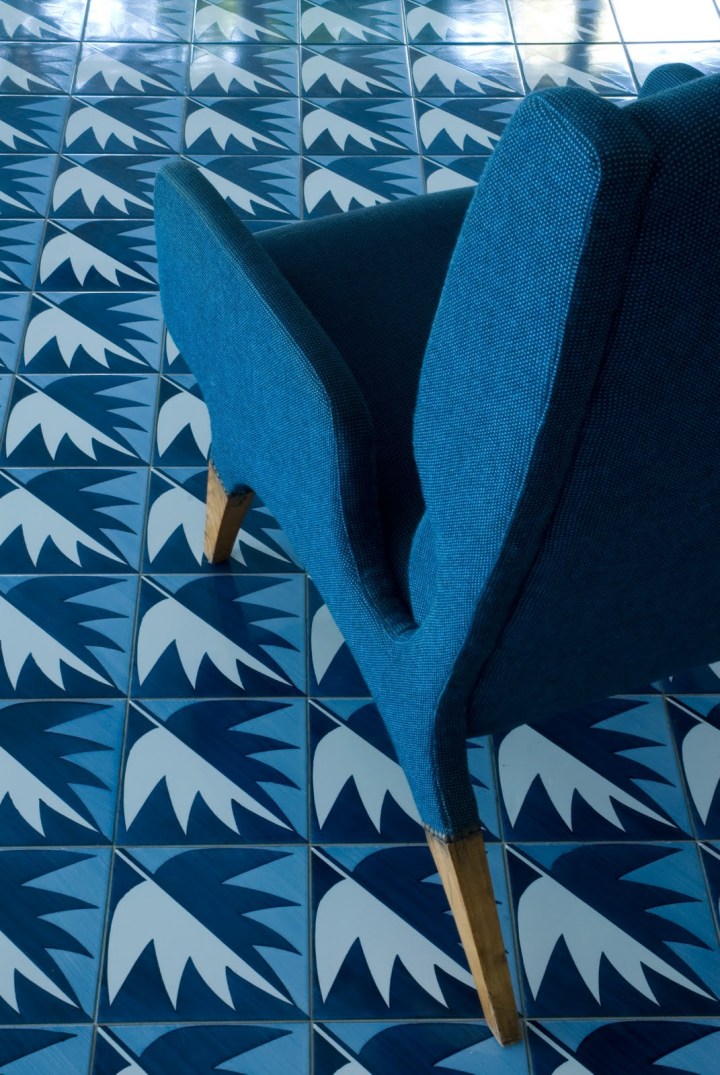
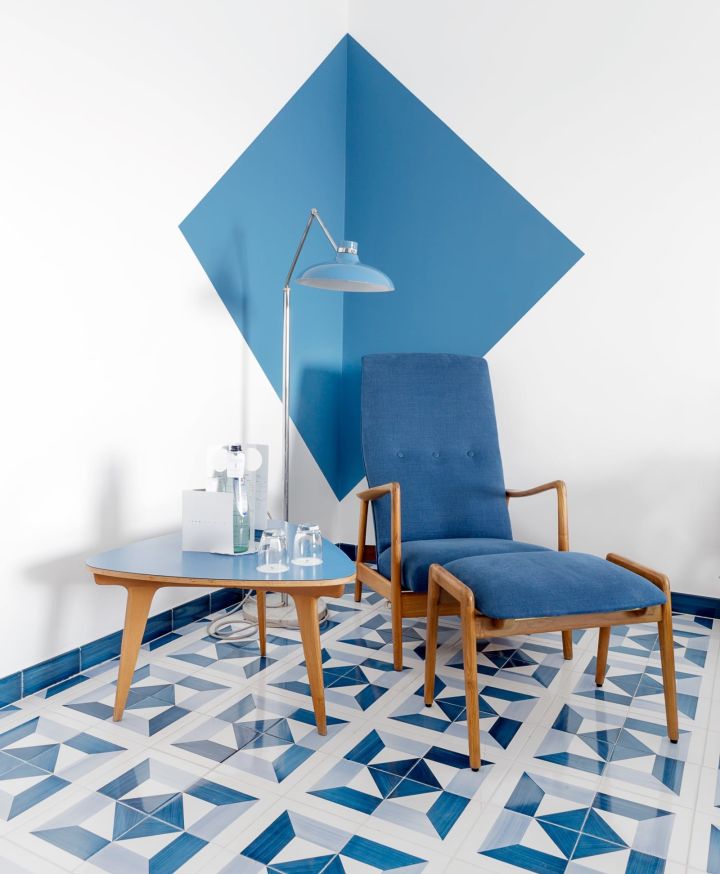
Shaded from direct sunshine by the building’s perforated sheath, the room is cooled naturally by the shades of blue and white, and by the ceramic tiles underfoot. Of all Parco dei Principi’s carefully curated details, these ceramic tiles are perhaps the most enduring. Ponti made 30 different designs, all in the dark blue, pale blue, and white of the local seascape — some geometric, some figurative, featuring moons, stars and leaves. They are configured differently in each of the hotel’s 96 rooms.
“I always think of the endless possibilities of the art,” Ponti observed, of creating these tiles. “Give someone a square measuring 20 by 20 and although people have been turning them out for centuries, there’s always room for a new pattern… There will never be a last design.” Here again, the concept of infinite blue. His dream was to make a permanent mark — infinite, like the blue of the sea and the sky.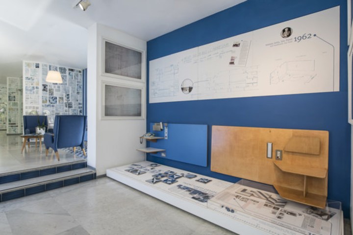
I stand on a balcony with tiles laid in diagonal stripes, looking out into that infinite blue until I am suspended in it. Below me, a sailing boat cuts across the bay, its wake drawing a straight white line through the water. Above me, a gull hangs steadily for a moment, then soars away into the sky. Borne on the wind, light as air. Gio Ponti is everywhere.


Beautiful Italy
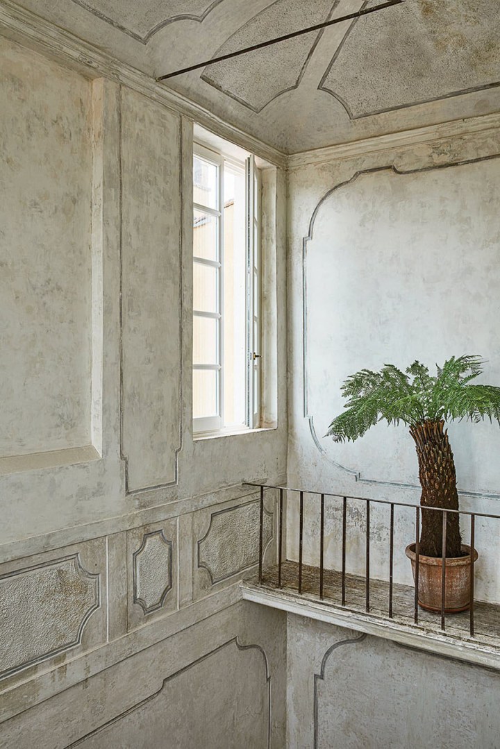
With Italy on my mind, I’d like to feature a gorgeous interior because well, we need a little more beauty in our lives. Presenting Vincenzo De Cotiis villa, Pietrasanta – Tuscany, Italy
 I love the idea of Old is New Again. I also believe that when we experience global disasters such as the current pandemic, we learn to appreciate history even more – especially Italy.
When we are forced to look at humanity from a wider perspective, we see the beauty of the human endeavor. The work and effort, the talent and skill, the appreciation of beauty, and the value of cooperation. Saving what is valuable and beautiful to us becomes even more important than before.
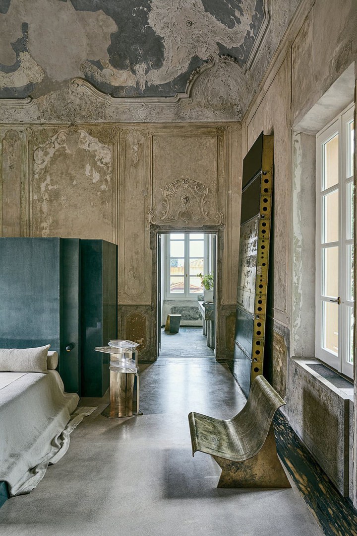
Milan-based Vincenzo De Cotiis renovated this beautiful villa for himself and his wife and business partner.
 He has overhauled the 5,500-square-foot (510-square-metre) early 18th-century villa in Pietrasanta by the sea in Tuscany, in a grandiose but understated, elegantly distressed minimalist style that is often evident in his palazzo renovations.
 This particular palazzo was built by a local painter, Antonio Digerini, who died in 1889, but it has served many purposes over the centuries including being a cloister and a hotel.
I love the exposed patina of the walls and ceiling beams, the minimalist emptiness of the rooms and the lack of unnecessary objects. The color palette is also beautifully muted with soft hints of cold greens and warmer brick-tones.
 In several spaces, the texture and tone of the patina of the original walls and ceilings is replicated in dyed, gessoed and sanded Belgian linen used for parts of the walls and ceilings. Most of the marble is local as the area is famous for its marble quarries.
 Many of the furnishings and art are of De Cotiis’s own creation and design and although their vibe is futuristic and even slightly brutalist, they fit seamlessly with the villa’s cold-cool ambiance. The balance exudes a sense of calm but in an eerily powerful way. It isn’t cozy or comfortable overall, yet it is inviting and interesting for those of us who love his style.
 De Cotiis doesn’t promise to create an environment in a style any client might want. But you can’t help but respect his boldness.

Learn more here
Beautiful Farmhouse
Recently I came across a stunning home that stopped me in my tracks. By Yoanna Kulas, this beautiful Farm style home is located near the shores of Lake Michigan. Below is the imagery of this beautiful home, along with a bit of background about the project.

Completed in May last year, this is the second home that Yoanna has built with her husband. Wanting to downsize from their previous home – a large French provincial home on three acres of land – and move closer to the city, nearer the beautiful Lake Michigan in Winnetka, they found just the right property. Surrounded by beautiful trees, she immediately had a vision for the new home.


Wanting to live a much simpler life and create a lovely environment for her family, Yoanna is both fascinated and inspired by Belgian style architecture and interiors, and also very much influenced by Scandinavian design. The style is simple, feminine and minimalistic, keeping the color palette neutral, mixing different textures and bringing light inside by choosing the right windows. The interiors are surrounded by beautiful things without clutter and unnecessary objects.
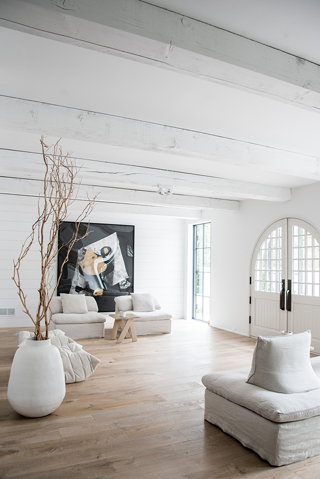
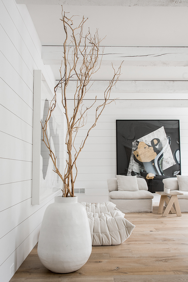

Taking two years to complete, Yoanna worked with architect Michael Abraham of Michael Abraham Architecture and Mick De Giulio of De Giulio Design for the kitchen and master bath. She carried out all the other interior (and landscape design) herself, carefully choosing every element including wide plank European White Oak flooring, White Carrara honed marble countertops and custom wood cabinetry. The same approach was applied to the furniture, lighting and accessories. The master bedroom and kitchen lighting is by Belgium brand Delta Light, and the dining room table and benches and kitchen counter stools are by Antwerp-based AM Designs. The living room features Togo sofas and chairs by Ligne Roset, lamps by Flos and hand made hemp rugs from Turkey.


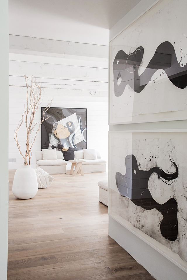
Large-scale art works that feature throughout the home are by Wesley Kimler and Marc Chagall, and the beautiful kitchen china is by Belgium designer Piet Boon. Wanting to create the master bedroom and bathroom as a calming place to relax and unwind, Yoanna chose Gervasoni Ghost furniture by Paola Navone and a beautiful freestanding bath. The gorgeous powder room accessories are by London-based designer Malgorzata Bany, whose work I introduced you to here.


Function and livability were hugely important when it came to the design of the home. The incredible indoor-outdoor flow is defined by huge steel and glass doors that open up to a covered barbecue area, where natural timber furniture creates a seamless connection with the interior. The landscape design beautifully compliments the exterior of the home, a mix of white stucco and cedar wood, while the custom front door, hand made in Poland, creates quite an impact.


First published http://www.thedesignchaser.com
Photos are by Belen Aquino
Beautiful Interiors
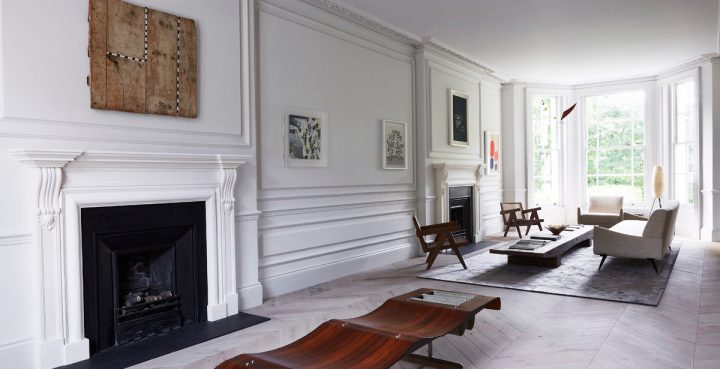
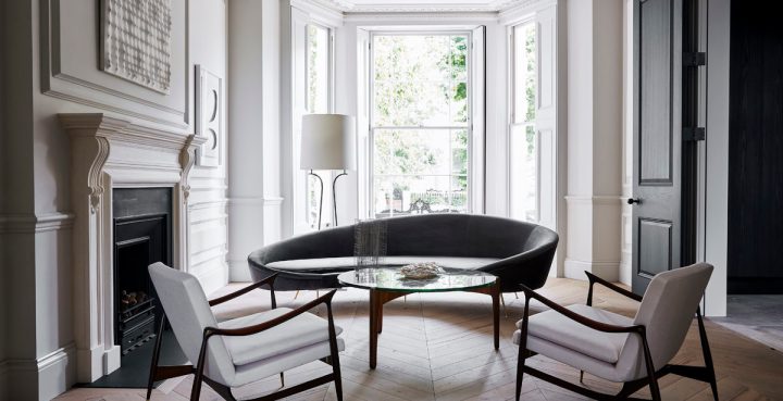
Little Venice Residence by Originate + GL Studio is exquisite. Formerly two adjoining townhouses, this stunning mid-19th century property in West London was completely restored by Originate Architects and GL Studio. Now a Victorian stucco-fronted villa, the original features were reinstated and married with contemporary elements to fulfill the needs of modern family. The details are gorgeous!


The restoration process included the installation of new fireplaces and arched openings in keeping with the historical period. New joinery units were designed by Originate using a unique finish to enhance the natural grain of the timber, while a fairly neutral colour palette was chosen to complement the client’s extensive collection art and furniture collection. In particular, a love of mid-century design that can bee seen with the iconic Pierre Jeanneret chairs, a beautiful Jorge Zalszupin table, and the Carl Hansen & Søn’s reissue of the Hans J Wegner CH22 lounge chair from 1950.


Images via Orginate and GL Studio
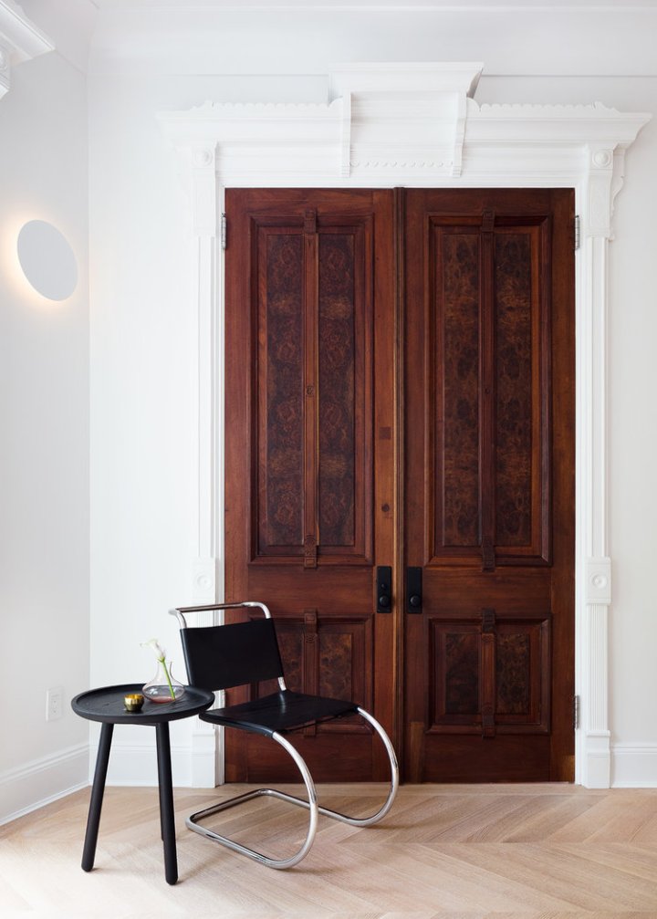
Beautiful Brownstone Interior Renovation
ST. JOHN’S PLACE TOWNHOUSE RENOVATION
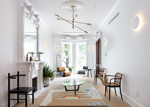
I am drooling over this newly renovated Brooklyn townhouse. I can’t get over the beautiful millwork – The details are stunning!

This Spring Hatchet Design Build completed an intricate your-long renovation of a stunning townhouse Brooklyn’s Prospect Heights neighborhood. Seeking to capture the classic-meets-modern essence of the home, they teamed up with Coil + Drift to style the space.
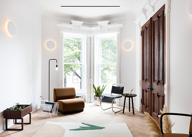
Working along side Brooklyn studio Cold Picnic, Sorensen-Jolink styled the bright home using furniture and lighting from Coil + Drift’s latest collection as well as vintage pieces from Williamsurg’s Home Union and rugs by Cold Picnic. The result is an elegantly-edited space that feels inviting and fresh while showcasing the homes restored beauty.


Beautiful Interiors on a Budget
Ikea isn’t for everyone but if you are looking for a soft minimal look without spending a lot, Ikea gets the job done. Some inspiration from Ikea’s blog Livet Hemma (Live at Home) today, with two very different living room looks. The first is a soft minimalism style living room created by Susanne Swegen. Inspired by her love of mixing Japanese and Finnish aesthetics, the space features a soft color scheme and lots of warm wood. The two-toned walls provide a lovely framework for the room, while mirrors are used to play with light and reflections. I absolutely love the recessed desk area with vertical shelving. Such a great use of space!


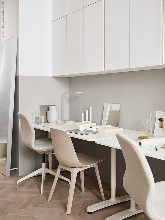
The soft pink Söderhamn sofa styled against the raw concrete creates a beautiful contrast of textures in this living room setting.

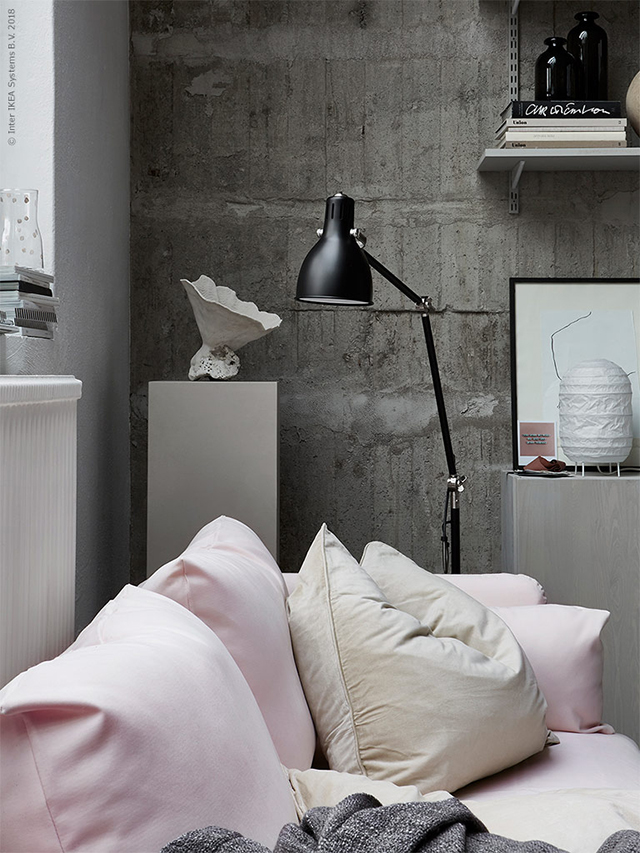

Styling by Susanne Swegen / Photography by Andrea Papini and Emily Layefor Ikea Livet Hemma
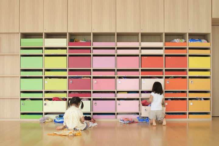
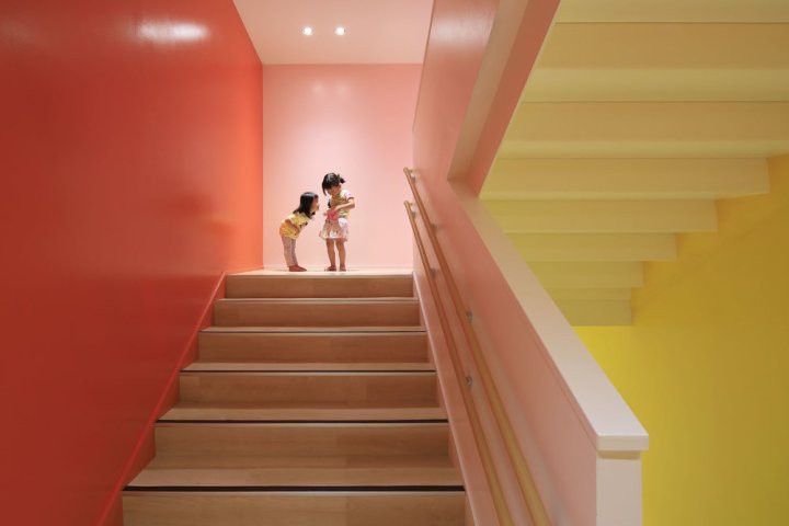
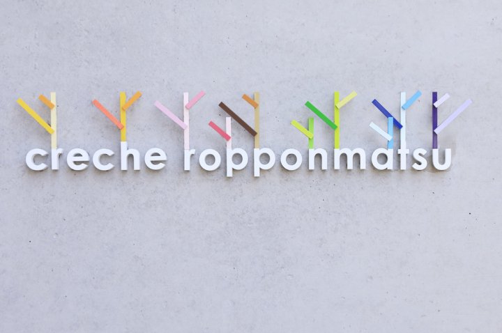
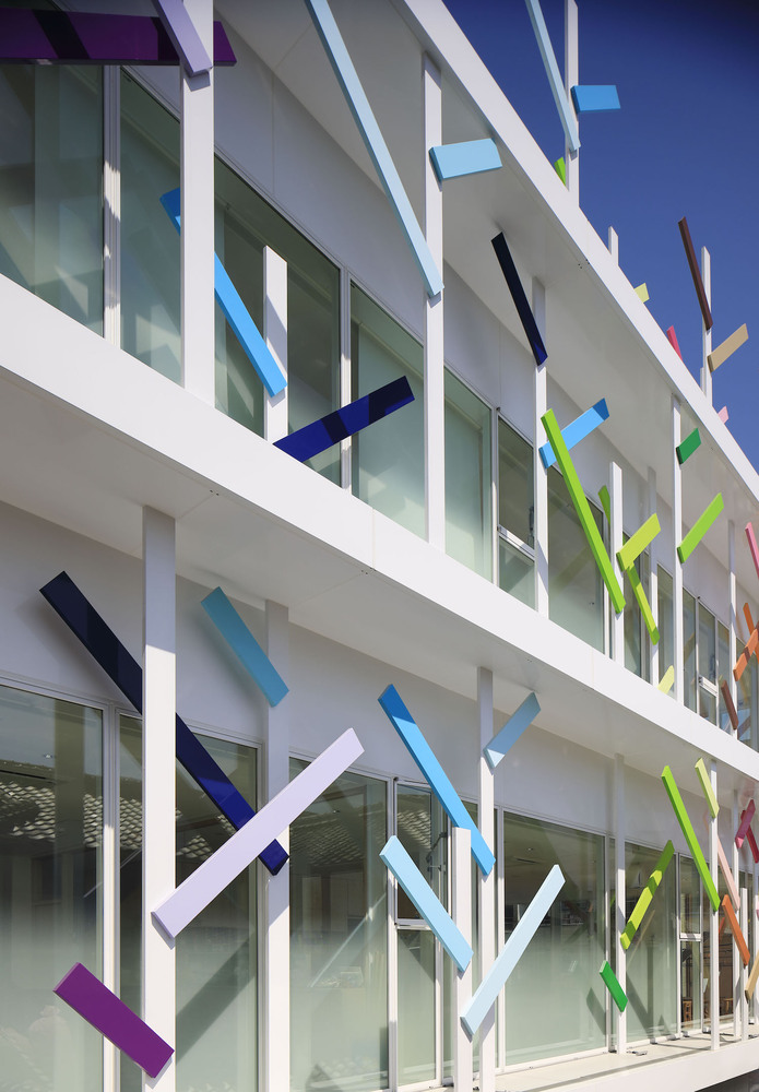
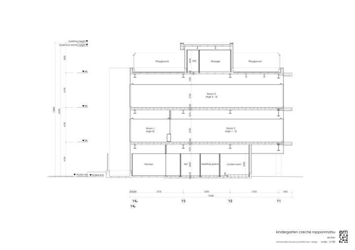
Beautiful Amazing Kindergarten
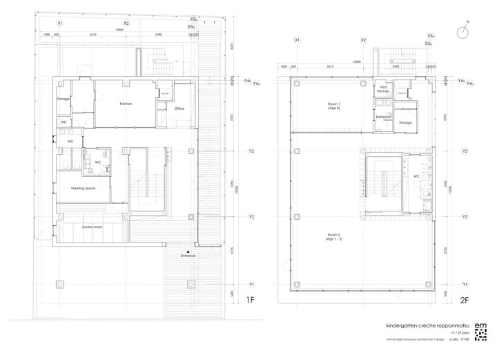
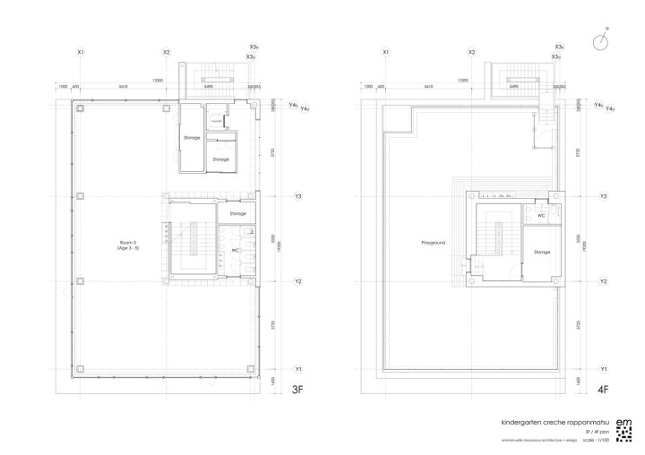
Today, I present one of those projects that takes your breath away. It is designed by Emmanuelle Moreaux and it’s a beautiful kindergarten full of color, a stimulating environment where kids can let their imagination run free. Every child should be so lucky to go to school to attend a learning environment like this.
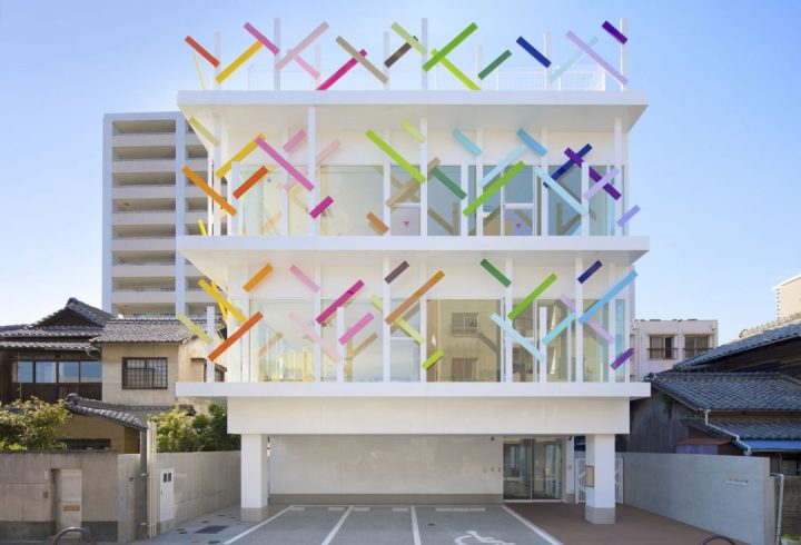
I love the use of color, a common feature that runs throughout the space. The school, Creche Ropponmatsu, is located in a residential area in Fukuoka, Japan. Emmanuele Moreaux designed this crazy, whimsical project – color is common theme throughout many of her projects. The result is amazing. Emmanuelle designed the architecture, interior space, logos and graphical signage, with a vision to open a new kindergarten where children can grow up freely in mind and body. Running behind the colorful grove, this kindergarten gives opportunity for children to raise rich sensibility by feeling many colors wherever they are.
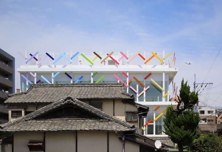
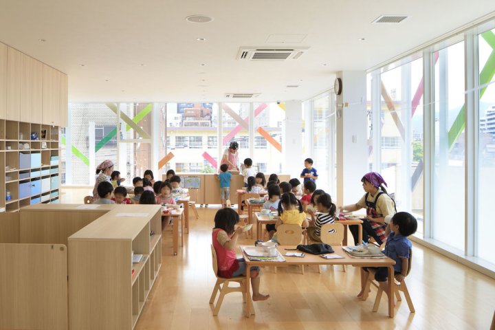
THREE-DIMENSIONAL COLORS AND ELEMENTS
Color is apparent in every corner of the space. 22 colors were used in the 63m height trees on the façade. The branches appear to wrap the entire building, protecting it, perhaps, from the less colorful world outside. Collections of color jump out at one glance. On the facade, there are 22 colors used in 63 multi-colored trees of 4 m in height extend the branches rhythmically and wrap the building. While giving full-sized glass with a feeling of openness, by wrapping it with colorful trees, gives a sense of distance to the outside. Inside, 200 colorful boxes in 25 colors are lined up on the wall, where each one of them belongs to every child to stock their personal goods. Every time children use their own tools or get changed, they find and pick up the box of their color.
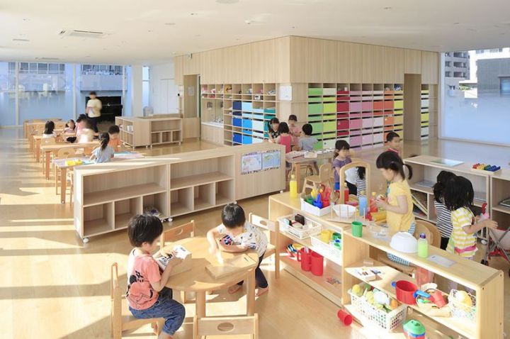
The stairs which connect the 4 floors is also full of colors, 18 different tones in fact. This creates an environment where kids are surrounded by diversity inside, outside and in common zones. Stimulation with colors and shapes is crucial for kids at this age – experts claim that color helps kids to develop their sensitivity and individuality.
DETAILS IN THE LOGO
Colorful trees on the façade have been also included in the logo, a perfect representation.

Beautiful Workplace Design
GoCstudio re-imagines a century-old Seattle building to house digital product company
 US architecture firm GoCstudio has created an open office for a growing tech company that features original brick and timber elements, along with new enclosures made of ebony-stained plywood.
 The office is located within the upper floor of a 100-year-old building in Seattle‘s Capitol Hill district. Encompassing 14,000 square feet, the space serves as a second office for Substantial, a digital product studio.
 The company had occupied a portion of the floor since 2013, and decided to take over the full story when its neighboring tenant moved out. Local firm GoCstudio was charged with overhauling the entire floor, to read as one unified space.
 The challenge was to create a cohesive open-plan workspace which retained the feel of the original Substantial space and would maximize the existing character of the building – exposed brick walls, old-growth Douglas Fir beams and roof decking, and the beautiful warehouse-style window walls.
 The architects worked closely with the client to understand day-to-day operations, as well as the company’s love of hosting parties. Their research led to the conception of the office’s signature element: The Forum, an assembly area for social and business activities.

A large aspect of Substantial’s working practice is the hosting of public and private events thus creating a large social space that could be multifunctional was an important factor in the design of the expansion.
 The social space was situated near the entry staircase and looks toward a large reception desk faced with a steel door from the old office. The room is illuminated by a large skylight.
 In the kitchen, the team installed two bars made of cross-laminated timber planks, along with several black dining tables with colorful chairs. Employees can be found working here throughout the day.
 Surrounding The Forum are conference rooms, with walls made of black-stained plywood and large panes of glass. Additional enclosures were inserted on the north side of the floor. A large portion of the office is given over to open areas with versatile workstations.
The space is filled with natural light, thanks to large floor-to-ceiling glass on three sides of the building. For the first time in many years, views are opened up through the building, from east to west.

Other projects by GoCstudio include a low-lying winery that blends with Washington’s natural terrain, and a floating wooden sauna that can accommodate up to six people.
Project credits:
Architect: GoCstudio (Jon Gentry, Aimée O’Carroll)
Builder: Montlake Associates
Lighting Designer: KMJ Design, Kathy Justin
Owner: Substantial
Photography: by Kevin Scott
Read more
Beautiful Textiles
Swedish brand HIMLA has launched a unique collaboration with interior
stylist and photographer Daniella Witte, and the imagery she has created
is stunning. Representing Scandinavian Simplicity, most of HIMLA’S products
made from linen, but they also work with other natural materials like wool,
silk and cotton.

Using textiles from the range, Daniella has created a relaxed interior with
natural colors and a simple aesthetic. Beautiful stone floors are softened
with sheer linen curtains and a warm layering of textiles that carry through
to every room in the home. These include soft rugs underfoot in the living
room, scattered cushions on the sofa and a lovely layering of tablecloth and
napkins on the dining table. Bathed in light, the bedroom is my favorite.
Read more about this inspiring collaboration here. Love the stone floor!


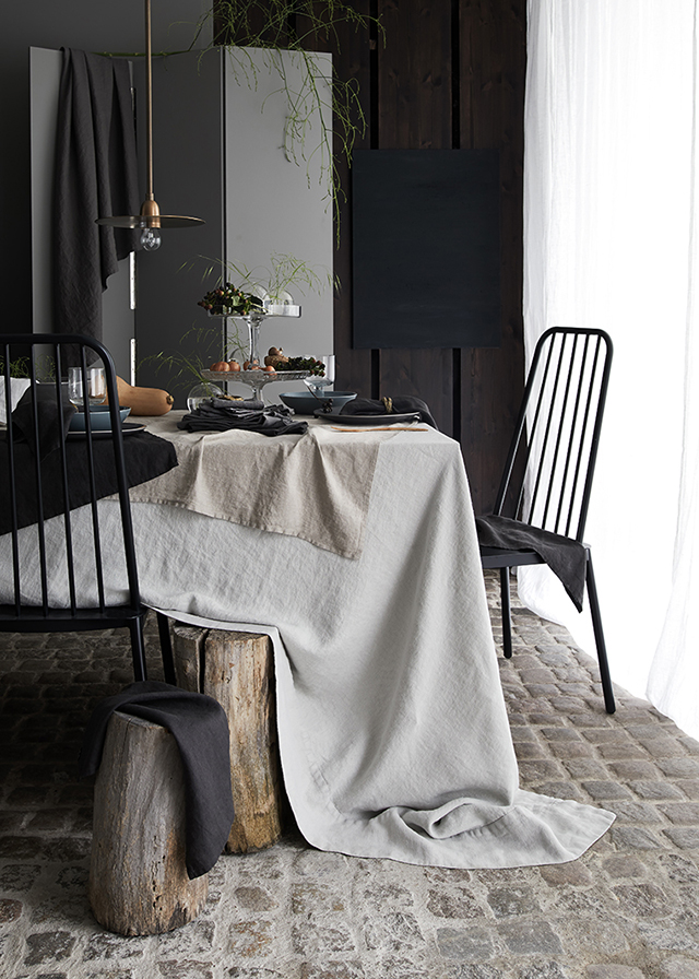

Styling and photography by Daniella Witte for Himla via TDC
Beautiful Renovated Home
This beautiful Copenhagen apartment was featured in
Elle Decoration South Africa earlier this year.

Located in the Frederiksberg, the couple renovated the once run-down
apartment themselves. Restoring the original architectural detailing,
they have introduced new contemporary additions to provide a strong
yet understated contrast. The couple have also incorporated their own
stories and heritage. Justine’s South African roots can be seen in details
such as the fabrics and lithographs created by artists such as her aunt,
South African artist Deborah Bell.


Bringing in a number of delicate heirlooms, Jonas’s Danish upbringing
is also evident. Featuring natural materials such as wood and stone, the
home showcases the pair’s attention to detail and the interaction between
origins, functionality and aesthetics. The end result a beautiful!
Images 1-5 Styling Marie Monrad Graunbøl / Photography by Mikkel Tjellesen via Elle Decoration. Last image via justinebell.com
