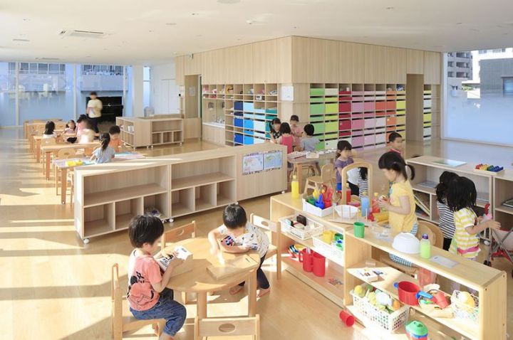
How to crate a beautiful, cool, functional space for kids.
 September is almost here and that can only mean one thing: back-to-school time! But homework doesn’t have to be boring – and neither does your child’s desk. Whether it’s for homework, drawing, coloring or simply chilling with a favorite book, study spaces can be both functional AND fun.
Here’s how:
1. Choose an area that works within the room
Placing a table along the length of the room (as pictured above) makes an area that may otherwise not be used for anything, useful – especially in a loft or attic room like this one. It’s light and bright, thanks to the window and the cheerful sunshine yellow and white, with plenty of desktop space for every activity you can think of! Don’t forget alcoves, unused corners, underneath loft beds, and even cupboards – they can make perfect study zones too!
2. Hang a shelf
If you don’t have a lot of space, consider hanging a wall-mounted shelf instead. Simple and smart, yet effective as well. If it’s next to a wall, even better – hang some extra storage for all those arty bits and pieces and to help keep everything tidy and organized. And don’t forget all that extra space underneath the desk. Stack some storage boxes, bins or baskets to stash away all the mess when work and play is over.
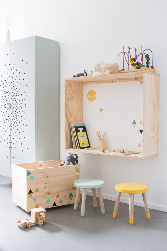
Image sourced from En Suus
3. Choose a colored chair or stool
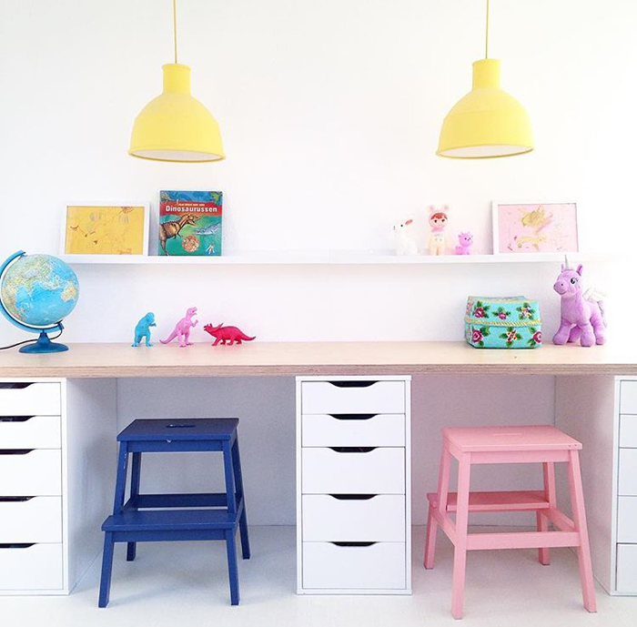
Image sourced from Saarkeloves on Instagram
These Ikea steps look amazing painted in bright colors and used as stools. Love how the drawers divide up the two areas whilst serving as functional desktop legs, not to mention brilliant storage for paper, pens, crayons and books.
Likewise, these sweet vintage chairs in this kids’ room (below) add a pop of bright color whilst being perfectly in keeping with the style of the room:

Image sourced from Coosje
4. Decorate!
Colored paint, wallpaper, wall stickers and wall art all help to add color and character to the walls, giving the study area its own identity. This simple yet creative two-tone ‘mountain’ design on the wall, which defines the corner and separates it out from the rest of the room:
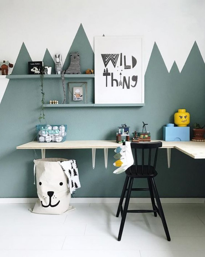
Image sourced from Wildones
How cool is this grey and white cloud wallpaper for the alcove surrounding the desk?
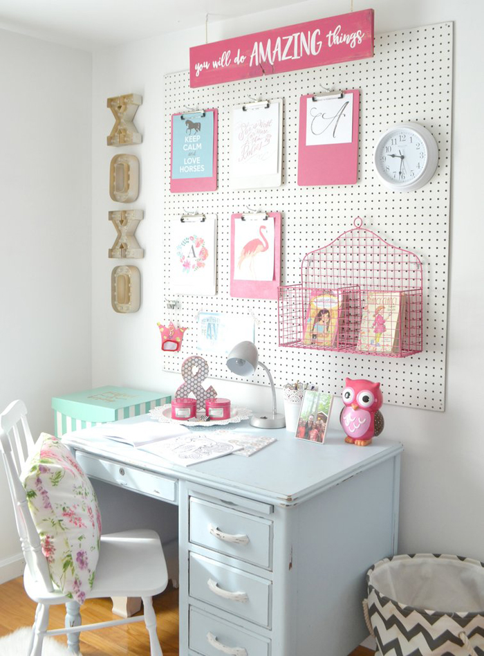
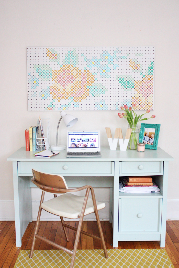
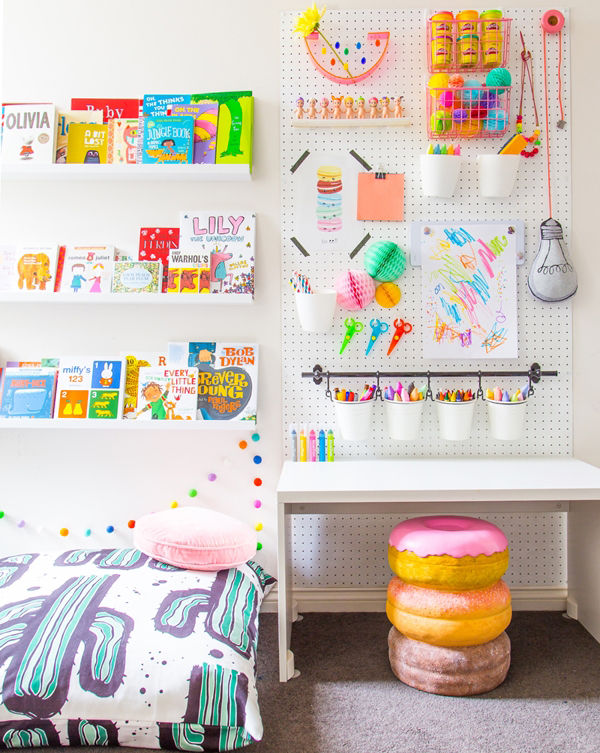
5. Add a peg board
A simple pegboard above the desk is decorative, functional as storage and the perfect solution for displaying their creative masterpieces:
So, whether it’s for a 2, 12 or 22-year-old, you can keep the study space both fun and functional by adding elements such as a bright chair or stool, a colorful shelf or pegboard or a decorative wall feature through paint, wallpaper or wall art. And let’s face it – when you have kids, there is plenty of wall art to display.


 US architecture firm
  The office is located within the upper floor of a 100-year-old building in
  The company had occupied a portion of the floor since 2013, and decided to take over the full story when its neighboring tenant moved out. Local firm
  The challenge was to create a cohesive open-plan workspace which retained the feel of the original Substantial space and would maximize the existing character of the building – exposed brick walls, old-growth Douglas Fir beams and roof decking, and the beautiful warehouse-style window walls.
 The architects worked closely with the client to understand day-to-day operations, as well as the company’s love of hosting parties. Their research led to the conception of the office’s signature element: The Forum, an assembly area for social and business activities.
 The social space was situated near the entry staircase and looks toward a large reception desk faced with a steel door from the old office. The room is illuminated by a large skylight.
 In the kitchen, the team installed two bars made of cross-laminated timber planks, along with several black dining tables with colorful chairs. Employees can be found working here throughout the day.
 Surrounding The Forum are conference rooms, with walls made of black-stained


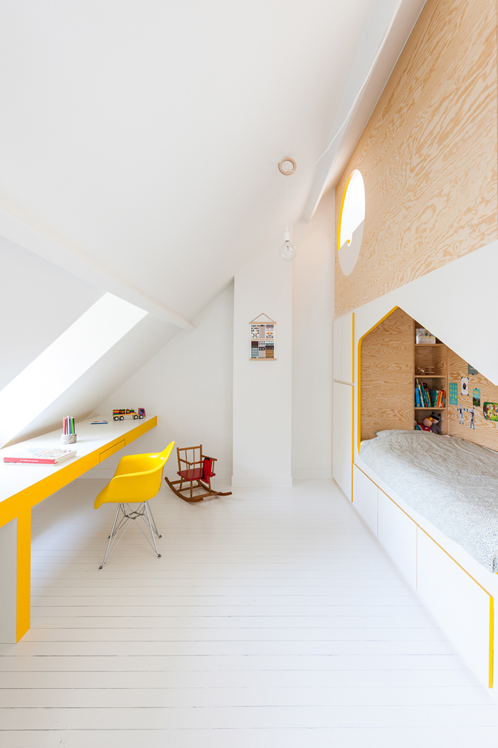
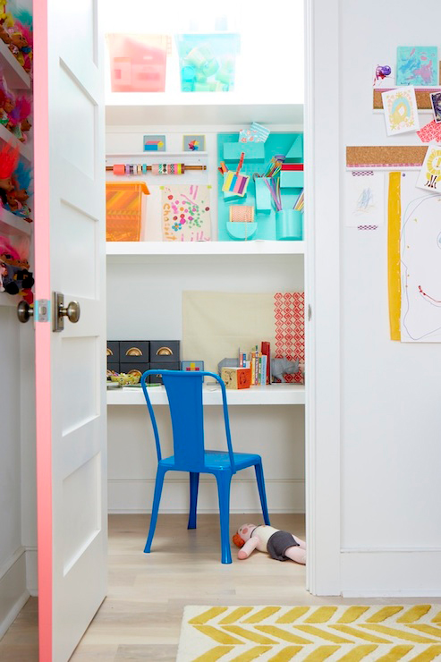
 Image sourced from