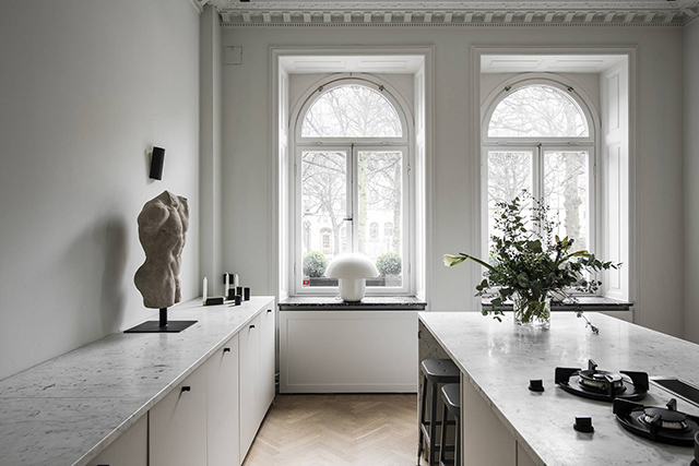
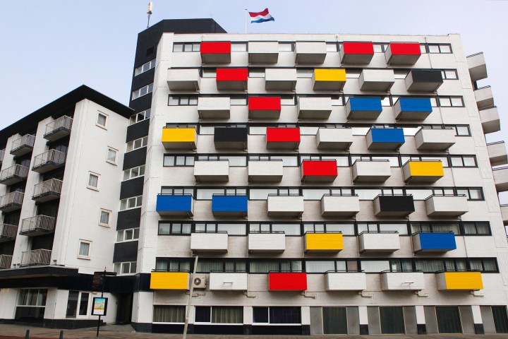
Serious Fun
Taking inspiration from the humble cardboard box, Ray and Charles Eames created toys and furniture to spark the imagination of kids and adults alike. A central tenant of the design philosophy of Ray and Charles Eames was an embrace of play as an end in itself, the idea that creativity should be unconstrained and unburdened. While the couple will always be remembered for their contributions to furniture, design and cinema, it was their approach to experimentation, and their interest in seemingly tangential topics such as clowns, that inspired their seemingly endless sense of wonder and a constant drive towards exploration and improvement. As champions of those beliefs, it only goes to follow that they’d also be some of the world’s foremost toy designers.
Ray and Charles Eames took child’s play seriously. They invented playthings, furniture, and films to spark, but never limit, the young imagination. Given their own ideas of fun, these toys tended to emphasize composition, structure, and building, giving children the tools of their own adult trades in miniature (and giving some adults the chance to make like children again). Many of their designs embrace what kids and parents have long known: that the box an item comes in, especially if it’s a very large item, can be more exciting than the contents.
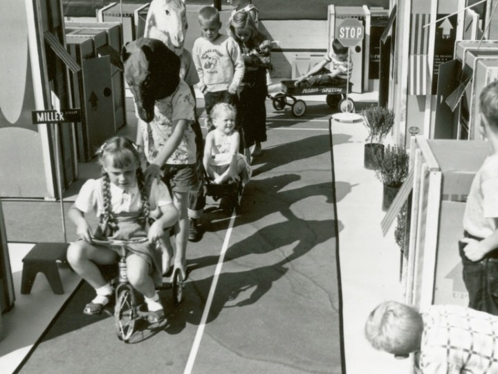
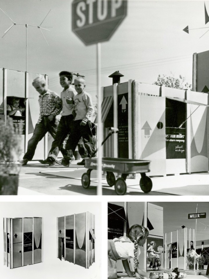
So it comes as no surprise that the Eameses improved the box itself, as a portfolio of photographs unearthed from the Herman Miller Archives reminds us. The humble cardboard box offers children their first chance to make space for themselves, whether that’s a race car, a robot, or a house, sprouting from the shipping container the Eames Office designed in 1951 for the Eames Storage Units (ESUs).
Printed in a colorful red and black design, and featuring the distinctive Herman Miller ‘M,’ the heavy cardboard carton, reinforced with wood splines, had only to be re-nailed to the bottom wood skid, after the furniture had been removed, to be made into a playhouse youngsters would love, reads text from a draft press release. A separate leaflet offers instructions on “How to Make a Playhouse,” but it should have been self-explanatory: dotted lines suggest locations for an entrance and a view out, as well as jaunty awnings.
In one fell swoop, the Eameses managed to combine adult and child fun, eliminate waste, and add excitement to the mundane process of delivery. The up arrows, as well as the deep V of the logo “M,” designed by Irving Harper for the company, suggest the possibility of upward expansion into a miniature townhouse or skyscraper, should a child or parent need more furniture.
The ESUs themselves were also a kind of demountable toy for grownups. Made of perforated steel extrusions with diagonal bracing, they could be configured as low credenzas or high bookshelves. Buyers could customize the interior arrangement, selecting plywood drawers or doors, and perforated metal or enameled Masonite filler panels. Owners could also take them apart and rearrange or add on, treating the furniture as a series of modular boxes‑ furniture as toy.
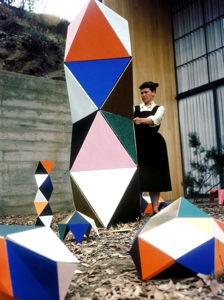
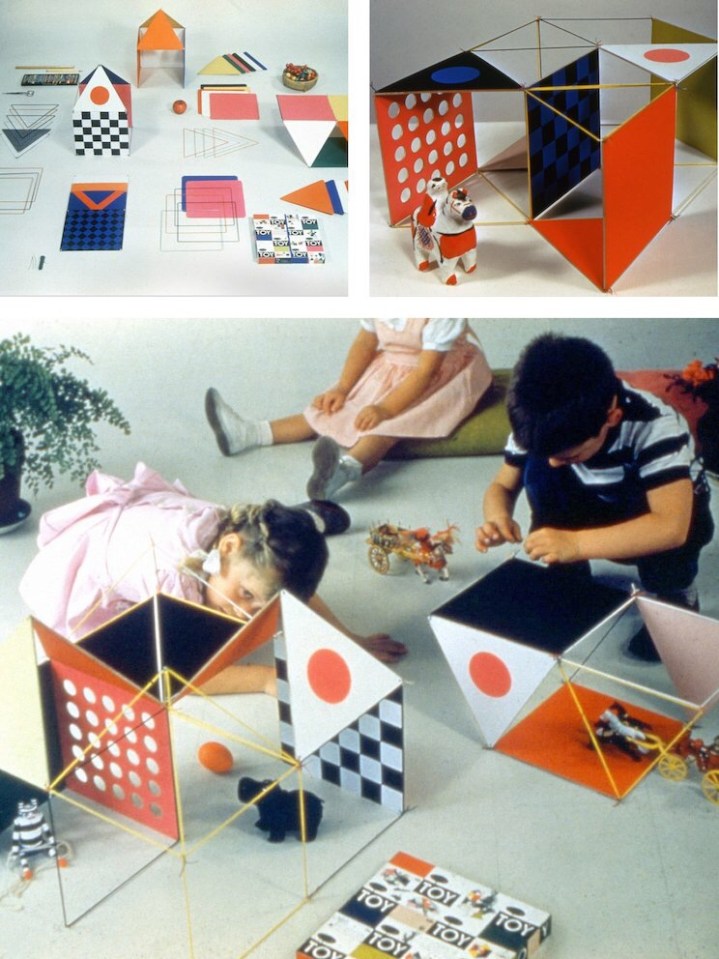
As adults designing playthings intended for children, the Eameses found more inspiration in boxes. The Toy, manufactured by Tigrett Enterprises in 1951, offered children the chance to make their own prefabricated structure, one more colorful and flexible than Carton City. The Eameses had first been in touch with Tigrett about manufacturing large, bright, paper-and-cardboard animal masks based on those they used for skits and photo shoots in the late 1940s. The Memphis-based company was run by the highly entrepreneurial John Burton Tigrett, who made his fortune selling the Glub-Glub duck and may have been looking for more patentable products. The masks never made it out of the prototype stage, but the simpler and more geometric Toy did.
The Toy combined thin wooden dowels, pipe cleaners, and a set of square and triangular stiffened-paper panels in green, yellow, blue, red, magenta, and black. Children could run the dowels through sleeves on the edges of the panels to strengthen them, and then attach these struts at the corners. Initially sold in a big, flat box via the Sears catalog, the Eameses soon redesigned this packaging as well, creating a far more elegant 30-inch hexagonal tube, into which all parts could be rolled and stored.
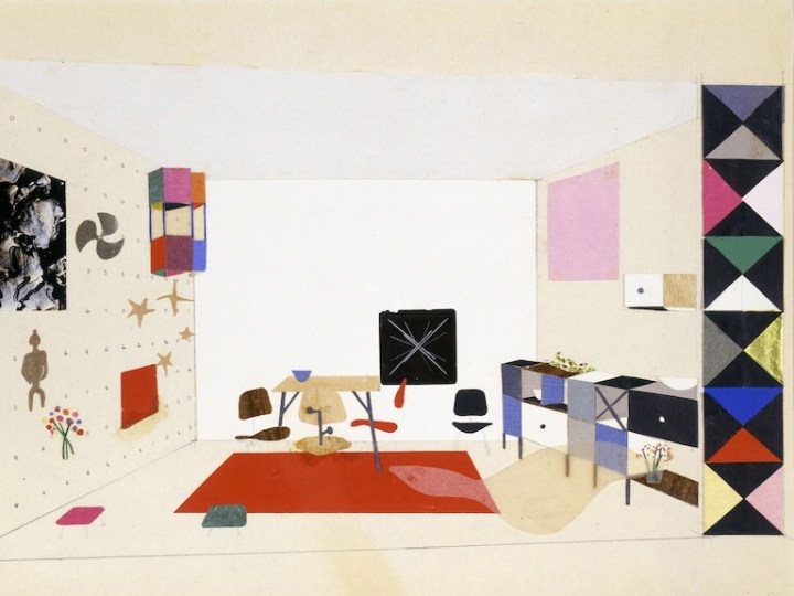
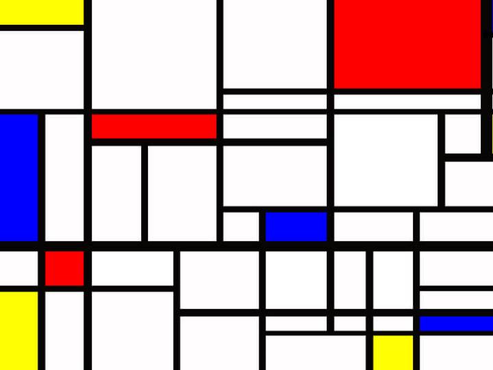
The first version of the Toy made spaces big enough for children to inhabit, like the cartons. The Little Toy, released in 1952, was scaled more like an architectural model, allowing children to radically reinterpret the dollhouse. (The office later prototyped a modern model house for Revell, but it never went into production.) The Little Toy boxes, which feature a grid of colorful rectangles and words, resemble the panelized arrangement of the Eames House façade and the ESUs, and all of these products, at their various scales, were being developed at the Eames Office within the same few years.
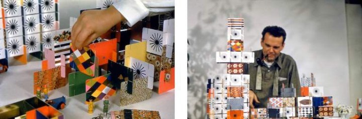
Charles Eames once said of the work done out of the Eames Office, “We work because it’s a chain reaction, each subject leads to the next.” The connection to the ESU cartons and The Toy is immediately apparent in the longest-lived of the modular, paper-based playthings to come out of the Eames Office, the House of Cards.
In the voiceover for “Toccata for Toy Trains,” Charles Eames says, “In a good old toy there is apt to be nothing self-conscious about the use of materials. What is wood is wood; what is tin is tin; and what is cast is beautifully cast.” He could have added, in reference to the couple’s own toys, what is cardboard is cardboard, and then talked about the qualities that make it an ideal building material: its strength, its low cost, its ability to withstand a judicious number of cuts and slots.
Why Magazine by Alexandra Lange
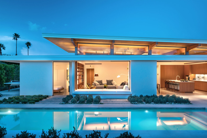
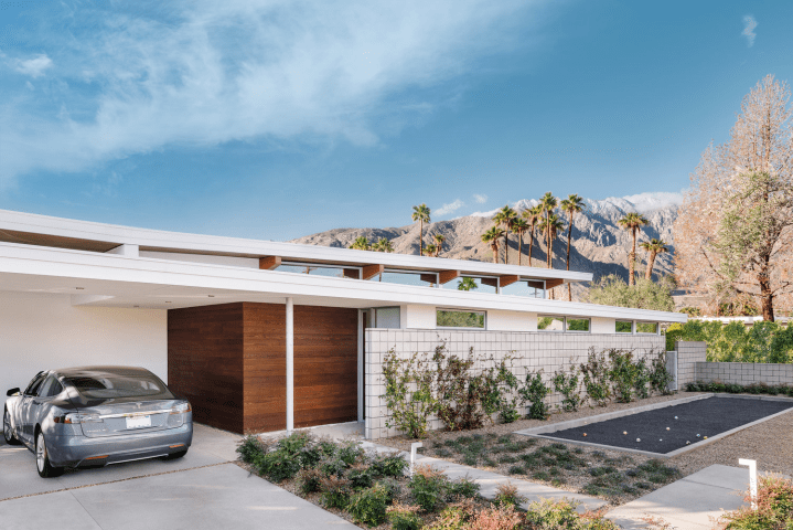
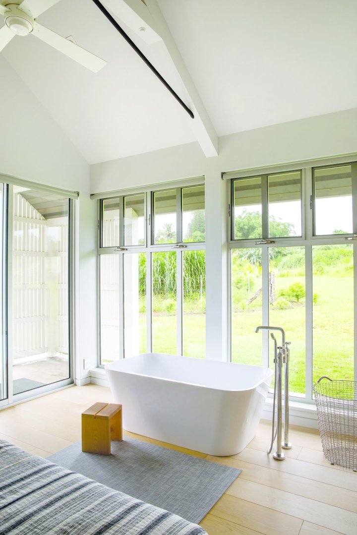
 Recently completed in February 2019, Axiom Desert House, Featured Home at this year’s Palm Springs Modernism Week—turns heads as a stunning, systems-built jewel that is now the private residence of designers Joel and Meelena Turkel, as well as a Living Lab for Turkel Design. The home’s open plan, indoor/outdoor flow, and thoughtful use of sustainable materials are a testament to modern prefab, celebrating transformative design that is simple, elegant, and replicable.

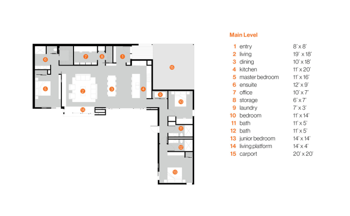
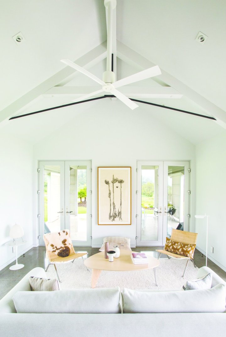
 Many cultures feature houses with rooms grouped around a private courtyard: this is a take on that venerable tradition. Passing through a flat-roofed entry, the space expands as you encounter a high, beamed ceiling, sloping upward to 12 feet. This is the great room – 40 feet in length, it opens directly onto the walled courtyard through glass panels that slide away into hidden pockets. An especially admired feature of the room is a 4-by-12-foot window-seat extending into and overlooking the courtyard. This too has operable glass panels that tuck away into pockets: a charming place to lie down—even sleep—“half-in, half-out.”

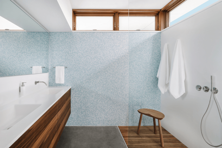
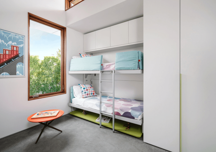
 Master suites occupy both ends of this “L” shaped home, each with private access to the courtyard; an ideal arrangement for a shared vacation home, in town or out. While being careful to ensure privacy, the outward facing walls stop short of the overhanging roof, bringing in balancing light and capturing expansive outward views.
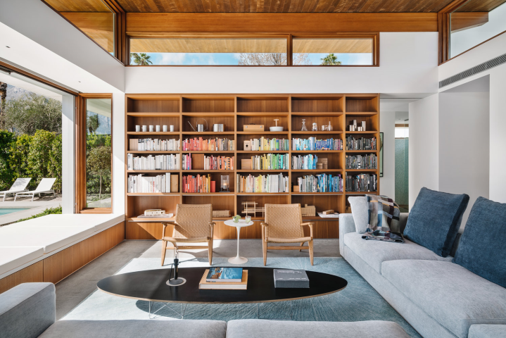


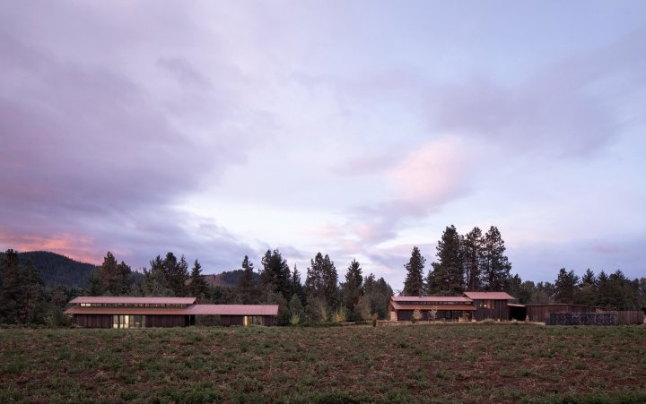

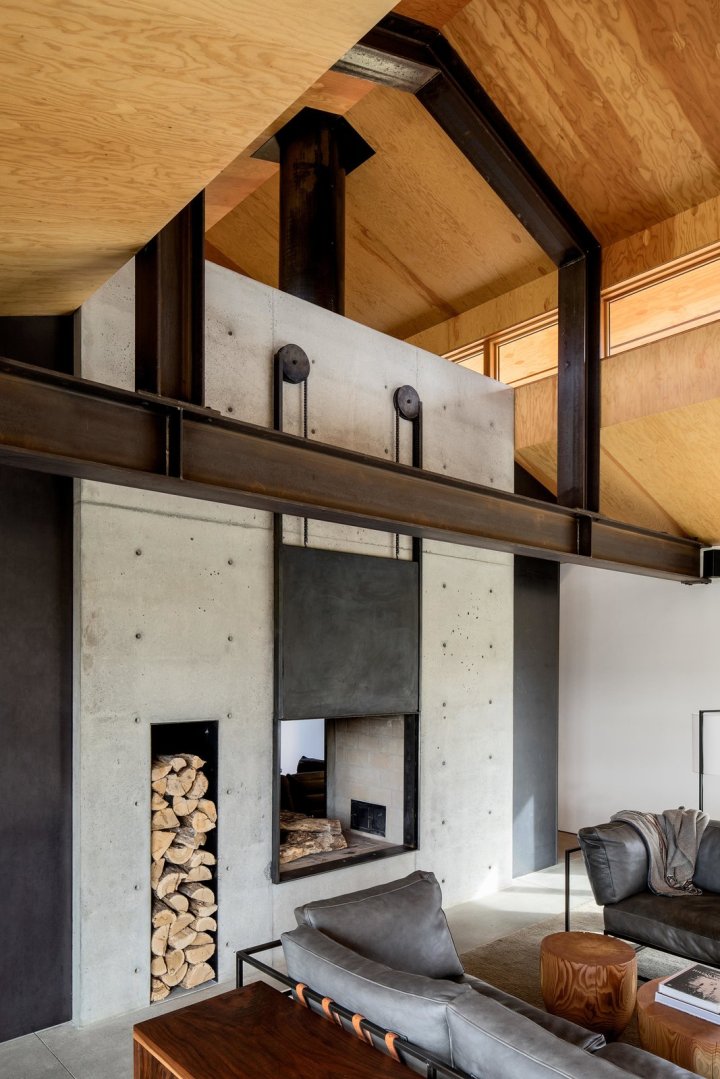
 The retreat contains four distinct buildings arranged in two groupings. The first grouping contains the main house, a woodworking shop, and a carport all contained under a single roof in a T-shape. A covered courtyard connects the three spaces in the middle of the “T”. A separate, free-standing artist studio is located just northeast of the main house, with a covered patio that connects to a guest room. Here, the owners work on their own projects, and occasionally host retreats and community-based arts workshops. In all four buildings, large bi-folding doors and sliding barn doors open up the spaces completely to the outdoors, allowing for the movement of large artworks and equipment, as well as an intimate connection with the environment.
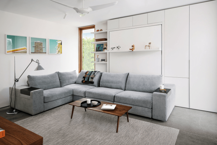
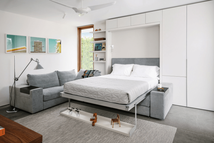
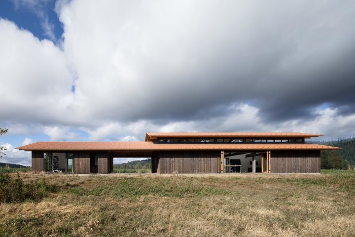
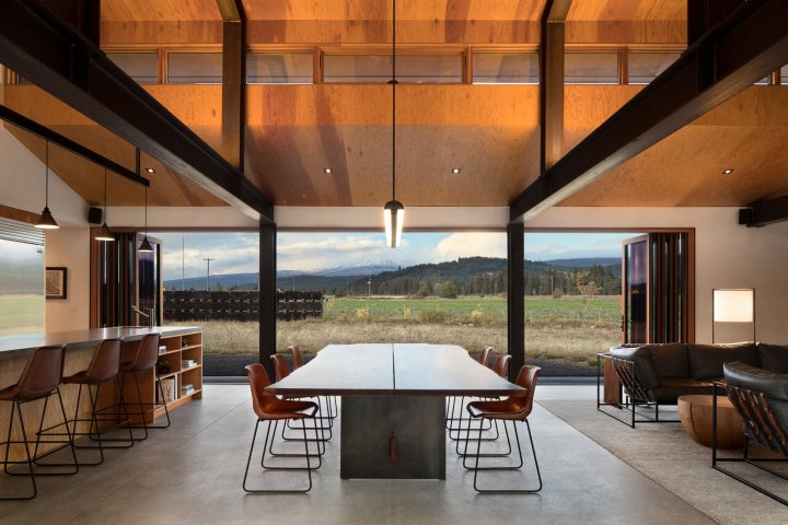
 The main house is minimal in form, consisting of a single double height volume with an open plan living, dining and kitchen area separated from a library by a double-sided fireplace. A set of hidden steel stairs nestled into the concrete fireplace lead to a loft above the library. The home’s single bedroom is located above the bathroom and mudroom and is accessed via a set of open stairs in the entry foyer. Two sets of 30-foot-long bi-fold doors in the main living space allow the home to open completely on both sides, maximizing the home’s sweeping views of the nearby river and Mount Adams.


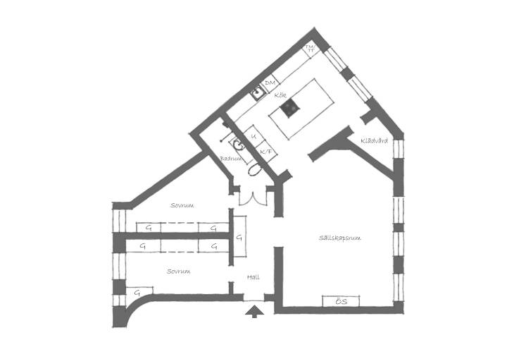
 Main Level
 Second Level


 Photos by Ryan Siphers


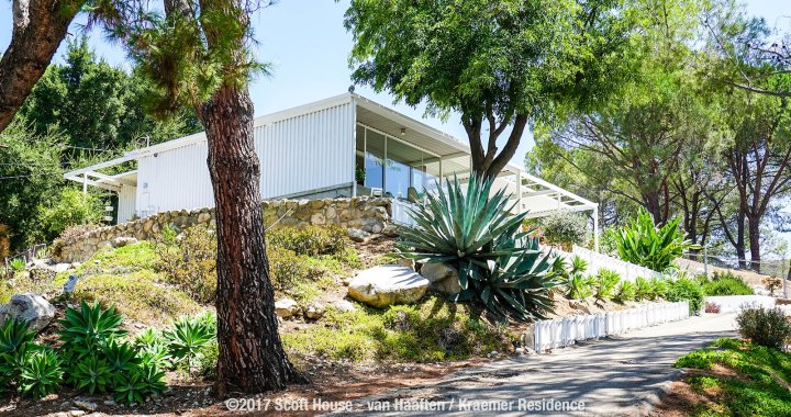
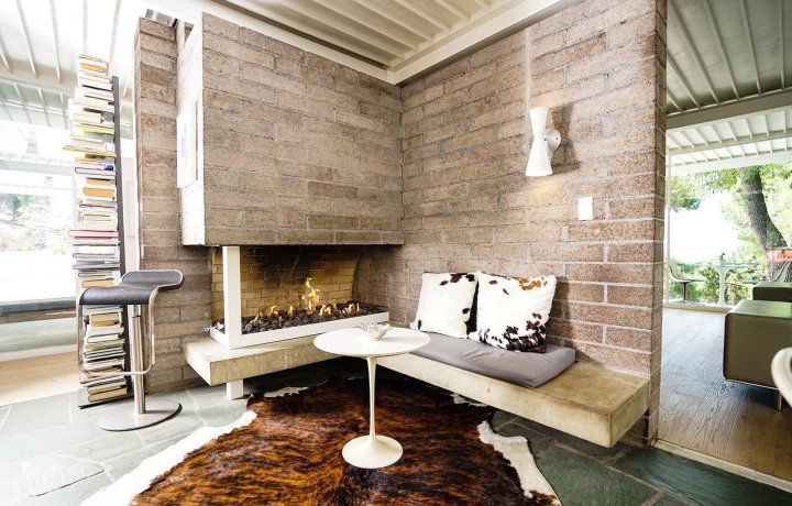
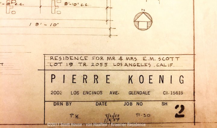
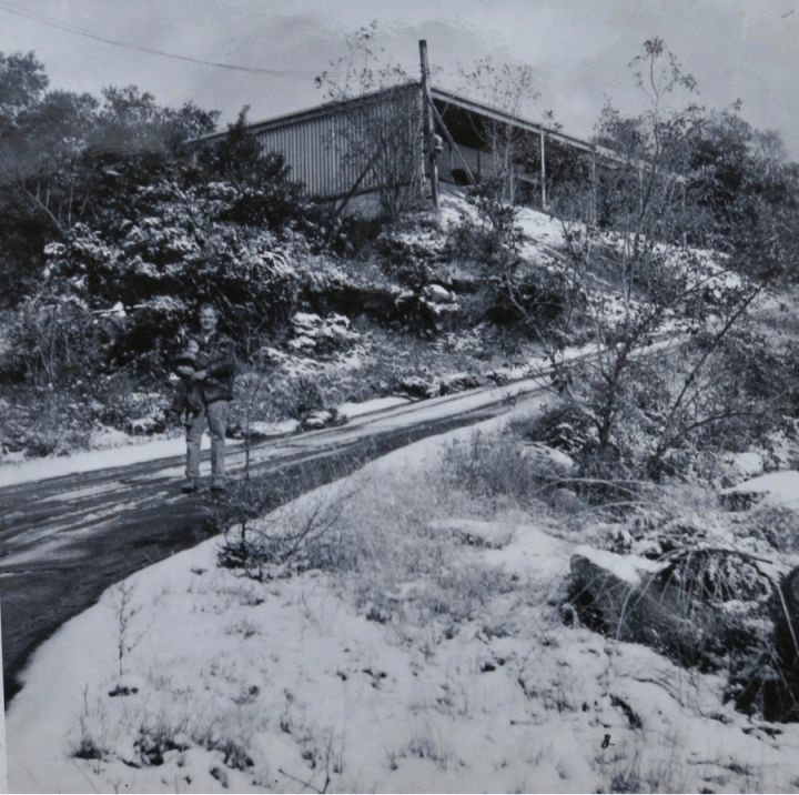 Edwin Scott and his son Mike in front of the Scott House in 1956.
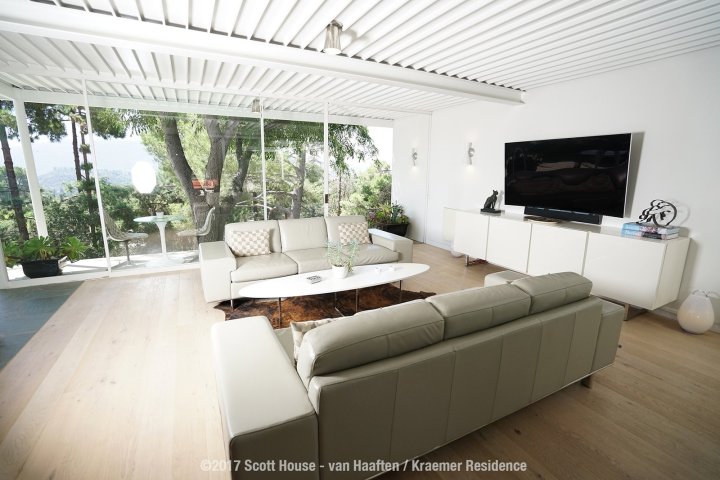
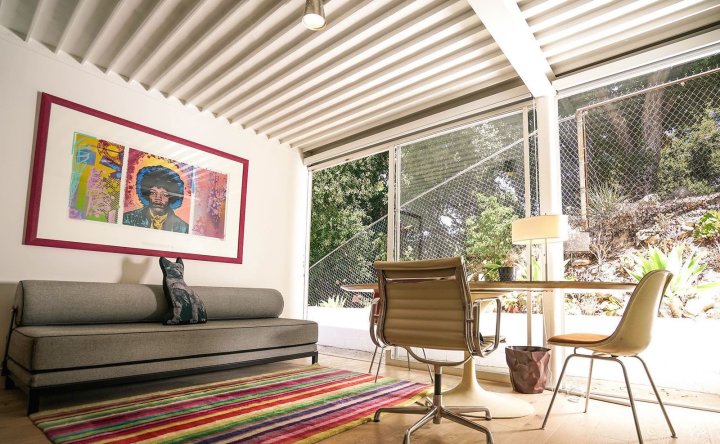
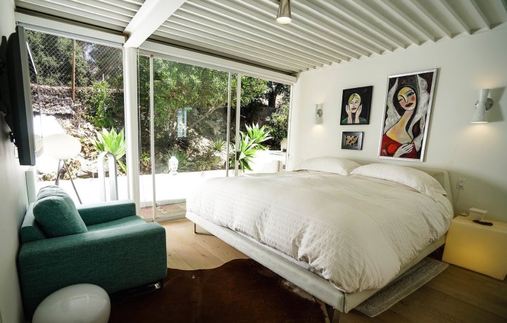
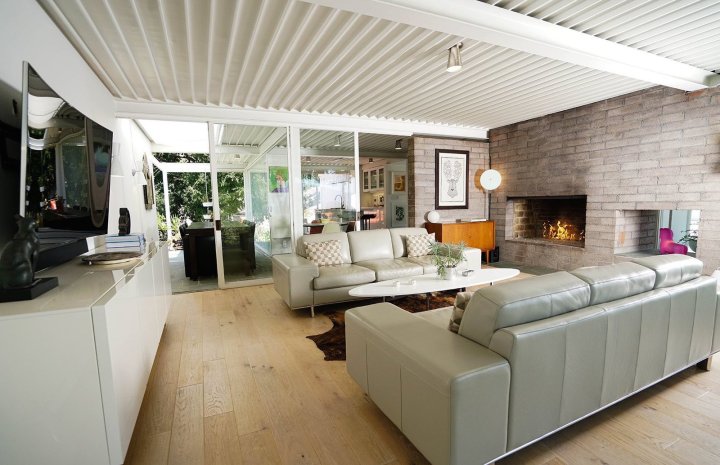
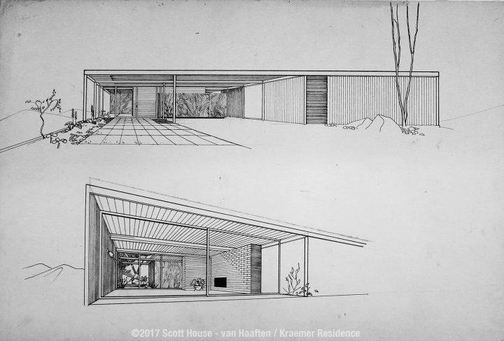
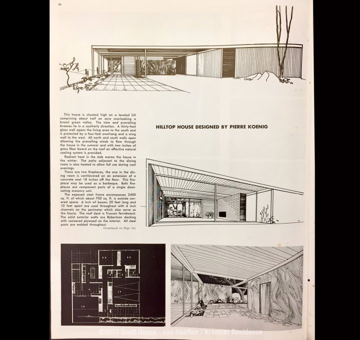
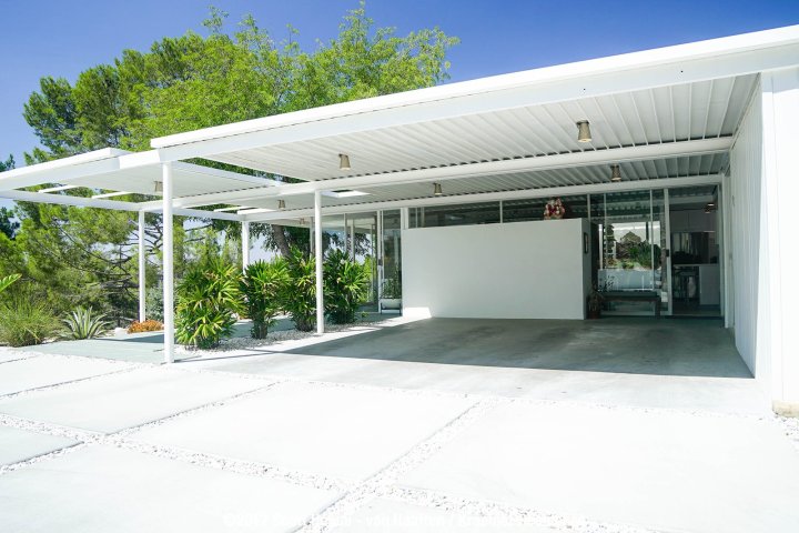
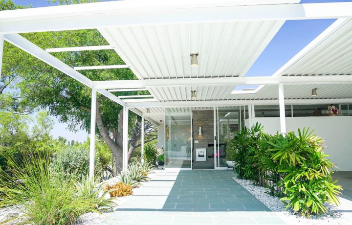
 Like many of Koenig’s Case Study Houses, the Scott House is an architecturally simple, L-shaped structure made up of straight, clean lines. Plenty of floor-to-ceiling glass walls link the interior spaces and visually connect the house with its surrounding environment. A bright and expansive central living area is anchored by a dividing wall and a two-sided fireplace. Sliding glass doors connect this central living space to other parts of the house. The kitchen connects to two dining zones: an indoor dining area with a small round table, and a larger “winter garden” dining space with a rectangular table. Full glazing on their exterior walls of the two bedrooms bring in tons of light and allow guests to feel a sense of being immersed in the outdoors.