Beautiful Interiors

Little Venice Residence by Originate + GL Studio is exquisite. Formerly two adjoining townhouses, this stunning mid-19th century property in West London was completely restored by Originate Architects and GL Studio. Now a Victorian stucco-fronted villa, the original features were reinstated and married with contemporary elements to fulfill the needs of modern family. The details are gorgeous!

LR-Garden-View-
littlevenice_03
littlevenice_02
littlevenice_6(1)littlevenice_7
The restoration process included the installation of new fireplaces and arched openings in keeping with the historical period. New joinery units were designed by Originate using a unique finish to enhance the natural grain of the timber, while a fairly neutral colour palette was chosen to complement the client’s extensive collection art and furniture collection. In particular, a love of mid-century design that can bee seen with the iconic Pierre Jeanneret chairs, a beautiful Jorge Zalszupin table, and the Carl Hansen & Søn’s reissue of the Hans J Wegner CH22 lounge chair from 1950.

littlevenice_5littlevenice_4
Dining-Stairs-Dining-Garden-
RR-Kitchen-Stairs-RR-Kitchen-Island-View
RR-Living-Room-RR-Living-Room-Seating-RR-Living-Room-Arch-
Images via Orginate and GL Studio

Beautiful Residential Home Design #2

ch house 1.jpg

Originally occupied by a small cottage in disrepair, this new modern home in Seattle’s Capitol Hill neighborhood, designed by SHED Architecture, is an economical, efficient, low-maintenance, and modern version of a traditional home – one with primary living spaces on the main floor and three bedrooms above.

The kitchen to occupies a central and commanding position in the house with easy access to the backyard patio. Large floor-to-ceiling sliding doors flank the east and west ends of the house, exposing an open-plan kitchen, dining and living space ideal for entertaining. The kitchen’s minimal palette of bamboo, fir, cork, and concrete allow the natural materials to take center stage without overpowering the functional details including a custom stainless steel pot rack. In order to achieve the desired aesthetic and budget-level, the designers selected cabinets from Ikea and created custom bamboo cabinet fronts and fir wraps with recessed pulls. The bamboo material was selected for and sets the tone for the rest of the house.

ch house 4

Capitol_Hill_Home_24Capitol_Hill_Home_23-1612x1075

The house sits on a well-traveled arterial along a bus line and is flanked by two multi-unit buildings: to the south a rental house that extends the length of the property line with several windows along that façade; to the north, a triplex with a south-facing entry court encroaches upon the original plot by means of an easement. By limiting windows along the sides of the house and focusing the glazing towards the east and west, the home establishes a strong connection to its front and rear yards while protecting its occupants privacy from the heavily used side-yards of the neighbors. A walled and elevated terrace extending from the sunken living room claims the front yard as usable space and shields the fully glazed living spaces from passersby. Corrugated metal siding and concrete site walls were used where privacy was desired, while wood windows, doors, and siding were used at the sheltered open ends where people interact directly with the building’s exterior.

ch house 3

chhouse 6

ch house 5

ch hose 7

The home was also designed with the environment in mind. A low-maintenance high performance enclosure was achieved by using an effective combination of advanced framing (required 30% less lumber), triple-pane windows protected by aluminum plate ‘visors,’ and metal siding. Natural light, open spaces and simple materials come together to create a private sanctuary for the homeowners to cook, entertain and recharge.

Capitol_Hill_Home_04-1612x1075Capitol_Hill_Home_22-1612x1075

Capitol_Hill_Home_30-1612x1075

Capitol_Hill_Home_26-1612x1075

Capitol_Hill_Home_10-1612x1075Capitol-Hill-House_20121019_0015-1116x1488Capitol_Hill_Home_31-1612x1075

Capitol-Hill-House-Floor-PlansCapitol-Hill-House-Site-Plan

Designed by SHED Architecture + Design 

Beautiful Toys by Charles & Ray Eames

Serious Fun

Taking inspiration from the humble cardboard box, Ray and Charles Eames created toys and furniture to spark the imagination of kids and adults alike. A central tenant of the design philosophy of Ray and Charles Eames was an embrace of play as an end in itself, the idea that creativity should be unconstrained and unburdened. While the couple will always be remembered for their contributions to furniture, design and cinema, it was their approach to experimentation, and their interest in seemingly tangential topics such as clowns, that inspired their seemingly endless sense of wonder and a constant drive towards exploration and improvement. As champions of those beliefs, it only goes to follow that they’d also be some of the world’s foremost toy designers.

Ray and Charles Eames took child’s play seriously. They invented playthings, furniture, and films to spark, but never limit, the young imagination. Given their own ideas of fun, these toys tended to emphasize composition, structure, and building, giving children the tools of their own adult trades in miniature (and giving some adults the chance to make like children again). Many of their designs embrace what kids and parents have long known: that the box an item comes in, especially if it’s a very large item, can be more exciting than the contents.

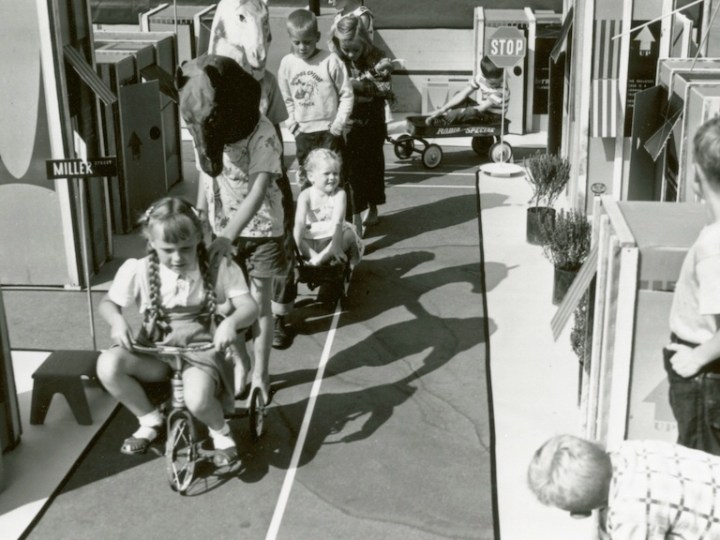
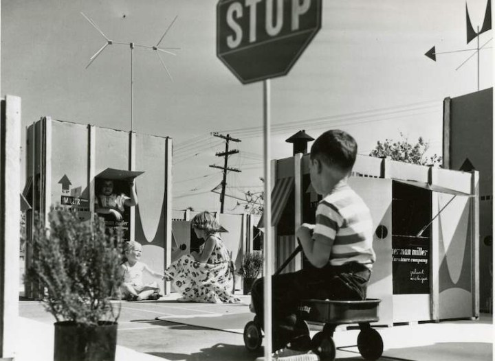
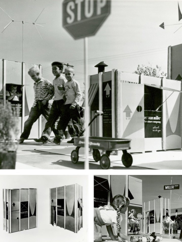
So it comes as no surprise that the Eameses improved the box itself, as a portfolio of photographs unearthed from the Herman Miller Archives reminds us. The humble cardboard box offers children their first chance to make space for themselves, whether that’s a race car, a robot, or a house, sprouting from the shipping container the Eames Office designed in 1951 for the Eames Storage Units (ESUs).

Printed in a colorful red and black design, and featuring the distinctive Herman Miller ‘M,’ the heavy cardboard carton, reinforced with wood splines, had only to be re-nailed to the bottom wood skid, after the furniture had been removed, to be made into a playhouse youngsters would love, reads text from a draft press release. A separate leaflet offers instructions on “How to Make a Playhouse,” but it should have been self-explanatory: dotted lines suggest locations for an entrance and a view out, as well as jaunty awnings.

In one fell swoop, the Eameses managed to combine adult and child fun, eliminate waste, and add excitement to the mundane process of delivery. The up arrows, as well as the deep V of the logo “M,” designed by Irving Harper for the company, suggest the possibility of upward expansion into a miniature townhouse or skyscraper, should a child or parent need more furniture.

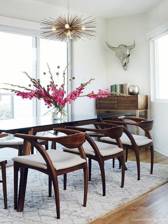
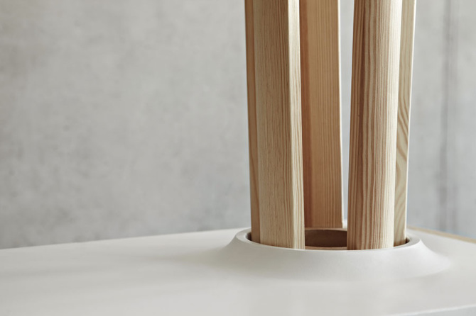
The ESUs themselves were also a kind of demountable toy for grownups. Made of perforated steel extrusions with diagonal bracing, they could be configured as low credenzas or high bookshelves. Buyers could customize the interior arrangement, selecting plywood drawers or doors, and perforated metal or enameled Masonite filler panels. Owners could also take them apart and rearrange or add on, treating the furniture as a series of modular boxes‑ furniture as toy.

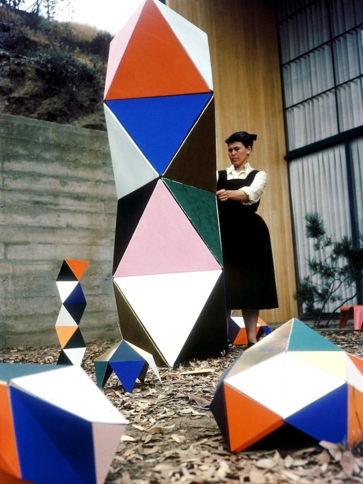
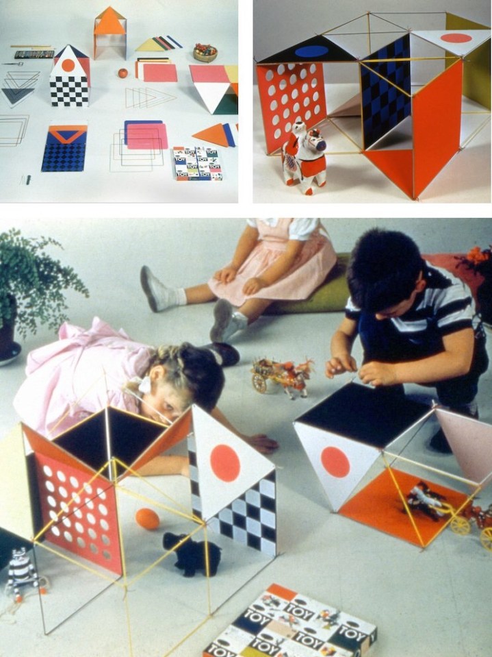
As adults designing playthings intended for children, the Eameses found more inspiration in boxes. The Toy, manufactured by Tigrett Enterprises in 1951, offered children the chance to make their own prefabricated structure, one more colorful and flexible than Carton City. The Eameses had first been in touch with Tigrett about manufacturing large, bright, paper-and-cardboard animal masks based on those they used for skits and photo shoots in the late 1940s. The Memphis-based company was run by the highly entrepreneurial John Burton Tigrett, who made his fortune selling the Glub-Glub duck and may have been looking for more patentable products. The masks never made it out of the prototype stage, but the simpler and more geometric Toy did.

The Toy combined thin wooden dowels, pipe cleaners, and a set of square and triangular stiffened-paper panels in green, yellow, blue, red, magenta, and black. Children could run the dowels through sleeves on the edges of the panels to strengthen them, and then attach these struts at the corners. Initially sold in a big, flat box via the Sears catalog, the Eameses soon redesigned this packaging as well, creating a far more elegant 30-inch hexagonal tube, into which all parts could be rolled and stored.

The first version of the Toy made spaces big enough for children to inhabit, like the cartons. The Little Toy, released in 1952, was scaled more like an architectural model, allowing children to radically reinterpret the dollhouse. (The office later prototyped a modern model house for Revell, but it never went into production.) The Little Toy boxes, which feature a grid of colorful rectangles and words, resemble the panelized arrangement of the Eames House façade and the ESUs, and all of these products, at their various scales, were being developed at the Eames Office within the same few years.

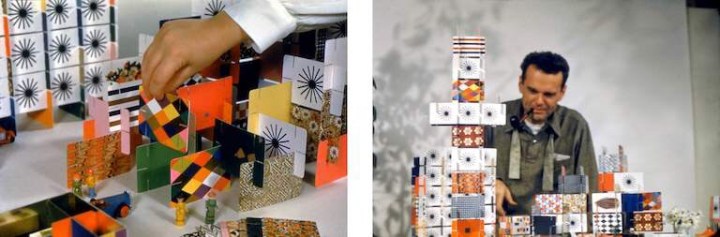
Charles Eames once said of the work done out of the Eames Office, “We work because it’s a chain reaction, each subject leads to the next.” The connection to the ESU cartons and The Toy is immediately apparent in the longest-lived of the modular, paper-based playthings to come out of the Eames Office, the House of Cards.

In the voiceover for “Toccata for Toy Trains,” Charles Eames says, “In a good old toy there is apt to be nothing self-conscious about the use of materials. What is wood is wood; what is tin is tin; and what is cast is beautifully cast.” He could have added, in reference to the couple’s own toys, what is cardboard is cardboard, and then talked about the qualities that make it an ideal building material: its strength, its low cost, its ability to withstand a judicious number of cuts and slots.

Why Magazine by Alexandra Lange

Beautiful Dining Room Designs

As a self-proclaimed lover of food, I believe the dining room is the most important room in a home (next to the kitchen, of course), so picking out a table, choosing the right chairs, and adding that perfect rug to tie it all together are very important. With so many ways to style the dining room, from rustic wooden tables to sleek touches of gold, here are some favorite looks to give you some much-needed inspiration.

dining_room_feature

Clean & Neutral
Go simple with natural tufted chairs, a sleek wooden table, and tons of white
flowers. The neutral palette is really versatile, great for changing up your
tabletop for different occasions.

dining

Modern & Bold
You can still keep your dining room relatively neutral with bold, modern
pieces like these exaggerated wooden chairs and metal taxidermy.
The combination is effortless.

dining 2

Inspired by Scandinavian Style
We’re always a fan of Scandinavian style, especially this simple
combination of light wood and modern white chairs. The faded palette
and modern silhouettes are staples of Scandinavian design.

dinnig 3

Mix & Match
Love the idea of mixing and matching your dining room chairs.
Choose one color palette to keep the look cohesive.

dinindg

Beautiful Mid-Century Modern Home

House stalking…and dreaming

House stalking is like a past time for me lately. Honestly, when I drive by a house I like I think about whether I could live in it and what it’s like inside, but it just seems so far out of reach these days, especially in the heart of Seattle. Property here is ridiculous if you’re wanting to live anywhere within the city limits. Sometimes I feel like I can barely afford life, let alone buying a home in the kind of up and coming area I’d want to be in.

One style I’m currently obsessed with is all things mid-century, I love the clean lines, modern style furniture, large widows and vaulted beamed ceilings. The problem being there are not too many good mid-century style homes in Seattle where bungalows rule. Palm Springs has the best examples, now if only I could find a way to plunk an Eichler home somewhere in Seattle, hmm.

This beauty is the Dr. Scholl’s estate in Palm Springs, CA, the epicenter for mid-century modern, is designed by Anshen+Allen. The entrance has an amazing colonnade and oversize atrium that leads straight into a round pool from the moment you step in the door. I love the front facade with minimal window lines, the privacy, the custom walnut Kerf cabinetry in the kitchen, vintage tiles and hand crafted walnut accent walls….mid-century doesn’t get any better than this. Now if only I had a spare $1.2 million and could tolerate the heat of Palm Springs.

29-full 3-full5-full 7-full 8-full10-full 11-full 13-full 15-full 16-full17-full 21-full 24-full 26-fullMain_Exterior


Beautiful Furniture Design From Krakow

Kraków designer Alicja Prussakowska has designed a coat stand
that’s not only useful but beautiful. Its dual purpose design provides
storage and seating in addition to providing spot to hang your hat.
Made of handcrafted pine with a MDF base, I’d like one of these.
IMG_5557-0 IMG_5597-0 IMG_5435-0 IMG_5491-0 IMG_5450-0 IMG_5465-0

Beautiful Architecture

Santiago Calatrava’s innovation, science and technology
building for Florida Polytechnic University makes me
want to study there just to be able to experience this
building. The design is characterized by a skeletal
form with a latticed envelope across a series of arched
ribs. The crowning feature is its rising operable roof
that can regulate the desired amount of direct light.
Simply beautiful.
florida-polytechnic-university-santiago-calatrava-designboom-07B florida-polytechnic-university-santiago-calatrava-designboom-04 florida-polytechnic-university-santiago-calatrava-designboom-08 florida-polytechnic-university-santiago-calatrava-designboom-12 florida-polytechnic-university-santiago-calatrava-designboom-01 florida-polytechnic-university-santiago-calatrava-designboom-03 florida-polytechnic-university-santiago-calatrava-designboom-02